• Home
  • Tools dropdown img
    • Spreadsheet Charts

      • ChartExpo for Google Sheets
      • ChartExpo for Microsoft Excel
    • Power BI Charts

      • Power BI Custom Visuals by ChartExpo
    • Word Cloud

  • Charts dropdown img
    • Chart Category

      • Bar Charts
      • Circle Graphs
      • Column Charts
      • Combo Charts
      • Comparison Charts
      • Line Graphs
      • PPC Charts
      • Sentiment Analysis Charts
      • Survey Charts
    • Chart Type

      • Box and Whisker Plot
      • Clustered Bar Chart
      • Clustered Column Chart
      • Comparison Bar Chart
      • Control Chart
      • CSAT Survey Bar Chart
      • CSAT Survey Chart
      • Dot Plot Chart
      • Double Bar Graph
      • Funnel Chart
      • Gauge Chart
      • Likert Scale Chart
      • Matrix Chart
      • Multi Axis Line Chart
      • Overlapping Bar Chart
      • Pareto Chart
      • Radar Chart
      • Radial Bar Chart
      • Sankey Diagram
      • Scatter Plot Chart
      • Slope Chart
      • Sunburst Chart
      • Tornado Chart
      • Waterfall Chart
      • Word Cloud
    • Google Sheets
      Microsoft Excel
  • Services
  • Pricing
  • Contact us
  • Blog
  • Support dropdown img
      • Gallery
      • Videos
      • Contact us
      • FAQs
      • Resources
    • Please feel free to contact us

      atsupport@chartexpo.com

Categories
All Data Visualizations Data Analytics Surveys
Add-ons/
  • Google Sheets
  • Microsoft Excel
  • Power BI
All Data Visualizations Data Analytics Surveys
Add-ons
  • Google Sheets
  • Microsoft Excel
  • Power BI

We use cookies

This website uses cookies to provide better user experience and user's session management.
By continuing visiting this website you consent the use of these cookies.

Ok

ChartExpo Survey


Home > Blog > Microsoft Excel

How to Flip Data in Excel for Better Insights

How to flip data in Excel?

If you’ve ever faced a messy spreadsheet, you know how frustrating it can be to organize information effectively. Excel, with its powerful tools, makes it easier to rearrange data. Learning how to flip data in Excel saves time and reduces errors.

Millions of professionals rely on Excel daily. Data modelling in Excel makes data presentation and analysis extraordinary. Often, flipping rows or columns is essential to achieve clarity. Whether working with sales reports, survey results, or timelines, flipping data ensures your information is structured correctly.

How to Flip Data in Excel

Imagine handling a dataset where rows need to be columns or vice versa. Manually re-entering the data takes time and risks inaccuracies. Excel simplifies this with built-in features like the Transpose option. Knowing how to use these tools effectively transforms how you handle data.

Flipping data also helps with comparisons. A flipped view can highlight trends or inconsistencies previously hidden, making Excel invaluable for improving decision-making.

Learning how to flip data in Excel isn’t just practical—it’s a skill that improves productivity. Whether you’re a beginner or experienced, mastering this feature enhances how you work with data.

Table of Contents:

  1. What is Flip Data in Excel?
  2. Why Flip Data in Excel?
  3. When Do You Need to Flip Columns and Rows in Excel?
  4. How to Flip Columns and Rows in Excel?
  5. How to Flip Data in Excel Using Functions?
  6. How to Flip Excel Sheets?
  7. How to Analyze Flipped Data in Excel?
  8. What are the Tips for Flipping Data in Excel?
  9. Wrap Up

First…

What is Flip Data in Excel?

Definition: Flipping data in Excel means rearranging how your data is displayed. It involves switching rows to columns or columns to rows. It is often done using the Transpose function or other tools.

Flipping data helps restructure your spreadsheet for better clarity or data analysis. It’s useful when your data layout doesn’t match your needs, such as turning a horizontal list into a vertical one. This quick adjustment, along with the ability to move columns in Excel, can make your data easier to understand and work with.

Why Flip Data in Excel?

Flipping data in Excel is more than a simple adjustment. It’s a smart way to optimize your spreadsheets. Sometimes, data isn’t structured in the best format for your task. Flipping rows and columns can solve this quickly and effectively, and here’s how:

  • Better data organization: Flipping data helps create a cleaner, more logical layout. It rearranges your information to fit your workflow. Organized data is easier to navigate and reduces confusion, making it an essential step in how to clean data in Excel.
  • Presentation purposes: Flipping data makes your charts and tables more appealing. It adjusts layouts to match the story you want to tell. Clear data presentations leave a lasting impression.
  • Improved data analysis: Data analysis depends on clarity. Flipping data can reveal trends or patterns that weren’t obvious before. It ensures your data aligns perfectly with analysis tools and supports better reporting when learning how to create a report in Excel.
  • Compatibility with templates: Templates often require specific layouts. Flipping data ensures your information fits seamlessly into pre-designed templates, saving time and eliminating formatting issues.

When Do You Need to Flip Columns and Rows in Excel?

Here’s why flipping rows and columns in Excel can be a total game-changer:

  • Improving readability: You’re staring at a long, endless vertical list. Or maybe a table that stretches across your screen like a never-ending highway. Flipping rows and columns can turn chaos into clarity, making it easier to identify patterns or even eliminate duplicates in Excel. Suddenly, the data speaks your language.
  • Preparing for pivot tables: Have you ever tried creating a pivot table only for Excel to tell you, “Nope, not happening”? Yeah, me too. Flipping rows and columns can save you from that frustration. Get the structure right, and your pivot table will work like magic.
  • Chart creation: Have you transformed your Excel data to a graph, and the bars look upside down, or the lines don’t add up? That’s Excel telling you to flip the data. Swap rows and columns, and watch your chart transform into something that makes sense.
  • Ensuring template compatibility: Have you downloaded a fancy template, and your data doesn’t fit? A quick row-column flip can make your info play nice with the new format, averting a crisis and streamlining data merging in Excel.
  • Data comparison: You’ve got two datasets; comparing them feels like trying to match socks from two different laundry loads. Flip rows into columns (or vice versa), and suddenly, everything aligns perfectly, like finding that missing sock.

How to Flip Columns and Rows in Excel?

Flipping rows and columns in Excel might sound like a tech wizard’s trick. But guess what? It’s super simple. Whether tidying up your data or reshaping it for analysis, flipping horizontally or vertically takes just a few steps. Let’s get you flipping like a pro!

How to Flip Data in Excel Horizontally

Ready to turn rows into columns? Here’s how to do it:

  1. Open your Excel sheet and select the data you want to flip.
  2. Copy it using Ctrl + C or right-click and choose “Copy”.
  3. Choose the cell where your flipped data will land and click on it.
  4. Right-click, then select “Paste Special”.
Select Paste Special for Applying How to Flip Data in Excel
  1. Check the “Transpose” box and click “OK”.
Check Transpose Box and Click Ok for Applying How to Flip Data in Excel
  1. That’s it! Your rows are now perfectly arranged as columns.
Rows are Perfectly Arranged as Columns for Applying How to Flip Data in Excel

How to flip data in Excel Vertically:

Flipping data in Excel vertically might sound fancy, but it’s just a nifty trick that makes life easier. Imagine turning a row into a column or vice versa. Here’s how to do it in seconds.

  1. Open your Excel sheet and pick the data you want to flip.
  2. Copy it. You can use Ctrl + C or right-click and hit “Copy”.
  3. Decide where you want your flipped data to appear. Click that starting cell.
  4. Right-click and choose “Paste Special”.
First Copy and Choose Paste Special for Applying How to Flip Data in Excel
  1. Look for the magical “Transpose” box, check it, and click “OK”.
Magical Transpose Box and Click OK for Applying How to Flip Data in Excel
  1. Done! Your data has gone from columns to rows or rows to columns.
Data has has Gone From Columns to Rows or Rows to Colums for Applying How to Flip Data in Excel

How to Flip Data in Excel Using Functions?

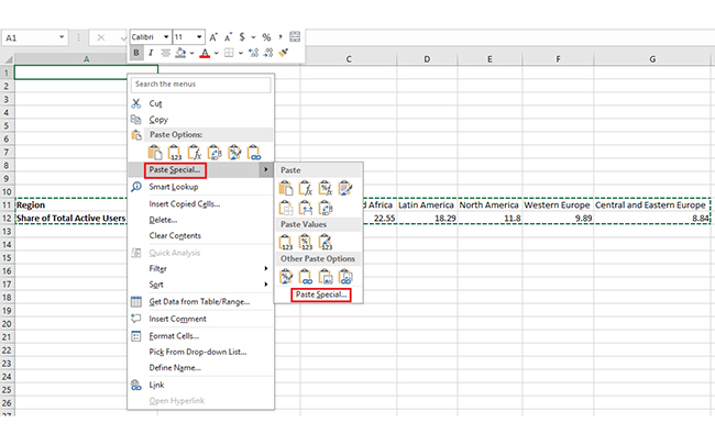
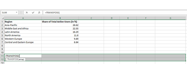
Flipping data in Excel doesn’t always need a copy-paste trick. You can use a powerful built-in function: TRANSPOSE. It’s like letting Excel do the heavy lifting while you sit back. Want to give it a try? Let’s walk through how to transpose data in Excel step by step.

  1. Select blank cells: First, pick some blank cells: the cells you select should match the original data’s size but flip. For instance, if your original data has 14 cells arranged vertically, you need to choose 14 cells arranged horizontally. It will be the landing pad for your flipped data.
Select Blank Cells for Applying How to Flip Data in Excel
Original Data has 14 Cells Arranged Vertically for Applying How to Flip Data in Excel
  1. Use the TRANSPOSE function: With those blank cells still selected, type:

=TRANSPOSE(

It’s like opening the door to Excel’s magic formula. Don’t press Enter just yet—hang tight.
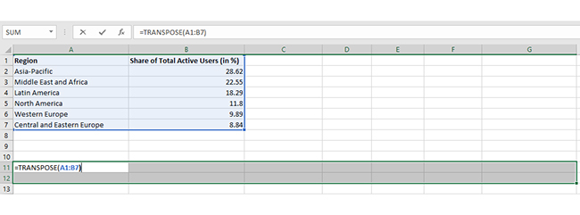
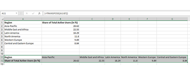
Use Transpose Function for Applying How to Flip Data in Excel
  1. Enter the original cell range: Now, tell Excel what to flip by typing the range of cells you’re working with. If your data is in A1:B7, your formula will look like this:

=TRANSPOSE(A1:B7)

Enter Original Cell Range for Applying How to Flip Data in Excel
  1. Here’s the secret sauce: press CTRL+SHIFT+ENTER instead of the usual Enter. Why? TRANSPOSE works with array formulas, which means it spreads the formula across multiple cells. Excel will flip your data beautifully, showing the new layout instantly.
Press CTRL+SHIFT+ENTER for Applying How to Flip Data in Excel

How to Flip Excel Sheets?

Flipping an entire Excel sheet might sound like a challenge, but don’t worry—it’s easy. Let’s break it down so you can master the flip like a pro!

  1. Select all the data: First, highlight all the data you want to flip. Make sure to include headers so nothing gets left behind.
  2. Copy the data: Right-click on the selection and choose Copy. Or press Ctrl+C for a faster move.
  3. Pick a blank area: Decide where your flipped sheet will live. Click on the first blank cell where you want to start.
  4. Paste Special with Transpose: Here’s the magic move: right-click the blank cell, choose “Paste Special,” and check the “Transpose” box. Press OK, and watch your sheet transform.
  5. Adjust as needed: Depending on your layout, you may need to tweak spacing, borders, or formatting. But don’t worry, the hard part is done!

How to Analyze Flipped Data in Excel?

Flipping data in Excel sounds simple, but it can get tricky fast. In data analysis, clear visuals are key to making sense of your numbers. Unfortunately, Excel’s built-in charts often fall short. They lack the flexibility and flair needed for impactful data storytelling.

That’s where ChartExpo comes in. It’s an add-on that turns Excel into a data visualization powerhouse. But first, let’s master flipping your data to prepare it for those stunning visuals.

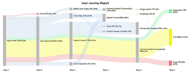
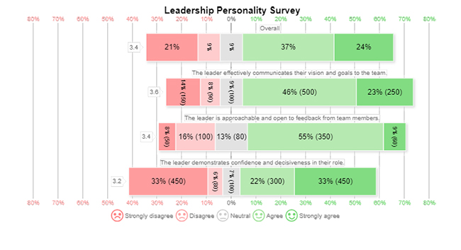
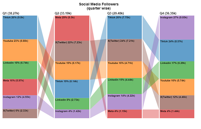
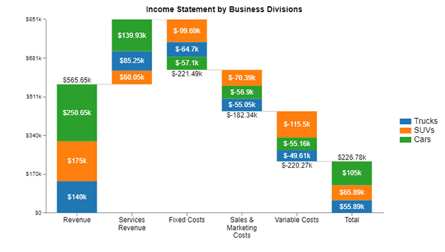
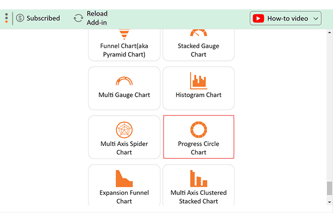
Below charts are created in Excel using ChartExpo for simple data analytics:

Sankey Chart

Sankey Chart for Applying How to Flip Data in Excel

Likert Scale Chart

Likert Scale Chart for Applying How to Flip Data in Excel

Comparison Bar Chart

Comparison Bar Chart for Applying How to Flip Data in Excel

Stacked Waterfall Chart

Stacked Waterfall Chart for Applying How to Flip Data in Excel

Progress Circle Chart

Progress Circle Chart for Applying How to Flip Data in Excel

Let’s learn how to install ChartExpo in Excel.

  1. Open your Excel application.
  2. Open the worksheet and click the “Insert” menu.
  3. You’ll see the “My Apps” option.
  4. In the Office Add-ins window, click “Store” and search for ChartExpo on my Apps Store.
  5. Click the “Add” button to install ChartExpo in your Excel.

ChartExpo charts are available both in Google Sheets and Microsoft Excel. Please use the following CTAs to install the tool of your choice and create beautiful visualizations with a few clicks in your favorite tool.

Example

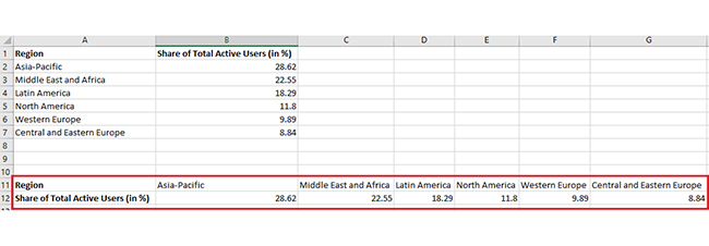
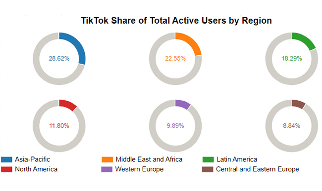
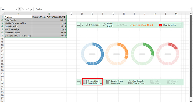
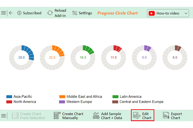
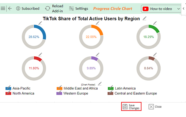
Let’s turn this Excel data to graph using ChartExpo and glean valuable insights.
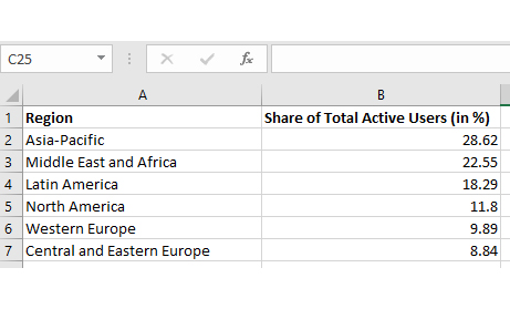
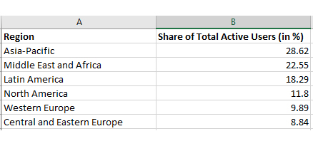
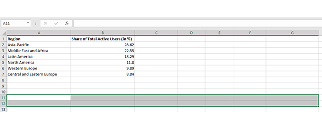
Region Share of Total Active Users (in %)
Asia-Pacific 28.62
Middle East and Africa 22.55
Latin America 18.29
North America 11.8
Western Europe 9.89
Central and Eastern Europe 8.84
  • To get started with ChartExpo, install ChartExpo in Excel.
  • Now Click on My Apps from the INSERT menu.
insert chartexpo in excel
  • Choose ChartExpo from My Apps, then click Insert.
open chartexpo in excel
  • Once it loads, scroll through the charts list to locate and choose the “Progress Circle Chart”. This chart is best suited to this scenario.
Search Progress Circle Chart in Excel
  • You will see a Progress Circle Chart on the screen.
See Progress Circle Chart Page on Screen After Applying How to Flip Data in Excel
  • Click the “Create Chart From Selection” button after selecting the data from the sheet, as shown.
Click Create Chart From Selection After Applying How to Flip Data in Excel
  • ChartExpo will generate the visualization below for you.
Initial Visual After Applying How to Flip Data in Excel
  • If you want to have the chart’s title, click Edit Chart, as shown in the above image.
  • Click the pencil icon next to the Chart Header to change the title.
  • It will open the properties dialog. Under the Text section, you can add a heading in Line 1 and enable Show.
  • Give the appropriate title of your chart and click the Apply button.
Add Chart Header After Applying How to Flip Data in Excel
  • You can add the (%) with all value and change the precision into two:
Add Postfix with All Value After Applying How to Flip Data in Excel
  • You can click on Settings and change the variation type:
Click on Settings and Change Variation Type After Applying How to Flip Data in Excel
  • Click the “Save Changes” button to persist the changes.
Click Save Changes After Applying How to Flip Data in Excel
  • Your Progress Circle Chart will appear as below.
Final How to Flip Data in Excel

Insights

  • Asia-Pacific: Leads with 28.62% of total active users.
  • Middle East and Africa: Second at 22.55%.
  • Other Regions: Latin America, North America, Western Europe, and Central/Eastern Europe show a diverse user base across regions.

Using Flipped Data to Improve Excel Chart Representation:

  1. Open your Excel Application.
  2. Install ChartExpo Add-in for Excel from Microsoft AppSource to create interactive visualizations.
  3. Select Progress Circle Chart from the list of charts.
  4. Select your data.
  5. Click on the “Create Chart from Selection” button.
  6. Customize your chart properties to add header, axis, legends, and other required information.

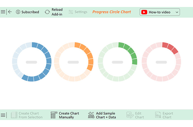
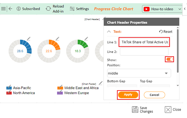
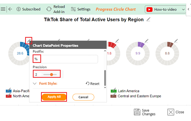
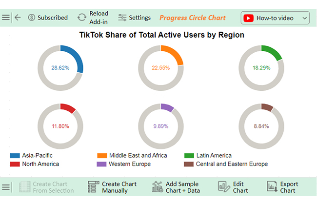
The following video will help you create a Progress Circle Chart in Microsoft Excel.

What are the Tips for Flipping Data in Excel?

Sometimes, you must turn your Excel data upside down or rearrange rows into columns. With a few tricks, you can flip your data like a pro. Let’s explore some handy tips:

  • Use Helper Columns/Rows: Start simple. Add a new column (or row) alongside your data. Number it sequentially (e.g., 1, 2, 3). Then, sort your data using these numbers in reverse.
  • TRANSPOSE Formula: Need rows as columns or columns as rows? Use the TRANSPOSE formula. Select your target range, type =TRANSPOSE(A1:D1), and press Ctrl+Shift+Enter (or Enter in newer Excel versions). Your data will flip instantly!
  • Paste Special with Transpose: This one’s quick! Copy your data, right-click where you want it flipped, choose Paste Special, and check Transpose.
  • Sort with helper numbers: Combine the helper column trick with sorting for more control. Assign custom numbers to the helper column to create the exact flip order you need. Then, sort your data based on those numbers.
  • Keyboard shortcuts: Speed things up with shortcuts! For example, use Ctrl+C to copy, Alt+E+S+E (or right-click) to paste special with Transpose.
  • Preserve formatting: Flipping data can mess up your formatting. To keep things neat, reapply borders, colors, or styles after flipping. You can also use Paste Special > Values to ensure no formatting surprises.
  • Test on a copy: Mistakes happen. Work on a copy of your data before flipping, just in case. Better safe than sorry.
  • Use VBA for automation: If you often flip data, let VBA do the heavy lifting. Write a simple macro to automate the process. It’s a game-changer for repetitive tasks.

FAQs

Is there a way to flip the data in Excel?

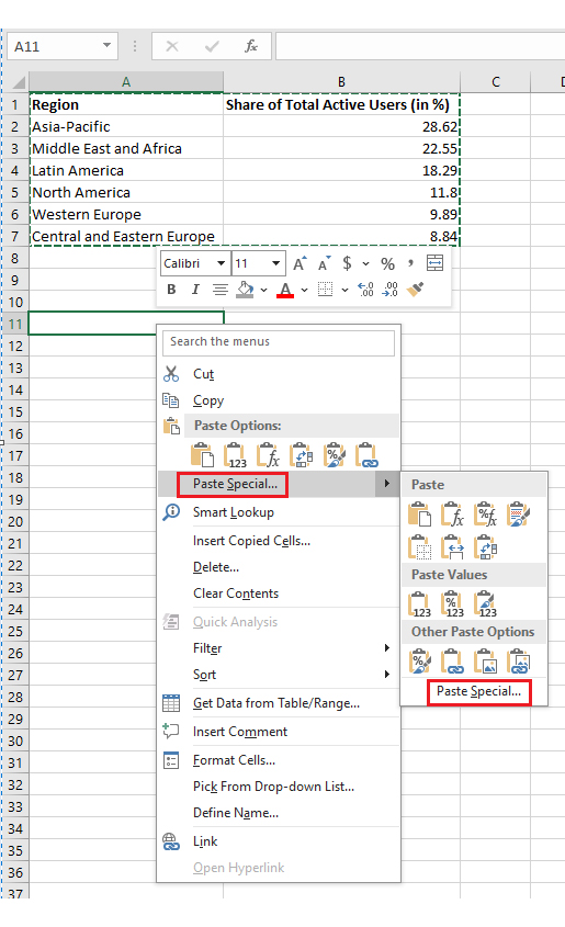
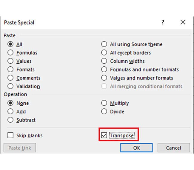
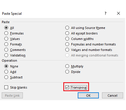
Yes, you can flip data in Excel using the Transpose option. Copy your data, then use “Paste Special” when selecting the Transpose checkbox. For formulas, use the TRANSPOSE function and press CTRL+SHIFT+ENTER. Quick and easy

How do I flip the order of data in an Excel chart?

To flip data in an Excel chart:

  • Reverse the order of your data source.
  • Use a helper column with sequential numbers.
  • Sort the data in descending order.
  • The chart will update automatically, reflecting the reversed data sequence.

How do you flip a list in Excel?

To flip a list in Excel:

  • Add a helper column with sequential numbers.
  • Sort the data by this column in descending order.
  • Alternatively, copy the list, use Paste Special with Transpose, and adjust as needed for rows or columns.

Wrap Up

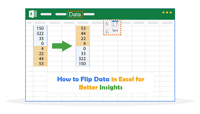
Flipping data in Excel is simple. It can be done in various ways, depending on your needs. You can flip rows, columns, or both. Sorting and formulas make this process easier. Follow the steps carefully.

To flip rows, use the Sort feature. Select your data and add a helper column. Fill it with numbers in order. Then, sort your data in descending order, and rows will flip instantly. For flipping columns, use the Transpose function. Copy the data first, then paste it as transposed. This will switch rows to columns or vice versa. Be precise during selection.

Formulas like INDEX can also help. They are flexible but need attention. Use them for advanced flipping. Apply the formula carefully to avoid mistakes.

Shortcuts like VBA can save time, and macros work for large data sets. Create a VBA script for instant flipping and practice more—practice is key to mastering this.

Flipping data in Excel enhances efficiency. It’s useful for analysis, presentation, and even tasks like how to add a chart in Excel. Pick the method that suits you and master the techniques with practice. ChartExpo for Excel offers powerful tools, so keep exploring its features.

How much did you enjoy this article?

ExcelAd2
Start Free Trial!
146616

Related articles

next previous
Microsoft Excel10 min read

Compound Interest in Excel for Smarter Reporting

Discover compound interest in Excel and how it works. Learn its formulas, calculation tips, and common errors to avoid for more accurate financial analysis.

Microsoft Excel9 min read

KPI Dashboard in Excel: A Complete Guide

A KPI dashboard in Excel helps track key metrics and streamline data visualization. Discover how to create, analyze, and use it with clear guides and examples.

Microsoft Excel11 min read

How to Plot a Speedometer Chart in Excel?

Create a Speedometer Chart in Excel to track KPIs, goals, and performance metrics visually. Explore templates, examples, and step-by-step instructions for better dashboards.

Microsoft Excel13 min read

Excel for Teachers for Insightful Preparation

Excel for teachers simplifies grading, tracks attendance, and organizes data. Find its key features, expert tips, and how ChartExpo enhances data visualization.

Microsoft Excel14 min read

How to Make a Cash Flow Diagram in Excel?

Learn how to make a Cash Flow Diagram in Excel. It will help you learn to visualize and analyze inflows and outflows of your business cash flow.

ChartExpo logo

Turn Data into Visual
Stories

CHARTEXPO

  • Home
  • Gallery
  • Videos
  • Services
  • Pricing
  • Contact us
  • FAQs
  • Privacy policy
  • Terms of Service
  • Sitemap

TOOLS

  • ChartExpo for Google Sheets
  • ChartExpo for Microsoft Excel
  • Power BI Custom Visuals by ChartExpo
  • Word Cloud

CATEGORIES

  • Bar Charts
  • Circle Graphs
  • Column Charts
  • Combo Charts
  • Comparison Charts
  • Line Graphs
  • PPC Charts
  • Sentiment Analysis Charts
  • Survey Charts

TOP CHARTS

  • Sankey Diagram
  • Likert Scale Chart
  • Comparison Bar Chart
  • Pareto Chart
  • Funnel Chart
  • Gauge Chart
  • Radar Chart
  • Radial Bar Chart
  • Sunburst Chart
  • see more
  • Scatter Plot Chart
  • CSAT Survey Bar Chart
  • CSAT Survey Chart
  • Dot Plot Chart
  • Double Bar Graph
  • Matrix Chart
  • Multi Axis Line Chart
  • Overlapping Bar Chart
  • Control Chart
  • Slope Chart
  • Clustered Bar Chart
  • Clustered Column Chart
  • Box and Whisker Plot
  • Tornado Chart
  • Waterfall Chart
  • Word Cloud
  • see less

RESOURCES

  • Blog
  • Resources
  • YouTube
SIGN UP FOR UPDATES

We wouldn't dream of spamming you or selling your info.

© 2025 ChartExpo, all rights reserved.