Categories
Power BI is arguably the best data analytics tool that gives users room to generate insightful visualizations and reports. With the Power BI tool, users can easily calculate date and time differences.


The DATEDIFF in Power BI is one of the essential time-related functions. In this guide, you’ll discover what the datediff Power BI is, why datediff in Power BI is important, and also get a good grasp of the datediff function in Power BI.
First…
Power BI users often have to calculate the time differences between two dates in a table. It’s a complex task, but all the user has to do is use the DAX DATEDIFF formula.
You only have to know what the start and end points are in date (or time) format. You also have to specify the type of interval you want.
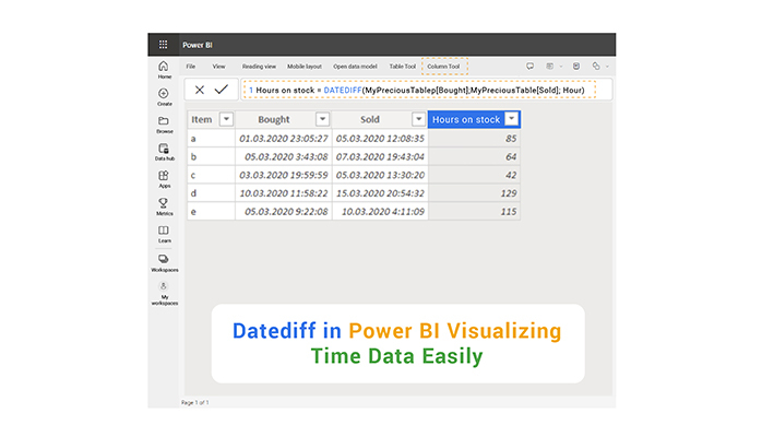
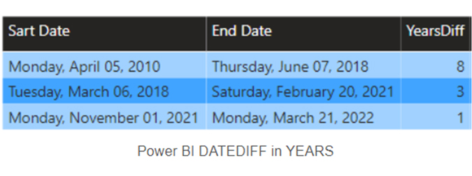
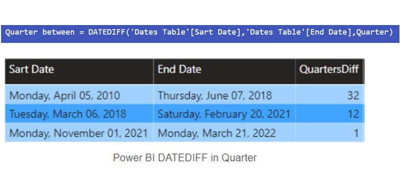
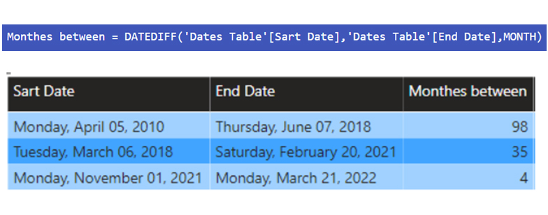
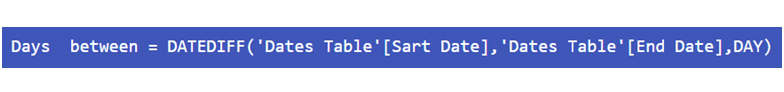
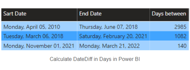
The DAX DATEDIFF function calculates the time interval between two dates (No of Days Between Two Dates). It presents the results in seconds, minutes, hours, days, weeks, months, quarters, or years.
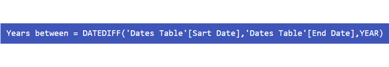
The syntax of Power BI DATEDIFF is: “DATEDIFF (Start Date, End Date, Interval).”
The “start date” and “end date” parameters are scalar date (or time) values. The “interval” parameter is the interval to be used to compare dates, and it could be ‘SECONDS,’ ‘MINUTES,’ ‘HOUR,’ ‘DAY,’ ‘WEEK,’ ‘MONTH,’ ‘QUARTER,’ or ‘YEAR.’
The DATEDIFF function in Power BI is important because it helps users analyze time-based data effectively by calculating the difference between two dates in various units (such as days, months, or years). This function is crucial for:
Here are some useful tips for using the DATEDIFF function in Power BI effectively:
Here are easy steps to help you use DATEDIFF in Power BI:
Launch the Power BI Desktop and open the Power BI file (or connect to the data source).
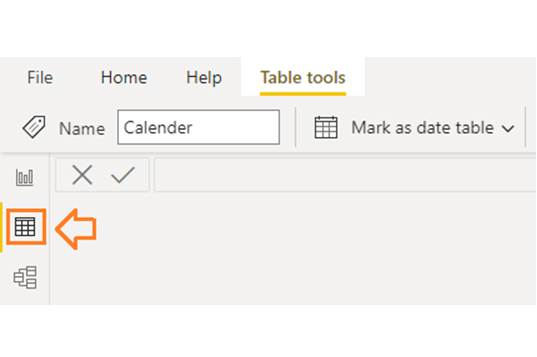
Select the table you want to create the calculated column or measure.
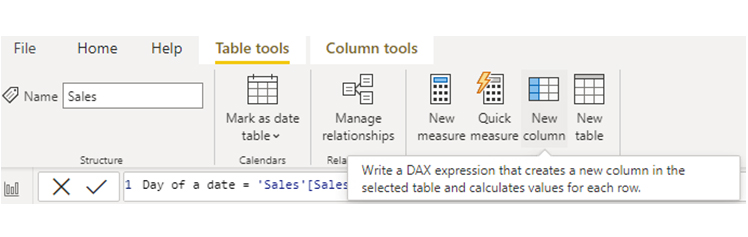
Click on “New Column” in the ribbon under the “Modeling” tab.
Here are the steps to follow when using the Power BI datediff measure:
Click on “New Measure” in the ribbon under the “Modeling” tab.
Navigate to the formula bar, and write the DATEDIFF formula. For instance, to calculate the difference in days between two date columns:
Press Enter to create a new measure. After that, Power BI will calculate the values based on the DATEDIFF formula at runtime. This measure can be used in visuals like charts, graphs, tables, or cards to display the calculated difference dynamically.
Examples:
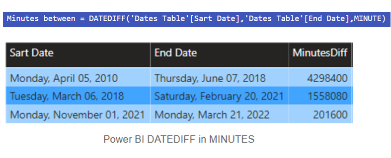
To calculate minutes or seconds, you’ll have to change the time interval parameter. For instance:
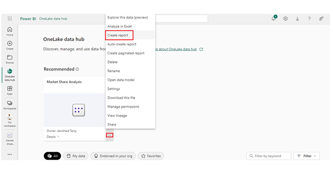
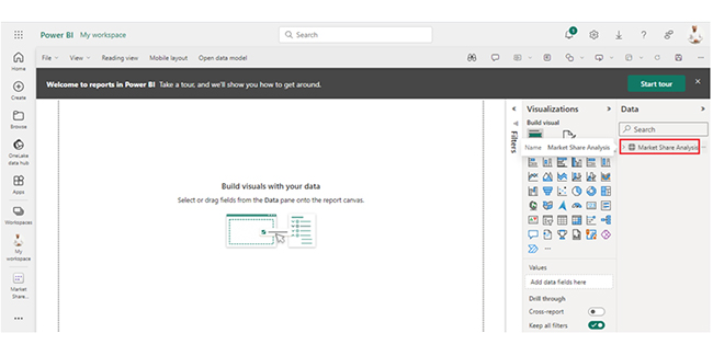
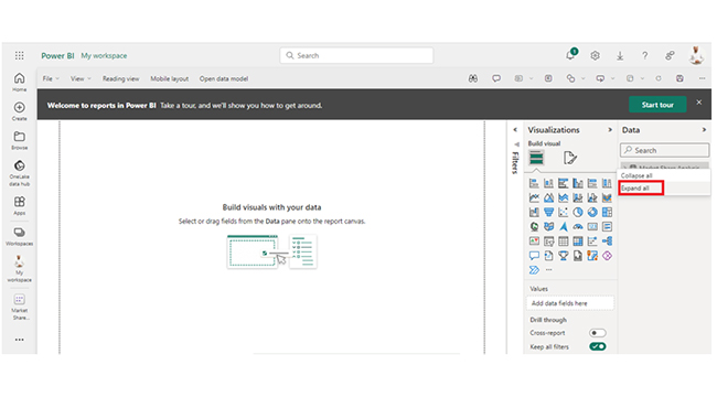
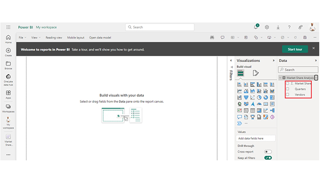
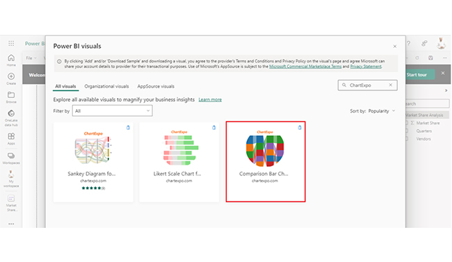
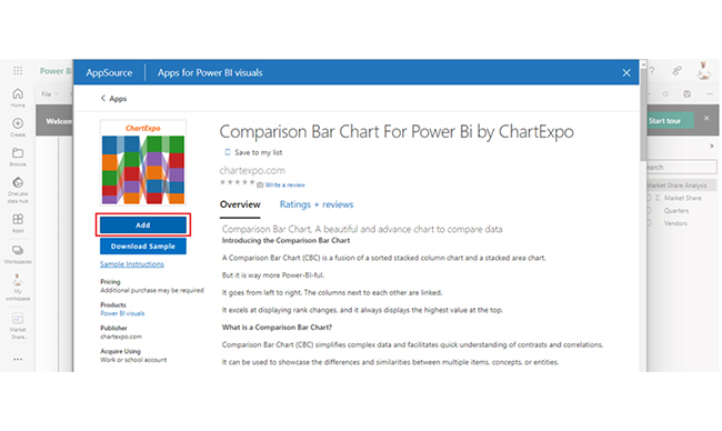
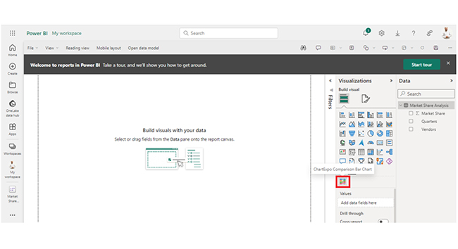
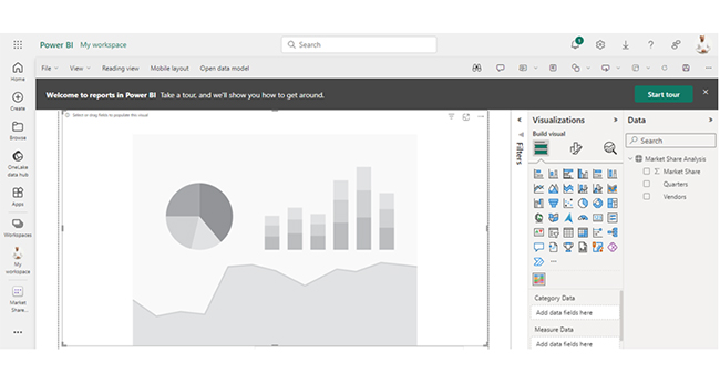
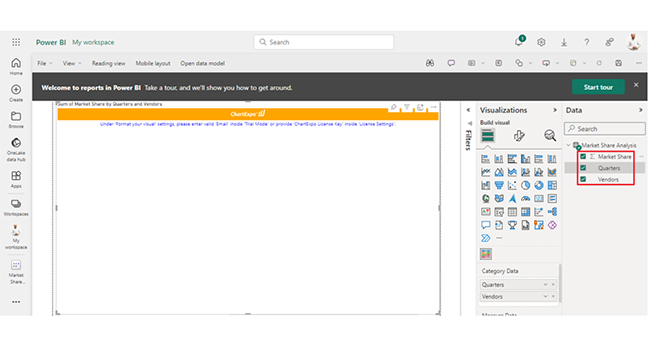
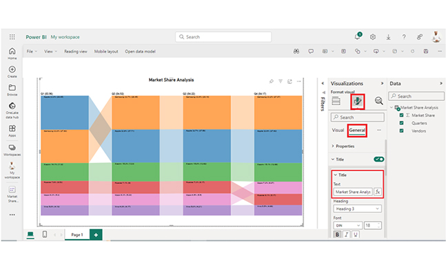
Learn how to visualize DATEDIFF calculations in Power BI effectively using Power BI charts to gain clear insights from your data.


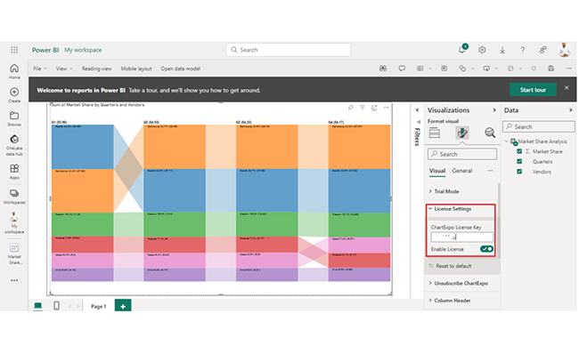
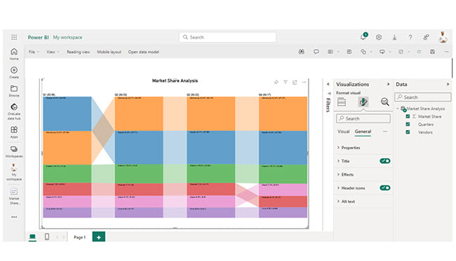
| Quarters | Vendors | Market Share |
| Q1 | Samsung | 27.69 |
| Q1 | Apple | 28.45 |
| Q1 | Xiaomi | 11.8 |
| Q1 | Huawei | 6.53 |
| Q1 | Oppo | 5.3 |
| Q1 | Vivo | 4.19 |
| Q2 | Samsung | 28.14 |
| Q2 | Apple | 27.58 |
| Q2 | Xiaomi | 12.62 |
| Q2 | Huawei | 6.17 |
| Q2 | Oppo | 5.5 |
| Q2 | Vivo | 4.21 |
| Q3 | Samsung | 28.45 |
| Q3 | Apple | 27.71 |
| Q3 | Xiaomi | 12.9 |
| Q3 | Huawei | 6 |
| Q3 | Oppo | 5.29 |
| Q3 | Vivo | 4.17 |
| Q4 | Samsung | 27.97 |
| Q4 | Apple | 27.62 |
| Q4 | Xiaomi | 12.68 |
| Q4 | Huawei | 5.17 |
| Q4 | Oppo | 6.07 |
| Q4 | Vivo | 4.66 |
The following video will help you create a Comparison Bar Chart in Microsoft Power BI.
The DATEDIFF function in Power BI calculates the difference between two dates in a specified time unit, thereby offering insights into temporal intervals for reporting and analysis purposes.
DATEDIFF in DAX is used to calculate the time difference between two dates. That gives room for dynamic time-based calculations and analysis in Power BI and other tools.
DATEDIFF in Power BI plays a vital role in time-based analysis, and that enables the user to understand and calculate date differences, filter by date ranges, aggregate data over time, and make informed decisions.
Visualizing DATEDIFF in Power BI helps the user understand time trends, identify patterns, compare intervals, and effectively communicate insights. Visualization boosts data interpretation and aids in decision-making and anomaly detection.
To get the most out of your DATEDIFF in Power BI, you have to document your calculations and check for leap years. Always document the logic and purpose behind your DATEDIFF calculations. The documentation comes in handy for others who will work on the same report. It can also be used for future references.
If the calculations involve years, always consider leap years, and how they may affect the results. You should consider whether to include the extra day in the leap years.
Now you know what the DATEDIFF in Power BI is, how will you incorporate it into your data analysis?
How much did you enjoy this article?


Discover diverse and high-quality Power BI report examples for inspiration and insights. Elevate your reporting with strategic visualization techniques.

A Customer Relationship Management Dashboard centralizes data, tracks key metrics, and drives smarter business decisions. Discover now!

Explore Healthcare Dashboard Examples and learn how to turn complex healthcare data into clear, actionable insights for better decision-making.


