• Home
  • Tools dropdown img
    • Spreadsheet Charts

      • ChartExpo for Google Sheets
      • ChartExpo for Microsoft Excel
    • Power BI Charts

      • Power BI Custom Visuals by ChartExpo
    • Word Cloud

  • Charts dropdown img
    • Chart Category

      • Bar Charts
      • Circle Graphs
      • Column Charts
      • Combo Charts
      • Comparison Charts
      • Line Graphs
      • PPC Charts
      • Sentiment Analysis Charts
      • Survey Charts
    • Chart Type

      • Box and Whisker Plot
      • Clustered Bar Chart
      • Clustered Column Chart
      • Comparison Bar Chart
      • Control Chart
      • CSAT Survey Bar Chart
      • CSAT Survey Chart
      • Dot Plot Chart
      • Double Bar Graph
      • Funnel Chart
      • Gauge Chart
      • Likert Scale Chart
      • Matrix Chart
      • Multi Axis Line Chart
      • Overlapping Bar Chart
      • Pareto Chart
      • Radar Chart
      • Radial Bar Chart
      • Sankey Diagram
      • Scatter Plot Chart
      • Slope Chart
      • Sunburst Chart
      • Tornado Chart
      • Waterfall Chart
      • Word Cloud
    • Google Sheets
      Microsoft Excel
  • Services
  • Pricing
  • Contact us
  • Blog
  • Support dropdown img
      • Gallery
      • Videos
      • Contact us
      • FAQs
      • Resources
    • Please feel free to contact us

      atsupport@chartexpo.com

Categories
All Data Visualizations Data Analytics Surveys
Add-ons/
  • Google Sheets
  • Microsoft Excel
  • Power BI
All Data Visualizations Data Analytics Surveys
Add-ons
  • Google Sheets
  • Microsoft Excel
  • Power BI

We use cookies

This website uses cookies to provide better user experience and user's session management.
By continuing visiting this website you consent the use of these cookies.

Ok

ChartExpo Survey


Home > Blog > Power BI

Calculate Function in Power BI to Unlock Effective Insights

Power BI is a business intelligence tool that helps users to visualize, analyze, and interpret complex data from multiple sources. To get the most out of the tool, you should consider using the calculate function in Power BI.

Calculate Function in Power BI

The calculate function in Power BI is a feature that enables users to create both simple and complex calculations and custom measures. In this guide, you’ll discover what the calculate function in Power BI is, why the DAX calculate function is important, examples of the Power BI calculate function, and how the calculate function works in DAX.

Table of Contents:

  1. What is a Calculate Function in Power BI?
  2. Why DAX Calculate Function is Important?
  3. What are the Advanced Techniques for Calculations Function in Power BI?
  4. How Does the Calculate Function Work in DAX?
  5. How to Visualize Your Data in Power BI?
  6. Tips and Tricks for Using Calculate Function Efficiently in Power BI
  7. Wrap Up

First…

What is a Calculate Function in Power BI?

“Calculate” in Power BI is often associated with the CALCULATE function, and it’s a powerful and versatile DAX (Data Analysis Expressions) function. In Power BI, DAX is a formula language used for the creation of custom calculations and aggregations.

The CALCULATE function is primarily used to modify (or override) the context in which a DAX formula is being evaluated. It allows you to create dynamic calculations by temporarily altering the filter context (or row context) in a calculation, often in combination with DAX variables for enhanced flexibility and clarity.

Here’s what a basic syntax for the CALCULATE function looks like:

  • CALCULATE (<expression>, <filter1>, <filter2>, …)

Why DAX Calculate Function is Important?

Here are reasons why the DAX CALCULATE function is important in Power BI.

  • Context Modification

The CALCULATE function allows you to modify the filter context and row context of the DAX formula. This helps create complex calculations that are needed for specific conditions or filters.

  • Aggregation and Evaluation

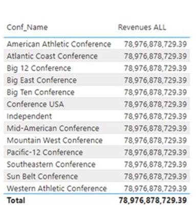
CALCULATE is used for aggregating values over specific conditions or filters in Power BI. It plays a vital role in computing totals, averages, or other measures of aggregated data based on specific criteria.

  • Nested Functions

The CALCULATE function can be nested within other DAX functions, and that allows for the creation of more intricate and sophisticated calculations. This flexibility helps in building advanced Power BI data models and reports.

  • Understanding Relationships

It helps in managing relationships between tables and also allows the creation of calculations that consider related tables. All these help users navigate through different levels of granularity in the data model.

  • Filtering and Row Context Control

It provides fine-grained control over the filters applied to a formula, and that enables the user to define complex conditions for aggregations or calculations while maintaining performance.

  • Solving Common Issues

Common issues and challenges in DAX calculations like dealing with context transition can be addressed using the CALCULATE function. It offers a mechanism for handling context changes in calculations.

  • Time Intelligence

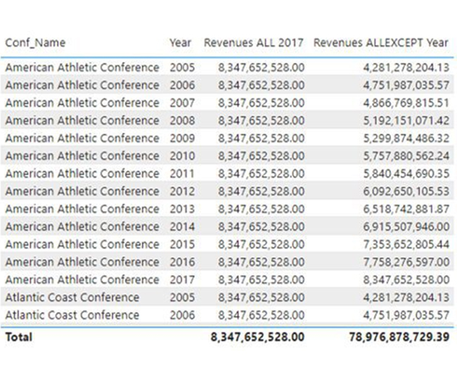
For time-based analysis like month-over-month or year-to-date comparisons, the CALCULATE function is essential. It allows users to manipulate time-related filters and context to perform calculations that are relevant to specific periods.

  • Dynamic Calculations

It helps in the creation of dynamic calculations by temporarily overriding (or adding) filters. This comes in handy when you want to perform calculations within a different context than the default context in which the formula is written.

What are the Advanced Techniques for Calculations Function in Power BI?

The Calculate function is a tool that is used for advanced data analysis and calculations in Power BI. Some advanced techniques for the Calculate function include:

  • Using variables to improve performance
  • Combining multiple functions to perform complex calculations
  • Creating custom tables using the Summarize function.

Another advanced technique for the Calculate function is the use of the Filter function to apply filters to specific columns or tables. This comes in handy when you’re looking to perform calculations on a subset of data that meets certain criteria. For instance, you can use the Filter Function to calculate the total sales for a specific product category or region.

The Calculate function can also be used in combination with the Time Intelligence function to perform calculations on time-based data. This allows the user to analyze trends and patterns over time. The trends could be month-to-month changes or year-over-year growth. Using the Calculate function with the Time Intelligence function will help you create powerful data visualizations that offer insights into your data.

How Does the Calculate Function Work in DAX?

The DAX CALCULATE function in Power BI modifies (or overrides) the context in which a formula is evaluated, and that allows for dynamic calculations by temporarily adjusting filters and conditions for more precise results.

Here are examples of the Power BI calculate function:
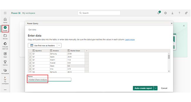
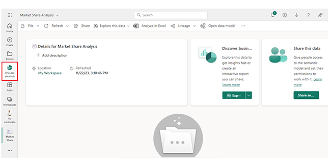
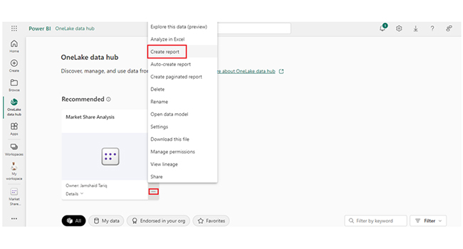
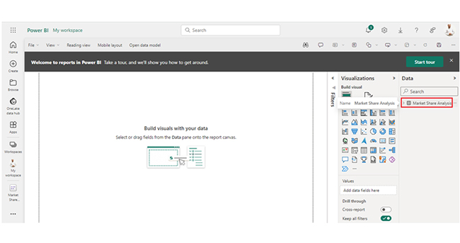
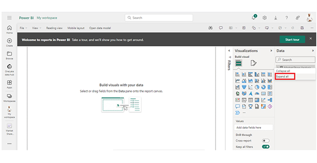
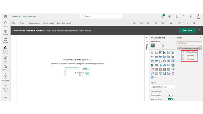
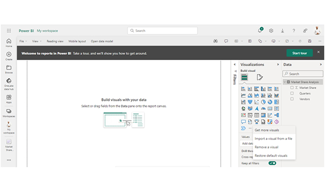
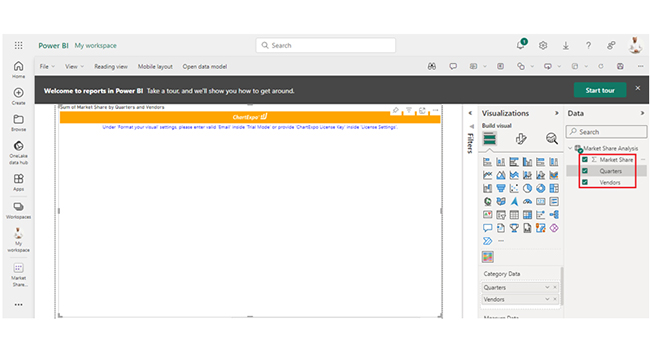
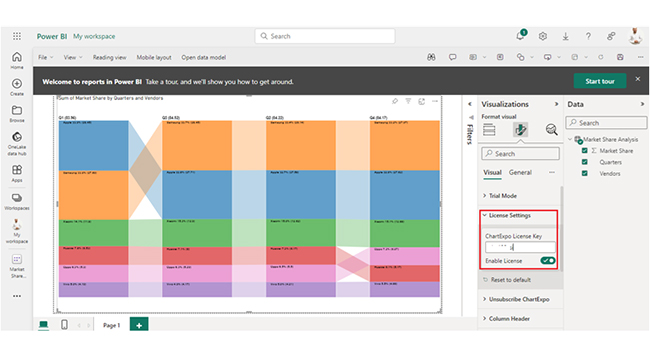
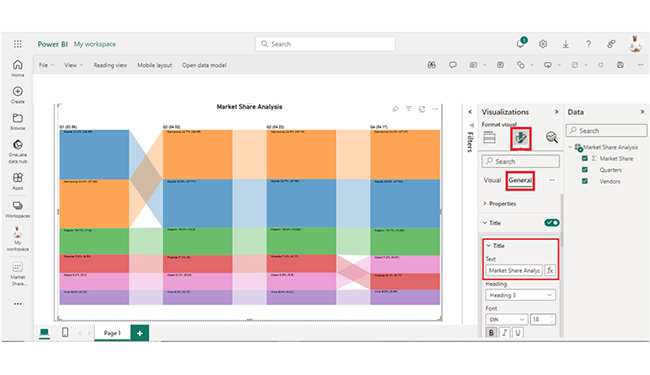
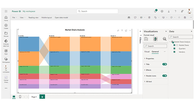
  • RevenuesALL=CALCULATE(SUM(NCAA_Financials_FCT[TotalRevenues]),ALL(NCAA_Financials_FCT))
RevenuesALL Example of Calculate Function in Power BI
  • RevenuesALL2017=CALCULATE(SUM(NCAA_Financials_FCT[TotalRevenues]),FILTER(ALL(NCAA_Financials_FCT),NCAA_Financials_FCT[Year]=2017))
  • Revenues ALLEXCEPT Year =CALCULATE (SUM(NCAA_Financials_FCT[TotalRevenues]),ALLEXCEPT ( NCAA_Financials_FCT,NCAA_Financials_FCT[Year] ))
RevenuesALL 2017 Example of Calculate Function in Power BI

How to Visualize Your Data in Power BI?

Stage 1: Log into Power BI, enter your email, and click “Submit.”

  • Log in to Power BI.
  • Enter your email address and click the “Submit” button.
Enter email to login to Power BI
  • You are redirected to your Microsoft account.
  • Enter your password and click “Sign in“.
Enter Password to login to Power BI
  • You can choose whether to stay signed in.
Click on stay signed in
  • Once done, the Power BI home screen will open.

Stage 2: Create a Data Set and Select the Data Set to Use in the Sankey Chart

  • Go to the left-side menu and click the “Create” button.
  • Select “Paste or manually enter data“.
select Paste or manually enter data in Power BI ce487
  • We’ll use the sample data below for this example.
Quarters Vendors Market Share
Q1 Samsung 27.69
Q1 Apple 28.45
Q1 Xiaomi 11.8
Q1 Huawei 6.53
Q1 Oppo 5.3
Q1 Vivo 4.19
Q2 Samsung 28.14
Q2 Apple 27.58
Q2 Xiaomi 12.62
Q2 Huawei 6.17
Q2 Oppo 5.5
Q2 Vivo 4.21
Q3 Samsung 28.45
Q3 Apple 27.71
Q3 Xiaomi 12.9
Q3 Huawei 6
Q3 Oppo 5.29
Q3 Vivo 4.17
Q4 Samsung 27.97
Q4 Apple 27.62
Q4 Xiaomi 12.68
Q4 Huawei 5.17
Q4 Oppo 6.07
Q4 Vivo 4.66
  • Paste the data table into the “Power Query” window, and name it “Market Share Analysis.” Next, select the “Create a dataset only” option.
Select Create a Dataset After Applying Calculate Function in Power BI
  • Look out for the “Data Hub” option on the left-side menu, and click on it. Power BI will populate the data set list. If no data set has been created, you’ll get an error message.
Look for Data Hub After Applying Calculate Function in Power BI
  • Click on “Create report.”
Click on Create Report After Applying Calculate Function in Power BI
  • Click on Market Share Analysis:
Click on Market Share Analysis After Applying Calculate Function in Power BI
  • Click on “Expand All.”
Click on Expand All After Applying Calculate Function in Power BI
  • To see the chart metrics, click on “Expand All.”
Look Chart Metrics After Applying Calculate Function in Power BI
  • Click on “Get more visuals.”
Click on Get More Visuals After Applying Calculate Function in Power BI
  • At this point, search “ChartExpo,” and select “Comparison Bar Chart.”
Select Comparison Bar Chart After Applying Calculate Function in Power BI
  • Click on “Add.”
Click on Add After Applying Calculate Function in Power BI
  • After that, you’ll see the Comparison Bar Chart in the visuals list.
See Comparison Bar Chart After in Visual List Applying Calculate Function in Power BI
  • You can expand the chart space.
Expand Chart Space After Applying Calculate Function in Power BI
  • You should select the metrics of your data.
Select Metrics of Data After Applying Calculate Function in Power BI
  • Click on the second icon of Format visuals, and also click on Visual.
Click on Second Icon of Format Visuals After Applying Calculate Function in Power BI
  • In Visual, click on License Settings and add the key. After that, you’ll see the comparison bar chart.
Click on License Settings and Add Key After Applying Calculate Function in Power BI
  • To add the header text, click on the General tab. Add the header text in the Title.
Add Header Text in Title After Applying Calculate Function in Power BI
  • Here’s the final look at the Comparison Bar Chart in Power BI.
Final Calculate Function in Power BI

Insights

  • Samsung and Apple are the top two vendors in terms of market share, with Samsung taking the lead.
  • Xiaomi has been gaining market share, while Huawei has been losing market share.
  • Oppo and Vivo have been relatively stable in terms of market share. There has been a transition between Huawei and Oppo in the last quarter.

Optimize Graphical Reporting with Calculate Function in Power BI:

  1. Open your Power BI Desktop or Web.
  2. From the Power BI Visualizations pane, expand three dots at the bottom and select “Get more visuals”.
  3. Search for “Comparison Bar Chart by ChartExpo” on the AppSource.
  4. Add the custom visual.
  5. Select your data and configure the chart settings to create the chart.
  6. Customize your chart properties to add header, axis, legends, and other required information.
  7. Share the chart with your audience.

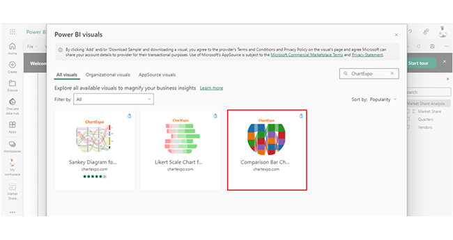
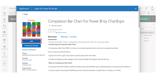
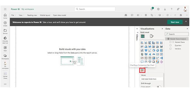
The following video will help you create a Comparison Bar Chart in Microsoft Power BI.

Tips and Tricks for Using Calculate Function Efficiently in Power BI

Here are some tips and tricks to help you use the Calculate function efficiently in Power BI:

  • Use the proper syntax and structure for the function
  • Use precision functions to avoid errors in calculations
  • Avoid circular references in calculations
  • Use user-defined variables to simplify complex calculations.

FAQs

What is a CALCULATE function in DAX?

The CALCULATE function in DAX (Data Analysis Expressions) helps in altering the filter and row context of a formula. That enables dynamic calculations by temporarily modifying conditions. It also makes it essential for creating complex and context-aware measures in data models.

How do you CALCULATE data in Power BI?

In Power BI, the CALCULATE function is used to perform dynamic and context-aware calculations. You have to specify the expression to evaluate and optional filters within CALCULATE (). It adjusts the filter and row context and also allows precise control over calculations. All these make it essential to create insightful and flexible reports in Power BI.

What is the difference between CALCULATE and FILTER DAX?

CALCULATE in DAX modifies the context for a specific calculation, and that temporarily overrides filters. FILTER, on the other hand, is used to create a table or column filtered based on specific conditions. CALCULATE adjusts the context for calculations, while FILTER focuses on creating filtered subsets of data.

Wrap Up

The CALCULATE function in Power BI is a DAX function that dynamically adjusts the filter and row context of a calculation. It helps in creating flexible and context-aware measures. The DAX CALCULATE function in Power BI comes in handy during context-aware and dynamic calculations.

Users use it to modify the filter and row context, and that enables precise control over calculations. It plays a pivotal role in the creation of sophisticated and insightful reports.

The CALCULATE function comes in handy when dealing with context transition. It offers a reliable mechanism for handling context changes in calculations. Users who are looking to navigate through different levels of granularity in a data model should also consider using the CALCULATE function.

Filtering and row context control can be handled with the CALCULATE function. It offers fine-grained control over the filters applied to a formula and also helps users define complex conditions for aggregations (or calculations) while maintaining performance.

By embracing the CALCULATE function in Power BI, you’ll be able to create more engaging, and interactive visualizations.

How much did you enjoy this article?

PBIAd2
Start Free Trial!
143942

Related articles

next previous
Power BI12 min read

How to Create Sankey Diagram in Microsoft Power BI?

Learn How to Create Sankey Diagram in Microsoft Power BI using Desktop & Web Service. What they are and how to use them effectively.

Power BI8 min read

Power BI Artificial Intelligence: Insights Using Visuals

Discover all there is to know about the Power BI artificial intelligence. You'll also discover how AI is used in Power BI, and how to use it for analysis and more.

Power BI9 min read

Budgeting in Healthcare: Use Visuals to Spot Budget Gaps

This guide helps you discover what budgeting in healthcare is. You'll also discover the factors that affect hospital budgets and types of budgeting in healthcare.

Power BI9 min read

Predictive Analytics in Power BI for Making Insightful Visuals

This guide shows you everything you need to know about Predictive Analytics in Power BI. It also shows you how it works, and how to interpret the results.

Power BI8 min read

Quarterly Business Review Template for Optimum Reports

Discover what the quarterly business review template is. This guide also shows you the best practices to consider when using the QBR template.

ChartExpo logo

Turn Data into Visual
Stories

CHARTEXPO

  • Home
  • Gallery
  • Videos
  • Services
  • Pricing
  • Contact us
  • FAQs
  • Privacy policy
  • Terms of Service
  • Sitemap

TOOLS

  • ChartExpo for Google Sheets
  • ChartExpo for Microsoft Excel
  • Power BI Custom Visuals by ChartExpo
  • Word Cloud

CATEGORIES

  • Bar Charts
  • Circle Graphs
  • Column Charts
  • Combo Charts
  • Comparison Charts
  • Line Graphs
  • PPC Charts
  • Sentiment Analysis Charts
  • Survey Charts

TOP CHARTS

  • Sankey Diagram
  • Likert Scale Chart
  • Comparison Bar Chart
  • Pareto Chart
  • Funnel Chart
  • Gauge Chart
  • Radar Chart
  • Radial Bar Chart
  • Sunburst Chart
  • see more
  • Scatter Plot Chart
  • CSAT Survey Bar Chart
  • CSAT Survey Chart
  • Dot Plot Chart
  • Double Bar Graph
  • Matrix Chart
  • Multi Axis Line Chart
  • Overlapping Bar Chart
  • Control Chart
  • Slope Chart
  • Clustered Bar Chart
  • Clustered Column Chart
  • Box and Whisker Plot
  • Tornado Chart
  • Waterfall Chart
  • Word Cloud
  • see less

RESOURCES

  • Blog
  • Resources
  • YouTube
SIGN UP FOR UPDATES

We wouldn't dream of spamming you or selling your info.

© 2025 ChartExpo, all rights reserved.