Categories
By ChartExpo Content Team
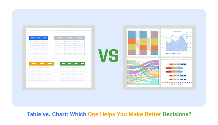
Both tables and charts have their strengths, but how do you know which one to use? It’s not about which is better; it’s about which gets your message across more effectively.
Table vs. chart isn’t just a technical decision—it’s about understanding your audience. Tables shine when you need precision. Got a bunch of detailed numbers to compare? Tables give you that structure, allowing viewers to find exactly what they need.


But if you’re trying to show a trend or pattern at a glance, charts are your best friend. They simplify complex data, letting your audience grasp the key message quickly.
Table vs. chart choice can make or break your presentation. Imagine trying to spot a trend in a table with hundreds of rows—pretty exhausting, right?
On the flip side, using a chart to communicate specific figures can leave your audience guessing.
The real question is: What’s your goal? Do you need to dive into details or highlight the big picture? By nailing the right format, you ensure your data isn’t just seen but understood.
First…
Tables are like the sturdy workhorses of data presentation.
Imagine a grid where each piece of data sits snug in its little box that’s your table! Each row represents a single record, and each column holds the same kind of data. Think of it as a neat way to organize facts, where you can quickly look down or across to compare numbers, check details, or even move columns in Excel to rearrange your data effortlessly.
Now, if tables are workhorses, charts are like the cool kids of data visualization. They turn numbers into visual objects like bars, lines, or pies. Why does that matter? Because our brains can spot a trend in a line chart or the biggest piece of a pie chart instantly. Charts are all about spotting patterns, understanding shifts, and getting a quick sense of scale.
Choosing between a table and a chart can be like deciding between reading a book or watching a movie. Tables give you details, precision, and a direct view of the data.
Charts, like a scatter chart, offer a story—a quick visual impact that shows growth, decline, or differences without digging through rows and columns.
So, when you’re deciding how to present your data, think about what’s most important for your audience. Do they need details or the big picture? Either way, you’ve got the tools to make it clear and engaging!
When it comes to managing loads of data with high precision, tables are your go-to. They shine by allowing you to view numbers clearly and make direct comparisons at a glance.
For folks who need to dig into specifics, like statisticians or researchers, tables provide the granular details necessary for deep data analysis. They line up data in rows and columns, making it easy to track changes over time, compare individual elements, or dive into the minutiae without missing a beat.
Charts, on the other hand, are the kings of simplification. They take complex data and turn it into visual stories that are easy to understand.
Whether it’s a bar graph, pie chart, or line plot vs scatter plot, charts help us see trends, patterns, and outliers without getting bogged down in numbers. They’re perfect for presentations or situations where you need to share insights with people who might not be data experts. With just a quick look, charts can offer a clear snapshot of what’s going on.
Tables are not without their downsides. They can be overwhelming when flooded with too much data, making it hard to find meaningful insights quickly. That’s where charts come in with a breath of fresh air. Charts can highlight trends and patterns that tables may hide in a sea of numbers, making them invaluable for quick decision-making.
Conversely, charts might not always be the best choice when you need to know exact values or when dealing with a small dataset where precision is key. In these instances, tables step up, providing the exact figures and detailed context that charts sometimes gloss over.
When it comes to presenting data, picking the right tool is key. This choice can make or break how your audience understands the information you’re sharing.
For starters, think about what you want your audience to take away from the data. Are you showing trends over time? Comparing groups? Detailing distribution? Your goals will guide your tool choice—be it graphs, charts, or a Pareto chart.
Deciding between tables and charts depends on several factors. If your data involves many precise values or you need to present data for detailed reference, tables work best. They’re perfect when your audience needs to look up specific values or when you want to present multiple parts of related data at once.
Charts, on the other hand, shine when you need to show patterns, relationships, or trends. They’re visually engaging and can quickly highlight what’s important without getting bogged down in the nitty-gritty details.
Consider who will be viewing your data. What’s their background? How much time do they have to look at your data? These questions are important. For quick decision-making, a simple bar or line chart is often enough. But for an academic or technical crowd, detailed tables or complex multivariate analyses might be necessary.
The context in which you present your data also affects whether you should use a table, a chart, or a Control chart in Excel. In a detailed report, tables are often expected as they provide hard data and specific numbers. In a presentation, however, you want to keep your audience engaged and get your point across quickly, making charts or control charts the better option.
The following video will help you create a Tree Diagram in Microsoft Excel.


The following video will help you to create a Tree Diagram in Google Sheets.
In the financial sector, precision is key. Tables are the go-to because they display raw numbers clearly.
Imagine you’re a financial analyst or an accountant; you need to see every digit to make accurate assessments and decisions. Tables show trends over time, like quarterly revenue or yearly expenses, without any fluff—just the facts, plain and simple.
Now, switch gears to business presentations. Here, you’re often trying to win over a client or impress a boss. Charts are your best friend because they make an impact—fast!
A well-designed chart can turn complex data into a clear story that anyone can understand at a glance. It’s all about making those numbers pop and keeping your audience engaged without them having to dig through rows and columns.
In academia, researchers often juggle depth and clarity. They need to present detailed data without losing the big picture. Here’s where a mix of tables and charts can come in handy.
Tables are great for the nitty-gritty details—like exact figures from experimental results.
Charts help summarize these findings visually, making it easier for fellow researchers or students to grasp the overarching trends and conclusions without getting lost in the weeds.
Data density—how much data is packed into a small space—greatly impacts readability.
High data density can be overwhelming and hard to read, making it tough for the audience to extract key information.
Low-density data, while easier on the eyes, might not convey enough detail to be useful. Striking the right balance is key; you want enough data to inform but not so much that it confuses.
For data involving multiple dimensions—different variables and metrics—a table is often the best choice.
Tables can display various data points side by side, allowing for a comprehensive overview. They support detailed decision-making processes by allowing users to compare, sort, and analyze data in various ways.
Charts are powerful tools for clarifying trends in data. A well-designed chart can highlight rise and fall, peaks and troughs, and other trends that might be less obvious in a table. By converting numbers into visual forms like lines, bars, or pie slices, charts help viewers quickly grasp the essential insights from the data.
Tables shine when you need to look up specific values quickly. They organize data in rows and columns, making it easy to spot the exact piece of information you need. Think of a table as your go-to for lists, schedules, or any scenario where detail is king. They’re straightforward: no fancy decoding needed!
Charts are your best pals when it comes to spotting trends and correlations at a glance. They transform numbers into visual stories. Pie charts show you how parts relate to a whole, while line charts are perfect for viewing data changes over time. Bar charts? They’re great for comparing quantities across different categories. Charts are all about the big picture.
Choosing between tables and charts depends on your goal. Need to look up individual values? Go for a table. Want to show trends or relationships? Pick a chart. Sometimes, combining both in a report provides clarity and depth, covering all bases for your audience.
Remember, the right tool not only presents data but makes it speak to your audience.
When we talk about data presentation, tables and charts are like bread and butter. But hold on. It’s not always clear when to use which! Some folks think tables pack more data and are thus always better.
Not true! Tables are great for detail and exact figures but can overwhelm quickly if there’s too much info. Charts, on the other hand, shine in showing patterns and trends.
Here’s a pitfall to dodge: using a chart when your data needs precise values to be compared. Ever seen a bar chart and tried to figure out the exact value of each bar? It’s a bit of a hassle, right? That’s a table’s job!
On the flip side, presenting a massive table with hundreds of numbers to show a simple trend? Overkill. A line graph would show that trend with less clutter.
Ever felt like you’re drowning in data when looking at a table? It happens. When a table is too packed, it’s tough to find the key points. That’s your cue to switch to a chart. If your goal is to highlight differences or progress, a chart cuts through the clutter.
Imagine trying to spot sales trends in a table filled with daily sales data for the year. Brutal, right? Now, picture a line chart showing those sales trends over the months. Much clearer! That’s the magic of choosing the right format for the data you have.
Charts are super tools, but only if used right. A common slip-up? Picking the wrong type of chart. Each chart type has its superpower.
For example, pie charts are great for showing parts of a whole, but use them to show changes over time, and you’re in trouble.
Another trickster move is messing with scales. Ever seen a bar chart where the y-axis doesn’t start at zero? It can make small differences look huge! Always keep your scales consistent and start axes at zero unless there’s a solid reason not to. It keeps your chart honest and your audience informed correctly.
Knowing the limits of tables and charts helps a ton. A table is your go-to when your audience needs to see exact figures or when dealing with a small dataset. But push too many numbers into a table, and it’s chaos.
Charts are your friends for showing relations, patterns, and trends. But the wrong chart can twist your message. Ever tried to fit too many categories into a single pie chart? It turns into a color mess where nothing stands out.
So, pick your battles. Use tables for precision and detail, and charts for impact and insight. Knowing when to use each can make your data speak clearly and effectively.
Tables are superb for presenting data, but overloading them with information overload can confuse rather than clarify. It’s tempting to include every piece of data you have, thinking it might provide value.
However, this often leads to a table so dense that readers can’t quickly locate the key information they need. The goal is to keep tables clean and concise. Include only the data that directly supports your main points. This way, readers can easily digest the figures and understand the context without feeling overwhelmed.
Charts are fantastic for spotting trends, patterns, and outliers. However, they’re not always the best choice when precise numbers are crucial.
For example, if you need to present exact sales figures or budget allocations, a table will communicate these numbers more effectively than a chart. Charts can sometimes mislead by emphasizing visual impact over numerical precision. When accuracy is key, opt for a table to ensure your audience gets the exact data in the clearest form.
While it’s essential to catch the eye of your audience, the real challenge lies in balancing visual appeal with informational value.
A common error in visual analytics is creating a chart that’s visually striking but ultimately confusing or misleading. This can happen with the use of overly complex designs or when choosing style over substance. Always design charts with the viewer’s understanding in mind. Ask yourself if the visual representation helps clarify the data or if it just makes the chart look good.
Aim for simplicity and clarity, ensuring that the visual elements enhance rather than detract from the data’s informational value.
Tables and charts serve different purposes when presenting data. Tables organize information in rows and columns, making them perfect for showing detailed, precise values. Charts, on the other hand, turn data into visuals, highlighting trends, patterns, or relationships at a glance. Think of tables as tools for digging deep into specifics, while charts simplify the bigger picture. Deciding which to use depends on whether you need exact figures or want to communicate a trend quickly.
Tables are ideal when your audience needs to access detailed data, compare specific values, or analyze multiple variables side by side. If you’re presenting a financial report, sales figures, or research data where accuracy matters, tables are your best bet. They allow for a straightforward presentation of numbers, ensuring clarity without losing the details.
Charts excel at simplifying complex data by turning numbers into visual forms. Whether it’s a line chart showing growth over time or a bar graph comparing categories, charts help audiences quickly grasp patterns and changes. They’re perfect for presenting insights in meetings or reports where time is limited, as they convey the gist of your data without requiring a deep dive into the numbers.
Absolutely! Combining tables and charts can offer a comprehensive view of your data. Tables provide the detailed numbers for those who want to dig into specifics, while charts offer an overview that highlights key trends. For instance, you might present a table to show exact sales figures by region and then include a bar chart to compare those figures visually. Using both formats can help cater to different audiences, ensuring everyone gets the information they need.
A frequent mistake is using a chart when precision is needed. For example, if your goal is to communicate exact sales figures, a table is the better choice. On the flip side, trying to showcase trends with a dense table filled with numbers can overwhelm your audience. Another pitfall is overloading tables with too much data or using a chart type that doesn’t fit the data’s story, leading to confusion rather than clarity. Always match your data presentation format to the message you want to communicate.
The decision comes down to your goals and your audience. If your data needs detailed examination—like comparing numbers across categories—a table is more effective. But if you’re summarizing trends, patterns, or relationships, charts make the information easier to digest. Consider the context of your presentation: reports often benefit from tables, while charts are better suited for engaging presentations or quick decision-making.
Not necessarily. While charts are great for quickly engaging your audience and simplifying complex data, tables are essential when your presentation requires precise figures. If you’re discussing financial forecasts or budget allocations, tables provide the accuracy your audience needs. However, if you’re aiming to highlight trends or changes over time, charts can better illustrate those points without overwhelming your audience.
Tables can be harder to digest if they include too much information at once. Rows upon rows of numbers can overwhelm readers, making it tough to spot the key insights. Charts, with their visual appeal, simplify data, allowing viewers to see patterns and outliers more quickly. That’s why charts are often preferred for high-level summaries, while tables are reserved for when exact details are needed.
Tables offer unmatched precision. They let you organize and display large amounts of data in a clear, structured way, perfect for comparing values and finding exact details. When working on in-depth analysis, tables are your go-to format. They allow users to drill down into specifics, helping them make data-driven decisions without losing any nuance.
Charts can be misleading if they’re not designed correctly. For instance, adjusting the scale of a bar chart can exaggerate differences between categories, making small variations look more significant than they are. Using the wrong type of chart, like a pie chart to show time trends, can also confuse viewers. It’s crucial to pick the right chart type and keep scales consistent to ensure your data tells an accurate story.
Picking between tables and charts isn’t about which one’s better—it’s about how effectively each communicates your data. Tables provide precision and detail. They’re great for in-depth analysis, where exact figures matter. Charts, on the other hand, make trends, patterns, and insights easy to see at a glance. They turn data into a story that’s easy for your audience to grasp.
The trick is knowing your goal. Are you diving into specifics or showing the big picture? Tables give clarity when accuracy is key, while charts simplify complex information for quick understanding. Using them together can be a powerful way to communicate, combining detail with visual impact.
Don’t fall into the trap of overloading tables with too much data or using the wrong type of chart for your message. The right format helps your audience see what matters, without getting bogged down.
In the end, it’s not just about presenting data—it’s about making it work for you. With the right choice, your data can inform, persuade, and even inspire action. Keep it clear, keep it simple, and let your data do the talking.
How much did you enjoy this article?


Calculate accounts receivable turnover ratio to measure credit collection speed, improve cash flow, and strengthen your financial strategy. Read on!

Change Management KPIs are the key to tracking adoption, performance, and ROI during transitions. Find out which metrics matter. Read on!

Data collection methods and techniques determine the quality of every insight you act on. Explore key approaches for gathering reliable data. Read on!


