Categories
How to update a chart in Excel? This question plagues many professionals daily.
Imagine you are a marketing manager preparing for an important presentation. Your excellently designed Excel chart now requires updating with fresh data. Fear begins to take hold.
Does this ring a bell? This blog post is for you.


Excel charts are effective instruments for visualizing data. They turn unprocessed numbers into engaging visual narratives.
Understanding how to update an Excel chart efficiently can help save valuable time. According to Salesforce, 56% of sales professionals dedicate more time to data entry than to actual selling. Just think about how much more productive we would be if everyone knew how to update charts quickly.
Why is this skill of such significance? Data changes quickly in today’s fast-moving business environment. An IDC report forecasts that the worldwide data sphere will reach 175 zettabytes by 2025. That is a significant amount of possible chart updates!
Getting the hang of updating an Excel chart is relatively easy. Mastering this skill through practice is possible, and it has the potential to impact many professionals significantly.
Bid farewell to obsolete charts and welcome dynamic, impactful presentations! Let’s explore various methods for updating Excel charts.
First…
Definition: Editing charts in Excel entails customizing and modifying them to effectively communicate data and elevate their visual appeal, thereby enhancing their capacity for Visual Storytelling. Sure, Excel’s default settings might get the job done, but true power lies in customization. It makes your data more accessible and impactful.
Why bother? Because raw charts, even a scatter chart, can be as thrilling as watching paint dry. When you grasp the hows and whys of chart editing, you unleash the ability to present complex data. As a result, your data becomes an eloquent storyteller.
Updating your chart in Excel keeps everything current, clear, and reliable, making your data work smarter for you. Here’s how:
Updating a chart in Excel, including a Scatter plot in Excel with 3-variables, is a breeze and enhances your visual storytelling by ensuring your data stays relevant and visually appealing. Here is the step-by-step process:
First, open your Excel workbook where your chart is located. Just a double-click away, and you’re ready to get started!
Next, locate the data source for your chart. This is typically the range of cells on which your chart is based. If your data has changed, update these cells. Excel will automatically adjust the chart to reflect the new data.
If your data range has expanded or contracted, you must update the range the chart references. Right-click on the chart, select “Select Data”, and adjust the range in the “Chart Data Range” box. This ensures your chart includes all relevant data.
Sometimes, your data might be better represented with a different chart type. Right-click on your chart, select “Change Chart Type,” and choose the one that best fits your new data. This could be anything from a bar chart to a pie chart.
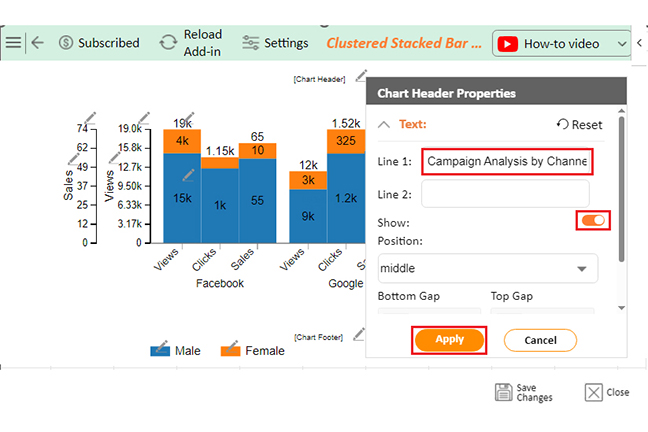
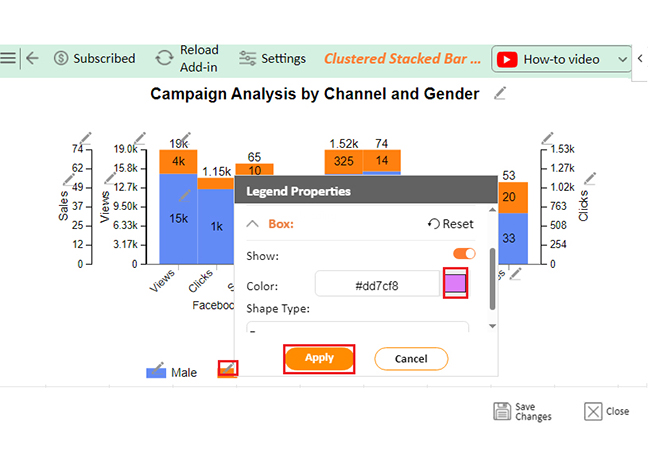
You might want to tweak the elements of your chart, like titles, legends, or labels. Click on the chart element you want to change, and make your edits directly. You can add or remove elements by selecting “Chart Tools” on the ribbon and “Add Chart Element.”
Make your chart look polished and professional by adjusting the formatting. Click on different parts of the chart to change colors, fonts, and styles. Use the “Format” tab in the “Chart Tools” for more advanced options.
If your chart is linked to an external data source, like a database or another workbook, ensure you refresh the data connections. Go to the “Data” tab and click “Refresh All” to ensure your chart has the most current data.
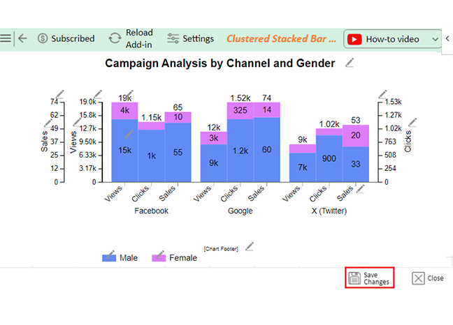
Finally, save your workbook to keep all your hard work intact. Click the “Save” icon or press Ctrl + S. Your chart is now updated and ready to present!
Have you ever tried to create a chart in Excel? It’s about as fun as untangling Christmas lights in July. Data visualization should be a breeze, not a hurricane. It’s supposed to make our data dance, not trip over its own feet. But Excel sometimes feels stuck in the disco era while we’re doing the latest TikTok dance.
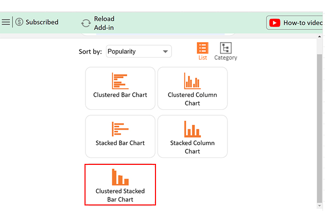
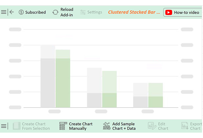
Enter ChartExpo. This add-in smooths Excel’s clunky chart-making process, like giving your data a makeover. Whether you’re crafting a pie chart or a stacked bar diagram, or a stacked bar chart, it transforms dull spreadsheets into visual masterpieces faster than you can say ‘chart wizardry.
It’s time to let ChartExpo light up your data world.
Let’s learn how to install ChartExpo in Excel.
ChartExpo charts are available in both Google Sheets and Microsoft Excel. Use the following CTAs to install the tool of your choice and create beautiful visualizations with just a few clicks in your preferred platform, including a tornado chart in Excel.


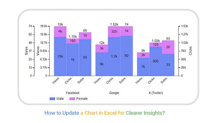
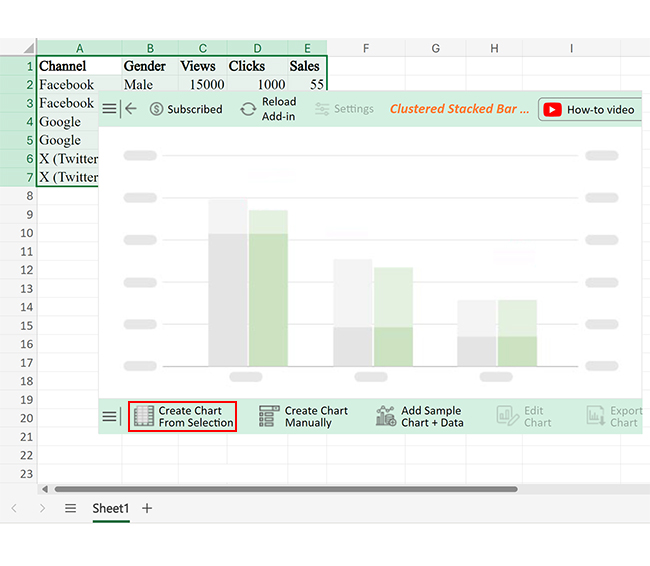
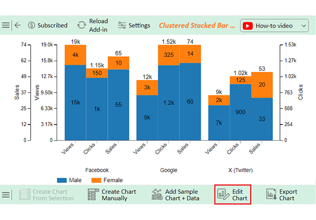
Let’s create a chart using ChartExpo from the data below in Excel.
| Channel | Gender | Views | Clicks | Sales |
| Male | 15000 | 1000 | 55 | |
| Female | 4000 | 150 | 10 | |
| Male | 9000 | 1200 | 60 | |
| Female | 3000 | 325 | 14 | |
| X (Twitter) | Male | 7000 | 900 | 33 |
| X (Twitter) | Female | 2000 | 125 | 20 |


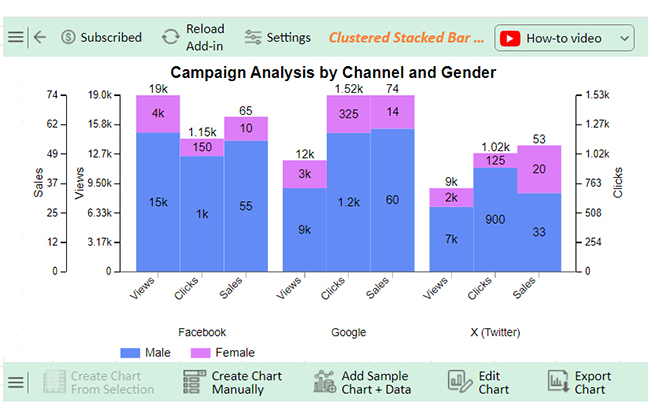


Males:
Females:
Twitter has balanced engagement and lower sales compared to other channels.
The following video will help you to create a Pareto Chart in Microsoft Excel.
Refreshing charts in Excel is more than just a routine task. It’s a vital practice for maintaining data integrity and clarity. Here are the key benefits:
Automatically updating Excel charts with new data can save you time and ensure accuracy. Here are the best practices to keep your charts current and reliable:
To update the chart data format, you can do the following:
Yes, a chart can update automatically when data changes. Link the chart to a dynamic data range. In Excel, use named ranges or tables. Ensure the chart references the updated data source. Changes are reflected instantly in the chart.
To automatically update your Excel chart, convert your data into a table. The chart will then reference this table. The chart will update automatically as you add or change data in the table. Use dynamic named ranges for more complex setups.
Updating a chart in Excel is essential for accurate data representation.
Start by opening your Excel workbook. Ensure the data source is current and modify the data range if needed. This keeps your chart relevant.
Changing the chart type can enhance clarity. Right-click the chart and select “Change Chart Type.” Choose the one that best fits your data. This simple step can make a big difference.
Edit chart elements to improve understanding. Adjust titles, legends, and labels. Use the “Chart Tools” for detailed formatting. Clear visuals make data more accessible.
Formatting adjustments are crucial. Change colors, fonts, and styles. This makes your chart look more professional. A well-formatted chart communicates better.
Refreshing data connections ensure accuracy. If linked to external sources, refresh regularly. This keeps your chart updated with the latest information. Don’t overlook this step.
Finally, save your changes. Press Ctrl + S or click the save icon. This ensures your updates are preserved. Consistent updates lead to reliable data.
Following these steps will make your Excel charts accurate and up-to-date. This process is straightforward and effective.
How much did you enjoy this article?


Learn how to use sparklines in Excel to quickly visualize trends inside cells. Discover types, creation steps, customization, use cases, benefits, and best practices.

Learn what a confidence interval graph is, how to create it in Excel, and how to interpret results to make more reliable, data-driven decisions.

A correlation matrix in Excel helps identify relationships between variables. Learn how to create, read, and use it for effective data analysis.


