Categories
Date hierarchy in Power BI is one aspect that most users struggle with. If you’re like most people, you’re probably spending a lot of time trying to create a date hierarchy.
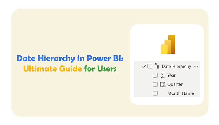


This guide dives right into what the date hierarchy in Power BI is, why it is important, and how to create one.
First…
Date hierarchy in Power BI is a feature that helps organize date-based data into a hierarchical structure. This will, in turn, make it easy for the user to analyze and navigate the data. With date hierarchy in Power BI, users can drill down from the year to the month, day, or hour level. It all depends on the user and the level of detail they want.
Date hierarchy offers an intuitive and logical method for understanding and examining trends.
Date hierarchy plays a role in the efficient data visualization and analysis of data. It allows users to drill down into time-based data, enabling effective trend analysis. This way, users can navigate and group data by year, quarter, month, or day, making it easier to identify patterns, trends, and seasonality over time.
Additionally, calculating the No. of Days Between two Dates further enhances insights by highlighting durations and gaps that may impact decision-making or performance evaluation.
Date hierarchy simplifies how calculations are made. Calculations are measured using time-based dimensions, and that improves the overall user experience. The model empowers users to make data-driven decisions.
Use the date hierarchy in Power BI when you want to easily break down and analyze your data over different time levels — like year, quarter, month, and day — without manually adding each level.
Best times to use it:
For advanced or fiscal calendars, use a custom date table and build your own hierarchy for better control.
There are cases where you’ll have to use the relationship editor in Power BI create date hierarchy. Here are easy steps to do just that.
During the creation process, the original field stays intact while a new field is generated. The hierarchy is always separate, even though it’s related to the content of the original field.
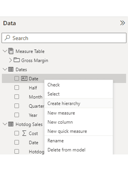
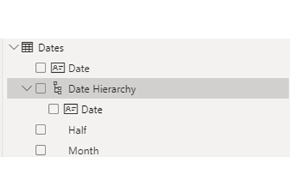
The new hierarchy is shown below the field where it was created. And a name is automatically assigned by Power BI. The naming is dependent on the original field name, and “Hierarchy” is attached to the end of it.
To expand the field, click the arrow on the left. You’ll notice that only one field is assigned to it.
You should use functions like DAY, MONTH, WEEKNUM, or YEAR to create new DAX columns in DAX format. You can also generate columns using imported SQL or Power Query. The formula and method will be dependent on the use case.
Adding more fields to the date hierarchy involves right-clicking on your desired field and choosing “Add to hierarchy.”
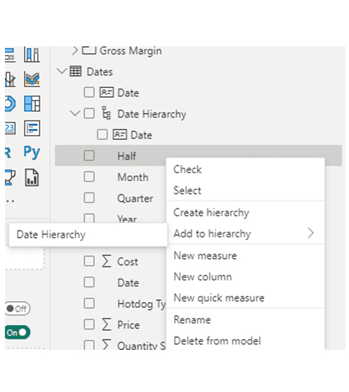
You have to start with the highest level of hierarchy, and fields have to be added in sequential order from the highest to the lowest. All columns that should be added have to be present in the data model and also be part of the data table. It could also be part of the non-date categories.
Assign the date hierarchy to the visuals in your dashboard or report. You’ll have to ascertain that they’re working. Since date hierarchies are dependent on the relationships between custom DAX formulas and date tables, you have to ascertain that the drill-down and expand features are working before you publish the report.
In Power BI, a Date Hierarchy is a built-in feature that automatically organizes date fields into multiple levels for easy time-based analysis. When you add a date field to a visual, Power BI usually creates a hierarchy in this standard format:
Default Date Hierarchy Levels:
This format helps you drill up or down to analyze data by year, quarter, month, or day within a single visual.
Here’s a concise guide to help you use date hierarchy in Power BI.
To change the date hierarchy in Power BI, use these steps:
Create or import a dedicated date table with columns like Year, Quarter, Month, and Week.
In Data view, right-click the date table > New Hierarchy. Add or reorder the levels as needed (e.g., Fiscal Year, Period, Week).
Drag your custom hierarchy to your visuals instead of the default one. This lets you control how time levels appear and how drill-down works.
Remove Default Hierarchy: When a date field is dragged to the visual, the date hierarchy will be automatically applied by Power BI. You can remove it by clicking on the drop-down arrow that’s next to the date.
Select Date Only: Select the option that displays the date without hierarchy (like “Date only” or “Date”). This removes the hierarchy and showcases the data as a single date value.
Navigate to Options: Go to File > Options and Settings> Options.
Disable Auto Date/Time: Beneath the “Current File” section, choose “Data Load” and uncheck “Auto Date/Time for new files.” This stops Power BI from automatically creating date hierarchies in any new files.
Revert Hierarchy: If there are existing models, replace the hierarchical date fields with the original date column. The original date field is found without hierarchy in the Fields pane.
Stage 1: Logging in to Power BI


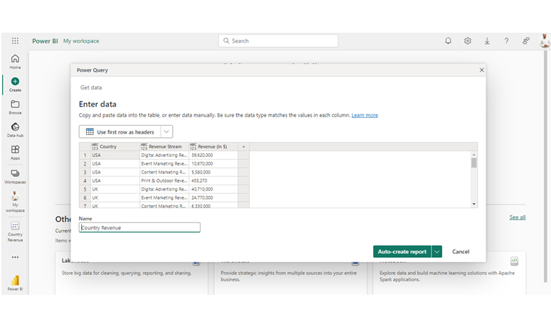
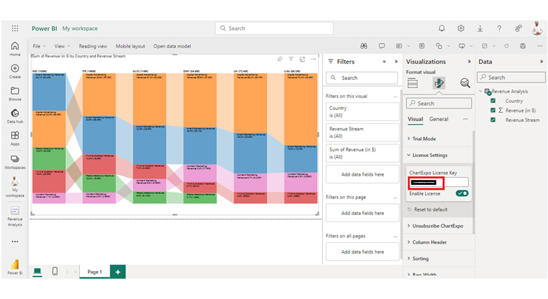
| Country | Revenue Stream | Revenue (in $) |
| USA | Digital Advertising Revenue | 39,620,000 |
| USA | Event Marketing Revenue | 10,670,000 |
| USA | Content Marketing Revenue | 5,580,000 |
| USA | Print & Outdoor Revenue | 455,270 |
| UK | Digital Advertising Revenue | 40,710,000 |
| UK | Event Marketing Revenue | 24,770,000 |
| UK | Content Marketing Revenue | 6,330,000 |
| UK | Print & Outdoor Revenue | 552,190 |
| DNK | Digital Advertising Revenue | 47,040,000 |
| DNK | Event Marketing Revenue | 29,070,000 |
| DNK | Content Marketing Revenue | 7,740,000 |
| DNK | Print & Outdoor Revenue | 600,690 |
| DNK | Media Relations Revenue | 106,430 |
| AUS | Digital Advertising Revenue | 53,790,000 |
| AUS | Event Marketing Revenue | 38,530,000 |
| AUS | Content Marketing Revenue | 6,590,000 |
| AUS | Print & Outdoor Revenue | 9,040,000 |
| AUS | Media Relations Revenue | 6,130,000 |
| FR | Digital Advertising Revenue | 57,860,000 |
| FR | Event Marketing Revenue | 50,450,000 |
| FR | Content Marketing Revenue | 3,560,000 |
| FR | Print & Outdoor Revenue | 18,790,000 |
| FR | Media Relations Revenue | 15,460,000 |
| IND | Digital Advertising Revenue | 60,470,000 |
| IND | Event Marketing Revenue | 63,200,000 |
| IND | Content Marketing Revenue | 2,080,000 |
| IND | Print & Outdoor Revenue | 29,500,000 |
| IND | Media Relations Revenue | 30,020,000 |
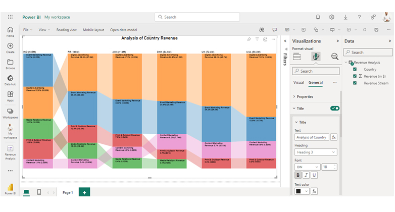
Here are three insights from the chart.
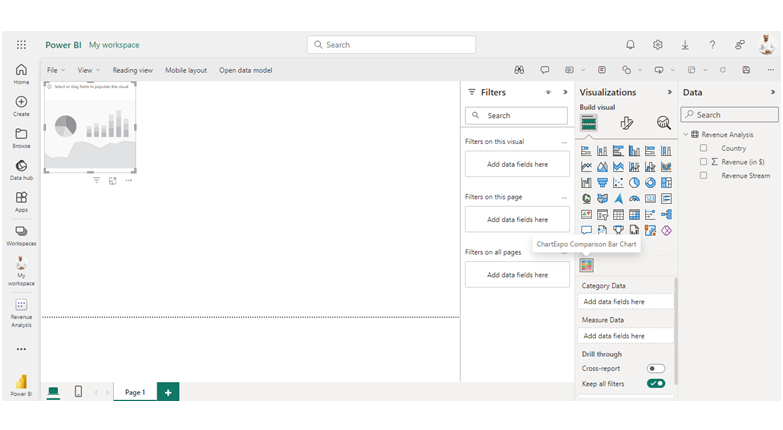
The following video will help you create a Comparison Bar Chart in Microsoft Power BI.
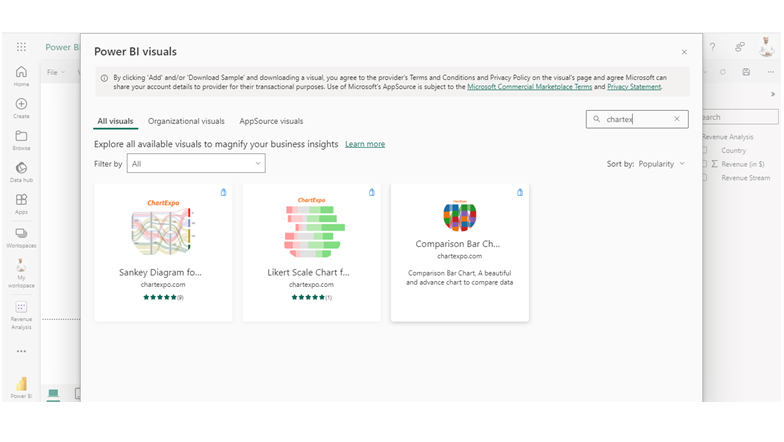
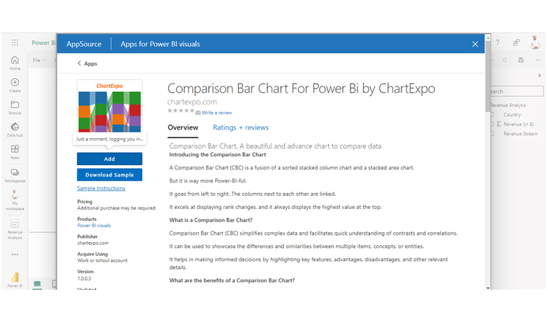
Explore more about the Sankey Chart generator for Power BI, a complete solution.
Always create and use a dedicated Date Dimension Table instead of relying on Power BI’s automatic date hierarchy. This gives you full flexibility in defining custom columns like fiscal year, week number, or custom periods.
Tip: Mark your date table as a “Date Table” under the Modeling tab to unlock full time intelligence functions.
Structure your hierarchy in a logical order — typically Year > Quarter > Month > Week > Day — or match your organization’s reporting needs. Avoid including unnecessary levels that could clutter visuals.
Example: For retail reports, a hierarchy like Fiscal Year > Period > Week might work better than a traditional calendar-based setup.
Use business-friendly names for each hierarchy level. Instead of “Qtr,” use “Quarter” or “Fiscal Quarter” for clarity. This helps users (especially non-technical ones) understand and navigate your visuals easily.
If multiple reports are built using similar data models, use the same date hierarchy structure across them. This promotes uniformity and helps users interpret time-based visuals consistently.
Ensure your custom date hierarchy accounts for any missing dates in your data source. Gaps can break visuals and lead to inaccurate trend analysis. Use DAX to fill in gaps or generate a full calendar table.
For non-standard reporting cycles like 4-4-5 calendars or marketing seasons, use calculated columns with DAX to define custom groupings. Then include these columns in your hierarchy.
Keep the hierarchy lean. Avoid adding unnecessary columns that may slow down visuals, especially in large datasets. Also, use relationships and filters efficiently to keep queries fast.
Your date hierarchy may not appear because:
Fix: Format the column as a date and enable Auto Date/Time in Power BI settings. For full control, use a custom Date table.
Navigate to the Fields pane and right-click on the date field. Choose “New hierarchy.” Next, add levels like Year, Quarter, Month, and Day.
The date hierarchy is used for organizing date-related data into predefined levels (like Year, Quarter, Month, or Day). This enables the user to easily navigate, aggregate, and analyze time-based information in visuals.
To access the date hierarchy, you’ll have to drag the date field into the visual. It automatically applies the hierarchy, and it becomes visible in the Fields pane under the date column.
To enable date hierarchy in Power BI, make sure your column is formatted as a date and turn on Auto Date/Time under File > Options > Data Load. This lets Power BI automatically create a date hierarchy for your visuals.
Date hierarchy in Power BI helps in organizing date data into levels like Year, Quarter, Month, or Day for easy analysis. It’s of great value for users who want to draw time-based insights. To create it, you’ll have to drag the date field into the visual.
Date hierarchy offers a consistent route to help users handle date fields across multiple dashboards and reports. It also helps the user to save time as there is no need for manual column creation. The drill-up and drill-down functionalities in visuals improve how the user interacts with the data.
Now you understand how date hierarchy in Power BI works, how will you incorporate it into your data analysis?
How much did you enjoy this article?


Discover diverse and high-quality Power BI report examples for inspiration and insights. Elevate your reporting with strategic visualization techniques.

A Customer Relationship Management Dashboard centralizes data, tracks key metrics, and drives smarter business decisions. Discover now!

Explore Healthcare Dashboard Examples and learn how to turn complex healthcare data into clear, actionable insights for better decision-making.


