• Home
  • Tools dropdown img
    • Spreadsheet Charts

      • ChartExpo for Google Sheets
      • ChartExpo for Microsoft Excel
    • Power BI Charts

      • Power BI Custom Visuals by ChartExpo
    • Word Cloud

  • Charts dropdown img
    • Chart Category

      • Bar Charts
      • Circle Graphs
      • Column Charts
      • Combo Charts
      • Comparison Charts
      • Line Graphs
      • PPC Charts
      • Sentiment Analysis Charts
      • Survey Charts
    • Chart Type

      • Box and Whisker Plot
      • Clustered Bar Chart
      • Clustered Column Chart
      • Comparison Bar Chart
      • Control Chart
      • CSAT Survey Bar Chart
      • CSAT Survey Chart
      • Dot Plot Chart
      • Double Bar Graph
      • Funnel Chart
      • Gauge Chart
      • Likert Scale Chart
      • Matrix Chart
      • Multi Axis Line Chart
      • Overlapping Bar Chart
      • Pareto Chart
      • Radar Chart
      • Radial Bar Chart
      • Sankey Diagram
      • Scatter Plot Chart
      • Slope Chart
      • Sunburst Chart
      • Tornado Chart
      • Waterfall Chart
      • Word Cloud
    • Google Sheets
      Microsoft Excel
  • Services
  • Pricing
  • Contact us
  • Blog
  • Support dropdown img
      • Gallery
      • Videos
      • Contact us
      • FAQs
      • Resources
    • Please feel free to contact us

      atsupport@chartexpo.com

Categories
All Data Visualizations Data Analytics Surveys
Add-ons/
  • Google Sheets
  • Microsoft Excel
  • Power BI
All Data Visualizations Data Analytics Surveys
Add-ons
  • Google Sheets
  • Microsoft Excel
  • Power BI

We use cookies

This website uses cookies to provide better user experience and user's session management.
By continuing visiting this website you consent the use of these cookies.

Ok

ChartExpo Survey


Home > Blog > Microsoft Excel

How to Combine Two Charts in Excel for Clear Insights?

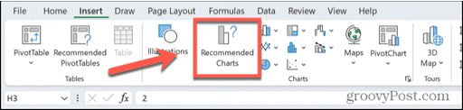
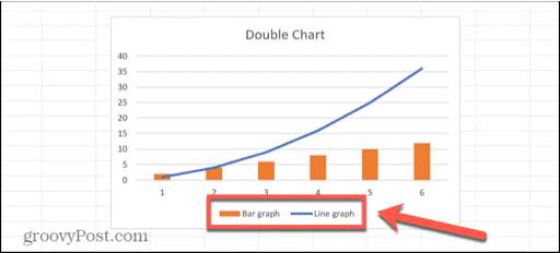
How to combine two charts in Excel is a skill every data analyst needs.

Why?

Let’s paint a scenario: Imagine you’re at work, presenting quarterly sales data. One chart shows units sold, and another displays total revenue. Separately, they tell part of the story. Together, they reveal trends and insights.

How to Combine Two Charts in Excel

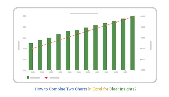
Combining these charts can be powerful. For instance, you might see that months with high sales don’t always mean higher revenue. This could indicate discounting strategies or varied product pricing. A combination chart helps you see these patterns.

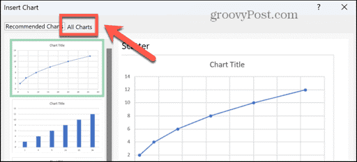
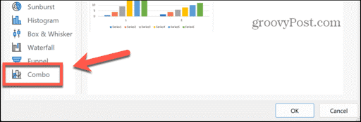
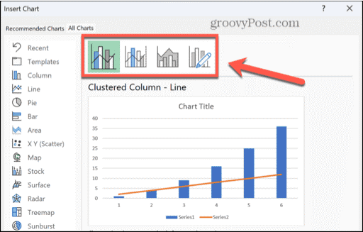
Excel makes this task straightforward. Start with a basic chart, then add a secondary axis. You can mix chart types, such as columns for units sold and a revenue line. This dual approach can highlight discrepancies or correlations between datasets.

Statistics show that visual data representation improves understanding by up to 400%. So, knowing how to combine two charts in Excel can dramatically enhance your presentations. It turns raw numbers into visual stories.

Mastering how to combine two charts in Excel is more than just a technical competency. It is a method to enhance your understanding of data. Whether in finance, marketing, or manufacturing, this ability can assist you in making better decisions.

Let’s explore how a combination chart could tell a more comprehensive story of your data.

Table of Contents:

  1. What is Combine Two Graphs?
  2. Why Do We Need to Combine Two Graphs in Excel?
  3. How to Combine Two Charts in Excel?
  4. How to Create a Combo Chart in Excel Using Add-Ins?
  5. Master the Art of Combining Two Charts in Microsoft Excel
  6. What is the Best Practice for Merging Graphs in Excel?
  7. Wrap Up

First…

What is Combine Two Graphs?

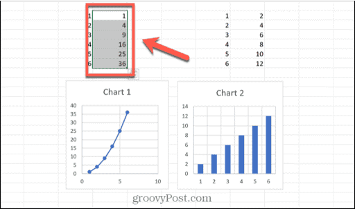
Definition: Combining two graphs in Excel involves merging two different data sets into a single chart. This technique is essential for comparing multiple data series within the same visual context, enhancing clarity and insights. By overlaying graphs, users can do trend analysis, and identify correlations, and differences more efficiently.

This method is used extensively in data analysis, financial reporting, and academic research. It helps to present comprehensive and comparative data views, making complex information easier to understand and interpret.

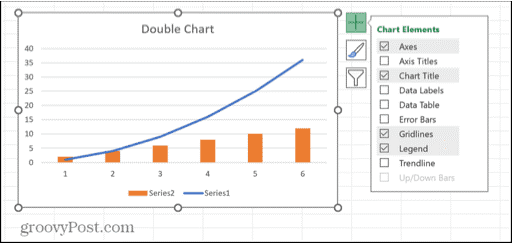
There are various display options available to assist in presenting chart information in a clear and easy-to-comprehend way. A few display options you can select include:

  • A clustered column with a line
  • A clustered column with a line on a secondary y-axis
  • Stacked area with a clustered column

Why Do We Need to Combine Two Graphs in Excel?

Merging graphs in Excel can significantly enhance how you present and analyze data. Combining graphs streamlines your data analysis and improves the overall effectiveness of your presentation. Here’s why this technique is so beneficial:

  • Comparison: Combining graphs allows for direct comparison between different data sets. This makes it easier to spot similarities and differences, providing clearer insights at a glance.
  • Visualization efficiency: Data presented in a single, combined graph is more accessible. Viewers can quickly understand the information without having to switch between multiple charts.
  • Correlation analysis: Overlaying graphs helps identify correlations between data sets. This is particularly useful in fields like finance and science, where understanding the relationship between variables is crucial.
  • Space-saving: Combining graphs conserves space in reports and presentations. Instead of multiple charts cluttering your document, a single, comprehensive chart presents all necessary data. This makes it more readable and organized.
  • Contextual understanding: Combining data sets in one graph provides a better context for the information. Viewers can see how different data points interact within the same frame, leading to a deeper understanding.
  • Highlighting differences: Placing data sets side by side in a combined graph makes highlighting and focusing on differences easier. This can be particularly useful in competitive analysis or performance tracking.
  • Consistency: Using combined graphs ensures consistency in your data presentation. It maintains a uniform style and format, making your reports more professional and cohesive.

How to Combine Two Charts in Excel?

  1. Select the data for the initial graph you wish to incorporate into your chart.
Select Data for Initial Graph for Learning How to Combine Two Charts in Excel
  1. Press and hold Ctrl for Windows or Cmd for Mac while selecting the desired data from the second chart.
Select Data for Second Graph for Learning How to Combine Two Charts in Excel
  1. Select the Insert option from the menu.
Select Insert Option for Learning How to Combine Two Charts in Excel
  1. Click on the Recommended Charts button located on the ribbon.
Click Recommended Charts for Learning How to Combine Two Charts in Excel
  1. Click the All Charts tab located at the top of the left-hand pane.
Click All Charts for Learning How to Combine Two Charts in Excel
  1. Click on Combo, which is located at the bottom left of the menu.
Click on Combo for Learning How to Combine Two Charts in Excel
  1. Select the specific combo chart style you prefer.
Select Specific Combo Chart Style for Learning How to Combine Two Charts in Excel
  1. To modify the chart type for each data set, click on the Chart Type drop-down menu.
Click on Chart Type for Learning How to Combine Two Charts in Excel
  1. Choose a chart type from the provided options.
Choose Chart Type in Options for Learning How to Combine Two Charts in Excel
  1. Repeat the process for any additional data sets you wish to modify.
  2. Once you are satisfied with your chart, press the OK button to generate it.
  3. Double-click on the chart title to rename it and enter a new title.
Add Chart Title After Learning How to Combine Two Charts in Excel
  1. To add more items to the chart or delete existing ones, choose the chart and click on the + (plus) symbol.
Add Symbol to Chart After Learning How to Combine Two Charts in Excel
  1. Check any additional elements you wish to incorporate or uncheck those you wish to eliminate.
Check Any Additional Elements After Learning How to Combine Two Charts in Excel
  1. To rename the data series, right-click on the graph and choose Select Data.
Rename Data Series After Learning How to Combine Two Charts in Excel
  1. Choose the series you prefer and then press the Edit button.
Choose Prefer Series After Learning How to Combine Two Charts in Excel
  1. Enter a new name into the Series Name field and then press OK.
Enter Series Name Field After Learning How to Combine Two Charts in Excel
  1. Repeat the process for any other series you wish to rename.
  2. The data labels will now show the updated names of the series.
Data Labels will Show in Series After Learning How to Combine Two Charts in Excel

How to Create a Combo Chart in Excel Using Add-Ins?

Ever tried creating a Combo Chart in Excel and felt like you were wrestling an octopus? Excel’s built-in charting tools can leave you tangled in a mess of clicks and formatting woes.

Worry no more; we have a solution – ChartExpo.

ChartExpo comes to the rescue from Excel’s visual limitations, whether you’re using add-ins for Excel Mac. It makes your data dance with clarity and precision.

Let’s see how you can create a Combo Chart in Excel using ChartExpo and transform your data visualization game.

Let’s learn how to install ChartExpo in Excel.

  1. Open your Excel application.
  2. Open the worksheet and click the “Insert” menu.
  3. You’ll see the “My Apps” option.
  4. In the Office Add-ins window, click “Store” and search for ChartExpo on my Apps Store.
  5. Click the “Add” button to install ChartExpo in your Excel.

ChartExpo charts are available both in Google Sheets and Microsoft Excel. Please use the following CTAs to install the tool of your choice and create beautiful visualizations with a few clicks in your favorite tool.

Combine Excel Charts Example

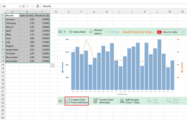
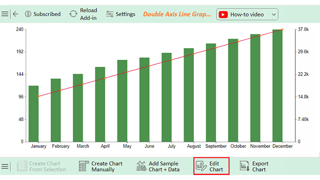
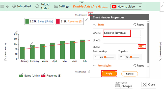
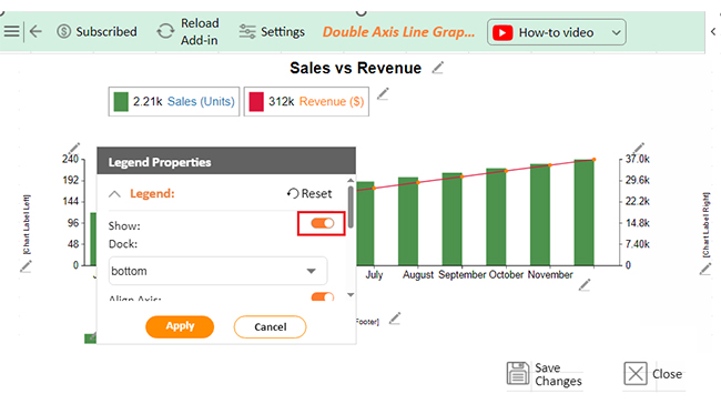
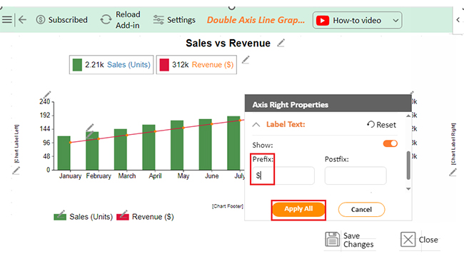
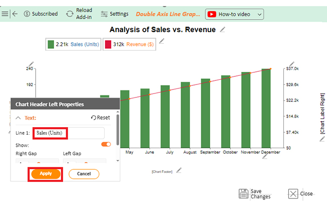
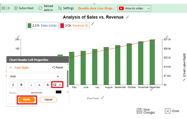
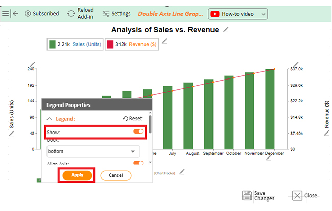
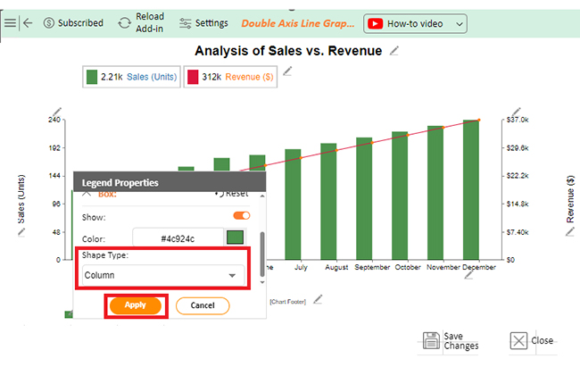
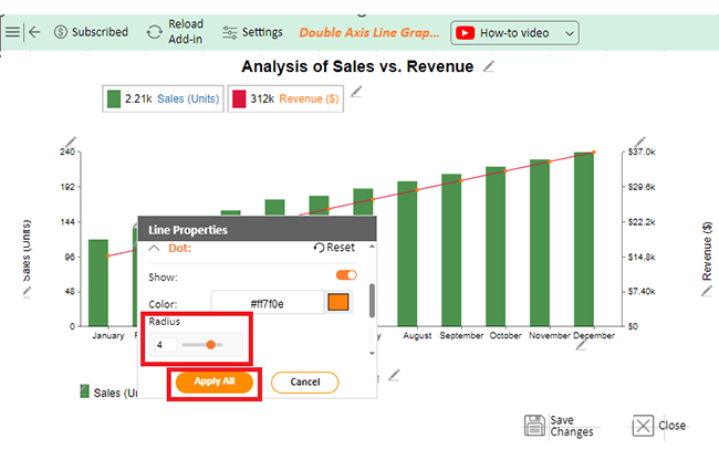
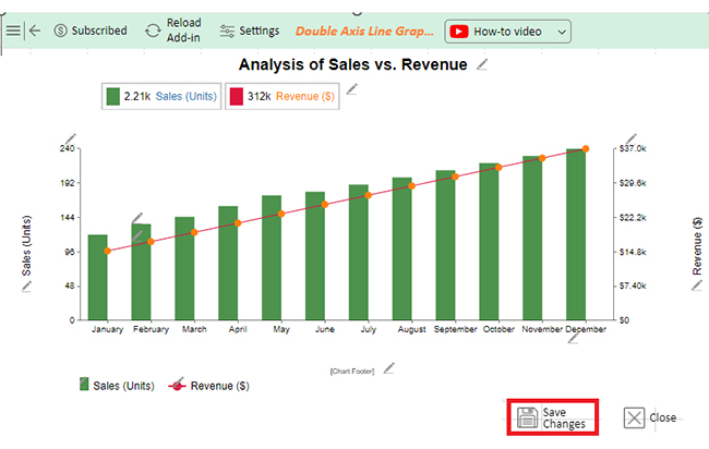
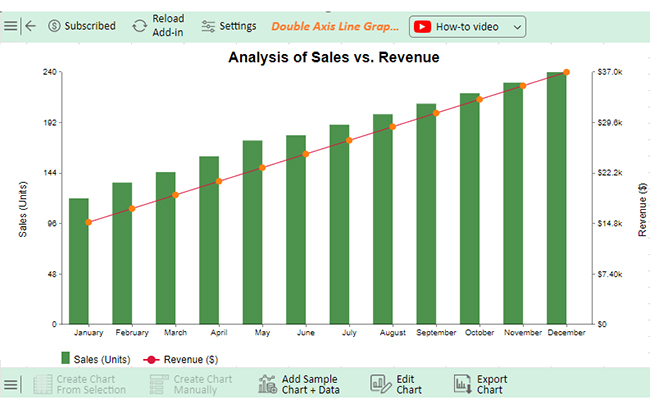
Let’s create a Combo Chart in Excel from the data below using ChartExpo.

Month Sales (Units) Revenue ($)
January 120 15000
February 135 17000
March 145 19000
April 160 21000
May 175 23000
June 180 25000
July 190 27000
August 200 29000
September 210 31000
October 220 33000
November 230 35000
December 240 37000
  • To get started with ChartExpo, install ChartExpo in Excel.
  • Now Click on My Apps from the INSERT menu.
insert chartexpo in excel
  • Choose ChartExpo from My Apps, then click Insert.
open chartexpo in excel
  • Once it loads, choose the “Double Axis Line Graph and Bar Chart” from the charts list.
search double axis line graph and bar chart in excel
  • Click the “Create Chart From Selection” button after selecting the data from the sheet, as shown.
Click Create Chart From Selection After Learning How to Combine Two Charts in Excel
  • ChartExpo will generate the visualization below for you.
Initial Visual After Learning How to Combine Two Charts in Excel
  • If you want to add anything to the chart, click the Edit Chart button:
  • Click the pencil icon next to the Chart Header to change the title.
  • It will open the properties dialog. Under the Text section, you can add a heading in Line 1 and enable Show.
  • Give the appropriate title of your chart and click the Apply button.
Add Chart Header After Learning How to Combine Two Charts in Excel
  • Now, you can enable the legend as follows:
Enable Legend After Learning How to Combine Two Charts in Excel
  • Add the dollar sign with all Revenue values by clicking on the small pencil icon as follows:
Add Prefix with Revenue After Learning How to Combine Two Charts in Excel
  • Change the labels for y-axes.
Change Labels of Y-Axes After Learning How to Combine Two Charts in Excel
  • You can change the font style.
Change Font Style After Learning How to Combine Two Charts in Excel
  • Similarly, you can change the revenue axis’s label text and font style.
  • You can show the legend.
Change Revenue Axis Label Text After Learning How to Combine Two Charts in Excel
  • You can change the shape type of the legend’s boxes.
Change Shape Type of Legend Boxes After Learning How to Combine Two Charts in Excel
  • You can change the dot size/radius of the line.
Change Dot Size of Line After Learning How to Combine Two Charts in Excel
  • Click the “Save Changes” button to persist the changes.
Click Save Changes After Learning How to Combine Two Charts in Excel
  • Your Double Axis Line Graph and Bar Chart will appear as below.
Final How to Combine Two Charts in Excel

Insights

  • There is a steady rise in sales volume and income from the beginning to the end of the year.
  • The number of units sold increased from 120 to 240, with revenue increasing from $15,000 to $37,000. This shows consistent and robust business growth over the year.

Master the Art of Combining Two Charts in Microsoft Excel

This video will show you how to combine two charts in Microsoft Excel, a versatile technique for comparing datasets and enhancing your visual analysis. Learn how to create a Multi-Axis Chart in Excel, a powerful tool for making more comprehensive and impactful data presentations. Integrate this skill into your Excel toolkit to elevate your data visualization capabilities!

What is the Best Practice for Merging Graphs in Excel?

Embrace the art of visual storytelling by thoughtfully blending your graphs to create a cohesive and compelling picture. Merging graphs in Excel, along with mastering techniques like how to move columns in Excel, can transform your data presentation making complex information more accessible and visually appealing. But how do you ensure your combined graphs are effective and professional? Here are some best practices to keep in mind:

  • Consistent data formatting and organization: Ensure your data is well-organized and consistently formatted. This means using uniform units, clear labels, and a logical structure. Consistent data formatting prevents confusion and errors when merging graphs.
  • Choose compatible chart types: Select chart types that complement each other. For instance, combining a line and bar chart can be effective. Conversely, merging a pie chart with a scatter plot might not make sense. Compatibility ensures the combined graph remains readable and informative.
  • Align axes and scales: Ensure the axes and scales of your graphs are aligned. This means setting the same range and intervals for the y-axes and ensuring the x-axes are in sync. Proper alignment helps compare the data sets accurately.
  • Consistent styling and formatting: Use the best colors, fonts, and styles across your combined graph. This uniformity enhances the visual appeal and makes it easier for the viewer to follow the data.
  • Logical arrangement: Arrange the data in a logical order. If you’re combining time-series data, ensure the timeline flows naturally. The logical arrangement helps maintain a clear narrative and makes the graph intuitive.
  • Avoid overcrowding: Combining graphs should simplify data interpretation, not complicate it. Avoid adding too many data series or overly detailed labels, which can overwhelm the viewer.
  • Review and test: Review your combined graph for accuracy and clarity. Feedback and testing ensure the graph is accurate and engaging.

FAQs

Can I merge two graphs in Excel?

Yes, you can merge two graphs in Excel.

  1. Highlight the data.
  2. Insert a chart.
  3. Add the second data set.
  4. Ensure both data sets are properly aligned and formatted for clarity and ease of comparison.

How do you group charts together in Excel?

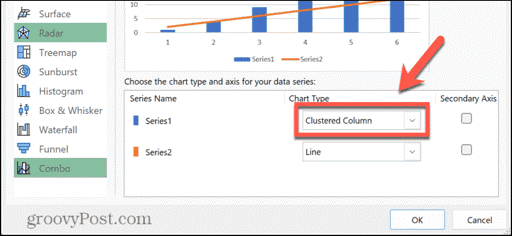
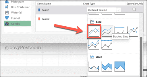
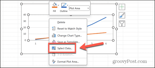
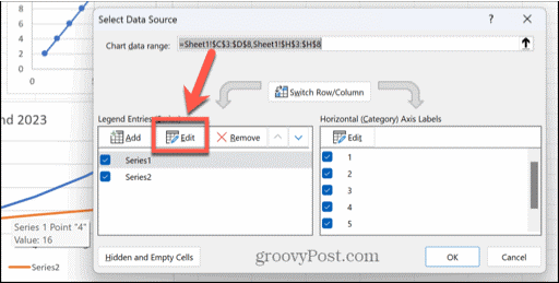
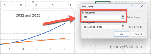
To group charts together in Excel:

  1. Select each chart while holding the “Ctrl” key.
  2. Right-click one of the selected charts and choose “Group“.
  3. This combines the charts, allowing you to move and resize them as a single unit.

How do I add another graph to an existing graph in Excel?

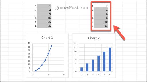
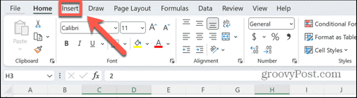
To add another graph to an existing graph in Excel:

  1. Right-click the chart and select “Select Data“.
  2. Click “Add” to insert a new data series.
  3. Choose the range for the new data – it will be added to the existing graph.

Wrap Up

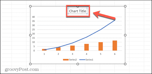
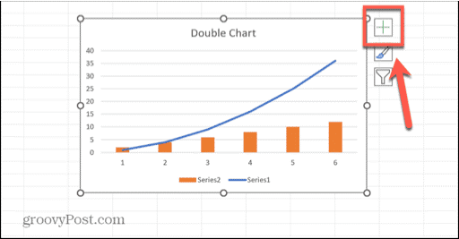
Combining two charts in Excel is a powerful way to enhance data visualization. This process allows you to compare multiple data sets in one comprehensive chart. Doing so makes your data analysis more effective and your presentations clearer.

First, ensure your data is well-organized. Consistent formatting and clear labels are crucial. This makes the merging process smoother and prevents errors.

Next, choose compatible chart types. Some charts work well together, like line and bar charts. Others may not. So, select types that complement each other. This compatibility ensures your final chart is readable.

Aligning axes and scales is essential. Ensure the y-axes have the same range and intervals. The x-axis should also be synchronized. Proper alignment makes it easier to compare the data sets accurately.

Styling and formatting should be consistent. Use the same colors, fonts, and styles across the combined chart. This uniformity enhances visual appeal and helps viewers follow the data easily.

Avoid overcrowding the chart. Combining graphs should simplify, not complicate. Limit the number of data series and keep labels concise. This prevents the chart from becoming overwhelming.

Review and test your combined chart. Ensure it accurately represents the data and is easy to understand. Feedback can help refine it further.

There you have it –  merging graphs in Excel involves these steps. Follow them to effectively combine two charts in Excel and create a clear and informative visual representation of your data.

How much did you enjoy this article?

ExcelAd2
Start Free Trial!
137630

Related articles

next previous
Microsoft Excel9 min read

KPI Dashboard in Excel: A Complete Guide

A KPI dashboard in Excel helps track key metrics and streamline data visualization. Discover how to create, analyze, and use it with clear guides and examples.

Microsoft Excel11 min read

How to Plot a Speedometer Chart in Excel?

Create a Speedometer Chart in Excel to track KPIs, goals, and performance metrics visually. Explore templates, examples, and step-by-step instructions for better dashboards.

Microsoft Excel13 min read

Excel for Teachers for Insightful Preparation

Excel for teachers simplifies grading, tracks attendance, and organizes data. Find its key features, expert tips, and how ChartExpo enhances data visualization.

Microsoft Excel14 min read

How to Make a Cash Flow Diagram in Excel?

Learn how to make a Cash Flow Diagram in Excel. It will help you learn to visualize and analyze inflows and outflows of your business cash flow.

Microsoft Excel11 min read

Succession Planning Template for Long-Term Success

Succession Planning Templates help businesses prepare for leadership changes. Learn to create, analyze, and use them for seamless transitions and growth.

ChartExpo logo

Turn Data into Visual
Stories

CHARTEXPO

  • Home
  • Gallery
  • Videos
  • Services
  • Pricing
  • Contact us
  • FAQs
  • Privacy policy
  • Terms of Service
  • Sitemap

TOOLS

  • ChartExpo for Google Sheets
  • ChartExpo for Microsoft Excel
  • Power BI Custom Visuals by ChartExpo
  • Word Cloud

CATEGORIES

  • Bar Charts
  • Circle Graphs
  • Column Charts
  • Combo Charts
  • Comparison Charts
  • Line Graphs
  • PPC Charts
  • Sentiment Analysis Charts
  • Survey Charts

TOP CHARTS

  • Sankey Diagram
  • Likert Scale Chart
  • Comparison Bar Chart
  • Pareto Chart
  • Funnel Chart
  • Gauge Chart
  • Radar Chart
  • Radial Bar Chart
  • Sunburst Chart
  • see more
  • Scatter Plot Chart
  • CSAT Survey Bar Chart
  • CSAT Survey Chart
  • Dot Plot Chart
  • Double Bar Graph
  • Matrix Chart
  • Multi Axis Line Chart
  • Overlapping Bar Chart
  • Control Chart
  • Slope Chart
  • Clustered Bar Chart
  • Clustered Column Chart
  • Box and Whisker Plot
  • Tornado Chart
  • Waterfall Chart
  • Word Cloud
  • see less

RESOURCES

  • Blog
  • Resources
  • YouTube
SIGN UP FOR UPDATES

We wouldn't dream of spamming you or selling your info.

© 2025 ChartExpo, all rights reserved.