Categories
How do you create an org chart in Excel?
Imagine you’re leading a growing startup. Your team has expanded from a handful of people to a bustling group of 50. Keeping track of who reports to whom is crucial. An org chart offers a clear visual representation. In Excel, this becomes both manageable and efficient.


Why Excel? Because it’s familiar. Most businesses already use it. You won’t need new software. Plus, Excel allows easy data integration. If your team grows, updating the org chart is seamless.
Excel is not only for numbers. It is an ideal tool for organizing data visually. More than 750 million people worldwide used Excel in 2023. That is a significant number that shows its wide-ranging use. An Excel org chart will save you time and clarity in your team structure. This is a constructive and efficient way to modern business management.
Are you ready to learn how to make an org chart in Excel? Keep reading. This blog post will walk you through every stage, from simple configuration to advanced customization. In the end, you can create a precise and professional organizational chart that portrays your team’s hierarchy.
Get ready to impress your colleagues with your new Excel skills!
First…
Definition: An organizational chart visually represents a company’s structure. It shows relationships between different roles and departments. Typically, it’s a hierarchical diagram. At the top is the highest authority, like a CEO. Below are various managers and employees. Lines connect these roles, illustrating the chain of command.
Organizational charts help clarify reporting lines. They show who supervises whom. This can prevent confusion. Charts also highlight departmental functions and interactions.
Different types of charts exist. For example;
These charts are useful for both small and large businesses. They assist in strategic planning and resource allocation. They can be updated as the company evolves.
Overall, organizational charts provide a clear overview of company structure. They help ensure efficient communication and workflow.
Creating an organizational chart sounds daunting, but using Excel makes it a breeze. Here’s why Excel is a fantastic choice for this job:
Hierarchical Org Chart
Matrix Org Chart
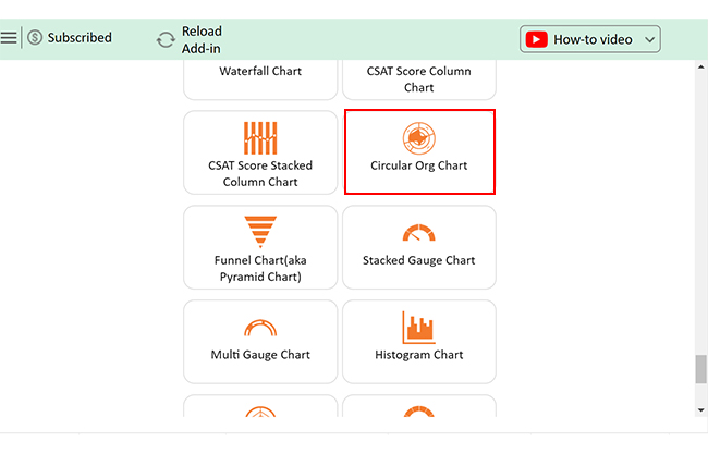
Circular Org Chart
Horizontal Org Chart
The following video will help you create an Circular Org Chart in Excel in Microsoft Excel.
Data visualization is a fundamental aspect of data analysis. It transforms numerical data into graphical representations to facilitate better understanding and communication.
Excel is a widely used tool for creating charts. However, it often lacks advanced visualization options and ease of use, particularly for creating complex organizational charts.
ChartExpo, an Excel add-in, addresses these limitations by providing enhanced visualization features and simplifying the chart creation process.
Let’s demonstrate how ChartExpo can help you overcome Excel’s inherent limitations, ensuring you create insightful and impactful visualizations, including the best Circular Chart for your data analysis needs


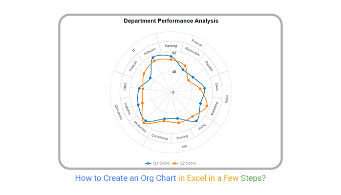
Let’s analyze the organizational data sample below in Excel using ChartExpo.
| Departments | Teams | Q1 Score | Q2 Score |
| Finance | Banking | 80 | 73 |
| Finance | Receivable | 57 | 67 |
| Finance | Payable | 59 | 47 |
| Sales | Sales | 75 | 65 |
| Sales | Marketing | 70 | 85 |
| HR | Hiring | 85 | 72 |
| HR | Training | 60 | 70 |
| HR | Compliance | 61 | 66 |
| Operations | Production | 85 | 91 |
| Operations | Logistics | 78 | 68 |
| Operations | CRM | 71 | 63 |
| IT | Network | 56 | 73 |
| IT | Software | 87 | 79 |


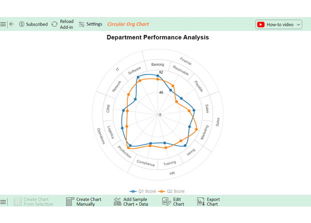


The data displays the quarterly performances of different teams across various departments. In Q2, there were improvements in operations (production) and HR (compliance & training) leadership. The Software team continues to perform well in Q1, but the Payable team in Finance experiences a significant decrease from Q1 to Q2.
Reading an organizational chart might seem overwhelming at first. But it’s pretty straightforward once you know what to look for. Let’s break it down:
Creating an organizational chart in Excel can be a smooth and efficient process with the right approach. Here are tips to help you get started and create a professional, easy-to-read chart:
Creating an organizational chart in Excel can be a great way to visualize your company’s structure. However, it comes with challenges. Here are some common problems you might encounter and how to address them:
The best way to create an organizational chart is to use dedicated software like ChartExpo. These tools offer user-friendly templates, easy customization, and collaborative features, ensuring a professional and up-to-date chart.
To convert an Excel spreadsheet to an organizational chart, use ChartExpo:
Here are five uses of an org chart:
Creating an organizational chart in Excel is a practical choice for many businesses. Start by planning your structure. Sketch a rough draft to visualize the hierarchy. This initial step sets a clear direction.
Next, open Excel and choose SmartArt or Shapes. SmartArt offers pre-made templates, making it easy to begin. Customize these templates to match your organization’s needs. Shapes provide more flexibility if you prefer designing from scratch.
Connect positions with lines to show reporting relationships. Ensure these lines are clear and straight. This clarity helps in understanding the chain of command. Label each position clearly with job titles and names.
Customize the chart’s appearance to enhance readability. Adjust colors, fonts, and shapes. A visually appealing chart is easier to understand. Align elements neatly for a professional look.
Review and update your chart regularly. Organizations change, and your chart should reflect that. Link your chart to a data source for easier updates. This ensures accuracy over time.
Finally, seek feedback from colleagues. They might provide valuable insights. Moreover, collaboration can improve the chart’s accuracy and usefulness.
Creating an organizational chart in Excel becomes a straightforward task with these steps.
So, next time your team expands, remember: that Excel is your ally. Create clear, professional org charts effortlessly. Your team will thank you. Your investors will be impressed. And you’ll stay organized, no matter how large your company grows.
How much did you enjoy this article?


Learn how to use sparklines in Excel to quickly visualize trends inside cells. Discover types, creation steps, customization, use cases, benefits, and best practices.

Learn what a confidence interval graph is, how to create it in Excel, and how to interpret results to make more reliable, data-driven decisions.

A correlation matrix in Excel helps identify relationships between variables. Learn how to create, read, and use it for effective data analysis.


