• Home
  • Tools dropdown img
    • Spreadsheet Charts

      • ChartExpo for Google Sheets
      • ChartExpo for Microsoft Excel
    • Power BI Charts

      • Power BI Custom Visuals by ChartExpo
    • Word Cloud

  • Charts dropdown img
    • Chart Category

      • Bar Charts
      • Circle Graphs
      • Column Charts
      • Combo Charts
      • Comparison Charts
      • Line Graphs
      • PPC Charts
      • Sentiment Analysis Charts
      • Survey Charts
    • Chart Type

      • Box and Whisker Plot
      • Clustered Bar Chart
      • Clustered Column Chart
      • Comparison Bar Chart
      • Control Chart
      • CSAT Survey Bar Chart
      • CSAT Survey Chart
      • Dot Plot Chart
      • Double Bar Graph
      • Funnel Chart
      • Gauge Chart
      • Likert Scale Chart
      • Matrix Chart
      • Multi Axis Line Chart
      • Overlapping Bar Chart
      • Pareto Chart
      • Radar Chart
      • Radial Bar Chart
      • Sankey Diagram
      • Scatter Plot Chart
      • Slope Chart
      • Sunburst Chart
      • Tornado Chart
      • Waterfall Chart
      • Word Cloud
    • Google Sheets
      Microsoft Excel
  • Services
  • Pricing
  • Contact us
  • Blog
  • Support dropdown img
      • Gallery
      • Videos
      • Contact us
      • FAQs
      • Resources
    • Please feel free to contact us

      atsupport@chartexpo.com

Categories
All Data Visualizations Data Analytics Surveys
Add-ons/
  • Google Sheets
  • Microsoft Excel
  • Power BI
All Data Visualizations Data Analytics Surveys
Add-ons
  • Google Sheets
  • Microsoft Excel
  • Power BI

We use cookies

This website uses cookies to provide better user experience and user's session management.
By continuing visiting this website you consent the use of these cookies.

Ok

ChartExpo Survey


Home > Blog > Power BI

Mastering Data Visualization: A Guide to Power BI in Office 365

If you already have Microsoft 365, you can access Power BI within it. This makes it easier, as you’re working with Microsoft’s suite of tools in one place.

Your employees and team get to work with the same suite of tools. This means that the learning curve is more gentle.

Power BI in Office 365

As a business, you also avoid having to deal with many service providers. This could also be cheaper in the end, as you can negotiate for affordable support. You may not even pay extra for the integrated tool.

In this article, we explore Power BI in Office 365. We begin by defining it and explaining how to use it. We then discuss its benefits and the best practices to follow when using it.

Eventually, we will learn how Power BI elevates data presentation in Office 365.

Table of Contents:

  1. What is Power BI in Office 365?
  2. How to Use Power BI in Office 365?
  3. Benefits of Power BI in Office 365
  4. Best Practices for Using Power BI in Office 365
  5. How Power BI Elevates Data Presentation in Office 365?
  6. Wrap Up

What is Power BI in Office 365?

Power BI is a business intelligence (BI) tool. It helps you collect, analyze, and data visualization from a variety of sources. Power BI is included in the Office 365 suite of productivity apps.

With Power BI, you can:

  • Connect to data from various sources, including Excel, SQL Server, Azure, and cloud-based services.
  • Clean, transform, and model your data to prepare it for analysis.
  • Create interactive dashboards and reports that visualize your data in a way that is easy to understand.
  • Share your dashboards and reports with others so that they can make informed decisions.

How to Use Power BI in Office 365?

If you already have a Microsoft 365 plan, you can access Power BI within it. You do, however, have dataset, storage, and data refresh limits per user.

You can purchase Power BI Premium licenses to get rid of the limits.

To use Power BI in Office 365, you need to be logged in.

  • Click on “Teams”.
  • Click on “Apps” on the left menu.
  • This opens the “Apps” panel.
  • Enter “Power BI” in the search bar in the Apps panel.
  • It should show as one of the “Apps” results.
  • Click on “add” on the top right of Power BI’s result.
  • This adds Power BI to your left menu.
  • Click on the Power BI icon.
  • Click “Open”.
  • Sign up for Power BI.
  • Enter some details, like email and region.
  • Click “Get Started.”

Benefits of Power BI in Office 365

Using Power BI in Office 365 greatly enhances data analysis and decision-making processes. Here are some key benefits:

  • Seamless Data Access

Power BI integration with Microsoft 365 allows users to access data from various Microsoft 365 apps:

  • SharePoint,
  • Excel,
  • OneDrive,
  • and Teams.

This streamlines the data import process. It makes it more efficient and reduces the need to switch between different applications.

  • Unified User Experience

Users can work with Power BI on Mac for reports and dashboards within the familiar Microsoft 365 environment. This creates a unified experience that enhances user adoption. It also reduces the learning curve, as employees can leverage their existing knowledge of Microsoft tools.

  • Secure Data Sharing

Microsoft 365 has security and permission settings. These allow for secure sharing of Power BI reports and dashboards with colleagues and external stakeholders. Controlled data sharing ensures that sensitive data remains protected.

  • Embedding in Apps and Portals

Power BI reports can be directly embedded into Microsoft 365 apps like SharePoint and Teams. You can also embed reports in custom applications and portals. This means that employees can access relevant data and insights without leaving the apps they use daily.

  • Automated Data Refresh

Power BI can automatically refresh data from Microsoft 365 sources. This ensures that reports and dashboards always reflect the latest information.

  • Easier Sign In

Users can benefit from a single sign-in when accessing Power BI through Microsoft 365. This simplifies user authentication and enhances security by centralizing access control.

  • Cost Savings

Organizations can optimize their software costs and reduce the need for multiple standalone tools. This consolidation can lead to cost savings in software licensing and support.

Best Practices for Using Power BI in Office 365

Here are some best practices for using Power BI in Office 365:

  • Limit visuals. Limit the number of visuals in dashboards and reports to improve performance.
  • Remove unnecessary interactions. Remove interactions between visuals that are not necessary to improve performance.
  • Cleanse and transform data. Cleanse and transform data before importing it into Power BI to improve data quality.
  • Organize data. Utilize Power BI Report Builder to keep your data organized, thus improving performance.
  • Ensure the cache update frequency is aligned with the data source refresh frequency. Ensure the cache update frequency aligns with the data source refresh frequency to improve performance.
  • Use white or light background colors. Use white or light background colors to improve report design.
  • Shorten numbers: Shorten numbers to improve report design.
  • Use tooltips. Use tooltips to improve report design.
  • Partition large tables. Partition large tables and process multiple partitions in parallel to improve performance.

How Power BI Elevates Data Presentation in Office 365?

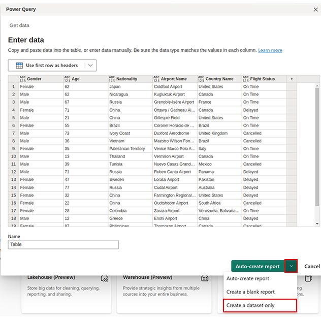
This section teaches how Power BI elevates data presentation in Office 365. We’ll use the Sankey Diagram (Sankey Chart) as a Power BI dashboard example.

Stage 1: Logging in to Power BI

  • Log in to Power BI.
  • Enter your email. Click the “Submit” button.
Enter email to login to Power BI
  • Enter your password and click “Sign in”.
Enter Password to login to Power BI
  • Choose whether to stay signed in.
Click on stay signed in

Stage 2: Creating a Data Set and Selecting the Data Set to Use in Your Sankey Chart

  • Click on the “Create” option on the left-side menu.
  • Select ”Paste or manually enter data“.
select Paste or manually enter data in Power BI
  • We’ll use the following 2021 life expectancy at birth data for this example.
Gender Age Nationality Airport Name Country Name Flight Status
Female 62 Japan Coldfoot Airport United States On-Time
Male 62 Nicaragua Kugluktuk Airport Canada On-Time
Male 67 Russia Grenoble-Isère Airport France On-Time
Female 71 China Ottawa / Gatineau Airport Canada Delayed
Male 21 China Gillespie Field United States On-Time
Female 55 Brazil Coronel Horácio de Mattos Airport Brazil On-Time
Male 73 Ivory Coast Duxford Aerodrome United Kingdom Cancelled
Male 36 Vietnam Maestro Wilson Fonseca Airport Brazil Cancelled
Female 35 Palestinian Territory Venice Marco Polo Airport Italy On-Time
Male 13 Thailand Vermilion Airport Canada On-Time
Male 39 Tunisia Nuevo Casas Grandes Airport Mexico Cancelled
Male 71 Russia Ruben Cantu Airport Panama Delayed
Female 47 Sweden Loralai Airport Pakistan Delayed
Female 77 Russia Cudal Airport Australia Delayed
Female 32 China Farmington Regional Airport United States Delayed
Female 22 China Oudtshoorn Airport South Africa Cancelled
Female 28 Colombia Zaraza Airport Venezuela On-Time
Male 12 Greece Enshi Airport China Delayed
Female 87 Philippines Thompson Airport Canada Cancelled
Male 62 China Guilin Liangjiang International Airport China Cancelled
  • Paste the above data table into the “Power Query” window.
Enter Data In The Table CE381
  • Select the “Create a dataset only” option.
Create Dataset in Power BI ce381
  • Click on the “Data Hub” option on the left-side menu.
  • Power BI populates the data set list. (If you have not created a data set, refer to the Error! Reference source not found section.)
  • The data details are shown below:
Click on Data Hub
  • Click on the “Create a report” dropdown.
  • Select “Start from scratch“.
Create Report and start from scratch
  • You should see the Report Canvas screen as shown below:
Report Canvas screen in Power BI ce366

Stage 3: Adding the Power BI Sankey Diagram Extension by ChartExpo

  • To finish creating our Sankey Diagram, we’ll use an add-in or Power BI visual from AppSource.
  • Navigate to the Power BI Visualizations panel.
  • Click the ellipsis (…) highlighted above to import the Power BI Sankey Diagram extension by ChartExpo.
click on to get more visuals
  • The following menu opens:
  • Select the “Get more visuals” option.
  • The following window opens:
click on to get more visuals ce351
  • Enter “Sankey Diagram for Power BI by ChartExpo” in the highlighted search box.
  • You should see the “Sankey Diagram for Power BI by ChartExpo” as shown in the image below.
Sankey Diagram for Power BI by ChartExpo
  • Click the highlighted “Add” button.
Click the Add button
  • Power BI will add the “Sankey Diagram for Power BI by ChartExpo” in the visualization panel.
Click on Sankey Diagram Icon

Stage 4: Drawing a Sankey Diagram with ChartExpo’s Power BI extension

  • Select the “Sankey Diagram for Power BI by ChartExpo” icon in the visualization panel.
  • The following window opens in the report section of your dashboard:
Report Section in Dashboard ce366
  • You can resize the visual as needed.
  • Go to the right-hand side of your Power BI dashboard.
Fields next to visualizations ce381
  • You’ll select the fields to use in your Sankey chart here.
  • The ChartExpo visual needs to be selected, though.
  • Select the fields in the following sequence:
    • Age
    • Airport Name
    • Country Name
    • Flight Status
    • Gender
Select fields for Sankey diagram ce381
  • You’ll be asked for a ChartExpo license key or email address.
enter email for ChartExpo license

Stage 5: Activate your ChartExpo Trial or Apply a Subscription Key

  • Select the ChartExpo visual. You should see three icons below “Build Visual” in the Visualizations panel.
Build visual panel in Power BI
  • Select the middle icon, “Format visual.”
  • The visual properties will be populated as shown below.
visual properties in Power BI
  • If you are a new user,
    • Type in your email under the section titled “Trial Mode”.
    • This should be the email address that you used to subscribe to the ChartExpo add-in. It is where your ChartExpo license key will be sent.
    • Ensure that your email address is valid.
    • Click “Enable Trial“. You’ll get a 7-day trial.
enter email id
    • You should receive a welcome email from ChartExpo.
    • The Sankey Diagram you create under the 7-day trial contains the ChartExpo watermark (see below).
Power BI in Office 365 1
  • If you have obtained a license key:
    • Enter your license key in the “ChartExpo License Key” textbox in the “License Settings” section (see below).
    • Slide the toggle switch next to “Enable License” to “On“.
enter license key
    • Your Sankey diagram should not have a watermark.
  • To add colors, expand the “Level Colors” properties and select a color.
  • Do this to change the color of each node.
  • All changes are automatically saved.
coloring Sankey diagram
  • Your final chart should look like the one below. If you get a license, the Sankey Chart will not have a watermark.
Final Power BI in Office 365

Insights

  • At level 1, Airport Name, Thompson Airport had the most traffic (8.95%). Cudal Airport came in second (7.92%), and Duxford Aerodrome was third (7.51%).
  • At level 2, Country Name, Canada had the most traffic (23.97%). Following it were Brazil (9.36%) and the United States (11.83%).
  • At level 3, Flight Status, most flights were on time (35.29%). There were a high number of canceled flights (32.82%) and delayed flights (31.89%).
  • At level 4, Gender, there were more female passengers (53.1%) than male passengers (46.9%).

FAQs

Is Power BI included in Office 365?

Power BI is included in the Microsoft 365 E5 plan. You can also use Power BI by purchasing a Power BI Pro license. Power BI Pro licenses are available for individual users or organizations.

How Do I open Power BI in Microsoft 365?

To use Power BI:

  • log in,
  • click on Teams,
  • select “Apps”,
  • enter “Power BI” in the search bar,
  • add it to the left menu,
  • sign up,
  • enter email and region details,
  • and click “Get Started.”

Wrap Up

We have explored Power BI in Office 365. You get to work with Power BI within a familiar Microsoft 365 environment.

This makes the learning curve more gentle. You also get to work with the same provider, rather than multiple ones.

We began by defining Power BI in Office 365. We learned how to access Power BI in Office 365. We then learned the benefits of Power BI in Office 365, and some best practices.

Some best practices include limiting the number of visuals in dashboards and reports and removing unnecessary interactions.

We then used ChartExpo’s Sankey Diagram to learn how Power BI elevates data presentation in Office 365.

Eventually, we answered some frequently asked questions.

We hope that this article gets you started on your journey to explore Microsoft 365 Power BI.

How much did you enjoy this article?

PBIAd2
Start Free Trial!
128243

Related articles

next previous
Power BI12 min read

Power BI Group By Guide for Effective Data Insights

Learn how Power BI Group By helps you aggregate data, clarify trends, and create reports by grouping values to make large datasets manageable & insightful.

Power BI12 min read

How to Create Sankey Diagram in Microsoft Power BI?

Learn How to Create Sankey Diagram in Microsoft Power BI using Desktop & Web Service. What they are and how to use them effectively.

Power BI8 min read

Power BI Artificial Intelligence: Insights Using Visuals

Discover all there is to know about the Power BI artificial intelligence. You'll also discover how AI is used in Power BI, and how to use it for analysis and more.

Power BI9 min read

Budgeting in Healthcare: Use Visuals to Spot Budget Gaps

This guide helps you discover what budgeting in healthcare is. You'll also discover the factors that affect hospital budgets and types of budgeting in healthcare.

Power BI9 min read

Predictive Analytics in Power BI for Making Insightful Visuals

This guide shows you everything you need to know about Predictive Analytics in Power BI. It also shows you how it works, and how to interpret the results.

ChartExpo logo

Turn Data into Visual
Stories

CHARTEXPO

  • Home
  • Gallery
  • Videos
  • Services
  • Pricing
  • Contact us
  • FAQs
  • Privacy policy
  • Terms of Service
  • Sitemap

TOOLS

  • ChartExpo for Google Sheets
  • ChartExpo for Microsoft Excel
  • Power BI Custom Visuals by ChartExpo
  • Word Cloud

CATEGORIES

  • Bar Charts
  • Circle Graphs
  • Column Charts
  • Combo Charts
  • Comparison Charts
  • Line Graphs
  • PPC Charts
  • Sentiment Analysis Charts
  • Survey Charts

TOP CHARTS

  • Sankey Diagram
  • Likert Scale Chart
  • Comparison Bar Chart
  • Pareto Chart
  • Funnel Chart
  • Gauge Chart
  • Radar Chart
  • Radial Bar Chart
  • Sunburst Chart
  • see more
  • Scatter Plot Chart
  • CSAT Survey Bar Chart
  • CSAT Survey Chart
  • Dot Plot Chart
  • Double Bar Graph
  • Matrix Chart
  • Multi Axis Line Chart
  • Overlapping Bar Chart
  • Control Chart
  • Slope Chart
  • Clustered Bar Chart
  • Clustered Column Chart
  • Box and Whisker Plot
  • Tornado Chart
  • Waterfall Chart
  • Word Cloud
  • see less

RESOURCES

  • Blog
  • Resources
  • YouTube
SIGN UP FOR UPDATES

We wouldn't dream of spamming you or selling your info.

© 2025 ChartExpo, all rights reserved.