Categories
Some visualization designs are better suited for visualizing year-over-year (YoY) growth data than others. In other words, they display insights in a clear and easy-to-follow way.
Some of the tested and proven year-over-year growth visualization designs include:
The charts highlighted above are amazingly easy to read and interpret, even for non-technical audiences.
Excel has very basic year-over-year growth charts (highlighted above). Yes, the spreadsheet tool comes with pretty Year-over-year Growth Charts that need more time and effort in editing.
You don’t have to do away with Excel. You can supercharge it by installing third-party add-ins to access ready-to-use and visually appealing year-over-year growth charts.
In this blog, you’ll learn the following:
Before diving into the how-to guide, we’ll address the following question: What is a Year-Over-Year Growth Chart?
Definition: The year-over-year (YOY) Growth Chart showcases the key performance indicators for comparing growth in a financial year to a previous one.
Unlike standalone monthly metrics, YOY growth gives you a picture of your performance without seasonal effects, monthly volatility, and other factors. You see a clearer picture of your actual successes and challenges over time. Unsurprisingly, this is a key metric for retail analytics.
One of the key advantages of the year-over-year growth chart is eliminating seasonality from your growth metrics.
Most retailers see a sharp uptick in sales during the holiday season. A single-month basis can give a false indication of massive growth. However, these inflated numbers aren’t truly representative of growth over time if they return to normal levels after the holidays pass.
Comparing similar periods over time, such as using Tornado charts, gives you a more precise measure of your company’s growth. That’s not to say that YoY metrics are the be-all, end-all of analysis. Focusing on 12 months may also present you with a broader picture.
Combining a longer-term perspective with month-over-month and quarter-over-quarter can help you gain 360-degree insights into your data. Additionally, incorporating a dot plot can provide a clear and concise visualization of individual data points across periods, enhancing your overall analysis.
The year-over-year growth chart is more than just revenue.
You can measure myriad aspects of your growth: conversions, average sale value, and other related metrics.
In the coming section, we’ll cover how to calculate year-over-year growth.
You can calculate year-over-year growth by following a particular formula, which we’ll highlight below.
Follow the steps below to calculate year-over-year growth.
Before you begin your equation, determine a suitable time. If you’ve just completed a successful season, compare your previous quarter with last year’s.
Also, compare this year’s monthly statistics with last year’s to uncover growth or decline.
Once you’ve established the timeframe, gather data for analysis.
Check your company’s balance sheet if you aren’t sure where these results may be located. This should list your previous performance and financial information for your company.
If you have both numbers, find your growth rate by subtracting last year’s performance numbers from this year’s.
Take the total number from the previous equation and divide it by last year’s number.
Using the earlier example, take the equation’s total, 70, and divide it by 430. The resulting figure is (70/430) = 0.1627.
The final step of calculating the year-over-year growth chart rate is to convert this total to a percentage.
Multiply the resulting total number by 100.
Here’s your equation: 0.1627 x 100 = 16.27. (16.3%)
You can now use this total when showing your success to investors or lenders. This can help them understand how well your business is performing. You can use this number to detail how you plan to perform a higher YOY growth rate next year.
If your total was negative and appears as a loss rather than growth, you can use a clustered stacked bar chart to determine the improvements needed to drive a positive result during your next year-over-year growth analysis.
In the coming section, we’ll highlight the best charts for presenting year-over-year growth.
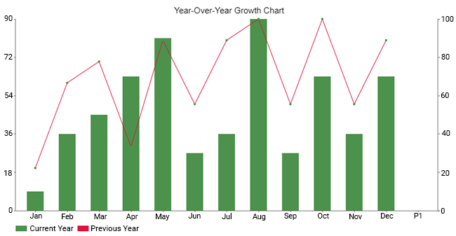
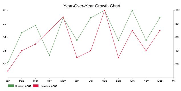
Here are the best charts to show year-over-year (YOY) growth:
A Waterfall chart for “Year-Over-Year Growth” is a graphical representation that illustrates the change in performance metrics from one year to the next. Each bar in the chart represents a specific metric, such as revenue or profit, for a particular year. The bars are stacked sequentially, with each segment indicating the amount of change from the previous year.

A Comparison Bar Chart (one of the Year-over-year Growth Charts) uses a bar to represent sections of the same category, and these bars are placed adjacent to each other.

It’s a great way of comparing the data visually. Bar graphs are reliable ways of comparing key data points.
A Dual Axis Bar and Line Graph is one of the best year-over-year growth charts for comparing two data sets for a presentation.
The visualization design uses two axes to easily illustrate the relationships between two variables with different magnitudes and scales of measurement.
The relationship between two variables is referred to as correlation. Dual Axis Bar and Line Chart illustrates plenty of information using limited space, so you can discover trends you may have otherwise missed.
A Dual-Axis-Line Chart is one of the best graphs for presenting growth year-over-year. The chart has a secondary axis to help you display insights into two varying data points.
More so, it uses two axes to easily illustrate the relationships between two variables with different magnitudes and scales of measurement.
The visualization design displays data as an arrangement of information in a series of data points called ‘markers’ connected by straight line segments. You can use the chart to visualize a trend in the data over time intervals.
In a typical line chart, you have an x and y-axis. The dual axes line chart features one x-axis and two y-axis. The Multi-Axis Chart extends this concept by allowing for multiple y-axes, making it possible to compare different datasets with varying scales on a single chart.

A Matrix Chart can help you identify the presence and strengths of relationships between two or more lists of items. Besides, it provides a compact way of representing many-to-many relationships of varying strengths.
Use this chart to analyze and understand the relationships between data sets.

A Pareto Bar Chart is a graph that indicates the frequency of defects and their cumulative impact.
The chart is useful, especially in hunting for defects to achieve maximum overall improvement. The key goal of a Pareto chart, one of the types of charts, is to separate the significant aspects of a problem from the trivial ones.
Pareto Analysis is based on the classic 80/20 rule. The rule says that 20% of the causal factors result in 80% of the overall outcomes. For instance, 80% of the world’s total wealth is held by 20% of the population.
This easy-to-read chart prevents you from attacking the causes randomly by uncovering the top 20% of the problems, negatively affecting 80% of your overall performance.
A Radar Chart is a two-dimensional chart showing at least three variables on an axis that starts from the same point.

The chart is straightforward to understand and customize. Furthermore, you can show several metrics across a single dimension. The visualization design is best-suited for showing outliers and commonalities in your data.
You can use radar charts in Excel and Google Sheets to display performance metrics such as clicks, sessions, new users, and page views, among others.
A Sentiment Trend Chart is one of the Year-over-year Growth Charts examples you can use to display the target market’s opinion of your offerings.
The chart is a must-have, especially if your goal is to show the growth and decline of key variables. The line curve in the chart shows the overall pattern and trend of a key variable over a specified period.
A Slope Chart is one of the Year-over-year Growth Charts that show transitions, changes over time, absolute values, and even rankings.
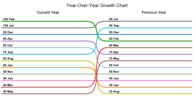
You can use this chart to show the before-and-after story of variables in your data.
Slope Graphs in Excel & Google Sheets can be useful when you have two time periods or points of comparison and want to show relative increases or decreases quickly across various categories between two data points.
A Progress Bar Chart in Excel is a visualization design that displays the progress made in a task or project. You can use the chart to monitor and prioritize your objectives, providing critical data for strategic decision-making.
Besides, it uses filled bars to display how much of the planned activity or goal has been completed.
The chart is significant, especially in tasks that require continuous monitoring and evaluation. It uses green and red bars to show the growth and decline of a variable under study.
In the coming section, we’ll address creating a year-over-year growth chart in Excel.
How to show yoy growth in an Excel chart?
Excel is one of the go-to data visualization tools for businesses and professionals.
However, this freemium spreadsheet tool comes with a very basic Year-over-year Growth Chart in Excel, such as Progress Graphs.
Well, you don’t have to do away with the spreadsheet app.
You can turn Excel into a reliable data visualization tool loaded with ready-made charts like Scatter plot, chord diagrams, Progress and Slope Graphs, by installing third-party apps, such as ChartExpo.
Why ChartExpo?
ChartExpo is a Year-over-year Growth Chart maker that comes as an add-in you can easily install in your Excel.
With different insightful and ready-to-use visualizations, ChartExpo turns your complex, raw data into compelling visual renderings that tell the story of your data.
This YOY growth graph in Excel generator produces simple and clear visualization designs with just a few clicks.
Yes, ChartExpo generates Growth graphs that are amazingly easy to interpret, even for non-technical audiences.
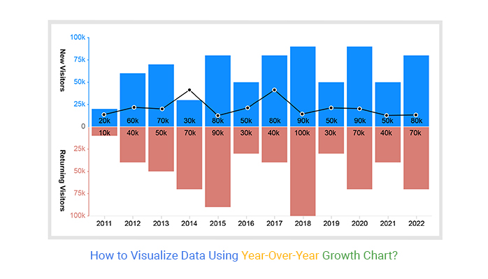
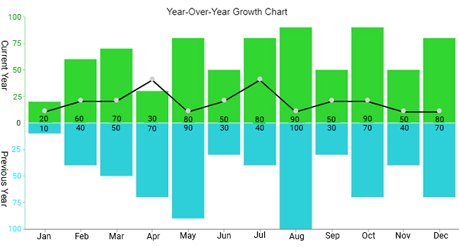
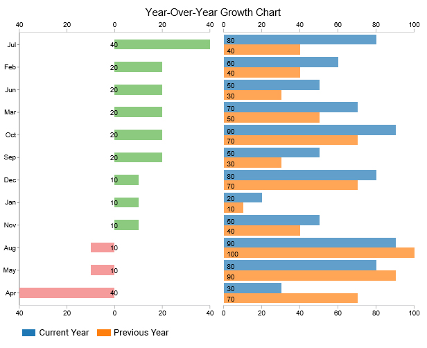
This section will use a Progress Chart to visualize the data below.
| Month | Current | Previous |
| Jan | 20 | 10 |
| Feb | 60 | 40 |
| Mar | 70 | 50 |
| Apr | 30 | 70 |
| May | 80 | 90 |
| Jun | 50 | 30 |
| Jul | 80 | 40 |
| Aug | 90 | 100 |
| Sep | 50 | 30 |
| Oct | 90 | 70 |
| Nov | 50 | 40 |
| Dec | 80 | 70 |
To install ChartExpo into your Excel, click this link.


In the coming section, we’ll address the following question: Why do we need a year-over-year growth chart?
Since your business’s success can vary per month, its performance throughout each month may make the company look unstable, even if it performed well during its off-season.
With the year-over-year growth chart, comparing specific months or quarters can smooth out periods of abysmal performance, which is crucial for effective data storytelling.
Most businesses use spreadsheet apps, such as Microsoft Excel and Google Sheets, making it possible to create an Area chart or use many other options, like a Progress Chart, and generate year-over-year growth charts in these apps
Year-over-year Growth Charts can help you view the results of different aspects of your company’s performance for in-depth understanding.
To calculate YoY, take your current year’s revenue and subtract the previous year’s revenue.
This gives you a total change in revenue. Then, divide that amount by last year’s total revenue. To get the year-over-year growth value, take that number and multiply it by 100.
Some visualization designs are better suited for visualizing year-over-year (YoY) data than others. In other words, they display a graph showing improvement in a clear and easy-to-follow way.
Some of the tested and proven year-over-year growth visualization designs include
The charts highlighted above are amazingly easy to read and interpret, even for non-technical audiences.
Excel has very basic year-over-year growth charts (highlighted above). Yes, the spreadsheet tool comes with pretty Year-over-year Growth Charts that need more time and effort in editing.
So, what’s the solution?
We recommend installing third-party apps, such as ChartExpo, into your Excel to access a ready-made Year-over-Year Growth Chart. Essentially, it’s an add-in you can easily download and install in your Excel app.
ChartExpo comes loaded with all 10 types of Year-over-year Growth Charts, and many more ready-to-go visualization designs.
Sign up for a 7-day trial to access all 10 types of YOY growth charts. Yes, you’ll enjoy unlimited access to easy-to-interpret and visually appealing charts.
How much did you enjoy this article?


Calculate accounts receivable turnover ratio to measure credit collection speed, improve cash flow, and strengthen your financial strategy. Read on!

Change Management KPIs are the key to tracking adoption, performance, and ROI during transitions. Find out which metrics matter. Read on!

Data collection methods and techniques determine the quality of every insight you act on. Explore key approaches for gathering reliable data. Read on!


