Categories
When analyzing and interpreting data, choosing the best graphs for comparing two sets of data is crucial.


You can easily be overwhelmed or get lost in the sea of data with multiple varying metrics. The number of charts you can use to visualize data is vast. The odds of using the wrong charts to visualize complex data are high.
The best-suited graphs comparing two sets of data are:
These charts (above) can save you space and make your data visualization dashboard lean. In other words, they can perform a task usually done by two different charts.
However, Excel does not natively support the Dual Axis Line, Multi Axis Line, and Dual Axis Bar and Line Charts.
Yes, you read that right.
You don’t have to do away with Excel. You can supercharge the application by installing a particular add-in to access the ready-to-use and visually appealing chart variants mentioned above.
In this blog, you’ll learn the following:
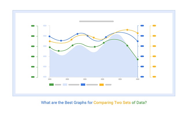
Before jumping right into the blog’s core, we’ll address the following question: What are the Best Graphs for Comparing Two Sets of Data?
Definition: The best graphs for comparing two sets of data are visual tools that help you see differences, similarities, and trends between the datasets clearly. Commonly used graphs for this purpose include side-by-side bar charts, line charts, Scatter plots, and dual-axis charts.
These graphs let you place both data sets next to each other, making it easier to spot patterns, relationships, and gaps, helping you make decisions confidently based on your data.
In the following video, you will learn how to make a comparison chart in Excel for comparing two or more sets of data.
You can also create comparison charts in Google Sheets in a few clicks using the ChartExpo add-in for Google Sheets.
In the next section, we’ll address the following: Why Use a Best Chart to Compare Two Sets of Data?
A chart to compare two sets of data is important because it reveals differences and similarities, helps identify trends, and allows for better decision-making by understanding how data sets relate to each other.
Some of the tested and best charts to compare two sets of data include:
You can use the charts above to create persuasive and compelling data stories using a chart maker. The charts are amazingly easy to read and interpret.
In the next section, we’ll address the following: Top 7 Best Graphs to Compare Two Sets of Data
Our brains interpret visual data 60,000 times faster than numbers and texts.
In other words, if you use the best graphs for comparing two sets of data, you’re more likely to win your audience over than using numbers only.
Check out some of the best examples of the best charts for comparing two sets of data.
Here we discuss the 3 best charts to compare two sets of data:
A Dual Axis Line Chart is one of the best graphs to compare two sets of data. The chart has a secondary y-axis to help you display insights into two varying data points.
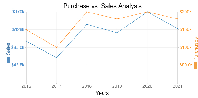
More so, it uses two axes to easily illustrate the relationships between two variables with different magnitudes and scales of measurement.
The visualization design displays data as an arrangement of information in a series of data points called ‘markers’ connected by straight line segments. You can use the chart to visualize a trend in the data over time intervals. In a typical line chart, you have an x-axis and a y-axis. The dual axes line chart features one x-axis and two y-axes.
A Dual Axis Bar and Line Chart is one of the best graphs for comparing two sets of data for a presentation.

The visualization design uses two axes to easily illustrate the relationships between two variables with different magnitudes and scales of measurement.
The relationship between two variables is referred to as correlation. A Dual Axis Bar and Line Chart illustrates plenty of information using limited space, so you can discover trends you may have otherwise missed, making it an essential tool for data storytelling.
Use a Multi-Axis Line Graph to plot multiple data series in one chart.

The chart can help you uncover hidden trends and relationships in various datasets. It’s made up of data points connected using line segments, where each point represents a single value.
Use this multi-axis chart in Excel to visualize continuous data like prices over time.
Now that we have discussed some types of comparison charts, let’s discuss how you can create one.
Excel generates a very basic graph to compare two sets of data in Excel, such as the Multi-Line Axis Chart. This means to create advanced Excel charts, you’ve got to spend extra effort and time editing the graphs that compare two things.
You don’t have to undergo all this.
Download and install a particular third-party add-in into your Excel to access ready-made charts for trend analysis.
There are thousands of add-ins purposely designed for Excel. To simplify things, we tested over 60 data visualization-based add-ins, including those that support advanced features like the Side-By-Side Bar Chart as well as the Slope chart.
We narrowed down our results based on the following factors:
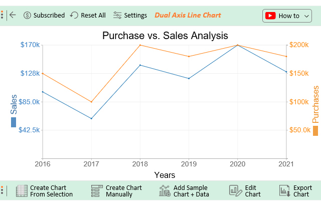
The Excel add-in for Mac and Windows that met all our conditions is ChartExpo.
The tool comes with ready-made charts in Excel and Google Sheets that need minimal editing.
Let’s take a closer look at ChartExpo.
ChartExpo is a chart add-in for Excel with an ultra-friendly user interface to ensure that any professional can visualize data, irrespective of their coding or programming skills.
This section will use a Dual Axis Line Chart to display insights into the table below:
| Year | Purchase | Sales |
| 2016 | 100,000 | 150,000 |
| 2017 | 60,000 | 100,000 |
| 2018 | 140,000 | 200,000 |
| 2019 | 120,000 | 180,000 |
| 2020 | 170,000 | 200,000 |
| 2021 | 130,000 | 180,000 |


Comparison insights can help to denote the growth or decline of the performance of key metrics you’re tracking.
Some of the tested and proven charts for comparing two sets of data include:
A side-by-side bar chart or box plot is often best graph comparing two sets of data, as both clearly show differences and similarities in distributions, central tendencies, and spread.
As well as some other charts we can use are:
The best way to compare two sets of data in Excel is by using clear graphs for comparing two sets of data that Excel supports, such as clustered bar charts, line charts, or scatter plots.
These graphs visually display differences and patterns between your two datasets, making it easier to spot trends, gaps, or correlations. You can insert these charts directly in Excel by selecting your data, going to the “Insert” tab, and choosing a chart type that best fits your comparison needs.
Graphs commonly used to compare two sets of data include:
These graphs help you easily spot differences, trends, and relationships when comparing two sets of data in your analysis.
Displaying insights into two different variables within data is easier said than done.
You can easily be overwhelmed or get lost in the sea of data with multiple varying metrics. The number of charts you can use to visualize data is vast. The odds of using the wrong charts to visualize complex data are high.
The best-suited charts for comparing two sets of data are:
These charts (above) can save you space and make your data visualization dashboard lean. In other words, they can perform a task usually done by two different charts.
However, Excel does not natively support the Dual Axis Line, Multi Axis Line, and Dual Axis Bar and Line Charts.
So, what’s the solution?
We recommend installing third-party apps, such as ChartExpo, into your Excel to access ready-made Excel charts comparing 2 sets of data.
ChartExpo is an add-in you can easily download and install in your Excel app. Besides, this tool comes loaded with insightful and easy-to-interpret Data Comparing Charts.
Here’s the bottom line: You don’t need programming or coding skills to visualize your data using ChartExpo.
How to visualize your data with comparison-based graphs, such as a Dual Axis Line Chart, should never be a problem for you.
Sign up for a 7-day free trial today to access easy-to-interpret and visually appealing Data Comparing Charts for your data story.
How much did you enjoy this article?


Calculate accounts receivable turnover ratio to measure credit collection speed, improve cash flow, and strengthen your financial strategy. Read on!

Change Management KPIs are the key to tracking adoption, performance, and ROI during transitions. Find out which metrics matter. Read on!

Data collection methods and techniques determine the quality of every insight you act on. Explore key approaches for gathering reliable data. Read on!


