• Home
  • Tools dropdown img
    • Spreadsheet Charts

      • ChartExpo for Google Sheets
      • ChartExpo for Microsoft Excel
    • Power BI Charts

      • Power BI Custom Visuals by ChartExpo
    • Word Cloud

  • Charts dropdown img
    • Chart Category

      • Bar Charts
      • Circle Graphs
      • Column Charts
      • Combo Charts
      • Comparison Charts
      • Line Graphs
      • PPC Charts
      • Sentiment Analysis Charts
      • Survey Charts
    • Chart Type

      • Box and Whisker Plot
      • Clustered Bar Chart
      • Clustered Column Chart
      • Comparison Bar Chart
      • Control Chart
      • CSAT Survey Bar Chart
      • CSAT Survey Chart
      • Dot Plot Chart
      • Double Bar Graph
      • Funnel Chart
      • Gauge Chart
      • Likert Scale Chart
      • Matrix Chart
      • Multi Axis Line Chart
      • Overlapping Bar Chart
      • Pareto Chart
      • Radar Chart
      • Radial Bar Chart
      • Sankey Diagram
      • Scatter Plot Chart
      • Slope Chart
      • Sunburst Chart
      • Tornado Chart
      • Waterfall Chart
      • Word Cloud
    • Google Sheets
      Microsoft Excel
  • Services
  • Pricing
  • Contact us
  • Blog
  • Support dropdown img
      • Gallery
      • Videos
      • Contact us
      • FAQs
      • Resources
    • Please feel free to contact us

      atsupport@chartexpo.com

Categories
All Data Visualizations Data Analytics Surveys
Add-ons/
  • Google Sheets
  • Microsoft Excel
  • Power BI
All Data Visualizations Data Analytics Surveys
Add-ons
  • Google Sheets
  • Microsoft Excel
  • Power BI

We use cookies

This website uses cookies to provide better user experience and user's session management.
By continuing visiting this website you consent the use of these cookies.

Ok

ChartExpo Survey


Home > Blog > Power BI

What is a Paginated Report and How to Create It?

As a regular Power BI user, you may be confused about what a paginated report is. Well, you’re not alone – many other users are just like you, and they don’t know the difference between a regular Power BI report and a paginated report.

What is a Paginated Report

In this guide, you’ll discover the answer to the “What is a paginated report” question. You’ll also discover the benefits of Power BI paginated reports, and the difference between the paginated report and regular Power BI reports.

Table of Contents:

  1. What is a Paginated Report?
  2. Why Do We Use Power BI Paginated Reports?
  3. What is the Difference Between Power BI Paginated Reports vs. Reports?
  4. How Do You Create Paginated Reports in Power BI?
  5. How to Publish a Paginated Report?
  6. How to Visualize Your Data in Power BI?
  7. Wrap Up

First…

What is a Paginated Report?

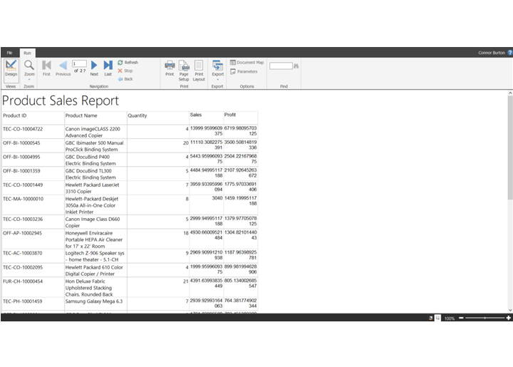
A paginated report is designed to be printed and exported. It is highly formatted, and it can nicely fit into a page. Paginated reports typically produce as many pages as needed to export/print all rows of data in the table. It’s a good fit for a list or table (like a receipt or invoice) that extends beyond a single page.

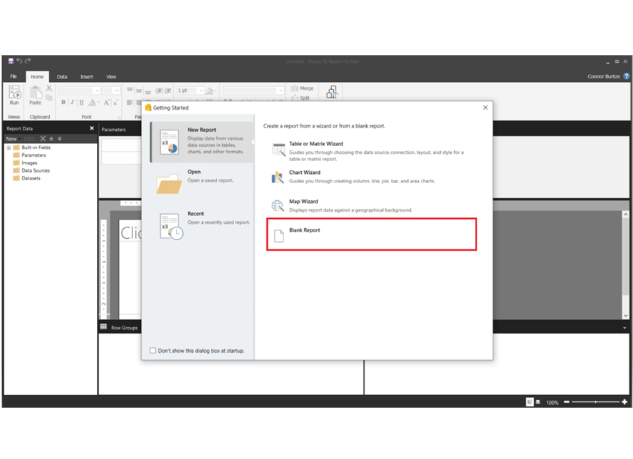
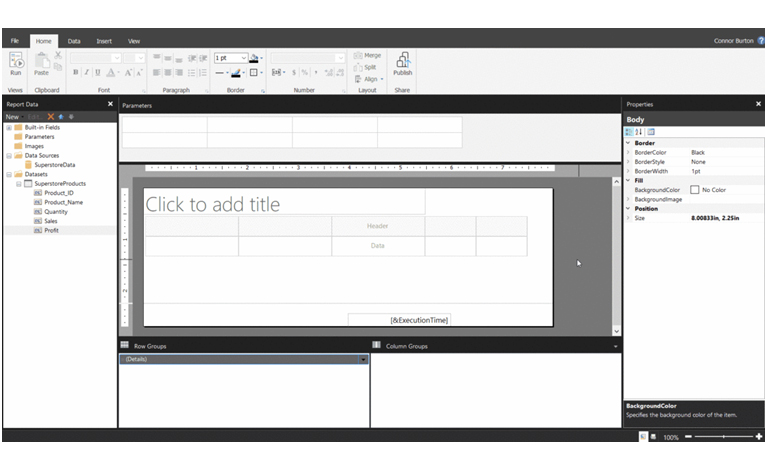
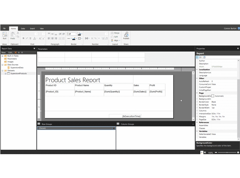
Using the Power BI Report Builder, you can create paginated reports in Power BI. Unlike Power BI Desktop reports where emphasis is on different types of charts and visualizations that users can interact with, the Power BI Report Builder focuses on the creation of reports that can be exported in a specified format.

When saved, the paginated report always comes with the .rdl (report definition language) file extension.

Why Do We Use Power BI Paginated Reports?

Here are the major benefits of working with paginated reports:

  • Printing and Exporting

Paginated reports support various page orientations and sizes. And that makes them a good fit for creating print-ready documents like receipts and invoices.

  • Parameter-Driven Reports

Users can generate reports using specific filters and parameters like regions, date ranges, or product categories. All these help in generating tailored reports.

  • Handling Large Datasets

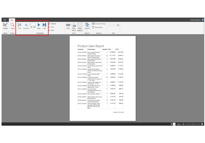
Paginated reports can render and handle large data volumes. Data can be displayed across multiple pages, and that makes it easy to navigate extensive reports.

  • Data Export Flexibility

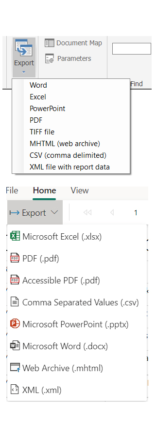
Paginated reports can be exported in multiple formats like Excel, Word, PDF, and XML.

What is the Difference Between Power BI Paginated Reports vs. Reports?

Power BI Paginated Reports

  • Purpose: Detailed, print-ready documents like financial statements and invoices.
  • Layout: Control over layout and precise formatting.
  • Datasets: Can efficiently handle large datasets.

Power BI Reports

  • Purpose: Real-time, interactive data exploration and insights.
  • Layout: Dynamic and visually engaging.
  • Datasets: Good fit for on-the-fly data manipulation.

How Do You Create Paginated Reports in Power BI?

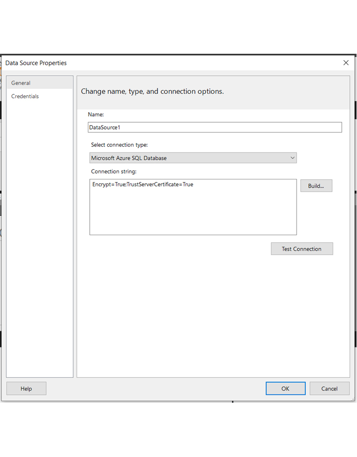
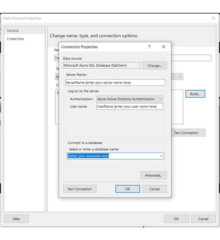
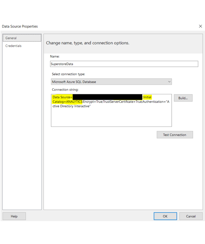
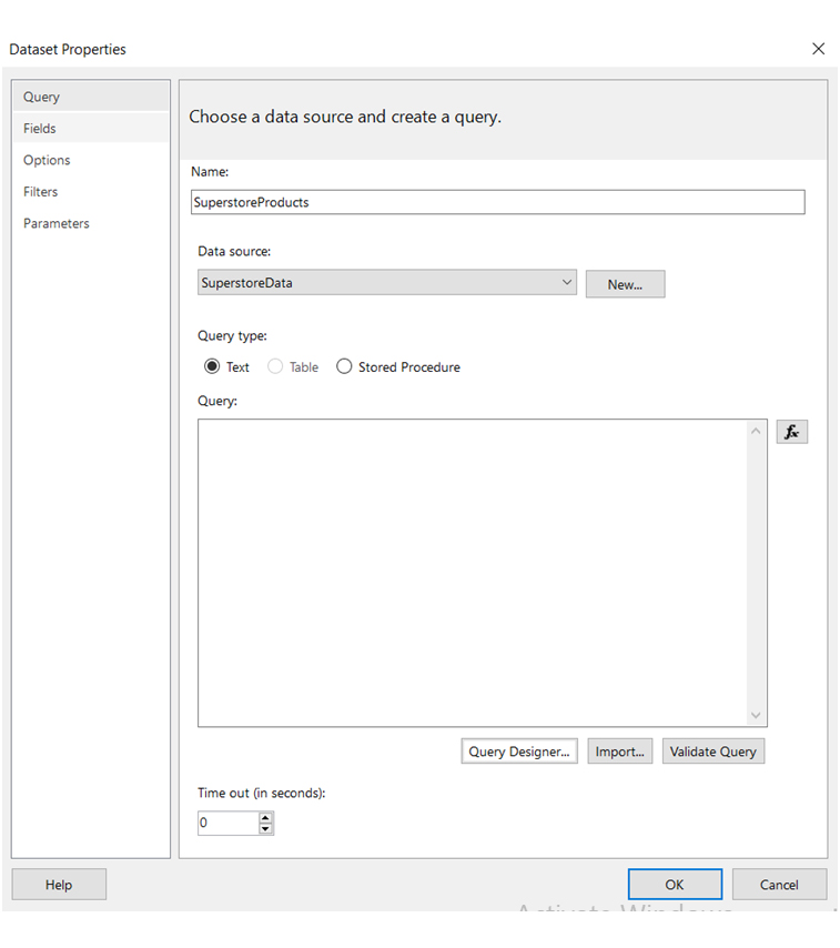
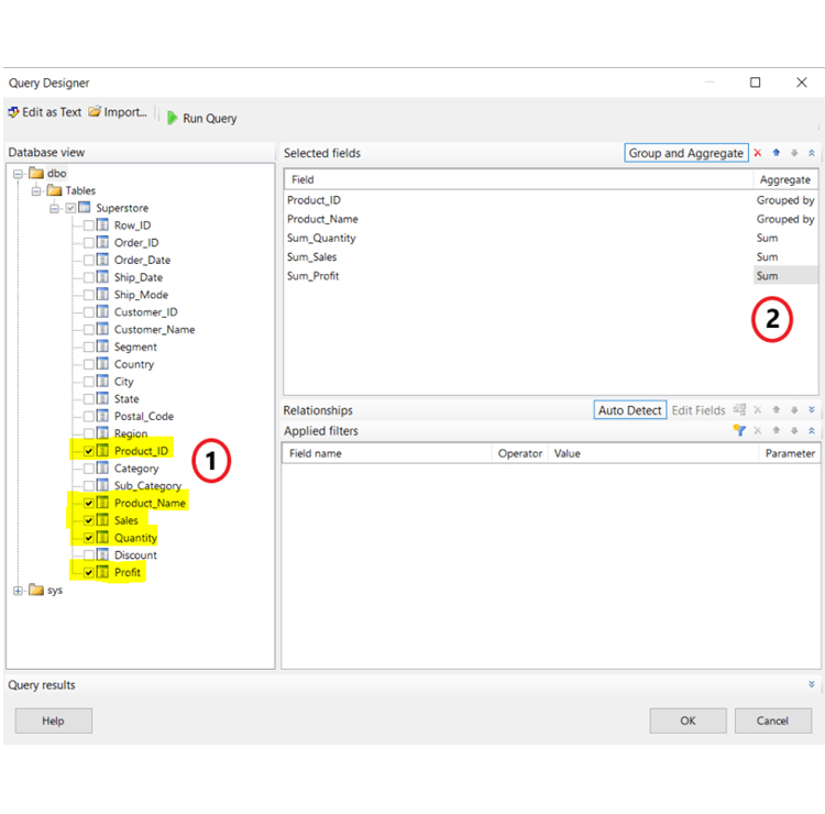
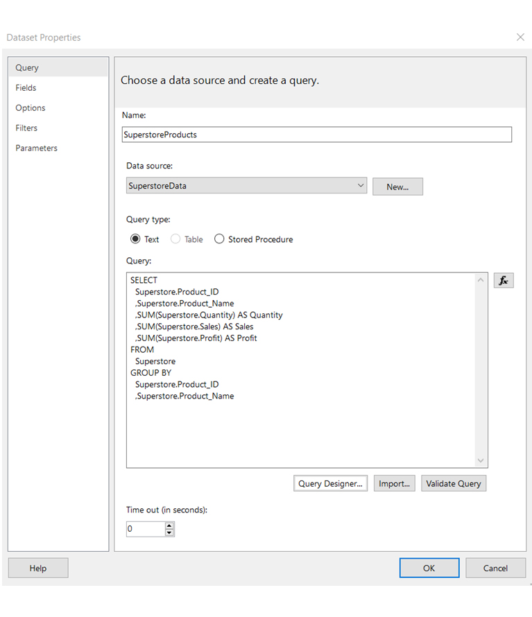
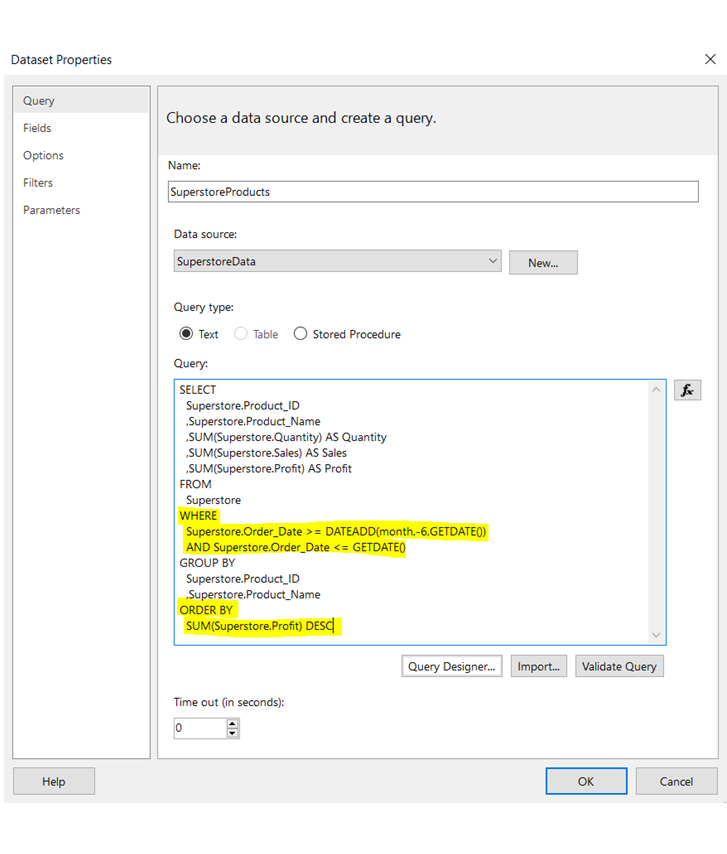
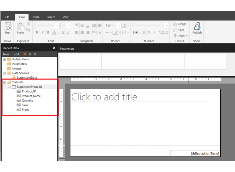
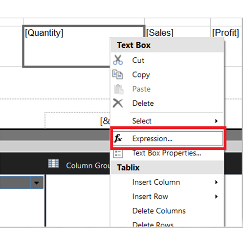
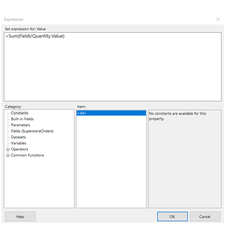
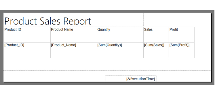
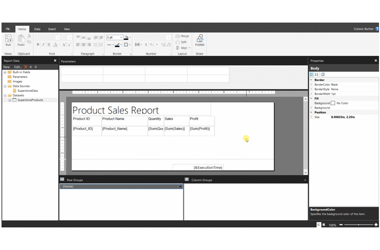
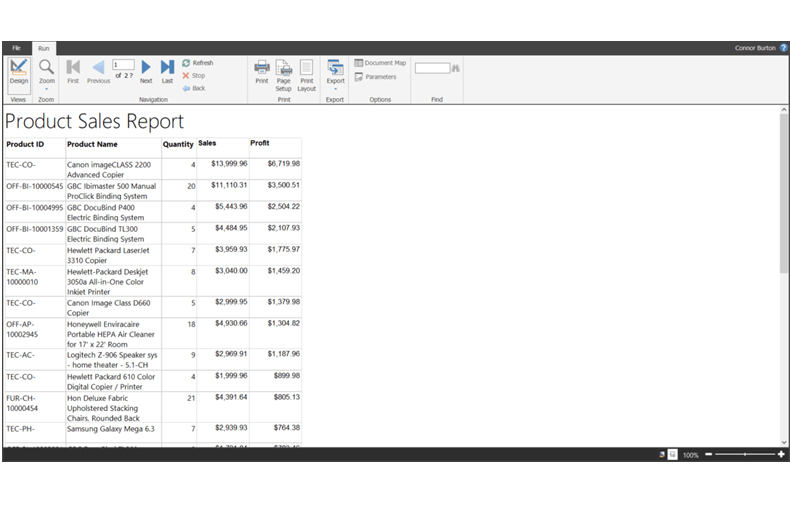
In this illustration, the data source is an Azure SQL database with superstore data. A paginated report will be created for sales data for each product in the past six months.

Step 1: Open Power BI Report Builder

Open Power BI Report Builder After Learning What is a Paginated Report

Step 2: Connect to Data

Connect to Data After Learning What is a Paginated Report
  • To configure the data connection properties, click on the Build button. Next, enter the Server Name, User name (or other vital credentials), and the database name. After that, click OK.
Configure Data Connection Properties After Learning What is a Paginated Report
  • The connection string will update automatically – and that’s dependent on what was entered for the connection properties. Next, click OK.
Update Automatically After Learning What is a Paginated Report
  • A look at the left side of the screen reveals the Data Source in the Report Data pane.

Step 3: Create a Dataset

Report Data Pane After Learning What is a Paginated Report
  • Input the name for the dataset and select the data source.
Input Name Dataset After Learning What is a Paginated Report
  • Navigate to the Query Designer button and click on it. The requirements from the request show that the following fields are needed from the past six months: Product_ID, Product_Name, Quantity (sum), Sales (sum), and Profit (sum).
  • Click OK.
Navigate Query Designer After Learning What is a Paginated Report
  • After clicking OK, the SQL query will be automatically written by the Query Designer. The Sum_prefix has been removed from the column aliases. The query is stored in the .rdl file and gets executed when a user runs the report. Data returned by the query is not stored in the file.
Automatically Written Query Designer After Learning What is a Paginated Report
  • The query needs to be manually adjusted so it can only filter data from the past six months. Furthermore, an ORDER BY statement has been added to sort the data descending by profile. These changes have been highlighted in the image below.
Write Order By Statement After Learning What is a Paginated Report
  • Alternatively, you can type the SQL code directly into the Query box. Before proceeding with this, you need to be confident in your skills. Only users who are confident in writing a query in a specified language should opt for this.
  • Click the “Validate Query” button to ascertain that the query runs without errors. To create the dataset, click OK.
  • Navigate to the “Report Data” pane to see the dataset in the Datasets folder.
Navigate Report Data Pane in Datasets Pane After Learning What is a Paginated Report

Step 4: Build the Table Visualization

Build Table Visualization After Learning What is a Paginated Report
  • Select “Insert Column,” and “Right” or “Left.” You can choose any side since the table is empty. Repeat it one more time.
Select Insert Column After Learning What is a Paginated Report
  • Let’s take a break to discuss the row and column groups. A close look at the “Row Groups” section reveals the “Details” group.
Give a Close Look at Row Group Section After Learning What is a Paginated Report
  • The data has been grouped by Poduct_ID and Product_Name in the dataset query, and one row per product is always returned by the dataset. The fields are brought one row per product into the table visualization. If the grouping had not been done in the query, the table would have one row for every row in the data source.
Grouped By Dataset Query After Learning What is a Paginated Report
  • The image shows how the fields will be displayed in the table, and the data only appears when the report runs.
Report Runs After Learning What is a Paginated Report
  • Navigate to the “Quantity” box, and click on it. Next select “Expression,” and input Sum() around the existing expression value and click “OK.”
  • There are options for exploring other functions in the “Common Functions” dropdown found in the “Category” section of the “Expression” window.
Explore Other Functions in Common Functions After Learning What is a Paginated Report
Write Sum Formula After Learning What is a Paginated Report
  • Repeat the process for the “[Profit]” and “[Sales]” boxes. After that, add a title to the report to make it look like this.
Add Title to Report After Learning What is a Paginated Report
  • The table was sorted from the largest profit to the smallest profit due to the ORDER BY SUM(Superstore. Profit) DESC statement. If the statement is removed, the table will display the data the way it was stored in the data source.
Sort Profits in DESC Statement After Learning What is a Paginated Report

Step 5: Formatting the Table/Report

Formating Table After Learning What is a Paginated Report
  • There are decimal points in Sales and Profit that are not formatted as currency.
Decimal Points in Sales and Profit not Formatted as Currency After Learning What is a Paginated Report
  • Navigate to the “Font” box of the toolbar, and change it to bold.
Navigate to Font Change to Bold After Learning What is a Paginated Report
  • The report is much cleaner and similar to the image below.
Report Gets Cleaner After Learning What is a Paginated Report
  • The image below shows how to navigate from the first page to other pages.
Navigate First Page to Other Pages After Learning What is a Paginated Report

How to Publish a Paginated Report?

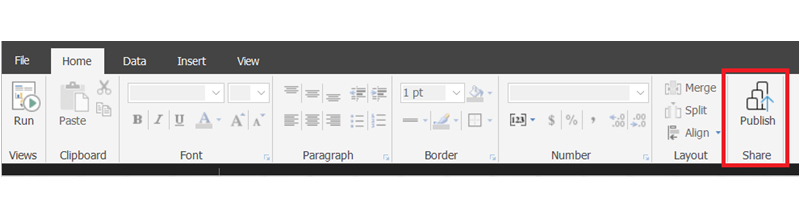
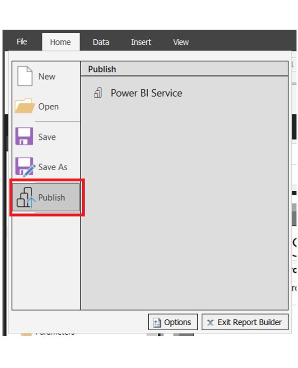
To publish a paginated report, navigate to the Home tab and use the Publish button (first image below). Alternatively, you can go to the File tab and use the Publish button (second image below).

Publish a Paginated Report After Learning What is a Paginated Report
Click Publish Button After Learning What is a Paginated Report

Here are some things you need to note.

  • A license is not needed before publishing a paginated report to My Workspace.
  • A Premium per User (PPU) or Power BI Pro license is needed before you can publish a paginated report to other workspaces.
  • A PPU license is needed to view a published paginated report, especially if the report has been published in the PPU workspace. If the report has been published to the premium capacity workspace, viewing it will require no license.

Exporting the Paginated Report

Exporting the Paginated Report After Learning What is a Paginated Report

Considerations and Limitations of Paginated Reports

Considerations

  • It’s the best fit for reports with large, structured datasets.
  • Good fit for print-optimized, static reports.

Limitations

  • Complex designs require more development time.
  • Limited export options to formats like Excel and PDF.

How to Visualize Your Data in Power BI?

Stage 1: Logging in to Power BI

  • Log in to Power BI.
  • Enter your email address and click the “Submit” button.
Enter email to login to Power BI
  • You are redirected to your Microsoft account.
  • Enter your password and click “Sign in“.
Enter Password to login to Power BI
  • You can choose whether to stay signed in.
Click on stay signed in
  • Once done, the Power BI home screen will open.

Stage 2: Creating a Data Set and Selecting the Data Set to Use in Your Chart

  • Go to the left-side menu and click the “Create” button.
  • Select “Paste or manually enter data“.
select Paste or manually enter data in Power BI ce487
  • We’ll use the sample data below for this example.
City Category Cost
Houston, TX Apartment Rent 1,352
Houston, TX Total Energy 190.29
Houston, TX Phone Bill 211.13
Houston, TX Doctor Visit 93.85
Houston, TX Dentist Visit 120.24
Houston, TX Optometrist Visit 120.7
Houston, TX Prescription Drug 505.78
Tampa, FL Apartment Rent 1,661
Tampa, FL Total Energy 189.14
Tampa, FL Phone Bill 193.94
Tampa, FL Doctor Visit 122.6
Tampa, FL Dentist Visit 111.7
Tampa, FL Optometrist Visit 116.93
Tampa, FL Prescription Drug 367.5
Columbia, SC Apartment Rent 1,154
Columbia, SC Total Energy 290.58
Columbia, SC Phone Bill 192.75
Columbia, SC Doctor Visit 150
Columbia, SC Dentist Visit 78.33
Columbia, SC Optometrist Visit 59
Columbia, SC Prescription Drug 416.3
San Francisco, CA Apartment Rent 3,830
San Francisco, CA Total Energy 298.77
San Francisco, CA Phone Bill 203.63
San Francisco, CA Doctor Visit 174.45
San Francisco, CA Dentist Visit 155.36
San Francisco, CA Optometrist Visit 159.79
San Francisco, CA Prescription Drug 498.84
  • Paste the data table into the “Power Query” window and name it “Cost of Living Standard Analysis.” Choose the “Create a dataset only” option.
Click Create a Dataset Only After Learning What is a Paginated Report
  • On the left-side menu, click “Data Hub.” Power BI will populate the data set list. And if a data set has not been created, you’ll get the error message. After that, click “Create report.”
Click Create Report After Learning What is a Paginated Report
  • Click “Get more visuals.”
Click Get More Visuals After Learning What is a Paginated Report
  • Search ChartExpo and select Comparison Bar Chart:
Select Comparison Bar Chart After Learning What is a Paginated Report
  • Click on a comparison bar chart, and also on the “Add” icon.
Click on Add Icon After Learning What is a Paginated Report
  • After that, you’ll see the Comparison Bar Chart in the visuals list.
Watch Comparison Bar Chart in Visual List After Learning What is a Paginated Report
  • Click on Cost-of-Living Standards.
Click Cost of Living Standards After Learning What is a Paginated Report
  • You’ll have to select the metrics of the data. Navigate to the License Settings, and add the key. After that, the comparison bar chart will be displayed on your screen. To add the header text, click on the General tab. Next, add the header text in the Title.
Navigate License Key After Learning What is a Paginated Report
  • The image below shows you how to disable the value of each top bar and align the text to the center.
Disable Value Each Top Bar and Align to Center After Learning What is a Paginated Report
  • Navigate to the options beneath the bar level to disable the percentage value and title case.
Disable Percentage Value and Title Case After Learning What is a Paginated Report
  • Here’s how to add the dollar sign with values.
Add Dollar Sign After Learning What is a Paginated Report
  • Here’s the final look at the Comparison Bar Chart in Power BI.
Final What is a Paginated Report

Insights

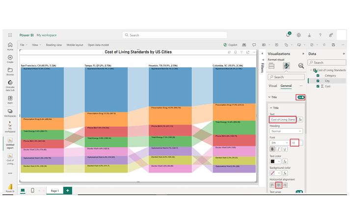
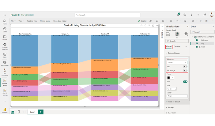
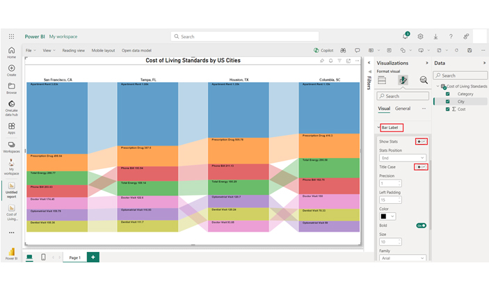
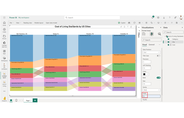
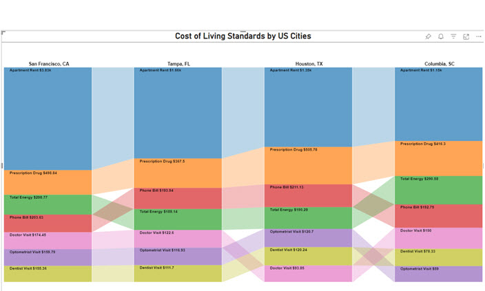
Here are key insights from the chart.

  • Houston, TX: Energy $190.29; Doctor $93.85; Phone $211.13; Rent $1,352; Prescription $505.78; Optometrist $120.7; Dentist $120.24.
  • Tampa, FL: Energy $189.14; Doctor $122.6; Phone $193.94; Rent $1,661; Prescription $367.5; Optometrist $166.93; Dentist $111.7.
  • Columbia, SC: Energy $290.58; Doctor $150; Phone $192.75; Rent $1,154; Prescription $416.3; Optometrist $59; Dentist $78.33.

Unlock the Power of Detailed Reporting with Mastery of Paginated Reports in Power BI:

Learn about Paginated Reports in this video, which are essential for designing well-structured, multi-page reports. Mastering Paginated Reports will enable you to produce detailed documents for precise data presentation.

FAQs

What is the Best Tool for Paginated Reports?

The Power BI Paginated Reports is the best tool for paginated reports. It offers advanced data handling, precise formatting, and seamless integration with the Power BI ecosystem.

Can You Convert a Power BI Report to a Paginated Report?

No, the Power BI report cannot be converted to a paginated report. They have different formatting requirements, serve distinct purposes, and are created separately.

Wrap Up

What is a paginated report? A paginated report is a detailed document that is designed to be exported and/or printed. Power BI Paginated reports are designed to efficiently handle large datasets, and they also come with precise formatting.

Paginated reports can be exported in various formats like PDF, XML, Excel, and Word. It’s the best fit for cases where precise formatting and placement of elements are important.

Paginated reports support multiple page orientations and sizes, and that makes them an ideal fit for creating print-ready documents like receipts, invoices, and other formal documents.

Now you know what a paginated report is, what things will you consider when creating one?

How much did you enjoy this article?

PBIAd2
Start Free Trial!
138100

Related articles

next previous
Power BI12 min read

Power BI Group By Guide for Effective Data Insights

Learn how Power BI Group By helps you aggregate data, clarify trends, and create reports by grouping values to make large datasets manageable & insightful.

Power BI12 min read

How to Create Sankey Diagram in Microsoft Power BI?

Learn How to Create Sankey Diagram in Microsoft Power BI using Desktop & Web Service. What they are and how to use them effectively.

Power BI8 min read

Power BI Artificial Intelligence: Insights Using Visuals

Discover all there is to know about the Power BI artificial intelligence. You'll also discover how AI is used in Power BI, and how to use it for analysis and more.

Power BI9 min read

Budgeting in Healthcare: Use Visuals to Spot Budget Gaps

This guide helps you discover what budgeting in healthcare is. You'll also discover the factors that affect hospital budgets and types of budgeting in healthcare.

Power BI9 min read

Predictive Analytics in Power BI for Making Insightful Visuals

This guide shows you everything you need to know about Predictive Analytics in Power BI. It also shows you how it works, and how to interpret the results.

ChartExpo logo

Turn Data into Visual
Stories

CHARTEXPO

  • Home
  • Gallery
  • Videos
  • Services
  • Pricing
  • Contact us
  • FAQs
  • Privacy policy
  • Terms of Service
  • Sitemap

TOOLS

  • ChartExpo for Google Sheets
  • ChartExpo for Microsoft Excel
  • Power BI Custom Visuals by ChartExpo
  • Word Cloud

CATEGORIES

  • Bar Charts
  • Circle Graphs
  • Column Charts
  • Combo Charts
  • Comparison Charts
  • Line Graphs
  • PPC Charts
  • Sentiment Analysis Charts
  • Survey Charts

TOP CHARTS

  • Sankey Diagram
  • Likert Scale Chart
  • Comparison Bar Chart
  • Pareto Chart
  • Funnel Chart
  • Gauge Chart
  • Radar Chart
  • Radial Bar Chart
  • Sunburst Chart
  • see more
  • Scatter Plot Chart
  • CSAT Survey Bar Chart
  • CSAT Survey Chart
  • Dot Plot Chart
  • Double Bar Graph
  • Matrix Chart
  • Multi Axis Line Chart
  • Overlapping Bar Chart
  • Control Chart
  • Slope Chart
  • Clustered Bar Chart
  • Clustered Column Chart
  • Box and Whisker Plot
  • Tornado Chart
  • Waterfall Chart
  • Word Cloud
  • see less

RESOURCES

  • Blog
  • Resources
  • YouTube
SIGN UP FOR UPDATES

We wouldn't dream of spamming you or selling your info.

© 2025 ChartExpo, all rights reserved.