• Home
  • Tools dropdown img
    • Spreadsheet Charts

      • ChartExpo for Google Sheets
      • ChartExpo for Microsoft Excel
    • Power BI Charts

      • Power BI Custom Visuals by ChartExpo
    • Word Cloud

  • Charts dropdown img
    • Chart Category

      • Bar Charts
      • Circle Graphs
      • Column Charts
      • Combo Charts
      • Comparison Charts
      • Line Graphs
      • PPC Charts
      • Sentiment Analysis Charts
      • Survey Charts
    • Chart Type

      • Box and Whisker Plot
      • Clustered Bar Chart
      • Clustered Column Chart
      • Comparison Bar Chart
      • Control Chart
      • CSAT Survey Bar Chart
      • CSAT Survey Chart
      • Dot Plot Chart
      • Double Bar Graph
      • Funnel Chart
      • Gauge Chart
      • Likert Scale Chart
      • Matrix Chart
      • Multi Axis Line Chart
      • Overlapping Bar Chart
      • Pareto Chart
      • Radar Chart
      • Radial Bar Chart
      • Sankey Diagram
      • Scatter Plot Chart
      • Slope Chart
      • Sunburst Chart
      • Tornado Chart
      • Waterfall Chart
      • Word Cloud
    • Google Sheets
      Microsoft Excel
  • Services
  • Pricing
  • Contact us
  • Blog
  • Support dropdown img
      • Gallery
      • Videos
      • Contact us
      • FAQs
      • Resources
    • Please feel free to contact us

      atsupport@chartexpo.com

Categories
All Data Visualizations Data Analytics Surveys
Add-ons/
  • Google Sheets
  • Microsoft Excel
  • Power BI
All Data Visualizations Data Analytics Surveys
Add-ons
  • Google Sheets
  • Microsoft Excel
  • Power BI

We use cookies

This website uses cookies to provide better user experience and user's session management.
By continuing visiting this website you consent the use of these cookies.

Ok

ChartExpo Survey


Home > Blog > Data Analytics

What are HEDIS Measures: Overview and Guide

What are HEDIS measures? This question often puzzles healthcare professionals and patients alike. The Healthcare Effectiveness Data and Information Set (HEDIS) assesses the quality of care provided by health plans. These measures provide a uniform method to evaluate performance across different healthcare service areas.

The NCQA created HEDIS measures to address health concerns and preventive care methods. They cover over 90 measures in 6 care areas: effectiveness, access/availability, and care experience.

What are HEDIS Measures

Did you know that more than 90% of health plans in America utilize HEDIS for performance evaluation? Their extensive adoption emphasizes the importance of these measures in influencing healthcare quality. HEDIS metrics offer important information on vaccination rates, cancer screenings, and management of chronic conditions.

For example, a HEDIS measure centers on breast cancer screening rates. Another metric measures the percentage of Type 2 diabetes patients receiving regular HbA1c testing critical for managing their condition.

Healthcare providers, insurers, and policymakers need to know what HEDIS measures are. These measures inform the work to improve quality, assist consumers in making informed choices, and impact healthcare policy. HEDIS measures help improve patient outcomes and streamline healthcare delivery by establishing standards and monitoring advancements.

Stay tuned to find out how these actions impact the modern healthcare environment.

Table of Contents:

  1. What are HEDI measures?
  2. What Does the HEDIs Mean?
  3. What Do HEDIs Stand For?
  4. How to Calculate HEDIS Score?
  5. How to Show HEDIS Measures in Reports?
  6. What are the Best Practices for HEDIS Reporting?
  7. What are the Advantages of HEDIS Measurements?
  8. What are the Limitations of HEDIS Measures?
  9. Wrap Up

First…

What are HEDI measures?

Definition: HEDIS (Healthcare Effectiveness Data and Information Set) measures are a set of standardized performance metrics used in the healthcare industry. They assess the quality of care provided by health plans.

HEDIS measures cover various aspects of care, such as preventive services, chronic disease management, and patient satisfaction. Health plans use these measures to improve care quality and report performance to regulatory agencies.

HEDIS measures are widely used in the U.S. to ensure consistent, high-quality healthcare.

What Does the HEDIs Mean?

Definition: HEDIS stands for Healthcare Effectiveness Data and Information Set. It is a widely used set of performance measures in the healthcare industry.

HEDIS is designed to assess health plans’ quality of care and services. It helps compare the performance of different health plans on important dimensions of care and service.

Healthcare providers use HEDIS data to improve patient care and outcomes. The National Committee for Quality Assurance (NCQA) maintains it.

What Do HEDIs Stand For?

HEDIs stands for Healthcare Effectiveness Data and Information Set. It is a tool for measuring and improving the quality of care in healthcare systems.

HEDIs include performance indicators that evaluate how well health plans and providers meet specific care standards. Using this data, healthcare organizations can identify areas for improvement, enhance patient outcomes, and ensure adherence to best practices. This helps in delivering high-quality, effective care to patients.

How to Calculate HEDIS Score?

Calculating a HEDIS score might seem complex, but it’s essentially about ensuring that healthcare providers deliver high-quality care. Let’s break it down step by step:

  1. Data collection: First, gather relevant data from medical records, claims, and patient surveys. This data forms the foundation of your HEDIS score.
  2. Measure specifications: Next, follow specific guidelines for each HEDIS measure. These guidelines define what counts as meeting the standard.
  3. Sample selection: Choose a representative sample of patients or cases that match the criteria for each measure.
  4. Data validation: Validate the collected data to ensure accuracy. This step often involves checking for errors or inconsistencies.
  5. Calculate rates: Now, calculate the performance rates by comparing the number of compliant cases to the total number of eligible cases. For each measure, divide the number of compliant events (numerator) by the total eligible population (denominator).
  6. Reporting: Finally, report the calculated rates to relevant agencies or stakeholders. This data helps improve care quality and ensures accountability.

How to Show HEDIS Measures in Reports?

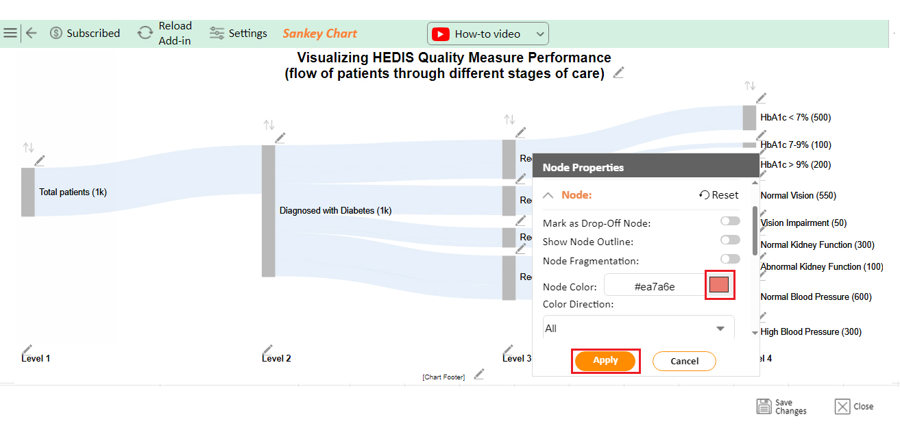
Showing HEDIS measures in reports doesn’t have to be as dry as last week’s toast. Why? We have data visualization – the fairy godmother of analytics. It transforms pumpkin-like data into a carriage of insights.

Now, Excel tries its best. It can crunch numbers, but when we need dazzling visuals, it’s stuck in the 90s. That’s where ChartExpo wears its cape of coolness. This Excel add-in gives your spreadsheet superpowers. 
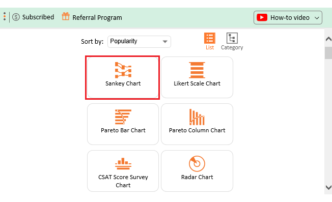
Suddenly, your HEDIS measures jump off the screen, dance happily, and shout, “Look at me!”

Let’s learn how to install ChartExpo in Excel.

  1. Open your Excel application.
  2. Open the worksheet and click the “Insert” menu.
  3. You’ll see the “My Apps” option.
  4. In the Office Add-ins window, click “Store” and search for ChartExpo on my Apps Store.
  5. Click the “Add” button to install ChartExpo in your Excel.

ChartExpo charts are available both in Google Sheets and Microsoft Excel. Please use the following CTAs to install the tool of your choice and create beautiful visualizations with a few clicks in your favorite tool.

Example

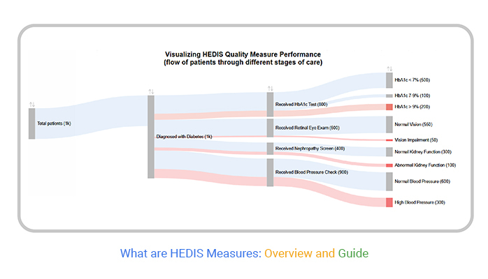
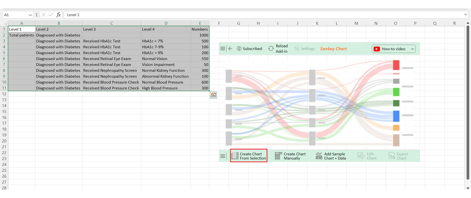
Let’s analyze the HEDIS data below using ChartExpo.

Level 1 Level 2 Level 3 Level 4 Numbers
Total patients Diagnosed with Diabetes 1000
Diagnosed with Diabetes Received HbA1c Test HbA1c < 7% 500
Diagnosed with Diabetes Received HbA1c Test HbA1c 7-9% 100
Diagnosed with Diabetes Received HbA1c Test HbA1c > 9% 200
Diagnosed with Diabetes Received Retinal Eye Exam Normal Vision 550
Diagnosed with Diabetes Received Retinal Eye Exam Vision Impairment 50
Diagnosed with Diabetes Received Nephropathy Screen Normal Kidney Function 300
Diagnosed with Diabetes Received Nephropathy Screen Abnormal Kidney Function 100
Diagnosed with Diabetes Received Blood Pressure Check Normal Blood Pressure 600
Diagnosed with Diabetes Received Blood Pressure Check High Blood Pressure 300
  • To get started with ChartExpo, install ChartExpo in Excel.
  • Now Click on My Apps from the INSERT menu.
insert chartexpo in excel
  • Choose ChartExpo from My Apps, then click Insert.
open chartexpo in excel
  • Once it loads, choose the “Sankey Chart” from the charts list.
search sankey chart in excel
  • Click the “Create Chart From Selection” button after selecting the data from the sheet.
Click Create Chart From Selection After Learning What are HEDIS Measures
  • ChartExpo will generate the visualization below for you.
Initial Visual After Learning What are HEDIS Measures
  • If you want to have the chart’s title, click Edit Chart, as shown in the above image.
  • Click the pencil icon next to the Chart Header to change the title.
  • It will open the properties dialog. Under the Text section, you can add a heading in Line 1 and enable Show.
  • Give the appropriate title of your chart and click the Apply button.
Add Chart Header on Chart After Learning What are HEDIS Measures
  • You can disable the “Show Node Outline” as follows:
Disable Show Node Outline After Learning What are HEDIS Measures
  • You can change the width to 15 as follows:
Change Width to 15 After Learning What are HEDIS Measures
  • You can disable the percentage values as follows:
Disable Percentage Values After Learning What are HEDIS Measures
  • You can disable the footer labels as follows:
Disable Footer Labels After Learning What are HEDIS Measures
  • Also, change the width of Nodes as follows, and after both changes, click on Apply:
Change Width of Nodes After Learning What are HEDIS Measures
  • Let’s give colors to the nodes. Click the pencil icon at the top of the nodes and go to “Node“. Select the color and click the “Apply” button to save all changes.
  • Click the “Save Changes” button to persist the changes.
Click Save Changes After Learning What are HEDIS Measures
  • Your final chart will appear below.
Final What are HEDIS Measures

Insights

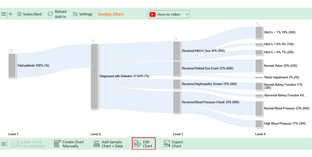
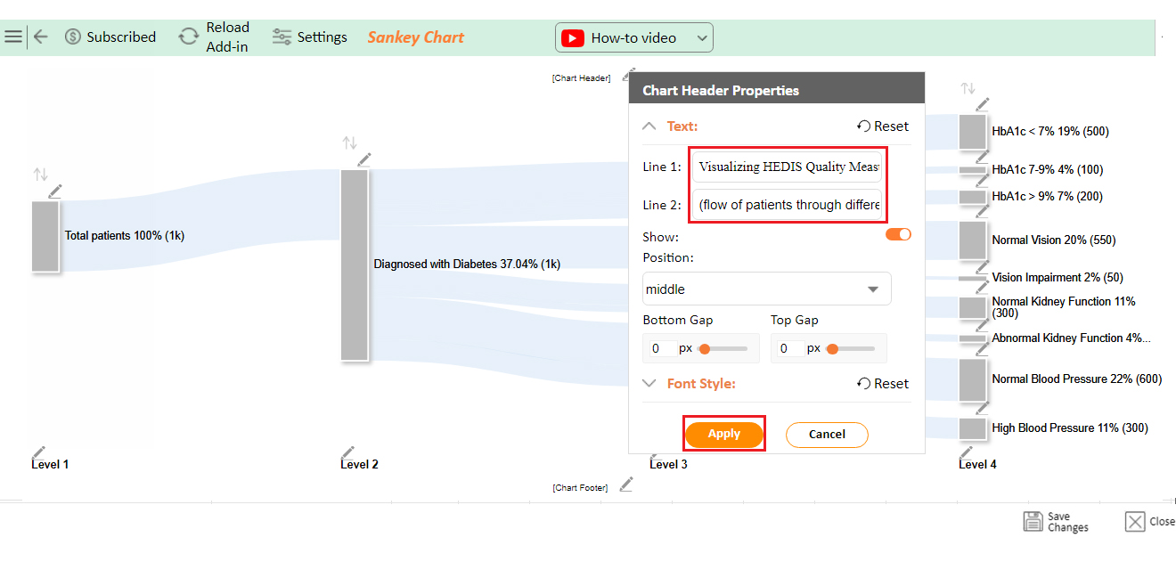
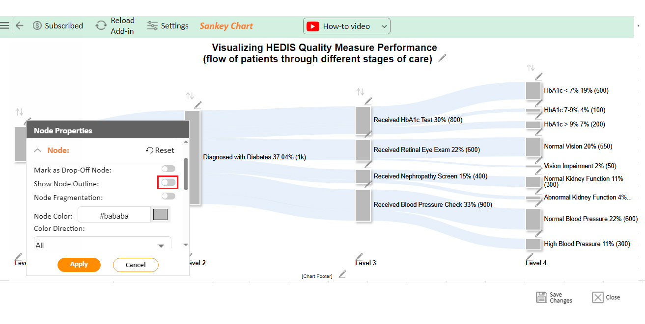
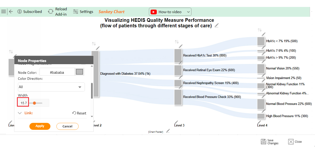
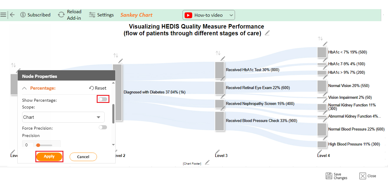
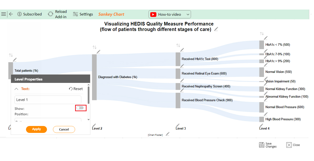
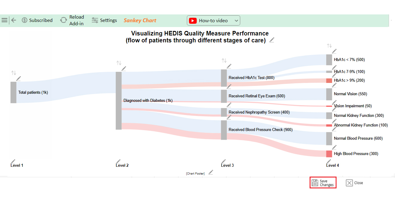
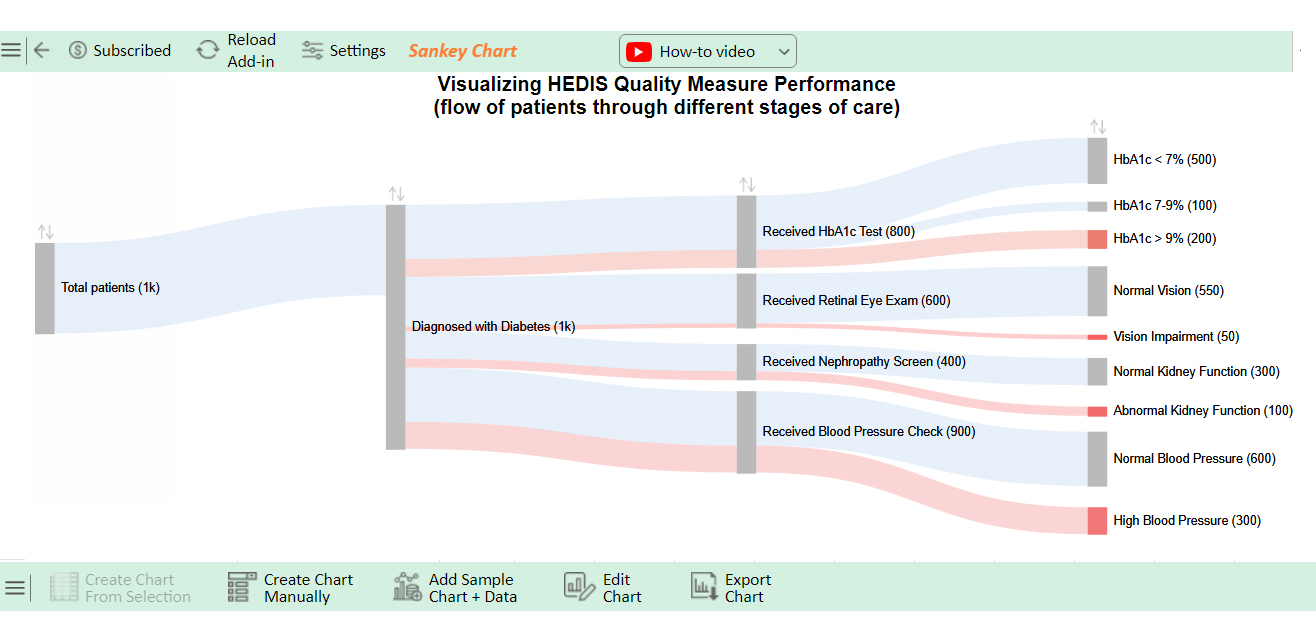
Out of 1,000 diabetes patients:

  • 800 received HbA1c tests
  • 500 were under control (<7%)
  • 100 were moderately controlled (7-9%)
  • 200 were poorly controlled (>9%)
  • 600 had normal blood pressure
  • 350 had vision or kidney issues

Regular screenings reveal varied management outcomes.

Optimize HEDIS Measures Insights through Graphs in Microsoft Excel:

  1. Open your Excel Application.
  2. Install ChartExpo Add-in for Excel from Microsoft AppSource to create interactive visualizations.
  3. Select the Sankey Chart from the list of charts.
  4. Select your data.
  5. Click on the “Create Chart from Selection” button.
  6. Customize your chart properties to add header, axis, legends, and other required information.

The following video will help you create a Sankey Chart in Microsoft Excel.

What are the Best Practices for HEDIS Reporting?

Reporting HEDIS data effectively is crucial for healthcare organizations striving to deliver top-notch care. But how do you ensure your reporting meets the mark? Here are some best practices to guide you:

  • Ensure data accuracy and integrity: Start with clean, reliable data by regularly validating and auditing your sources.
  • Comprehensive documentation: Keep thorough and consistent records that back up your data and reporting.
  • Timely and standardized data submission: Make sure your data is consistently submitted on time and collected using standardized methods.
  • Leverage technology: Use the latest technology to streamline data collection, analysis, and reporting. This boosts efficiency and accuracy.
  • Ongoing training and quality improvement: Regularly train your team and focus on continuous quality improvement to meet HEDIS standards ahead of time.
  • Prioritize compliance and security: Adhere to all regulatory requirements and maintain strict confidentiality and security for patient data.

What are the Advantages of HEDIS Measurements?

HEDIS measurements offer significant advantages for healthcare providers and patients. Here’s how they make a difference:

  • Standardization: HEDIS provides a uniform framework, allowing consistent evaluation of healthcare quality across different organizations.
  • Quality improvement: It drives continuous quality improvement by identifying areas where care can be enhanced.
  • Transparency and accountability: HEDIS fosters transparency. It holds providers accountable for the quality of care they deliver.
  • Informed decision-making: Patients and providers can make data-driven decisions based on reliable, standardized data.
  • Preventive care focus: HEDIS emphasizes preventive care, helping to catch and address health issues early.
  • Improved health outcomes: HEDIS focuses on quality and prevention, contributing to better overall patient health outcomes.

What are the Limitations of HEDIS Measures?

While HEDIS measures are valuable for assessing healthcare quality, they have limitations. Here’s what you need to know:

  • Resource-intensive: Implementing and maintaining HEDIS measures can be costly and time-consuming. They require significant resources for data collection, validation, and reporting.
  • Limited scope: HEDIS focuses on specific aspects of care. It may not capture the full spectrum of patient experiences or outcomes.
  • Data accuracy issues: Incomplete or inconsistent documentation can compromise the accuracy of HEDIS data, leading to potential misrepresentation of care quality.
  • Lag in reporting: There is often a delay between when care is provided and when it’s reported. This makes it challenging to address issues in real-time.
  • Potential for gaming: Some organizations might focus on meeting HEDIS metrics rather than truly improving care, which can lead to “gaming” the system.
  • Administrative burden: Collecting, validating, and reporting data adds to the administrative workload, diverting resources from direct patient care.

FAQs

What is the HEDIS star measure?

The HEDIS Star Measure evaluates the quality of healthcare services. It uses performance data to rate health plans. Scores range from 1 to 5 stars, with 5 indicating top performance. It helps consumers compare plan quality.

How many HEDIS measures are there for 2024?

There are 96 HEDIS measures for 2024. These cover various aspects of healthcare quality. They assess performance across different domains, such as preventive care and chronic disease management. The measures help evaluate and improve health plan quality.

How to increase HEDIS scores?

To increase HEDIS scores:

  • Improve patient engagement and follow-up care.
  • Implement regular screenings and preventive measures.
  • Use data analytics to identify gaps in care.
  • Train staff to enhance performance.
  • Monitor progress and adjust strategies as needed.

Wrap Up

HEDIS measures are essential tools in healthcare. They provide a standardized way to assess the quality of care from which health plans can identify areas for improvement.

These measures cover a broad range of aspects of care. From preventive services to chronic disease management, HEDIS ensures patients receive consistent care. This consistency helps to raise the overall quality of healthcare.

HEDIS measures also promote transparency. They allow patients and regulators to see how well health plans are performing. This visibility drives accountability, pushing providers to deliver better care.

One of the key benefits of HEDIS is its focus on preventive care. By encouraging early intervention, these measures help to reduce the long-term burden of chronic diseases. This not only benefits patients but also helps to lower healthcare costs.

However, HEDIS measures have limitations. They can be resource-intensive and may not capture every aspect of patient care. Despite these challenges, their role in improving healthcare quality is undeniable.

In conclusion, HEDIS measures are a powerful tool for enhancing healthcare. They set the standard for quality and push the industry toward better outcomes. While not perfect, they are crucial for driving continuous improvement in patient care.

How much did you enjoy this article?

PBIAd1
Start Free Trial!
139287

Related articles

next previous
Data Analytics10 min read

Supplier Comparison Template: Download It Now

A supplier comparison template streamlines vendor evaluation by comparing cost and quality. Click here to learn its benefits and how to analyze them.

Data Analytics32 min read

Ecommerce Analytics: How to Fix What It Often Gets Wrong

Ecommerce analytics often lead to mixed signals and costly misreads. Fix attribution gaps, align teams, and act on the right data. Get started now!

Data Analytics30 min read

When Sales Funnel Breaks: Failures, Fixes, & Funnel Debt

Is your sales funnel hiding costly gaps? Learn how pipeline stalls, false metrics, and handoff chaos could be draining revenue. Get started now!

Data Analytics9 min read

Procurement Key Performance Indicators for Quick Insights

Procurement Key Performance Indicators track costs, efficiency, and supplier reliability. Learn to use these KPIs effectively, their importance, and examples.

Data Analytics29 min read

Correlation Analysis: Don’t Worship Correlation, Question It.

Correlation analysis helps spot patterns, avoid costly mistakes, and guide decisions with data that matters. Want smarter strategy? Get started now!

ChartExpo logo

Turn Data into Visual
Stories

CHARTEXPO

  • Home
  • Gallery
  • Videos
  • Services
  • Pricing
  • Contact us
  • FAQs
  • Privacy policy
  • Terms of Service
  • Sitemap

TOOLS

  • ChartExpo for Google Sheets
  • ChartExpo for Microsoft Excel
  • Power BI Custom Visuals by ChartExpo
  • Word Cloud

CATEGORIES

  • Bar Charts
  • Circle Graphs
  • Column Charts
  • Combo Charts
  • Comparison Charts
  • Line Graphs
  • PPC Charts
  • Sentiment Analysis Charts
  • Survey Charts

TOP CHARTS

  • Sankey Diagram
  • Likert Scale Chart
  • Comparison Bar Chart
  • Pareto Chart
  • Funnel Chart
  • Gauge Chart
  • Radar Chart
  • Radial Bar Chart
  • Sunburst Chart
  • see more
  • Scatter Plot Chart
  • CSAT Survey Bar Chart
  • CSAT Survey Chart
  • Dot Plot Chart
  • Double Bar Graph
  • Matrix Chart
  • Multi Axis Line Chart
  • Overlapping Bar Chart
  • Control Chart
  • Slope Chart
  • Clustered Bar Chart
  • Clustered Column Chart
  • Box and Whisker Plot
  • Tornado Chart
  • Waterfall Chart
  • Word Cloud
  • see less

RESOURCES

  • Blog
  • Resources
  • YouTube
SIGN UP FOR UPDATES

We wouldn't dream of spamming you or selling your info.

© 2025 ChartExpo, all rights reserved.