• Home
  • Tools dropdown img
    • Spreadsheet Charts

      • ChartExpo for Google Sheets
      • ChartExpo for Microsoft Excel
    • Power BI Charts

      • Power BI Custom Visuals by ChartExpo
    • Word Cloud

  • Charts dropdown img
    • Chart Category

      • Bar Charts
      • Circle Graphs
      • Column Charts
      • Combo Charts
      • Comparison Charts
      • Line Graphs
      • PPC Charts
      • Sentiment Analysis Charts
      • Survey Charts
    • Chart Type

      • Box and Whisker Plot
      • Clustered Bar Chart
      • Clustered Column Chart
      • Comparison Bar Chart
      • Control Chart
      • CSAT Survey Bar Chart
      • CSAT Survey Chart
      • Dot Plot Chart
      • Double Bar Graph
      • Funnel Chart
      • Gauge Chart
      • Likert Scale Chart
      • Matrix Chart
      • Multi Axis Line Chart
      • Overlapping Bar Chart
      • Pareto Chart
      • Radar Chart
      • Radial Bar Chart
      • Sankey Diagram
      • Scatter Plot Chart
      • Slope Chart
      • Sunburst Chart
      • Tornado Chart
      • Waterfall Chart
      • Word Cloud
    • Google Sheets
      Microsoft Excel
  • Services
  • Pricing
  • Contact us
  • Blog
  • Support dropdown img
      • Gallery
      • Videos
      • Contact us
      • FAQs
      • Resources
    • Please feel free to contact us

      atsupport@chartexpo.com

Categories
All Data Visualizations Data Analytics Surveys
Add-ons/
  • Google Sheets
  • Microsoft Excel
  • Power BI
All Data Visualizations Data Analytics Surveys
Add-ons
  • Google Sheets
  • Microsoft Excel
  • Power BI

We use cookies

This website uses cookies to provide better user experience and user's session management.
By continuing visiting this website you consent the use of these cookies.

Ok

ChartExpo Survey


Home > Blog > Power BI

Vlookup in Power BI: Key Functions & Features Explained

The LOOKUP function is common in data representation. Just like Excel, the VLOOKUP function in Power BI is one of the extensively used LOOKUP functions. However, it is not built into Power BI. You’ll have to replicate the LOOKUP function using DAX for the VLOOKUP function in Power BI.

Vlookup in Power BI

In this guide, you’ll discover what Vlookup in Power BI is, why Power BI Vlookup is important, and when to use the Vlookup function in Power BI.

Table of Contents:

  1. What is VLOOKUP in Power BI?
  2. Why is Power BI VLOOKUP Important?
  3. When to Use the VLOOKUP Function in Power BI?
  4. How to Replicate VLOOKUP in Power BI?
  5. How to Visualize Data Using Power BI?
  6. What are the Best Practices for Using VLOOKUP in Power BI?
  7. Wrap Up

First…

What is VLOOKUP in Power BI?

In Power BI, VLOOKUP is not directly used in Excel. However, it would help if you used DAX (Data Analysis Expressions) functions like LOOKUPVALUE or RELATED to perform similar lookups.

  • LOOKUPVALUE: You’ll have to search for a value in a column and return the corresponding value from another column. It’s useful for relationships that are not set up.
  • RELATED: It retrieves a value from a related table based on a relationship defined in the data model.

Why is Power BI VLOOKUP Important?

  • Data Integration: It’s used for combining data from multiple tables or sources to create comprehensive reports.
  • Enhanced Analysis: Used for accessing related data points for comparisons and detailed insights.
  • Dynamic Relationships: It’s used for establishing and using relationships between tables to automatically pull in related data.
  • Efficiency: Used for performing lookups without manually merging data. It also saves time and reduces errors.

When to Use the VLOOKUP Function in Power BI?

Use lookup functions like LOOKUPVALUE and RELATED when you need to:

  • Combine Data: Integrate data from various tables based on common fields and relationships.
  • Retrieve Related Values: Fetch values from a related table to enrich the current dataset.
  • Create Calculated Columns: Add columns with data from other tables to enhance reporting and data analysis.
  • Perform Data Matching: Match and retrieve values from one dataset based on criteria in another dataset.

How to Replicate VLOOKUP in Power BI?

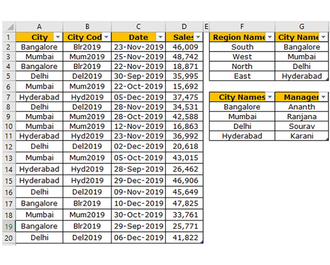
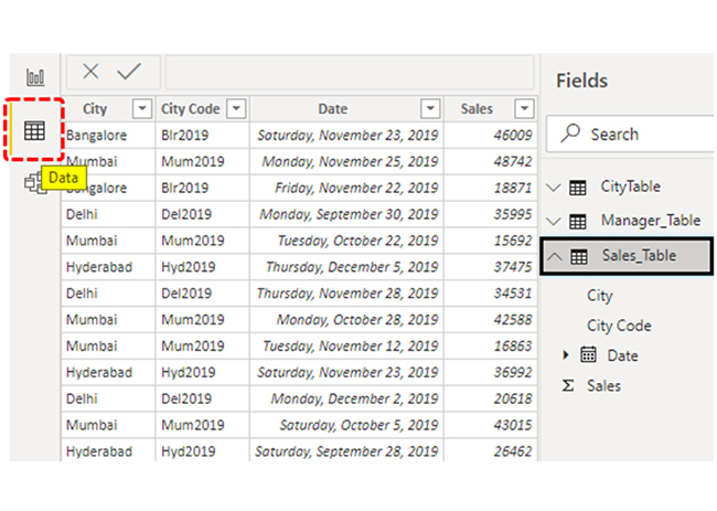
Let’s say you have three tables: “Sales,” “City,” and “Manager.”

You have Three Tables for Doing Vlookup in Power BI

Copy the data to an Excel file and import it to Power BI as an Excel file reference. You should also download the Excel workbook from the link below, and that’s what is being used in this illustration.

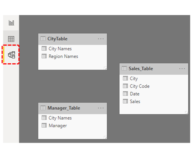
Upload the tables to Power BI.

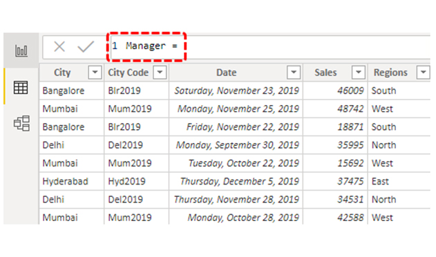
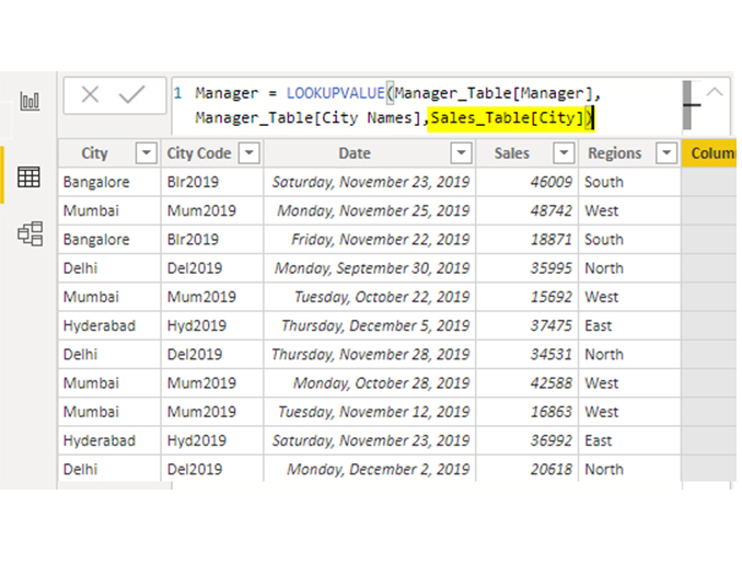
A close look at the “Sales_Table” shows that there are no “Region Names” and “Manger” names. You can fetch the data from the other two tables. There is “City” as the common column or value among these tables.

Common Column is City for Doing Vlookup in Power BI

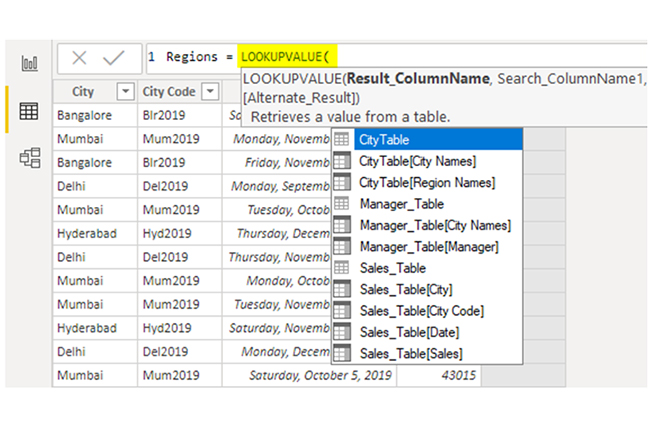
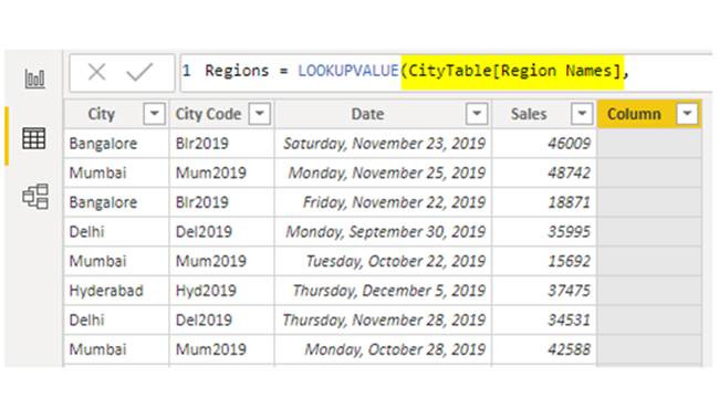
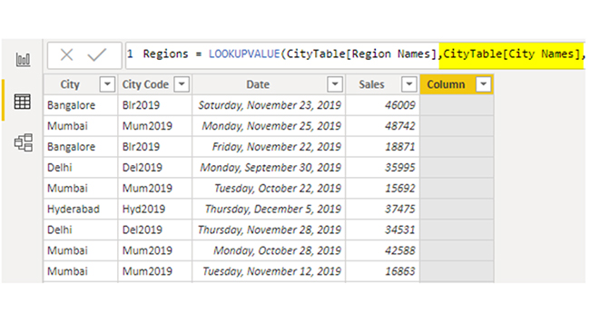
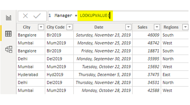
With the LOOKUPVALUE DAX function, you can fetch the data from other tables to the “Sales Table.” Here’s the syntax of the LOOKUPVALUE DAX function.

LOOKUPVALUE DAX function for Doing Vlookup in Power BI
  • Result_ColumnName: You have to specify the column the result comes from. For instance, if you’re fetching the “Region” name from “City Table,” the result column will be “Region Names” from “City Table.”
  • Search_ColumnName: It’s based on the column you’re searching the Result Column in the other table. For instance, in “City Table,” “City” is the base column.
  • Search_Value: In the result required table (Sales_Table), it’s based on the column you’re searching for the result. In “Sales_Table,” “City” is the search base value.

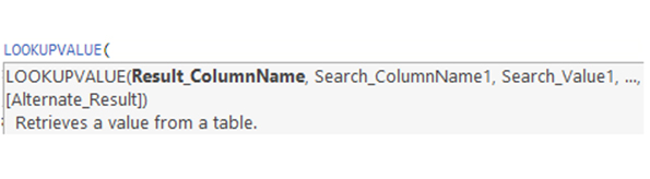
Pro Tip: Search_Column Name and Search Value should be the same in both tables.

For instance, in the above tables:

  • Navigate to the “Data” tab and choose “Sales_Table.”
Navigate to Data Tab and Choose Sales_Tables for Doing Vlookup in Power BI
  • Right-click on the “Sales_Table” and choose “New column.”
Choose New Column for Doing Vlookup in Power BI
  • You’ll have to name the column. You can name it “Regions.”
Name It As Regions for Doing Vlookup in Power BI
  • Open the LOOKUPVALUE function.
Open LOOKUPVALUE function for Doing Vlookup in Power BI
  • The first argument of the DAX function is “Result_Column Name.” From “City Table,” choose the “Region Names” column.
Choose Region Names Column for Doing Vlookup in Power BI
  • The next argument is “Search Column Name.” From “City Table” based on “City Names,” you’ll have to fetch the data. Therefore, choose the “City Names” column from the “City Table.”
Choose City Names Column from City Table for Doing Vlookup in Power BI
  • The next argument is Search Value. From the current table, the “Sales_Table” base value is the “City Names” column. Choose the column.
Choose the Column for Doing Vlookup in Power BI

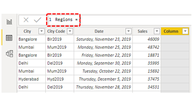
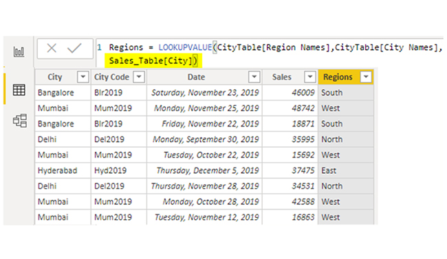
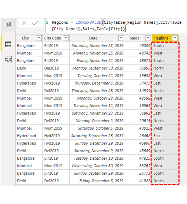
Close the bracket and press the “Enter” key. You’ll get a new “Sales Table” column as “Regions.”

Get New Sales Table Column as Resions for Doing Vlookup in Power BI

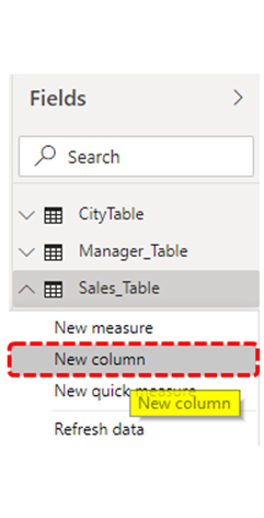
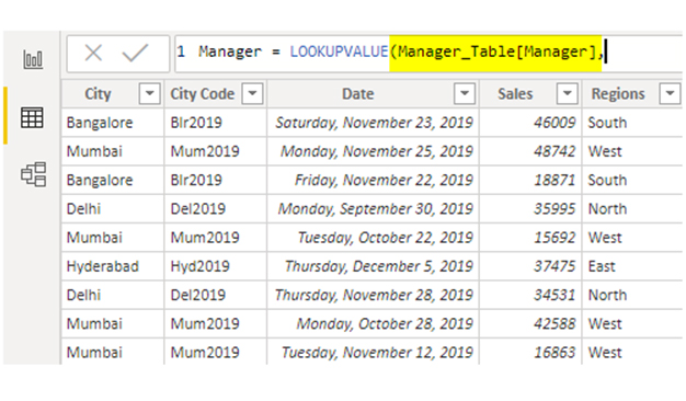
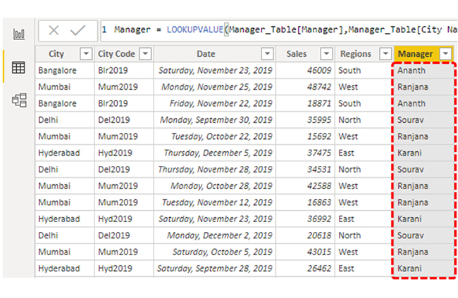
You’ll have to fetch the “Manager Names” from the “Manager Table.” Right-click on the “Sales_Tabel” and choose “New Column.” You’ll have to name the column, name it “Manager.”

Name It Manager for Doing Vlookup in Power BI

Open the LOOKUPVALUE function again.

Open LOOKUPVALUE Function for Doing Vlookup in Power BI

You’ll need results from “Manager_Table.” The Result_Column Name will be “Manager” from “Manager_Table.”

Name Will be Manager From Manager_Table for Doing Vlookup in Power BI

You’ll have to select the “Search_Column” name. From “Manager_Table” based on “City” you’ll be fetching the data. Choose the “City” column from “Manager_Table.”

Choose the City Column from Manager_Table for Doing Vlookup in Power BI

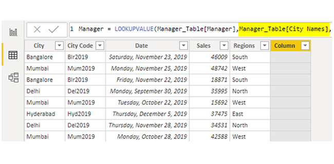
Search Value will also be “City” name but from “Sales_Table.”

Search Value will City Name But From Sales_Table for Doing Vlookup in Power BI

Close the bracket and press the “Enter” key to get the “Manager” names as the new column.

Press Enter Get Manager Names as New Column for Doing Vlookup in Power BI

That’s how to use the LOOKUPVALUE DAX function in Power BI to replicate VLOOKUP in Power BI.
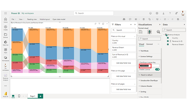
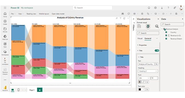
How to Visualize Data Using Power BI?

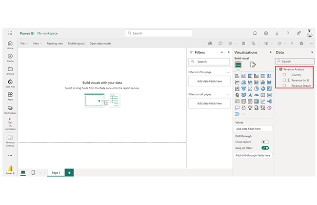
Stage 1: Logging in to Power BI

  • Log in to Power BI.
  • Enter your email address and click the “Submit” button.
Enter email to login to Power BI
  • You are redirected to your Microsoft account.
  • Enter your password and click “Sign in“.
Enter Password to login to Power BI
  • You can choose whether to stay signed in.
Click on stay signed in
  • Once done, the Power BI home screen will open.

Stage 2: Creating a Data Set and Selecting the Data Set to Use in Your Chart

  • Go to the left-side menu and click the “Create” button.
  • Select “Paste or manually enter data“.
select Paste or manually enter data in Power BI ce487
  • We’ll use the sample data below for this example.
Country Revenue Stream Revenue (in $)
USA Digital Advertising Revenue 39,620,000
USA Event Marketing Revenue 10,670,000
USA Content Marketing Revenue 5,580,000
USA Print & Outdoor Revenue 455,270
UK Digital Advertising Revenue 40,710,000
UK Event Marketing Revenue 24,770,000
UK Content Marketing Revenue 6,330,000
UK Print & Outdoor Revenue 552,190
DNK Digital Advertising Revenue 47,040,000
DNK Event Marketing Revenue 29,070,000
DNK Content Marketing Revenue 7,740,000
DNK Print & Outdoor Revenue 600,690
DNK Media Relations Revenue 106,430
AUS Digital Advertising Revenue 53,790,000
AUS Event Marketing Revenue 38,530,000
AUS Content Marketing Revenue 6,590,000
AUS Print & Outdoor Revenue 9,040,000
AUS Media Relations Revenue 6,130,000
FR Digital Advertising Revenue 57,860,000
FR Event Marketing Revenue 50,450,000
FR Content Marketing Revenue 3,560,000
FR Print & Outdoor Revenue 18,790,000
FR Media Relations Revenue 15,460,000
IND Digital Advertising Revenue 60,470,000
IND Event Marketing Revenue 63,200,000
IND Content Marketing Revenue 2,080,000
IND Print & Outdoor Revenue 29,500,000
IND Media Relations Revenue 30,020,000
  • Paste the data above into the “Power Query” window. After that, select the “Create a dataset only” option.
Select Create a Data Only for Doing Vlookup in Power BI
  • Navigate to the left-side menu, and click on the “Data Hub” option. Power BI will populate the data set list. You will get an error message if no data set has been created. Next, click “Create report.”
Click Create Report for Doing Vlookup in Power BI
  • Click on “Expand All” to see the chart metrics. Check the dimensions and metrics.
Click on Expand All for Doing Vlookup in Power BI
  • Click on “Get more visuals.” Search for ChartExpo and select the Comparison Bar Chart.
Click Get More Visuals for Doing Vlookup in Power BI
  • Click on “Add.”
Click Add Button for Doing Vlookup in Power BI
  • You’ll see the Comparison Bar Chart in the visuals list.
See Comparison Bar Chart in Visuals List for Doing Vlookup in Power BI
  • In Visual, click on License Settings and add the key. After adding the key, you’ll see the comparison bar chart.
Click on License Settings and Add Key for Doing Vlookup in Power BI
  • Here’s the Comparison Bar Chart final look in Power BI.
Final Vlookup in Power BI

Insights

  • India has the highest total revenue, and they’re closely followed by France, Australia, and Denmark.
  • “Digital Advertising” tends to be a significant revenue contributor in most countries. However, “Event Marketing” is the leading revenue contributor in India.
  • The “Media Relations” revenue stream is absent in the UK and the US.
  • France has a lower contribution from content marketing compared to other revenue streams, while India has the lowest revenue from content marketing despite its overall high revenue.

Simplify Data Updates in Charts with Power BI Refresh Techniques:

  1. Open your Power BI Desktop or Web.
  2. From the Power BI Visualizations pane, expand three dots at the bottom and select “Get more visuals”.
  3. Search for “Comparison Bar Chart by ChartExpo” on the AppSource.
  4. Add the custom visual.
  5. Select your data and configure the chart settings to create the chart.
  6. Customize your chart properties to add header, axis, legends, and other required information.
  7. Share the chart with your audience.

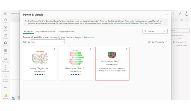
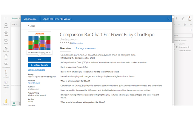
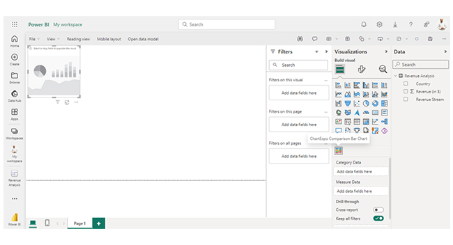
The following video will help you create a Comparison Bar Chart in Microsoft Power BI.

What are the Best Practices for Using VLOOKUP in Power BI?

Here are the best practices for using lookup functions in Power BI:

  • Define Relationships: Use the data model to establish relationships between tables whenever possible. It allows the RELATED function to efficiently fetch related data.
  • Optimize Performance: Limit using complex or nested lookups in large datasets to avoid performance issues. You have to ascertain that lookup columns are indexed for faster retrieval.
  • Use LOOKUPVALUE Wisely: Apply LOOKUPVALUE for lookups when relationships are not defined or when you need to perform more complex queries. You should properly handle cases where lookup values may not be found.
  • Validate Results: Always verify lookup results to ensure they align with expected outcomes. This will help you identify and correct any data integrity issues.
  • Handle Missing Data: Implement error handling for cases where lookup values are not found. Use IFERROR or similar functions to adequately manage missing data.
  • Keep It Simple: Use lookups when necessary and keep formulas straightforward to maintain readability and ease of maintenance.

FAQs

Can you use VLOOKUP in Power BI?

VLOOKUP is not directly used in Power BI. You can use DAX functions like LOOKUPVALUE or RELATED to achieve similar results like looking up and integrating data between tables.

Is VLOOKUP a DAX function?

No, VLOOKUP is not a DAX function. In Power BI, similar functionality is achieved using DAX functions like LOOKUPVALUE and RELATED for data integration and lookups.

Which is the replacement of the VLOOKUP function in Power BI?

In Power BI, RELATED and LOOKUPVALUE are used as replacements for VLOOKUP. LOOKUPVALUE retrieves values based on criteria, while RELATED fetches values from related tables.

Wrap Up

VLOOKUP in Power BI is replaced by RELATED and LOOKUPVALUE. These functions are used for integrating data, enriching reports, and performing advanced analysis. They can also be used to effectively link tables.

To get the best out of VLOOKUP in Power BI, you’ll have to keep things simple. Use lookups when necessary, and always keep the formulas straightforward. All these help maintain readability and ease of maintenance.

You should also verify the lookup results. This will help you ascertain that the results align with the expected outcomes. All these come in handy when identifying and correcting any data integrity issues.

Always define relationships. And that can be done by using data models to establish relationships between tables. This way, it becomes easy for the RELATED function to efficiently fetch related data.

By following the steps in this guide, users will become proficient in using Power BI to create interactive and engaging visualizations.

How much did you enjoy this article?

PBIAd2
Start Free Trial!
141762

Related articles

next previous
Power BI12 min read

How to Create Sankey Diagram in Microsoft Power BI?

Learn How to Create Sankey Diagram in Microsoft Power BI using Desktop & Web Service. What they are and how to use them effectively.

Power BI8 min read

Power BI Artificial Intelligence: Insights Using Visuals

Discover all there is to know about the Power BI artificial intelligence. You'll also discover how AI is used in Power BI, and how to use it for analysis and more.

Power BI9 min read

Budgeting in Healthcare: Use Visuals to Spot Budget Gaps

This guide helps you discover what budgeting in healthcare is. You'll also discover the factors that affect hospital budgets and types of budgeting in healthcare.

Power BI9 min read

Predictive Analytics in Power BI for Making Insightful Visuals

This guide shows you everything you need to know about Predictive Analytics in Power BI. It also shows you how it works, and how to interpret the results.

Power BI8 min read

Quarterly Business Review Template for Optimum Reports

Discover what the quarterly business review template is. This guide also shows you the best practices to consider when using the QBR template.

ChartExpo logo

Turn Data into Visual
Stories

CHARTEXPO

  • Home
  • Gallery
  • Videos
  • Services
  • Pricing
  • Contact us
  • FAQs
  • Privacy policy
  • Terms of Service
  • Sitemap

TOOLS

  • ChartExpo for Google Sheets
  • ChartExpo for Microsoft Excel
  • Power BI Custom Visuals by ChartExpo
  • Word Cloud

CATEGORIES

  • Bar Charts
  • Circle Graphs
  • Column Charts
  • Combo Charts
  • Comparison Charts
  • Line Graphs
  • PPC Charts
  • Sentiment Analysis Charts
  • Survey Charts

TOP CHARTS

  • Sankey Diagram
  • Likert Scale Chart
  • Comparison Bar Chart
  • Pareto Chart
  • Funnel Chart
  • Gauge Chart
  • Radar Chart
  • Radial Bar Chart
  • Sunburst Chart
  • see more
  • Scatter Plot Chart
  • CSAT Survey Bar Chart
  • CSAT Survey Chart
  • Dot Plot Chart
  • Double Bar Graph
  • Matrix Chart
  • Multi Axis Line Chart
  • Overlapping Bar Chart
  • Control Chart
  • Slope Chart
  • Clustered Bar Chart
  • Clustered Column Chart
  • Box and Whisker Plot
  • Tornado Chart
  • Waterfall Chart
  • Word Cloud
  • see less

RESOURCES

  • Blog
  • Resources
  • YouTube
SIGN UP FOR UPDATES

We wouldn't dream of spamming you or selling your info.

© 2025 ChartExpo, all rights reserved.