Data runs the world, but messy spreadsheets slow it down. Analyzing numbers is one thing, but making them speak through visuals is another. Excel is excellent for crunching data, yet its Excel charts often feel plain and limited.
Categories
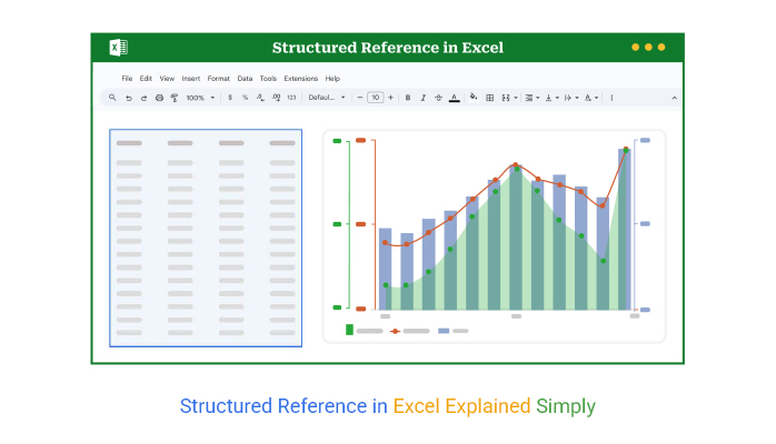
Structured reference in Excel—Why does it matter so much? The truth is, Excel isn’t standing still. Over 750 million people use it, and every update makes it smarter and more dynamic for analysis.


Think about the way data is handled today. Businesses no longer rely on static sheets. They need agility. Structured reference in Excel transforms tables into living data sources that respond instantly to change. Imagine running sales reports where your formulas automatically expand as new entries appear. No more manual fixes. No wasted minutes.
This shift connects directly with other advances in Excel. From building dashboard templates in Excel that track performance in real time, the game has changed. Applying custom sorting in Excel now brings hidden trends to light. Professionals across finance, research, and operations are seeing measurable gains.
Structured reference in Excel is more than a technical tweak. It’s a mindset. It encourages smarter data habits, clearer structures, and faster analysis. As Excel keeps pushing forward, the choice is simple: adapt or fall behind.
The good news is that this shift isn’t about complexity. It’s about clarity. And clarity leads to better decisions, stronger insights, and undeniable results.
Let’s dig deeper.
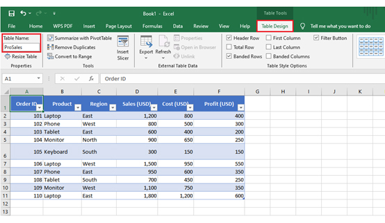
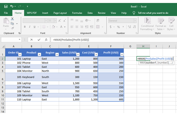
Definition: A structured reference in Excel is a way to call data in a table using names instead of cell addresses. It makes formulas easier to read. You do not need to remember column letters. The table name and headers guide the formula. This improves accuracy, as it updates automatically when new rows or columns are added.
Analysts prefer this method because it maintains consistency in reports. It can work smoothly with tools such as frequency tables in Excel to analyze data patterns. Learning this approach saves time, creates clarity, and makes large datasets far easier to manage.
Have you ever opened a massive Excel file and felt lost in endless rows and columns? That feeling disappears when you use structured reference in Excel. It makes your work easier, your formulas clearer, and your time better spent.
Let’s break down why it matters:
I know you’ve wished Excel formulas could speak in plain language. That is what structured reference in Excel delivers. It turns your formulas into readable instructions and makes managing data far more intuitive.
How?
Do Excel tables ever feel more intelligent than standard ranges? That is because structured reference in Excel gives you different ways to call your data. Each type of reference tells Excel exactly what you want. Once you understand these options, building reports and analysis becomes simple:
Structured reference in Excel makes Excel formulas clear and simple. They work well with artificial intelligence in Excel and chart formatting.
Let’s explore a few practical examples:
Have you ever struggled to understand long cell references in Excel formulas? Structured reference in Excel makes things easier by using meaningful table and column names instead of codes. Your formulas become cleaner, faster to write, and easier for anyone to follow.
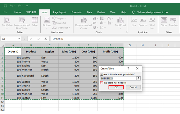
Here is how to create one in five simple steps:
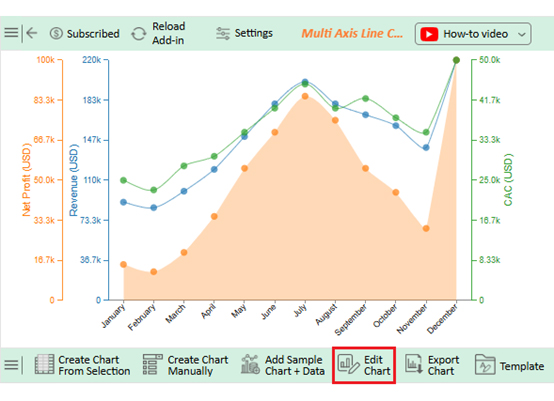
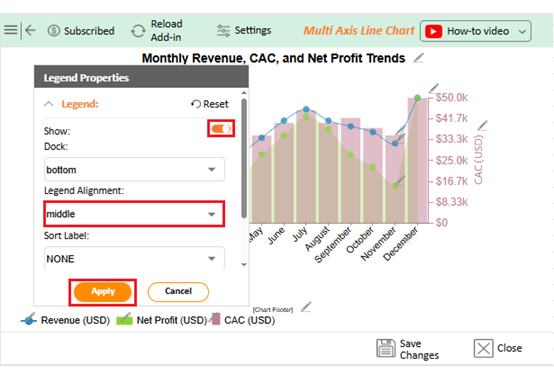
Data storytelling depends on strong visuals. And this is where ChartExpo steps up. It brings fresh, powerful visualizations that turn raw data into insights you can actually act on.
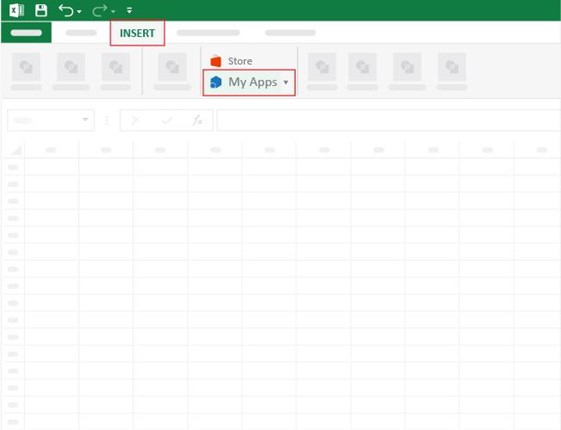
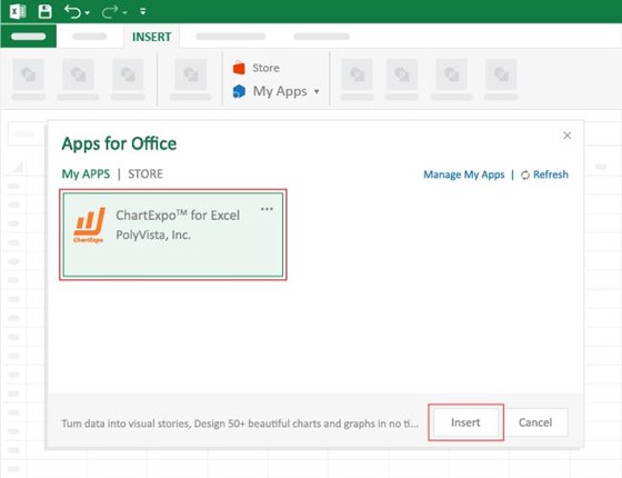
How to Install ChartExpo in Excel?
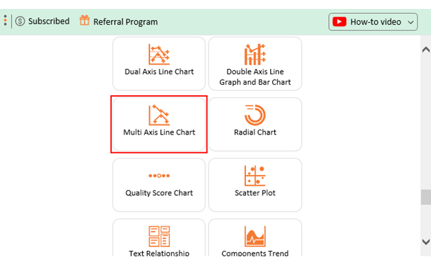
ChartExpo charts are available both in Google Sheets and Microsoft Excel. Please use the following CTAs to install the tool of your choice and create beautiful visualizations, including a Scatter plot, with a few clicks in your favorite tool.
|
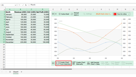
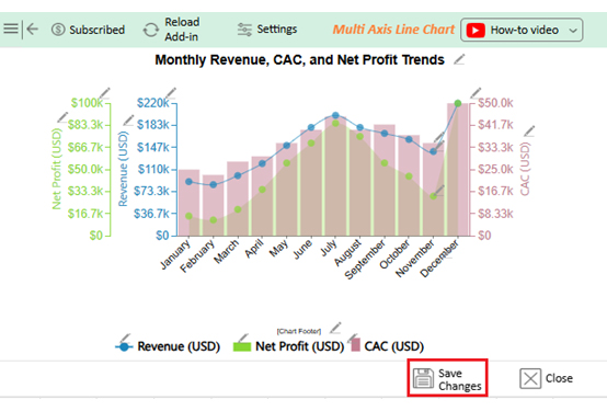
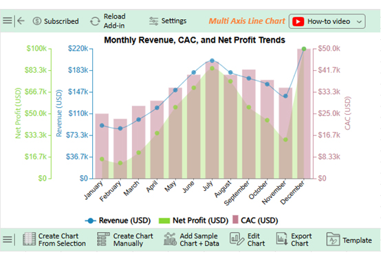
Month |
Revenue (USD) | CAC (USD) |
Net Profit (USD) |
| January | 90,000 | 25,000 | 15,000 |
| February | 85,000 | 23,000 | 12,000 |
| March | 100,000 | 28,000 | 20,000 |
| April | 120,000 | 30,000 | 35,000 |
| May | 150,000 | 35,000 | 55,000 |
| June | 180,000 | 40,000 | 70,000 |
| July | 200,000 | 45,000 | 85,000 |
| August | 180,000 | 40,000 | 75,000 |
| September | 170,000 | 42,000 | 55,000 |
| October | 160,000 | 38,000 | 45,000 |
| November | 140,000 | 35,000 | 30,000 |
| December | 220,000 | 50,000 | 100,000 |
Fixing formulas every time data changes feels frustrating. That problem disappears with structured reference in Excel. It keeps your work dynamic, clean, and easy to read. Here are the key benefits:
Using structured references the right way turns good spreadsheets into great ones. The goal is clarity, efficiency, and flexibility. Follow these practices to get the most out of them:
A structured reference condition uses table names and column headers instead of cell addresses. It makes formulas easier to read. The references adjust automatically to improve clarity. They are dynamic and adapt to new data.
Brackets [ ] represent structured references in Excel tables. They hold table names, column headers, or row indicators. They replace traditional cell addresses. This symbol improves readability, ensuring formulas adapt. It helps Excel identify the right data.
Mastering structured reference in Excel is about more than learning a new formula style. It is about creating clarity in every calculation. With structured references, your data becomes easier to manage, and your reports stay accurate as they grow.
Structured references replace confusing cell codes with names that make sense. This saves time and reduces errors. It also creates formulas that anyone on your team can read and understand without explanation.
Dynamic data analysis depends on smart structures. Whether you are calculating compound interest in Excel or managing monthly sales, structured references adapt as new data enters the table. This flexibility turns static sheets into living reports.
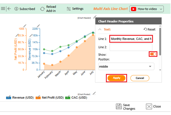
Data visualization is another essential piece of analysis. Excel is powerful, but chart formatting in Excel can feel limited and repetitive. To truly bring numbers to life, you need a solution that goes further than standard Excel charts.
This is where artificial intelligence in Excel and tools like ChartExpo can transform your workflow. ChartExpo offers advanced visualizations that Excel does not provide. It helps you tell the story behind your numbers with clarity and impact.
Do you want to make better decisions? Start with structure and finish with visuals. Use structured references to keep your formulas clean and reliable. And finally, install ChartExpo to create the kind of charts that drive action. Let your analysis speak with confidence.
How much did you enjoy this article?


Learn how to create a Control chart in Excel to track process stability, detect unusual variation early, and improve data-driven decision-making.
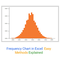
Learn how to create and use frequency charts in Excel to simplify data analysis, visualize distributions, and make better business decisions with clear insights.

Learn what box plot outliers in Excel are, how to detect them using the IQR method, and how to interpret them with real-world examples and Excel use cases.