Categories
By ChartExpo Content Team
Imagine two points in time, two snapshots of your business captured in numbers. Now, imagine drawing a line between these points for various subjects, like cities, companies, or products. That’s your Slope Chart, a minimalist yet potent visualization tool that showcases how things have changed over a specified period.
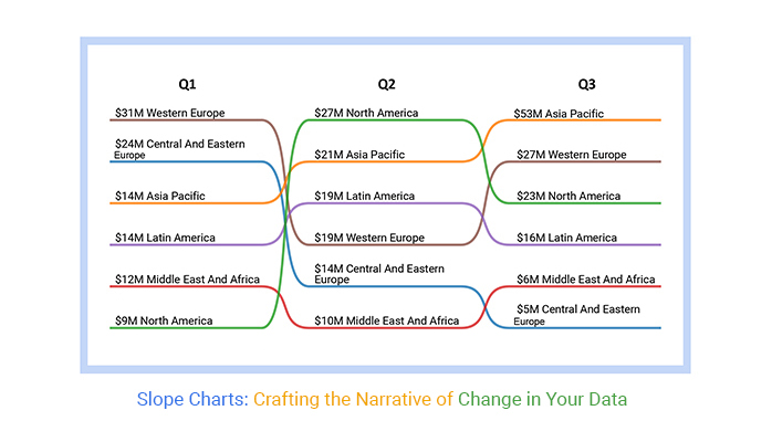
Unlike the clutter of pie charts or the dizzying arrays of bar graphs, Slope Charts offer clarity. They’re about change, movement, and trends. In a world that never stops evolving, they’re not just useful; they’re essential.
Edward Tufte popularized the Slope Chart, also called the Slopegraph, in his 1983 classic, “The Visual Display of Quantitative Information.” Slope Chart was his answer to the clutter and chaos of traditional charts, offering a cleaner, more insightful way to narrate the story of data over time.
In this blog you will learn:
Ever wondered how superheroes compare their strengths from one movie to another? Imagine if Iron Man wanted to check his improvement in suit technology from one epic battle to the next.
Enter the Slope Chart! It’s not just a graph; it’s the superhero of the data visualization world. A Slope Chart connects the dots (quite literally) between two moments, giving us a visual storyline of change, progress, or the occasional hiccup.
It’s like watching a race where the starting and finishing points are years apart, and each runner is a piece of data.
Definition: A Slope Chart is a type of data visualization that is used to display changes in values between two points in time or between two conditions. It is particularly effective for illustrating trends, comparisons, and growth or decline across categories or groups over a specific period.
The simplicity of a Slope Chart lies in its minimalist design, which focuses on connecting two points with lines, making it easy to track the direction and steepness of changes across different entities or variables.
Here are the key components of a Slope Chart:
Think of the horizontal axis as your starting line and finish line. It’s where you mark the points you’re comparing could be years, could be chocolate versus vanilla ice cream preferences. It’s your chart’s way of saying, “Here’s where we start, and here’s where we end up.”
This axis is all about quantity. It tells you how much of something you have at each point. It’s like measuring how high you can jump on a trampoline at the start and end of summer. Spoiler: You’re probably jumping higher by the end because practice makes perfect!
Data points are your key players. They’re the exact spots on your chart where the data says, “Look at me! This is how things stood at this point in time.” They’re like checkpoints in a video game, marking your progress.
Here’s where the action happens. The lines connect your data points, showing you the journey from A to B. If the line slopes up, things are looking up. If it slopes down, well, it’s time to investigate why. It’s like connecting the dots but with more pizzazz.
This is about making your chart not just informative but also a feast for the eyes. Color coding, line styles, and thickness play into how easily your audience can read and enjoy your chart. It’s like choosing the perfect outfit for a first date; first impressions matter.
Without a title and labels, your chart is like a map without legends or street names. The title tells your audience what the adventure is about, and the labels are there to make sure no one gets lost along the way.
When your slope graph is a bit more complex, a legend acts as your trusty decoder ring, helping to distinguish between different datasets or categories. It’s like having subtitles in a foreign film suddenly, everything makes sense.
Each of the following Slope Charts, from shaded to small multiple, offers a unique lens to view your data’s story. They’re not just charts; they’re narrators, each with its own style of storytelling.
Imagine a Slope Chart. Now, throw in some shade literally. A shaded Slope Chart isn’t about keeping secrets; it’s about highlighting the gap between two lines, making it a cinch to see not just the journey but the terrain between start and finish.
Perfect for when you’re tracking changes over time and want that extra bit of context without squinting. Think of it as your data, but with a bit more drama.
Not all journeys are smooth. Some are a series of steps, and that’s where the stepped Slope Chart shines. Each change in your data becomes a step, making it clear when and how things shifted.
It’s like watching your data climb a staircase, each step a clear move towards its goal. Ideal for those moments when you want to pinpoint changes precisely each step tells a part of the story.
Curves are all about smooth transitions, and a curved Slope Chart takes your data on a gentle ride from point A to B. No sharp edges, just a sleek curve that eases you into understanding the trend.
It’s the visual equivalent of a calm sea voyage for your data points. When you’re looking to soften the impact of sudden changes, let the curves do the talking.
Imagine a cake, but for data. A stacked Slope Chart layers different datasets on top of each other, creating a rich, multi-flavored visual treat. You see not just one journey, but several, all interlinked and stacked.
It’s a crowd-pleaser when your data has more layers than an onion, each slice revealing more about the story you’re telling.
Ever wanted your data to sing in harmony? Enter the small multiple Slope Chart. It’s like having a choir where each voice is a different dataset, all following the same melody but at their own pace.
This chart type lets you compare multiple datasets in the same format, side by side, making it easier to spot trends, outliers, or that one data line marching to the beat of its own drum.
Many-to-many Slope Charts illustrate the relationship and changes between multiple pairs of variables. Unlike traditional Slope Charts that typically depict the connection between two variables, many-to-many Slope Charts can effectively visualize complex interactions between multiple sets of data points. They provide a clear and concise way to analyze trends, patterns, and correlations across various dimensions simultaneously.
Here’s the deal with Slope charts: they cut through the noise. You’re not left squinting at bars or pie slices, trying to figure out what’s what. Instead, you see the journey from start to finish in a clean, uncomplicated line. And when you want to explore individual data points in more detail, a Scatter chart complements that view by adding extra clarity without the mess.
Ever tried spotting a needle in a haystack? That’s what looking for changes in a complex chart can feel like. Slope Charts make it easy. A steep line? Someone’s on the move. A flat line? They’re cruising. No need to play detective; the story’s right there.
It’s not just about who shot up or slid down. Slope Charts let you see the lineup at a glance. Who’s leading the race and who’s lagging behind becomes as clear as day. It’s like having a leaderboard that tells you not just the positions but how and why they changed.
Imagine trying to describe a race using just numbers. Now, picture a single line showing that same race’s ups and downs. That’s the power of a Slope Chart. It transforms columns of numbers into a visual story, making your data not just understandable, but memorable.
In the world of data, spotting a trend is like finding gold. Slope Charts are your trusty metal detector. They shine a spotlight on the big shifts and subtle trends alike, making it easy to spot where things are heading. Whether you’re tracking sales, scores, or satisfaction, you’ll see the trends at a glance.
Slope Charts are the epitome of minimalist design, yielding maximum insight. In a landscape cluttered with overly complex graphs that scream for attention, Slope Charts stand out for their calm clarity.
They’re like that understated piece of art that captures the essence with just a few strokes simple, yet profoundly impactful. This minimalist approach ensures that the message isn’t lost in the noise, making it a preferred tool for those who value substance over flash.
Behind every dataset lies a story waiting to be told, and Slope Charts are the storytellers that bring these narratives to life. They transform abstract numbers into visual tales of growth, decline, or stagnation.
By drawing the eye along the journey from Point A to Point B, Slope Charts create a narrative arc that resonates with the viewer, making the data not just seen, but felt. In the hands of a skilled communicator, a Slope Chart is not just a tool for analysis it’s a canvas for storytelling.
One of the most compelling aspects of Slope Charts is their accessibility. They democratize data, making insights available to all, regardless of their statistical prowess. This universal understandability breaks down the barriers between the data wizards and the lay audience, fostering a shared space for dialogue and decision-making.
Whether you’re presenting to the board, your team, or your social media followers, Slope Charts ensure your message is accessible, engaging, and, most importantly, understood by everyone.
Slopegraphs serve as a dynamic tool to illustrate change, highlight progressions, or underscore shifts between two significant points in time. Their linear and straightforward design allows for an immediate grasp of upward or downward trends, making them particularly suited for various analytical scenarios. Here’s an expanded look into situations where Slope Charts prove exceptionally useful:
Ideal for businesses and financial analysts, Slopegraphs can depict annual revenue or expense changes across different departments or sectors, offering a clear view of financial health and operational effectiveness over time.
In educational settings, comparing standardized test scores or graduation rates from one year to the next for various schools or districts can spotlight trends in educational outcomes, informing policy and intervention strategies.
For environmental scientists tracking changes in temperature, pollution levels, or wildlife populations, Slopegraphs can visually narrate the story of environmental shifts, making it easier to communicate findings to both scientific and general audiences.
Public health officials analyzing the incidence rates of diseases before and after public health campaigns or interventions can employ Slopegraphs to effectively communicate the impact of their efforts on public health outcomes.
Companies tracking the adoption rate of new technologies or software versions among their user base can use Slopegraphs to highlight successful uptakes or areas where additional marketing efforts may be needed.
Additionally, integrating metrics such as the customer effort score can provide deeper insights into how easily users are adopting these new tools. This approach not only showcases adoption trends but also helps identify where the customer experience can be streamlined for better engagement.
HR departments interested in monitoring employee satisfaction or engagement levels through periodic surveys can utilize Slopegraphs to demonstrate areas of improvement or decline, aiding in the development of targeted employee retention strategies.
For retail and e-commerce, comparing sales data during peak shopping seasons (like Black Friday or holiday periods) across consecutive years can help businesses understand consumer behavior trends, informing stock and marketing decisions.
Digital marketers analyzing campaign performance metrics (engagement rates, click-through rates, etc.) before and after specific campaigns can use Slopegraphs to assess the effectiveness of their strategies and adjust accordingly.
Researchers studying changes in social attitudes or behaviors in response to major events or over time can leverage Slopegraphs to present their findings in a manner that’s both accessible and compelling to a broad audience.
Sports Analytics allows analysts to compare team or individual athlete performance metrics (points per game, assists, rebounds, etc.) across seasons, illustrating improvements, declines, or consistencies in performance. This provides fans and stakeholders with clear insights.
Let’s break down those moments when you might want to bench your Slopegraph in favor of something else from your data visualization toolkit.
If you’re only tracking the journey of, say, two or three data points, a Slopegraph might feel like using a sledgehammer to crack a nut. It’s like turning on a big, bright spotlight to highlight a speck of dust. In these cases, simpler visuals or a good table could convey your point more effectively without the overkill.
When your data points are more unpredictable than a plot twist in a mystery novel, Slopegraphs can turn into a tangled mess faster than headphones in your pocket. The steep ups and downs might just end up confusing your audience rather than enlightening them. It’s like trying to read a map during a bumpy road trip everything’s moving too much to make sense of it.
Sometimes, the story behind your data is more complex than a season finale cliffhanger. If you’re dealing with multifaceted relationships that require more than a “this went up, and that went down” kind of explanation, a Slopegraph’s simplicity might fall short. Think of it as trying to explain the entire plot of a complicated movie in a single tweet some details are bound to get lost.
Ever tried listening to a story in a crowded room? That’s what it’s like trying to make sense of a Slopegraph crammed with too many data categories. It gets noisy, crowded, and hard to follow. If you’re dealing with a wide array of categories, consider breaking them down into more digestible pieces or opting for a different type of visualization that handles crowds better.
Let’s be honest; sometimes you just need more flair. If your priority isn’t visual simplicity or you’re aiming to dazzle with a bit more visual complexity, then it might be time to explore beyond the humble Slopegraph. It’s akin to choosing a vibrant painting over a minimalist sketch both have their place, depending on the vibe you’re going for.
You can create a Slope Chart in your favorite spreadsheet. Follow the steps below to create a Slope Chart.
The following video will help you to create a Slope Chart in Microsoft Excel.
The following video will help you to create a Slope Chart in Google Sheets.
Crafting a Slope Chart isn’t just about plotting lines; it’s about telling a story. It’s a narrative of change, of growth, and sometimes, of unexpected outcomes. By choosing the right data, keeping your design simple and consistent, and highlighting key changes, you can turn numbers on a spreadsheet into a compelling data-driven story. So why not give it a try? Dive into your data, and let the slopes tell the tale.
The first step is always about the data. You’re looking for pairs that tell a story together. It could be the performance of stocks before and after a market crash, student grades before and after a new educational policy, or anything that has a clear ‘then and now’ scenario. The trick? Keep it relevant and keep it interesting.
Keep your Slope Chart clean. This isn’t the place for fancy fonts or loud colors. Let your data be the star of the show. Label clearly, highlight significant changes, but above all, resist the urge to overdecorate. A minimalistic approach often speaks volumes.
Every data set has its standouts and its stragglers. Use color or annotations to draw attention to these. Did a particular stock outperform all others? Did one student show remarkable improvement? These stories deserve the spotlight. But remember, the goal is clarity, not chaos.
Your Slope Chart is a story, and every story needs a consistent narrative. This means uniformity in colors, labels, and scales. If you’re comparing years, ensure every line follows the same time increments. Consistency helps your audience follow along without getting lost.
Data visualization can be a slippery slope, leading us through a landscape rich with insight or, occasionally, into pits of confusion. Let’s discuss slope graphs’ potential for misinterpretation, the challenge of displaying complex data sets, and common mistakes to avoid.
Slope Charts are akin to a narrow spotlight on a vast stage they highlight changes between two or more points brilliantly but falter when the scene demands a broader illumination.
For datasets that sprawl across multiple dimensions or time points, the Slope Chart’s elegance gives way to inadequacy. It’s like using a peephole to appreciate a panoramic view effective for a narrow focus but lacking in breadth.
At their core, Slope Charts aim to simplify comparison. Yet, when lines entangle or when we attempt to discern minor variances in steepness, the clarity they promise can evaporate. It’s akin to trying to trace the path of individual raindrops during a downpour what should be a straightforward task becomes surprisingly challenging.
The impact of starting points on a Slope Chart can skew perception dramatically, creating misleading charts. A small change from a high base can appear less significant than it truly is, overshadowing more dramatic percentage changes from a lower base. This illusion can distort reality, much like a camera angle that flattens hills into plains misleading unless scrutinized closely.
While a minimalist Slope Chart can elegantly convey change, adding too many variables transforms clarity into chaos. Each additional line introduces the potential for confusion, turning a clear narrative into a cryptic puzzle. It’s the visual equivalent of trying to isolate a single voice in a cacophony a task that demands more effort than it should.
A Slope Chart stripped of contextual detail is a narrative half-told. It may show the ”what but not the why” or ”how”. This omission leaves the viewer with an incomplete understanding, much like a map without a legend, directions without destinations.
A Slope Chart without precise, clear labeling is like a chart maker without a purpose, directionless and confusing. Effective labeling is not just about marking beginnings and ends; it’s about enriching each point with meaning and transforming coordinates into a coherent story.
Manipulating scales can artificially amplify or minimize changes, leading to misinterpretation. It’s a delicate balance to strike ensuring scales reflect true changes without exaggerating or understating. This is akin to adjusting a photograph’s contrast too much or too little can distort the picture.
When lines overlap, distinguishing between them becomes a Herculean task. Strategic use of color, thickness, and style can untangle this web, but it requires thoughtful design. It’s like trying to follow multiple melodies in a symphony each distinct, yet part of a greater whole.
Outliers can be the most telling part of the dataset, hinting at underlying trends or anomalies. Overlooking these can lead to a sanitized narrative that misses the richness of the data. They are the exceptions that prove the rule, offering insights into the unexpected.
Without context, a Slope Chart is a journey without a destination. Providing background, such as historical events, economic conditions, or external factors, transforms raw data into a compelling narrative. It’s the difference between a set of directions and a guided tour a richer, more engaging experience.
Let’s dive into the world of Slope Charts, a tool as sharp as your grandma’s knitting needle but way cooler because it deals with data, not yarn.
Scenario: Witness how five different retail sectors fared before and after a global health crisis struck, revealing which areas thrived and which took a dive.
| Years | Sector | Amount (in billions) |
| 2019 | Electronics | 50 |
| 2019 | Fashion | 60 |
| 2019 | Groceries | 20 |
| 2019 | Home & Garden | 30 |
| 2019 | Personal Care | 10 |
| 2020 | Electronics | 70 |
| 2020 | Fashion | 45 |
| 2020 | Groceries | 80 |
| 2020 | Home & Garden | 60 |
| 2020 | Personal Care | 25 |
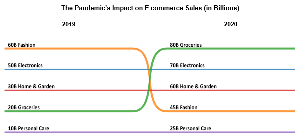
Insight: Groceries saw an astronomical rise, with electronics not too far behind. Fashion, it seems, took a backseat during these trying times.
Scenario: A timeline of the ever-changing social media landscape, showing the rise and fall of platforms from 2015 to 2020.
| Years | Social Media Platform | Traffic (in millions) |
| 2015 | 1500 | |
| 2015 | 400 | |
| 2015 | 320 | |
| 2015 | Snapchat | 200 |
| 2015 | TikTok | 0 |
| 2020 | 2500 | |
| 2020 | 1000 | |
| 2020 | 330 | |
| 2020 | Snapchat | 280 |
| 2020 | TikTok | 800 |
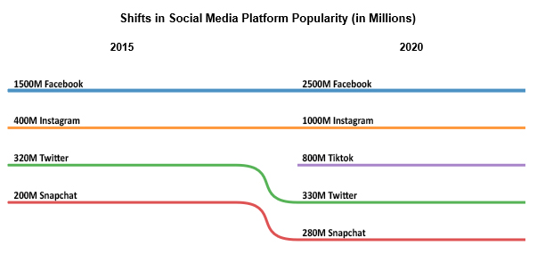
Insight: TikTok’s explosive growth is the talk of the town, while Twitter barely moves the needle.
Scenario: Tracking the global capacity of renewable energy sources over a decade, highlighting the world’s pivot towards greener pastures.
| Years | Energy Source | Capacity (GW) |
| 2010 | Solar | 40 |
| 2010 | Wind | 180 |
| 2010 | Hydro | 920 |
| 2010 | Biomass | 70 |
| 2010 | Geothermal | 11 |
| 2020 | Solar | 580 |
| 2020 | Wind | 710 |
| 2020 | Hydro | 1210 |
| 2020 | Biomass | 120 |
| 2020 | Geothermal | 14 |
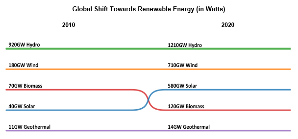
Insight: Solar energy wins the race, with wind energy hot on its heels, showcasing a brighter, greener future.
When you sit down to create or enhance your Slope Chart, keep the following guidelines at the forefront of your design process. Each decision, from the axis labels to the color palette, should be made with your audience’s understanding in mind, especially when conveying insights through descriptive analytics.
Your goal? To craft a chart that not only informs but engages and enlightens.
Slope Charts are brilliant for comparing the ‘before’ and ‘after’ of data points, or tracking changes over time. To achieve clarity, focus on simplicity. A clean design ensures that your message is direct and uncomplicated. Opt for a minimalist approach – this isn’t just about what you add, but what you decide to leave out. Simplify by limiting the number of data points to those that are truly essential.
Colors do more than beautify; they communicate. Choose colors that offer a stark contrast between your data points, but be mindful of color blindness. Employ a palette that differentiates clearly between your comparative elements without overwhelming your audience. Remember, the goal is to guide your viewer’s eye naturally to the focal points of your data story.
Words matter in visual data. Use annotations sparingly but effectively to provide context or highlight surprising insights. It’s like whispering a secret in the viewer’s ear that could change the way they see the data. Think of annotations as your voice in the chart, guiding, explaining, and sometimes even surprising.
Precision in labeling your axes is paramount. Your labels should be clear and descriptive, but not cluttered. Scaling is equally crucial. Ensure your scale accurately represents your data without exaggerating or diminishing the changes it illustrates. It’s about honesty in storytelling.
Finally, shine a spotlight on what matters most. Whether it’s an unexpected trend, a significant drop, or an impressive growth spurt, use design elements like bold lines, arrows, or strategic color highlights to draw attention. This focus transforms your chart from mere numbers to a compelling narrative.
Reading a Slope Chart is like following a trail; start at the beginning point, follow the line to the end, and observe the journey. Did the line ascend? That’s growth. Did it descend? There was a drop. A flat line means no significant change. The steeper the slope, the more dramatic the change.
Slope Charts are like those friends who are great at storytelling with numbers but can’t quite capture the essence of a story without them. They thrive on quantitative data, numbers and changes over time. For qualitative data, other types of visualizations, like bar charts or pie charts, might be the better guests to invite to your data party.
Imagine a family photo of all chart types. Bar charts are the dependable ones, pie charts the colorful personalities, and then there’s the Slope Chart, which stands out by showing change over time with elegance and simplicity. Unlike its siblings, the Slope Chart specializes in highlighting the journey between two points, making it unique in the chart family album.
Slope Charts like to keep things between two points, a start and an end. Introducing more points turns them into line charts, their close relatives. They’re all about simplicity, focusing on the transition between two moments rather than the full journey.
Even the most honest charts can be misleading, and Slope Charts are no exception. Their simplicity is both a strength and a weakness. Without careful consideration of scale and context, they might exaggerate minor changes or downplay significant shifts. It’s all about the details and ensuring they’re aligned with the truth of the data.
In the end, Slope Charts are more than just lines on a graph; they are the bridges between data and decision, insight, and action.
As we forge ahead, let these charts be our guide, not just in the world of data but in the larger journey of progress. For in every line, every slope, lies a story waiting to be discovered, a future waiting to be shaped.
Let’s continue to chart this course together, with curiosity as our compass and clarity as our destination.
How much did you enjoy this article?


Track energy consumption with precision. Learn practical methods to measure energy use, calculate costs, and optimize efficiency. Read on!
Master how to insert a chart in PowerPoint and turn spreadsheet numbers into persuasive slides. From built-in graphs to Excel imports, learn it all. Read on!
Reporting tracks past performance, while analytics uncovers why results happened and what comes next. Learn how each method strengthens decisions.