Categories
By ChartExpo Content Team
Residual plots pack a powerful punch in data analysis. These visual tools reveal hidden patterns and insights in your statistical models. A residual plot compares predicted values against actual observations, exposing potential issues lurking beneath the surface.
Mastering residual plots can transform your data analysis game. They highlight where models shine and where they stumble. By spotting trends in residuals, you’ll catch non-linearity, heteroscedasticity, and other pesky problems. Don’t let faulty assumptions derail your analysis – let residual plots guide you to more accurate predictions.


But residual plots aren’t just for statisticians. Anyone working with data can benefit from their revelatory power. Whether you’re a business analyst, researcher, or data enthusiast, understanding residual plots will sharpen your analytical skills. Ready to uncover the stories your data’s trying to tell?
First…
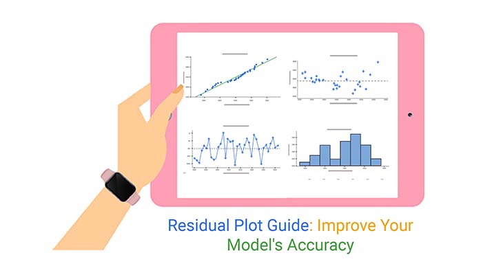
First off, a residual plot is a graph. This simple graph can reveal a lot about how well your regression model is working. Think of it as the X-ray of your statistical model’s performance.
It plots the residuals on the y-axis against the predicted values on the x-axis. If your model is perfect, these points should scatter randomly around the horizontal axis. If not, well, the plot will tell us what’s going wrong.
Why bother with residual plots? They are your go-to tool for checking if your regression model has any issues that you need to fix. These plots help identify things like non-linearity, autocorrelation, and heteroscedasticity.
In simpler terms, they help make sure your model is up to snuff and your predictions are on point.
Let’s break down what we mean by residuals. In the battle of observed versus predicted values, residuals are the difference between the two. When you make predictions with a regression model, the residuals are the errors of those predictions.
They tell you how far off each prediction was from the actual observed value.
Think of residuals as the tell-tale heart of your regression model. They play a crucial role in diagnosing the model.
By analyzing these residuals, you can detect if there’s a pattern messing up your predictions, which helps in improving the model’s accuracy. Remember, a good model is all about making predictions that are as close to reality as possible.
Residual plots are essential tools in statistics, helping us understand the difference between observed and predicted values in data analysis. However, it’s easy to misread these plots, which can lead to incorrect conclusions about your data. Let’s break down some common errors and how to avoid them.
One frequent mistake is treating all patterns as problems. Not every trend or visible pattern in a residual plot indicates a model issue. Some patterns are natural variances in data.
Another misconception is assuming that a lack of pattern guarantees model fitness. No obvious pattern doesn’t always mean your model is perfect for your data.
First, look at the plot’s spread. Are the residuals evenly distributed across the plot? If they flare out or narrow at different points, this suggests non-constant variance.
Next, check for patterns. Lines, curves, or clusters can indicate model misspecifications.
Lastly, consider the plot’s center. Residuals should cluster around the horizontal line at zero. If they don’t, your model might be biased.
Well-behaved residuals appear as a random scatter of dots centered around zero, with no clear pattern across the plot’s range. They’ll look like an unstructured cloud.
On the flip side, problematic residuals show patterns: maybe a curve, a clustering of data points, or a fan shape where variance increases with fitted values. Spotting these issues early helps in refining your regression model for better accuracy.
Have you ever stared at a residual plot and felt a bit puzzled? You’re not alone! Spotting trends in these plots can be quite the detective work. But don’t worry, it’s less about having a magic eye and more about knowing what to look for. So, let’s break it down.
Curved or wavy patterns in residual plots are like red flags waving at you, saying, “Hey, something’s up!”
These patterns suggest that the relationship between the variables isn’t just a straight line. Maybe it’s more of a curve or a wave. This is your cue to consider that the relationship might be non-linear, and it’s time to think outside the linear box.
When you’ve got a curve on your hands, polynomial terms can be your best pals. By adding these terms to your regression model, you can bend that line to fit the curves in your data. It’s like giving your model a yoga class; suddenly, it’s flexible enough to fit more complex relationships. Start with a quadratic term (squared terms), and if that doesn’t cut it, consider cubic terms (yes, we’re talking cubed!).
Sometimes, even polynomials can’t capture all the twists and turns of your data. That’s when Generalized Additive Models (GAMs) come into play. Think of GAMs as the superheroes of flexible modeling. These models don’t just stick to one form – they adapt. They can handle curves, zigs, zags, you name it.
By using smooth functions, GAMs can mold themselves to fit the unique shape of your data.
Remember, the goal here is to give you the tools to make your residual plots as random-looking as possible because in the world of residuals, randomness equals success.
Keep these tips in your toolkit, and you’ll be ready to tackle those patterns like a pro!
When diving into the world of residual plots, it’s like being a detective on a hunt for clues about data behavior. Let’s break it down.
Homoscedasticity refers to a scenario in data where the variance of residuals (errors) is consistent across all levels of an independent variable. Picture residuals scattering uniformly across a plot – no clear pattern, just a random dispersion.
On the flip side, heteroscedasticity is when residuals show a pattern or trend. If you see residuals fanning out or forming a cone shape as values increase, that’s heteroscedasticity waving at you. It’s a sign that variance isn’t playing fair across the spectrum.
Here’s how you catch those variance gremlins. Use a Sankey plot to visualize the flow of residuals against predicted values. Watch out for patterns – do they spread evenly or seem to cling to a trend? Uniform flows indicate good homoscedasticity; anything else suggests heteroscedasticity.
It’s all about spotting the unusual. If it looks odd, it probably is!
Imagine you’re looking at a funnel, wide at one end and narrow at the other. That’s exactly what you don’t want to see in your residual plot. This pattern, where residuals widen as the value of predictors increases, is a classic tell-tale of heteroscedasticity.
Keep your eyes peeled for this funnel trick – it’s a key clue that your data might need some tweaking.
Caught a case of heteroscedasticity? No worries, we’ve got the tools to fix it. Enter weighted least squares, a brilliant method that gives more weight to certain data points, balancing out the variance.
Think of it as giving a megaphone to voices that aren’t heard as well. Another handy trick is transformation. Applying a log or square root can tame unruly data, making variance more uniform. It’s like smoothing out wrinkles on a shirt – suddenly, everything looks neater.
Residual plots are a fantastic tool for spotting bias in your predictive models. When you plot residuals, which are the differences between observed and predicted values, you get a clear picture of how well your model is performing.
If the residuals don’t hover around the zero line, there’s a good chance your model is biased. This means it’s systematically overestimating or underestimating the actual values.
Non-centered residuals are a red flag in residual analysis. If you notice that your residual plot shows a spread that isn’t centered around zero, it suggests your model might be off-kilter.
This could be due to several reasons like a missed variable or an incorrect assumption about the data distribution. To fix this, revisit your model assumptions and check the variables you’ve included. Adjusting these can help recenter your residuals, making your model more accurate.
Sometimes, the issue isn’t with what you’ve included in your model, but what you’ve left out.
Missing predictors can skew your residuals, making them look more like a scattergun than a nice, even spread. Similarly, if your model form – say, linear when it should be polynomial – doesn’t fit the data, the residuals will tell the tale.
The key here is to keep an open mind and not hesitate to experiment with different model forms or adding new predictors to see how they affect the residual plot.
When your residual plots show clear patterns and aren’t random, it’s time to think about re-fitting your model with better-suited predictors.
This might mean swapping out some variables, or it could mean transforming existing variables to better capture the relationship with the target variable. The goal is to refine the model so that the residuals are as close to random as possible, indicating a well-fitted model.
When analyzing data through regression models, outliers can be a real headache. They throw off the estimates, making the model less accurate.
Think of it as trying to hit a bullseye with a few darts way off to the side; they can skew where you think the center should be. That’s what outliers do in regression analysis. They might represent unique cases or errors in data collection, but either way, you need to handle them smartly to keep your model on point.
Now, how do you spot these pesky outliers? Enter Cook’s Distance and leverage scores, two trusty tools in your stats toolkit.
Cook’s Distance helps you see the influence of each data point. A high Cook’s Distance means that point is a troublemaker, pulling your regression line away from where it should be.
Leverage scores, on the other hand, tell you how far a data point is from the average. High leverage points are like the class clowns standing out from the crowd, potentially dragging your model off course.
So, you’ve identified the outliers, but what next? This is where sensitivity analysis and robust regression come into play.
Sensitivity analysis messes around with your data, removing outliers to see how it affects your model. It’s like asking, “What happens to my model if I kick out the troublemakers?”
On the flip side, robust regression is like a sturdy ship that doesn’t sway much in stormy weather. It’s designed to not get thrown off course by outliers.
Using these methods ensures your regression model can stand strong, even in the face of data that tries to pull it in all the wrong directions.
Imagine trying to read a book in the dark. Tough, right? That’s what analyzing data without ChartExpo can feel like. This tool lights up your data analysis by making residual plots clearer and more detailed.
It uses colors and shapes that make sense to anyone, helping you spot what’s off in your data at just a glance. No more squinting at confusing charts and graphs. ChartExpo makes everything pop, making your analysis not only accurate but also a visual treat.
Think of residual plots as your data’s storytellers. They highlight the good, the bad, and the quirky.
For instance, in quality control, these plots help manufacturers spot products that don’t meet quality standards.
In finance, analysts use them to identify unusual changes in stock prices.
And in healthcare analytics, residual plots assist in monitoring patient recovery trends. Each plot tells a story, helping different sectors make better decisions based on solid data insights.
The following video will help you to create a Scatter Plot in Microsoft Excel.


The following video will help you to create a Scatter Plot in Google Sheets.
Ever noticed how some patterns seem to repeat over time in a time series chart in Excel? That’s autocorrelation, and it can quietly affect your analysis if you don’t account for it properly.
In the realm of statistics, a residual plot is a tool that helps us spot this repetition in data.
Imagine you’re trying to predict tomorrow’s temperature. If today was warm, and you notice that warm days tend to follow warm days, that’s autocorrelation. A residual plot helps by showing us the leftovers (residuals) after fitting a model to the data. If these residuals display a clear pattern, autocorrelation is likely present.
Now, how do we catch this autocorrelation red-handed? Cue the Durbin-Watson test. It’s like a detective that specializes in sniffing out whether the residuals from a linear regression are cozying up with each other, which they shouldn’t!
A value close to 2 suggests no autocorrelation; far from 2 means it’s time to rethink your model.
So, we’ve spotted autocorrelation. What’s next? We bring in the backups – lagged variables. Think of them as echoes of the past data points in your model. By including, say, yesterday’s temperature as a predictor for today, you help the model understand and adjust for patterns over time. It’s like giving your model a memory.
When simpler models don’t cut it because of autocorrelation, ARIMA models step in. ARIMA stands for AutoRegressive Integrated Moving Average. Big name, right? But here’s the scoop – it combines trends, cycles, seasonality, and a whole lot of statistical magic to forecast future points in the series. Transitioning to ARIMA might seem a leap, but it’s worth it when dealing with tricky time series that refuse to play nice.
When you’re peering into the world of statistics, one of the tricks up your sleeve is a residual plot. These handy diagrams show the leftovers, or residuals, from your regression model. If predictors in your model are too chummy, acting like old school friends, that’s multicollinearity. It messes with the reliability of your statistical findings.
Residual plots are like your best pals, helping you spot these too-close relationships by showing patterns. If residuals form a clear shape, like a line or a curve, you might have predictors that are too tightly knit.
Imagine throwing a party and all your guests stick to their cliques. That’s kind of what happens in your data when predictors are correlated. They stick together, influencing the model’s outcome more than they should.
This scenario skews your residuals, the error terms, which should ideally look random and scattered in a residual plot. When predictors are correlated, the residuals might form patterns or clusters. This is a red flag waving at you, saying, “Hey, check this out, something’s fishy!”
VIF, or Variance Inflation Factor, is your detective tool here. It measures how much the variance of an estimated regression coefficient increases if your predictors are correlated.
If VIF is high (typically, a value of 5 or above), it means your predictor has got some serious multicollinearity issues. It’s like finding out one of the wheels on your car is doing all the work! Not great, right?
You’d use VIF to pinpoint the troublemaker predictors and then reconsider how they’re used in your model to ensure your results aren’t skewed.
When you’re dealing with categorical variables in your data, residual plots become a go-to tool for uncovering patterns that might not be obvious at first glance. Think of these plots as a flashlight in a dark room, helping you spot where the model fits well and where it doesn’t. Each category in your variable can show different residual patterns, and that’s where the insights lie.
A residual plot can reveal if certain categories are prone to higher errors than others. This might suggest a need for model adjustments specific to those categories. It’s not just about spotting a trend; it’s about understanding why some groups behave differently. This understanding can lead you to refine your predictive models significantly.
Why stop at a basic residual plot when you can go deeper? Grouping residuals by categories can reveal hidden patterns. Let’s say you’re analyzing sales data with a “Region” category. By plotting residuals for each region, you might notice that some regions consistently over or under-predict sales.
This method acts like a detective’s magnifying glass, highlighting discrepancies in each group. It’s not just about finding flaws; it’s about understanding the story behind the data. These insights can guide targeted strategies for specific regions, enhancing overall model accuracy.
Overfitting or underfitting can be tricky to diagnose, especially when categorical variables are in play. Residual plots segmented by category help you see if your model is too cozy with the training data (overfitting) or too distant (underfitting).
Imagine fitting a suit. If it’s too tight, it’s uncomfortable (overfitting). If it’s too loose, it looks sloppy (underfitting). Your model should fit ‘just right’ across all categories.
By assessing how well the residuals scatter around the zero line in each category, you can adjust your model to improve its predictive performance across the board.
Dummy variables are a fantastic tool for handling categorical data, but they must be used wisely. They transform categorical data into a numerical format that your model can understand, essentially creating a ‘yes’ or ‘no’ scenario for each category.
Think of each category as a light switch that can be either on or off. This approach helps the model assess the impact of each category independently. However, remember to drop one dummy variable to avoid the dreaded ‘dummy variable trap,’ ensuring your model remains efficient and interpretable.
When you plot residuals and they don’t look quite right – maybe they’re skewed or clumped instead of nice and random – it’s a head-scratcher, isn’t it?
This is a sign that the data might not be normal, and that can mess with your analysis. So, what do you do?
You can try transforming the data or using a different kind of regression that doesn’t assume normality. Let’s get into the nitty-gritty of how to deal with these rebel residuals!
Ever wondered if your data is normal? Q-Q plots are your go-to tool. They’re like a mirror for your data, showing if it’s normal or if it’s got some quirks.
You plot your data against a theoretical normal distribution and see how well they match up. If your points line up nicely along the line, you’re good. If not, it’s time to think about making some adjustments.
And don’t forget about tests like Shapiro-Wilk or Anderson-Darling – they’re like the judges that give the final verdict on normality.
So, your data laughed in the face of normality, and now you’re stuck? Enter the Box-Cox transformation, a handy trick to coax your rebellious data back in line.
This technique finds the best power transformation to make your data normal. It’s like finding the right key for a stubborn lock. Apply it, and voila! You might just get that normal distribution curve you’ve been hoping for.
What if your data is not just non-normal but also non-linear? No panic! Robust regression is here to save the day. This method is tough. It doesn’t get thrown off by outliers or weirdness in your data.
Think of it as the all-terrain vehicle of regressions – it can handle all the bumps and curves of your data without tipping over. Whether it’s least squares fitting a bit too tight or you just have some really wild points, robust regression keeps things steady.
When you dive into the world of predictive modeling, you might hit a snag called overfitting.
Imagine you taught a parrot to recite Shakespeare perfectly in your living room but found it clammed up in any other setting. That’s overfitting in a nutshell: a model that performs flawlessly on training data but flunks on new, unseen data. Residual plots come to the rescue here.
They show the difference between observed values and predicted values. If a residual plot reveals patterns or trends, it’s a red flag that the model might be overfitting or underfitting.
Cross-validation is like a reality check for your model. Instead of relying on the same old data for training, cross-validation shakes things up.
It splits the data into chunks – one for training and another for testing, cycling through so each chunk gets its turn. This method helps spot overfitting early by ensuring the model can handle different slices of data, not just memorize one set.
Ever heard the saying, “Keep it simple, silly”? The same goes for statistical models. A model choked with too many parameters might fit the training data as snug as a glove but stumble on anything new.
Simplifying the model – a process called pruning – might involve removing some variables, opting for simpler forms of existing variables, or choosing straightforward models. This approach often leads to a model that’s less of a diva, performing well across varied datasets.
Think of Lasso and Ridge regularization as a tightrope act balancing model complexity and training data fit.
Lasso can shrink some coefficients down to zero, effectively choosing a simpler model by excluding some features altogether.
Ridge, meanwhile, reduces coefficients but keeps all the features in play. Both methods add a penalty to the model’s loss function – think of it as a cost for complexity.
This penalty helps prevent the model from going wild on the training data and keeps it more reliable on unseen data.
Residual plots are key for spotting patterns in data analysis. When handling large datasets, it’s vital to visualize residuals to identify model inadequacies.
Using alpha transparency in your plots can tackle the challenge of overlapping data points. This technique adjusts the opacity of points, allowing for better data visualization of densely packed areas.
Density plots complement this by showing data concentration areas through color intensity. These methods ensure that even in large datasets, you can discern the true nature of the residuals clearly and effectively.
In massive datasets, analyzing every single residual can be overwhelming. Random sampling comes to the rescue! By selecting a representative subset of data, you can simplify your residual analysis without losing the big picture.
This approach not only speeds up the process but also keeps the plots manageable and insightful.
Residual binning involves grouping residuals into bins of similar values, which simplifies the overall plot and highlights trends more clearly.
This technique allows you to focus on the range and frequency of residuals, providing a cleaner, more structured view of the data deviations. By binning, you can quickly identify areas where the model performs well and areas where it does not, facilitating targeted improvements in your analysis.
When working with small sample sizes, analyzing residuals can feel a bit like trying to read tea leaves: tricky and sometimes unclear. A residual plot helps us visualize the difference between observed and predicted values from a model. With smaller datasets, each data point’s influence grows, which might mislead your analysis if you’re not careful.
Ever noticed how clouds sometimes seem to form familiar shapes, even though they’re just random formations?
That’s a bit like finding patterns in small datasets. What might look like a meaningful trend could merely be random noise. This randomness can lead to incorrect conclusions if one isn’t vigilant. It’s like seeing faces in the clouds – intriguing but not necessarily real.
Bootstrapping is a handy tool, kind of like a magic trick for statisticians. It involves repeatedly sampling from a dataset with replacement to create ‘new’ datasets.
This method allows analysts to better understand the variability of the estimates from their model. Think of it as a way to double-check your work by running many simulations to see how stable your results are.
Finding the signal amidst the noise isn’t just a challenge for radio technicians.
In data analysis, especially with small samples, distinguishing between random fluctuations and true trends is key. By looking beyond the immediate noise and considering broader data patterns, you can often catch a glimpse of the bigger picture, much like stepping back from a painting to see the entire scene instead of just the brushstrokes.
When dealing with residual plots, it’s like walking a tightrope! On one side, you have statistical significance, which tells you if the patterns you see in the data are likely due to chance.
On the other side, there’s practical significance, which asks the big question: “So what?” It’s great if a pattern is statistically significant, but does it matter in the real world?
To balance these, first, make sure the residuals (the differences between observed and predicted values) don’t show any obvious patterns. If they do, your model might be missing something important.
Then, step back and ask if these patterns are big enough to care about in practice. Sometimes, even a statistically significant result can be too small to be worth tweaking your model.
Imagine you’re a detective, and residuals are your clues. They can tell you a lot about where your prediction model is hitting the mark and where it’s missing.
By looking at these clues, you can figure out not just where the model goes wrong, but by how much. For instance, if you see that your residuals tend to be huge whenever it rains, you know that your model isn’t great at handling rainy days.
To quantify this impact, you might look at the average size of your residuals on rainy days versus all other days. This tells you how much worse your model performs when it rains, giving you a clear number to work on improving.
Think of decision trees as your model’s best friend. They’re straightforward: they split your data into branches to make predictions easier to manage.
Here’s how they help in adjusting models: say your residuals show that your model struggles with predicting high sales volumes. You can use a decision tree to break down your data by sales volume. This breakdown can show you exactly where to tweak your model – for instance, by adding new variables or adjusting parameters specifically for high-sales scenarios.
It’s like giving your model a map and a flashlight in a dark forest!
When it’s time to talk about your model’s residuals with stakeholders, think of it as telling a story.
Start with the big picture: “Here’s how our model is performing overall.” Then zoom in on the residuals: “Here are the areas where we’re not quite on target.” Use graphs to show these patterns – it’s like showing pictures in a storybook, making it easier to understand.
Finally, focus on the impact: “Here’s how these patterns could affect our decisions moving forward.” By framing your insights this way, stakeholders can grasp not just the ‘what’ but the ‘why’ and the ‘how’ of model adjustments.
A residual plot shows how well your model’s predictions match the actual data. If the points are scattered randomly, the model is working well. Patterns in the plot suggest the model might be missing something important.
A good residual plot has no obvious patterns. The points should scatter randomly around the horizontal line at zero. This randomness shows the model is making accurate predictions.
Start by calculating the residuals, which are the differences between actual values and predicted values from your model. Plot the residuals on the Y-axis and either the predicted values or an independent variable on the X-axis. Check for any patterns or randomness in the plot.
Look for randomness. If the points are scattered without any clear pattern, your model is fine. If you see curves, clusters, or trends, it means the model might not be capturing everything in the data.
Residual plots are a simple yet powerful tool for turning data into something you can actually use. They make comparing categories easy and clear, helping you spot trends without getting lost in the numbers. Whether you’re working with sales data, survey results, or anything else that needs quick comparisons, a residual plot makes your job easier.
Remember, the key to creating an effective residual plot is to keep it simple. Focus on what matters and don’t overcrowd your chart with unnecessary details. Let the bars do the talking.
In the end, a good residual plot isn’t about fancy designs or complex tricks – it’s about making data understandable at a glance. Stick to what works, and your audience will thank you.
How much did you enjoy this article?


Calculate accounts receivable turnover ratio to measure credit collection speed, improve cash flow, and strengthen your financial strategy. Read on!

Change Management KPIs are the key to tracking adoption, performance, and ROI during transitions. Find out which metrics matter. Read on!

Data collection methods and techniques determine the quality of every insight you act on. Explore key approaches for gathering reliable data. Read on!


