• Home
  • Tools dropdown img
    • Spreadsheet Charts

      • ChartExpo for Google Sheets
      • ChartExpo for Microsoft Excel
    • Power BI Charts

      • Power BI Custom Visuals by ChartExpo
    • Word Cloud

  • Charts dropdown img
    • Chart Category

      • Bar Charts
      • Circle Graphs
      • Column Charts
      • Combo Charts
      • Comparison Charts
      • Line Graphs
      • PPC Charts
      • Sentiment Analysis Charts
      • Survey Charts
    • Chart Type

      • Box and Whisker Plot
      • Clustered Bar Chart
      • Clustered Column Chart
      • Comparison Bar Chart
      • Control Chart
      • CSAT Survey Bar Chart
      • CSAT Survey Chart
      • Dot Plot Chart
      • Double Bar Graph
      • Funnel Chart
      • Gauge Chart
      • Likert Scale Chart
      • Matrix Chart
      • Multi Axis Line Chart
      • Overlapping Bar Chart
      • Pareto Chart
      • Radar Chart
      • Radial Bar Chart
      • Sankey Diagram
      • Scatter Plot Chart
      • Slope Chart
      • Sunburst Chart
      • Tornado Chart
      • Waterfall Chart
      • Word Cloud
    • Google Sheets
      Microsoft Excel
  • Services
  • Pricing
  • Contact us
  • Blog
  • Support dropdown img
      • Gallery
      • Videos
      • Contact us
      • FAQs
      • Resources
    • Please feel free to contact us

      atsupport@chartexpo.com

Categories
All Data Visualizations Data Analytics Surveys
Add-ons/
  • Google Sheets
  • Microsoft Excel
  • Power BI
All Data Visualizations Data Analytics Surveys
Add-ons
  • Google Sheets
  • Microsoft Excel
  • Power BI

We use cookies

This website uses cookies to provide better user experience and user's session management.
By continuing visiting this website you consent the use of these cookies.

Ok

ChartExpo Survey


Home > Blog > Power BI

Power BI Field Parameter: A Guide for Smarter Reporting

Power BI Field parameters are somewhat new, but they’re an effective function that helps users toggle between what dimensions (or measures) a visualization is showing. With the feature, the creation of these parameters is automated, and that eliminates the labor-intensive workarounds that existed in the past.

Power BI Field Parameter

In this blog, you’ll discover what Power BI field parameters are, advanced techniques for Power BI field parameters, use cases for Power BI field parameters, and how to create a Power BI field parameter.

Table of Content:

  1. What are Field Parameters in Power BI?
  2. Why Use Power BI Field Parameters?
  3. Top 5 Power BI Field Parameters Hierarchy Examples
  4. Advanced Techniques for Field Parameters Power BI
  5. How to Create Field Parameters in Power BI?
    • Step 1: Enable Field Parameters
    • Step 2: Create New Field Parameter
    • Step 3: Apply Parameters in Visuals
  6. How to Edit PowerBI Field Parameters?
  7. How to Visualize Field Parameters in Power BI?
  8. How to Use Field Parameters in Power BI?
  9. What are the Benefits of Using Parameters in Power BI?
  10. Key Considerations For Power BI Field Parameters
  11. Limitations for Creating Parameters in Power BI
  12. Best Practices for Using Field Parameters
  13. Power BI Field Parameters – FAQs
  14. Wrap Up

First…

What are Field Parameters in Power BI?

Definition: Field Parameters in Power BI are a feature that allows users to dynamically switch between different dimensions or measures within a report. By creating field parameters, you can give report viewers the flexibility to customize visuals using a slicer, without needing to edit the report itself.

Power BI Field Parameter 1

This makes it possible to analyze data from multiple perspectives on the fly, such as toggling between sales, profit, or region fields in a single chart. Power BI automatically generates the necessary table and slicer once the parameter is set up, making reports more interactive, flexible, and user-friendly.

Why Use Power BI Field Parameters?

Field parameters help you

  • Declutter reports and improve performance by reducing the number of visuals.
  • Make interactive reports by offering dropdowns, buttons, and checkboxes to select columns.

Use Cases for Power BI Field Parameters

  • Interactive Dashboards: Users can switch between different metrics or dimensions, which enhances user interaction and customization.
  • Dynamic Reporting: It facilitates the creation of reports that adapt to user-selected fields, like changing between financial KPIs or performance indicators, without altering the report structure.
  • Flexible Analysis: It gives room for dynamic axis changes in charts, allowing users to view data by different time periods or categories. This could involve switching from monthly to quarterly sales KPIs.
  • Personalized Insights: Users can adjust filters in Power BI and visuals based on their preferences, like filtering data based on selected business departments.

Top 5 Power BI Field Parameters Hierarchy Examples

  1. Switch Between Metrics: Create a parameter to toggle between Sales, Profit, and Revenue in the same chart for quick comparisons.
  2. Dynamic Dimensions: Allow users to switch views between Region, Product, or Customer Segment using a single slicer.
  3. KPI Analysis: Build a dashboard where users can switch between KPIs like Customer Retention Rate, Average Order Value, and Churn Rate.
  4. Time-Based Comparison: Use field parameters to toggle between Monthly, Quarterly, and Yearly trends in one line chart.
  5. Product Performance Dashboard: Let users dynamically switch between Units Sold, Revenue, and Profit Margin to analyze product performance in depth.

Advanced Techniques for Field Parameters Power BI

  • Dynamic Measures: Field parameters can be used to switch between different visual measures.
  • Dynamic Axis Switching: It can be used to dynamically change the axis of charts. With a field parameter, you can select different dimensions and apply them to the visual’s axis property.
  • Dynamic Filtering: Users can apply different filters based on their selection. You can create a measure with DAX that adjusts based on the selected parameter to filter data dynamically.
  • Dynamic Hierarchies: It can be used to switch dynamically between hierarchy levels (like Year or Month).
  • Dynamic Titles and Labels: It’s used to change titles and labels based on the selected field parameter.

How to Create Field Parameters in Power BI?

Step 1: Enable Field Parameters

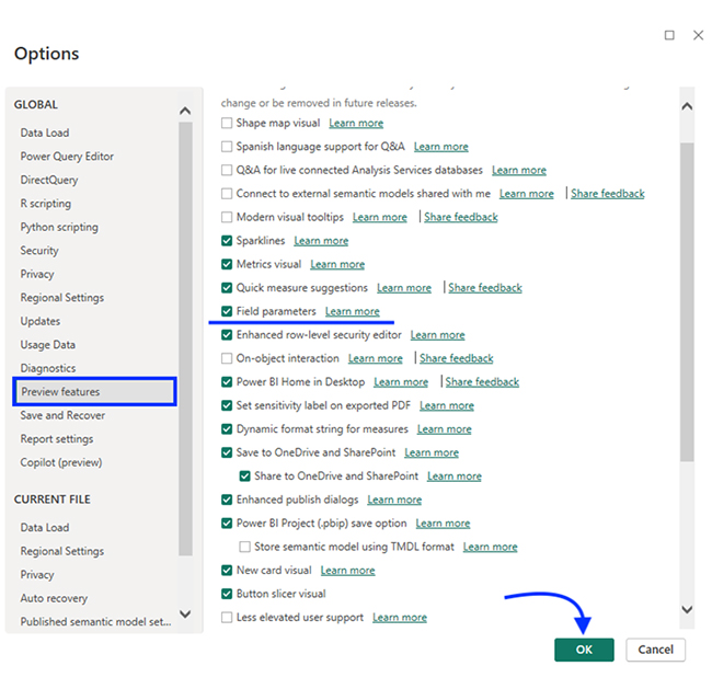
If you can’t find the “Fields” option at Modeling > New Parameter, you’ll have to enable it in the settings. To do that, open Power BI Desktop and navigate to Options and Settings.

Go to Options > Global > Preview features and tick the checkbox against “Field parameters.” Next, click “Ok” to save the settings.

Go to Options Then Global and Next Click Ok for Doing Power BI Field Parameter

Step 2: Create New Field Parameter

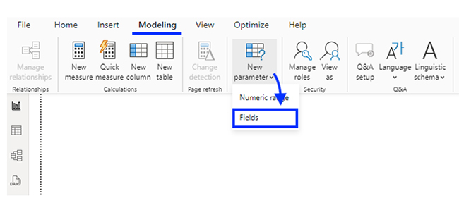
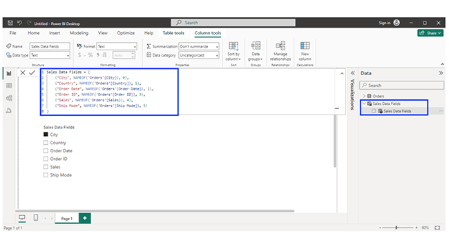
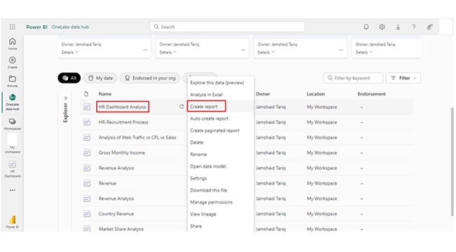
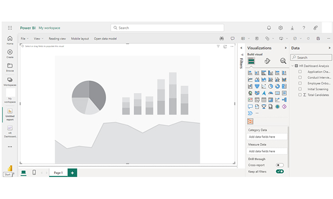
You’ll have to add data to your report. Power BI supports a few native connectors and/or lets you manually import data. After your data is loaded, you’ll have to go to the Modeling tab to create new field parameters in Power BI. To do that, click “New parameter,” and select Fields from the drop-down.

Click New Parameter and Select Fields for New Power BI Fields Parameter

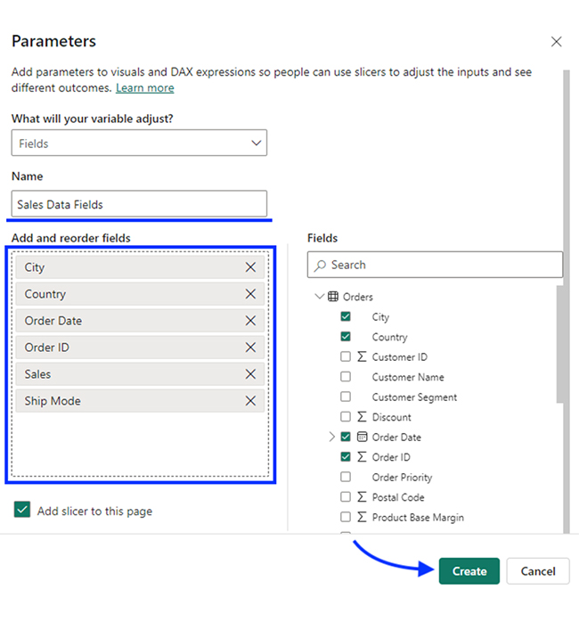
Enter a name for the parameter. The name will be displayed in the data pane. Select the dimensions and metrics from the “Fields” section. You also have the option of renaming the field names and changing their order in the field parameters.

To add a slicer to the report, you’ll have to tick the checkbox at the bottom. Next, click the “Create” button to add the field parameter.

Add a Slicer to Report and Click Create Create Button for Doing Power BI Field Parameter

The DAX expressions are used to generate a Power BI field parameter table in the data pane.

Use Dax Expressions to Generate for Doing Power BI Field Parameter Table

Step 3: Apply Parameters in Visuals

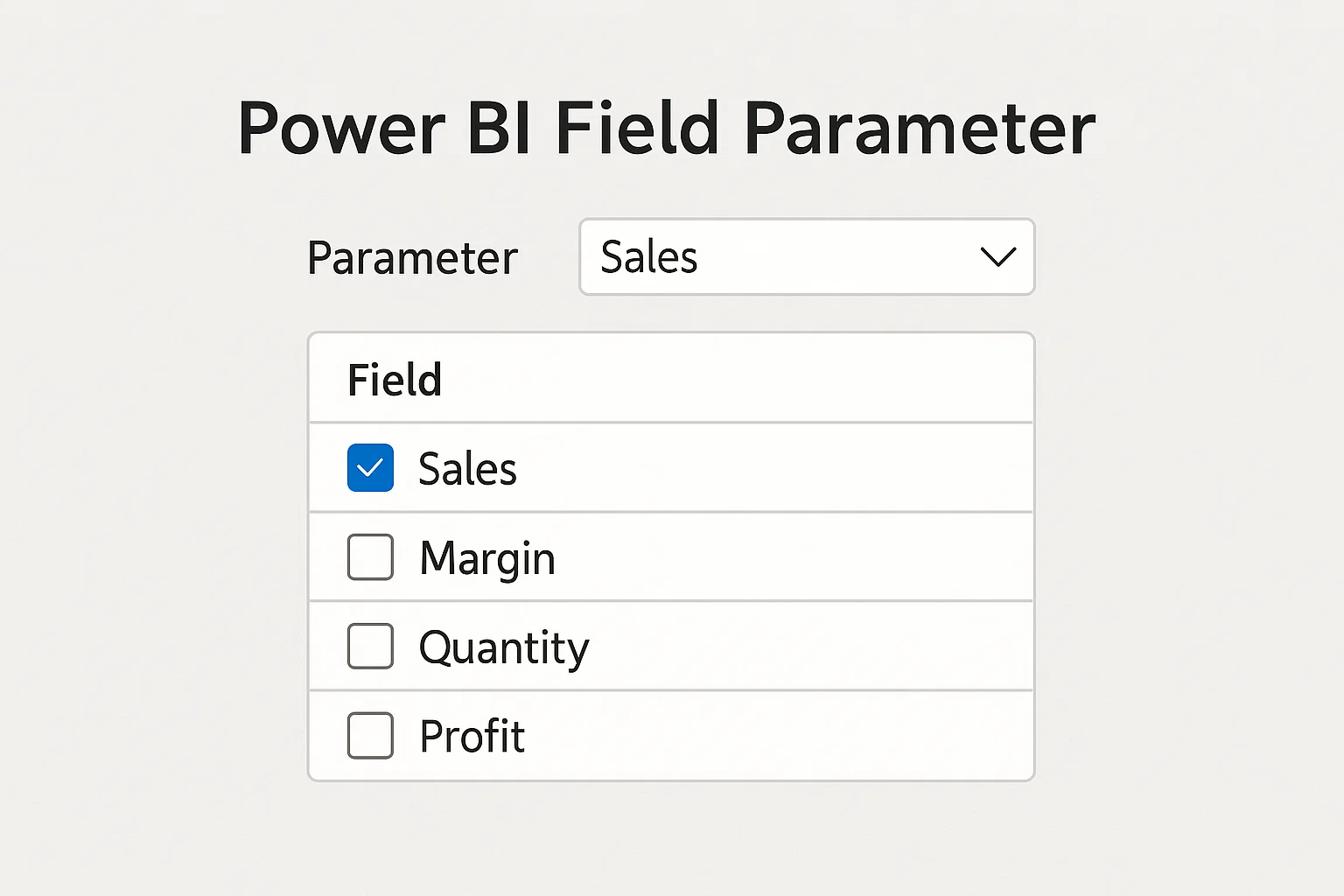
The created field parameter can be used to build a dynamic visual. For instance, here’s a new table visual that has been built using the field parameter.

Create Power BI Field Parameter Can be Used to Build Dynamic Visual

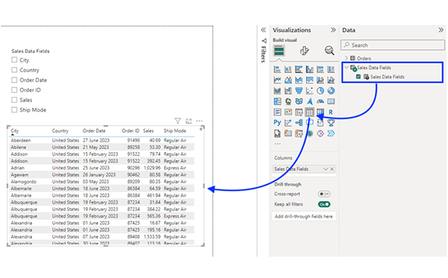
The parameter slicer can be used to interact with the Power BI visuals. The image below shows how it has been used to display only certain fields in the table visual.

Parameter Slicer can be Used to Interact with Power BI Visuals After Doing Power BI Field Parameter

To make the slicer in Power BI more user-friendly, you’ll have to change its appearance. To do that, select the slicer and navigate to Visualizations > Format Visual to adjust the visual appearance.
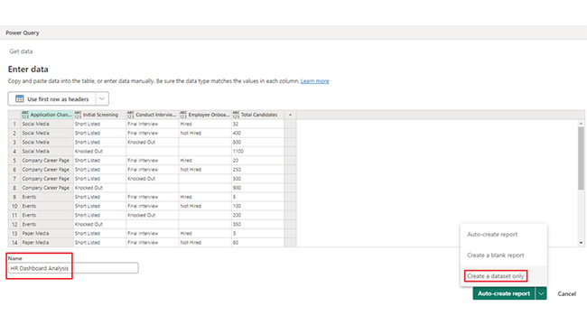
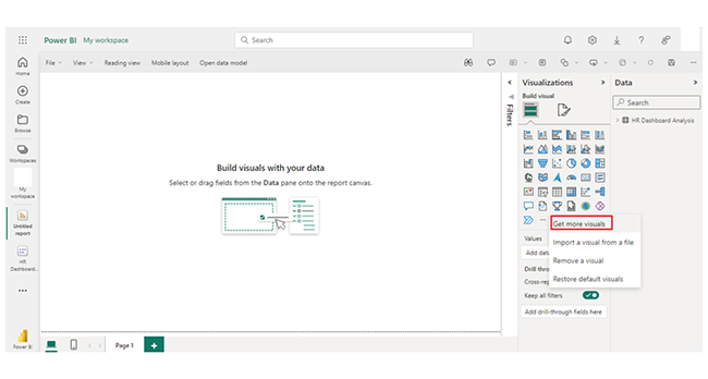
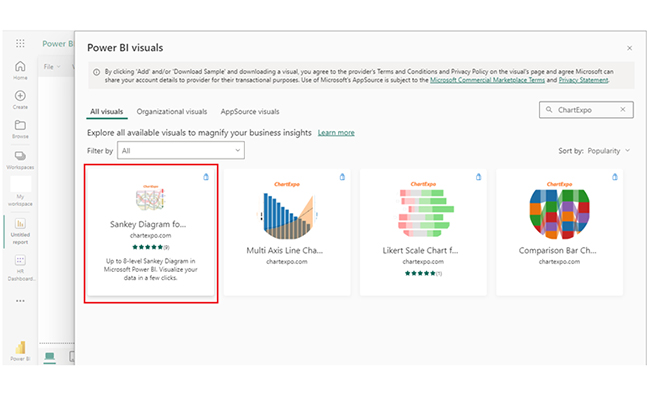
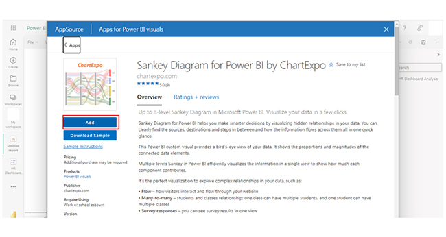
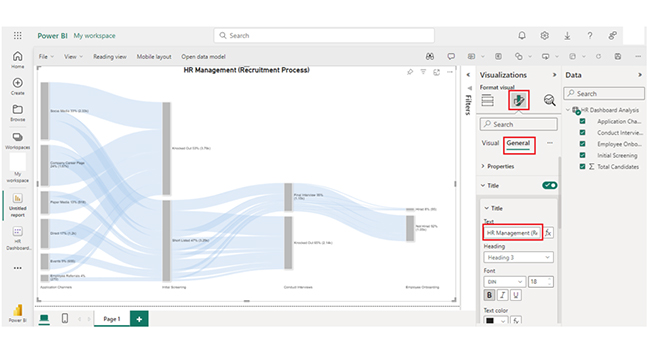
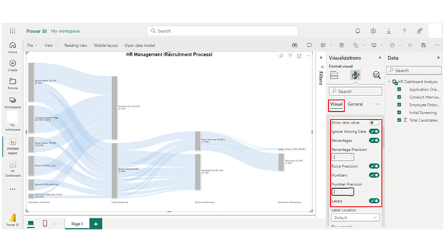
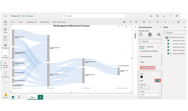
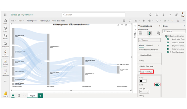
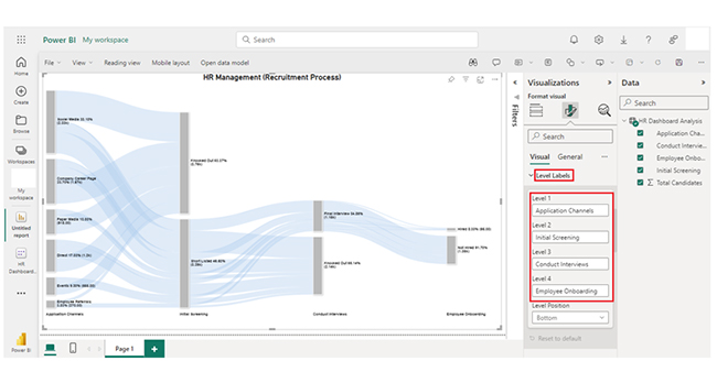
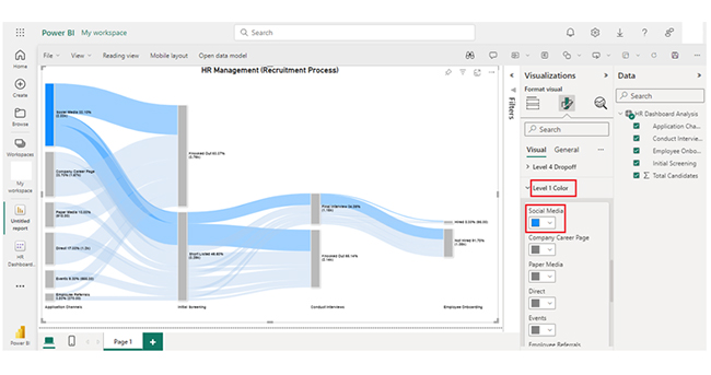
How to Edit PowerBI Field Parameters?

  • Go to the parameter table in the Data pane.
  • Edit fields: add, remove, rename, or reorder dimensions/measures.
  • Adjust the DAX expression if needed.
  • Save and refresh to update visuals.

How to Visualize Field Parameters in Power BI?

Stage 1: Log in to Power BI, enter your email, and click “Submit.”

  • Log in to Power BI.
  • Enter your email address and click the “Submit” button.
Enter email to login to Power BI
  • You are redirected to your Microsoft account.
  • Enter your password and click “Sign in“.
Enter Password to login to Power BI
  • You can choose whether to stay signed in.
Click on stay signed in
  • Once done, the Power BI home screen will open.

Stage 2: Create a Data Set and Select the Data Set to Use in the Sankey Chart

  • Go to the left-side menu and click the “Create” button.
  • Select “Paste or manually enter data“.
select Paste or manually enter data in Power BI ce487
  • We’ll use the sample data below for this example.
Application Channels Initial Screening Conduct Interviews Employee Onboarding
Total Candidates
Social Media Short Listed Final Interview Hired 32
Social Media Short Listed Final Interview Not Hired 400
Social Media Short Listed Knocked Out 800
Social Media Knocked Out 1100
Company Career Page Short Listed Final Interview Hired 20
Company Career Page Short Listed Final Interview Not Hired 250
Company Career Page Short Listed Knocked Out 500
Company Career Page Knocked Out 900
Events Short Listed Final Interview Hired 5
Events Short Listed Final Interview Not Hired 100
Events Short Listed Knocked Out 200
Events Knocked Out 350
Paper Media Short Listed Final Interview Hired 3
Paper Media Short Listed Final Interview Not Hired 80
Paper Media Short Listed Knocked Out 135
Paper Media Knocked Out 700
Employee Referrals Short Listed Final Interview Hired 10
Employee Referrals Short Listed Final Interview Not Hired 70
Employee Referrals Short Listed Knocked Out 80
Employee Referrals Knocked Out 110
Direct Short Listed Final Interview Hired 25
Direct Short Listed Final Interview Not Hired 150
Direct Short Listed Knocked Out 425
Direct Knocked Out 600
  • Paste the data table above into the “Power Query” window. After that, select the “Create a dataset only” option.
Select Create a Dataset Only After Doing Power BI Field Parameter
  • Navigate to the left-side menu, and click on the “Data Hub” option. Power BI will populate the data set list. If the data set has not been created, you’ll get an error message.
Click on Data Hub After Doing Power BI Field Parameter
  • Click on the “Create report” dropdown.
Click on Create Report After Doing Power BI Field Parameter
  • To add the Power BI Sankey Diagram Extension by ChartExpo, you’ll have to use an add-in or Power BI visual from AppSource. Navigate to the right side of the Power BI dashboard, and open the Power BI Visualizations panel. After that, click on the ellipsis symbol (…) to import the Power BI Sankey Diagram extension by ChartExpo. In the menu that opens, select the “Get more visuals” option.
Select Get More Visuals After Doing Power BI Field Parameter
  • A window opens. Enter “ChartExpo” in the highlighted search box. You’ll see the “Sankey Diagram for Power BI by ChartExpo” as shown in the image below.
Enter Sankey Diagram in Search Box After Doing Power BI Field Parameter
  • After that, click on the Sankey Diagram, and also click on the highlighted “Add” button.
Click Add Button After Doing Power BI Field Parameter
  • Power BI will add the “Sankey Diagram for Power BI by ChartExpo” icon in the visualization panel.
Sankey Diagram Icon Will be Added in Visualization Panel After Doing Power BI Field Parameter
  • To draw a Sankey Diagram with ChartExpo’s Power BI extension, select the “Sankey Diagram for Power BI by ChartExpo” icon in the visualization panel. A window similar to the one below will open in the report section of your dashboard.
Report Section of Dashboard After Doing Power BI Field Parameter
  • You’ll have to select the fields to use in the Sankey chart.
Select Fields After Doing Power BI Field Parameter
  • When selecting the fields, follow the sequence below:
    • Application Channels
    • Initial Screening
    • Conduct Interviews
    • Employee Onboarding
    • Total Candidates
  • You’ll have to provide your email address or the ChartExpo license key. To see the Sankey Chart, add the key under the visual section.
Enter License Key After Doing Power BI Field Parameter
  • You can add the top header text in the chart under the General section.
Add Top Header Text in Chart After Doing Power BI Field Parameter
  • Click on visual to set the number and also enable the options as shown below:
Click on Visual to Set Number After Doing Power BI Field Parameter
  • You can change the “Node Font Style” as shown below:
Change Node Font Style After Doing Power BI Field Parameter
  • You can change “Level Font Style” as shown below:
Change Level Font Style After Doing Power BI Field Parameter
  • You can see the Level Labels.
See Level Labels After Doing Power BI Field Parameter
  • Here’s how to change the Nodes color.
Change Nodes Color After Doing Power BI Field Parameter
  • Here’s “How to change Level 1 color.” You can follow the same steps to change the Nodes color of other levels.
Change Nodes color of Other Levels After Doing Power BI Field Parameter
  • After changing the all-nodes color, here’s the final look of the HR Dashboard in Power BI using ChartExpo.
Final Power BI Field Parameter

Insights

  • Social Media is the primary application channel with the highest number of candidates (1100).
  • The company’s Career Page has the second-highest number of candidates, with 900 candidates.
  • Paper Media and Events have comparatively lower candidate counts of 700 and 350, respectively.
  • Direct applications have 600 candidates.

How to Use Field Parameters in Power BI?

Field Parameters in Power BI make your reports more interactive by allowing users to switch between different fields or measures with a slicer. Here’s how to use them:

  1. Create a Field Parameter: Go to Modeling > New Parameter > Fields and select the dimensions or measures you want to include.
  2. Add the Parameter Slicer: Insert the automatically created slicer into your report to let users pick which field to view.
  3. Apply in Visuals: Use the parameter in charts, tables, or other visuals. The selected field from the slicer will dynamically update the visual.
  4. Customize Further: Rename fields, reorder them, or edit the DAX expression in the parameter table to refine how the visuals behave.

What are the Benefits of Using Parameters in Power BI?

  1. Enhanced Interactivity: It allows users to switch between different metrics, dimensions, or hierarchies, thereby offering a more engaging and interactive experience.
  2. Flexibility: It allows users to customize visual analytics and analyses without creating multiple versions of the same report.
  3. Reduced Report Duplication: It minimizes the need to create separate reports for different metrics or KPIs. After all, a single report can adapt based on the user selections.
  4. Improved User Experience: It offers a more tailored experience by allowing users to focus on relevant data and insights based on their preferences or needs.

Key Considerations For Power BI Field Parameters

  1. Data Sensitivity: Parameters make fields easily switchable, so avoid including confidential or restricted data.
  2. Report Performance: Adding too many fields in a parameter can slow down visuals, especially with large datasets.
  3. User Experience: Use clear, descriptive names for fields to ensure slicers are intuitive for end users.
  4. Visual Compatibility: Not all Power BI visuals fully support field parameters, so test before deploying widely.
  5. Admin Settings: Field parameters must be enabled in Power BI Desktop settings, and some organizations may restrict their use.
  6. Maintenance Effort: Any changes in your data model (like renaming fields) may require updates to the parameter table or DAX expressions.

Limitations for Creating Parameters in Power BI

While field parameters in Power BI are powerful, there are some limitations to keep in mind:

  1. No Confidential Data Control: Parameters shared via slicers are visible to all users, which may expose sensitive data if not handled carefully.
  2. Limited Customization Options: Field parameters are flexible, but they don’t support advanced conditional formatting in Power BI without manual DAX adjustments.
  3. Performance Impact: Using too many parameters in large datasets can slow down report performance.
  4. Not Supported Everywhere: Some visuals and features may not fully support field parameters, limiting flexibility in complex dashboards.
  5. Admin Restrictions: If disabled by your Power BI administrator, you may not be able to create or use field parameters.

Best Practices for Using Field Parameters

To get the most out of field parameters in Power BI, keep these best practices in mind:

  1. Keep Parameters Simple: Limit the number of fields in a parameter to avoid overwhelming users.
  2. Use Clear Labels: Rename fields with user-friendly names so slicers are easy to understand.
  3. Group Related Metrics: Organize dimensions and measures logically (e.g., financial KPIs together, customer metrics together).
  4. Test Performance: Check how parameters impact report speed, especially with large datasets.
  5. Combine with Slicers and Filters: Enhance interactivity by pairing parameters with other slicers for deeper insights.
  6. Document Usage: Add tooltips or instructions so users know how to switch fields effectively.

Power BI Field Parameters – FAQs

How do you write parameters in Power BI?

To write parameters, you’ll have to use the “What If” parameter feature or DAX expressions. Define parameters in the “Modeling” tab, and use them in measures, calculations, and visuals.

What is the difference between Field parameters and calculation groups in Power BI?

Field parameters give room for dynamic field selection in reports, while calculation groups provide a way to apply reusable calculations or measures across multiple visuals. Calculation groups focus on measures, while field parameters focus on field selection.

How can Power BI Field Parameters enhance the interactivity of my reports?

Field parameters enhance interactivity by letting users dynamically switch between dimensions, metrics, or hierarchies. This allows for customizable views and analysis within the report without the need to modify its structure.

Wrap Up

Power BI Field parameters allow dynamic field selection in reports. Advanced techniques for field parameters in Power BI include dynamic measures, axis switching, filtering, hierarchies, and titles and labels.

With field parameters, users can dynamically switch between different metrics, hierarchies, and dimensions. And that provides a more engaging and interactive experience. It also minimizes the need for creating separate reports for different metrics or dimensions.

Field parameters streamline maintenance. It makes it easy to maintain and update reports. After all, changes to field parameters automatically reflect across all relevant visuals and calculations.

Finally, it enables users to focus on relevant data and insights based on their preferences or needs.

The Field parameter in Power BI is a feature that helps you interact with your data. This will, in turn, lead to a more robust data analysis.

How much did you enjoy this article?

PBIAd2
Start Free Trial!
143898

Related articles

next previous
Power BI7 min read

Power BI Data Sources: Connecting for Better Insights

The guide explains what Power BI Data Sources are and the various types of Power BI Data Sources. You'll discover how to visualize source data in Power BI.

Power BI7 min read

Time Intelligence in Power BI to build Insightful Reports

Discover all you need to know about Time Intelligence in Power BI. This guide explores the benefits of Time Intelligence and tips for using Time Intelligence.

Power BI13 min read

Conditional Formatting in Power BI for Advanced Analytics

Learn how to use Conditional Formatting in Power BI to make your dashboards smarter, more colorful, and easier to interpret in just a few steps.

Power BI12 min read

How to Use Power BI for Clear Insights with Charts

Discover how to use Power BI to analyze data, create interactive reports, and make smarter business decisions with ease.

Power BI13 min read

Power BI Publishing to Web: Maximize Potential

Learn what Power BI Publishing to Web is, how it works, and when to use it. Share interactive reports publicly with simple embed codes.

ChartExpo logo

Turn Data into Visual
Stories

CHARTEXPO

  • Home
  • Gallery
  • Videos
  • Services
  • Pricing
  • Contact us
  • FAQs
  • Privacy policy
  • Terms of Service
  • Sitemap

TOOLS

  • ChartExpo for Google Sheets
  • ChartExpo for Microsoft Excel
  • Power BI Custom Visuals by ChartExpo
  • Word Cloud

CATEGORIES

  • Bar Charts
  • Circle Graphs
  • Column Charts
  • Combo Charts
  • Comparison Charts
  • Line Graphs
  • PPC Charts
  • Sentiment Analysis Charts
  • Survey Charts

TOP CHARTS

  • Sankey Diagram
  • Likert Scale Chart
  • Comparison Bar Chart
  • Pareto Chart
  • Funnel Chart
  • Gauge Chart
  • Radar Chart
  • Radial Bar Chart
  • Sunburst Chart
  • see more
  • Scatter Plot Chart
  • CSAT Survey Bar Chart
  • CSAT Survey Chart
  • Dot Plot Chart
  • Double Bar Graph
  • Matrix Chart
  • Multi Axis Line Chart
  • Overlapping Bar Chart
  • Control Chart
  • Slope Chart
  • Clustered Bar Chart
  • Clustered Column Chart
  • Box and Whisker Plot
  • Tornado Chart
  • Waterfall Chart
  • Word Cloud
  • see less

RESOURCES

  • Blog
  • Resources
  • YouTube
SIGN UP FOR UPDATES

We wouldn't dream of spamming you or selling your info.

© 2025 ChartExpo, all rights reserved.