• Home
  • Tools dropdown img
    • Spreadsheet Charts

      • ChartExpo for Google Sheets
      • ChartExpo for Microsoft Excel
    • Power BI Charts

      • Power BI Custom Visuals by ChartExpo
    • Word Cloud

  • Charts dropdown img
    • Chart Category

      • Bar Charts
      • Circle Graphs
      • Column Charts
      • Combo Charts
      • Comparison Charts
      • Line Graphs
      • PPC Charts
      • Sentiment Analysis Charts
      • Survey Charts
    • Chart Type

      • Box and Whisker Plot
      • Clustered Bar Chart
      • Clustered Column Chart
      • Comparison Bar Chart
      • Control Chart
      • CSAT Survey Bar Chart
      • CSAT Survey Chart
      • Dot Plot Chart
      • Double Bar Graph
      • Funnel Chart
      • Gauge Chart
      • Likert Scale Chart
      • Matrix Chart
      • Multi Axis Line Chart
      • Overlapping Bar Chart
      • Pareto Chart
      • Radar Chart
      • Radial Bar Chart
      • Sankey Diagram
      • Scatter Plot Chart
      • Slope Chart
      • Sunburst Chart
      • Tornado Chart
      • Waterfall Chart
      • Word Cloud
    • Google Sheets
      Microsoft Excel
  • Services
  • Pricing
  • Contact us
  • Blog
  • Support dropdown img
      • Gallery
      • Videos
      • Contact us
      • FAQs
      • Resources
    • Please feel free to contact us

      atsupport@chartexpo.com

Categories
All Data Visualizations Data Analytics Surveys
Add-ons/
  • Google Sheets
  • Microsoft Excel
  • Power BI
All Data Visualizations Data Analytics Surveys
Add-ons
  • Google Sheets
  • Microsoft Excel
  • Power BI

We use cookies

This website uses cookies to provide better user experience and user's session management.
By continuing visiting this website you consent the use of these cookies.

Ok

ChartExpo Survey


Home > Blog > Power BI

Power BI Copilot: Best Tips for Faster Insights

Buried inside Microsoft Power BI sits one of the most practical AI tools available in business analytics today. Power BI Copilot lets any user type a question in plain English and receive a complete report, visual, or data summary within seconds, with no coding or query writing required.

Power BI Copilot

Organizations once spent hours building dashboards by hand. That bottleneck is largely gone. This guide covers what Power BI Copilot does, why it matters for day-to-day decision-making, and how to put it to work to build reports that quickly surface real insights from your data.

What is Power BI Copilot?

Definition: Power BI Copilot is an AI assistant built into the Power BI platform that responds to natural language input with reports, data summaries, and visual outputs. A user types a request rather than constructing queries manually, and the tool returns a result immediately.

The feature, also called Copilot for Power BI, applies machine learning models to read user intent and translate it into meaningful data outputs. This makes analytics accessible to business users who lack a technical background, while also accelerating the work of those who do.

Why is Power BI Copilot Important?

Data-driven decision-making requires speed and accuracy, two things that manual reporting rarely delivers. This tool closes that gap by handling the heavy analytical lifting so teams can focus on outcomes.

  • Speeds up data analysis: Processes large volumes of data in seconds, cutting the time that would otherwise go to manual calculations and sorting.
  • Uses natural language queries: Let users phrase their requests in everyday language rather than writing structured query syntax.
  • Simplifies report creation: Produces complete dashboards and visualizations from a single prompt, removing the need to build them step by step.
  • Helps non-technical users: Opens data exploration to people without programming skills, lowering the barrier to working with complex datasets.
  • Automates insights discovery: Scans data automatically for trends, unusual patterns, and anomalies that a user might otherwise miss.
  • Reduces manual effort: Cuts down on repetitive work such as data formatting, cleaning, and standard report generation.
  • Improves decision-making: Delivers timely, accurate analysis that gives businesses a factual basis for choices that matter.

Beyond reporting, the tool extends to predictive analytics in Power BI, giving users the ability to spot emerging trends and act on them before they become problems.

Key Features and Capabilities of Power BI Copilot

The AI layer inside Power BI draws on Power BI artificial intelligence to interpret requests, automate outputs, and surface patterns that would take much longer to find manually.

  • Natural language prompts: Accepts typed questions in plain language so users can query their data without learning any specialized syntax.
  • Automatic report generation: Builds dashboards and full reports from a single input, basing the output on the data and the stated goal.
  • AI-driven insights: Detects patterns, outliers, and directional trends across datasets without any manual investigation.
  • Data summarization: Distills large datasets into compact, readable summaries so teams can grasp the key numbers quickly.
  • Visualization suggestions: Select chart types and visual formats that best represent the data being analyzed.
  • DAX query assistance: Generates and refines DAX formulas on request, making formula work accessible to users without advanced technical skills.
  • Smart narrative explanations: Writes plain-language summaries of findings, making reports interpretable by anyone who reads them.

Together, these capabilities make Copilot in Power BI a practical upgrade to standard Power BI features, reducing the distance between raw data and actionable conclusions.

How to use Copilot in Power BI?

Before using Power BI Copilot for the first time, you must link your report to a workspace that has Copilot support enabled. This connection is what makes the AI features available inside your environment.

  • Open Copilot from the Ribbon

Start by opening an existing report in Power BI Desktop and selecting Copilot from the ribbon. This action opens the Copilot pane on the side and prompts you to choose a compatible workspace.

Power BI Copilot
  • Select a Copilot-Compatible Workspace

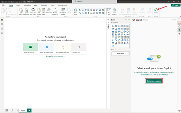
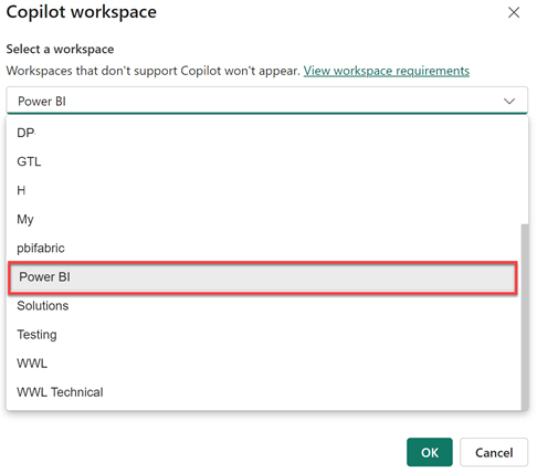
Choose a workspace that supports Copilot from the list provided. Only eligible workspaces (Fabric or Premium capacity) will be visible. This workspace is used for Copilot functionality and does not have to match your final publishing workspace.

Power BI Copilot
  • Access Workspace Settings

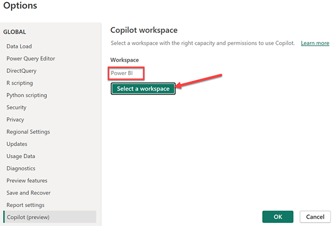
To check or change the selected workspace, click the Settings (gear icon) at the bottom-right corner of Power BI Desktop. This opens the options panel where Copilot settings are available.

Power BI Copilot
  • Verify or Change Workspace in Options

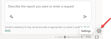
In the Options window, navigate to Copilot (Preview) settings. Here, you can view the currently connected workspace or switch to another compatible workspace if needed.

Power BI Copilot
  • Handle Workspace Errors

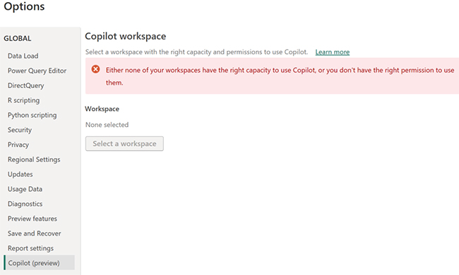
If no compatible workspace is available, you may see an error indicating that your workspaces either lack the required capacity or you don’t have the necessary permissions. In this case, you need access to a Fabric or Premium workspace.

Power BI Copilot

With a valid workspace in place, you can start generating reports, building visuals, and running data queries using natural language. When connected to a data source in Power BI, Copilot refines its output over time based on how you interact with it and the context of your data.

How to Create a Report Using Copilot in Power BI?

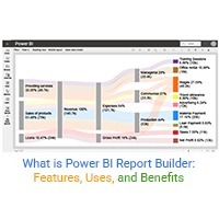
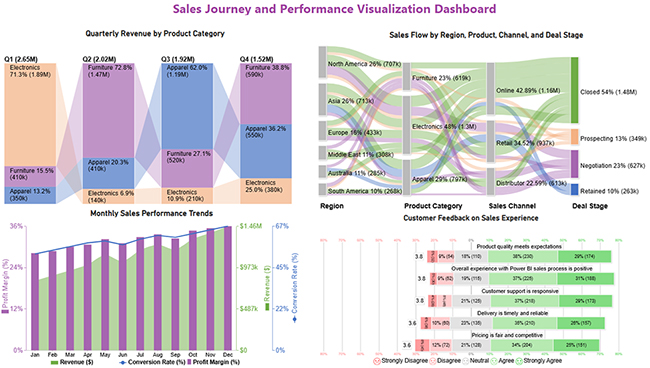
The walkthrough below shows how to use Power BI Copilot to analyze a dataset and build four chart types: Sankey Charts, Multi-Axis Line Charts, Comparison Bar Charts, and Likert Charts.

Step 1: Prepare Your Data

Organize your dataset with relevant fields such as Region, Product Category, Sales, Time (Month/Quarter), and Customer Feedback.

Ensure clean, structured data with no missing values for accurate Copilot results.

Step 2: Load Data into Power BI

  • Open Power BI Desktop.
  • Go to Home → Get Data.
  • Select your dataset (Excel, CSV, etc.).
  • Click Load.

Step 3: Activate Copilot

Enable Copilot from the toolbar or workspace (if supported).

Use natural language prompts to begin analysis, such as “Show sales trends by month” or “Visualize sales flow by region.”

Step 4: Create a Sankey Chart (Sales Flow Analysis)

Use Copilot to generate a Sankey chart by prompting:

“Show sales flow from region to product category to channel and deal stage.”

  • Visualizes flow between regions, categories, and sales stages.
  • Helps identify where most conversions happen.
  • Useful for tracking customer journey and sales pipelines.

Step 5: Create a Multi-Axis Line Chart (Trend Analysis)

Prompt Copilot:

“Show monthly revenue, profit margin, and conversion rate.”

  • Displays multiple metrics on different axes.
  • Helps compare revenue growth with performance indicators.
  • Ideal for identifying seasonal trends and performance changes.

Step 6: Create a Comparison Bar Chart (Category Performance)

Prompt Copilot:

“Compare quarterly revenue by product category.”

  • Compares categories like Electronics, Furniture, and Apparel.
  • Highlights top-performing segments across quarters.
  • Useful for strategic planning and resource allocation.

Step 7: Create a Likert Chart (Customer Feedback Analysis)

Prompt Copilot:

“Show customer satisfaction levels for product quality and service.”

  • Displays responses like Strongly Agree to Strongly Disagree.
  • Helps measure customer experience and satisfaction.
  • Useful for improving service quality and decision-making.

Step 8: Customize Visuals

Use the formatting panel or prompts to:

  • Adjust colors and labels.
  • Add tooltips for better insights.
  • Improve readability and layout.

Step 9: Refine Insights with Prompts

Ask follow-up questions like:

  • “Show top-performing region”.
  • “Highlight the lowest conversion stage”.
  • “Compare feedback across categories”.

This improves accuracy and depth of analysis.

Step 10: Build and Share Dashboard

  • Arrange all visuals into a single dashboard.
  • Align charts for storytelling (flow → trends → comparison → feedback).
  • Save and publish your report.

The steps above cover the full build process, including tasks like forecasting in Power BI that are part of predictive workflows. For additional chart types beyond what is native to the platform, third-party tools can extend what you build here with more specialized visuals.

Power BI Copilot

Key Insights

  • Electronics dominates the sales flow, capturing the most conversions through online channels and recording the top closed deal rate.
  • Product category standings rotate quarter to quarter, with a different category leading performance in each period.
  • Revenue, profit margin, and conversion rate all trend upward across the year, reaching their peak in the final quarter.
  • Buyer responses are mostly favorable, with product quality and overall experience drawing the highest levels of agreement.

Benefits of Using Power BI Copilot

Adopting Power BI Copilot reduces the time between data and decision. Teams get sharper outputs without increasing their workload, and the results reach decision-makers faster.

  • Faster report creation: Assembles dashboards in response to a single prompt, eliminating the back-and-forth of manual report building.
  • Simplified data exploration: Gives users a direct path to the data they need without requiring familiarity with technical tools.
  • AI-assisted insights: Surfaces trends and patterns across datasets automatically, so analysts spend less time searching for them.
  • Less manual analysis: Takes repetitive tasks such as calculations and processing off the plate, so teams can concentrate on interpretation.
  • Improved productivity: Frees staff to work on higher-value questions instead of spending their time preparing data.
  • Better business decisions: Puts current, reliable data in front of decision-makers so that choices are grounded in evidence.

Companies using Power BI embedded can extend these same capabilities into the apps their customers and staff already use, keeping analytics where the work happens.

Common Use Cases of Copilot for Power BI

Power BI Copilot sees use across a wide range of industries, with teams applying it wherever recurring data questions slow things down. Many organizations pair it with apps for Power BI to extend their reporting into specialized workflows.

  • Sales performance analysis: Tracks revenue movement, spots top products, and monitors how sales figures change across reporting periods.
  • Financial reporting: Builds financial summaries automatically so teams can review profit, expense, and budget data without starting from scratch each time.
  • Marketing campaign insights: Measures campaign results across conversion, engagement, and ROI so teams know what is working and what is not.
  • Customer behavior analysis: Maps interaction patterns to reveal how buyers behave and where targeting can be refined.
  • Operational dashboards: Track live business metrics so teams can act on performance issues as they arise rather than after the fact.

Marketing and operations teams are among the most frequent users, each tracking different metrics but benefiting from the same speed advantage. Power BI tooltips add another layer to this experience by surfacing contextual data directly within visuals.

Limitations of Power BI Copilot

Power BI Copilot delivers clear value, but it works within constraints that teams should weigh before rolling it out. Knowing these limits helps set the right expectations from the start.

  • Requires supported datasets: Performs at its best on clean, well-structured data and struggles when the underlying dataset is incomplete or poorly organized.
  • Needs proper data modeling: Depends on well-built data models to return accurate results; gaps in the model translate directly to gaps in the output.
  • Limited complex customization: Handles standard reporting well but may fall short when highly specialized or deeply layered report configurations are required.
  • May require prompt refinement: Some queries need to be reworded before the tool returns the result the user had in mind.
  • Availability depends on license: The range of features a user can access varies by subscription tier, so not all capabilities are available at every license level.

Teams weighing their options should compare Power BI Pro vs. Premium carefully, since the tier determines which Copilot features are available and at what scale.

FAQs

Is Copilot available with Power BI?

Yes, Power BI Copilot is available, but access depends on your licensing plan and whether your organization has enabled AI features.

How do I enable Microsoft Copilot in Power BI?

To enable Copilot, open your workspace settings in Power BI and turn on the feature, provided your workspace has the required Fabric or Premium capacity enabled.

Is Power BI Copilot good?

Yes, the AI assistant in Power BI is useful for simplifying data analysis, generating insights, reports, and visuals from natural language input.

Is Copilot in Power BI Desktop free?

No, most Copilot capabilities in Power BI Desktop require a paid license. Access is typically limited to users on a Premium or Fabric capacity plan.

Wrap Up

Power BI Copilot removes the technical barriers that once kept many business users away from their own data. By accepting natural language input and returning complete reports and visuals in seconds, it shifts the bottleneck out of analytics and back to where it belongs: deciding what to do with the results.

Teams that use it consistently report faster turnaround on reporting tasks and more time spent on interpretation rather than data preparation. The tool does not replace human judgment, but it removes the delay between having a question and getting reliable, current data to answer it well.

How much did you enjoy this article?

PBIAd2
Start Free Trial!
161236

Related articles

next previous
Power BI10 min read

Recruitment Dashboard: What to Track and Why It Matters

Recruitment dashboards turn hiring data into real-time KPIs. Track metrics, reduce time-to-hire, and remove bottlenecks. Learn more!

Power BI8 min read

What is Power BI Report Builder: Features, Uses, and Benefits

Learn how to use Power BI Report Builder to create paginated, print-ready reports. Discover when to use it, key features, and real reporting use cases.

Power BI6 min read

KPI Visual in Power BI: From Data Chaos to Clear Insights

Learn how to use KPI visuals in Power BI to track performance against targets, understand trends, and make faster, data-driven decisions.

Power BI9 min read

Power BI Calculated Columns: A Quick Start Guide

Power BI Calculated Columns transform raw data into structured DAX-driven insights. Learn to create, apply, and optimize them. Read on!

Power BI8 min read

Power BI Dashboard vs Report: A Comprehensive Guide

Power BI Dashboards vs Reports: key differences, use cases, and when to use each for monitoring KPIs and analyzing data in depth.

ChartExpo logo

Turn Data into Visual
Stories

CHARTEXPO

  • Home
  • Gallery
  • Videos
  • Services
  • Pricing
  • Contact us
  • FAQs
  • Privacy policy
  • Terms of Service
  • Sitemap

TOOLS

  • ChartExpo for Google Sheets
  • ChartExpo for Microsoft Excel
  • Power BI Custom Visuals by ChartExpo
  • Word Cloud

CATEGORIES

  • Bar Charts
  • Circle Graphs
  • Column Charts
  • Combo Charts
  • Comparison Charts
  • Line Graphs
  • PPC Charts
  • Sentiment Analysis Charts
  • Survey Charts

TOP CHARTS

  • Sankey Diagram
  • Likert Scale Chart
  • Comparison Bar Chart
  • Pareto Chart
  • Funnel Chart
  • Gauge Chart
  • Radar Chart
  • Radial Bar Chart
  • Sunburst Chart
  • see more
  • Scatter Plot Chart
  • CSAT Survey Bar Chart
  • CSAT Survey Chart
  • Dot Plot Chart
  • Double Bar Graph
  • Matrix Chart
  • Multi Axis Line Chart
  • Overlapping Bar Chart
  • Control Chart
  • Slope Chart
  • Clustered Bar Chart
  • Clustered Column Chart
  • Box and Whisker Plot
  • Tornado Chart
  • Waterfall Chart
  • Word Cloud
  • see less

RESOURCES

  • Blog
  • Resources
  • YouTube
SIGN UP FOR UPDATES

We wouldn't dream of spamming you or selling your info.

© 2026 ChartExpo, all rights reserved.