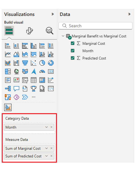
Categories
Power BI tooltips display contextual information when users hover over report elements for deeper insights — and that enhances visualization.


This guide shows you some Power BI design ideas and how to use Power BI. It also shows you how to integrate the Power BI datasets into any Power BI data model.
Whether you’re using Power BI for Mac or Power BI Web, this guide will expose you to some Power BI advanced features, like the Power BI connectors and the Power BI report builder.
There are sections in this guide that show you how the Power BI transform data works and how to represent data using the Sankey Diagram in Power BI. And if you’re building a dashboard from scratch, you can draw some inspiration by looking at some Power BI dashboard designs.
Definition: Power BI tooltips are small, interactive pop-up boxes that appear when you hover a visual or data point in a Power BI report. Tooltips show specific data values, additional measures (or dimensions), and custom visuals.
The tooltip showcases relevant information when users hover over a data point or visual. This helps the user to get a good grasp of the story behind the data without switching views or navigating away from the main dashboard.
Instead of cluttering a dashboard with extra text boxes or visuals, you can insert detailed metrics in the tooltip. This keeps the report clean and focused.
Users can dig deeper into the data by simply hovering. This encourages self-service analytics and helps users explore insights independently.
Tooltips guide users through complex dashboards and offer hints or data highlights. This improves usability and engagement. It also makes the dashboards more interactive and intuitive for non-technical users.
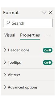
Select the visual you want to customize. Navigate to the visualizations pane and find the Tooltip section.
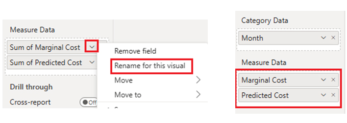
Drag fields into the tooltip well to display specific measures (or dimensions). When you hover over the visual, the tooltip will show the fields.
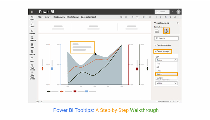
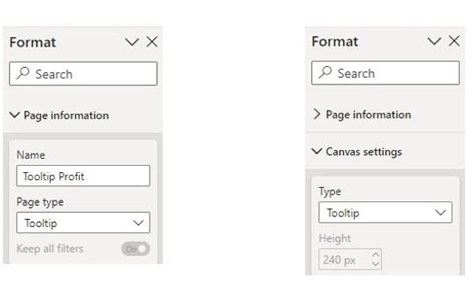
Navigate to the “New Page” option and create a new page. In the Page Information section (under the Format pane), turn on “Tooltip.” You can resize the page to a smaller size (like 320×240 px) under Page Size > Type > Tooltip.
Design your page with Power BI charts, KPIs, or text relevant to the main report visuals. You should also format it to match your report’s theme and layout.
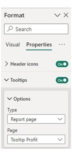
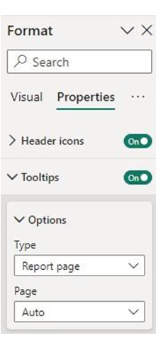
Navigate to the main report page, select a visual, and go to the Format pane > Tooltip. Change the Type to Report Page, and choose the tooltip page you created from the Page dropdown.
To see the customized tooltip in action, hover over the visual. You can also use filters and slicers on the tooltip page for dynamic, data-driven responses.
Create a new report page and turn it into a tooltip. Navigate to the Format pane, switch on the “Tooltip” toggle under Page Information, and change the page size to Tooltip under Page Size settings.
Add charts, images, KPIs, and other visuals relevant to the main data point. Use fields and filters to make the tooltip dynamic. The data shown will change based on where the user hovers. This is especially useful when paired with a KPI visual in Power BI, as it allows users to see detailed performance context without leaving the main dashboard.
To activate the tooltip, select the visual on your main report. In the Format > Tooltip section, you’ll have to choose “Report Page” as the type. After that, select your custom tooltip page from the dropdown.
When users hover over the visual, Power BI automatically displays the custom tooltip, which shows the relevant filtered data. All these give room for cleaner reports with rich, drill-down insights available on demand.
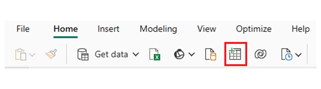
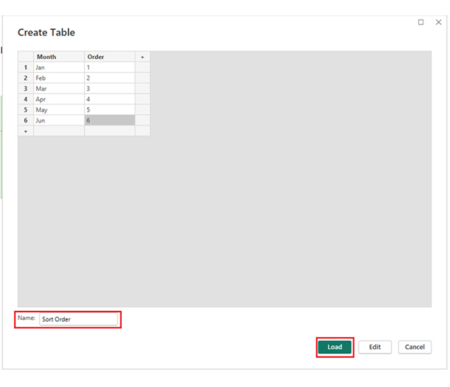
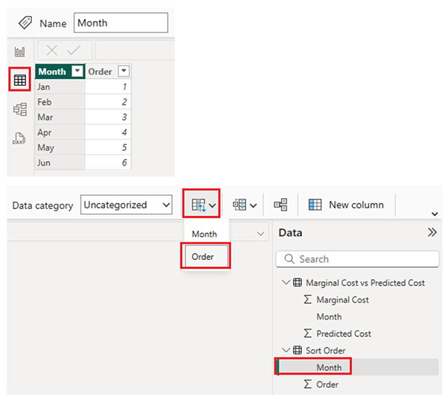
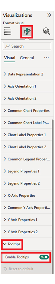
Here are the steps to enable Tooltips:
There’s the Pie Chart on page “Tooltip Profit” as a custom tooltip.
Multiple Tooltips:
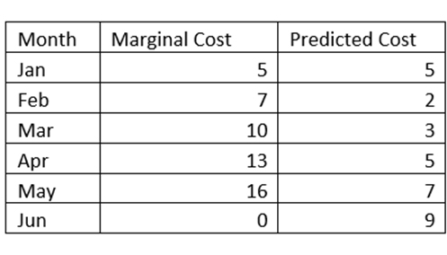
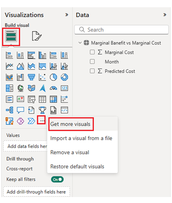
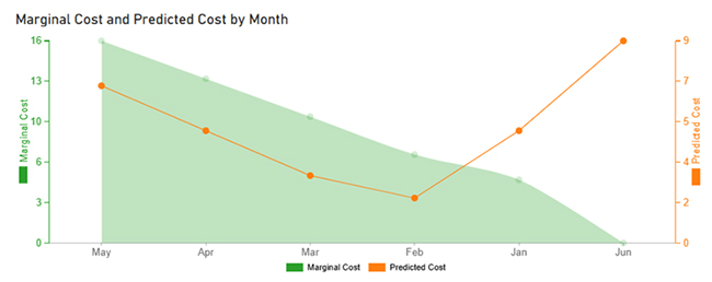
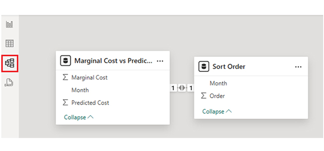
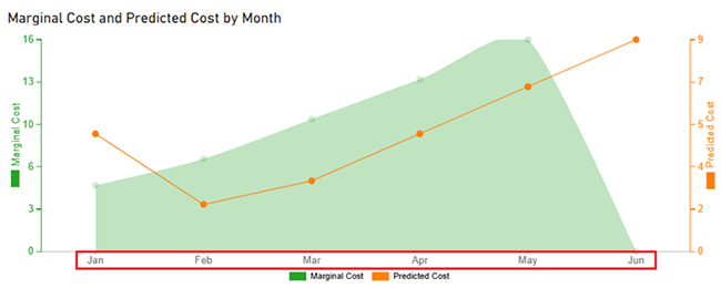
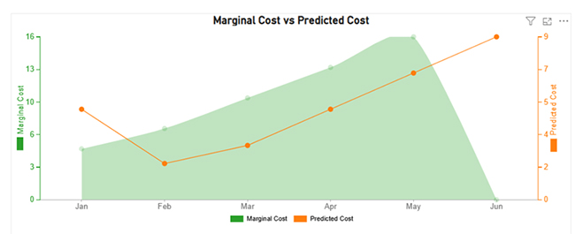
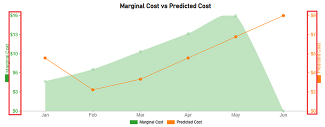
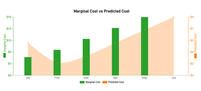
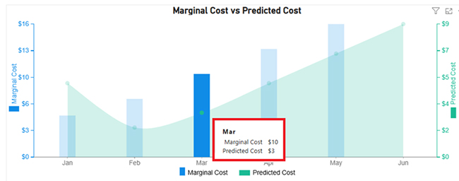
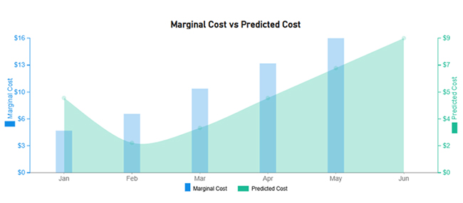
The chart compares Marginal Cost (bar chart) with Predicted Cost (area chart) over six months (Jan-Jun):
Select the visual, navigate to the Format pane, enable Tooltip, and assign fields (or a custom report page) as the tooltip.
A dynamic tooltip in Power BI shows context-sensitive data that changes based on the data point hovered over, and that provides tailored insights using filters (or field values) from the main visual.
Use custom tooltip pages with different visuals, assign them to various report elements by selecting each visual, and link the appropriate tooltip page.
Power BI tooltips are hover-over pop-ups that display contextual data. They help offer instant insights, enhance interactivity, save space, and help users explore detailed information without cluttering reports.
To get the most out of the Power BI tooltips, you have to keep it concise, avoid clutter, and test responsiveness. Showcase only the most relevant and actionable data to avoid overwhelming users.
Focus on key insights and don’t overcrowd tooltips with too many visuals (or metrics). You should also check how tooltips behave on different screen sizes and in Power BI Service.
Now you know the importance of Power BI tooltips, how will you integrate them into your data visualization process?
How much did you enjoy this article?


Discover diverse and high-quality Power BI report examples for inspiration and insights. Elevate your reporting with strategic visualization techniques.

A Customer Relationship Management Dashboard centralizes data, tracks key metrics, and drives smarter business decisions. Discover now!

Explore Healthcare Dashboard Examples and learn how to turn complex healthcare data into clear, actionable insights for better decision-making.


