Categories
Power BI is a data visualization and business intelligence tool that helps organizations use data analytics to address business challenges.


Power BI users will likely have to write formulas, expressions, or refilter tables for certain use cases. This will, in turn, enable the user to evaluate data and calculate numbers so as to address real-world business challenges.
First…
The ALLEXCEPT function in Power BI is a powerful tool for managing filters in Power BI.
It removes all context filters in the table, except for those applied to the specified columns, allowing for precise control over your data analysis.
ALL function: It removes all filters from a table or column.
Here’s an example:
ALLEXCEPT function in Power BI comes in handy in scenarios where users want to perform calculations on a table while maintaining certain filters but removing others. The function plays a vital role in situations where the user needs to isolate specific dimensions for analysis.
For instance, when calculating the total sales for each product category while disregarding filters on other columns, you should use ALLEXCEPT(’Sales’, ‘Sales’[ProductCategory]). It ensures that filters on the ‘ProductCategory’ column are preserved. That provides a context for the calculation, and filters on other columns (like region or date) are removed.
The result is a focused analysis that allows you to examine the desired dimension’s contribution to the calculation without interference from unrelated filters. By combining the ALLEXCEPT function with the CALCULATE function in Power BI, you can enhance the flexibility of DAX calculations, enabling more precise and targeted data analysis.
The ALLEXCEPT function in DAX is used to control the filter context within a calculation. It removes filters from all columns in a table except for the specified ones, enabling focused calculations on specific dimensions while maintaining the context of those columns. When combined with DAX variables, ALLEXCEPT enhances the flexibility and clarity of your formulas, making it easier to manage complex calculations and improve performance.
Here’s the breakdown of how ALLEXCEPT works in DAX:
ALLEXCEPT(<table>, <column1>, <column2>, …)
In Power BI, the ALLSELECT function is used to evaluate a table expression. It removes all filters except those explicitly defined using the visual elements (or slicers).
The ALLEXCEPT function, on the other hand, is used to remove filters from all columns except the ones specified.
Here’s how to use ALLEXCEPT in Power BI:
<table>: The table from which you want to remove filters.
<column1>, <column2>, … The columns for which you want to retain filters.
If there’s a table named Sales with columns Product, Region, and Date, and you need to calculate the total sales for all products in a specific region, regardless of the date filter, Power BI makes this simple. To ensure clarity, use the appropriate Power BI date format while working with the Date column. Here’s how it’s done.
Total Sales (All Except Date) =
CALCULATE(
SUM(Sales[SalesAmount]),
ALLEXCEPT(Sales, Sales[Product], Sales[Region])
)


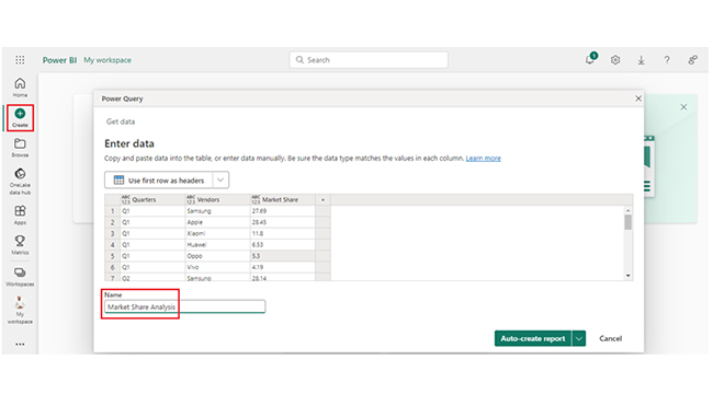
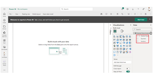
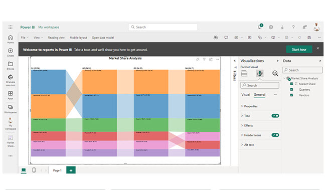
| Quarters | Vendors | Market Share |
| Q1 | Samsung | 27.69 |
| Q1 | Apple | 28.45 |
| Q1 | Xiaomi | 11.8 |
| Q1 | Huawei | 6.53 |
| Q1 | Oppo | 5.3 |
| Q1 | Vivo | 4.19 |
| Q2 | Samsung | 28.14 |
| Q2 | Apple | 27.58 |
| Q2 | Xiaomi | 12.62 |
| Q2 | Huawei | 6.17 |
| Q2 | Oppo | 5.5 |
| Q2 | Vivo | 4.21 |
| Q3 | Samsung | 28.45 |
| Q3 | Apple | 27.71 |
| Q3 | Xiaomi | 12.9 |
| Q3 | Huawei | 6 |
| Q3 | Oppo | 5.29 |
| Q3 | Vivo | 4.17 |
| Q4 | Samsung | 27.97 |
| Q4 | Apple | 27.62 |
| Q4 | Xiaomi | 12.68 |
| Q4 | Huawei | 5.17 |
| Q4 | Oppo | 6.07 |
| Q4 | Vivo | 4.66 |
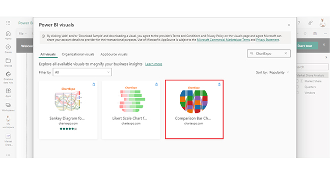
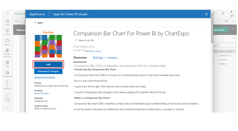
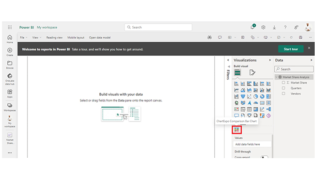
The following video will help you create a Comparison Bar Chart in Microsoft Power BI.
In DAX, the ALLEXCEPT function removes filters from all columns in a specified table except for the columns explicitly mentioned. It also allows focused calculations on selected dimensions while preserving their filter context.
“All Except” refers to a function in DAX used in Power BI. ALLEXCEPT removes filters from all columns in a table except for the ones specified, and that enables focused calculations on selected dimensions.
Yes, ALLEXCEPT DAX function returns a table. Filters are removed from all columns in a specified table except for the columns explicitly listed. This creates a modified table with a refined filter context.
ALLEXCEPT in Power BI helps the user perform focused analyses on specific dimensions while retaining context. It boosts flexibility, isolates dimensions for detailed insights, and gives room for more targeted and precise data analysis.
Visualization in Power BI improves understanding by presenting data insights graphically. It helps the user evaluate ALLEXCEPT results and also provides a clear, intuitive representation of filtered data. It also supports informed decision-making.
The ALLEXCEPT function plays a vital role in complex calculations where isolating specific dimensions is crucial. It helps in facilitating the creation of sophisticated DAX formulas that respond to changing filter contexts.
Furthermore, the function helps the user to achieve more consistent and predictable results in cases where they have to control the impact of filters on a calculation.
By now, you should know how to create the Comparison Bar Chart in Power BI and the benefits of the ALLEXCEPT function in Power BI. It’s time to perform more complex data analyses for your organization.
How much did you enjoy this article?


Discover diverse and high-quality Power BI report examples for inspiration and insights. Elevate your reporting with strategic visualization techniques.

A Customer Relationship Management Dashboard centralizes data, tracks key metrics, and drives smarter business decisions. Discover now!

Explore Healthcare Dashboard Examples and learn how to turn complex healthcare data into clear, actionable insights for better decision-making.


