• Home
  • Tools dropdown img
    • Spreadsheet Charts

      • ChartExpo for Google Sheets
      • ChartExpo for Microsoft Excel
    • Power BI Charts

      • Power BI Custom Visuals by ChartExpo
    • Word Cloud

  • Charts dropdown img
    • Chart Category

      • Bar Charts
      • Circle Graphs
      • Column Charts
      • Combo Charts
      • Comparison Charts
      • Line Graphs
      • PPC Charts
      • Sentiment Analysis Charts
      • Survey Charts
    • Chart Type

      • Box and Whisker Plot
      • Clustered Bar Chart
      • Clustered Column Chart
      • Comparison Bar Chart
      • Control Chart
      • CSAT Survey Bar Chart
      • CSAT Survey Chart
      • Dot Plot Chart
      • Double Bar Graph
      • Funnel Chart
      • Gauge Chart
      • Likert Scale Chart
      • Matrix Chart
      • Multi Axis Line Chart
      • Overlapping Bar Chart
      • Pareto Chart
      • Radar Chart
      • Radial Bar Chart
      • Sankey Diagram
      • Scatter Plot Chart
      • Slope Chart
      • Sunburst Chart
      • Tornado Chart
      • Waterfall Chart
      • Word Cloud
    • Google Sheets
      Microsoft Excel
  • Services
  • Pricing
  • Contact us
  • Blog
  • Support dropdown img
      • Gallery
      • Videos
      • Contact us
      • FAQs
      • Resources
    • Please feel free to contact us

      atsupport@chartexpo.com

Categories
All Data Visualizations Data Analytics Surveys
Add-ons/
  • Google Sheets
  • Microsoft Excel
  • Power BI
All Data Visualizations Data Analytics Surveys
Add-ons
  • Google Sheets
  • Microsoft Excel
  • Power BI

We use cookies

This website uses cookies to provide better user experience and user's session management.
By continuing visiting this website you consent the use of these cookies.

Ok

ChartExpo Survey


Home > Blog > Power BI

Percentage of Total in Power BI: A Visual Guide

The percentage of total in Power BI is one of the most important metrics that helps users draw meaningful insights from their analysis and make data-driven decisions.

Percentage of Total in Power BI

In this guide, you’ll discover how to calculate the percentage of the total in Power BI and why such calculations are important.

Table of Contents:

  1. What is Power BI Percent of Total?
  2. Why Do We Calculate the Percentage of the Total in Power BI?
  3. How Do You Calculate the Percentage of Total in Power BI?
  4. How Do You Evaluate the Power BI Percent of Total by Category?
  5. How to show a Percentage of the total in Power BI??
  6. What are the Advantages of Calculating the Power BI Percentage of Total?
  7. Wrap Up

First…

What is Power BI Percent of Total?

Definition: The percentage of the total in Power BI is used to express the proportion of a value compared to the total of the values given. It’s widely used to figure out the contribution of each item to the overall total. Results from this calculation are usually expressed as a percentage. It’s used to visualize relative importance (or distribution) within a Power BI dataset.

Why Do We Calculate the Percentage of the Total in Power BI?

Calculating the percentage of the total in Power BI is essential for several reasons:

  • Relative Comparison: It helps in comparing individual values against the total value. This way, users will gain insights into the contribution (or relative importance) of an individual value to the whole.
  • Visualization: The percentage of the total is much easier to visually interpret in graphs and charts. Imagine slicing a pie to see which piece is the biggest percentage let you quickly spot the significant portions. This clarity helps you interpret graphs and charts more effectively, providing a clear grasp of value distribution within the dataset. It’s like turning raw numbers into a visual story, making complex data intuitive and accessible. With visual storytelling, you can quickly and effectively communicate insights, making data not just understandable but engaging and memorable.
  • Identifying Trends and Patterns: Trend analysis enhances the identification of outliers or patterns by spotlighting values with a significant impact on the total. It’s like having a magnifying glass that highlights the most impactful data points, helping you see trends and anomalies that might otherwise go unnoticed. By focusing on these key values, trend analysis turns data into a vivid narrative, making it easier to uncover insights and patterns that drive meaningful decisions.
  • Decision Making: The Percentage of the total in Power BI indicates the areas (or items) with the most significant impact on the entire performance. And that helps in making data-driven decisions.
  • Benchmarking: By comparing the percentage contribution of different categories (or items), Power BI percent of the total helps benchmark against industry standards (or targets).

How Do You Calculate the Percentage of Total in Power BI?

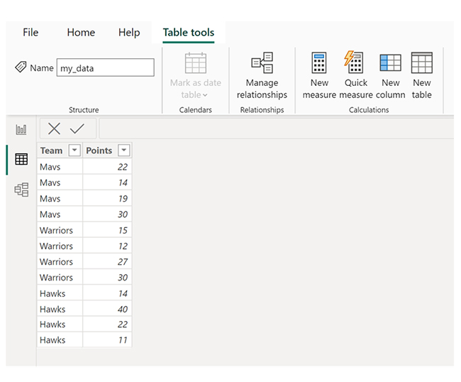
Let’s say there’s a table in Power BI named my_data, the table contains points scored by basketball players on multiple teams.

Putting Basketball Players Data for Calculating Percentage of Total in Power BI

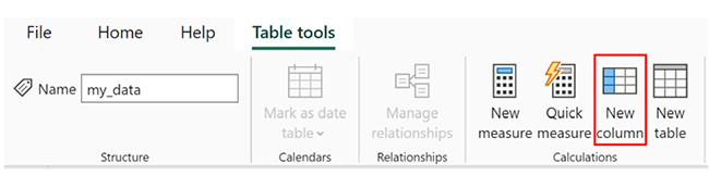
There’s the option of adding a new column to show how each value in the Points column represents a percentage of the total values in the Points column. To do that, click the “Table Tools” tab. From the options that come up, click the “New column” icon.

Add New Column for Calculating Percentage of Total in Power BI

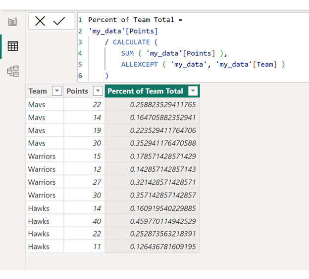
After that, input the formula below into the formula bar:

A new column named “Percent of Team Total” will be created. The column shows you how each value in the “Points” column represents a percentage of the total values in the Points column for each team.

To showcase the values as percentages, click the dropdown arrow next to the Format option. After that, click Percentage.

Click Percenatge for Calculating Percentage of Total in Power BI

Each of the values in the Percent of Team Total column will be showcased as percentages.

See Percent of Team Total Column for Calculating Percentage of Total in Power BI

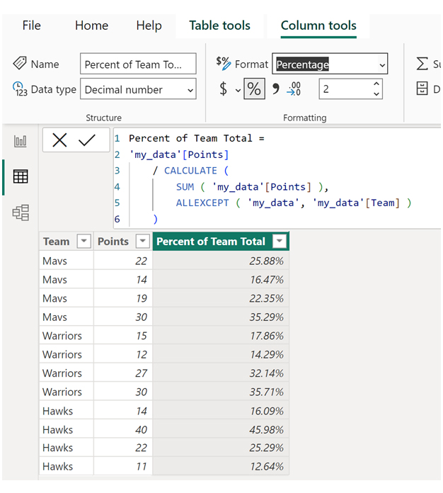
Here’s an easy way of interpreting the values in the Percent of Team Total column:

  • The first Mavs player scored 25.88% of all points scored by the Mavs.
  • The second Mavs player scored 16.47% of all points scored by the Mavs.
  • The third Mavs player scored 22.35% of all points scored by the Mavs.
  • The fourth Mavs player scored 35.29% of all points scored by the Mavs.

Adding up all the percentages will give a total of 100%.

Total Mavs Points: 25.88% + 16.47% + 22.35% + 35.29% = 100%.

You’ll notice the same pattern in other teams in the table.

How Do You Evaluate the Power BI Percent of Total by Category?

These are the steps to help you evaluate the Power BI percent of total by category:

  1. Create the Measure: You can get started by using Data Analysis Expressions (DAX) to create a measure that calculates the total for your desired category. For instance, to calculate the percentage of total sales by product category, you’ll have to create a measure that calculates the total sales for the individual product category.
  2. Create a Percentage of Total Measure: To calculate the percentage of total for each category, create another measure using DAX. To do that, you’ll have to divide the total for each category by the overall total across all categories.
  3. Visualize the Data: In the realm of Power BI dashboard designs, visualizations like column charts, bar charts, or tables can vividly showcase the percentage of the total by category. Simply drag the category field and the percentage of total measure into your chosen data visualization to bring your data to life. This approach transforms raw figures into a visually engaging story, making it easy to discern how each category contributes to the whole. With thoughtful design, your Power BI dashboards become not just a display of data but a powerful tool for insightful analysis and decision-making.
  4. Add Interactivity: Power BI interactive features enable users to explore the data. For instance, you can enable the drill-down feature to allow you to drill down into categories for detailed analysis of your data.
  5. Analyze and Interpret: Analyze your data to identify outliers, patterns, or trends using the DAX format. By interpreting the results, you’ll gain insights into the relative contribution of individual categories to the overall total.

How to show a Percentage of the total in Power BI?

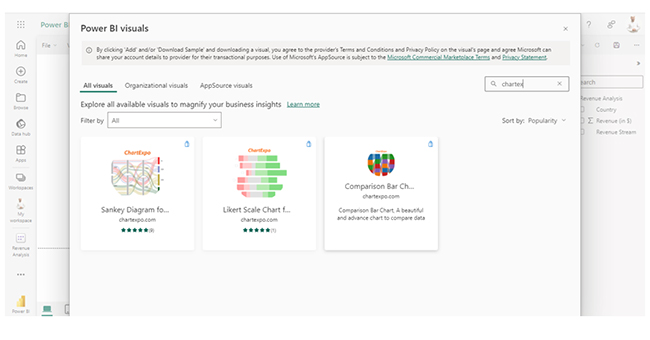
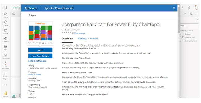
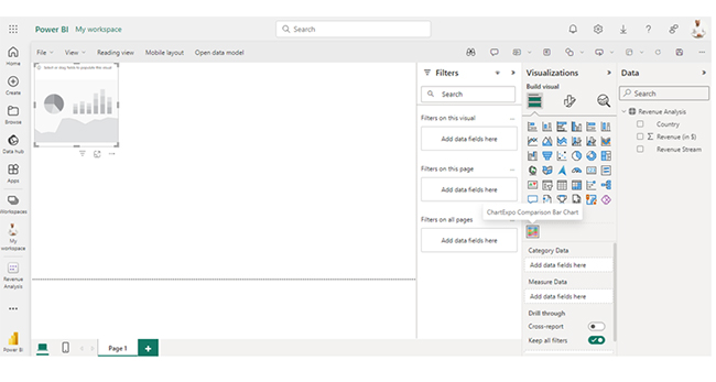
Stage 1: Logging in to Power BI

  • Log in to Power BI.
  • Enter your email address and click the “Submit” button.
Enter email to login to Power BI
  • You are redirected to your Microsoft account.
  • Enter your password and click “Sign in“.
Enter Password to login to Power BI
  • You can choose whether to stay signed in.
Click on stay signed in
  • Once done, the Power BI home screen will open.

Stage 2: Creating a Data Set and Selecting the Data Set to Use in Your Chart

  • Go to the left-side menu and click the “Create” button.
  • Select “Paste or manually enter data“.
select Paste or manually enter data in Power BI ce487
  • We’ll use the sample data below for this example.
Country Revenue Stream Revenue (in $)
USA Digital Advertising Revenue 39,620,000
USA Event Marketing Revenue 10,670,000
USA Content Marketing Revenue 5,580,000
USA Print & Outdoor Revenue 455,270
UK Digital Advertising Revenue 40,710,000
UK Event Marketing Revenue 24,770,000
UK Content Marketing Revenue 6,330,000
UK Print & Outdoor Revenue 552,190
DNK Digital Advertising Revenue 47,040,000
DNK Event Marketing Revenue 29,070,000
DNK Content Marketing Revenue 7,740,000
DNK Print & Outdoor Revenue 600,690
DNK Media Relations Revenue 106,430
AUS Digital Advertising Revenue 53,790,000
AUS Event Marketing Revenue 38,530,000
AUS Content Marketing Revenue 6,590,000
AUS Print & Outdoor Revenue 9,040,000
AUS Media Relations Revenue 6,130,000
FR Digital Advertising Revenue 57,860,000
FR Event Marketing Revenue 50,450,000
FR Content Marketing Revenue 3,560,000
FR Print & Outdoor Revenue 18,790,000
FR Media Relations Revenue 15,460,000
IND Digital Advertising Revenue 60,470,000
IND Event Marketing Revenue 63,200,000
IND Content Marketing Revenue 2,080,000
IND Print & Outdoor Revenue 29,500,000
IND Media Relations Revenue 30,020,000
  • Paste the data table into the “Power Query” window. After that, choose the “Create a dataset only” option.
Create A Dataset Only After Calculating Percentage of Total in Power BI
  • Navigate to the left-side menu and click the “Data Hub” option. Power BI will populate the dataset. However, if you’ve not created a data set, you’ll get an error message. Next, click “Create report.”
Click Create Report After Calculating Percentage of Total in Power BI
  • To see the chart metrics, click “Expand All.” You can check the dimensions and metrics.
Click Expand All for Selecting Fields After Calculating Percentage of Total in Power BI
  • Click “Get more visuals,” and search ChartExpo. Select Comparison Bar Chart:
Click Get More Visuals After Calculating Percentage of Total in Power BI
  • Click “Add.”
Click Add After Calculating Percentage of Total in Power BI
  • You’ll see the Comparison Bar Chart in the visuals list:
Look for Comparison Bar Chart After Calculating Percentage of Total in Power BI
  • At this point, click on the License Settings and add your key. After adding the key, you’ll get a comparison bar chart similar to the one below.
Add License Key After Calculating Percentage of Total in Power BI
  • The Comparison Bar Chart in Power BI will look like this:
Final Percentage of Total in Power BI

Insights

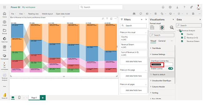
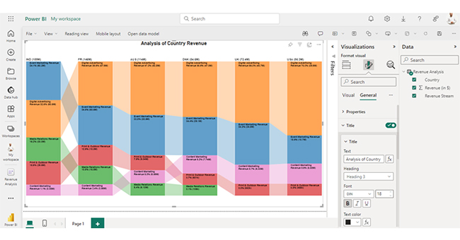
Here are the major insights from the chart:

  • The country with the highest total revenue is India. They’re followed closely by France, Australia, and Denmark.
  • “Digital Advertising” generates significant revenue in most countries. However, that’s not the case in India. In India, “Event Marketing” is the leading revenue contributor.
  • Revenue streams like “Media Relations” are absent in the US and the UK.
  • The contribution from content marketing in France is low compared to other revenue streams.

What are the Advantages of Calculating the Power BI Percentage of Total?

Calculating the percentage of the total in Power BI offers several advantages that enhance data analysis and visualization. Here are some key advantages:

  1. Comparative Analysis: It helps in comparing individual values against the total. This will, in turn, enable the user to draw insight into the contribution or relative importance of each value.
  2. Identifying Trends: The percentage of total in Power BI helps in identifying anomalies (or trends). It does that by highlighting values with a significant impact on the total.
  3. Visual Representation: Percentages of total are visually intuitive and that makes it easy to get a good grasp of patterns and data distribution.
  4. Flexibility: Power BI allows users to calculate percentages of total across multiple levels of granularity and dimensions.
  5. Decision Support: The percentage of total calculations helps in the decision-making process. And that is done by showcasing the items (or areas) that have the most impact on the overall performance.
  6. Interactivity: There are interactive features that help users to drill down into data. This will enable the user to have a more robust exploration of the percentages of total.
  7. Customization: There are options for customizing the calculations to fit your analytical needs. These could be calculating percentages within periods or subcategories.

FAQs

How to Show the Percentage on Power BI?

First, you need to create a measure using DAX to calculate the percentage. After that, add it to the visualization along with other relevant fields for comparison.

How to Calculate the Percentage with DAX?

The formula below is used for calculating percentage with DAX in Power BI:

Measure for Total Sales:

Total Sales = SUM(Sales[SalesAmount])

Measure for Sales Percentage:

Sales Percentage = DIVIDE(SUM(Sales[SalesAmount]), [Total Sales], 0)

Wrap Up

A good grasp of the percentage of total in Power BI helps users analyze the relative contributions within the data. Calculating it involves comparing individual values against the total. To do that, use DAX to create a measure that divides the value by the total, and multiplies it by 100.

The percentage of total in Power BI plays a crucial role in:

  • Comparative analysis
  • Visual representation
  • Identifying trends
  • Decision making
  • Customization
  • Interactivity

Following the steps in this guide will make you a proficient Power BI user over time. This way, you’ll be able to create interactive and engaging visualizations.

Now you know the benefits of calculating the percentage of total in Power BI, what type of data will you be analyzing, and what will you be looking out for?

How much did you enjoy this article?

PBIAd2
Start Free Trial!
137307

Related articles

next previous
Power BI14 min read

Power BI Data Visualizations: Building Charts That Inspire

Discover and navigate Power BI data visualizations. Enhance your data visualization capabilities. Choose the most appropriate tools for your use case.

Power BI8 min read

Power BI Incremental Refresh: A Complete Guide

This guide dives deep into what the Power BI incremental refresh is. It shows you why you should use it, and how to set up incremental refresh in Power BI.

Power BI17 min read

Creating a Hierarchy in Power BI: Unveiling Essential Steps

Unlock full potential with our comprehensive guide on creating a hierarchy in Power BI. Learn processes, & user-friendly techniques for insightful visuals.

Power BI13 min read

Date Hierarchy in Power BI: Ultimate Guide for Users

Enhance your analysis with Date Hierarchy in Power BI. Discover the steps to create, customize, & utilize hierarchies effectively for more insight and reporting.

Power BI12 min read

How to Create a Dashboard in Power BI?

Uncover the secrets through the steps for how to create a dashboard in Power BI. Harness the power of Microsoft's business intelligence platform.

ChartExpo logo

Turn Data into Visual
Stories

CHARTEXPO

  • Home
  • Gallery
  • Videos
  • Services
  • Pricing
  • Contact us
  • FAQs
  • Privacy policy
  • Terms of Service
  • Sitemap

TOOLS

  • ChartExpo for Google Sheets
  • ChartExpo for Microsoft Excel
  • Power BI Custom Visuals by ChartExpo
  • Word Cloud

CATEGORIES

  • Bar Charts
  • Circle Graphs
  • Column Charts
  • Combo Charts
  • Comparison Charts
  • Line Graphs
  • PPC Charts
  • Sentiment Analysis Charts
  • Survey Charts

TOP CHARTS

  • Sankey Diagram
  • Likert Scale Chart
  • Comparison Bar Chart
  • Pareto Chart
  • Funnel Chart
  • Gauge Chart
  • Radar Chart
  • Radial Bar Chart
  • Sunburst Chart
  • see more
  • Scatter Plot Chart
  • CSAT Survey Bar Chart
  • CSAT Survey Chart
  • Dot Plot Chart
  • Double Bar Graph
  • Matrix Chart
  • Multi Axis Line Chart
  • Overlapping Bar Chart
  • Control Chart
  • Slope Chart
  • Clustered Bar Chart
  • Clustered Column Chart
  • Box and Whisker Plot
  • Tornado Chart
  • Waterfall Chart
  • Word Cloud
  • see less

RESOURCES

  • Blog
  • Resources
  • YouTube
SIGN UP FOR UPDATES

We wouldn't dream of spamming you or selling your info.

© 2025 ChartExpo, all rights reserved.