• Home
  • Tools dropdown img
    • Spreadsheet Charts

      • ChartExpo for Google Sheets
      • ChartExpo for Microsoft Excel
    • Power BI Charts

      • Power BI Custom Visuals by ChartExpo
    • Word Cloud

  • Charts dropdown img
    • Chart Category

      • Bar Charts
      • Circle Graphs
      • Column Charts
      • Combo Charts
      • Comparison Charts
      • Line Graphs
      • PPC Charts
      • Sentiment Analysis Charts
      • Survey Charts
    • Chart Type

      • Box and Whisker Plot
      • Clustered Bar Chart
      • Clustered Column Chart
      • Comparison Bar Chart
      • Control Chart
      • CSAT Survey Bar Chart
      • CSAT Survey Chart
      • Dot Plot Chart
      • Double Bar Graph
      • Funnel Chart
      • Gauge Chart
      • Likert Scale Chart
      • Matrix Chart
      • Multi Axis Line Chart
      • Overlapping Bar Chart
      • Pareto Chart
      • Radar Chart
      • Radial Bar Chart
      • Sankey Diagram
      • Scatter Plot Chart
      • Slope Chart
      • Sunburst Chart
      • Tornado Chart
      • Waterfall Chart
      • Word Cloud
    • Google Sheets
      Microsoft Excel
  • Services
  • Pricing
  • Contact us
  • Blog
  • Support dropdown img
      • Gallery
      • Videos
      • Contact us
      • FAQs
      • Resources
    • Please feel free to contact us

      atsupport@chartexpo.com

Categories
All Data Visualizations Data Analytics Surveys
Add-ons/
  • Google Sheets
  • Microsoft Excel
  • Power BI
All Data Visualizations Data Analytics Surveys
Add-ons
  • Google Sheets
  • Microsoft Excel
  • Power BI

We use cookies

This website uses cookies to provide better user experience and user's session management.
By continuing visiting this website you consent the use of these cookies.

Ok

ChartExpo Survey


Home > Blog > Data Analytics

Nominal vs. Ordinal Data: Key Differences Explained

Picking the right data type isn’t optional. It shapes how you collect information, analyze patterns, and tell stories with numbers.

Nominal vs. Ordinal Data

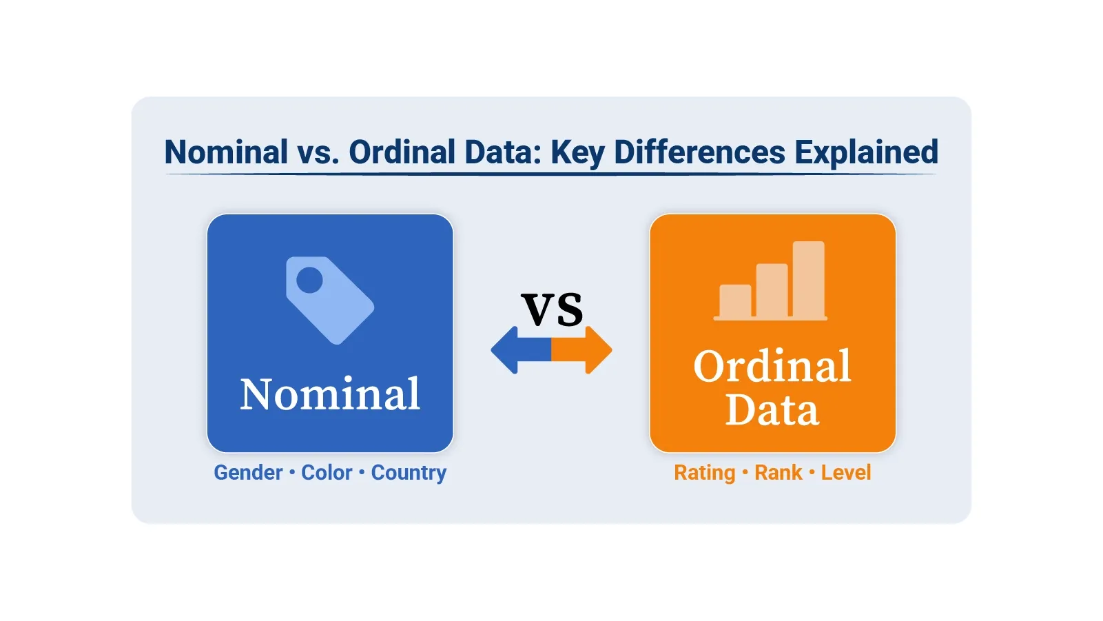
Nominal vs. ordinal data might sound like academic jargon, but get it wrong and your conclusions fall apart. These are both categorical types, yet they function differently and demand distinct approaches.

Nominal data groups things into categories without ranking them. Ordinal data ranks categories in order but can’t measure the gaps between them. That distinction matters when you’re building charts, running analysis, or presenting findings. This guide breaks down definitions, shows real-world scenarios, and walks through visualization methods using Google Sheets tools.

Table of Contents:

  1. What is Nominal Data?
  2. How is Nominal Data Collected?
  3. What is Nominal Data Used For?
  4. What is Ordinal Data?
  5. How is Ordinal Data Collected?
  6. What is Ordinal Data Used For?
  7. Nominal vs. Ordinal Data: Key Differences
  8. Ordinal Data vs. Nominal Data: Similarities
  9. Explaining the Nominal Data vs. Ordinal Data Examples
  10. How to Visualize Nominal and Ordinal Data in Google Sheets?
  11. Best Practices for Analyzing Nominal and Ordinal Data
  12. FAQs
  13. Wrap Up

What is Nominal Data?

Definition: Nominal data sorts information into distinct groups that have no inherent sequence. Each category stands alone as a label, not a rank. Think of it as putting items into buckets where the buckets don’t line up in any meaningful way.

Gender, product type, region, or customer segment all work as nominal data. You can’t say one is higher or better than another. They’re just different labels for different things.

How is Nominal Data Collected?

You typically gather nominal data through structured methods that let people pick from preset categories. Here’s how it works:

  • Survey forms asking respondents to select options.
  • Multiple-choice questions with distinct answer choices.
  • Database systems that categorize records into types.
  • Field observation, where you assign items to groups.

What is Nominal Data Used For?

Nominal data powers several analysis techniques:

  • Finding patterns through data discovery and grouping similar items together
  • Building visual representations like pie charts and bar graphs
  • Creating summary reports that show category distributions
  • Segmenting audiences for targeted data analytics

What is Ordinal Data?

Definition: Ordinal data adds a layer of structure that nominal data lacks. Categories still exist, but now they follow a sequence. One item ranks above or below another in a clear hierarchy.

The catch? You can see the order, but you can’t measure the distance between ranks. Going from poor to fair isn’t the same jump as fair to good, even though both move one step up. That makes ordinal data useful for ranking, but limited for math.

Satisfaction ratings work this way. So do education tiers and priority levels. You know which is higher, just not by how much.

How is Ordinal Data Collected?

Collection methods capture the ranking structure:

  • Likert scale questions that ask people to rate agreement levels
  • Survey items where respondents rank options by preference
  • Performance reviews that assign tiered ratings
  • Priority assignments that sort tasks by importance

The key element is maintaining logical sequence. Values must follow a path from low to high or worst to best.

What is Ordinal Data Used For?

Ordinal data supports analysis where position matters:

  • Tracking trends by analyzing and interpreting data patterns across ordered groups.
  • Making sense of ranked information through data interpretation.
  • Showing ordered results in data presentation formats.
  • Evaluating how options stack up against each other.

Ranking lets you compare relative standing. Exact calculations like standard deviation don’t apply because the intervals aren’t uniform.

Nominal vs. Ordinal Data: Key Differences

The split between these types comes down to structure and what you can do with them. Here’s the breakdown:

Nominal Data

Ordinal Data

There is no natural order among categories. Categories follow a meaningful order.
Categories cannot be ranked or compared. Categories can be ranked based on their position.
Mathematical operations cannot be performed. Mathematical operations are limited and do not include fixed intervals.
Examples include color, gender, and region. Examples include ratings, grades, and levels.

Ordinal Data vs. Nominal Data: Similarities

Even with their differences, ordinal data vs. nominal data share common ground:

  • Both sit in the categorical data family.
  • Neither uses true numbers at its foundation.
  • Survey design and classification systems rely on both.
  • Frequency counts work for analyzing either type.

This overlap confuses. Knowing which type you’re working with prevents analytical mistakes.

Explaining the Nominal Data vs. Ordinal Data Examples

Real scenarios make the distinction clearer.

Nominal Data Examples:

  • Types of products, like Electronics, Apparel, and Grocery
  • Countries where customers live, such as the USA, Canada, and the UK
  • The web browsers people use, including Chrome, Firefox, and Safari

Ordinal Data Examples:

  • How satisfied customers feel, ranked as Low, Medium, or High
  • Educational background, progressing through High School, Bachelor’s, and Master’s
  • Task urgency, classified as Low, Normal, High

These ordinal data vs. nominal data examples show whether your categories form a hierarchy or simply label different groups. Tools like Excel and Google Sheets handle both types.

ChartExpo turns categorical information into clear charts that support better data interpretation and reporting. The next section highlights ten powerful ChartExpo visuals for analyzing nominal vs. ordinal data in Excel and Google Sheets.

Top 10 ChartExpo Visuals in Google Sheets to Show Nominal vs Ordinal Data

Example # 1:

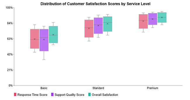
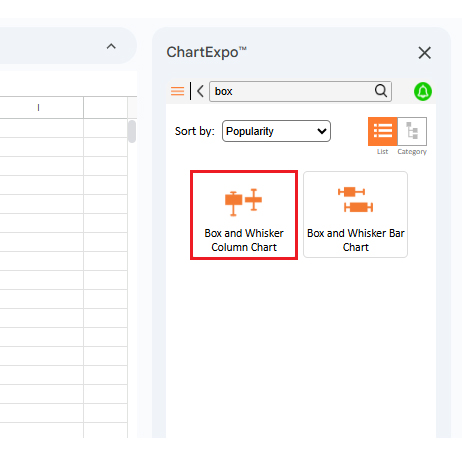
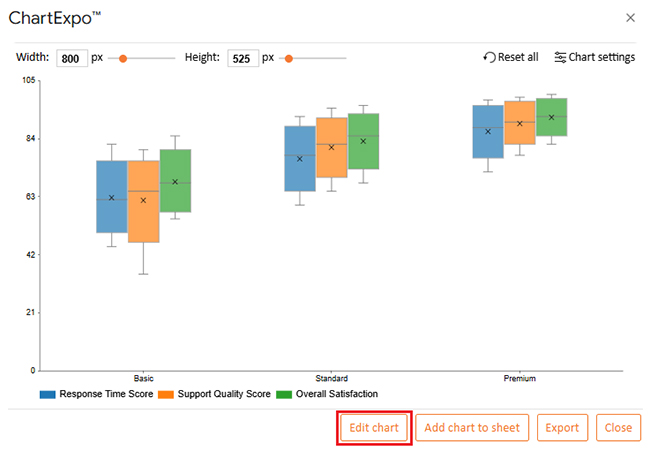
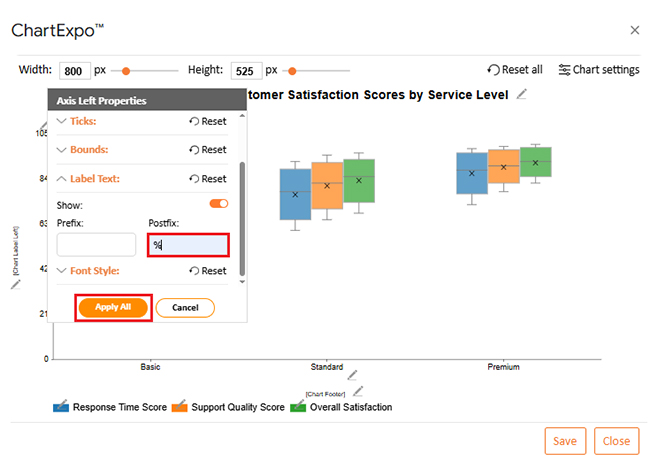
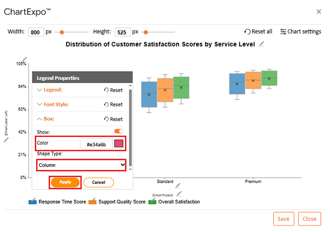
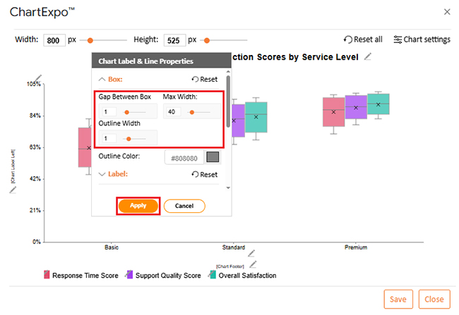
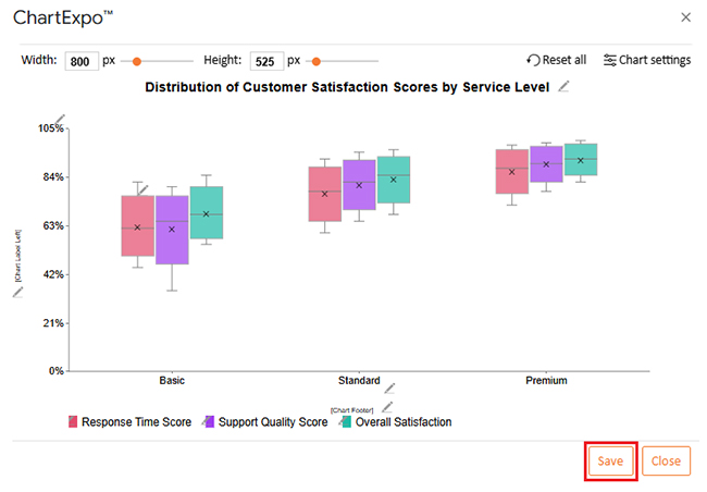
Box and Whisker Column Charts show how data spreads across categories by displaying median values, quartiles, range, and outliers. They’re particularly effective for comparing ordinal or grouped information, revealing consistency and spotting unusual values.

Nominal vs. Ordinal Data

Example # 2:

Clustered Bar Charts let you compare several metrics at once within the same categories. They make differences obvious at a glance, which helps when analyzing patterns across categorical data groupings.

Nominal vs. Ordinal Data

Example # 3:

Clustered Column Charts display multiple measures side by side for easy evaluation. They work well with nominal data when you want to compare respondent groups across different customer segments.

Nominal vs. Ordinal Data

Example # 4:

Double Bar Graphs show two related metrics across identical categories, making contrasts easy to spot. They’re especially useful with ordinal data where values get compared across naturally ordered groups.

Nominal vs. Ordinal Data

Example # 5:

Pareto Bar Charts rank categories from highest to lowest impact while adding a cumulative trend line. They shine when analyzing nominal data, showing which few categories drive most of the results.

Nominal vs. Ordinal Data

Example # 6:

Overlapping Bar Charts layer multiple values within categories so you can see differences quickly. They’re effective for visualizing nominal data when comparing different groups across shared categories.

Nominal vs. Ordinal Data

Example # 7:

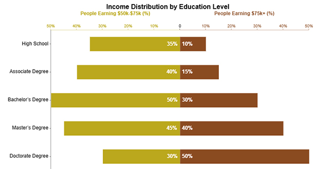
Progress Circle Charts use circular indicators to show completion or proportion, giving you instant visual feedback on performance. They work perfectly for comparing progress across ordered categories like income brackets, satisfaction tiers, or achievement levels.

Nominal vs. Ordinal Data

Example # 8:

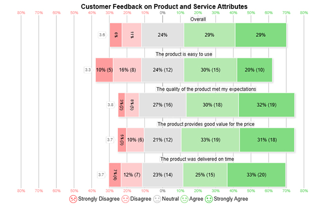
Likert Charts visualize ordinal survey responses by showing ordered agreement or satisfaction levels for each question. They make comparing sentiment distribution simple and highlight overall response trends immediately.

Nominal vs. Ordinal Data

Example # 9:

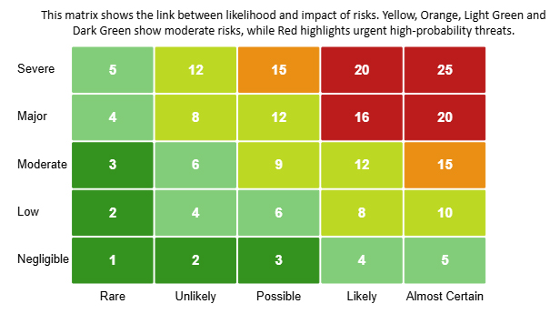
Heatmaps use color gradients to show data intensity, letting you spot patterns, trends, and outliers fast. They’re particularly powerful for analyzing ordinal data where ordered categories help you compare levels of impact, frequency, or risk.

Nominal vs. Ordinal Data

Example # 10:

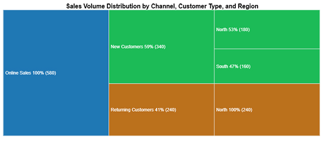
Tree Diagrams show hierarchical relationships by breaking data into categories and subcategories with a structured layout. They’re ideal for visualizing nominal data, revealing how different categories contribute to an overall outcome.

Nominal vs. Ordinal Data

How to Visualize Nominal and Ordinal Data in Google Sheets?

Google Sheets gives you built-in chart options that handle both data types. Bar charts, column charts, and pie charts suit nominal data. Ordered bar charts and line charts work better for ordinal data. The trick is keeping category grouping intact for nominal data and preserving natural order for ordinal data.

Adding tools like ChartExpo to Google Sheets unlocks advanced options. You get Likert Charts, Pareto Charts, Heatmaps, and Tree Diagrams without writing complex formulas.

Why use ChartExpo?

  1. Makes advanced charts like Likert, Pareto, and Heatmaps simple to create without formula headaches.
  2. Improves clarity when visualizing nominal and ordinal data for better data interpretation.
  3. Cuts down time by offering ready-made, presentation-quality templates right in Google Sheets.
  1. Provides a 7-day free trial and costs only $10 monthly for enhanced chart capabilities in Google Sheets.

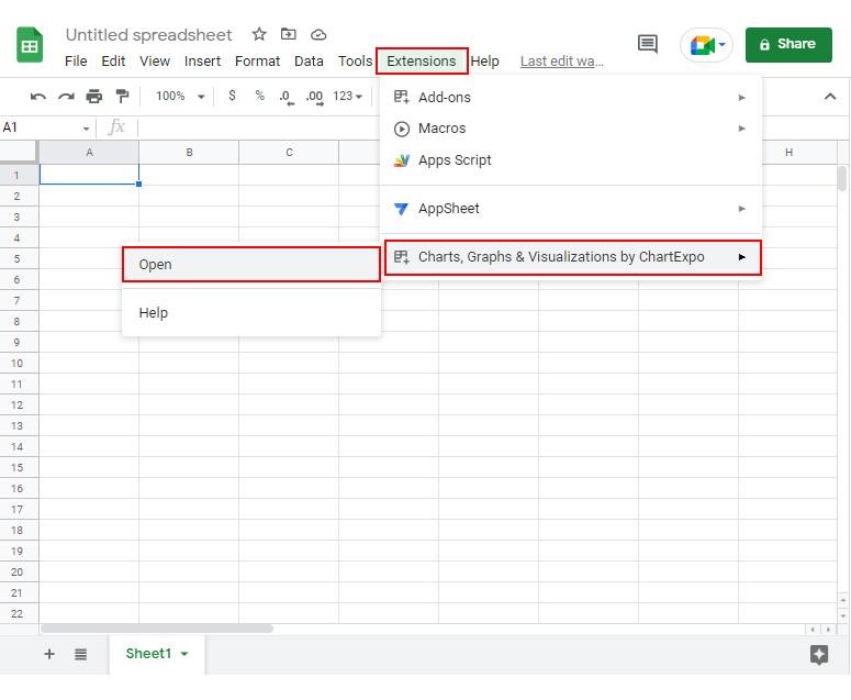
How to install ChartExpo in Google Sheets?

  1. Go to Google Sheets and open the file you are interested in. Then click on the Extensions tab in the upper menu.
  2. Click on the Add-ons and enter “Get add-ons.”
  3. Go to the Google Workspace Marketplace and search for ChartExpo.
  4. Explore “Charts, Graphs & Visualizations by ChartExpo, and click the “Install” button.
  5. Allow the necessary access and confirm your Google account when asked.

ChartExpo works with Google Sheets and Microsoft Excel. Select a platform you like, install the add-on, and start creating powerful visualizations with a few clicks.

Example:

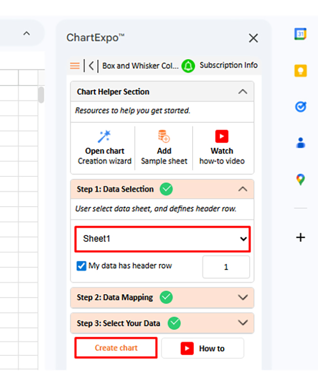
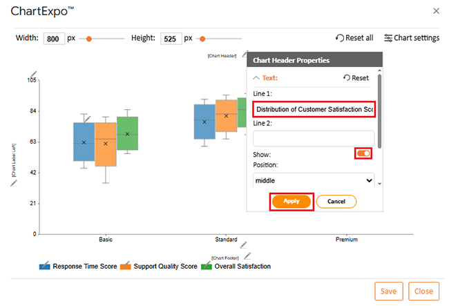
Consider we have the following data for the Box and Whisker Column Chart.

Service Level 

Response Time Score  Support Quality Score 

Overall Satisfaction 

Basic  45  35  55 
Basic  55  58  60 
Basic  62  65  68 
Basic  70  72  75 
Basic  82  80  85 
Standard  60  65  68 
Standard  70  75  78 
Standard  78  82  85 
Standard  85  88  90 
Standard  92  95  96 
Premium  72  78  82 
Premium  82  86  88 
Premium  88  90  92 
Premium  94  96  97 
Premium  98  99  100 
  • To get started with ChartExpo, install ChartExpo in Google Sheets.
  • Go to Extensions > Charts, Graphs & Visualizations by ChartExpo > Open.
Nominal vs. Ordinal Data
  • Once ChartExpo is installed in Google Sheets, click on the “Add new chart” button.
Nominal vs. Ordinal Data
  • Once it loads, scroll through the charts list to locate and choose the “Box and Whisker Column Chart”.
Nominal vs. Ordinal Data
  • Then, select a sheet, pick the right metrics and dimensions, and press the Create button to have your chart ready in seconds.
Nominal vs. Ordinal Data
  • If you want to customize your chart, select the ‘Edit Chart’ option and design it to your specifications.
Nominal vs. Ordinal Data
  • To change the chart’s title, select the pencil icon on the header. Then, enter the text you want and select “Apply”. This will change the chart’s title immediately.
Nominal vs. Ordinal Data
  • You can add a postfix sign.
Nominal vs. Ordinal Data
  • You can change the legend color and shape type from “Legend Properties”.
Nominal vs. Ordinal Data
  • You can add a gap between boxes.
Nominal vs. Ordinal Data
  • When you are done with all the changes, click the “Save” button to save them.
Nominal vs. Ordinal Data
  • The final look of the Box and Whisker Column Chart is shown below.
Nominal vs. Ordinal Data

Key Insights

  • Premium tier delivers the strongest median performance across response speed, support excellence, and overall customer happiness, showing superior experiences at higher service levels.
  • Standard tier beats Basic across every metric, with higher central values and tighter clustering that suggest more dependable performance.
  • Basic tier shows wider swings, especially in support excellence, pointing to less consistent customer experiences than higher tiers.

Best Practices for Analyzing Nominal and Ordinal Data

  • Figure out whether you’re dealing with nominal or ordinal data before running any analysis.
  • Pick appropriate charts – bar graphs for nominal data, ordered visualizations for ordinal data.
  • Count frequencies when working with nominal data and track rankings for ordinal data.
  • Keep category sequences logical and verify data quality for reliable data interpretation.

FAQs

How do you know if your data is nominal or ordinal?

If your data consists of categories without order, it is nominal. If the categories follow a clear ranking, it is ordinal.

What is an example of nominal and ordinal data?

An example of nominal data is customer region, while an example of ordinal data is customer satisfaction level.

Wrap Up

Understanding nominal vs. ordinal data determines which analysis methods work and which charts make sense. When you categorize data correctly, you improve precision in data analysis, strengthen data interpretation, and make your data storytelling clearer. Using proper charts in Google Sheets alongside tools like ChartExpo transforms categorical information into actionable insights.

Whether your labels lack order or follow a rank, the right visualization approach improves data quality, presents findings more effectively, and supports confident decisions. Don’t skip the step of identifying your data type – it’s the foundation everything else builds on.

How much did you enjoy this article?

ExcelAd1
Start Free Trial!
159698

Related articles

next previous
Data Analytics10 min read

Fleet Management Dashboard: Features, Metrics, and Tips

Fleet Management Dashboard tracks vehicles, drivers, and fuel usage in real time. Build actionable insights using Power BI visuals. Learn more now!

Data Analytics9 min read

Board Report Template: A Complete Walkthrough

Board Report Templates streamline governance with decision-ready insights. Build effective formats that strengthen oversight. Discover how!

Data Analytics10 min read

Online Retailer Demand Forecasting and Price Optimization

Analytics for an Online Retailer Demand Forecasting and Price Optimization: build forecasts, set prices, avoid stockouts, and see trends. Read on!

Data Analytics7 min read

Brand Awareness Metrics for Better Brand Insights

Brand Awareness Metrics show what people notice, remember, and repeat. Track search, reach, share of voice, and surveys. Read on, then act!

Data Analytics10 min read

Charts Templates for PowerPoint for Improved Presentations

Charts Templates for PowerPoint set chart layout, labels, and colors in slides, and reuse charts across decks and reports. Read on!

ChartExpo logo

Turn Data into Visual
Stories

CHARTEXPO

  • Home
  • Gallery
  • Videos
  • Services
  • Pricing
  • Contact us
  • FAQs
  • Privacy policy
  • Terms of Service
  • Sitemap

TOOLS

  • ChartExpo for Google Sheets
  • ChartExpo for Microsoft Excel
  • Power BI Custom Visuals by ChartExpo
  • Word Cloud

CATEGORIES

  • Bar Charts
  • Circle Graphs
  • Column Charts
  • Combo Charts
  • Comparison Charts
  • Line Graphs
  • PPC Charts
  • Sentiment Analysis Charts
  • Survey Charts

TOP CHARTS

  • Sankey Diagram
  • Likert Scale Chart
  • Comparison Bar Chart
  • Pareto Chart
  • Funnel Chart
  • Gauge Chart
  • Radar Chart
  • Radial Bar Chart
  • Sunburst Chart
  • see more
  • Scatter Plot Chart
  • CSAT Survey Bar Chart
  • CSAT Survey Chart
  • Dot Plot Chart
  • Double Bar Graph
  • Matrix Chart
  • Multi Axis Line Chart
  • Overlapping Bar Chart
  • Control Chart
  • Slope Chart
  • Clustered Bar Chart
  • Clustered Column Chart
  • Box and Whisker Plot
  • Tornado Chart
  • Waterfall Chart
  • Word Cloud
  • see less

RESOURCES

  • Blog
  • Resources
  • YouTube
SIGN UP FOR UPDATES

We wouldn't dream of spamming you or selling your info.

© 2026 ChartExpo, all rights reserved.