Categories
Online surveys have become essential for businesses, organizations, and academia. Surveys can be beneficial to gather valuable information from your target audience. They provide a cost-effective and efficient way to collect data on various topics.


But let’s face it, getting people to take a survey can be a real challenge. It’s like trying to convince a cat to take a bath – not impossible, but not easy.
How do you entice people to take your survey?
The key is motivation. You can encourage survey participation by providing incentives, being clear about its goal, and using clear language.
But becoming a survey-seducing master is no easy talk. It takes finesse, charm, and a little bit of creativity.
How?
Online surveys provide reliable data to inform decision-making. Here are reasons why online surveys should be in your best interest.
Conducting online surveys takes little time and effort. Since data is easily accessible, analyzing it is equally an easy task.
Using online surveys can significantly cut down your research cost. You can use online questionnaires to enter information into the database automatically. Thus, eliminating the cost spent on manual survey data collection and entry.
Online surveys provide quantifiable data that can be easily compiled and analyzed. Once you’ve collected the data, you can access it at any time of the day at your convenience.
Most consumers don’t like junk mail and most likely don’t have time for a face-to-face interview. With an online survey tool, participants can pick a moment that suits them best.
Online surveys are exceedingly fast in acquiring feedback from respondents. It allows researchers to gather large quantities of data quickly and effortlessly.
Work on how your survey looks by giving it a logo, theme, or background color. An appealing design leaves a positive impact and instantly convinces customers to take your survey.
Audiences answer more while taking online surveys than traditional methods. It creates an anonymous environment for them. Consequently, it drives them to always be truthful with the answers without fear.
Not every question in every survey resonates with all your customers. Online surveys can help you pre-screen respondents and survey only those people who meet your specific criteria.
Taking an online survey is easier and more flexible for your audience. They get the liberty to answer and to skip. And as an organizer, you can tailor your questions to their convenience. So, there is always a win-win situation.
Provide a clear link to the longitudinal survey on your website, social media channel, or email campaigns. Also, ensure it is mobile-friendly, as the majority of the population accesses the internet via mobile devices.
Selecting your survey respondents can ensure that you maximize your prospects of getting results. You can use social media advertising or email marketing to target specific groups of people.
Incentives motivate participants to take the survey and provide adequate responses. This creates a win-win situation for both parties. An incentive could be a discount code, a free product trial, or a chance to win a prize.
Avoid taking too much of your respondent’s time. They’ll naturally lose focus and leave their responses mid-way. Therefore, strategically design your questions and options to keep things light and avoid pressuring your audience.
Address your recipients by name, and explain why their feedback is important. This can create a sense of urgency and encourage people to take your survey. Ensure that information used to personalize the invitation exists for all respondents.
Send follow-up messages to all survey respondents to foster a sense of community and encourage candid feedback. This serves as a reminder to those yet to complete the survey. Equally, it shows gratitude to those who have already done so.
Showing appreciation can help build trust and create a sense of goodwill. This could be in the form of a thank you note or sharing survey results with your respondents.
Low response rates may cause more than just annoyance; they may also make surveys challenging. Use these strategies to meet your response quotas.
Keep the goal of your survey in mind when creating your questions. Refrain from overloading the survey with unnecessary questions.
If you’re conducting a particularly in-depth survey, gift cards are a way of showing appreciation. If you can afford it, there are other tangible incentives, such as vouchers or discounts.
Use a language that is attention-grabbing and relevant to your target audience. It will help increase open rates for your survey invitation.
When the question isn’t straightforward, the answers won’t be either. Ensure that your questions are direct and offer respondents more than just ‘yes’ or ‘no’ where applicable.
Here are five common ways to present your survey results:
Data is usually easier to understand when shared through a visual medium. Depending on the survey, there are many types of graphs and charts you can use. Ensure to pick on something that accurately displays your data.
Infographics are your best bet if you need to share easily read and quickly consumed data. It breaks down complex ideas into simple messages that are more appealing to read than blocks of text.
Video infographics result from combining different animations in one informative video. They offer an effective communication platform capable of effortlessly conveying concrete and complex information.
A spreadsheet gives you the freedom to display all the necessary information at once.
We’ve all been there – staring at a spreadsheet full of numbers, trying to make sense of it all. While Excel may be the go-to tool for data organization, it’s not ideal for visualization. Sure, you can create some visualizations, but they’re about as visually appealing as a bowl of oatmeal.
You need something more powerful to bring your online survey data to life.
That’s where ChartExpo comes in.
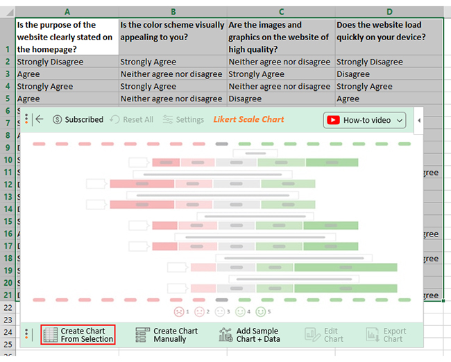
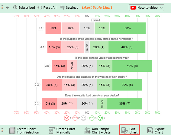
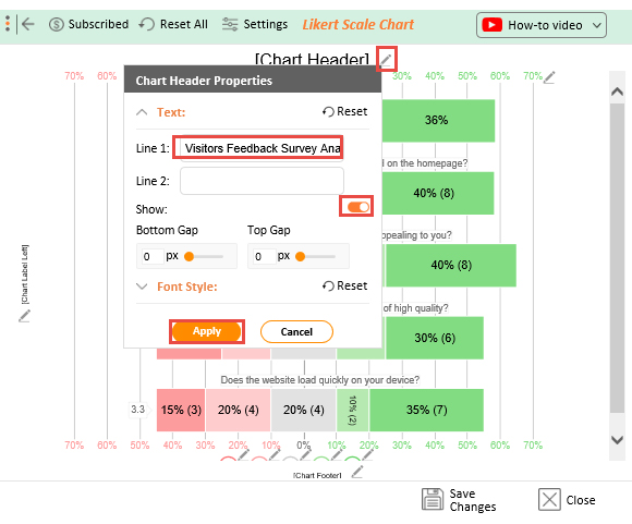
This tool empowers you to analyze your survey data in Excel effortlessly. You can turn your data into appealing, insightful visualizations that knock your socks off.
ChartExpo charts are available both in Google Sheets and Microsoft Excel. Please use the following CTAs to install the tool of your choice and create beautiful visualizations with a few clicks in your favorite tool.


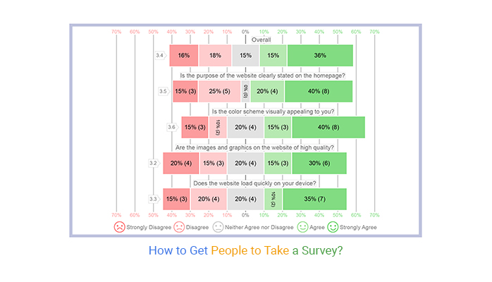
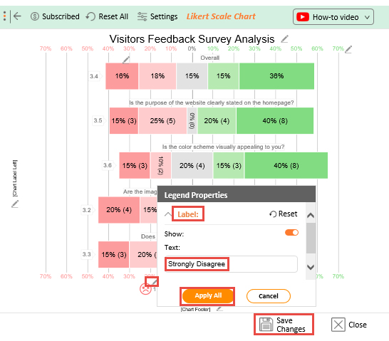
Let’s say you want to improve your online store website. Therefore, you can ask clients who recently visited to complete an online survey with the following questions.
You ask them to provide an answer to each question using the scale below:
Assume your survey yields the results table below.
| Is the purpose of the website clearly stated on the homepage? | Is the color scheme visually appealing to you? | Are the images and graphics on the website of high quality? | Does the website load quickly on your device? |
| Strongly Disagree | Strongly Agree | Neither agree nor disagree | Strongly Disagree |
| Agree | Neither agree nor disagree | Strongly Agree | Disagree |
| Strongly Agree | Strongly Agree | Neither agree nor disagree | Strongly Agree |
| Agree | Neither agree nor disagree | Disagree | Agree |
| Strongly Disagree | Disagree | Strongly Disagree | Disagree |
| Strongly Agree | Strongly Agree | Agree | Strongly Agree |
| Agree | Agree | Strongly Disagree | Strongly Agree |
| Disagree | Neither agree nor disagree | Agree | Strongly Agree |
| Strongly Agree | Agree | Strongly Agree | Disagree |
| Strongly Agree | Strongly Agree | Strongly Agree | Neither agree nor disagree |
| Disagree | Strongly Disagree | Neither agree nor disagree | Strongly Agree |
| Strongly Disagree | Strongly Agree | Strongly Agree | Strongly Disagree |
| Disagree | Neither agree nor disagree | Strongly Disagree | Strongly Agree |
| Strongly Agree | Strongly Agree | Strongly Agree | Agree |
| Agree | Agree | Agree | Neither agree nor disagree |
| Disagree | Strongly Disagree | Neither agree nor disagree | Strongly Agree |
| Strongly Agree | Strongly Agree | Strongly Agree | Neither agree nor disagree |
| Strongly Agree | Strongly Agree | Disagree | Disagree |
| Strongly Agree | Disagree | Strongly Disagree | Strongly Disagree |
| Disagree | Strongly Disagree | Disagree | Neither agree nor disagree |
This table contains example data. Expect many responses and questions in real life.


Consider beginning your message with a personalized greeting when asking someone to take your survey. Try to maintain your company’s brand and voice with your greeting. Then tell the respondent why you are sending them an invitation to your survey.
Here are tips on how to attract people to fill in a survey:
An online survey is a structured questionnaire completed by a target audience over the internet. Compared to traditional surveys, online surveys provide a cost-effective way to collect information from a broader audience.
Getting people to take a survey is a challenging feat. However, with the right approach, it can be a breeze. Keep your survey short and sweet, target the right audience, and offer incentives to boost participation.
Businesses use online surveys for their own and their client’s benefit. Online surveys provide valuable insights into customer experience, trends, and reactions. Consequently, contributes to the growth of the business.
The best way to communicate insights is through visuals. However, visualizing data with Excel poses a challenge. It doesn’t belong in the realm of data analysis. This creates the need for a tool that makes it simple to represent data visually.
Enter ChartExpo.
ChartExpo is an Excel add-in that helps transform data into visually appealing, insightful visualizations.
With ChartExpo, you can get more bang for your buck. Try it for free with a 7-day trial and sign up for the $10 monthly plan to unlock its full potential.
Go ahead and try ChartExpo today to improve your company’s visual communication of data.
How much did you enjoy this article?


Google Forms to Google Sheets keeps your data organized and current with every submission. Learn the steps, methods, and tips now!

Product survey questions reveal what customers truly think. Learn how to ask the right ones and act on the survey results. Read on!

Learn how the 5-Point Performance Rating Scale improves employee evaluations with clear, consistent, and fair performance reviews across teams.


