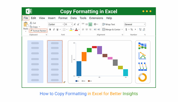


Excel is excellent — until your data needs to look sharp. You spend hours crunching numbers, but presenting them with Excel charts? Excel begins to stumble. Yes, you can color cells and bold headers, but real data visualization requires more.
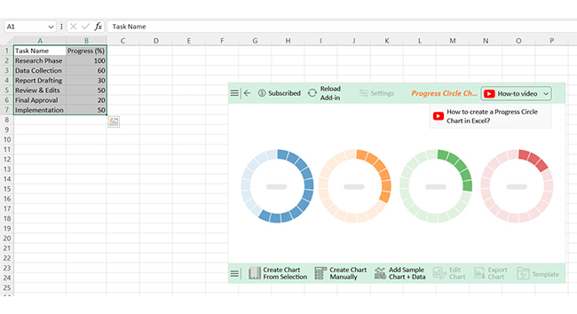
Knowing how to copy formatting in Excel helps, but it won’t fix clunky charts or bland visuals. That’s where ChartExpo steps in. It plugs into Excel and turns your data into clear, stunning visuals, including a Scatter plot chart, without the usual hassle.