• Home
  • Tools dropdown img
    • Spreadsheet Charts

      • ChartExpo for Google Sheets
      • ChartExpo for Microsoft Excel
    • Power BI Charts

      • Power BI Custom Visuals by ChartExpo
    • Word Cloud

  • Charts dropdown img
    • Chart Category

      • Bar Charts
      • Circle Graphs
      • Column Charts
      • Combo Charts
      • Comparison Charts
      • Line Graphs
      • PPC Charts
      • Sentiment Analysis Charts
      • Survey Charts
    • Chart Type

      • Box and Whisker Plot
      • Clustered Bar Chart
      • Clustered Column Chart
      • Comparison Bar Chart
      • Control Chart
      • CSAT Survey Bar Chart
      • CSAT Survey Chart
      • Dot Plot Chart
      • Double Bar Graph
      • Funnel Chart
      • Gauge Chart
      • Likert Scale Chart
      • Matrix Chart
      • Multi Axis Line Chart
      • Overlapping Bar Chart
      • Pareto Chart
      • Radar Chart
      • Radial Bar Chart
      • Sankey Diagram
      • Scatter Plot Chart
      • Slope Chart
      • Sunburst Chart
      • Tornado Chart
      • Waterfall Chart
      • Word Cloud
    • Google Sheets
      Microsoft Excel
  • Services
  • Pricing
  • Contact us
  • Blog
  • Support dropdown img
      • Gallery
      • Videos
      • Contact us
      • FAQs
      • Resources
    • Please feel free to contact us

      atsupport@chartexpo.com

Categories
All Data Visualizations Data Analytics Surveys
Add-ons/
  • Google Sheets
  • Microsoft Excel
  • Power BI
All Data Visualizations Data Analytics Surveys
Add-ons
  • Google Sheets
  • Microsoft Excel
  • Power BI

We use cookies

This website uses cookies to provide better user experience and user's session management.
By continuing visiting this website you consent the use of these cookies.

Ok

ChartExpo Survey


Home > Blog > Microsoft Excel

Forecasting Using Excel: Visual Methods That Work

It may surprise you, but businesses in the United States lose an estimated $611 billion yearly from poor data quality. This number is enough to make you pause.

Forecasting Using Excel

Now ask yourself this: Could forecasting using Excel be the difference between guessing and growing?

I will help you get the answer.

Every company, from a local bakery to Fortune 500 giants, runs on decisions. Those decisions are stronger when powered by data. In fact, a Harvard Business Review study found that data-driven organizations are 23 times more likely to acquire customers. Yet most businesses fail to turn raw data into action. Forecasting using Excel gives you a practical path to change that.

How?

Consider, for example, a startup founder trying to secure investment. Their pitch depends on credible numbers. In these moments, financial forecasting for startups becomes the backbone of confidence. Without it, funding dries up. With it, growth feels tangible.

But it’s not just startups that benefit. Retailers rely on time series forecasting to predict sales spikes in advance of holidays. Airlines use it to anticipate passenger loads. Even healthcare systems lean on it to prepare for flu season.

And what ties all this together? The reality is that Excel has become more powerful than most realize. With formulas, automation, and advanced tools, it does more than store numbers. It transforms them into signals about the future. Forecasting using Excel is no longer a back-office task. It is the frontline strategy for companies that want to act, not react.

Now is the time to harness Excel’s potential—start leveraging its advanced capabilities to stay ahead.

Follow my lead…

Table of Contents:

  1. What is Forecasting Using Excel?
  2. Why Use Forecasting Models in Excel?
  3. Common Methods of Forecasting Using Excel
  4. How Does Excel’s Forecasting Functionality Work?
  5. Examples of Forecasting in Excel
  6. What is the Forecasting Formula in Excel?
  7. How to Calculate Forecasting Data in Excel?
  8. How to Analyze Forecasting Data in Excel?
  9. Benefits of Forecasting in Excel
  10. How to Choose the Right Method for Excel Forecasting?
  11. FAQs
  12. Wrap Up

What is Forecasting Using Excel?

Definition: Forecasting using Excel involves transforming past data into future insights. It helps businesses identify trends and patterns that are often hidden in plain sight. With a few functions and tools, Excel can project sales, costs, or growth.

Many startups utilize business forecasting to establish trust with investors and inform their next steps. It is not about guessing. It is about using data to make smarter choices. Excel offers charts, formulas, and models that keep things clear. Forecasting in Excel takes what happened yesterday and shows what may happen tomorrow. Consequently, this clarity fuels stronger decisions.

Why Use Forecasting Models in Excel?

You do not need expensive software to see the future of your business. Excel is already on your computer, waiting to work harder for you. Companies of every size are proving that business forecasting in Excel can be simple, flexible, and powerful. Whether you are a founder, manager, or analyst, forecasting models in Excel put control back in your hands.

How?

  • Cost-effective: Excel saves money because it does not require costly platforms or new licenses. It gives you the ability to forecast with the tools you already have.
  • Customizable: Forecasting in Excel adapts to your needs. You can build models for sales growth, expenses, or staffing without being locked into rigid templates.
  • Visualization: Excel turns numbers into visuals that tell a story. With charts and graphs, time series forecasting becomes easier to understand and present to others.
  • Ease of Use: Most people already know the basics of Excel. This makes forecasting more accessible, since you can build and update models without months of training. Start using Excel for your business forecasting today and take greater control of your future.

Common Methods of Forecasting Using Excel

You have more power in Excel than you may think. Forecasting does not always demand complex software or data science teams. With a few built-in tools, you can project sales, plan budgets, and test ideas with confidence.

Are you experimenting with what-if analysis in Excel or calculating growth using compound interest? These methods provide structure to decisions that matter. The beauty lies in their simplicity:

  1. Trend Analysis: This method helps determine whether your numbers are increasing or decreasing over time. It allows businesses to spot growth opportunities or detect slow declines before they become costly.
  2. Moving Averages: By smoothing out daily or weekly fluctuations, moving averages in Excel reveal the underlying trend of the data. They enable decision-makers to focus on the long-term signal rather than short-term noise.
  3. Exponential Smoothing (ETS): ETS is useful when recent data is more relevant. It gives newer values greater weight, capturing sudden shifts in demand or behavior quickly and accurately.
  4. Linear Regression: Regression models in Excel uncover relationships between variables. For example, you might learn how advertising spend affects sales, or how foot traffic impacts revenue.
  5. Custom Calculations: Excel does not lock you into preset formulas. You can combine functions, create your own models, and even bring in external data. This flexibility enables forecasting to adapt to any business challenge.

How Does Excel’s Forecasting Functionality Work?

Most people view Excel as a tool for storing numbers, but it is a forecasting tool hiding in plain sight. With the right features, you can turn rows of data into a forward-looking plan. It doesn’t matter whether you want to interpolate in Excel to fill gaps or experiment with artificial intelligence add-ins. The software offers more forecasting power than many realize:

  • Forecast Sheet: This feature automatically creates charts and projections from historical data. It provides a visual representation of where your numbers may be headed.
  • LINEAR Function: This function predicts future values by extending a straight line through past data points. It is ideal for simple predictions where trends are consistent.
  • TREND Function: The TREND function builds forecasts based on linear patterns. It works well when you need multiple predictions simultaneously, rather than a single value.
  • GROWTH Formula: The GROWTH formula projects data using exponential patterns. It is handy for businesses experiencing rapid increases in sales or demand.

Examples of Forecasting in Excel

Data is powerful only when acted on. That is why Excel shines—it turns numbers into stories about the future. From forecasting revenue to planning expenses, its tools make projections clear. Whether using GETPIVOTDATA in Excel to find insights or considering Excel’s business uses, the goal is the same: better decisions based on data.

These examples will help you get started:

  • Sales forecasting: Excel estimates future sales by analyzing past data. This enables smarter inventory, staffing, and revenue planning.
  • Market demand forecasting: Businesses can track buying patterns, seasonal shifts, and customer trends. With this, Excel projects demand and avoid costly overproduction or stockouts.
  • Budgeting: Forecasting in Excel guides spending plans. It shows how income, costs, and growth connect, helping teams stay on track financially.

What is the Forecasting Formula in Excel?

Definition: The forecasting formula in Excel predicts future values using existing data. The most commonly used formula is: =FORECAST.LINEAR(x, known_ys, known_xs). This function commonly predicts future numbers by extending a straight line through known values. It helps you spot steady growth or decline.

You can also use the TREND function, which returns multiple predictions at once, making it useful for large datasets.

Both methods project future outcomes using past values. They transform Excel from a basic spreadsheet into a decision-making tool that provides clear direction for planning.

How to Calculate Forecasting Data in Excel?

Predicting future trends in Excel does not have to be complicated. The FORECAST function helps you estimate outcomes based on past data. Let us walk through an example to see how it works in practice:

Example

Assume we have data for advertising spend as our known x-values and sales figures as our known y-values. With this information, the FORECAST function can predict future sales. How? It will calculate an additional point along the straight line that best fits the given data.

  • Prepare your data: Organize advertising spend and sales data in columns.
Forecasting Using Excel
  • Use the FORECAST formula: To estimate sales for April, enter the FORECAST function into a cell using the April spend as the input value.
Forecasting Using Excel
  • Review the result: Excel will return the predicted sales figure for April, based on the relationship between past advertising spend and sales.
Forecasting Using Excel

How to Analyze Forecasting Data in Excel?

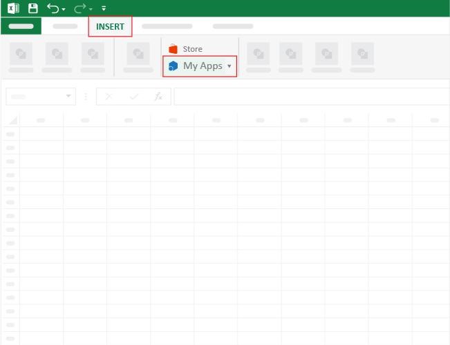
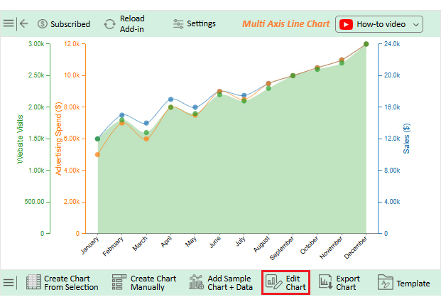
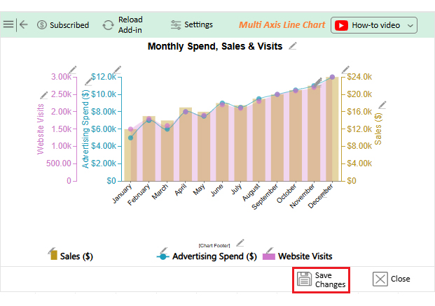
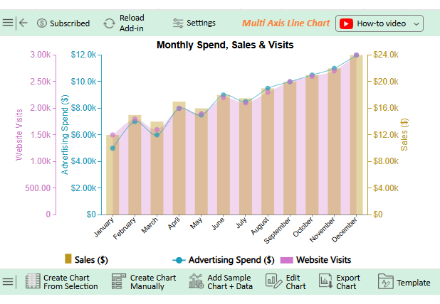
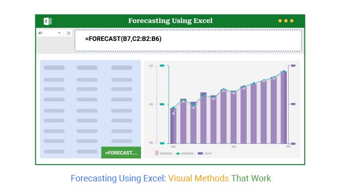
Numbers alone can seem dry, even when they reveal growth opportunities. That is why forecasting using Excel is crucial. But while Excel handles calculations effectively, its standard charts may not always communicate the story clearly or compellingly. Subtle trends may remain hidden behind ordinary graphs.

And what’s the fuss about charts and graphs? Data visualization bridges the gap between raw numbers and informed decisions.

This is where ChartExpo makes a difference. It converts raw spreadsheets into visuals that communicate effectively. With ChartExpo, forecasts become clearer, more shareable, and more persuasive. Data finally appears as insightful as it is.

Try ChartExpo today and see how your forecasting process transforms.

How to Install ChartExpo in Excel?

  1. Open your Excel application.
  2. Open the worksheet and click the “Insert” menu.
  3. You’ll see the “My Apps” option.
  4. In the Office Add-ins window, click “Store” and search for ChartExpo on my Apps Store.
  5. Click the “Add” button to install ChartExpo in your Excel.

ChartExpo charts are available both in Google Sheets and Microsoft Excel. Please use the following CTAs to install the tool of your choice and create beautiful visualizations with a few clicks in your favorite tool.

Example

Let’s visualize and analyze this sample data in Excel using ChartExpo.

Month Advertising Spend ($) Sales ($) Website Visits
January 5000 12000 1500
February 7000 15000 1800
March 6000 14000 1600
April 8000 17000 2000
May 7500 16000 1900
June 9000 18000 2200
July 8500 17500 2100
August 9500 19000 2300
September 10000 20000 2500
October 10500 21000 2600
November 11000 22000 2700
December 12000 24000 3000
  • To get started with ChartExpo, install ChartExpo in Excel.
  • Now, click on My Apps from the INSERT menu.
Forecasting Using Excel
  • Choose ChartExpo from My Apps, then click Insert.
Forecasting Using Excel
  • Once it loads, scroll through the charts list to locate and choose the “Multi Axis Line Chart”.
Forecasting Using Excel
  • Click the “Create Chart From Selection” button after selecting the data from the sheet, as shown.
Forecasting Using Excel
  • If you want to add anything to the chart, click the Edit Chart button:
Forecasting Using Excel
  • Click the pencil icon next to the Chart Header to change the title.
  • It will open the properties dialog. Under the Text section, you can add a heading in Line 1 and enable Show.
  • Give the appropriate title of your chart and click the Apply button.
Forecasting Using Excel
  • Click on Settings and change the “Data Representation” as follows.
Forecasting Using Excel
  • You can change the bars’ Opacity and width.
Forecasting Using Excel
  • Change the legend shapes into “Circle” from the Shape type and color, and click the “Apply” button:
Forecasting Using Excel
  • You can add a prefix sign as follows:
Forecasting Using Excel
  • You can increase font size for better readability as follows:
Forecasting Using Excel
  • You can also change legend alignment as follows:
Forecasting Using Excel
  • Click the “Save Changes” button to persist the changes made to the chart.
Forecasting Using Excel
  • Your final Multi Axis Line Chart will look like the one below.
Forecasting Using Excel

Key Insights

  • Sales and visits rise consistently, with December as the peak.
  • Increased ad spend directly boosts sales and website traffic.
  • Strong spikes appear in June and again from September to December.
  • December records the highest performance across all metrics.

Benefits of Forecasting in Excel

Running a business without forecasting is like driving at night with the headlights off. You may move forward, but every turn is risky. Forecasting in Excel lights the path ahead, turning past data into practical insights for decisions. Here are the benefits plainly explained:

  • Identifies trends before they emerge: Excel highlights growth or decline early, letting you act before competitors notice.
  • Improves planning accuracy: Forecasting pinpoints future resource, staffing, and budget needs, enabling teams to prepare confidently in advance.
  • Reduces decision risk: Excel delivers data-driven evidence, replacing guesswork with confidence for every business move.
  • Simplifies sharing and collaboration: Excel’s familiar format allows everyone to view, adjust, and understand forecasts with ease.
  • Drives steady growth: Forecasts highlight achievable targets, enabling growth without risking overextension.

How to Choose the Right Method for Excel Forecasting?

Choose the right Excel method as you would pick the right tool. Each method fits a purpose, but not all suit every job. Adjust your approach based on your timeline, your data pattern, and the needed detail.

Follow these guidelines:

  • Short-term forecasting: For short periods, simple methods such as moving averages are effective. They smooth out small fluctuations and provide a quick view of near-future trends.
  • Seasonal data: Sometimes, the data you work with rises and falls during specific months or events. In those cases, use seasonal models. Excel can apply formulas that capture cycles, making it easier to plan for demand peaks.
  • Complex data: When your data is influenced by many factors, use advanced methods like regression or exponential smoothing. These methods handle multiple variables and capture shifts that simpler models may miss.

FAQs

Is Excel good for forecasting?

Yes, Excel is effective for forecasting. It offers built-in formulas and tools to analyze data. You can create simple or advanced models. It works well for sales, budgets, and trends. Forecasts remain flexible and accessible.

What forecasting method is used in Excel?

Excel uses several forecasting methods. These include moving averages, exponential smoothing, and linear regression. Functions like FORECAST.LINEAR and TREND extend data into the future, and you can also apply growth formulas. Each method fits different forecasting needs and goals.

Wrap Up

Forecasting is not guessing. It uses data to guide confident choices. Excel helps turn numbers into insights, making forecasting practical for everyone.

Businesses run on decisions, and good decisions come from understanding trends and patterns. Excel answers the question “What is Excel software used for beyond simple spreadsheets?” It is a planning tool that helps leaders see what comes next.

Functions such as GETPIVOTDATA in Excel make analysis easier. They allow you to pull details from large sets of information quickly. This saves time and reduces errors. It also keeps your forecasts reliable.

New tools now expand Excel’s reach. Add-ins bring features that feel close to artificial intelligence in Excel. These tools help automate processes and improve accuracy. Forecasts become smarter with less effort.

Excel has limits in visualization. Charts often look basic and lack clarity.

But don’t worry: ChartExpo helps by turning plain spreadsheets into clear, compelling visuals.

So, the next step is clear: install ChartExpo and see its impact today. Let Excel do the math while ChartExpo reveals insights. Together, they make forecasts sharper, faster, and more convincing.

Take action now and turn data into results.

How much did you enjoy this article?

ExcelAd2
Start Free Trial!
157647

Related articles

next previous
Microsoft Excel11 min read

Sparkline in Excel: Visual Insights at a Glance

Sparkline in Excel helps visualize trends fast. Learn to create, customize, and analyze sparklines with ChartExpo for clearer, actionable insights.

Microsoft Excel13 min read

Financial Charts: Tips, Best Practices, and Examples

Explore financial charts and graphs to improve data analysis, reveal trends, and make smarter business decisions with clear visual insights.

Microsoft Excel12 min read

Excel Chart Templates for Insightful Presentations

Learn how chart templates save time and boost consistency in Excel. This guide covers benefits and top chart examples to improve your data visuals.

Microsoft Excel13 min read

Excel Automation: Turning Data into Insights Faster

Excel automations help you save time, reduce errors, and streamline your tasks. Learn simple methods to automate reports and work smarter in Excel.

Microsoft Excel13 min read

Excel Template for Job Tracking: A Complete Guide

An Excel template for job tracking helps organize tasks and progress. This guide shows how to use it and boost results with smart tips and tools.

ChartExpo logo

Turn Data into Visual
Stories

CHARTEXPO

  • Home
  • Gallery
  • Videos
  • Services
  • Pricing
  • Contact us
  • FAQs
  • Privacy policy
  • Terms of Service
  • Sitemap

TOOLS

  • ChartExpo for Google Sheets
  • ChartExpo for Microsoft Excel
  • Power BI Custom Visuals by ChartExpo
  • Word Cloud

CATEGORIES

  • Bar Charts
  • Circle Graphs
  • Column Charts
  • Combo Charts
  • Comparison Charts
  • Line Graphs
  • PPC Charts
  • Sentiment Analysis Charts
  • Survey Charts

TOP CHARTS

  • Sankey Diagram
  • Likert Scale Chart
  • Comparison Bar Chart
  • Pareto Chart
  • Funnel Chart
  • Gauge Chart
  • Radar Chart
  • Radial Bar Chart
  • Sunburst Chart
  • see more
  • Scatter Plot Chart
  • CSAT Survey Bar Chart
  • CSAT Survey Chart
  • Dot Plot Chart
  • Double Bar Graph
  • Matrix Chart
  • Multi Axis Line Chart
  • Overlapping Bar Chart
  • Control Chart
  • Slope Chart
  • Clustered Bar Chart
  • Clustered Column Chart
  • Box and Whisker Plot
  • Tornado Chart
  • Waterfall Chart
  • Word Cloud
  • see less

RESOURCES

  • Blog
  • Resources
  • YouTube
SIGN UP FOR UPDATES

We wouldn't dream of spamming you or selling your info.

© 2026 ChartExpo, all rights reserved.