Categories
What is What-If Analysis in Excel? It’s a powerful tool for testing scenarios and making informed decisions. Whether planning a budget or forecasting sales, this feature simplifies exploring outcomes.
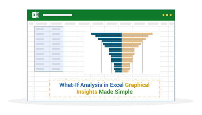
What-If Analysis in Excel helps you answer “what-if” questions: What if costs rise by 10%? What if sales double next quarter? These tools calculate outcomes based on variable changes. It’s all about finding possibilities before making commitments. That’s not all. You can enhance this with custom Excel charts and cool Excel charts and graphs to visualize the impact of your decisions.


Businesses rely on data-driven decision-making. What-If Analysis in Excel turns numbers into actionable insights. It supports financial planning, project management, and strategy building. The Analysis Toolpak in Excel further extends functionality, making complex analysis even easier.
This tool is invaluable even for personal use. Want to plan loan repayments or track savings goals? Change inputs, and Excel will show you what your future might look like. It’s flexible and easy to use once you know how.
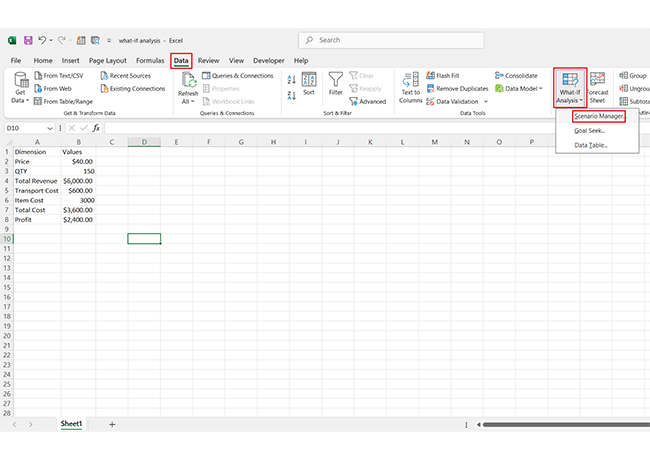
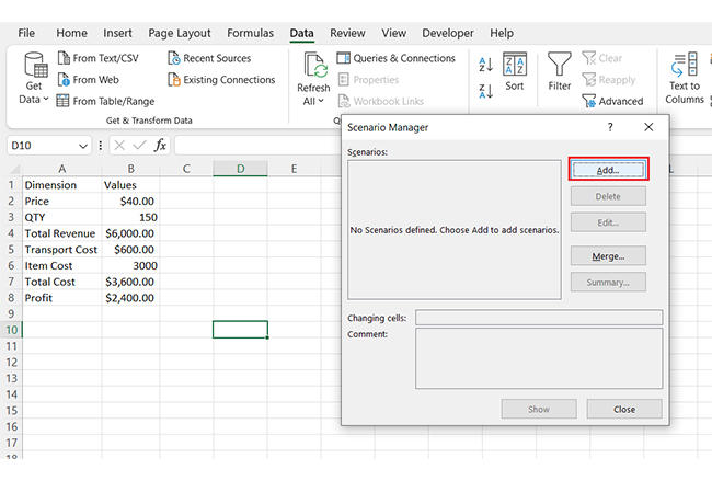
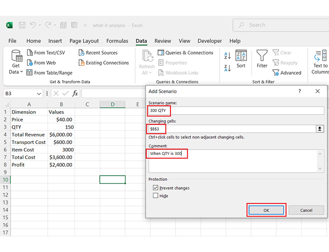
Excel’s built-in tools, such as Goal Seek, Data Tables, and Scenario Manager, simplify the process. These features help break down complex calculations, saving time and improving accuracy. Then, you can present the findings with cool Excel charts and graphs for better communication.
Let’s learn how What-If Analysis in Excel can transform your approach to planning.
First…
Definition: It’s a game-changing feature for making smarter decisions. It helps you explore different outcomes without changing your original data. This makes planning a budget, forecasting profits, or analyzing scenarios easier and more accurate.
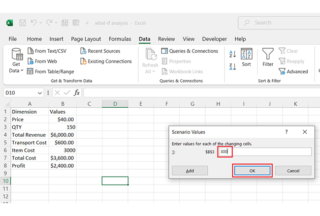
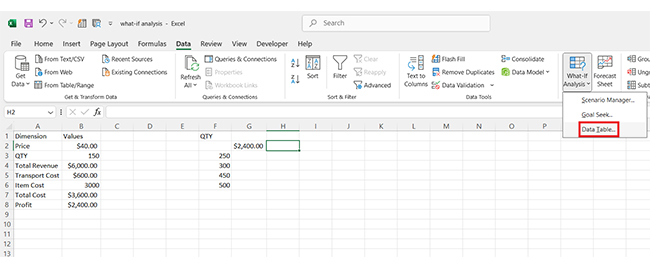
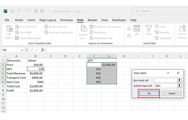
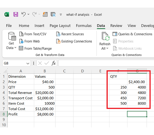
Definition: What-If Analysis in an Excel data table allows you to evaluate multiple outcomes by varying one or two inputs. For example, see how changing interest rates or monthly contributions affect savings.
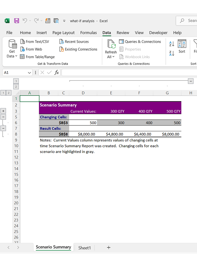
Data tables display all results in a single, organized view. To visualize these changes and their impacts, use the advanced Excel charts.
What-If Analysis in Excel Data Table is perfect for financial planning, project estimates, or decision-making. It saves time by automating calculations, and when combined with a finance dashboard in Excel, it provides clearer insights into different scenarios. With these insights, Excel’s Data Table makes analyzing possibilities straightforward and effective.
So, what is the use of What-If Analysis in Excel? It lets you explore possibilities and outcomes by adjusting key variables. It’s like creating a crystal ball for your data. This tool is essential for business analytics, helping you predict and plan for various scenarios.
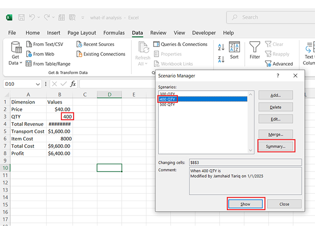
This tool uses features like Goal Seek, Scenarios, and Data Tables. You input assumptions or targets, and Excel calculates the results. Want to know how a price change affects profits or how higher interest rates impact your loan? What-if analysis shows the answers instantly, making it a powerful tool for business analytics and financial forecasting.
Excel’s What-If Analysis simplifies decision-making. Instead of endless manual calculations, you get clear comparisons and insights. You can visualize results with Excel charts or even create a dynamic graph Excel to showcase the impact of different scenarios. Adjust numbers, test scenarios, and plan confidently—all within the same spreadsheet.
What-If Analysis is more than a feature; it’s a strategy. It helps you visualize potential outcomes and make smarter choices. Excel turns data into decisions that work for your business or personal planning.
Excel’s What-If Analysis tools help you explore scenarios, set goals, and analyze data efficiently. Whether planning budgets, forecasting sales, or running simulations, these tools make it easy. Let’s break it down step-by-step.
It helps you test ideas, plan smarter, and make confident decisions. Whether you’re managing finances, projects, or strategies, this tool offers many benefits. Here’s how it can make your life easier!
Ever feel overwhelmed by Excel’s What-If Analysis? Here’s how to master it with ease:
Ever wondered, “What if?” when analyzing data? That’s the magic of What-If Analysis in Excel! It helps you test scenarios and make data-driven decisions.
However, Excel’s native options for data visualization tools often feel clunky and limited. Clear visuals and a digital dashboard are crucial for insights, especially in data analytics.
Enter ChartExpo—a powerful Excel add-in that transforms your Excel charts into stunning, interactive visuals. Say goodbye to dull graphs and hello to impactful storytelling with better data analytics and visualization.
Let’s learn how to install ChartExpo in Excel.
ChartExpo charts, including a Scatter plot in Excel with 3-variables, are available in both Google Sheets and Microsoft Excel. Use the following CTAs to install the tool of your choice and create beautiful visualizations with just a few clicks in your favorite tool.


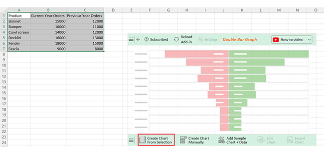
Let’s see how to use a What-If Analysis data table in Excel with ChartExpo.
| Product | Current Year Orders | Previous Year Orders |
| Bonnet | 15000 | 12000 |
| Bumper | 10000 | 11000 |
| Cowl screen | 14000 | 12000 |
| Decklid | 16000 | 13000 |
| Fender | 18000 | 15000 |
| Fascia | 9000 | 8000 |


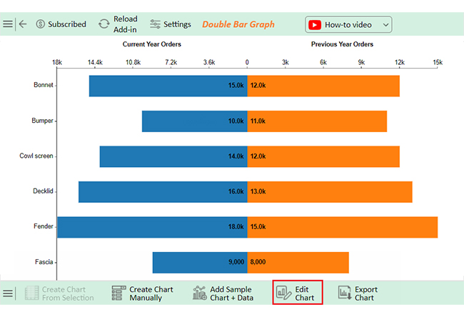
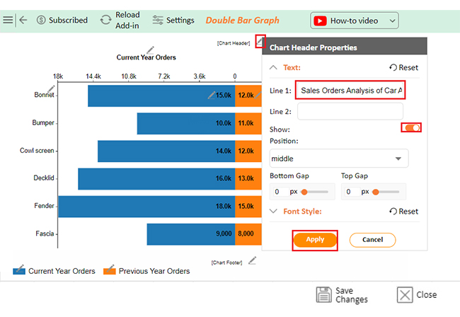
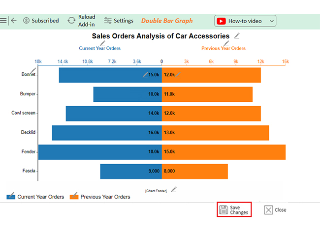
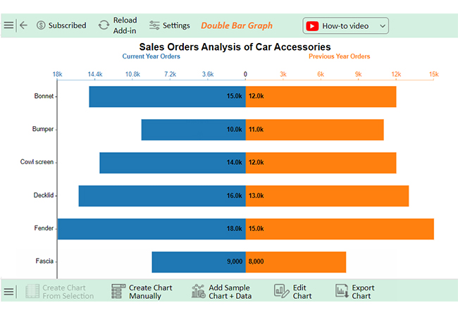


This example of What-If Analysis in Excel shows that:
The overall trend shows that there is strong demand for most products.
The following video will help you create a Double Bar Graph in Microsoft Excel.
The three types of What-If Analysis in Excel are:
Solver is an advanced What-If Analysis tool in Excel. It optimizes a target cell’s value by adjusting variables within constraints. It is useful for complex problems and helps find maximum, minimum, or specific outcomes for formulas involving multiple variables.
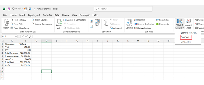
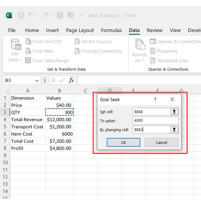
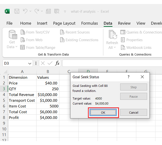
To use Goal Seek in Excel:
What-If Analysis in Excel is a powerful decision-making tool. It helps you explore different scenarios without altering the original data. This feature is essential for forecasting and planning, making it a cornerstone of AI for data analytics.
With What-If Analysis, you can test assumptions and adjust values to see how changes affect outcomes. This capability is vital for businesses, students, and analysts looking to leverage Excel chart add-ins for better information design and visualization.
Tools like Goal Seek, Data Tables, and Scenario Manager enhance flexibility. They simplify complex calculations and present results clearly. Moreover, they integrate seamlessly with chart elements in Excel to make your insights more compelling. Each tool addresses specific needs, making analysis more efficient and insightful.
By automating repetitive tasks, What-If Analysis in Excel saves time, allowing you to focus on generating actionable insights. It improves decision-making by highlighting optimal options and identifying potential risks. For better outcomes, combine it with Excel Charts Add-ins for advanced visualization.
This feature is more than just a tool—it’s a game-changer for information design. Installing ChartExpo or similar add-ins can further enhance its capabilities. How? By enabling you to predict outcomes, analyze possibilities, and make smarter decisions. Whether for personal budgets, academic projects, or corporate strategies, Excel equips you with the tools to succeed.
How much did you enjoy this article?


Learn how to use sparklines in Excel to quickly visualize trends inside cells. Discover types, creation steps, customization, use cases, benefits, and best practices.

Learn what a confidence interval graph is, how to create it in Excel, and how to interpret results to make more reliable, data-driven decisions.

A correlation matrix in Excel helps identify relationships between variables. Learn how to create, read, and use it for effective data analysis.


