Categories
What is interpolation in Excel?
Imagine you have missing values in a dataset and must estimate them accurately. What do you do? I have a solution – interpolation in Excel. It helps fill the gaps between known data points, making calculations smoother.


Interpolation reduces these risks by generating reliable estimates. You can use built-in functions, formulas, or graphing techniques. The FORECAST, TREND, and LINEST functions are helpful for linear interpolation, while more advanced users turn to cubic splines. With the right approach, missing values become less of a problem.
Businesses and researchers rely on Excel for data-driven insights. Financial analysts use interpolation to predict stock prices. Scientists apply it to weather patterns. Engineers estimate missing values in sensor data.
Interpolation also improves data visualization. Excel charts with missing values can look misleading. Filling in those gaps creates smoother trends and more accurate graphs. Whether working on sales reports, financial models, or experimental results, the ability to interpolate in Excel makes a difference.
As datasets grow, so do the challenges of maintaining accuracy. Learning how to interpolate in Excel can save time and prevent errors. With the proper methods, even incomplete data can provide clear insights.
Let me show you how…
Definition: Interpolation in Excel estimates missing values between known data points. It helps create smoother datasets for better trend analysis in Excel.
Excel provides functions like TREND for linear interpolation and GROWTH for exponential trends. These tools improve accuracy in data visualization examples using Excel. How? Using interpolation, you can predict trends and enhance reports. It ensures smoother graphs, making insights clear.
Are you in forecasting or scientific analysis? Interpolation is a key skill for better data accuracy.
When dealing with incomplete data, interpolation fills in the gaps, providing a more complete picture, often supported by quick visuals like a sparkline in Excel to track trends. It’s a powerful tool for anyone working with numbers, helping you achieve better accuracy and efficiency. Here’s how it makes a real difference:
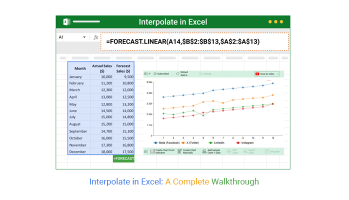
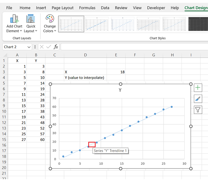
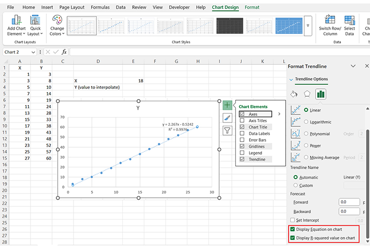
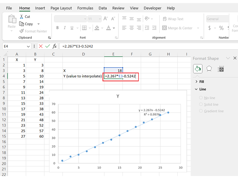
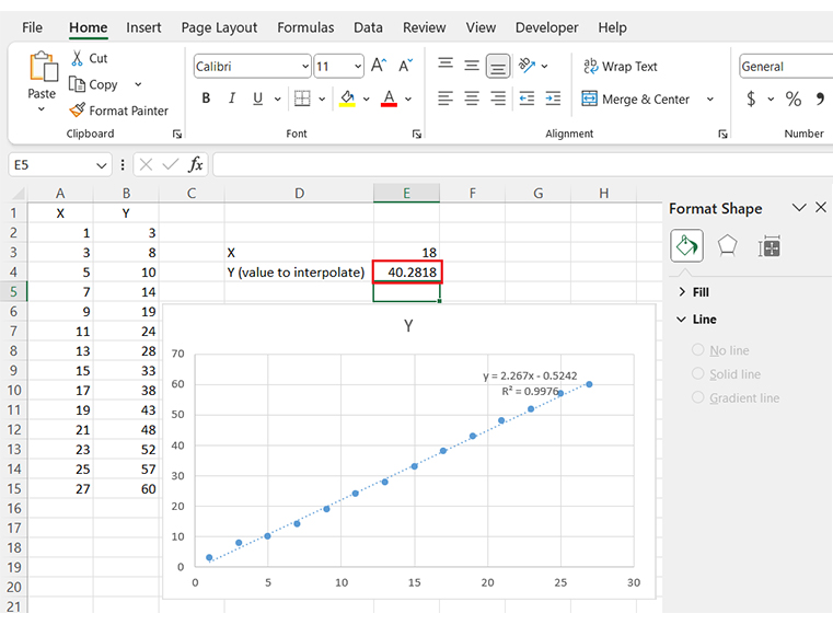
Have you ever wondered how linear interpolation in Excel works? It’s not as complex as it sounds. You can effortlessly estimate missing data points and make your analysis more accurate. Here’s a quick guide on how to get it done:
Have you ever found yourself with missing data in Excel and wondered how to estimate it accurately? Performing interpolation in Excel can help you fill those gaps and make your analysis more reliable.
Here’s how to do it step-by-step.


Have you ever tried analyzing data in Excel only to be frustrated by missing values? It’s a common issue that can make your charts look incomplete.
That’s where interpolation in Excel comes in. It estimates those missing values to complete the picture.
But here’s the catch: while Excel offers basic interpolation, its data visualization tools often fail to provide smooth, clear insights. This is where ChartExpo steps in. It enhances data visualization in Excel, turning your basic graphs into powerful, accurate representations of your data.
Let’s see how interpolation works and why ChartExpo is the key to unlocking better visualizations in Excel.
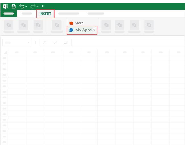
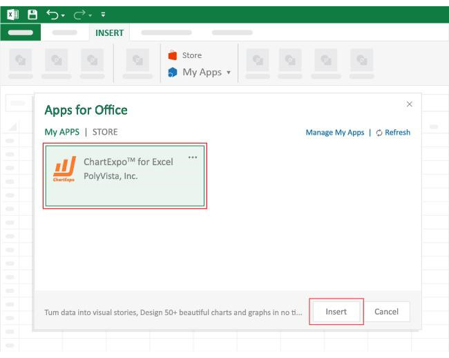
How to Install ChartExpo in Excel?
ChartExpo charts are available both in Google Sheets and Microsoft Excel. Please use the following CTAs to install the tool of your choice and create beautiful visualizations, including an exponential growth chart, with a few clicks in your favorite tool.
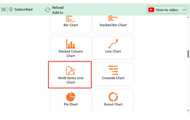
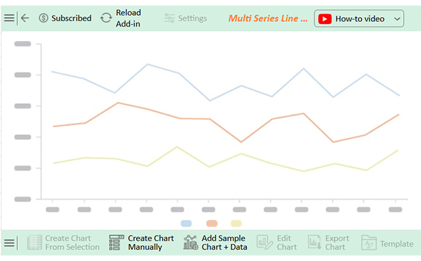
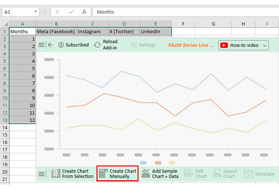
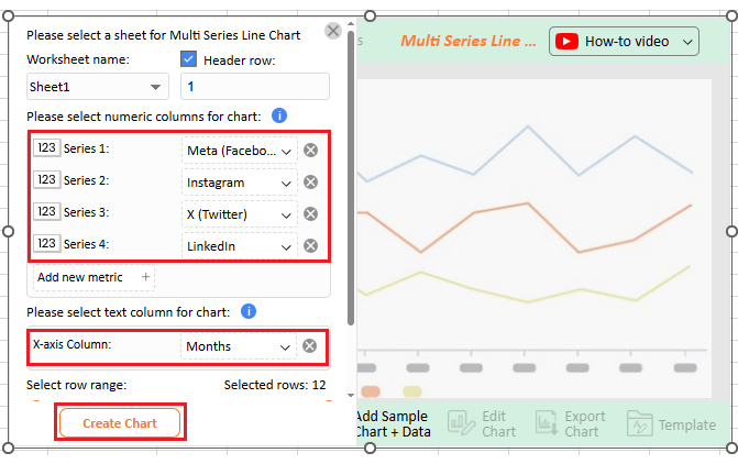
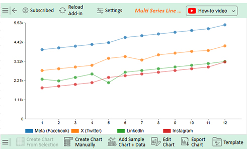
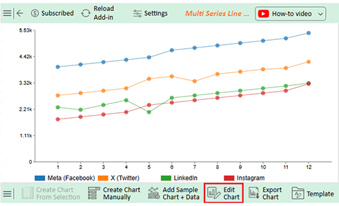
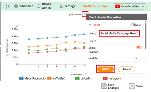
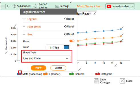
Let’s learn how to add a chart in Excel using ChartExpo and glean valuable insights from it:
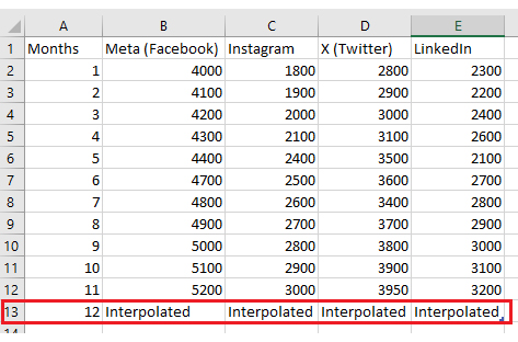
| Months | Meta (Facebook) | X (Twitter) | ||
| 1 | 4000 | 1800 | 2800 | 2300 |
| 2 | 4100 | 1900 | 2900 | 2200 |
| 3 | 4200 | 2000 | 3000 | 2400 |
| 4 | 4300 | 2100 | 3100 | 2600 |
| 5 | 4400 | 2400 | 3500 | 2100 |
| 6 | 4700 | 2500 | 3600 | 2700 |
| 7 | 4800 | 2600 | 3400 | 2800 |
| 8 | 4900 | 2700 | 3700 | 2900 |
| 9 | 5000 | 2800 | 3800 | 3000 |
| 10 | 5100 | 2900 | 3900 | 3100 |
| 11 | 5200 | 3000 | 3950 | 3200 |
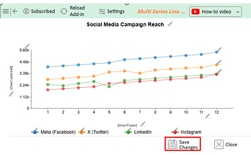
| 12 | Interpolated | Interpolated | Interpolated | Interpolated |
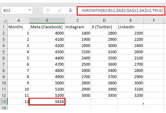
| Months | Meta (Facebook) | X (Twitter) | ||
| 1 | 4000 | 1800 | 2800 | 2300 |
| 2 | 4100 | 1900 | 2900 | 2200 |
| 3 | 4200 | 2000 | 3000 | 2400 |
| 4 | 4300 | 2100 | 3100 | 2600 |
| 5 | 4400 | 2400 | 3500 | 2100 |
| 6 | 4700 | 2500 | 3600 | 2700 |
| 7 | 4800 | 2600 | 3400 | 2800 |
| 8 | 4900 | 2700 | 3700 | 2900 |
| 9 | 5000 | 2800 | 3800 | 3000 |
| 10 | 5100 | 2900 | 3900 | 3100 |
| 11 | 5200 | 3000 | 3950 | 3200 |
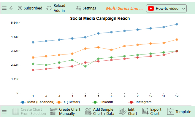
| 12 | 5424 | 3290 | 4214 | 3318 |
Have you ever wondered how Excel’s forecast linear interpolation can make your data work for you? It’s a helpful tool, especially when dealing with incomplete datasets. Estimating missing values helps create smoother, more accurate trends.
Let’s explore the reasons why using linear interpolation in Excel can boost your data analysis:


Interpolation in Excel means estimating missing values within a dataset. It helps smooth out data for better analysis. This is useful for trend analysis in Excel and predicting unknown values between known data points.
Excel offers several functions for interpolation. The TREND function estimates linear data, while GROWTH works for exponential trends. These Excel functions for data analysis ensure accuracy.
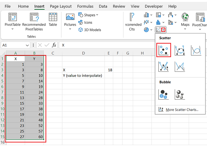
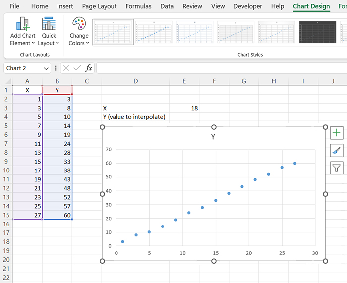
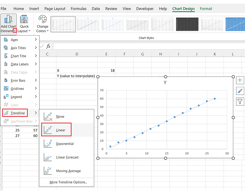
Polynomial interpolation can be applied to complex data. A scatter plot with a trendline is a great way to visualize these estimates. You can also use Excel plug-ins for advanced interpolation techniques.
Interpolation is widely used in data visualization. It helps create smoother graphs by filling gaps in datasets and improving insights when working with charts.
After interpolating, you can convert Excel data to graphs for better understanding. Using cool Excel charts and graphs makes your findings more impactful.
Mastering interpolation boosts data analysis in Excel. Whether predicting values or enhancing visuals, knowing how to interpolate ensures accurate and precise reports.
Do not hesitate; Install ChartExpo to create easy-to-read, insightful charts.
How much did you enjoy this article?


Learn how to use sparklines in Excel to quickly visualize trends inside cells. Discover types, creation steps, customization, use cases, benefits, and best practices.

Learn what a confidence interval graph is, how to create it in Excel, and how to interpret results to make more reliable, data-driven decisions.

A correlation matrix in Excel helps identify relationships between variables. Learn how to create, read, and use it for effective data analysis.


