Categories
By ChartExpo Content Team
Too much data and still no clarity? You’re not alone.
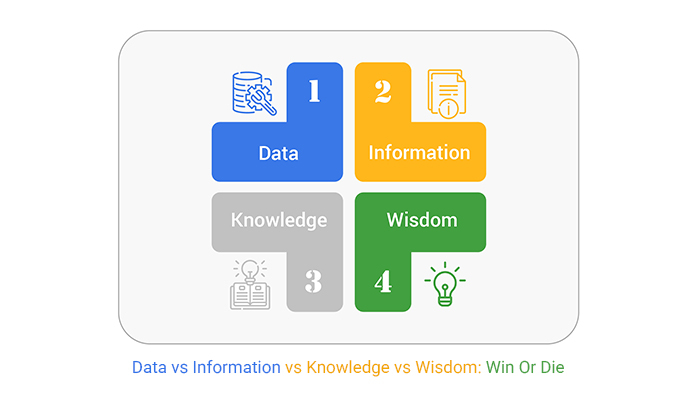
Teams gather reports, dashboards, charts, and still struggle to move forward. The reason? They confuse the layers of value: data vs information vs knowledge vs wisdom (DIKW).
It starts small. A spreadsheet here, a dashboard there. But without structure, raw data turns into noise. People think more data means better decisions. That belief wastes hours, breaks momentum, and creates confusion. The result? Stalled projects, frustrated analysts, and a strategy that never lands.
Data vs information vs knowledge vs wisdom isn’t a buzzword string. It’s a filter for action. Misunderstanding these layers leads to bad bets, burnout, and lost trust. Understanding them builds alignment, speed, and smarter outcomes.
This guide will walk you through the breakdown – data vs information vs knowledge vs wisdom – step by step. It’ll show where teams lose value, how to fix it, and how to build systems that actually think.
It’s common for teams to get excited about data. Numbers offer a sense of security, a belief that they hold the answers. But data alone is not a strategy. It’s like reading a map without knowing your destination. Teams often collect heaps of data, thinking more is better. Yet, without proper interpretation, it’s just noise.
A strategy needs direction, goals, and an understanding of what the data signifies. The smartest teams can fall into the trap of analysis paralysis, overwhelmed by information without actionable insights. They drown in metrics, losing sight of the bigger picture. To avoid this, teams must align data with clear objectives, turning them into strategic insights.
Dashboards can be mesmerizing, with their colorful charts and graphs. But they can also mislead. Definitions lay the groundwork for clarity. Without precise definitions, dashboards become a maze of confusion. Teams might celebrate metrics that lack significance or overlook critical ones.
Clear definitions transform dashboards from a sea of numbers into a story. They establish a common language, ensuring everyone is on the same page. When everyone understands what each metric means, they can focus on what truly matters. It’s the difference between wandering aimlessly and marching together toward a shared goal.
Confusing data with wisdom can be costly. It wastes time as teams sift through mountains of data, searching for insights that aren’t there. This inefficiency breeds frustration, eroding trust within teams. When trust fades, so does the momentum to move projects forward.
The misunderstanding also impacts decision-making. Decisions based on incomplete understanding lead to missteps, further slowing progress. Over time, this erodes confidence in strategies and leaders. The cost of this confusion is steep, affecting both morale and outcomes. By clarifying each layer, teams can avoid these pitfalls, build trust, and gain traction.
Raw data is like an uncut diamond. Its value lies hidden beneath layers of noise and redundancy. Without proper processing, data remains just a pile of numbers with little to no context. It’s crucial to sift through the clutter, extracting pieces that shine with relevance.
Many organizations struggle because they drown in data but lack the means to refine it. This is where the art of turning raw data into information becomes essential. By filtering and organizing data, you pave the way for actionable insights. Without this step, data remains an unused treasure trove.
Information that doesn’t lead to action is like having a map with no destination. It’s essential to transform information into insights that drive decisions. Without action, information remains static, losing its potential impact.
Actionability breathes life into information. It turns facts and figures into strategies and plans. This ensures that every piece of information serves a purpose, guiding decisions that lead to real-world results. Without actionability, information becomes a missed opportunity.
Knowledge is a precious resource that can easily slip away if not captured. When experts leave or retire, they take valuable insights with them. This is why it’s vital to preserve and share knowledge, ensuring it remains within the organization.
Think of knowledge as a library. It needs proper cataloging to be accessible and useful. Documenting processes and insights ensures that expertise remains available for future use. By doing so, you safeguard the organization’s intellectual wealth.
Wisdom is knowledge applied with insight and experience. It’s the secret sauce that turns good decisions into great ones. Systematizing wisdom means embedding these insights into everyday processes. This approach ensures that lessons learned translate into repeatable success.
Imagine wisdom as a guiding star. By integrating it into workflows, you create a roadmap for others to follow. This not only improves decision-making but also fosters a culture of continuous learning and improvement.
The funnel chart is a tool that visualizes the journey from data to wisdom. Along this journey, value can leak at various stages. Identifying these leaks is crucial to maintaining a steady flow of insights.
Plugging leaks means ensuring that each stage of the funnel retains its value. Whether it’s refining data or transforming information into action, each step needs attention. By doing so, you maximize the potential of your insights, turning every piece of data into a stepping stone toward wisdom.


Picture this: you’re at a dinner party, and someone is bombarding you with random trivia. You’d probably tune out, right? This is what happens when we overwhelm stakeholders with raw data. It’s tempting to show everything, thinking it makes our case stronger. But in reality, it just makes eyes glaze over.
Instead, we need to serve the most appetizing bites. Choosing the best pieces of data creates a more compelling and digestible narrative. It’s like giving a highlight reel instead of the entire game. This approach not only maintains interest but also builds trust. It shows you’ve done the homework and are presenting what’s truly important.
Think of information as a map. A good one doesn’t just show you where you are; it guides you to where you need to go. The best maps highlight decision points clearly. They make you stop, think, and choose a path. This is what well-crafted information does for decision-makers. It doesn’t just present facts; it leads them to action.
The art lies in knowing which details to emphasize. It’s about spotlighting the crossroads, not the whole journey. By presenting information that demands attention, you compel stakeholders to engage and make choices. It’s like a choose-your-own-adventure book, where every fact pushes the story forward.
Meetings can feel like running a marathon without the finish line in sight. Endless slides, endless talks, and yet, no one remembers much. The secret to effective knowledge transfer is brevity and clarity. Short, focused exchanges are more memorable and impactful than long-winded presentations.
Think of it like a well-prepared speech. Every word counts, and every point hits home. When you focus on the core message and remove the fluff, you create space for meaningful dialogue. This way, knowledge isn’t just shared; it’s absorbed and retained. It’s like enjoying a potent espresso shot instead of a diluted cup of coffee.
Wisdom is like the seasoned sailor who knows the sea’s moods. It’s the ability to foresee storms and navigate them wisely. In business, this translates to understanding risks and making them impossible to ignore. It’s not about fear-mongering; it’s about painting a clear picture of potential pitfalls and the paths around them.
Imagine standing at a crossroads with a storm on the horizon. Wisdom points out the clouds and suggests the safest route. It turns risk into a tangible factor that demands attention. By presenting wisdom in this way, you compel action. It’s like showing the lighthouse to a ship lost at sea.
A dot plot chart is like a breadcrumb trail. It shows the path from raw facts to final decisions. Each dot represents a piece of data, and together, they form a line that guides the viewer. This visual tool makes it easy to see how different pieces of information influence each other and the choices made.
Imagine connecting the dots in a puzzle. As more dots join, the picture becomes clearer. A dot plot chart provides a visual narrative, illustrating how small facts contribute to big decisions. It’s like seeing the forest for the trees, where each dot adds to the complete view, helping stakeholders understand the journey from data to action.
The following video will help you create an Excel Dot Plot.
The following video will help you create a Dot Plot in Google Sheets.
(That Actually Learn)
Data silos are like those pesky weeds in a garden. They pop up unnoticed, but if left unchecked, they rob the soil of nutrients needed for plants to grow. Within organizations, these silos hoard information, keeping it from those who need it most. When teams can’t access the same data, collaboration suffers. Decisions are made in isolation, leading to inefficiencies and missteps.
Breaking down these silos demands more than just new tools. It requires a mindset shift. Teams need to see data as a shared resource, not a private stash. By fostering open communication and collaboration, organizations can transform these isolated pockets of data into a collective intelligence. The result is a smarter, more agile organization ready to tackle any challenge.
Picture a dragon sitting on a pile of gold, guarding it fiercely. Knowledge hoarding in companies is much the same. Employees hold onto information, thinking it gives them power or job security. But in reality, it stifles growth and innovation. When knowledge doesn’t circulate, it loses value. Teams can’t learn from past successes or failures, leading to repeated mistakes.
The solution is simple yet profound: cultivate a culture of sharing. Encourage employees to view knowledge as a communal asset. Create platforms for collaboration where ideas can be exchanged freely. In doing so, companies don’t just preserve their future—they actively shape it. Employees become part of a learning ecosystem, where every shared insight fuels collective growth.
Employee turnover can feel like losing a key player in a well-rehearsed play. The show must go on, but the loss is felt deeply. To prevent this disruption, companies must build systems that capture and retain expertise. This involves documenting processes, strategies, and insights in ways that are accessible and useful for newcomers.
Think of it as creating an instruction manual for success. These systems should evolve with the organization, incorporating new knowledge and experiences. By doing so, companies ensure that wisdom isn’t tied to individuals but shared across the organization. This continuity not only preserves expertise but enhances the organization’s resilience in the face of change.
Toyota’s approach to knowledge management is legendary. They’ve built a model where learning is woven into the fabric of their operations. It’s not just about capturing knowledge but embedding it in their processes. This ensures that wisdom is passed down through generations, much like family recipes shared at a dinner table.
At Toyota, every mistake is an opportunity to learn. Their systems are designed to capture lessons and integrate them into daily routines. This creates an environment where knowledge isn’t static but dynamic, constantly evolving. As a result, Toyota doesn’t just survive in a competitive market; it leads the way, setting standards for others to follow.
Visualize a tree map, a tool that helps identify where knowledge is thriving and where gaps exist. Just as a gardener tends to weak branches, organizations must address these gaps to ensure balanced growth. A tree map allows teams to see the big picture, identifying areas that need attention.
By spotting knowledge gaps, organizations can take proactive steps to address them. This might involve training programs, mentorship, or better information-sharing practices. The goal is to create a balanced knowledge ecosystem where every branch is healthy and productive. When knowledge flows freely, organizations are better equipped to adapt to new challenges and seize opportunities.
Analysts thrive when their work leads to meaningful outcomes. Yet, when data feels pointless, frustration kicks in. It’s like painting a masterpiece only to have it hidden away. This lack of purpose can drive skilled workers to seek greener pastures.
Without insights, data becomes noise. Imagine trying to find a melody in chaos. When analysts can’t transform data into valuable information, they feel stuck. Over time, this disconnect can push them to leave for places where their efforts make a difference.
Dashboards, full of colorful charts, can be misleading. They often look impressive but fail to tell the whole story. It’s like watching a movie trailer that promises excitement but delivers a snooze-fest. These flashy visuals can distract from real issues, leading to broken strategies.
Relying solely on dashboards can result in missed opportunities. They might highlight surface trends but overlook deeper insights. It’s akin to admiring the tip of an iceberg while ignoring the massive chunk below. Companies risk heading in the wrong direction if they don’t dig deeper.
Having too much information can paralyze decision-making. It’s like standing in front of a buffet with too many dishes to choose from. This overload can freeze a person, making it hard to take action. Instead of clarity, it breeds confusion and indecision.
Decision paralysis slows down progress. When leaders can’t make choices because they’re buried in data, plans stall. It’s like trying to drive with the brakes on. Companies need to find a balance, focusing on what’s truly important to move forward.
Tornado charts illustrate the chaos from DIKW failures. Imagine a whirlwind tearing through an organization, leaving confusion in its wake. These charts highlight areas where data handling went wrong, exposing weaknesses.
Such visuals can guide recovery efforts. By pinpointing damage, organizations can focus on rebuilding. It’s like surveying a storm’s aftermath to plan repairs. Understanding where things broke down helps prevent future failures, strengthening the entire structure.


(Engineering For Knowledge Transfer)
Many Business Intelligence (BI) tools stop at presenting information. It’s like showing someone a map without giving them directions. Users see lots of data, but can’t always make sense of it. These tools excel at gathering and displaying data, but often fall short in helping users understand what to do next.
The gap between information and action is where BI tools struggle. Users need guidance to turn numbers into decisions. Without this, the tools become just another way to look at data. Helping users take the next step is the key to making BI tools truly valuable.
Systems that think beyond reports acknowledge that data is just the beginning. They ask, “What does this mean for me?” Instead of just displaying numbers, they suggest actions or highlight trends. This makes them more than just data presenters; they become advisors.
These systems are like having a mentor who explains not just what you’re seeing, but why it matters. They guide users through the maze of data to the insights that count. By doing this, they make information practical and actionable, which is what users truly need.
Collecting wisdom means preserving valuable insights without getting tangled in red tape. It’s like catching a butterfly without harming it. Systems must gather and share knowledge smoothly, without adding unnecessary layers of process.
Avoiding bureaucratic clutter requires systems to be simple and straightforward. They should capture insights in a way that’s easy for everyone to understand and use. This ensures that wisdom is shared widely, benefiting the whole organization without slowing it down.
Amazon’s approach to metrics is all about driving strategy. They don’t collect data for the sake of it. Instead, they focus on metrics that inform their business goals. It’s not about feeding egos; it’s about making strategic moves.
This focus helps them stay ahead. By tying metrics to strategy, Amazon ensures every piece of data serves a purpose. This keeps their operations sharp and aligned with their goals. It’s a lesson in using data wisely, not just abundantly.
Sankey diagrams show how data moves and transforms. They’re like a roadmap, showing the path from raw data to final decisions. These diagrams highlight where data gets turned into insights, tracing the journey.
This visual representation helps users see connections and transformations at a glance. It’s a powerful way to understand how data evolves and informs decisions. By using Sankey diagrams, users can follow the flow and grasp the big picture quickly.
Measuring the wrong things is like counting the number of bricks in a house without checking if they’re stacked right. You might end up with a pile of bricks instead of a sturdy home. Many organizations fall into this trap. They focus on the quantity of data rather than its quality. This approach leads to decisions based on incomplete pictures.
Focusing on superficial metrics can cause a strategy to falter. It’s like a shiny new car with no engine. It looks good, but it doesn’t get you anywhere. The right metrics should guide you towards understanding and wisdom. They should help you assess if information is being used effectively to make decisions. This ensures you’re building a solid foundation instead of a house of cards.
Creating the right KPIs is like setting a GPS for your journey. You need to know where you’re heading and what you want to achieve. KPIs should measure how well information is being used to create knowledge. This means looking beyond clicks and page views. It’s about understanding how insights are applied to achieve goals.
Think of KPIs like the ingredients list for a recipe. Each one should have a purpose that contributes to the final dish. They should reflect the effectiveness of information use. This way, they can help you see if you’re getting closer to wisdom, not just gathering more facts. It ensures that your strategy is both effective and meaningful.
Auditing your system is like checking your car before a long road trip. You want to make sure everything is in top shape to avoid a breakdown. This involves assessing how data is transformed into wisdom. It’s about ensuring the process is efficient and effective.
A thorough audit helps identify weak points. It’s like finding a leak in a boat before setting sail. By addressing these issues, you prevent bigger problems down the line. Regular audits ensure that your system is resilient and adaptable, ready to meet future challenges. They help you stay on course and avoid unexpected detours.
A progress bar is a simple yet powerful tool. It helps track growth and development. In strategic thinking, it can measure how effectively data is turned into wisdom. It’s like watching a plant grow from a seed. You see each stage of development and know when it’s time to harvest.
Using a progress bar ensures that you’re moving in the right direction. It provides a clear view of where you stand in your journey. This helps in making adjustments as needed. It keeps you focused on the end goal, ensuring that each step takes you closer to wisdom.
Confirmation bias is like a favorite sweater you refuse to part with. It’s comforting but not always right for the occasion. Analysts often fall into this trap, seeing only what fits their beliefs. They ignore data that contradicts their preconceptions. This can lead to conclusions that are as shaky as a house of cards.
By clinging to what they hope to find, analysts might dismiss valuable insights. It’s like trying to find Waldo but refusing to look in certain parts of the picture. The result? Misguided strategies and missed opportunities. Breaking free from this bias requires a conscious effort to challenge one’s own views and remain open to all possibilities.
Veterans in any field come with a treasure trove of experience. They’ve been around the block. But sometimes, this experience breeds arrogance. They may dismiss new ideas, believing their knowledge is superior. This can stifle creativity and innovation. It’s like having a captain who refuses to change course despite stormy seas ahead.
When veterans cling to old methods, they risk missing out on fresh perspectives. This arrogance creates a barrier that prevents growth. Seasoned professionals must remain open-minded. Embracing change and listening to new voices can lead to breakthroughs that weren’t possible before.
Ever looked at clouds and seen a dragon? That’s noise overfitting in action. It’s when we find patterns where none exist. In data analysis, this can lead to decisions based on illusions. Analysts might identify trends that are mere coincidences. It’s like connecting dots that were never meant to be linked.
This tendency can lead to misguided actions and strategies. It’s essential to differentiate between genuine patterns and random noise. By focusing on the big picture and maintaining a skeptical eye, one can avoid the trap of seeing what isn’t really there.
Scatter plots are more than dots on a graph. They can reveal biases lurking under the surface. When analyzed correctly, these plots expose hidden trends and patterns. It’s like shining a flashlight in a dark room and suddenly seeing what was there all along.
By using scatter plots, analysts can identify biases that might otherwise go unnoticed. This insight can prevent flawed strategies based on misinterpretations. It’s a powerful tool to ensure that decisions are grounded in reality, not skewed perceptions.
Imagine trying to quench your thirst by drinking from a fire hose. More isn’t always better. In the quest for data, we often drown in it, losing sight of what we truly need. Cluttered data can obscure the insights we seek, leading to analysis paralysis.
The key is discerning which data truly matters. It’s about filtering out the noise to focus on the signals. When too much data clouds judgment, stepping back and reassessing can save both time and resources. It’s not about the quantity but the relevance of what we gather.
Picture a library filled with books. While it holds a wealth of knowledge, finding what you need can be a task. Sometimes, less is more. By trimming the excess, you sharpen your focus and clarity. This principle applies to information as well.
Streamlining information helps in making quicker, more precise decisions. It’s like cleaning a cluttered desk—the tidy space enhances focus. By reducing information overload, you allow the essentials to shine, making decision paths clearer and more effective.
Innovation often stalls not because of a lack of ideas but due to a glut of procedures. When knowledge becomes tangled in red tape, creativity suffers. Picture a race car stuck in a traffic jam—it has the potential but lacks the freedom to move.
Breaking free from bureaucratic chains can rejuvenate innovation. It’s about creating an environment where ideas flow freely. By simplifying processes, you empower teams to transform insights into actionable innovations, sparking progress and creativity.
In the world of strategies, there are times when data falls short. It’s like navigating with a map that suddenly ends. Here, intuition and experience step in. These are the moments when human judgment becomes invaluable.
Relying solely on numbers can sometimes miss the human element. Judgment calls, informed by experience and insight, often steer the ship through uncharted waters. It’s about trusting your gut when the path is unclear, ensuring the mission stays on course.
Spotify has mastered the art of real-time decision-making. Imagine an orchestra playing without a conductor. Spotify’s decision trees keep the music flowing, even under pressure. These trees allow for quick pivots and informed choices, ensuring their service remains seamless.
In a fast-paced environment, the ability to make swift, strategic decisions is vital. Spotify’s approach showcases how structured decision-making can lead to harmony, even amidst chaos. Their model helps in maintaining a rhythm, enabling continuous improvement and adaptability.
Think of a slope chart as a roadmap. It guides you through the twists and turns of strategic choices. In the DIKW hierarchy, understanding dependencies is crucial. Slope charts highlight the connections, helping to visualize how each element impacts the other.
By mapping these dependencies, decision-makers gain a clearer picture. It’s like connecting the dots, revealing the bigger picture. This approach aids in making informed decisions, ensuring each choice aligns with the ultimate goal.
(That Don’t Stall)
Imagine a world where feedback reaches you before a competitor even blinks. That’s the power of closing feedback loops at lightning speed. Organizations using the DIKW framework treat feedback like gold.
They transform data into actionable insights, allowing them to pivot and adjust strategies swiftly. This rapid cycle of feedback and improvement keeps them one step ahead. It’s like being the first to spot an incoming wave and riding it smoothly to shore.
These organizations use their DIKW insights to anticipate and react faster than rivals. It’s like having a crystal ball that shows what customers want before they even know it. By prioritizing speed, they create a dynamic loop of learning and adapting.
This loop is a powerful competitive edge, ensuring they not only keep up but lead the charge. As they refine their processes, they become adept at closing these loops faster, turning every challenge into an opportunity for growth.
Picture every project as a refining engine, extracting wisdom from raw data. Organizations embracing DIKW turn each project into an opportunity to gather insights. They treat projects as experiments, using them to learn, adapt, and grow.
This mindset transforms projects from static tasks into dynamic engines of innovation. Each project contributes to a growing pool of organizational wisdom, much like a collection of priceless artifacts.
These organizations see projects as stepping stones. They use DIKW to gather data, turn it into information, and build knowledge. Over time, this knowledge becomes wisdom, guiding future projects.
It’s like building a library where each book contains lessons from the past. By turning projects into refinement engines, they create a culture of learning. This culture ensures they remain agile, ready to tackle new challenges with the wisdom gained from past experiences.
Teaching DIKW thinking is like planting seeds of wisdom. But, how do you nurture these seeds without stifling the plant’s growth? Organizations face this challenge as they aim to instill DIKW principles.
The goal is to integrate DIKW without losing agility. Think of it as a dance where the steps are learned, but the rhythm remains spontaneous. This balance ensures that teams can apply DIKW thinking while maintaining their nimbleness.
Organizations achieve this by embedding DIKW into everyday routines. They encourage teams to think critically and transform data into insights. It’s like teaching someone to fish rather than simply giving them a fish. By fostering a culture where DIKW is second nature, they empower teams to act quickly. This empowerment retains agility, allowing them to navigate challenges with ease. It’s a fine line, but one that leads to an organization that is both wise and flexible.
Dropbox’s approach is revolutionary. They focus on moving smarter rather than just faster. By using the DIKW framework, they turn their funnel into a powerhouse of insights. It’s like having a GPS that not only shows the fastest route but the best one. Dropbox gathers data, transforms it into information, and builds knowledge. This knowledge becomes wisdom, guiding their strategies and decisions.
This approach allows Dropbox to optimize their processes. They don’t just rush forward; they make informed choices. It’s the difference between running blindly and having a map to guide you. By using DIKW, Dropbox ensures they don’t just keep up with the competition—they lead the way. Their funnel becomes a tool for continuous learning and improvement. It’s a smart move that keeps them ahead in the fast-paced tech industry.
Imagine a matrix chart as a blueprint for learning. Organizations use it to structure learning, preventing stagnation. It’s like having a map that shows not just the destination but the best route. This chart helps organizations visualize their DIKW processes. They can see where they stand and where they need to go, ensuring they don’t get stuck in one place.
The matrix chart is more than just a tool; it’s a strategy for success. By structuring learning, organizations create a roadmap for growth. They can identify gaps in their knowledge and address them before they become roadblocks. It’s like tuning an instrument, ensuring every note is perfect. This approach keeps them moving forward, always learning, and always improving. It ensures stagnation never catches up, keeping the organization vibrant and dynamic.
Data ownership determines who gets to tell the story. Imagine a newsroom where only some have access to the breaking news. Those few can shape public perception by deciding which facts to highlight. In organizations, data owners can craft the narrative that aligns with their goals, influencing stakeholders’ perceptions.
Owning data is about control and trust. Stakeholders look to data owners as the custodians of truth. This trust means that data owners can guide the narrative, impacting everything from market positioning to internal policies. With ownership comes the responsibility to use data ethically, ensuring the narrative is truthful and beneficial for all involved.
Information gatekeepers are the unsung heroes who ensure that the right information reaches the right people. They sift through mountains of data, picking out what’s relevant and timely. Their role is crucial as they hold the keys to actionable insights, making them pivotal in strategic planning.
These gatekeepers act as filters, preventing information overload. They focus on relevance, ensuring that decision-makers aren’t bogged down by unnecessary noise. In a world teeming with information, their ability to distill data into clear, actionable insights is invaluable.
Wisdom hoarders pose a unique challenge within organizations. They are the keepers of deep insights and learned experiences. However, when they withhold this wisdom, they can stifle innovation and growth. It’s like having a treasure chest but refusing to share its contents.
These individuals hold the potential to guide new initiatives and avert past mistakes. Yet, their reluctance to share can lead to repeated errors and missed opportunities. Encouraging a culture of openness and knowledge-sharing can mitigate this threat, ensuring the organization capitalizes on its collective wisdom.
A horizontal waterfall chart is a valuable tool in visualizing the flow and control of data, information, knowledge, and wisdom. It shows how data transitions through each stage, highlighting where control shifts within an organization. This clarity helps identify bottlenecks and areas ripe for improvement.
By mapping these flows, organizations can prioritize areas that need attention. They can highlight inefficiencies or power struggles that may hinder progress. Understanding these dynamics is key to ensuring smooth transitions and maximizing the value derived from each stage of the DIKW hierarchy.
In the heat of the moment, systems must prove their worth. It’s one thing to have a well-documented process; it’s another to see it perform under pressure. DIKW systems that shine do more than offer guidance—they deliver results when stakes are high. They’re the lifelines that help organizations navigate tough situations with agility.
These systems are built to withstand stress and adapt to the unexpected. They ensure that the transition from data to wisdom happens smoothly, even in challenging scenarios. When real-world chaos tests these frameworks, their true value emerges, turning potential setbacks into opportunities for growth.
Quick recovery isn’t just about bouncing back; it’s about learning swiftly and moving forward with renewed strength. Fast-fail models emphasize this learning process. They allow businesses to test, learn, and adapt without fear of failure. This approach helps organizations adapt to market shifts with confidence.
The essence of these models lies in their ability to convert mistakes into lessons. By embracing failure as a stepping stone, companies can refine their strategies and outsmart competitors. This continuous cycle of testing and learning turns potential failures into stepping stones for innovation and progress.
Mistakes don’t spell doom; they can be catalysts for growth. When viewed through the lens of learning, errors become opportunities to gain momentum. Organizations that harness this mindset can transform setbacks into strategic advantages. Each misstep offers insights that can inform future actions and strategies.
This approach requires a shift in thinking. Instead of fearing errors, businesses should welcome them as part of the journey. By analyzing what went wrong and why, companies can refine their processes and emerge stronger. This proactive stance allows them to stay agile and competitive in an ever-changing market.
Zara’s success isn’t just about fashion; it’s about timing and insight. The retail giant uses real-time data to stay ahead, making informed decisions that resonate with customers. This strategy allows Zara to remain flexible, adapting its inventory and approach based on current trends and consumer behavior.
By leveraging real-time insights, Zara can pivot swiftly and effectively. This agility keeps them at the forefront of retail, consistently meeting customer demands. Their approach demonstrates the power of timely information in driving business success and maintaining a competitive edge in the fast-paced retail sector.
Visual tools like clustered stacked bar charts are more than just pretty pictures. They help organizations spot trends and bottlenecks quickly. By presenting complex information in an accessible format, these charts enable faster decision-making and strategic planning. They transform raw data into visual stories that drive action.
These charts offer a snapshot of performance and highlight areas needing attention. By using them effectively, businesses can identify strategic drains and address them promptly. This proactive approach ensures that resources are directed where they’re most needed, leading to improved efficiency and outcomes.
Data alone won’t help you move. Information can stall. Knowledge fades. Wisdom gets stuck if it isn’t shared.
Data vs information vs knowledge vs wisdom isn’t a checklist. It’s a chain. Break one link, and your insight flow stops. Teams collect data, but without action, it sits idle. Dashboards look sharp but don’t always drive decisions. Meetings pass without decisions because knowledge isn’t passed with a purpose.
Each layer in data vs information vs knowledge vs wisdom needs care. Data needs sorting. Information needs meaning. Knowledge needs to be shared. Wisdom needs practice. If your team skips any of these steps, the cost adds up fast—wasted time, lost talent, bad calls.
You don’t need more data. You need better flow. Fix how you move from data to action. Align your team around what matters most. Make sure each part leads to something real.
Data vs information vs knowledge vs wisdom isn’t about more. It’s about making things count. That’s how you move.
How much did you enjoy this article?


Calculate accounts receivable turnover ratio to measure credit collection speed, improve cash flow, and strengthen your financial strategy. Read on!

Change Management KPIs are the key to tracking adoption, performance, and ROI during transitions. Find out which metrics matter. Read on!

Data collection methods and techniques determine the quality of every insight you act on. Explore key approaches for gathering reliable data. Read on!


