Categories
By ChartExpo Content Team
The difference between a bar chart and a histogram isn’t design. Its meaning.
Bar chart vs histogram seems like a small choice. It’s not. This mistake shows up in meetings, dashboards, and reports. It wastes time. It leads to confusion. It breaks momentum.
People use a bar chart versus a histogram the wrong way when the pressure’s high. Deadlines get tight. Charts get built fast. The software picks one, and no one checks. Suddenly, the axis misleads. The story shifts. Teams walk away with the wrong idea.
Bar chart vs histogram is about more than looks. It shapes how people think. Bar charts tell people to compare. Histograms tell people to look for patterns. Get it wrong, and you change the question before the meeting starts.
If your data shows names, use a bar chart. If it shows measurements, pick a histogram. Know the goal. Are you comparing? Are you analyzing a range? The choice tells the story. The wrong one tells the wrong story.
Bar chart vs histogram may sound simple. But it’s often the reason decisions get delayed, buy-in falls apart, or questions keep piling up. Fix the visual, and you fix the message.
| Bar Chart vs Histogram: Feature Comparison at a Glance | ||
| Feature | Bar Chart | Histogram |
| Data Type | Categorical | Continuous |
| Bar Spacing | Gaps between bars | No gaps between bars |
| X-axis Labels | Categories (names, labels) | Number ranges (intervals) |
| Purpose | Comparison between categories | Distribution analysis |
| Audience Use | Executives, summary readers | Analysts, data scientists |
| Common Misuse | Used to show distributions | Used to compare categories |
| Sorting Impact | Changes perception | Less relevant |
| Clarity Speed | Quick to scan | Requires interpretation |
| Typical Use Case | Sales by product | Exam scores across students |
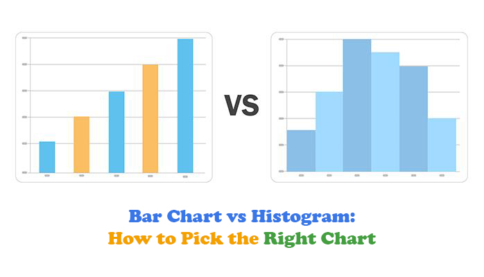
Want to impress at your next meeting? Spotting the difference between these two charts is like recognizing a familiar face in a crowd. Bar charts have spaces between their bars, signaling separate categories. It’s as if each bar is saying, “Look at me, I’m unique!” Histograms, however, have bars that touch, symbolizing continuous data. They tell you, “We’re all connected.”
Now, when you’re faced with data, think about your goal. Are you comparing distinct categories or exploring data distribution? If it’s the former, grab a bar chart. If it’s the latter, reach for a histogram. This quick decision-making skill will make you seem like the data guru in the room, and who doesn’t love a little extra credibility?
Choosing the wrong chart can be like trying to fit a square peg in a round hole. It leads to confusion, making it harder to interpret data correctly. This slows down decision-making and can leave everyone scratching their heads. If the wrong tool is used, you might end up with insights that are as clear as mud, especially when comparing distribution patterns that could also be analyzed using a confidence interval graph for better clarity.
When decisions are delayed, time slips through your fingers. Confidence in the data wanes, and stakeholders start questioning the results. This creates a ripple effect, affecting project timelines and outcomes. Using the right chart not only saves time but also keeps your team on the same page, ensuring everyone is confident in the decisions being made.
| Bar Chart vs Histogram: Misconceptions That Confuse Teams | ||
| Misconception | Why It’s Incorrect | Reality Clarified |
| Bar charts and histograms are the same | They look similar but serve different purposes | Bar charts compare categories, and histograms show distributions |
| Spacing is just a design choice | Spacing communicates data type | Gaps indicate categories, touching bars imply continuity |
| Histograms can compare categories | They are built for continuous ranges | Use bar charts for discrete category comparisons |
| Any chart will do if the data is right | Form impacts interpretation | Chart choice must match data intent |
| Histograms always show frequency | They can also show density or probability | Interpretation depends on the axis configuration |
| Bar charts work for time series | They don’t show progression or trend | Use line charts or histograms for time-based data |
| Bins are cosmetic in histograms | Bin size affects insight quality | Bins must reflect the data structure |
Imagine a world where the right chart leads to instant understanding. When you use the correct visual, it’s like turning on a light in a dark room. Everyone sees the same picture, and alignment happens naturally. This clarity speeds up decision-making, as there’s no need for endless debates or second-guessing.
With everyone aligned, projects get the green light faster. There’s a sense of momentum, and progress feels effortless. The right chart can be the key to unlocking this dream scenario. It transforms data into insights, insights into decisions, and decisions into action. In this ideal world, data doesn’t just inform, it inspires.
Picture a bookshelf again. Each book belongs to a category: fiction, non-fiction, or mystery. Bar graphs work this way. They present data as distinct, separate chunks. This makes them great for comparing how one category stacks up against another. It’s almost like a face-off between your favorite book genres.
But then, consider the unfolding of a rainbow. A histogram presents data along a range, like a gradient of colors. It’s not about which color is more popular, but about how colors blend and shift. This helps people see how data spreads across a continuum. It’s less about individual categories, more about understanding distribution. The mental shift is from isolated items to a flowing spectrum.
Spacing in charts speaks volumes. Bar graphs have gaps between bars. These gaps are like pauses in a conversation, emphasizing separation. They signal to viewers that the data points are distinct. Each bar is its own story, with space to breathe.
Histograms, on the other hand, have bars that touch. This lack of spacing creates a sense of continuity. The bars almost whisper to each other, connecting data points into a flowing narrative. It’s like a seamless conversation where one idea leads to another. The touch of bars suggests a relationship, drawing attention to the overall pattern rather than individual data points.
| Bar Chart vs Histogram: Visual Cues That Signal the Right Chart | ||
| Visual Element | Bar Chart | Histogram |
| Bar Spacing | Gaps between bars | No gaps between bars |
| X-axis Labels | Categories or names | Numerical ranges |
| Data Continuity | Discrete | Continuous |
| Interpretation Style | Direct comparison | Pattern discovery |
| Sorting Impact | Changes perception | Minimal effect |
| Axis Type | Nominal or ordinal | Interval or ratio |
| Common Use Case | Sales by category | Test score distribution |
| Data Type | Categorical | Measured/Quantitative |
| Viewer Focus | Individual bars | Shape of data |
Bar graphs invite you to judge. They set up a comparison, like a friendly competition, where each category vies for attention. You’re asked to evaluate, to see which bar stands tallest. It’s about making decisions based on clear, distinct categories.
Histograms, however, are about discovering patterns. They unfold stories of how data is distributed over intervals. The focus shifts from individual bars to the whole picture. You’re not just comparing; you’re uncovering trends and patterns. It’s like watching a landscape unfold, giving insight into how data spreads over a range.
| Bar Chart vs Histogram: Interpretation Tasks by Chart Type | ||
| Chart Type | Viewer’s Mental Task | Best Use Case |
| Bar Chart | Compare values between categories | Product sales, customer segments |
| Histogram | Detect distribution patterns | Test scores, age ranges |
| Bar Chart | Evaluate group performance | Department output, regional revenue |
| Histogram | Identify skew or clustering | Income levels, temperature data |
| Bar Chart | Rank categorical outcomes | Survey responses, feature usage |
| Histogram | Uncover data shape | Website session lengths, delivery times |
Here’s a tale of transformation. A company struggled with its sales forecast. They used a bar graph to present sales by product. Each bar stood alone, but the decision-makers missed the bigger picture. They focused on individual products, ignoring overall trends.
Then, someone suggested a change. They switched to a histogram to show sales over time. Suddenly, the pattern became clear. The continuous flow of data revealed seasonal trends and cycles. Decision-makers saw the broader context and understood the market dynamics. This insight led to strategic decisions that secured approval. The simple switch in presentation unlocked a new understanding and drove impactful business outcomes.
| Bar Chart vs Histogram: Real Case Mistakes and Fixes | ||
| Scenario | Wrong Chart Used | Fix (Correct Chart) |
| Sales forecast missed trends | Bar Chart | Switched to Histogram |
| Customer spike hidden | Histogram with bad bins | Rebuilt with proper bins |
| Education funding misunderstood | Bar Chart only | Added Histogram for depth |
| Survey response spread unclear | Bar Chart | Used a Histogram to show the distribution |
| Tool auto-selected chart type | Histogram for categories | Overrode with Bar Chart |
| Revenue range overlooked | Bar Chart | The histogram revealed spread and outliers |
The following video will help you draw a Histogram in Microsoft Excel.
The following video will help you draw a Histogram in Google Sheets.
When you treat continuous data as categories, it’s like mixing apples and oranges. You might end up with a visual that looks like a jumbled mess. This approach can drown your audience in confusion, making it hard for them to see the patterns you’re trying to highlight. By organizing data accurately, you help others see the story your numbers tell.
Mislabeling data can slow everything down. It’s like trying to read a book with the pages out of order. People spend more time deciphering the chart than understanding the insights.
Avoid this pitfall by using the right visual for your data type, such as a frequency chart in Excel, when it fits your analysis. It makes your message clear and lets your audience engage with your findings.
A histogram with poor labels is like a map without street names. Viewers might lose their way and miss critical insights. When labels aren’t clear, it’s easy for errors to sneak in, making it seem like the data is wrong. This can chip away at your credibility, even if the numbers were right all along.
Errors in labeling can make you feel like you’re the one at fault. It’s frustrating when your hard work is misunderstood because of simple mistakes. Ensuring labels are precise and informative helps keep your message intact. It also saves you from the embarrassment of having to explain errors that weren’t really yours.
Auto-formatting can be a double-edged sword. It’s convenient, but it can introduce silent errors. These mistakes hide in plain sight, waiting to surface at the worst moment. Imagine presenting your data only to find that automatic styling has distorted your message. It’s the kind of surprise nobody wants.
Relying too heavily on automated features can leave you vulnerable. It’s like letting someone else drive your car without knowing where they’re going. Regularly checking and adjusting your settings helps avoid these hidden pitfalls. This attention to detail saves you from the headache of last-minute corrections.
| Bar Chart vs Histogram: Common Mistakes and How to Avoid Them | ||
| Mistake | Why It’s Wrong | Correction |
| A histogram is used for names | Suggests false continuity | Use a bar chart instead |
| Bar chart used for measurements | Hides distribution pattern | Use a histogram |
| Axis labels mismatched | Confuses data type and purpose | Match the axis to the data type |
| Too few histogram bins | Oversimplifies the distribution | Increase bin count |
| Too many histogram bins | Introduces noise | Reduce bin count for clarity |
| Auto-selected chart type not reviewed | Might misrepresent data | Manually validate the chart choice |
| Missing axis units | Reduces interpretability | Add appropriate scale labels |
| Histogram with uneven bins | Distorts frequency comparisons | Use equal-width bins |
A quick glance can save you from a charting blunder. Check your axes! A bar chart uses discrete categories, and the axis should reflect this. In contrast, a histogram’s axis should show continuous intervals. This simple check can prevent a major headache.
Picture this: You create a chart with categories on a histogram’s axis. The bars blend into each other, and your audience struggles to understand. A swift axis check would have flagged this mistake. It’s a small step with a big impact, ensuring your visual tells the right story.
Automated chart tools are convenient, but they don’t always get it right. Sometimes, you need to take the reins. Trust your judgment when the tool picks a chart that doesn’t fit your data’s story.
Let’s say your software selects a histogram for categorical data. It’s like wearing flip-flops in a snowstorm, totally inappropriate! Override the generator and choose a bar chart. Your audience will grasp your message better, and you’ll avoid miscommunication.
Switching charts should clarify your data, not confuse it. If changing a bar chart to a histogram alters your message, you’ve got a problem. This is a clue that the initial choice was off.
Imagine you’re presenting survey results with a bar chart. You switch to a histogram, and suddenly, the results look different. That’s a red flag! Your data’s story should remain consistent, regardless of the chart type. Stick with the one that accurately reflects your information.
| Bar Chart vs Histogram: Fast Chart Selection Guide | ||
| Data Type | Purpose of Chart | Recommended Chart |
| Categorical | Compare groups | Bar Chart |
| Categorical | Show category performance | Bar Chart |
| Categorical | Display frequency of labels | Bar Chart |
| Continuous | Analyze data distribution | Histogram |
| Continuous | Spot outliers and clusters | Histogram |
| Continuous | Understand variability | Histogram |
| Categorical | Present survey results | Bar Chart |
| Continuous | Visualize measurements | Histogram |
When data is categorized by names or labels, use a bar chart. This is the go-to for illustrating different categories or groups. It’s ideal for showing the popularity of various ice cream flavors or the number of customers visiting each store.
For data measured by numbers, histograms are your friend. They work well with continuous data, like the height of students in a class. By grouping these measurements, a histogram reveals the distribution and helps identify trends. This simple rule enables you to pick the right visualization quickly.
Focus on your goal when choosing a chart. If you’re comparing different entities, a bar chart does the job. It makes it easy to see differences at a glance. However, if you’re interested in seeing how data falls into ranges, a histogram is more appropriate.
Forecasting trends? Bar charts give a snapshot of current data but don’t show future possibilities. On the other hand, group data or surface risks with histograms. They reveal patterns and potential outliers, helping you spot risks early. Aligning your chart with your intent ensures your data speaks clearly.
| Bar Chart vs Histogram: Intent and Chart Guidance | ||
| Intent | What They Need to Know | Suggested Chart Type |
| Compare sales by product | Differences between distinct categories | Bar Chart |
| Explore the age distribution | How values spread across intervals | Histogram |
| Summarize performance by department | Clear outcome-based insight | Bar Chart |
| Understand income variability | Frequency of income ranges | Histogram |
| Present product popularity | Ranked categories | Bar Chart |
| Reveal data patterns | Distribution trends | Histogram |
| Analyze test scores | Cluster and spread of scores | Histogram |
| Compare website traffic by channel | Distinct traffic sources | Bar Chart |
| Spot outliers in transaction amounts | Anomalies in continuous data | Histogram |
Knowing your audience is half the battle. Executives want the headline. They need clear, straightforward information, often just the key insights. Bar charts help here, providing an easy comparison at a glance.
Analysts, however, crave the details, the shape of the data. They want to dig into distributions and trends. This is where histograms excel, peeling back layers to reveal the full story. Tailoring your approach to your audience ensures your message hits the mark.
| Bar Chart vs Histogram: Audience Preference by Role | ||
| Audience Role | Preferred Visualization | Why It Works |
| Executives | Bar Chart | Focus on the summary and clear comparisons |
| Analysts | Histogram | Seek patterns, distribution, and outliers |
| Policy Makers | Bar Chart + Histogram | Need both an overview and context |
| Marketing Teams | Bar Chart | Visualize campaign performance across categories |
| Data Scientists | Histogram | Explore spread, skewness, and clusters |
| Sales Managers | Bar Chart | Track performance by region or product |
| Product Managers | Bar Chart + Histogram | Compare usage metrics and explore behavior |
| Operations Leaders | Histogram | Identify process variation and bottlenecks |
Bins are crucial in data visualization. They’re the intervals that group data in a histogram. If these bins aren’t set correctly, they can create fake peaks. This misrepresents the data. It makes minor variations look significant or hides real trends. Imagine trying to find a needle in a haystack, but someone keeps adding more hay.
Bad bins can also hide signals. Important data points might get lost in a sea of similar values. This invites false certainty. It makes trends seem real when they’re not. Choosing the right bin size is essential. It ensures data is presented accurately.
| Bar Chart vs Histogram: What to Watch in Bin Configuration | ||
| Bin Setup Issue | Visual Impact | Recommendation |
| Too few bins | Flattens detail, hides trends | Use more bins based on the data size |
| Too many bins | Creates visual noise | Reduce bins to highlight core patterns |
| Inconsistent bin width | Distorts frequency comparisons | Use equal-width bins |
| Misaligned bin edges | Misrepresents group boundaries | Align bins to natural data breaks |
| No bin labels | Confuses interpretation | Clearly label each interval range |
| Arbitrary bin intervals | Skews perception of distribution | Base bins on data characteristics |
| Bins too wide | Hides critical detail | Narrow bins for finer granularity |
| Bins too narrow | Overwhelms the viewer with noise | Balance precision with readability |
Outliers are those pesky data points that don’t fit the pattern. They can vanish into the tails of a chart if not handled correctly. This is a big deal because outliers often hold valuable insights. Ignoring them is like throwing away the last piece of a puzzle. You might miss the picture entirely.
When outliers disappear, it’s easy to overlook crucial information. These data points could be an early warning of problems or opportunities. It’s important to highlight them. Make sure they don’t get lost in the noise. Otherwise, you risk missing out on key insights.
Charts need to cover the full range of data. Missing ranges can hide risks. If zero isn’t shown, it might seem like there’s no risk when there actually is. It’s a bit like ignoring an elephant in the room. The problem might be there, but if you don’t see it, you can’t address it.
Not showing the full range can lead to overconfidence. It makes it look like everything’s fine when it isn’t. Always show the entire range of data. This ensures that all risks and opportunities are visible. It helps in making informed decisions based on the full picture.
A company noticed unusual customer behavior. They saw a sudden drop in sales, but couldn’t figure out why. The initial histogram they used was misleading. It had been set up with arbitrary bins. This meant the spike in customer activity wasn’t visible. It was like searching for a missing sock in a cluttered drawer.
They decided to rebuild the histogram with intentional bins. This time, they adjusted the intervals to suit their data better. The spike became clear. It turned out to be a temporary surge due to a marketing campaign. By changing their approach, they gained valuable insights. They could now plan future campaigns more effectively.
Bar charts are like a fast-food menu, easy to read and quick to digest. They let you compare items side by side with ease. This makes them great for presentations where time is tight and you need to get the point across fast. You see the tallest bar, and you know the winner.
Histograms, on the other hand, are the fine dining of graphs. They require a bit more chewing. They reveal the shape of data distribution, which can be complex. When you use histograms, consider adding notes or explanations. They can help your audience understand the data better without feeling lost.
People tend to focus on the first thing they see. In a bar chart, the first bar often grabs the spotlight. This initial impression can shape how the rest of the data is perceived. If the bars aren’t sorted logically, it might mislead viewers about the importance or size of the categories.
Sorting bars by size or category can make a big difference. It helps viewers understand the data in a meaningful way. When the order is random, it might confuse the audience, leading them to form incorrect conclusions before even diving into the details.
Dashboards jam-packed with data can overwhelm. Raw histograms often leave viewers scratching their heads. Without context, they might not know what the ranges mean or why certain patterns matter. This can lead to hasty judgments or misinterpretations.
Instead of lengthy explanations, sprinkle annotations around your histograms. A short note here or a quick highlight there can guide viewers. Annotations draw attention to key points, helping the audience get the gist without a deep analysis.
| Bar Chart vs Histogram: When to Use One, the Other, or Both | ||
| What You Need to Show | Use a Bar Chart? | Use Histogram? |
| Total sales by product | Yes | No |
| Income bracket spread | No | Yes |
| Both summary and data shape | Yes | Yes |
| Category-level performance | Yes | No |
| Distribution of exam scores | No | Yes |
| Detecting skewness and clusters | No | Yes |
| Comparing departments | Yes | No |
| Visualizing behavior patterns | No | Yes |
| Executive summary plus details | Yes | Yes |
Bar charts are like the headlines of a newspaper. They tell you the main story in bold letters. They show outcomes such as total sales by region or profit margins by product. When you want to highlight differences between categories, bars are your go-to tool.
Histograms, on the other hand, dig deeper. They reveal behaviors and patterns. They show how data is spread across intervals, such as age ranges or income brackets. By stacking these two, you give your audience both the summary and the storyline. They show both the outcome and the nuances. This approach turns a simple data presentation into a dynamic conversation.
Averages can be misleading. They provide a single number that represents a whole, but they can mask the real story. A bar chart displaying average income by city might suggest one city is wealthier than another. But that doesn’t reveal how income is distributed among residents.
Histograms force you to confront the distribution. They show how many people fall into different income brackets. This clarity can uncover inequalities hidden by averages. Seeing the spread of data can change perceptions. It can drive discussions on important issues like wealth distribution and social equity. By showing the full range, histograms tell stories that need to be heard.
Creating impact with data isn’t just about convincing someone with numbers. It’s about sparking a conversation. Bar charts make a point succinctly. They are convincing with clear, direct comparisons. But to truly lead a discussion, you need depth.
Histograms provide that depth. They invite questions and exploration. How does this group compare to another? What’s the spread within this dataset? Combining both charts shifts you from merely convincing to actively engaging. You lead the audience from understanding to exploration. This approach encourages them to think deeper and ask questions. It transforms data presentation into an interactive dialogue.
| Bar Chart vs Histogram: Shape, Summary, or Both? | ||
| What You Need to Show | Use a Bar Chart? | Use Histogram? |
| Total revenue by product | Yes | No |
| Income distribution across the population | No | Yes |
| Summarize and analyze customer spend | Yes | Yes |
| Frequency of complaint types | Yes | No |
| Length of customer support calls | No | Yes |
| Sales performance and customer range | Yes | Yes |
| Product popularity and variability | Yes | Yes |
| Department output comparison | Yes | No |
| Detect spending anomalies | No | Yes |
Picture this: a heated policy debate over education funding. One side argues that more money is needed, using a bar chart to show average spending per student. The chart is clear. It paints a picture of disparity between districts. But it doesn’t tell the whole story.
Then, a histogram enters the scene. It reveals how spending per student varies within each district. Suddenly, the debate shifts. The histogram shows some schools get significantly more funding than others, even within the same district. This dual approach opens eyes and changes the conversation. The combination of both charts provides a fuller understanding. It leads to more informed decisions and actions. Two charts together can illuminate complexities and drive change.
| Bar Chart vs Histogram: When Neither is Enough | ||
| Purpose | Better Alternative | Why Not Bar or Histogram Alone? |
| Show outliers and medians | Box-and-whisker plot | Bar charts hide distribution, and histograms lack a central tendency marker |
| Display multiple group comparisons | Small multiples | A single chart would be overcrowded |
| Visualize smooth data distribution | Density plot | Histogram bins may distort the shape |
| Track change over time | Line chart | Bar and histogram don’t show progression |
| Explore variable correlation | Scatter plot | Neither chart shows relationships |
| Understand feature interaction | Heatmap | Histograms and bar charts lack dimensional layering |
Box and whiskers plots are your go-to for understanding data spread. These plots show medians and highlight outliers. They’re a favorite for statisticians wanting to see data distribution at a glance.
Medians give you a midpoint, while the spread shows data variation. Outliers stand out, offering insights into edge cases. If you need to understand how your data varies and pinpoint anomalies, box plots are the way to go. They can reveal the highs and lows that bar charts and histograms might miss.
Density plots offer a smooth view of data distribution. They don’t require bins like histograms. This means you can see the data shape without constraints. Density plots are perfect for continuous data, revealing patterns that might go unnoticed in a histogram.
These plots are handy when you want to see the data’s overall trend without the jagged lines of a histogram. They provide a clearer picture of where data points cluster, allowing you to grasp the data’s essence without distraction.
Small multiples are ideal for comparing multiple datasets. They let you see different groups side by side. This approach avoids cramming all data into one complex graph. Each dataset gets its own space, making it easier to see differences and similarities.
When you have a lot of data to compare, small multiples keep it manageable. They let you focus on each group individually while still seeing the big picture. This method helps maintain clarity and impact without losing the story’s richness.
Every chart tells a story. But the wrong one tells the wrong story. That’s the risk when you confuse a bar chart with a histogram.
A bar chart compares categories. A histogram shows the distribution. One invites judgment. The other helps you see patterns. If you switch them, you change how people think. That’s not a small mistake. It can stall meetings, break trust, or send decisions in the wrong direction.
Think about your goal. Are you comparing groups or showing how values spread? Are you naming things or measuring them? The answer tells you which chart to use.
Check your axis. Bar charts use names. Histograms use number ranges. If the chart type doesn’t match the data, you’re setting the audience up to fail. That failure won’t look like an error. It’ll feel like confusion, wasted time, or the wrong takeaway.
Don’t rely on the chart tool to decide for you. The auto setting can pick the wrong chart and leave you fixing it later. One small check before you publish can save a lot of rework after.
Use bar charts and histograms with intent. Stack them if needed. Compare outcomes with bars. Show behavior with histograms. Let each chart do its job.
How much did you enjoy this article?


Calculate accounts receivable turnover ratio to measure credit collection speed, improve cash flow, and strengthen your financial strategy. Read on!

Change Management KPIs are the key to tracking adoption, performance, and ROI during transitions. Find out which metrics matter. Read on!

Data collection methods and techniques determine the quality of every insight you act on. Explore key approaches for gathering reliable data. Read on!


