• Home
  • Tools dropdown img
    • Spreadsheet Charts

      • ChartExpo for Google Sheets
      • ChartExpo for Microsoft Excel
    • Power BI Charts

      • Power BI Custom Visuals by ChartExpo
    • Word Cloud

  • Charts dropdown img
    • Chart Category

      • Bar Charts
      • Circle Graphs
      • Column Charts
      • Combo Charts
      • Comparison Charts
      • Line Graphs
      • PPC Charts
      • Sentiment Analysis Charts
      • Survey Charts
    • Chart Type

      • Box and Whisker Plot
      • Clustered Bar Chart
      • Clustered Column Chart
      • Comparison Bar Chart
      • Control Chart
      • CSAT Survey Bar Chart
      • CSAT Survey Chart
      • Dot Plot Chart
      • Double Bar Graph
      • Funnel Chart
      • Gauge Chart
      • Likert Scale Chart
      • Matrix Chart
      • Multi Axis Line Chart
      • Overlapping Bar Chart
      • Pareto Chart
      • Radar Chart
      • Radial Bar Chart
      • Sankey Diagram
      • Scatter Plot Chart
      • Slope Chart
      • Sunburst Chart
      • Tornado Chart
      • Waterfall Chart
      • Word Cloud
    • Google Sheets
      Microsoft Excel
  • Services
  • Pricing
  • Contact us
  • Blog
  • Support dropdown img
      • Gallery
      • Videos
      • Contact us
      • FAQs
      • Resources
    • Please feel free to contact us

      atsupport@chartexpo.com

Categories
All Data Visualizations Data Analytics Surveys
Add-ons/
  • Google Sheets
  • Microsoft Excel
  • Power BI
All Data Visualizations Data Analytics Surveys
Add-ons
  • Google Sheets
  • Microsoft Excel
  • Power BI

We use cookies

This website uses cookies to provide better user experience and user's session management.
By continuing visiting this website you consent the use of these cookies.

Ok

ChartExpo Survey


Home > Blog > Data Analytics

Value Stream Mapping Template: A Complete Guide

A value stream mapping template gives organizations a structured way to document and scrutinize every activity involved in delivering a product or service.

Value Stream Mapping Template

By converting complex workflows into visual representations, teams can see exactly where value is created, where delays accumulate, and where resources go to waste. This guide covers what the template is, why it matters, how to build one, and how to analyze it.

Whether the goal is eliminating production delays, accelerating software delivery, or improving patient care, a consistent value stream template gives teams the structure to identify problems, measure progress, and drive meaningful change across the organization.

Table of Contents:

  1. What is a Value Stream Mapping Template?
  2. Why Use a Value Stream Mapping Template?
  3. Key Components of a Value Stream Mapping Template
  4. Value Stream Mapping Template Examples
  5. How to Create a Value Stream Mapping Template?
  6. How to Analyze a Value Stream Mapping Template in Google Sheets?
  7. Benefits of Using a Value Stream Mapping Template
  8. Common Metrics Tracked in a Value Stream Mapping Template
  9. Best Practices for Designing Value Stream Mapping Format
  10. FAQs
  11. Wrap Up

What is a Value Stream Mapping Template?

Definition: A value stream mapping template is a structured visual tool used to document, analyze, and improve every step involved in delivering a product or service to customers. It captures how work, data, and materials move through a system while exposing bottlenecks, handoff delays, and activities that add no value.

When teams adopt a consistent framework for process mapping, they gain shared structures that enable faster analysis and more reliable comparisons across departments. Rather than building workflow diagrams from scratch each time, organizations use this repeatable approach to track improvements and keep their process maps current as operations evolve.

Why Use a Value Stream Mapping Template?

Workflow problems tend to stay invisible when processes are distributed across multiple systems, teams, or tools. A value stream mapping template brings everything into one coherent view, making inefficiencies impossible to ignore and giving decision-makers a foundation for targeted action.

  • Identifies process inefficiencies: Surfaces redundant steps, unnecessary delays, and activities that consume resources without delivering value.
  • Visualizes end-to-end workflow: Creates a unified picture of how tasks, data, and materials travel across the entire system.
  • Highlights waste and delays: Brings bottlenecks, idle periods, and excessive handoffs into immediate focus for the team.
  • Improves cross-team alignment: Builds a shared understanding of how work flows between departments and stakeholders.
  • Supports continuous improvement: Gives teams a repeatable structure for monitoring changes and refining operations over time.
  • Enables data-driven decisions: Ties improvement efforts to concrete performance metrics rather than assumptions.

Because the template anchors analysis in measurable data, teams can rank improvement opportunities by impact, much like a customer journey map helps prioritize the moments that matter most to users.

Key Components of a Value Stream Mapping Template

A value stream template delivers its full analytical value only when all critical variables are captured within a consistent framework. Without these elements, the analysis fragments and critical issues stay hidden.

  • Process steps: Each activity that contributes directly or indirectly to value delivery.
  • Information flow: The path that instructions, requests, and data take between stages.
  • Material flow: Movement of physical goods or digital work items through the system.
  • Cycle time: The duration required to complete a single task or activity.
  • Lead time: Total elapsed time from the moment work begins to final delivery.
  • Inventory levels: Accumulation of work items or queues that build between stages.
  • Bottlenecks: Constraints that restrict throughput and slow the overall flow.

Teams often track and manage these elements using Google spreadsheet templates, which provide a flexible environment for organizing and analyzing process data efficiently.

Value Stream Mapping Template Examples

This mapping structure applies across nearly every function because value flow challenges are universal. The following scenarios illustrate how different industries put the value stream mapping template to use.

  • Cycle Time Breakdown Across Value Stream Stages

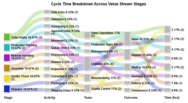
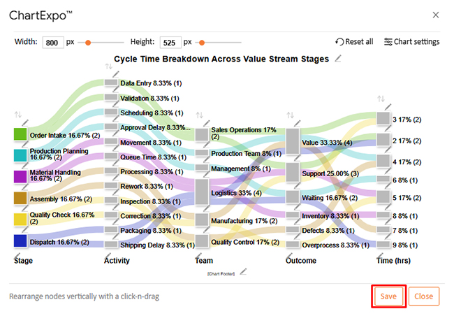
This example shows how total process time is divided across value-adding, support, and waste activities. It exposes where delays and bottlenecks concentrate and pinpoints the stages with the greatest opportunity for improvement.

Value Stream Mapping Template
  • Software Development Flow

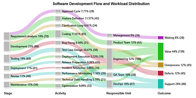
This example traces how work items advance through development stages, revealing where defects, overprocessing, and inefficient handoffs erode delivery speed and overall throughput.

Value Stream Mapping Template
  • Patient Flow and Workload Distribution Across Care Stages

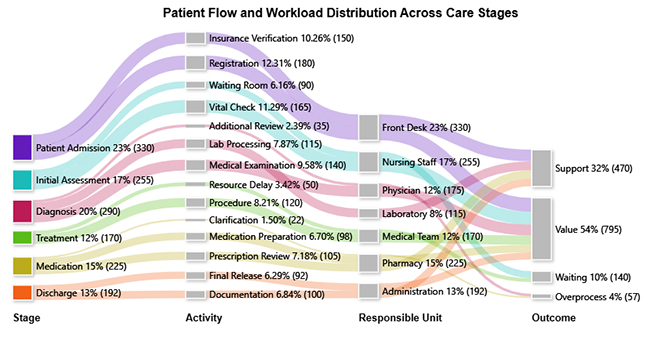
This example maps patient volumes across care units, highlighting where workloads become unbalanced and where extended waiting periods degrade both care quality and operational efficiency.

Value Stream Mapping Template

Each scenario benefits from a consistent value stream mapping format, allowing decision-makers to diagnose problems without rebuilding their analytical framework from scratch. The core mapping structure stays stable even as visual styles vary.

How to Create a Value Stream Mapping Template?

Building an effective value stream mapping template requires disciplined data collection, clear scope boundaries, and a realistic view of how work currently flows. The following steps establish a repeatable process for designing maps that support sound decisions.

  • Define process scope: Set clear start and end boundaries to keep the map focused and prevent scope creep.
  • Identify key steps: Pinpoint every activity that directly shapes when and how value reaches the customer.
  • Capture data points: Record cycle times, wait durations, and work volumes at each stage.
  • Map current state: Document the workflow as it actually operates today, not as it is supposed to work.
  • Highlight waste areas: Flag redundant activities, unnecessary motion, and delays that consume time without adding value.
  • Design future state: Sketch a learner workflow that eliminates identified waste and improves throughput.

This approach mirrors the logic behind business process mapping, where workflows are systematically defined, evaluated, and improved to increase operational efficiency.

How to Analyze a Value Stream Mapping Template in Google Sheets?

Spreadsheet environments offer a practical space to evaluate value stream data because they support flexible calculations, instant adjustments, and easy sharing across teams. A structured analytical workflow turns raw process data into actionable insight.

  • Organize workflow data: Structure cycle time, lead time, and inventory figures into clearly labeled columns.
  • Identify delays: Compare actual processing time against idle intervals to find where work stalls.
  • Calculate efficiency ratios: Determine what proportion of total time contributes value versus waste.
  • Visualize flow relationships: Convert tabular data into diagrams that reveal how work moves through the system.
  • Detect bottlenecks: Locate stages where processing time or queue length is disproportionately high.
  • Refine future state: Adjust input variables to model potential process improvements before implementation.

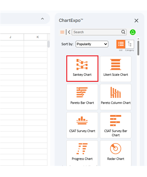
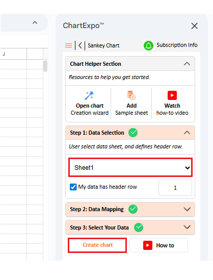
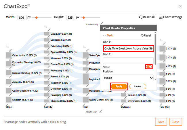
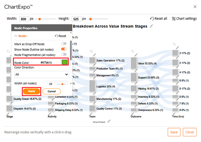
Visualization is the most powerful step in this analysis. ChartExpo integrates directly with spreadsheet environments to transform process data into clear visual formats, including Sankey Charts. Analytical assets like a Google spreadsheet timesheet template help teams capture granular activity-level data before visualization begins.

Why use ChartExpo?

  • Transforms spreadsheet data into clear visual insights for faster understanding.
  • Exposes patterns and bottlenecks hidden in raw numbers.
  • Works seamlessly with analytical sources like Google Finance in Google Sheets, improving insight generation and reporting clarity.
  • Offers a 7-day free trial at $10/month.

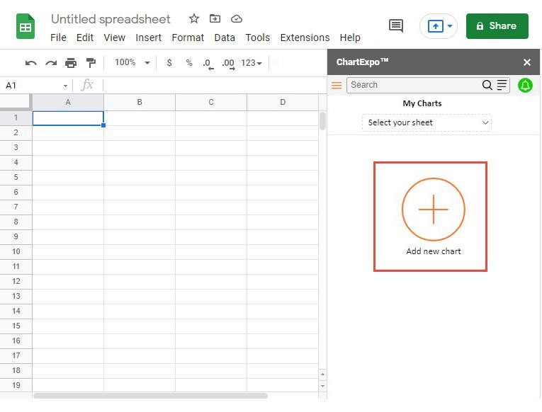
How to install ChartExpo in Google Sheets?

  • Open your Google spreadsheet and click Extensions in the top menu.
  • Select Add-ons > Get add-ons and search for ChartExpo in the Google Workspace Marketplace.
  • Choose Charts, Graphs & Visualizations by ChartExpo and click Install.
  • Grant the required permissions to complete installation.

Example:

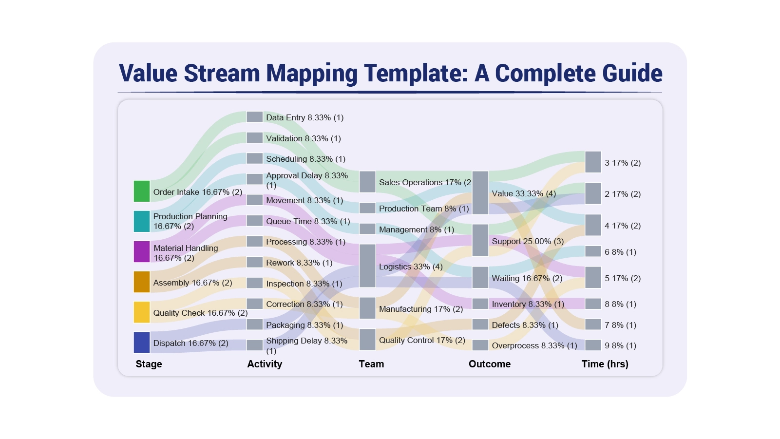
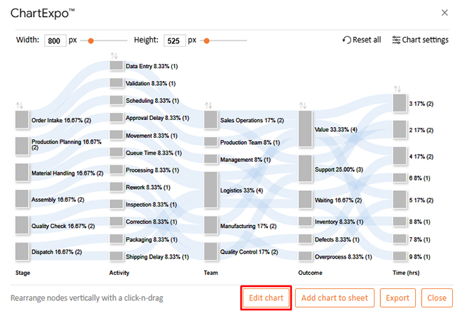
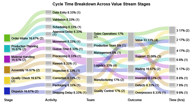
Consider we have the following data for a Sankey Chart.

Stage

Activity Team Outcome

Time (hrs)

Order Intake Data Entry Sales Operations Value 3
Order Intake Validation Sales Operations Support 2
Production Planning Scheduling Production Team Value 4
Production Planning Approval Delay Management Waiting 6
Material Handling Movement Logistics Support 5
Material Handling Queue Time Logistics Inventory 8
Assembly Processing Manufacturing Value 7
Assembly Rework Quality Control Defects 4
Quality Check Inspection Quality Control Support 3
Quality Check Correction Manufacturing Overprocess 5
Dispatch Packaging Logistics Value 2
Dispatch Shipping Delay Logistics Waiting 9
  • ChartExpo: To get started with ChartExpo, install ChartExpo.
  • Go to Extensions > Charts, Graphs & Visualizations by ChartExpo > Open.
Value Stream Mapping Template


  • Once ChartExpo is installed, click on the “Add new chart” button.
Value Stream Mapping Template
  • Once it loads, scroll through the charts list to locate and choose the “Sankey Chart”.
Value Stream Mapping Template
  • Then, select your worksheet and confirm the data range; your data is automatically mapped, and then click on the Create button.
Value Stream Mapping Template
  • If you want to customize your chart, select the ‘Edit Chart’ option and design it to your specifications.
Value Stream Mapping Template
  • To change the chart’s title, select the pencil icon on the header. Then, enter the text you want and select “Apply”.
Value Stream Mapping Template
  • You can change bar colors by clicking the pencil icon, selecting the node, choosing a color, and clicking Apply to save the changes.
Value Stream Mapping Template
  • When you are done with all the changes, click the “Save” button or follow the steps to save a Google Sheet to save the changes.
Value Stream Mapping Template
  • The final look of the Sankey Chart is shown below.
Value Stream Mapping Template

Key Insights

  • Value-adding activities account for the largest share of total time, yet waste categories consume enough hours to represent a significant drag on overall efficiency.
  • Shipping Delay and Queue Time stand out as the two most disruptive bottlenecks, each independently eroding workflow continuity and extending lead times.
  • Waste is concentrated within Management and Logistics functions, pointing to approval delays and inventory accumulation as the primary targets for improvement.

Benefits of Using a Value Stream Mapping Template

Organizations that use a value stream mapping template consistently and keep it updated gain tangible operational advantages. Its benefits extend well beyond producing a diagram.

  • Reduced process waste: Uncovers non-value-adding activities and gives teams a clear path to eliminating them.
  • Improved operational efficiency: Promotes smarter use of resources and removes friction that slows workflow execution.
  • Faster cycle times: Reveals where workflow adjustments can compress task durations and shorten delivery timelines.
  • Better process visibility: Gives every stakeholder a clear view of how activities, information, and materials move through the system.
  • Enhanced team collaboration: Establishes a shared process reference that reduces miscommunication between departments.
  • Stronger performance tracking: Creates a structured baseline for measuring whether improvement efforts are producing results.

Because the value stream mapping format emphasizes quantifiable performance metrics, teams can verify results objectively, similar to how a cash flow analysis template converts financial activity into measurable data.

Common Metrics Tracked in a Value Stream Mapping Template

Raw process data only becomes useful when organized into meaningful performance indicators. These metrics give the value stream mapping template its analytical power and make improvement opportunities visible.

  • Cycle time: The amount of time needed to complete one unit of work from start to finish.
  • Lead time: Total time elapsed between process initiation and delivery of the final output.
  • Process efficiency: The share of total time that consists of value-adding activities.
  • Inventory levels: Queues or work accumulations forming between stages that signal bottlenecks.
  • Wait time: Periods during which work sits idle before the next stage can begin.
  • Throughput: The number of completed outputs produced over a defined time period.

These indicators are often reviewed alongside financial reporting tools such as a balance sheet template in Google Sheets, which helps organizations evaluate both operational and financial performance within a single analytical framework.

Best Practices for Designing Value Stream Mapping Format

An effective process map balances clarity, precision, and practical usability. Overengineering the layout makes it harder to interpret and slows analysis down.

  • Keep layout simple: A clean, uncluttered map makes it easier for all stakeholders to read and interpret the workflow.
  • Use consistent symbols: Standardized notation ensures that every team member interprets process elements the same way.
  • Focus on customer value: Center the analysis on activities that directly contribute to outcomes the customer cares about.
  • Validate data accuracy: Confirm that cycle times, volumes, and other inputs are reliable before drawing conclusions.
  • Update maps regularly: Revise the template whenever processes change to keep the analysis relevant.
  • Align with business goals: Ensure that optimization targets support the organization’s broader strategic priorities.

These principles reflect the same discipline found in tools like an event budget template, where structure and accuracy are prerequisites for sound planning. The same rigor underpins Google Sheets CRM templates, which depend on consistent layouts and dependable data to support informed decisions.

FAQs

What are the 4 steps of value stream mapping?

The four steps are defining the process scope, mapping the current state, identifying inefficiencies, and designing an improved future state.

What are the five principles of the value stream map?

The five principles are defining customer value, mapping the full value stream, creating continuous flow, implementing pull-based production, and pursuing ongoing improvement.

What are the 7 wastes of value stream mapping?

The seven wastes are overproduction, waiting, unnecessary transportation, overprocessing, excess inventory, unnecessary motion, and defects.

Wrap Up

A value stream mapping template transforms complex workflows into actionable intelligence. When teams commit to maintaining accurate, up-to-date maps, they gain a continuous window into where time is lost and where resources are underused.

Pairing the template with visualization tools like ChartExpo amplifies these benefits. Raw process data becomes intuitive graphics that teams can interpret quickly, share broadly, and act on with confidence. The result is a process improvement cycle that runs on evidence rather than intuition, helping organizations achieve faster cycle times, leaner operations, and more consistent delivery outcomes.

How much did you enjoy this article?

ExcelAd1
Start Free Trial!
159799

Related articles

next previous
Data Analytics7 min read

Sales Follow-Up Statistics: Insights That Improve Follow-Ups

Track response speed, outreach frequency, and conversions with sales follow up statistics. Learn what these metrics reveal. Read on!

Data Analytics9 min read

Nominal vs. Ordinal Data: Key Differences Explained

Explore the differences between nominal vs. ordinal data types and learn when to use each for accurate analysis. Discover now!

Data Analytics10 min read

Fleet Management Dashboard: Features, Metrics, and Tips

Fleet Management Dashboard tracks vehicles, drivers, and fuel usage in real time. Build actionable insights using Power BI visuals. Learn more now!

Data Analytics9 min read

Board Report Template: A Complete Walkthrough

Board Report Templates streamline governance with decision-ready insights. Build effective formats that strengthen oversight. Discover how!

Data Analytics10 min read

Online Retailer Demand Forecasting and Price Optimization

Analytics for an Online Retailer Demand Forecasting and Price Optimization: build forecasts, set prices, avoid stockouts, and see trends. Read on!

ChartExpo logo

Turn Data into Visual
Stories

CHARTEXPO

  • Home
  • Gallery
  • Videos
  • Services
  • Pricing
  • Contact us
  • FAQs
  • Privacy policy
  • Terms of Service
  • Sitemap

TOOLS

  • ChartExpo for Google Sheets
  • ChartExpo for Microsoft Excel
  • Power BI Custom Visuals by ChartExpo
  • Word Cloud

CATEGORIES

  • Bar Charts
  • Circle Graphs
  • Column Charts
  • Combo Charts
  • Comparison Charts
  • Line Graphs
  • PPC Charts
  • Sentiment Analysis Charts
  • Survey Charts

TOP CHARTS

  • Sankey Diagram
  • Likert Scale Chart
  • Comparison Bar Chart
  • Pareto Chart
  • Funnel Chart
  • Gauge Chart
  • Radar Chart
  • Radial Bar Chart
  • Sunburst Chart
  • see more
  • Scatter Plot Chart
  • CSAT Survey Bar Chart
  • CSAT Survey Chart
  • Dot Plot Chart
  • Double Bar Graph
  • Matrix Chart
  • Multi Axis Line Chart
  • Overlapping Bar Chart
  • Control Chart
  • Slope Chart
  • Clustered Bar Chart
  • Clustered Column Chart
  • Box and Whisker Plot
  • Tornado Chart
  • Waterfall Chart
  • Word Cloud
  • see less

RESOURCES

  • Blog
  • Resources
  • YouTube
SIGN UP FOR UPDATES

We wouldn't dream of spamming you or selling your info.

© 2026 ChartExpo, all rights reserved.