• Home
  • Tools dropdown img
    • Spreadsheet Charts

      • ChartExpo for Google Sheets
      • ChartExpo for Microsoft Excel
    • Power BI Charts

      • Power BI Custom Visuals by ChartExpo
    • Word Cloud

  • Charts dropdown img
    • Chart Category

      • Bar Charts
      • Circle Graphs
      • Column Charts
      • Combo Charts
      • Comparison Charts
      • Line Graphs
      • PPC Charts
      • Sentiment Analysis Charts
      • Survey Charts
    • Chart Type

      • Box and Whisker Plot
      • Clustered Bar Chart
      • Clustered Column Chart
      • Comparison Bar Chart
      • Control Chart
      • CSAT Survey Bar Chart
      • CSAT Survey Chart
      • Dot Plot Chart
      • Double Bar Graph
      • Funnel Chart
      • Gauge Chart
      • Likert Scale Chart
      • Matrix Chart
      • Multi Axis Line Chart
      • Overlapping Bar Chart
      • Pareto Chart
      • Radar Chart
      • Radial Bar Chart
      • Sankey Diagram
      • Scatter Plot Chart
      • Slope Chart
      • Sunburst Chart
      • Tornado Chart
      • Waterfall Chart
      • Word Cloud
    • Google Sheets
      Microsoft Excel
  • Services
  • Pricing
  • Contact us
  • Blog
  • Support dropdown img
      • Gallery
      • Videos
      • Contact us
      • FAQs
      • Resources
    • Please feel free to contact us

      atsupport@chartexpo.com

Categories
All Data Visualizations Data Analytics Surveys
Add-ons/
  • Google Sheets
  • Microsoft Excel
  • Power BI
All Data Visualizations Data Analytics Surveys
Add-ons
  • Google Sheets
  • Microsoft Excel
  • Power BI

We use cookies

This website uses cookies to provide better user experience and user's session management.
By continuing visiting this website you consent the use of these cookies.

Ok

ChartExpo Survey


Home > Blog > Data Analytics

How to Measure Energy Use: Simple Visual Guide

Energy costs can spiral out of control when you’re flying blind. Organizations that track consumption patterns gain leverage over their utility bills and operational expenses.
How to Measure Energy Use

Measuring energy use reveals where power gets wasted, which systems hog resources, and how adjustments translate into savings. The practice isn’t about obsessing over monthly statements.

It’s about building visibility into how facilities actually consume power throughout operations. Better measurement equals better decisions, tighter budgets, and clearer paths toward efficiency targets that matter.

Table of Contents:

  1. What Does Measuring Energy Use Mean?
  2. Why Measuring Energy Use is Important?
  3. Key Concepts and Units Used to Measure Energy Use
  4. Common Methods to Measure Energy Use
  5. Energy Usage Formula and Step-by-Step Calculations
  6. Energy Use Consumption Example
  7. How to Measure and Analyze Energy Usage Data in Power BI?
  8. Benefits of Measuring Energy Use
  9. Common Challenges and Limitations in Measuring Energy Use
  10. FAQs
  11. Wrap Up

What Does Measuring Energy Use Mean?

Definition: Tracking energy consumption means logging the power drawn by equipment, systems, or entire facilities across specific time windows.

This applies everywhere from homes to factories, each environment showing distinct usage fingerprints. The focus sits on patterns over time rather than random snapshots.

Monitors capture data from individual devices, networked infrastructures, and ongoing processes that pull electricity, gas, or other energy forms.

Organizations that understand how to measure energy use can tie consumption records to efficiency benchmarks, system performance reviews, and resource planning decisions that stick.

Why Measuring Energy Use is Important?

Tracking consumption matters for any operation chasing cost control, efficiency gains, or sustainability compliance.

  • Pinpoints which assets drain the most power.
  • Keeps spending in check through better oversight.
  • Sharpens budget forecasts with real numbers.
  • Informs choices around upgrades and replacements.
  • Boosts system productivity across the board.
  • Meets environmental standards and reporting rules.
  • Sets a reference point for improvement work.

Regular measurement shifts organizations from reactive fire-fighting to strategic energy planning.

Key Concepts and Units Used to Measure Energy Use

Grasping measurement fundamentals makes interpreting readings straightforward and enables meaningful comparisons across devices.

Key Concepts

  • Power: How fast energy gets consumed.
  • Energy: Total power drawn across time.
  • Load: Strain placed on the supply system.

Common Energy Units

  • Watts (W) and kilowatts (kW) quantify power draw.
  • Kilowatt-hours (kWh) track actual consumption.
  • Joules (J) serve as the SI energy standard.
  • British Thermal Units (BTU) measure heating and cooling.
  • Calories (cal) and kilocalories (kcal) express thermal energy.

Common Methods to Measure Energy Use

Multiple approaches exist for tracking consumption, each offering different precision levels and implementation complexity.

  • Reviewing utility bills shows historical trends.
  • Smart and digital meters deliver live data streams.
  • Plug-in monitors isolate individual appliance usage.
  • Building management platforms centralize facility tracking.
  • Sub-meters break down equipment-specific draws.
  • Manual logs and audits verify accuracy.

Combining techniques strengthens reliability when measuring energy consumption across varied systems.

Energy Usage Formula and Step-by-Step Calculations

Precise math matters when quantifying power draw for appliances or whole facilities. The process scales from single devices to complex operations.

  • Note the wattage rating.
  • Multiply watts by operating hours for daily watt-hours.
  • Divide by 1,000 to get kilowatt-hours.
  • Project monthly figures if needed.
  • Sum individual values for total facility usage.

Following these steps maintains consistency across all devices for which you measure energy consumption.

Energy Use Consumption Example

Real scenarios clarify measuring energy usage concepts. Take a standard household air conditioner running daily.

  • Appliance type: air conditioner rated at 1,500 watts
  • Usage duration: 6 hours per day
  • Energy consumption:5 kW × 6 hours = 9 kWh per day

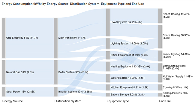
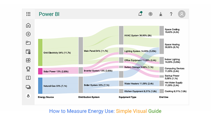
This demonstrates measuring energy consumption using basic inputs. The Sankey chart below traces how energy flows from sources through systems to end applications, spotlighting major consumption zones.
How to Measure Energy Use

How to Measure and Analyze Energy Usage Data in Power BI?

Power BI unlocks structured analysis for teams learning how to measure energy use at enterprise scale.

  1. Pull in datasets and scrub data inconsistencies through Power BI transform data capabilities.
  2. Consolidate energy figures and create a measure in Power BI for uniform calculations.
  3. Monitor KPIs over time ranges.
  4. Spot consumption trends that signal inefficiency.
  5. Decode distribution patterns throughout systems.
  6. Map energy transfers via a Sankey diagram in Power BI.

ChartExpo elevates this process by turning intricate energy pathways into interactive Sankey charts. Rather than static reports, analysts present energy flows through dynamic visualizations. Stakeholders catch inefficiencies, losses, and optimization windows faster.

Why use ChartExpo?

  • Delivers certified Power BI visuals built for complex energy datasets.
  • Breaks down energy flow analysis using intuitive, interactive formats.
  • Accelerates stakeholder comprehension with visual-first insights.
  • Provides a 7-day trial and runs $10 monthly for premium visualization.

Example:

Consider we have the following data for a Sankey Chart.

Energy Source

Distribution System Equipment Type End Use

Energy Consumption (kWh)

Grid Electricity Main Panel HVAC System Space Cooling 4200
Grid Electricity Main Panel HVAC System Space Heating 3800
Grid Electricity Main Panel Lighting System Indoor Lighting 2100
Grid Electricity Main Panel Office Equipment Computing Devices 1600
Solar Power Inverter System Lighting System Indoor Lighting 950
Solar Power Inverter System Office Equipment Computing Devices 800
Solar Power Inverter System Battery Storage Backup Power 1100
Natural Gas Boiler System Heating Equipment Space Heating 2900
Natural Gas Boiler System Water Heaters Hot Water Supply 2400
Natural Gas Boiler System Kitchen Equipment Cooking 1800

Power BI Login:

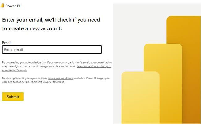
  • Log in to Power BI.
  • Enter your email. Click the “Submit” button.
How to Measure Energy Use
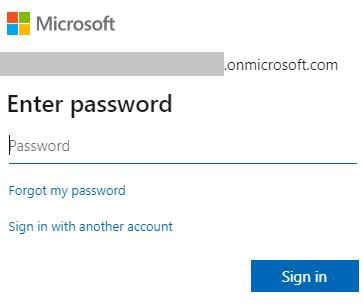
  • You are redirected to your Microsoft account.
  • Enter your password and click “Sign in”.
How to Measure Energy Use
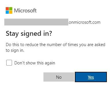
  • Choose whether to stay signed in.
How to Measure Energy Use
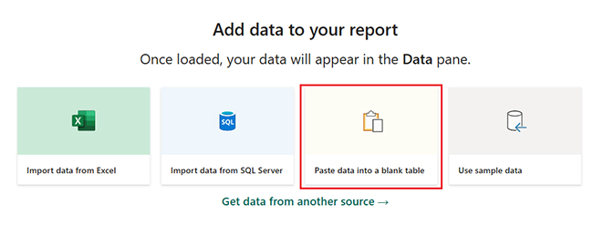
  • Once done, the Power BI home screen will open.
  • First, you need to add data to your report, click on the “Paste data into a blank report”.
How to Measure Energy Use
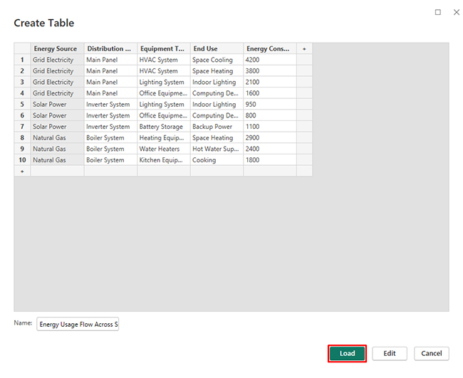
  • Paste the data table above into a blank table, name it and click on the “Load” button.
How to Measure Energy Use
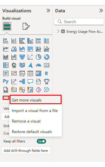
  • To build a Sankey Chart, import the visual from App Source by opening the Visualizations panel in Power BI.
  • Select “Get more Visuals”.
How to Measure Energy Use
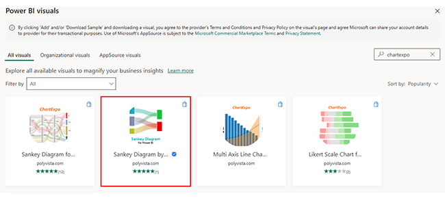
  • Search ChartExpo and select the Sankey Diagram.
How to Measure Energy Use
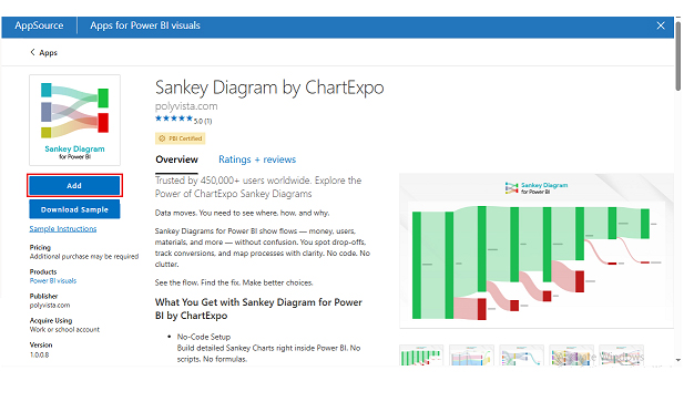
  • Click on the “ADD” button.
How to Measure Energy Use
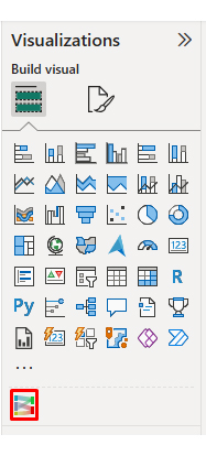
  • After that, you can select the “Sankey Chart” icon in the visualization panel.
How to Measure Energy Use
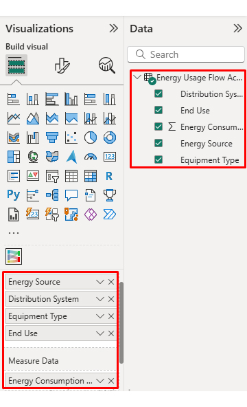
  • To add a Sankey Chart visual, click on the chart icon and choose the dimension and measures.
How to Measure Energy Use
  • In Visualization’s properties, click on License Settings and add the key so that you’ll see the Sankey Chart without a watermark.
How to Measure Energy Use
  • Now, after applying the key, the watermark is removed from the chart.
How to Measure Energy Use
  • Now, we will enhance the chart’s appearance, and to do so, we can modify the title to better align with the visualized data.
How to Measure Energy Use
  • You can set bar colors from “Visual”.
How to Measure Energy Use
  • You can change font size and node width for better visualization from “Nodes Font Size”.
How to Measure Energy Use
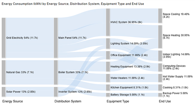
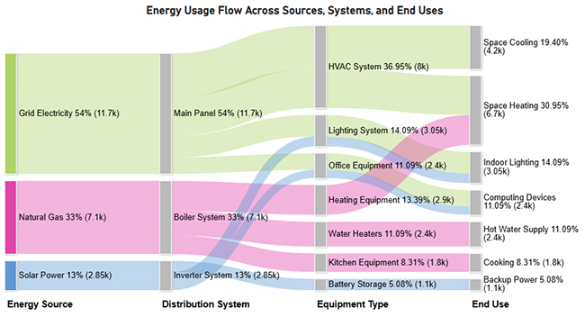
  • The final look of the Sankey Chart is given below.
How to Measure Energy Use

Key Insights

  • Grid power drives most usage, with HVAC demanding the lion’s share for cooling and heating spaces.
  • Natural gas feeds primarily into thermal applications, powering water heating and space conditioning.
  • Solar generation covers selective loads including lighting, computing gear, and emergency backup capacity, cutting grid dependence.

Benefits of Measuring Energy Use

Measuring energy usage pays off across financial, operational, and environmental dimensions.

Economic Benefits

  • Cuts utility expenses.
  • Strengthens forecasting precision.
  • Improves ROI on efficiency projects.

Operational Benefits

  • Maximizes equipment output.
  • Minimizes downtime and waste.
  • Powers decisions with hard data.
  • Clarifies energy demands across operations.

Environmental & Sustainability Benefits

  • Shrinks carbon footprints.
  • Raises efficiency standards.
  • Consolidates insights via an energy dashboard.

Visual tools like an energy flow diagram help organizations grasp how power moves across infrastructure. Structured tracking through a Power BI KPIs dashboard supports performance monitoring.

Common Challenges and Limitations in Measuring Energy Use

Despite advantages, measuring energy usage brings obstacles.

Energy Use Measurement Challenges

  • Data arrives incomplete or incorrect.
  • Standard protocols don’t exist.
  • Equipment capabilities fall short.
  • System integration gets messy.
  • Separating individual loads proves difficult.
  • Defining measurement boundaries remains unclear.

Energy Use Measurement Limitations

  • User behavior shifts unpredictably.
  • Weather and climate throw curveballs.
  • Energy principles remain poorly understood.
  • Interpreting Power BI metrics takes skill.

FAQs

How do I calculate energy use in kilowatt-hours?

Multiply kilowatts by hours of operation.

What tools are used to measure energy consumption?

Options include smart meters, plug-in devices, bills, and management platforms.

Can energy use data help reduce electricity bills?

Absolutely. Insights from measuring energy usage expose inefficiencies that cut costs.

How often should energy usage be monitored?

Constant tracking works best, but monthly checks suffice for most situations.

Wrap Up

Getting a handle on how to measure energy use turns guesswork into control. When you consistently measure energy consumption, you can spot high-demand systems, validate savings from upgrades, and keep budgets aligned with real operating patterns. It also creates a baseline for audits, benchmarking, and compliance.

Pair meter and sub-meter data with Power BI measures, KPIs, and an energy dashboard to translate readings into decisions. A Sankey view can expose where energy flows and where losses concentrate, so teams prioritize fixes that deliver the fastest impact—lower costs, steadier performance, and clearer sustainability reporting. Trend lines also help forecast demand and prevent surprises on utility bills.

How much did you enjoy this article?

PBIAd1
Start Free Trial!
159268

Related articles

next previous
Data Analytics9 min read

Insert Chart in PowerPoint: Easy Steps

Master how to insert a chart in PowerPoint and turn spreadsheet numbers into persuasive slides. From built-in graphs to Excel imports, learn it all. Read on!

Data Analytics10 min read

Reporting vs Analytics: Everything You Need to Know

Reporting tracks past performance, while analytics uncovers why results happened and what comes next. Learn how each method strengthens decisions.

Data Analytics10 min read

Booking Dashboard: Charts for Booking Insights

Learn how a Booking Dashboard centralizes reservations, tracks KPIs, and improves forecasting. How to create and analyze booking dashboards in Power BI.

Data Analytics11 min read

Growth Metrics: Growth Insights Made Visual

Growth metrics measure performance and growth. This blog shows key KPIs and tools to help you track progress and make smarter decisions.

Data Analytics11 min read

Renovation Budgeting: A Visual Approach

Learn how to use renovation budgeting to plan and track your home project. This guide shows tips, tools, and visuals to control costs and avoid overspending.

ChartExpo logo

Turn Data into Visual
Stories

CHARTEXPO

  • Home
  • Gallery
  • Videos
  • Services
  • Pricing
  • Contact us
  • FAQs
  • Privacy policy
  • Terms of Service
  • Sitemap

TOOLS

  • ChartExpo for Google Sheets
  • ChartExpo for Microsoft Excel
  • Power BI Custom Visuals by ChartExpo
  • Word Cloud

CATEGORIES

  • Bar Charts
  • Circle Graphs
  • Column Charts
  • Combo Charts
  • Comparison Charts
  • Line Graphs
  • PPC Charts
  • Sentiment Analysis Charts
  • Survey Charts

TOP CHARTS

  • Sankey Diagram
  • Likert Scale Chart
  • Comparison Bar Chart
  • Pareto Chart
  • Funnel Chart
  • Gauge Chart
  • Radar Chart
  • Radial Bar Chart
  • Sunburst Chart
  • see more
  • Scatter Plot Chart
  • CSAT Survey Bar Chart
  • CSAT Survey Chart
  • Dot Plot Chart
  • Double Bar Graph
  • Matrix Chart
  • Multi Axis Line Chart
  • Overlapping Bar Chart
  • Control Chart
  • Slope Chart
  • Clustered Bar Chart
  • Clustered Column Chart
  • Box and Whisker Plot
  • Tornado Chart
  • Waterfall Chart
  • Word Cloud
  • see less

RESOURCES

  • Blog
  • Resources
  • YouTube
SIGN UP FOR UPDATES

We wouldn't dream of spamming you or selling your info.

© 2026 ChartExpo, all rights reserved.