Categories
Energy dashboards offer real-time insights into energy consumption, helping businesses reduce costs, monitor usage, and improve sustainability.


This guide dives deep into what an energy dashboard is and why you should use an energy management dashboard. And if you’re looking for some data dashboard examples, there is a section in this guide dedicated to that.
Furthermore, this guide also shows you some business intelligence dashboards, a digital dashboard, and a renewable energy chart. There are executive dashboard examples, and an energy flow diagram that helps you get a good grasp of the dashboard user interface design.
There are sections in this guide that show some best-designed dashboards and how to create a dashboard in Power BI.
Definition: An Energy Dashboard is a digital tool that offers real-time analytics and data on energy consumption, costs, and efficiency. It helps business owners and individuals optimize energy efficiency, monitor usage patterns, and reduce operational expenses.
An energy dashboard offers live tracking of energy usage across multiple facilities, and that helps organizations identify inefficiencies and reduce unnecessary consumption. Real-time insights allow for immediate corrective actions to eliminate energy waste.
Industries are required to reduce their carbon footprint and meet energy efficiency standards. Energy dashboards help track renewable energy contributions, carbon emissions, and compliance metrics. This helps support regulatory compliance and corporate sustainability initiatives.
Since there are detailed energy usage analytics, business owners can identify cost-saving opportunities like optimizing HVAC systems and reducing peak-hour consumption. Analyzing historical trends helps organizations forecast future energy expenses and plan budgets.
Energy dashboards help track the performance of lighting, machinery, and HVAC. That helps in identifying inefficient equipment that requires replacement or maintenance. This way, users will be able to improve operational efficiency and prevent unexpected breakdowns.
Business leaders can use energy dashboards to analyze costs, optimize budgets, and improve financial planning. This is done by identifying areas where energy savings can be achieved.
Facility managers use energy dashboards to optimize budgets, analyze costs, and improve financial planning. To do that, they’ll have to identify areas where energy savings can be achieved.
Energy managers and sustainability officers use dashboards to track carbon footprints, set energy-saving goals, and ascertain compliance with environmental regulations and corporate sustainability initiatives.
Government agencies and utility providers use energy dashboards to implement energy efficiency programs and support renewable energy integration.
Manufacturing plants rely on energy dashboards to monitor equipment efficiency, maintain optimal production performance, and reduce operational costs while minimizing energy waste.
For those using wind or solar energy, the dashboard displays real-time production data and net metering insights. This will, in turn, help users track energy savings and sustainability contributions.
The dashboard gives detailed breakdowns of energy usage by time, day, or device. It also estimates monthly bills and showcases peak energy usage times.
Consumers can view and pay bills, analyze past payments, and set up autopay. This makes financial management easier.
Users can set up alerts for high energy consumption, unusual usage patterns, or peak demand periods. This enables proactive energy management.
Here’s how to use the energy management dashboard:
To gather real-time data on gas, electricity, and water usage, you’ll have to integrate the dashboard with smart meters, energy monitoring systems, and IoT sensors.
The dashboard provides live tracking of energy usage across multiple locations, equipment, or departments. Users can identify peak consumption hours, detect inefficiencies, and make adjustments to reduce waste.
Use historical data to analyze energy consumption patterns over days, weeks, or months. You should also figure out cost-saving opportunities by comparing usage across periods and assessing performance against benchmarks.
Define energy-saving targets like reducing electricity consumption by 10% over six months. The dashboard offers insights on progress, and that helps organizations stay on track.
Set up alerts for excessive demand, unusual energy spikes, or system failures. Instant notifications give room for quick responses, and that prevents energy waste and potential equipment damage.
Read more about the energy flow diagram.
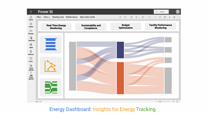
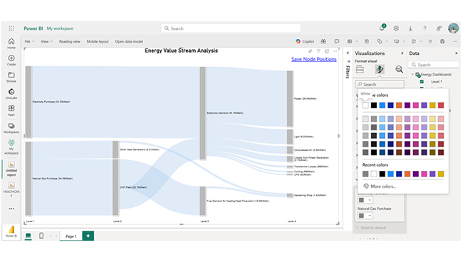
Create an insightful Power BI energy dashboard with the help of a Sankey diagram generator to visualize complex energy data.
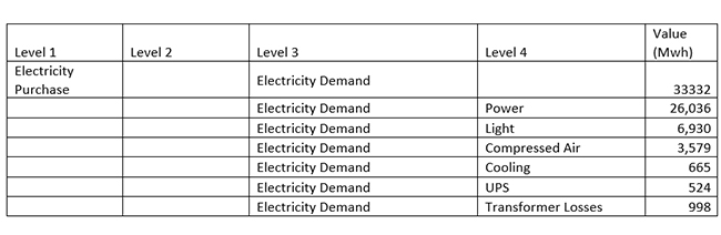
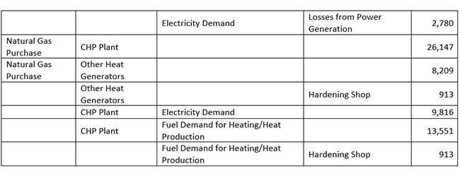
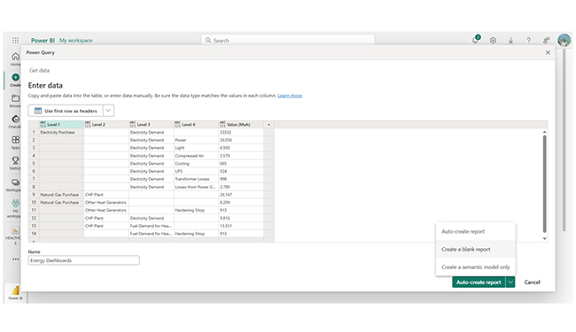
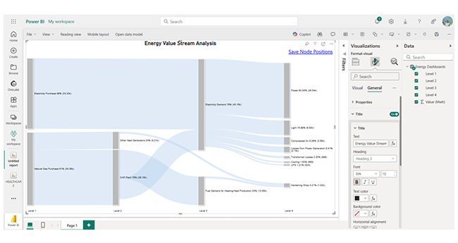
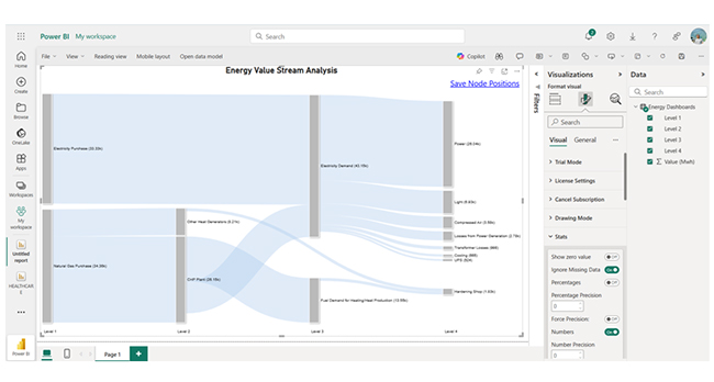
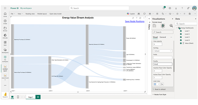
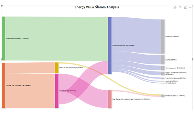
The data shows electricity and natural gas consumption across multiple categories. Power (26,035 MWh) dominates electricity demand, while CHP plants (26,147 MWh) drive gas usage. Furthermore, Transformer losses and generation inefficiencies show potential energy-saving opportunities.
You have to connect the dashboard with smart meters and IoT sensors to provide real-time energy tracking for accurate decision-making.
You should analyze historical data to identify patterns, areas for improvement, and seasonal variations.
Use insights to adjust HVAC systems, operational schedules, and lighting for lower consumption.
Focus on relevant KPIs like peak demand, total consumption, carbon footprint, and cost per unit to align with business goals.
An Open Energy Dashboard is a web-based, open-source platform that offers real-time energy data visualization. It helps organizations to analyze, track, and optimize energy consumption for sustainability improvements and cost savings.
A Smart Energy Meter Dashboard is a digital interface that displays real-time energy consumption data from smart meters. It helps users monitor usage, detect inefficiencies, and optimize energy management for sustainability and cost savings.
An Energy Efficiency Dashboard is a data visualization tool that tracks energy consumption, identifies inefficiencies, and provides insights to optimize energy use. This reduces costs and enhances sustainability efforts in homes and businesses.
The Energy Dashboard is a visual tool that analyzes and tracks energy consumption. It helps optimize usage, detect inefficiencies, reduce costs, and improve sustainability efforts using data-driven insights and real-time monitoring.
To get the most out of the energy consumption dashboard, you’ll have to ensure real-time data integration and customize key metrics. To provide real-time energy tracking, you’ll have to connect the dashboard with IoT sensors and smart meters.
You should also focus on relevant KPIs like peak demand, total consumption, carbon footprint, and cost per unit.
Now you know what the energy dashboard is, what key features will you look forward to seeing in your dashboard?
How much did you enjoy this article?


Calculate accounts receivable turnover ratio to measure credit collection speed, improve cash flow, and strengthen your financial strategy. Read on!

Change Management KPIs are the key to tracking adoption, performance, and ROI during transitions. Find out which metrics matter. Read on!

Data collection methods and techniques determine the quality of every insight you act on. Explore key approaches for gathering reliable data. Read on!


