• Home
  • Tools dropdown img
    • Spreadsheet Charts

      • ChartExpo for Google Sheets
      • ChartExpo for Microsoft Excel
    • Power BI Charts

      • Power BI Custom Visuals by ChartExpo
    • Word Cloud

  • Charts dropdown img
    • Chart Category

      • Bar Charts
      • Circle Graphs
      • Column Charts
      • Combo Charts
      • Comparison Charts
      • Line Graphs
      • PPC Charts
      • Sentiment Analysis Charts
      • Survey Charts
    • Chart Type

      • Box and Whisker Plot
      • Clustered Bar Chart
      • Clustered Column Chart
      • Comparison Bar Chart
      • Control Chart
      • CSAT Survey Bar Chart
      • CSAT Survey Chart
      • Dot Plot Chart
      • Double Bar Graph
      • Funnel Chart
      • Gauge Chart
      • Likert Scale Chart
      • Matrix Chart
      • Multi Axis Line Chart
      • Overlapping Bar Chart
      • Pareto Chart
      • Radar Chart
      • Radial Bar Chart
      • Sankey Diagram
      • Scatter Plot Chart
      • Slope Chart
      • Sunburst Chart
      • Tornado Chart
      • Waterfall Chart
      • Word Cloud
    • Google Sheets
      Microsoft Excel
  • Services
  • Pricing
  • Contact us
  • Blog
  • Support dropdown img
      • Gallery
      • Videos
      • Contact us
      • FAQs
      • Resources
    • Please feel free to contact us

      atsupport@chartexpo.com

Categories
All Data Visualizations Data Analytics Surveys
Add-ons/
  • Google Sheets
  • Microsoft Excel
  • Power BI
All Data Visualizations Data Analytics Surveys
Add-ons
  • Google Sheets
  • Microsoft Excel
  • Power BI

We use cookies

This website uses cookies to provide better user experience and user's session management.
By continuing visiting this website you consent the use of these cookies.

Ok

ChartExpo Survey


Home > Blog > Google Sheets

Data Analysis in Google Sheets: Best Ways to Show Insights

You’ve stared at massive spreadsheets, trying to figure out what story the numbers are telling. You’re not alone.

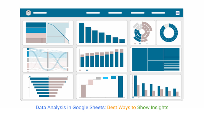
Data analysis in Google Sheets transforms those overwhelming rows and columns into clear, actionable insights without requiring fancy software or a statistics degree.

Data Analysis in Google Sheets

The platform comes loaded with tools like Pivot Tables, Charts, Conditional Formatting, and powerful formulas that do the heavy lifting.

Features such as Explore, sorting, filtering, and statistical calculations let you spot trends fast. Plus, with AI add-ons and optional Python integration, you can push deeper whenever you’re ready.

Table of Contents:

  1. What is Data Analysis in Google Sheets?
  2. Why Use Google Sheets for Data Analysis?
  3. 6 Easy Ways to Analyze Data in Google Sheets
  4. Tools for Google Sheet Data Analysis
  5. Common Functions Used in Data Analysis with Google Sheets
  6. Practical Google Sheet Data Analysis Examples
  7. How to Conduct Data Analysis in Google Sheets?
  8. Data Analysis in Google Sheets vs. ChartExpo
  9. Benefits of Using Google Sheets for Data Analysis
  10. Best Practices for Accurate Data Analysis in Google Sheets
  11. FAQs
  12. Wrap Up

What is Data Analysis in Google Sheets?

Definition: Data analysis in Google Sheets involves collecting, cleaning, organizing, and interpreting information within a spreadsheet environment. It’s about working with structured datasets, running calculations, and extracting insights that drive business and research decisions.

Teams commonly rely on this approach for reporting, performance tracking, and exploratory data analysis. It’s where patterns and anomalies get examined before anyone draws deeper conclusions. No specialized tools required.

Why Use Google Sheets for Data Analysis?

Working with spreadsheets has become the go-to choice because it enables real-time collaboration, instant updates, and flexible analysis across distributed teams. Here’s what makes it stand out:

  • Supports simultaneous collaboration with automatic version control, so nobody overwrites anyone’s work.
  • Provides real-time data updates and visibility across the team without email chains.
  • Works exceptionally well for data analysis for marketing, finance dashboards, and operational reporting workflows.
  • Reduces reliance on complex enterprise tools through built-in Google Sheets automation capabilities that handle repetitive tasks.
  • Adapts easily to different dataset sizes, improving decision accuracy without manual rework.

6 Easy Ways to Analyze Data in Google Sheets

1. Pivot Tables for Summarization

What it does:

Condenses large datasets into meaningful summaries like totals, counts, or averages by category. This makes working with thousands of rows significantly easier.

How to use:

Select your dataset, insert a pivot table from the menu, then organize your fields into rows, columns, values, or filters using the pivot editor panel on the right side.

2. Charts and Graphs for Visualization

What it does:

Converts numerical values into visual formats, including bar, line, or pie charts. These visuals help users understand patterns through a clear graphical representation rather than squinting at raw numbers.

How to use:

Highlight the data range, insert a chart, then pick and customize the chart type using built-in Google charts options.

3. Conditional Formatting for Highlighting

What it does:

Automatically applies visual cues to cells based on rules you define. Trends, thresholds, and anomalies stand out instantly without you scanning every single cell manually.

How to use:

Open conditional formatting from the Format menu and define rules based on values, ranges, or custom formulas that match your analysis requirements.

4. Formulas and Functions for Calculations

What it does:

Executes calculations, logical tests, and data lookups to extract precise insights from your datasets. The formula library is extensive and handles most analytical needs out of the box.

How to use:

Use functions like SUM, AVERAGE, VLOOKUP, or QUERY to support structured data analysis with Google Sheets workflows that update automatically as data changes.

5. Filtering and Sorting for Organization

What it does:

Reorganizes datasets by category, value, or date, making it much easier to focus on the specific records and insights that matter for your current analysis task.

How to use:

Enable filters from the Data menu or sort ranges by clicking column headers. Filter views let teammates see different slices simultaneously.

6. Built-In Analysis Tools for Quick Insights

What it does:

Delivers automated summaries, suggested visuals, and instant insights using the built-in AI features baked right into the interface. No prompting required.

How to use:

Access the Explore option at the bottom-right corner or utilize Google Sheets AI assistance for fast analytical support on any dataset.

Tools for Google Sheet Data Analysis

Google Sheets supports data analysis through built-in tools, add-ons like ChartExpo, and integrations for both basic and advanced analytics.

Built-In Google Sheets Tools

  • Core functions: SUM, AVERAGE, COUNT, FILTER, QUERY, VLOOKUP, and IMPORTRANGE handle calculations and data retrieval across sheets with ease.
  • Pivot tables: Summarize large datasets to uncover trends hidden in raw data.
  • Charting tools: Charts and graphs present insights clearly for stakeholders.
  • Conditional formatting: Highlights key values and outliers so they’re impossible to miss during review.
  • Data cleanup: Removes duplicates and standardizes formatting without manual cell-by-cell editing.
  • AI assistance (Gemini): Suggests formulas, visuals, and insights using natural language queries you type directly into the interface.

Common Functions Used in Data Analysis with Google Sheets

As of 2026, these are the essential data analysis functions in Google Sheets, categorized by their primary use case:

1. Data Summarization

  • SUM / AVERAGE: Basic arithmetic totals and means that form the foundation of analysis work.
  • COUNTIF / SUMIF: Aggregates data only when it meets specific criteria, saving time on manual filtering.
  • MIN / MAX / MEDIAN: Identifies range boundaries and central tendencies for quick statistical snapshots.

2. Data Cleaning

  • TRIM: Removes leading, trailing, and repeated spaces that sneak in from data imports.
  • UNIQUE: Extracts a list of distinct values while removing duplicates for clean dropdown lists.
  • SPLIT: Breaks text into multiple cells, such as separating “First Last” names into two separate columns automatically.

3. Lookups and Merging

  • XLOOKUP: The modern standard for finding and retrieving matching data across different tables.
  • INDEX & MATCH: A robust alternative for complex, multi-directional lookups.
  • IMPORTRANGE: Pulls data from separate spreadsheets, invaluable for consolidating reports.

4. Advanced Manipulation

  • QUERY: Uses SQL-like commands to filter, sort, and group large datasets in a single formula.
  • FILTER: Displays only the rows that meet your specific conditions without altering the source data at all.
  • ARRAYFORMULA: Applies a calculation to an entire column at once, ensuring consistency.

These advanced functions support what-if analysis in Google Sheets, enabling quick testing of scenarios before committing to decisions.

Practical Google Sheet Data Analysis Examples

Real-world spreadsheet analysis typically includes these common use cases:

  • Reviewing customer feedback collected through a survey in Google Sheets with automated sentiment tagging.
  • Monitoring performance metrics and stock data using Google Finance in Google Sheets formulas that update live.
  • Comparing budgeted versus actual figures side-by-side with variance highlighting for finance teams.
  • Creating dashboards and learning how to create a chart in Google Sheets that updates automatically as new data arrives.

Example # 1:

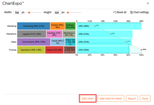
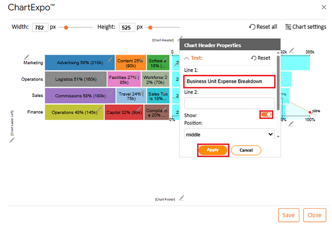
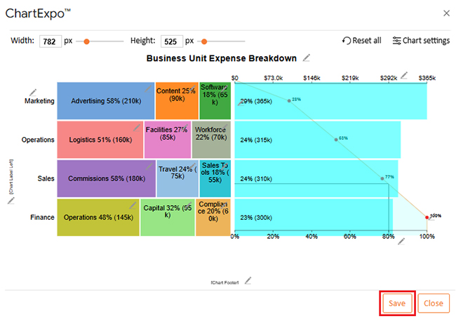
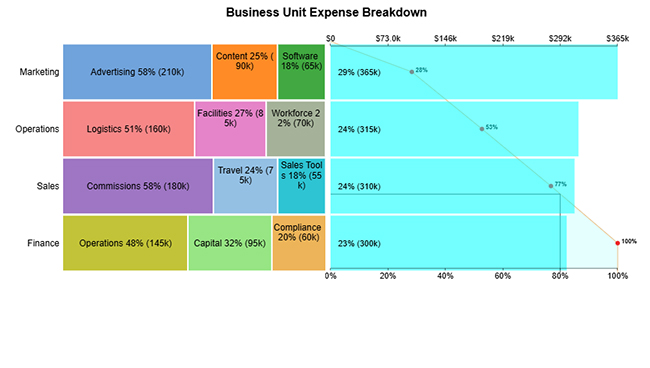
Stacked bars + Pareto Bar Chart demonstrates how each category contributes within a group, while the Pareto element highlights the few categories driving most of the total impact.
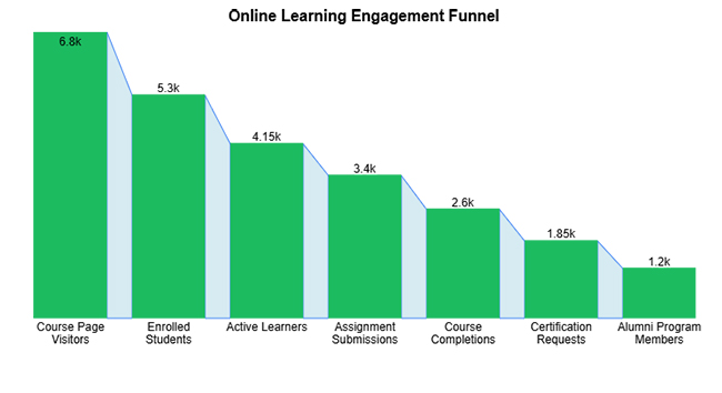
Data Analysis in Google Sheets

Example # 2:

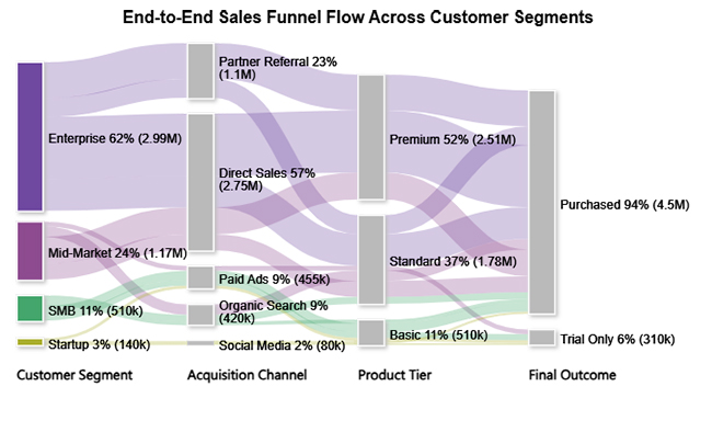
An expansion funnel chart visualizes how values change across sequential stages. It’s ideal for showing progression, drop-offs, or growth patterns over time.
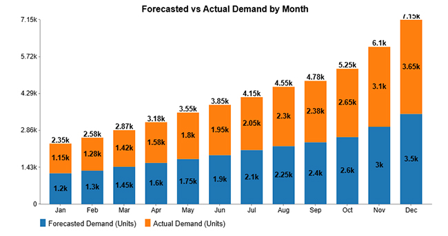
Data Analysis in Google Sheets

Example # 3:

A Stacked Column Chart compares multiple related values within a category. It makes analyzing totals and individual contributions over time straightforward.
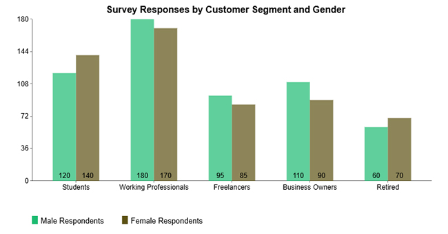
Data Analysis in Google Sheets

Example # 4:

A Clustered Column Chart compares multiple categories side by side within each group. Differences between segments become easy to identify at a glance.

Data Analysis in Google Sheets

Example # 5:

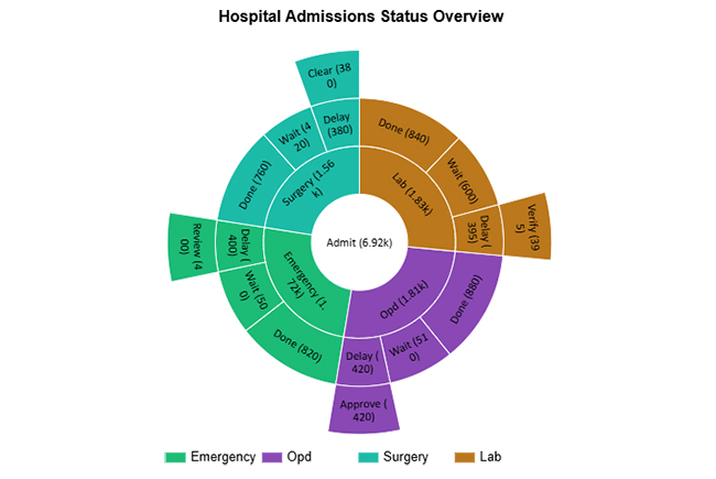
A Sunburst Chart displays hierarchical data in concentric rings. It makes understanding proportions and relationships within complex structures intuitive.

Data Analysis in Google Sheets

Example # 6:

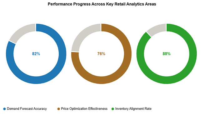
A Progress Circle Chart shows goal completion or performance progress in a simple, circular visual format that stakeholders understand immediately.

Data Analysis in Google Sheets

Example # 7:

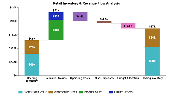
A Waterfall Chart shows how sequential positive and negative values contribute to a final total. Financial and performance changes become easy to track.

Data Analysis in Google Sheets

Example # 8:

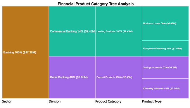
A Tree Diagram visualizes hierarchical data by breaking a whole into nested categories. Proportions become easy to compare across multiple levels.

Data Analysis in Google Sheets

Example # 9:

A Sankey chart shows how values flow between categories, with link width representing the magnitude of movement. Perfect for budget allocation or user journey visualization.

Data Analysis in Google Sheets

Example # 10:

A Tornado Chart compares two values across categories to highlight the magnitude and direction of differences. Great for sensitivity analysis.

Data Analysis in Google Sheets

How to Conduct Data Analysis in Google Sheets?

To perform data analysis in Google Sheets effectively, follow this structured workflow:

  1. Prepare and clean data: Use clear headers, consistent formatting, and remove duplicates first.
  2. Apply basic formulas: Calculate totals, averages, and counts to establish a baseline understanding.
  3. Summarize with pivot tables: Aggregate data to identify patterns and trends.
  4. Visualize results: Use charts to communicate insights to stakeholders.
  5. Highlight key data: Apply conditional formatting to spot trends and outliers that deserve attention.

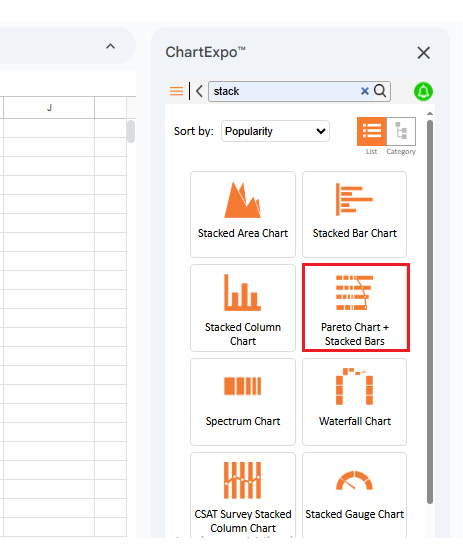
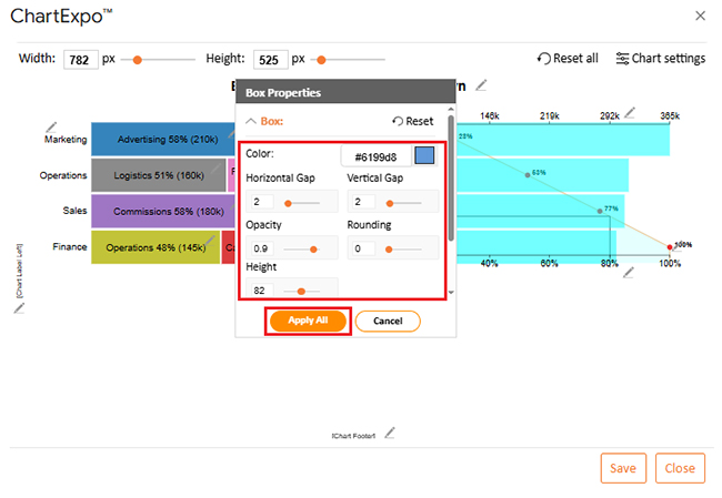
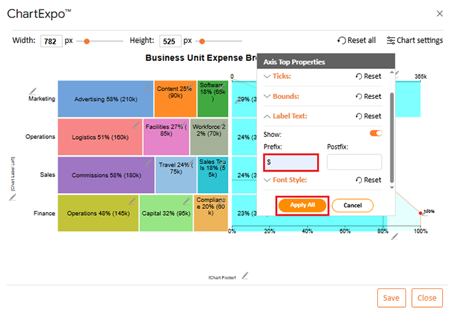
For deeper insights, ChartExpo enhances data visualization with advanced, ready-made charts beyond what standard options offer.

Why Use ChartExpo?

  1. Creates advanced charts quickly without manual setup headaches.
  2. Simplifies complex data into clear visuals that non-technical stakeholders understand.
  3. Speeds up insight discovery when deadlines are tight.
  4. Offers a 7-day free trial at $10/month.

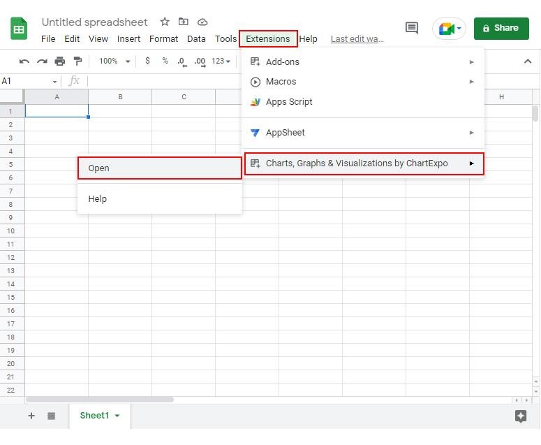
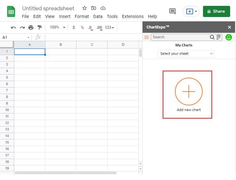
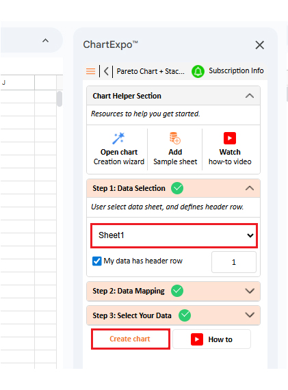
How to Install ChartExpo in Google Sheets?

  1. Open your Google Sheet and click Extensions in the top menu bar.
  2. Select Add-ons, then Get add-ons, and search for ChartExpo in the Marketplace.
  3. Choose Charts, Graphs & Visualizations by ChartExpo and click Install.
  4. Grant the required permissions to complete installation.

Example:

Consider the following sample data for a stacked bars + Pareto Chart:

Business Unit Expense Type Monthly Spend (USD)
Finance Operations 145,000
Finance Capital 95,000
Finance Compliance 60,000
Sales Commissions 180,000
Sales Travel 75,000
Sales Sales Tools 55,000
Marketing Advertising 210,000
Marketing Software 65,000
Marketing Content 90,000
Operations Logistics 160,000
Operations Facilities 85,000
Operations Workforce 70,000
  • To get started with ChartExpo, install ChartExpo in Google Sheets. Go to Extensions > Charts, Graphs & Visualizations by ChartExpo > Open.
Data Analysis in Google Sheets
  • Once ChartExpo is installed in Google Sheets, click on the “Add new chart” button.
Data Analysis in Google Sheets
  • Once it loads, scroll through the charts list to locate and choose the “Stacked Bars + Pareto Chart”.
Data Analysis in Google Sheets
  • Then, select your worksheet and confirm the data range. Your data is automatically mapped. Click on the Create button.
Data Analysis in Google Sheets
  • If you want to customize your chart, select the ‘Edit Chart’ option and design it to your specifications.
Data Analysis in Google Sheets
  • To change the chart’s title, select the pencil icon on the header. Enter the text you want and select “Apply”.
Data Analysis in Google Sheets
  • You can change the box color and properties.
Data Analysis in Google Sheets
  • You can add a prefix sign.
Data Analysis in Google Sheets
  • When you’re done with all the changes, click the “Save” button to save them.
Data Analysis in Google Sheets
  • The final look of Stacked bars + Pareto Chart is shown below.
Data Analysis in Google Sheets

Key Insights

  • Advertising, Logistics, and Commissions are the top cost drivers, each accounting for over half of the spend within their respective business units.
  • Marketing and Operations show the highest cost concentration among departments.

Data Analysis in Google Sheets vs. ChartExpo

Aspect Data Analysis in Google Sheets ChartExpo
Primary focus Calculations, tables, and standard charts Advanced data visualization and insights
Chart creation Manual setup using built-in tools Ready-made charts with minimal effort
Ease of use Requires formulas and configuration No-code, intuitive interface
Best use case Every day analysis and reporting Visual storytelling and decision support

Benefits of Using Google Sheets for Data Analysis

Data analysis in Google Sheets transforms raw data into actionable insights without complex software.

  • Cloud-based and collaborative for real-time teamwork across time zones.
  • Free, user-friendly, and accessible to all skill levels, from interns to executives.
  • Built-in tools simplify calculations and pattern detection.
  • Fast charts highlight trends for stakeholder presentations.
  • Enables faster, more informed decisions.

It also supports broader data analytics needs without specialized tools.

Best Practices for Accurate Data Analysis in Google Sheets

For reliable data analysis in Google Sheets, follow these best practices:

  • Clean data by removing duplicates and fixing errors before analysis.
  • Use a clear structure with proper headers and one value per cell.
  • Apply data validation to reduce entry errors at the source.
  • Rely on formulas and pivot tables instead of manual calculations.
  • Visualize insights with clear charts and formatting.
  • Document assumptions and keep backups.

FAQs

Is Google Sheets a Data Analysis Tool?

Yes, it functions as a versatile platform for organizing, calculating, and visualizing information. It handles a wide range of analytical tasks from basic reporting to moderately complex statistical analysis.

How Do You Analyze Data in a Spreadsheet?

You analyze information by structuring datasets, applying formulas and summaries, using visuals to identify trends, and interpreting results to support decisions. A consistent workflow beats random exploration.

Can Google Sheets Handle Large Datasets?

Yes, it works well for small to medium datasets. Very large data with hundreds of thousands of rows may require BigQuery for better performance.

Wrap Up

Data Analysis in Google Sheets empowers users to transform raw data into meaningful insights using flexible tools, visualizations, and automation.

By combining built-in capabilities with advanced tools like ChartExpo, teams can analyze data in Google Sheets more efficiently, uncover patterns faster, and communicate insights clearly. That’s how data-driven decisions get made.

How much did you enjoy this article?

GSAd1
Start Free Trial!
158474

Related articles

next previous
Google Sheets11 min read

Small Business Budget Spreadsheet: A Complete Guide

A small business budget template tracks income and cash flow. Learn pros and cons, and best practices to manage budgets effectively in Google Sheets.

Google Sheets13 min read

Real Estate Investment Spreadsheet for Property Insights

A real estate investment spreadsheet tracks income, expenses, and ROI. This blog offers sample templates and tips to enhance property investment decisions.

Google Sheets13 min read

Sales Projection Template in Google Sheets for Clear Insights

A sales projection template helps predict revenue with clarity. Learn best practices, examples, and tips in Google Sheets to improve planning and growth.

Google Sheets11 min read

Google Sheets Apps for Presentable Insights

Google Sheets apps boost productivity with smarter data handling. Click here to learn how to use them for better charts, faster analysis, and smarter decisions.

Google Sheets14 min read

Google Sheets Query Function: A Visual Approach

The Google Sheets query function filters and analyzes data fast. Click here to learn the syntax with examples and best practices to boost your data analysis.

ChartExpo logo

Turn Data into Visual
Stories

CHARTEXPO

  • Home
  • Gallery
  • Videos
  • Services
  • Pricing
  • Contact us
  • FAQs
  • Privacy policy
  • Terms of Service
  • Sitemap

TOOLS

  • ChartExpo for Google Sheets
  • ChartExpo for Microsoft Excel
  • Power BI Custom Visuals by ChartExpo
  • Word Cloud

CATEGORIES

  • Bar Charts
  • Circle Graphs
  • Column Charts
  • Combo Charts
  • Comparison Charts
  • Line Graphs
  • PPC Charts
  • Sentiment Analysis Charts
  • Survey Charts

TOP CHARTS

  • Sankey Diagram
  • Likert Scale Chart
  • Comparison Bar Chart
  • Pareto Chart
  • Funnel Chart
  • Gauge Chart
  • Radar Chart
  • Radial Bar Chart
  • Sunburst Chart
  • see more
  • Scatter Plot Chart
  • CSAT Survey Bar Chart
  • CSAT Survey Chart
  • Dot Plot Chart
  • Double Bar Graph
  • Matrix Chart
  • Multi Axis Line Chart
  • Overlapping Bar Chart
  • Control Chart
  • Slope Chart
  • Clustered Bar Chart
  • Clustered Column Chart
  • Box and Whisker Plot
  • Tornado Chart
  • Waterfall Chart
  • Word Cloud
  • see less

RESOURCES

  • Blog
  • Resources
  • YouTube
SIGN UP FOR UPDATES

We wouldn't dream of spamming you or selling your info.

© 2026 ChartExpo, all rights reserved.