Categories
By ChartExpo Content Team
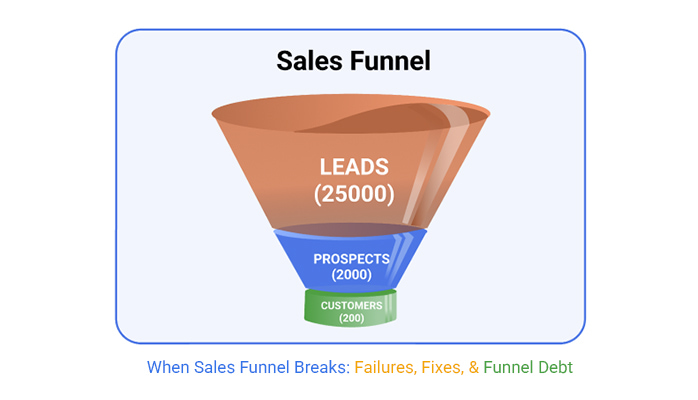
They show neat percentages, stage labels, and colorful dashboards. Everything looks fine—until you miss the quarter. That’s the trap. A sales funnel can give the illusion of movement while nothing’s actually happening. Deals shift stages without progressing. Metrics improve on paper, but revenue stays flat.
The sales funnel is not broken. It’s misread. Teams chase leads that won’t convert. They rely on surface-level data. They confuse activity for momentum. The problem isn’t always the top or bottom—it’s the middle. That quiet section where leads stall, get cold, and slowly vanish.
If your sales funnel feels busy but brings in less, you’re not alone. Many teams overtrust conversion rates and under-investigate mid-funnel loss. They spend on tools, reports, and handoffs without fixing the leaks that cost real money. This guide will show you what’s missing, where the funnel really breaks, and how to stop losing revenue in plain sight.
CRM systems often label progress with shiny tags. These labels promise movement and growth. But sometimes, they lie. They can mislead teams into thinking deals are further along than they really are. It’s a bit like a movie set—everything looks real until you peek behind the scenes.
Why do these labels deceive? It’s all about perception. A label might say “negotiation,” but the client could still be in the “considering” phase. This misalignment creates a gap between expectation and reality. It can lead to misplaced confidence. This fiction can stall progress, as teams wait for a deal that’s still miles away
| Misleading Sales Funnel Labels vs. Reality | ||
| Funnel Label | Perceived Meaning | Actual Buyer Behavior |
| Discovery Call | Qualified interest | Casual curiosity or no follow-up |
| Demo Booked | Product validation phase | Just comparing vendors |
| Proposal Sent | Near closing | Still gathering options |
| Negotiation | Budget confirmed | Stalling or price shopping |
| Decision Maker Engaged | Executive buy-in | Polite interest, no urgency |
| Follow-Up Scheduled | Continued interest | Delayed brush-off |
| Verbal Commitment | Deal done soon | Non-binding enthusiasm |
| Technical Review | Final validation | Internal delay or stall |
| Contract Sent | Signed deal pending | Legal bottlenecks or silence |
| Closed Lost – No Budget | Dead deal | Needs nurturing or timing reset |
Forecasting feels like predicting the weather. Sometimes the sun shines; other times, there’s an unexpected storm. Sales forecasts often give a sense of control. They promise outcomes based on past data. Yet, this confidence can be misleading. It lulls teams into false security, like a calm sea before a storm.
Why does this happen? It’s rooted in optimism. A forecast might rely heavily on past successes, ignoring current challenges. This creates a trap where past performance is assumed to dictate future results. The reality, however, is more unpredictable. Markets shift, and customer needs change. The trap lies in not preparing for the unexpected.
| Sales Funnel Forecasting Methods and Pitfalls | ||
| Forecasting Method | Assumption | Common Pitfall |
| Historical Trend | Past performance predicts future results | Ignores market shifts and anomalies |
| Weighted Pipeline | Probability reflects real closing likelihood | Probabilities are often inflated or outdated |
| Sales Rep Estimates | Reps have reliable insight into deal progress | Subjective bias and optimism skew numbers |
| AI/ML Forecasting | Models detect patterns humans miss | Requires clean, large datasets to be accurate |
| Stage-Based Forecasting | Each stage conversion is predictable | Doesn’t account for stalled or skipped stages |
| Top-Down Goals | Targets drive behavior and funnel adapts | Can lead to sandbagging or overpromising |
| Rolling Forecasts | Constant updates reflect reality | Time-consuming and often reactive, not strategic |
| Territory Forecasting | Region trends predict local outcomes | Overlooks individual deal nuance and variability |
| Segment-Based Forecasting | Customer type drives close rate | Segment definitions may be too broad or too rigid |
| Velocity Forecasting | Speed indicates buyer urgency | Doesn’t account for sudden stalls or external delays |
Executives expect insights beyond numbers. They want to see the story behind each lead. But often, the funnel only shows a narrow picture. It’s like reading a book with missing chapters. Executives look for clues on how to steer the ship, but the funnel might just show the tip of the iceberg.
What’s often missing? Context and detail. A funnel might indicate progress, but it doesn’t show the why or how. Executives need to know the reasons behind a stalled deal or a sudden drop in interest. They’re not just interested in what’s happening; they want to know why it’s happening. This understanding is crucial for making informed decisions.
Ah, the mid-funnel. It’s like the middle child of the sales process. Often overlooked, but oh so important. Many teams focus on the start and end of the funnel, ignoring what’s happening in between. This is where decay can set in, quietly sabotaging your efforts. It’s not dramatic, but it slowly chips away at your progress.
Imagine you’re on a road trip. You start with a full tank and a map. You’re excited! But halfway through, the car starts to sputter. That’s the mid-funnel stall. It’s sneaky and doesn’t make a scene. It’s the silent thief that steals your momentum. Spotting this stall means diving into data and noticing the little things that others miss.
| Mid-Funnel Red Flags and Revenue Impact | ||
| Warning Sign | Indicator Metric | Lost Revenue Risk |
| Stalled Opportunities | Days in Stage > Avg Cycle Time | Leads quietly decay, reducing total pipeline velocity |
| Low Email Open Rates | <10% open rate on mid-funnel campaigns | Prospects disengage before decision phase |
| No Recent Activity | No contact in 14+ days | Momentum lost; deal cooling or forgotten |
| High No-Show Rates | Missed meetings > 25% | Signals weak interest or poor qualification |
| Repeated Requalification | Same lead re-enters discovery | Wastes time; potential mismatch or confusion |
| Lack of Mutual Action Plan | No shared timeline/goals set | No buyer commitment; harder to forecast |
| Multiple Stakeholders Ignored | Only 1 point of contact | Higher chance of internal deal derailment |
| Ghosting After Demo | No follow-up after 7 days | Deal likely dying in silence |
| Frequent Discount Requests | Price objections early/mid funnel | Desperation signals low value perception |
| Extended Proposal Review | Proposal pending > 2 weeks | Stuck deal jeopardizes forecast accuracy |
Percentages can be seductive. They look neat and tidy. But sometimes, they lie. Conversion rates can give a false sense of security. They present a pretty picture, but what’s behind the curtain? Often, it’s a different story. Numbers need context to be meaningful. Without it, they’re just theater.
Picture a magician on stage. The illusions are grand, but they’re just that—illusions. Conversion rates can play the same trick. They show improvement when, in reality, the pipeline could be shrinking. It’s crucial to dig deeper and see past the percentages. This ensures that the truth is visible and actionable.
| Sales Funnel Metrics That Mislead | ||
| KPI | Superficial Signal | Underlying Problem |
| Conversion Rate | Looks like funnel is improving | High attrition hidden between stages |
| Lead Volume | Top-of-funnel activity is strong | Low quality or irrelevant leads |
| Pipeline Size | Plenty of deals in progress | Few with true closing probability |
| Average Deal Size | Higher value per deal | Skewed by a few large but unlikely opportunities |
| Email Open Rates | Strong engagement | No correlation to deal movement |
| Demo Bookings | Interest seems high | Prospects may just be browsing |
| Time in Stage | Stable average duration | Masked by outliers or stalled deals |
| Forecast Accuracy | Model looks reliable | Too dependent on static assumptions |
| SQL Conversion | Marketing is delivering leads | Sales disqualifies most post-handoff |
| Win Rate | Strong close percentage | Only from highly selective or cherry-picked deals |
Moving prospects from one stage to another should mean progress, right? Not always. Sometimes, it’s a mirage. Prospects move, but nothing changes. It’s progress in name only. This is a common trap. The movement looks good on paper, but it doesn’t translate to real growth.
Think of it like rearranging deck chairs on a sinking ship. It might look busy, but it doesn’t stop the ship from sinking. Real progress means substantial change. It’s about quality, not just quantity. Tracking meaningful movement ensures you’re not just spinning wheels without going anywhere.
Box and whisker plots might sound fancy, but they’re simple tools. They show how data is spread out. In the context of a funnel, they reveal volatility across stages. This is important because it shows where things get shaky.
Think of it as a weather forecast for your funnel. It tells you where storms might brew. With this knowledge, you can prepare and address issues before they escalate. This tool helps teams see the bigger picture and focus their energy where it matters the most.
The following video will help you to create a Funnel Chart in Microsoft Excel.


The following video will help you to create a Funnel Chart in Google Sheets.
Funnel shapes aren’t one-size-fits-all. Some businesses thrive with a linear approach, where prospects move steadily from awareness to purchase. It’s straightforward and works well when decisions are simple. But what if your process is more like a conversation, with back-and-forth interactions? A looped funnel might be your best bet, allowing for revisits and refinement.
Then there’s the layered funnel, perfect for complex sales cycles. It handles multiple touchpoints, each layer addressing different needs. By analyzing sales follow-up statistics at each stage, you can see which interactions drive progress and which need improvement. Imagine it as a stack of pancakes, each one satisfying a part of the customer’s hunger until they’re full and ready to buy. The choice of shape should match your business style and customer journey.
| Sales Funnel Shapes and Strategic Fit | ||
| Funnel Shape | Ideal Use Case | Potential Misfit Risk |
| Linear Funnel | Simple, step-based B2B or transactional sales | Fails in complex, multi-touch journeys |
| Looped Funnel | High-touch consultative sales with revisits | Difficult to forecast and measure stage boundaries |
| Layered Funnel | Complex B2B with multiple buyer personas | Overcomplicates simple transactional sales |
| Hourglass Funnel | Emphasizes retention and upsell after initial sale | Can distract from net new acquisition focus |
| Bowtie Funnel | Balances acquisition and expansion strategies | Requires tight cross-functional coordination |
| Flywheel Model | Product-led or inbound-driven growth | May downplay urgency in outbound sales motions |
| Segmented Funnel | Multiple funnel paths for different ICPs | Harder to manage and scale consistently |
| Dynamic Funnel | Real-time funnel adaptation using AI/ML | Data-heavy and prone to overfitting |
| Multi-Channel Funnel | Sales across email, social, direct, etc. | Attribution confusion and channel misalignment |
| Feedback-Loop Funnel | Rapid iteration based on user behavior | Can cause churn in long-cycle enterprise deals |
Sales-Led Growth (SLG) funnels focus on personal touch. They rely on sales teams to guide prospects. It’s a hands-on approach, ideal for high-value deals. On the flip side, Product-Led Growth (PLG) funnels let the product do the talking. Customers experience the value firsthand, often through free trials or freemium models. This appeals to tech-savvy buyers who prefer self-service.
Hybrid funnels blend the best of both worlds. They provide flexibility, catering to different buyer preferences. Imagine a buffet where customers can choose their path, whether guided by a sales rep or exploring on their own. The trick is to balance these approaches, ensuring everyone gets what they need from the process.
Misalignment between funnel design and organizational setup is like trying to drive a car with mismatched tires. It hampers performance and wastes energy. If your teams aren’t structured to support the funnel’s flow, you’ll hit bottlenecks. It’s crucial to have clear roles and responsibilities that match the funnel stages.
Consider this: if marketing passes leads to sales without proper qualification, it’s like handing over a half-baked cake. Sales teams waste time, and prospects get frustrated. A well-aligned organization supports the funnel at every step, ensuring smooth transitions and happy customers.
A fintech company once faced a dilemma. Their traditional funnel relied on Marketing Qualified Leads (MQLs), but conversions were low. They decided to switch gears and embrace a Product-Led Growth strategy. This meant scrapping MQLs and focusing on user experience. The result? Skyrocketing engagement and a boost in conversions.
They built a funnel where the product was the hero. Prospects could try before buying, experiencing the value firsthand. This approach resonated with users, turning curiosity into commitment. It was a bold move, but sometimes breaking the mold is the key to success.
Imagine trying to understand a complex process without a map. That’s where a Sankey diagram comes in handy. It visualizes the flow of prospects through your funnel, showing how each team and channel contributes. It’s like a roadmap, pointing out where prospects come in and where they might slip away.
The beauty of a Sankey diagram lies in its simplicity. It highlights bottlenecks and inefficiencies, helping teams focus on areas that need attention. It’s a powerful tool for aligning efforts and ensuring everyone is rowing in the same direction. When teams see the big picture, they’re better equipped to make informed decisions.
Marketing Qualified Leads (MQLs) and Sales Qualified Leads (SQLs) are supposed to guide teams. Yet, confusion often reigns. Marketing may label a lead as MQL based on interest, while sales may disagree on its readiness. This mismatch causes friction.
Think of MQLs and SQLs as two sides of a coin. They need alignment to work. Without a shared understanding of criteria, teams push and pull in different directions. This can stall progress and lead to missed opportunities.
Sales teams often reject leads, saying they’re “not qualified.” But what does that mean? It could be timing, budget, or interest level. Understanding these patterns helps improve lead quality over time.
Picture a bouncer at a club. They know who should get in and who shouldn’t. Sales teams act similarly. By learning from rejections, marketing can better prepare leads, ensuring they meet the criteria for entry.
For a smooth handoff, focus on intent, timing, and fit. Intent shows interest; timing indicates readiness; and fit ensures alignment with business goals. Together, they make the lead transition seamless.
Think of this as a handshake. Both teams need to grip firmly. When marketing and sales align on these elements, leads have a better chance of converting. This collaboration enhances efficiency and boosts the bottom line.
Ever felt like moving through quicksand? CRM stage inflation can feel just like that. You think you’re moving forward, but in reality, you’re stuck. Adding too many stages in your CRM doesn’t equal progress. It often leads to confusion.
This inflation can create a false sense of achievement. More stages can mean more chances for errors. Sales teams may mark progress that doesn’t exist, giving a skewed view of success. It’s like painting over rust; looks good on the surface but crumbles underneath.
| Overstuffed Sales Funnel Stages and Fixes | ||
| Stage Name | What’s Wrong | Simplification Tactic |
| Initial Contact | Too vague; overlaps with awareness | Merge with lead capture or discovery |
| Qualification Lite | Redundant with full qualification | Fold into discovery or skip entirely |
| Discovery Call Scheduled | Status not action-oriented | Track completion, not just intent |
| Needs Analysis | Rehash of discovery call | Incorporate into discovery or demo |
| Demo Scheduled | Non-informative stage | Use outcome-based milestone instead |
| Technical Scoping | Only applies to niche deals | Treat as optional tag, not formal stage |
| Proposal Drafting | Internal task mislabeled as progress | Combine with Proposal Sent |
| Legal Review Pending | Slows momentum, not universal | Track in parallel, not in funnel |
| Awaiting Signature | Creates false sense of near-close | Roll into contract sent or closing |
| Closed – In Review | Ambiguous post-decision limbo | Replace with clear win/loss disposition |
Dashboards can be deceptive. They show what you want to see, not what you need to know. Visibility without clarity is like staring at a foggy mirror. You see shapes but not details. Data on dashboards can be misleading when it lacks context.
Without clear, actionable insights, dashboards become more of a hindrance. They might omit crucial data points, leading to wrong decisions. It’s like driving with a cracked windshield; you move forward, but your view is distorted.
Picture a courtroom with too many lawyers, each with different stories. Attribution overload can feel like that. Various tools claim credit for conversions, creating a tangled web of data. This makes it hard to track which efforts truly drive success.
Such overload can paralyze decision-making. Conflicting data means teams waste time debating instead of acting. It’s like trying to find a single voice in a crowded room; the message gets lost in the noise.
Imagine finding out you’ve lost $3 million because of a multi-tool mess. That’s the reality some companies face. Tools that don’t sync can hide revenue gaps. Teams think they’re performing well, but hidden issues sap their success.
This gap often goes unnoticed until it’s too late. By then, the damage is done. Teams scramble to patch holes, but the loss is already on the books. It’s like finding a leak in your boat after you’ve set sail; the journey is disrupted, and the destination seems further away.
Think of a matrix chart as a detective’s board, linking tools to process breakdowns. It shows who owns what, revealing gaps in responsibility. When tools aren’t clearly assigned, chaos reigns. This chart helps visualize where accountability falls short.
Finding the right match between tools and ownership is key. It’s like pairing socks; one missing match can throw off the entire outfit. Proper alignment ensures everyone knows their role, promoting smoother operation and better outcomes.
Picture a funnel that stops flowing. That’s the flat funnel problem. Leads enter, but there’s no movement. Why? Often, it’s because nurturing efforts fail. Nurturing isn’t about bombarding leads with information. It’s about creating a conversation. If leads feel talked at instead of engaged with, they lose interest fast.
The lack of personalization is a common culprit. Imagine receiving a one-size-fits-all email when you’re looking for specific solutions. Personal touches, timely follow-ups, and relevant content revive the nurturing process. This helps keep the conversation alive and guides leads through their buying journey.
Automation can be a lifesaver, but when is it too much? Picture a robot trying to sell you a car. Sounds off, right? Automation handles repetitive tasks well. It ensures that no lead slips through the cracks. But relying solely on it can make interactions feel cold and impersonal.
There’s magic in human touch. Imagine a friendly call that answers your questions or a personalized email that speaks directly to your needs. These human elements breathe life into interactions. Knowing when to switch from autopilot to personal engagement is key. It turns prospects into partners, not just numbers on a list.
Ever had a conversation cut short? Frustrating, isn’t it? That’s the follow-up gap. When leads express interest, they expect timely responses. Delays can make them feel ignored, leading to lost opportunities. Momentum builds with quick and thoughtful follow-ups. It’s like catching a wave—timing is everything.
Quick responses show prospects they’re valued. It’s more than politeness; it’s about keeping the dialogue flowing. This consistency builds trust and moves leads closer to a decision. Every prompt follow-up is a step closer to sealing the deal, turning interest into commitment.
Let’s talk about a professional services firm facing declining sales. They realized their mid-funnel was a ghost town. Leads entered but never moved forward. By reworking their approach, they revitalized their process. They introduced personalized content, timely follow-ups, and human interaction.
The results were striking. Leads that previously fell away now stayed engaged. The firm turned potential losses into wins. Their revenue climbed, all because they breathed life into a neglected part of their funnel. This example shows the impact of attention and care in the middle stages.
Visuals speak volumes. Imagine a stacked area chart showing where your energy leaks. Each stage of the funnel tells a story. As leads move, some stages lose more prospects than others. This chart reveals those drops, highlighting where improvements are needed.
By examining these patterns, businesses can pinpoint where they lose momentum. They can then focus efforts to plug these gaps. The chart becomes a tool for spotting weaknesses and making informed decisions. Understanding this flow helps maintain a healthy progression through the funnel, keeping prospects engaged and moving forward.
Think of funnel velocity like the speedometer in a car. It tells you how fast prospects are moving through the sales process. The faster they move, the quicker the business sees revenue. This speed is a strong indicator of how efficiently a sales process works.
While conversion rate is important, speed can often tell a more compelling story. Fast-moving deals can indicate a well-oiled sales machine, while slow-moving ones might signal a need for process tweaks. Prioritizing speed can lead to quicker revenue gains and more agile business responses.
Last-touch attribution is the idea that the last interaction a customer had before buying is the one that sealed the deal. But beware, this can be misleading. It’s like crediting the last runner in a relay race for the whole team’s win.
Focusing solely on last-touch ignores the entire customer journey. Each interaction plays a role in guiding the customer to the finish line. A holistic view captures the full story, providing richer insights into what truly drives conversions.
Understanding the cost of acquiring a customer (CAC) and the payback period is crucial. Imagine spending $100 to gain a customer who brings in $10 a month. You’ll want to know how long it takes to break even.
Aligning financial metrics with the sales process prevents overspending and ensures profitability. Clear financial insights allow businesses to allocate resources wisely and maximize returns. This alignment is key to sustainable growth.
Picture a startup with high hopes and big dreams. They had rapid growth but failed to notice their slowing funnel velocity. They focused on conversion rates, missing the warning signs of stalled deals.
This oversight led to a cash crunch, and they missed their Series B funding. It’s a cautionary tale about the importance of not overlooking speed in the sales process. Keeping a keen eye on velocity can be the difference between success and missed opportunities.
A funnel chart visualizes how prospects move through each stage of the sales process. It’s like watching a race from start to finish, seeing where runners excel or stumble. This chart helps pinpoint where deals get stuck or flow smoothly.
By connecting stage progression to revenue, businesses can identify bottlenecks and opportunities. This insight allows them to fine-tune strategies and drive higher revenue. A well-analyzed funnel chart is a powerful tool for any business looking to grow.
Ever fix one thing and break another? That’s a false win. You increase click rates, but overall sales slump. It’s like fixing a leaky roof and ignoring the sinking foundation. The thrill of a quick win can blind you to the real issues. It’s important to keep an eye on the big picture.
These false wins trick teams into thinking they’re succeeding. Meanwhile, the real problem festers. It’s a common trap when focusing too closely on metrics. Balance is key. Look at the whole journey, not just one stop along the way.
Meet the FrankenFunnel! A monster of patches and quick fixes. Each patch might work alone, but together they create chaos. Imagine a quilt made of mismatched patches. It’s not sturdy, and it’s definitely not pretty. This is what happens when you patch without planning.
Patching without a solid strategy leads to inefficiency. You might see temporary gains, but long-term results suffer. It’s like putting a band-aid on a broken bone. A complete rebuild might seem daunting, but it’s often necessary for true success.
Cost per Acquisition, or CAC, is a sneaky thing. It’s easy to focus on one stage and ignore the rest. Imagine fixing one leaky pipe, but the whole plumbing system is faulty. Budget efficiency spirals down the drain while you celebrate a small victory.
Tuning one stage can lead to more spending with less return. It’s like pouring money into a flashy ad campaign without considering the buying process. The key is to balance every part of the journey, not just the first step.
Let’s visit a direct-to-consumer (DTC) brand. They over-optimized and faced a decline. Their story is a warning. They focused on increasing website visits, forgetting product quality. The initial spike in traffic didn’t lead to long-term success.
Customers noticed the dip in quality and left. The brand chased numbers and lost sight of customer satisfaction. This tale shows how over-optimization leads to short-lived success. It’s a lesson in keeping the customer experience at the forefront.
Picture a tornado chart. It spins insights into how changes impact ROI. Each tweak affects the next, creating a whirlwind of effects. It’s vital to see how one adjustment influences others. This chart helps visualize these tradeoffs clearly.
Understanding these tradeoffs can steer you away from dangerous changes. It’s like having a map in a maze. You see the twists and turns before making a move. This tool helps maintain balance and avoid costly errors.
| Dangerous Sales Funnel Fixes and Their Fallout | ||
| Fix Attempt | Short-Term Win | Long-Term Risk |
| Add More Stages | Gives illusion of control | Slows momentum and confuses reps |
| Automate Follow-Ups | Ensures no lead is missed | Generic outreach leads to disengagement |
| Over-Segment ICPs | More personalized targeting | Creates data silos and analysis paralysis |
| Boost Content Volume | Increased visibility | Diluted message and lower quality |
| Shortcut Qualification | Faster lead routing | Poor-fit leads waste sales resources |
| Ignore Lost Deals | Keeps metrics clean | Misses pattern insights for improvement |
| Aggressive Discounting | Wins urgent deals | Devalues product and hurts margin |
| Chasing Vanity Metrics | Looks great in reports | Fails to reflect true revenue health |
| Split Territories Repeatedly | Improves coverage | Disrupts relationship continuity |
| Patch with New Tools | Temporary efficiency gain | Tech debt and integration chaos |
Ever felt your funnel was just a series of stages? It’s time to think beyond that. Translate those stages into predictive metrics. Instead of focusing on where prospects are, focus on where they’re headed. This shift from static stages to dynamic forecasting empowers teams to anticipate outcomes and adjust strategies in real-time.
Forecasting speaks the language of the boardroom. It turns funnel data into a forward-looking narrative, telling the story of potential revenue and growth. This approach connects daily activities with future outcomes, creating a bridge between sales teams and decision-makers.
In the world of budgets, three letters can make all the difference: CAC, LTV, and Payback. These metrics aren’t just numbers; they’re storytellers. Customer Acquisition Cost (CAC) shows how much you invest in gaining each customer Lifetime Value (LTV) reveals the long-term benefit of each customer. Payback Period answers the critical question of how long it takes to recover your investment.
These metrics are the language of financial decision-makers. They offer insights into the efficiency and effectiveness of sales strategies. By presenting these figures, you build a case for future investments, showing not only past performance but potential for growth.
Let’s face it, jargon can be a barrier. Instead of focusing on the funnel itself, talk about outcomes. What results does the funnel drive? How does it impact revenue, customer retention, and market expansion? These are the questions that resonate in the boardroom.
By shifting the conversation to outcomes, you engage decision-makers on their terms. You highlight the benefits of the funnel without getting lost in technical details. This approach makes the conversation relevant, relatable, and, most importantly, actionable.
Meet Jane, a CMO with a vision. Faced with defending a $2M marketing spend, she turned to her funnel data. By illustrating the journey of prospects through the sales process, she demonstrated how each stage contributed to revenue growth. But she didn’t stop there.
Jane connected the funnel movement to forecasted outcomes. She showed how the investment would lead to future growth, linking every dollar spent to a potential return. Her narrative was clear: the spend wasn’t just an expense; it was an investment in future success.
Think of a Funnel chart as a roadmap. It visualizes how each stage of the funnel contributes to overall performance. Funnel charts break down complex data into simple, digestible visuals. They show the flow of prospects through the funnel and highlight where adjustments are needed.
In the boardroom, a Funnel chart becomes a tool for clarity. It links past performance to future forecasts, showing decision-makers the path ahead. Simplifying the data, it helps teams make informed decisions, driving strategies that align with business goals.
Imagine a play where actors forget their lines and improvise. Buyers do this all the time. They exit the process, then re-enter with renewed interest. This behavior can baffle businesses. However, it’s an opportunity to engage them in new ways. Recognize these intent surges as signs of interest, much like shifts observed in population pyramid types that reveal changing patterns. A savvy business anticipates and addresses these shifts. It’s about staying relevant and visible, even when buyers take unexpected turns.
Think of these exits and re-entries as doorways. Each doorway leads back to the main path. Keep communication channels open. Provide content that aligns with their current needs. This way, they feel guided and understood. Your role is to support their journey, not dictate it. Embrace the unpredictability of their actions. Be ready to offer solutions and insights whenever they return. This approach builds trust and fosters long-term relationships.
Traditional models picture a buyer’s journey as a straight line. But buyers loop back, skip steps, and roam freely. This behavior challenges stage-based thinking. Picture a roller coaster with loops and twists. It’s exhilarating and unpredictable. Buyers enjoy this freedom, exploring at their own pace. Businesses must adjust, creating flexible strategies. Offer value at every point, acknowledging the buyer’s unique path.
Each loop represents a chance to engage. Provide relevant content and touchpoints whenever they circle back. This continuous engagement nurtures the relationship. It’s not about pushing them through stages but guiding them through their journey. Recognize their autonomy and support their choices. This mindset builds loyalty and trust, crucial for long-term success. Embrace the loops and create a journey worth remembering.
A SaaS company faced stagnant growth. They relied heavily on traditional funnel strategies. But they realized their customers weren’t following a straight path. So, they shifted their focus. They embraced nonlinear journeys and saw impressive results. By offering flexible solutions, they catered to diverse customer needs. The team provided resources and support at various touchpoints. This approach resonated with customers, fostering loyalty and engagement.
Their success lay in understanding customer behavior. They replaced rigid stages with adaptable strategies. This shift allowed them to respond to customer needs in real-time. The team’s ability to pivot and adjust made all the difference. They learned that customers appreciate personalized experiences. By focusing on the journey and not the destination, the SaaS company thrived. It’s a reminder that flexibility often leads to growth and success.
Visualize a mosaic where each tile represents a buyer action. These actions form a complex pattern. Traditional models can’t capture this intricacy. A mosaic plot offers a fresh perspective, showcasing the full picture. It highlights how buyers interact with brands in varied ways. Understanding this pattern helps businesses adapt their strategies. They move away from one-size-fits-all approaches, embracing diversity.
This plot reveals insights that static models overlook. It paints a vivid picture of buyer behavior, offering a clearer view of their journey. Businesses gain a deeper understanding of customer interactions. This information helps them tailor their approach, meeting customers’ needs effectively. It’s about seeing the bigger picture and recognizing the value of each interaction. By appreciating the mosaic, businesses can thrive in a world of nonlinear buying.
Sales funnels aren’t magic. They’re not diagrams. They’re not theory. They’re systems—and most of them are broken.
You’ve now seen how labels lie, velocity hides problems, and stage names cover for a lack of behavior signals. You’ve seen how segmenting by title or vertical often misses the real signals—the actions people take. And you’ve seen why most fixes fail: they focus on content or messaging, not on the structure underneath.
You know now that your funnel is a living system that needs inputs, triggers, feedback, and correction. Funnels aren’t something you finish—they’re something you maintain. Or they decay.
Fixing yours means looking at what buyers actually do, not what you hope they’ll do. It means clearing the noise, spotting where friction builds, and responding fast. It means choosing tools that support motion, not management.
This isn’t about theory. This is about hitting quota, saving your pipeline, and keeping the trust of the people your funnel was supposed to serve.
Sales funnel doesn’t fail you—you let it fail when you stop paying attention.
How much did you enjoy this article?


Calculate accounts receivable turnover ratio to measure credit collection speed, improve cash flow, and strengthen your financial strategy. Read on!

Change Management KPIs are the key to tracking adoption, performance, and ROI during transitions. Find out which metrics matter. Read on!

Data collection methods and techniques determine the quality of every insight you act on. Explore key approaches for gathering reliable data. Read on!


