• Home
  • Tools dropdown img
    • Spreadsheet Charts

      • ChartExpo for Google Sheets
      • ChartExpo for Microsoft Excel
    • Power BI Charts

      • Power BI Custom Visuals by ChartExpo
    • Word Cloud

  • Charts dropdown img
    • Chart Category

      • Bar Charts
      • Circle Graphs
      • Column Charts
      • Combo Charts
      • Comparison Charts
      • Line Graphs
      • PPC Charts
      • Sentiment Analysis Charts
      • Survey Charts
    • Chart Type

      • Box and Whisker Plot
      • Clustered Bar Chart
      • Clustered Column Chart
      • Comparison Bar Chart
      • Control Chart
      • CSAT Survey Bar Chart
      • CSAT Survey Chart
      • Dot Plot Chart
      • Double Bar Graph
      • Funnel Chart
      • Gauge Chart
      • Likert Scale Chart
      • Matrix Chart
      • Multi Axis Line Chart
      • Overlapping Bar Chart
      • Pareto Chart
      • Radar Chart
      • Radial Bar Chart
      • Sankey Diagram
      • Scatter Plot Chart
      • Slope Chart
      • Sunburst Chart
      • Tornado Chart
      • Waterfall Chart
      • Word Cloud
    • Google Sheets
      Microsoft Excel
  • Services
  • Pricing
  • Contact us
  • Blog
  • Support dropdown img
      • Gallery
      • Videos
      • Contact us
      • FAQs
      • Resources
    • Please feel free to contact us

      atsupport@chartexpo.com

Categories
All Data Visualizations Data Analytics Surveys
Add-ons/
  • Google Sheets
  • Microsoft Excel
  • Power BI
All Data Visualizations Data Analytics Surveys
Add-ons
  • Google Sheets
  • Microsoft Excel
  • Power BI

We use cookies

This website uses cookies to provide better user experience and user's session management.
By continuing visiting this website you consent the use of these cookies.

Ok

ChartExpo Survey


Home > Blog > Power BI

Microsoft Fabric vs. Power BI What You Need to Know

The Microsoft Fabric vs Power BI has been a central debate among professionals in the data science and data analytics field. Each of these platforms plays a crucial role in shaping business intelligence strategies.

Microsoft Fabric vs Power BI

Yes, these two tools are considered alternatives. However, they serve different purposes, and in this guide, you’ll discover the differences between Microsoft Fabric and the Power BI tool.

Table of Contents:

  1. What is Microsoft Fabric vs. Power BI?
  2. Why is Microsoft Fabric vs. Power BI Important?
  3. What is the Difference between Microsoft Fabric and Power BI?
  4. Which one is best in Microsoft Fabric vs. Power BI?
  5. How to Craft a Best Quality Dashboard with Power BI?
  6. How to Visualize Your Data Using Power BI?
  7. Wrap Up

First…

What is Microsoft Fabric vs. Power BI?

Microsoft Fabric: Microsoft Fabric (also known as Office UI or Fluent UI Fabric) is a collection of design components, guidelines, and tools for creating consistent and visually appealing user interfaces across multiple Microsoft platforms and products.

Power BI: Power BI, developed by Microsoft is a data visualization and business analytics platform that helps users connect to multiple data sources, and model and transform data. Users can also use it to create interactive dashboards and reports. It provides features like interactive filtering, data visualization, collaboration, data exploration, and sharing capabilities. This will, in turn, help organizations make data-driven decisions.

Why is Microsoft Fabric vs. Power BI Important?

Here are the important roles Microsoft Fabric and Power BI play in the Microsoft ecosystem.

Importance of Microsoft Fabric

  • Consistency: Microsoft Fabric ascertains consistency in the user interface across multiple Microsoft platforms and products, and that promotes a seamless user experience.
  • Efficiency: Fabric accelerates the development process for applications, and that lowers the development time and effort. This is possible with the provision of a set of design guidelines and ready-to-use UI components.
  • Brand Identity: Fabric helps maintain Microsoft’s brand identity by ensuring that applications built on the Microsoft platforms adhere to the company’s design language. This will, in turn, foster brand recognition and trust among users.

Importance of Power BI

  • Data Analysis: Power BI helps organizations to analyze large volumes of data from multiple sources, and draw meaningful insights to drive decision-making.
  • Visualization: Power BI enables users to create interactive dashboards and reports. These reports and dashboards are usually easy to understand and interpret.
  • Decision-making: Since users can draw insights from the data analysis, Power BI gives organizations the room to make informed decisions that drive business success.

What is the Difference between Microsoft Fabric and Power BI?

The difference between Microsoft Fabric and Power BI lies in their purpose, functionality, and target audience.

  • Purpose

Microsoft Fabric: Fabric (also known as Office UI or Fluent UI Fabric) is a design system used to provide guidelines, components, and tools for building consistent and visually appealing user interfaces across Microsoft platforms and products.

Power BI: It’s a data visualization and business analytics platform focused on helping users connect to multiple data sources, analyze data, and create interactive dashboards and reports. All these help the user gain insights and make data-driven decisions.

  • Functionality

Microsoft Fabric: Fabric provides UI components (like menus, buttons, and icons), design guidelines, colors, typography, and other design elements to ensure consistency in the user interface.

Power BI: Power BI provides a comprehensive set of features for data transformation, data connectivity, visualization, data modeling, collaboration, exploration, and sharing. All these empower the user to effectively visualize and analyze data.

  • Target Audience

Microsoft Fabric: Fabric is designed for designers, developers, and UI/UX professionals who build applications, and have much experience on Microsoft platforms like Office 365, Windows, and Microsoft 365.

Power BI: Power BI is designed for a broader audience, and that includes analysts, business users, decision-makers, and data scientists who are looking to draw insights, analyze data, and create interactive reports and dashboards to support their decision-making process.

Which One is Best in Microsoft Fabric vs. Power BI?

Identifying the best between Power BI and Microsoft Fabric is largely dependent on your goals and needs.

Microsoft Fabric is the best fit for UI/UX professionals, designers, and developers who are looking to build applications and want to ascertain consistency and adherence to Microsoft’s design language.

Power BI: It’s ideal for data scientists, decision-makers, analysts, and business users focused on analyzing and interpreting data, drawing actionable insights, and creating interactive reports and dashboards to enhance their decision-making process.

How to Craft a Best Quality Dashboard With Power BI?

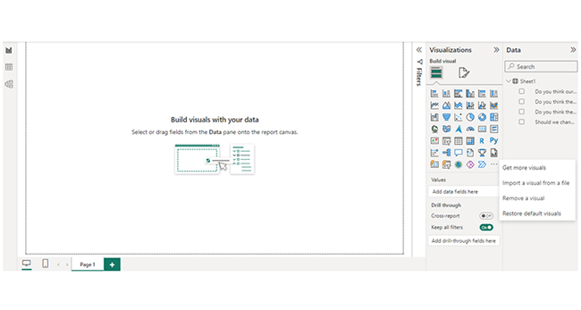
Crafting the best-designed dashboards with Power BI requires a blend of design principles, technical expertise, and a deep understanding of your data and audience. Follow this step-by-step guide to create a dashboard that is both visually appealing and highly functional:

  • Define Dashboard Objectives: Outline the purpose of the dashboard and the specific insights you want to communicate to your target audience.
  • Gather and Prepare Data: Gather and prepare the data to be used for the analysis. Ensure data quality, clean up all inconsistencies, and transform the data for analysis.
  • Design Layout: Plan the layout of your dashboard to ascertain that it’s visually appealing and easy to use. Organize your visualizations, and use whitespace effectively to avoid clutter.
  • Add Interactivity: Use Power BI’s interactive features to boost user engagement. Incorporate slicers, drill-downs, and filters to allow users to explore the data in more detail.
  • Apply Consistent Formatting: Maintain consistency in formatting across your dashboard. Consider factors like data type, audience preference, and the message you want to convey.
  • Optimize Performance: To optimize the performance of your dashboard, minimize data refresh times, and reduce the number of visualizations on each page.
  • Test and Iterate: Use a sample audience to test your dashboard. Gather feedback and incorporate the feedback into your design.
  • Publish and Share: After completing the dashboard, publish it to the Power BI service, and share it with relevant stakeholders. Set up scheduled refreshes to ascertain the data is always up to date.

How to Visualize Your Data Using Power BI?

Stage 1: Log into Power BI, enter your email, and click “Submit.”

  • Log in to Power BI.
  • Enter your email address and click the “Submit” button.
Enter email to login to Power BI
  • You are redirected to your Microsoft account.
  • Enter your password and click “Sign in“.
Enter Password to login to Power BI
  • You can choose whether to stay signed in.
Click on stay signed in
  • Once done, the Power BI home screen will open.

Stage 2: Create a Data Set and Select the Data Set to Use in the Sankey Chart

  • Go to the left-side menu and click the “Create” button.
  • Select “Paste or manually enter data“.
select Paste or manually enter data in Power BI ce487
  • We’ll use the sample data below for this example.
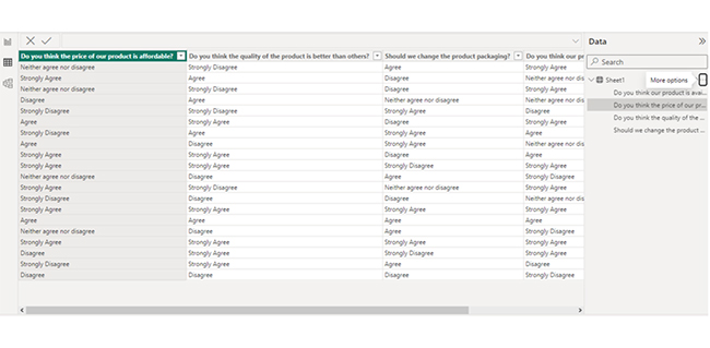
Do you think the price of our product is affordable? Do you think the quality of the product is better than others? Should we change the product packaging?
Do you think our product is available in all stores in your city?
Neither agree nor disagree Strongly Disagree Agree Strongly Agree
Strongly Agree Agree Disagree Neither agree nor disagree
Neither agree nor disagree Strongly Disagree Disagree Strongly Agree
Neither agree nor disagree Agree Neither agree nor disagree Disagree
Strongly Disagree Strongly Disagree Strongly Agree Disagree
Agree Strongly Agree Disagree Strongly Agree
Strongly Disagree Agree Strongly Agree Agree
Agree Disagree Strongly Agree Neither agree nor disagree
Strongly Agree Strongly Agree Disagree Agree
Strongly Agree Strongly Agree Strongly Disagree Strongly Agree
Neither agree nor disagree Disagree Agree Strongly Disagree
Neither agree nor disagree Strongly Agree Strongly Disagree Strongly Agree
Strongly Disagree Disagree Disagree Neither agree nor disagree
Strongly Agree Strongly Agree Strongly Agree Strongly Agree
Agree Agree Agree Agree
Neither agree nor disagree Disagree Agree Strongly Disagree
Strongly Agree Strongly Agree Strongly Agree Strongly Agree
Disagree Strongly Agree Strongly Disagree Strongly Agree
Strongly Disagree Strongly Agree Agree Disagree
Disagree Disagree Disagree Strongly Disagree
  • Paste the data table above into the “Power Query” window. Next, select the “Create a dataset only” option.
Select Create a Dataset Only for Learning Microsoft Fabric vs Power BI
  • Navigate to the left-side menu, and click the “Data Hub” option. Power BI will populate the data set list. If no data set has been created, you’ll get an error message. Next, click on “Create report.” After that, click on “Expand All” to see the chart metrics. Check the dimensions and metrics. Click on “Get more visuals.”
Click on Create Report for Learning Microsoft Fabric vs Power BI
  • Search “ChartExpo” and select “Likert Scale Chart.”
Select Likert Scale Chart for Learning Microsoft Fabric vs Power BI
  • Click on “Add.”
Click on Add for Learning Microsoft Fabric vs Power BI
  • After that, you’ll see the Likert Scale Chart in the visuals list.
Likert Scale Chart in Visual List for Learning Microsoft Fabric vs Power BI
  • In Visual, click on License Settings and add the key. After adding the key, you’ll see the Likert Scale Chart.
Add License Settings for Learning Microsoft Fabric vs Power BI
  • After that, set the scale of the chart as follows:
Set Scale of Chart for Learning Microsoft Fabric vs Power BI
  • You can add the header text at the top of the chart.
Add Header Text for Learning Microsoft Fabric vs Power BI
  • Here’s the final look of the Likert Scale Chart in Power BI:
Final Microsoft Fabric vs Power BI

Insights

  • Price Affordability: Strongly Agree: Mixed opinions show varying perceptions of affordability.
  • Product Quality: Strongly Agree: Customers believe the quality surpasses competitors.
  • Packaging Change: Disagree: There is no clear consensus on why there should be a packaging overhaul.
  • Availability in Stores: Mixed: Uncertain if the product is universally accessible in the city’s stores.

Elevate Chart Analytics With Power BI:

  1. Open your Power BI Desktop or Web.
  2. From the Power BI Visualizations pane, expand three dots at the bottom and select “Get more visuals”.
  3. Search for “Likert Scale Chart by ChartExpo” on the AppSource.
  4. Add the custom visual.
  5. Select your data and configure the chart settings to create the chart.
  6. Customize your chart properties to add header, axis, legends, and other required information.
  7. Share the chart with your audience.

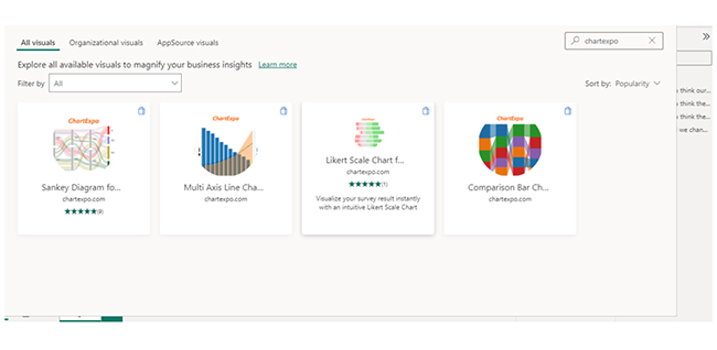
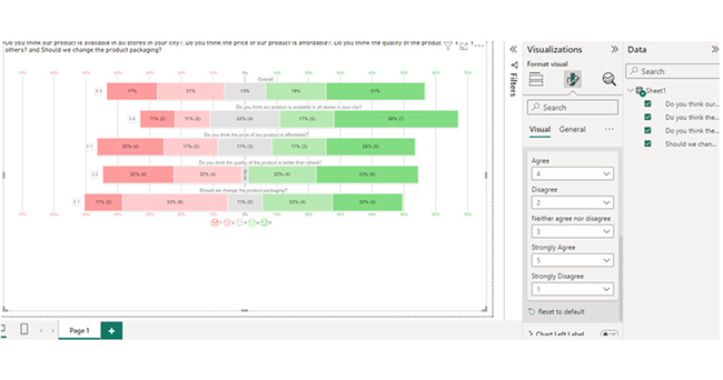
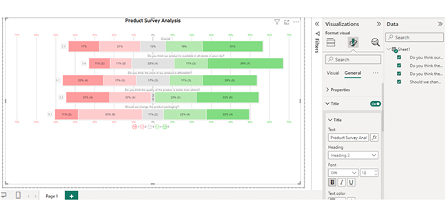
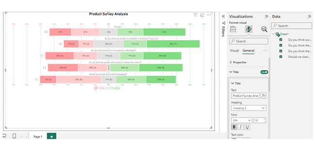
The following video will help you to create a Likert Scale Chart in Microsoft Power BI.

FAQs

Is Power BI being rebranded as Fabric?

No, Power BI is not being rebranded as Fabric. Fabric is a design system used for creating consistent user interfaces across Microsoft products, while Power BI is a data visualization and business analytics platform.

Is Microsoft Fabric Free the same as Power BI?

No, Microsoft Fabric is a design system that provides UI components. Power BI, on the other hand, is a business analytics platform. Both Microsoft Fabric and Power BI have free versions, but their functionalities are different.

Is Microsoft Fabric replacing Power BI?

No, Power BI is not being replaced by Microsoft Fabric.

Wrap Up

Microsoft Fabric vs Power BI is an age-long debate. Microsoft Fabric offers UI design guidelines and components, while Power BI is a business analytics platform for data visualization.

Fabric provides consistent user interfaces, while Power BI helps users make data-driven decisions. The two tools play a vital role in user experience and help users draw insights from their data.

When creating a dashboard with Power BI, you should consider adding context and insights. And that involves including annotations, descriptions, and titles to provide context and insights for your data. This will help the users figure out the story behind the data and the key takeaways.

Furthermore, add interactivity. That involves incorporating filters, slicers, and drill-down capabilities to allow the user to explore the data in more detail. Also, test your dashboard using a sample audience and gather feedback. Feedback should be used to make improvements.

Now you know the difference between Microsoft Fabric vs Power BI, which of these tools will you be using to visualize your data?

How much did you enjoy this article?

PBIAd2
Start Free Trial!
145753

Related articles

next previous
Power BI12 min read

How to Create Sankey Diagram in Microsoft Power BI?

Learn How to Create Sankey Diagram in Microsoft Power BI using Desktop & Web Service. What they are and how to use them effectively.

Power BI8 min read

Power BI Artificial Intelligence: Insights Using Visuals

Discover all there is to know about the Power BI artificial intelligence. You'll also discover how AI is used in Power BI, and how to use it for analysis and more.

Power BI9 min read

Budgeting in Healthcare: Use Visuals to Spot Budget Gaps

This guide helps you discover what budgeting in healthcare is. You'll also discover the factors that affect hospital budgets and types of budgeting in healthcare.

Power BI9 min read

Predictive Analytics in Power BI for Making Insightful Visuals

This guide shows you everything you need to know about Predictive Analytics in Power BI. It also shows you how it works, and how to interpret the results.

Power BI8 min read

Quarterly Business Review Template for Optimum Reports

Discover what the quarterly business review template is. This guide also shows you the best practices to consider when using the QBR template.

ChartExpo logo

Turn Data into Visual
Stories

CHARTEXPO

  • Home
  • Gallery
  • Videos
  • Services
  • Pricing
  • Contact us
  • FAQs
  • Privacy policy
  • Terms of Service
  • Sitemap

TOOLS

  • ChartExpo for Google Sheets
  • ChartExpo for Microsoft Excel
  • Power BI Custom Visuals by ChartExpo
  • Word Cloud

CATEGORIES

  • Bar Charts
  • Circle Graphs
  • Column Charts
  • Combo Charts
  • Comparison Charts
  • Line Graphs
  • PPC Charts
  • Sentiment Analysis Charts
  • Survey Charts

TOP CHARTS

  • Sankey Diagram
  • Likert Scale Chart
  • Comparison Bar Chart
  • Pareto Chart
  • Funnel Chart
  • Gauge Chart
  • Radar Chart
  • Radial Bar Chart
  • Sunburst Chart
  • see more
  • Scatter Plot Chart
  • CSAT Survey Bar Chart
  • CSAT Survey Chart
  • Dot Plot Chart
  • Double Bar Graph
  • Matrix Chart
  • Multi Axis Line Chart
  • Overlapping Bar Chart
  • Control Chart
  • Slope Chart
  • Clustered Bar Chart
  • Clustered Column Chart
  • Box and Whisker Plot
  • Tornado Chart
  • Waterfall Chart
  • Word Cloud
  • see less

RESOURCES

  • Blog
  • Resources
  • YouTube
SIGN UP FOR UPDATES

We wouldn't dream of spamming you or selling your info.

© 2025 ChartExpo, all rights reserved.