• Home
  • Tools dropdown img
    • Spreadsheet Charts

      • ChartExpo for Google Sheets
      • ChartExpo for Microsoft Excel
    • Power BI Charts

      • Power BI Custom Visuals by ChartExpo
    • Word Cloud

  • Charts dropdown img
    • Chart Category

      • Bar Charts
      • Circle Graphs
      • Column Charts
      • Combo Charts
      • Comparison Charts
      • Line Graphs
      • PPC Charts
      • Sentiment Analysis Charts
      • Survey Charts
    • Chart Type

      • Box and Whisker Plot
      • Clustered Bar Chart
      • Clustered Column Chart
      • Comparison Bar Chart
      • Control Chart
      • CSAT Survey Bar Chart
      • CSAT Survey Chart
      • Dot Plot Chart
      • Double Bar Graph
      • Funnel Chart
      • Gauge Chart
      • Likert Scale Chart
      • Matrix Chart
      • Multi Axis Line Chart
      • Overlapping Bar Chart
      • Pareto Chart
      • Radar Chart
      • Radial Bar Chart
      • Sankey Diagram
      • Scatter Plot Chart
      • Slope Chart
      • Sunburst Chart
      • Tornado Chart
      • Waterfall Chart
      • Word Cloud
    • Google Sheets
      Microsoft Excel
  • Services
  • Pricing
  • Contact us
  • Blog
  • Support dropdown img
      • Gallery
      • Videos
      • Contact us
      • FAQs
      • Resources
    • Please feel free to contact us

      atsupport@chartexpo.com

Categories
All Data Visualizations Data Analytics Surveys
Add-ons/
  • Google Sheets
  • Microsoft Excel
  • Power BI
All Data Visualizations Data Analytics Surveys
Add-ons
  • Google Sheets
  • Microsoft Excel
  • Power BI

We use cookies

This website uses cookies to provide better user experience and user's session management.
By continuing visiting this website you consent the use of these cookies.

Ok

ChartExpo Survey


Home > Blog > Microsoft Excel

Analysis Toolpak in Excel to Enhance Your Data Skills

What is the Analysis ToolPak in Excel?

Imagine you’re handling monthly sales data – thousands of rows filled with numbers, trends, and patterns.

How do you turn it all into something meaningful? Analysis ToolPak in Excel is a powerful add-on that helps break enormous datasets into valuable insights. Yet, not everyone knows about this built-in toolkit for advanced data analysis.

Analysis Toolpak in Excel

The Analysis ToolPak in Excel streamlines complex calculations. It’s invaluable for tasks like forecasting, finding correlations, and running detailed statistical tests. For example, the “Descriptive Statistics” feature lets you summarize data with a single click, providing averages, variances, and other key metrics. Businesses rely on these kinds of quick insights to make decisions faster and smarter.

According to research, 80% of businesses now prioritize data-driven decisions. However, making sense of raw data can be challenging without the right tools. The Analysis ToolPak bridges that gap. It offers solutions for anyone working with data, whether you’re in finance, education, or sales. Automating tasks saves time, reduces errors, and lets you focus on what matters: interpreting the results.

If you’re familiar with formulas but want more efficiency, this toolkit is your next step. It requires no programming knowledge, only the desire to explore data more deeply.

Table of Contents:

  1. What is Analysis Toolpak in Excel?
  2. What is the Importance of Using Toolpak in Excel?
  3. How to Enable the Data Analysis Toolpak in Excel?
  4. How to Load the Analysis Toolpak Add-in in Excel?
  5. How to Integrate Analysis Toolpak Into Your Workflow?
  6. How to Create Visuals in Excel?
  7. What are the Advanced Tips and Tricks for Excel’s Analysis Toolpak?
  8. Wrap Up

First…

What is Analysis Toolpak in Excel?

Definition: The Analysis ToolPak in Excel is an add-on designed for advanced data analysis. It includes a range of powerful statistical and engineering functions, along with the ability to create statistical graphs, all accessible with just a few clicks. Tasks covered by the ToolPak include:

  • Descriptive statistics: Summarizes data with metrics like mean, median, and standard deviation.
  • Regression analysis: Identifies relationships between variables.
  • Hypothesis testing: Tests data against a given hypothesis for validation.
  • Histograms and ANOVA: Provides visual data distributions and compares group variances.
  • Moving averages and exponential smoothing: Smooths data to reveal trends over time.

What is the Importance of Using Toolpak in Excel?

Ever wish Excel could do more heavy lifting with your data? The Analysis ToolPak is like Excel’s secret weapon for anyone needing fast, reliable data insights.

Here’s why it matters:

  • Efficient data analysis: ToolPak simplifies complex calculations, saving time. You get faster results, which means quicker insights.
  • Advanced statistical functions: From regression to ANOVA, ToolPak offers advanced tools that basic Excel doesn’t. It’s like having pro-level analytics at your fingertips.
  • Accessibility for non-statisticians: ToolPak is user-friendly, even for those without a stats background. Just a few clicks, and you’re doing serious analysis.
  • Improved decision-making: With ToolPak, your data drives decisions—no guesswork—just solid, data-driven decision-making backed by insights.
  • Professional reporting: ToolPak’s results look polished and are easy to interpret, enhancing data interpretation and giving your reports a clean, professional edge.

How to Enable the Data Analysis Toolpak in Excel?

Enabling the Data Analysis ToolPak is the first step if you want deeper data analysis in Excel. This built-in add-on is easy to set up and unlocks a range of powerful tools, from statistical tests to data visualization.

To Enable the Data Analysis ToolPak in Excel for Windows

  1. Open Excel.
  2. Click the File menu.
  3. Select Options at the bottom.
  4. In the Excel Options window, go to the Add-Ins tab.
  5. At the bottom, click Go…
  6. Check the box next to Analysis ToolPak and click OK.

To Enable the Data Analysis ToolPak in Excel for Mac

  1. Open Excel and start a blank worksheet.
  2. Go to the Data tab in your worksheet.
  3. If the Ribbon isn’t showing, click View and check Ribbon.
  4. Click Data Analysis ToolPak on the Ribbon to enable it, then click OK.

How to Load the Analysis Toolpak Add-in in Excel?

Loading the Analysis ToolPak add-in opens up a world of advanced data tools in your spreadsheet. Here are a few quick steps to set it up.

  1. Go to the File tab and select Options.
  2. Under Add-ins, find and select Analysis ToolPak, then click Go.
Select Options and Under Add-ins and Select Analysis ToolPak then Click Go for Using Analysis Toolpak in Excel
  1. Check the box for Analysis ToolPak and click OK.
Check Box for Analysis Toolpak in Excel

Once loaded, go to the Data tab. In the Analysis group, you’ll see that Data Analysis is available.

In Analysis Group and see Data Analysis for Using Analysis Toolpak in Excel

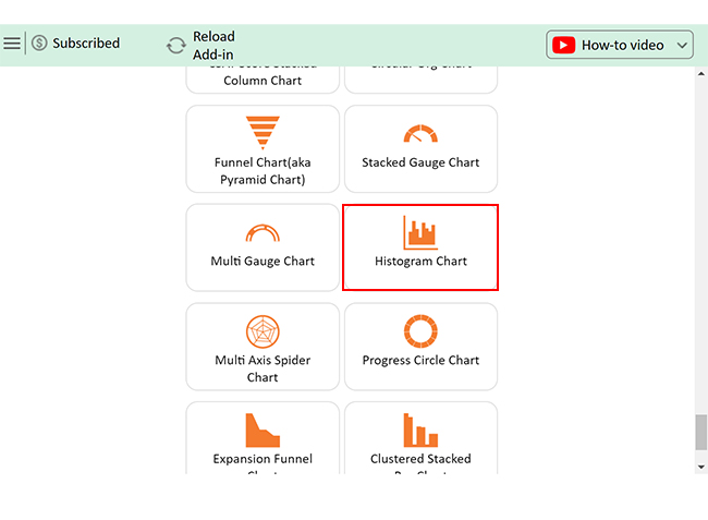
When you click Data Analysis, a dialog box will pop up, showing various tools. For instance, select Histogram and click OK to create a histogram right in Excel. You’re now set to start analyzing data at a whole new level!

Select Histogram and Click OK for Using Analysis Toolpak in Excel

How to Integrate Analysis Toolpak Into Your Workflow?

Integrating the Data Analysis ToolPak into your workflow can help you go from basic calculations to powerful, data-driven insights. Here’s a simple guide to get started.

  1. Enable the analysis ToolPak: Start by enabling the ToolPak to access its powerful features:
    • Open Excel: Start Excel on your computer.
    • Go to Options: Click on the “File” tab, then select “Options.”
    • Select Add-ins: In the Excel Options window, choose “Add-ins” from the sidebar.
    • Manage Add-ins: At the bottom, select “Excel Add-ins” from the dropdown menu and click “Go.”
    • Check Analysis ToolPak: In the Add-Ins dialog, check the box next to “Analysis ToolPak” and click “OK.”
  1. Familiarize yourself with the features: Spend some time exploring functions like Descriptive Statistics, Regression, and ANOVA. Understanding these will make knowing when and how to use them easier.
  2. Incorporate into your projects: Try using the ToolPak’s features in real projects. Whether analyzing sales trends or performing statistical tests, hands-on experience is the best way to learn.
  3. Document your findings: Use Excel’s built-in tools to record insights and findings. This not only tracks progress but also helps when sharing with team members.
  4. Continuous learning: Excel’s ToolPak offers so much that there’s always more to learn. Explore tutorials or guides to get the most from its tools.
  5. Collaborate and share: Share insights and results with your team. Showing others what’s possible with the ToolPak encourages collaboration and improves workflow.

How to Create Visuals in Excel?

Data tells stories, but only if we can see it clearly.

In data analysis, visualization is key—it turns raw numbers into insights. Yet, Excel’s standard charts often fall short, lacking the depth needed for complex data storytelling.

This is where add-ins step in to save the day.

One standout tool, ChartExpo, offers a way to enhance Excel’s basic charting abilities. It provides access to a wide range of engaging, informative visuals, making it an excellent choice for data visualization.

Let’s explore how ChartExpo can bring your data to life in ways Excel alone simply can’t.

Top 10 Charts Example

The charts below were created in Excel using ChartExpo:

Sankey Chart

Sankey Chart After Using Analysis Toolpak in Excel

Likert Scale Chart

Likert Scale Chart After Using Analysis Toolpak in Excel

Comparison Bar Chart

Comparison Bar Chart After Using Analysis Toolpak in Excel

Gauge Chart

Gauge Chart After Using Analysis Toolpak in Excel

Progress Circle Chart

Progress Circle Chart After Using Analysis Toolpak in Excel

Slope Chart

Slope Chart After Using Analysis Toolpak in Excel

Mosaic Plot

Mosaic Plot After Using Analysis Toolpak in Excel

Clustered Stacked Bar Chart

Clustered Stacked Bar Chart After Using Analysis Toolpak in Excel

Multi Axis Line Chart

Multi Axis Line Chart After Using Analysis Toolpak in Excel

Histogram Chart

Histogram Chart After Using Analysis Toolpak in Excel

Let’s learn how to install ChartExpo in Excel.

  1. Open your Excel application.
  2. Open the worksheet and click the “Insert” menu.
  3. You’ll see the “My Apps” option.
  4. In the Office Add-ins window, click “Store” and search for ChartExpo on my Apps Store.
  5. Click the “Add” button to install ChartExpo in your Excel.

ChartExpo charts are available both in Google Sheets and Microsoft Excel. Please use the following CTAs to install the tool of your choice and create beautiful visualizations with a few clicks in your favorite tool.

Example

Let’s visualize the data below and glean insights using ChartExpo for Excel.’

Age
11
15
12
12
12
14
14
10
14
11
13
13
15
13
12
11
11
15
11
10
14
12
14
11
11
13
14
10
10
13
12
15
14
15
12
11
15
16
18
16
20
17
18
15
19
15
17
15
17
19
18
16
15
15
20
19
20
20
19
19
20
16
15
16
18
15
15
17
20
16
16
15
17
15
20
18
20
19
19
20
17
18
17
17
20
16
15
19
15
18
18
17
15
20
25
22
22
25
25
25
24
21
21
25
24
25
21
22
21
22
24
23
24
25
25
21
24
22
24
25
24
25
21
24
22
23
25
23
23
25
22
23
22
22
23
22
21
30
27
28
28
29
27
26
28
27
27
29
30
26
26
26
27
30
28
30
28
26
28
26
27
30
27
30
27
27
30
30
28
29
34
32
31
33
32
31
33
33
34
32
34
34
33
31
32
32
31
31
33
34
34
32
34
31
33
34
38
38
38
38
37
36
37
36
40
37
38
39
40
38
38
39
36
38
37
36
38
39
36
37
36
36
39
37
39
44
44
44
43
44
44
44
45
44
44
43
43
42
42
50
45
47
46
46
49
47
46
47
47
48
47
46
  • To get started with ChartExpo, install ChartExpo in Excel.
  • Now Click on My Apps from the INSERT menu.
insert chartexpo in excel
  • Choose ChartExpo from My Apps, then click Insert.
open chartexpo in excel
  • Once it loads, choose the “Histogram Chart” from the charts list.
search histogram chart in excel
  • The Histogram Chart below will appear on your screen.
Histogram Page Appear After Using Analysis Toolpak in Excel
  • Click the “Create Chart From Selection” button after selecting the data from the sheet, as shown.
Click Create Chart From Selection After Using Analysis Toolpak in Excel
  • ChartExpo will generate the visualization below for you.
Initial Visual After Using Analysis Toolpak in Excel
  • If you want to have the chart’s title, click Edit Chart, as shown in the above image.
  • Click the pencil icon next to the Chart Header to change the title.
  • It will open the properties dialog. Under the Text section, you can add a heading in Line 1 and enable Show.
  • Give the appropriate title of your chart and click the Apply button.
Add Chart Header After Using Analysis Toolpak in Excel
  • You can add the text on the chart label left as follows:
Add text on Chart Label Left After Using Analysis Toolpak in Excel
  • You can add the text on the chart footer as follows:
Add Text on Chart Footer After Using Analysis Toolpak in Excel
  • Click the “Save Changes” button to persist the changes.
Click Save Changes After Using Analysis Toolpak in Excel
  • Your Histogram Chart will appear as below.
Final Analysis Toolpak in Excel

Insights

  • The ages range from 10 to 50.
  • Clusters are prominent around:
  • 15-20
  • 25-30
  • A few outliers are over 40.
  • Most ages concentrate in the younger and middle brackets.
  • The data suggests a diverse range with higher youth representation.

Streamline Graphical Analysis with Analysis Toolpak in Microsoft Excel:

  1. Open your Excel Application.
  2. Install ChartExpo Add-in for Excel from Microsoft AppSource to create interactive visualizations.
  3. Select the Histogram from the list of charts.
  4. Select your data
  5. Click on the “Create Chart from Selection” button.
  6. Customize your chart properties to add header, axis, legends, and other required information.

The following video will help you create a Histogram in Microsoft Excel.

What are the Advanced Tips and Tricks for Excel’s Analysis Toolpak?

Excel’s Data Analysis ToolPak can significantly elevate your data work, but mastering some advanced tips can make it even more powerful. Here are expert strategies to get the most out of it.

  1. Customize output ranges: Direct results to specific cells for a cleaner, organized spreadsheet.
  2. Use named ranges: Make formulas easier to read and manage by assigning names to important data ranges.
  3. Analyze multiple variables: Utilize tools like ANOVA and Regression to assess relationships between multiple data points.
  4. Leverage descriptive statistics: Get a quick snapshot of your data’s key metrics, such as mean and variance, using the Descriptive Statistics tool.
  5. Automate repetitive analysis: Record macros or set up templates to save time on analyses you perform regularly.
  6. Conduct sensitivity and scenario analysis: Explore how different variables impact outcomes to prepare for real-world scenarios.
  7. Visualize results: Turn raw data into charts or histograms to make your findings clear and impactful.
  8. Validate and document your analysis: Check your calculations and record steps to ensure accuracy and transparency.

FAQs

How do I know if I have an analysis ToolPak in Excel?

To check if you have the Analysis ToolPak in Excel:

  • Go to the File
  • Select Options, then click Add-Ins.
  • Look for “Analysis ToolPak” in the list.
  • If it’s there, you’re all set!

Why is data analysis ToolPak not showing in Excel?

If the Analysis ToolPak isn’t showing in Excel, it might not be installed or activated:

  • Go to File > Options > Add-Ins.
  • Under “Manage,” select Excel Add-ins and click Go.
  • Check “Analysis ToolPak” to enable it.

How to use the analysis ToolPak in Excel?

To use the Analysis ToolPak:

  • Go to the Data tab in Excel.
  • Click on Data Analysis in the Analysis group.
  • Select the analysis tool you need, like Descriptive Statistics or Regression.
  • Input your data range and press OK to run.

Wrap Up

The Analysis ToolPak in Excel is a powerful asset. It brings complex data analysis tools within reach. With it, you can perform advanced statistical and engineering calculations effortlessly.

The ToolPak streamlines tasks that would otherwise require in-depth knowledge. Features like regression analysis, moving averages, and hypothesis testing are ready to use. They quickly turn raw data into insightful summaries.

The ToolPak is a game-changer for anyone handling large datasets. It simplifies data exploration and helps you make informed decisions based on clear, accurate results.

However, while the ToolPak is useful, it has limitations. Its visual options are basic and can feel restrictive. For those seeking impactful visuals, the ToolPak alone may not be enough.

That’s where ChartExpo comes in. This Excel add-in takes data visualization to a new level. With it, you can create unique, compelling charts that showcase insights effectively.

Want more than standard visuals? Install ChartExpo for Excel and bring your data to life with advanced, eye-catching charts.

How much did you enjoy this article?

ExcelAd2
Start Free Trial!
144262

Related articles

next previous
Microsoft Excel9 min read

How to Create a Stacked Waterfall Chart in Excel?

Discover how to build and customize a stacked waterfall chart in Excel. Ideal for showing positive and negative values across categories or time.

Microsoft Excel10 min read

Excel Bookkeeping for Small Business: Insights at a Glance

Excel bookkeeping for small businesses helps track income, expenses, and cash flow. Learn about templates and financial analysis to simplify bookkeeping.

Microsoft Excel10 min read

Compound Interest in Excel for Smarter Reporting

Discover compound interest in Excel and how it works. Learn its formulas, calculation tips, and common errors to avoid for more accurate financial analysis.

Microsoft Excel9 min read

KPI Dashboard in Excel: A Complete Guide

A KPI dashboard in Excel helps track key metrics and streamline data visualization. Discover how to create, analyze, and use it with clear guides and examples.

Microsoft Excel11 min read

How to Plot a Speedometer Chart in Excel?

Create a Speedometer Chart in Excel to track KPIs, goals, and performance metrics visually. Explore templates, examples, and step-by-step instructions for better dashboards.

ChartExpo logo

Turn Data into Visual
Stories

CHARTEXPO

  • Home
  • Gallery
  • Videos
  • Services
  • Pricing
  • Contact us
  • FAQs
  • Privacy policy
  • Terms of Service
  • Sitemap

TOOLS

  • ChartExpo for Google Sheets
  • ChartExpo for Microsoft Excel
  • Power BI Custom Visuals by ChartExpo
  • Word Cloud

CATEGORIES

  • Bar Charts
  • Circle Graphs
  • Column Charts
  • Combo Charts
  • Comparison Charts
  • Line Graphs
  • PPC Charts
  • Sentiment Analysis Charts
  • Survey Charts

TOP CHARTS

  • Sankey Diagram
  • Likert Scale Chart
  • Comparison Bar Chart
  • Pareto Chart
  • Funnel Chart
  • Gauge Chart
  • Radar Chart
  • Radial Bar Chart
  • Sunburst Chart
  • see more
  • Scatter Plot Chart
  • CSAT Survey Bar Chart
  • CSAT Survey Chart
  • Dot Plot Chart
  • Double Bar Graph
  • Matrix Chart
  • Multi Axis Line Chart
  • Overlapping Bar Chart
  • Control Chart
  • Slope Chart
  • Clustered Bar Chart
  • Clustered Column Chart
  • Box and Whisker Plot
  • Tornado Chart
  • Waterfall Chart
  • Word Cloud
  • see less

RESOURCES

  • Blog
  • Resources
  • YouTube
SIGN UP FOR UPDATES

We wouldn't dream of spamming you or selling your info.

© 2025 ChartExpo, all rights reserved.