Categories
Ever wondered how to visually compare not just one, but two or more sets of data in a single glance? That’s precisely what Side-by-Side Bar Charts are all about: simplicity meets clarity. They’re like the best friends at a party who effortlessly guide you through a crowd.


Imagine this: you’ve got sales figures for two consecutive years or customer satisfaction ratings across different regions. Instead of drowning in a sea of numbers or deciphering complex tables, Side-by-Side Bar Charts lay it all out, side by side – no detective work needed. It’s like having a map in the jungle, showing you where the treasure lies.
But wait, there’s more! Side-by-side bar Charts aren’t just about showing numbers; they tell stories. Stories of growth, comparison, and trends over time. Whether you’re a data geek or just dipping your toes into visual analytics, Side-by-Side Bar Charts are your new best friend. They make you look like a superhero at meetings, effortlessly presenting insights that make others agree.
First…
A Side-by-Side Bar Chart, also known as a Side-by-Side Bar Graph or Butterfly Chart, is a simple, yet powerful way to compare data. It’s about placing bars next to each other, allowing you to see differences and similarities at a glance. Let’s dive into why they matter, who should use them, and what you’ll learn from this guide.
Side-by-side bar Charts play a crucial role in data visualization. They allow you to make clear and immediate comparisons between different datasets. Imagine trying to compare sales figures for multiple products across several years – these charts make that comparison simple and effective.
These charts are a game-changer for decision-making. By highlighting contrasts and similarities, they help you spot trends, outliers, and patterns quickly. This visual clarity can lead to more informed and faster decisions.
By the end of this guide, you’ll be able to create effective Side-by-Side Bar Charts. You’ll also pick up advanced techniques to make your charts stand out and convey information.
In today’s data-driven world, data literacy is key. Side-by-side bar charts, coupled with the right data visualization tools, enhance your decision-making skills, providing a solid foundation for mastering data visualization. Whether you’re starting out or looking to refine your skills, this guide is your stepping stone.
Data pros, these charts are your go-to for comparing datasets. They help you analyze and present data with clarity and precision.
Managers, make smarter decisions with these charts. Compare performance metrics, sales data, and more in a straightforward way.
Teachers and students, use these charts to simplify complex data. They’re perfect for classroom presentations and assignments.
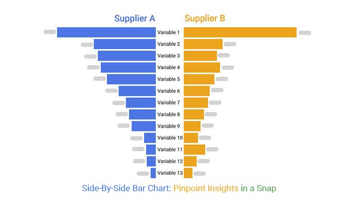
A Side-by-Side Bar Chart is a visual tool used to compare different categories or groups. It shows these groups as individual bars placed side by side along a horizontal or vertical axis. Each bar represents a specific category, making it easy to see similarities, differences, and trends at a glance. A good chart maker can simplify the process of creating this type of chart, ensuring clarity and accuracy in visual comparisons.
In this chart type, each bar stands tall for a particular category. The X and Y axes play a crucial role: the X-axis labels the categories being compared, while the Y-axis measures their values.
Labels and legends add clarity, explaining what each bar stands for and helping you navigate the chart like a pro. Understanding how to create a chart from a table ensures you can effectively transform data into visual insights.
How does the Side-by-Side Bar Chart stack up against other contenders?
Every chart type has its perks and quirks:
Side-by-side bar Charts let you compare different data sets directly. No more flipping back and forth between numbers. Just put them side by side and see the differences pop.
These charts keep it simple. With a clean layout, anyone can grasp the info fast. You won’t waste time figuring out what’s what.
Large datasets can overwhelm even the keenest eyes. Here’s how to streamline:
Charts can mislead if not done right. Stay on track with:
Can’t compare all at once? Navigate with:
When jazzing up your Side-by-Side Bar Chart, color schemes play a key role. Opt for colors that pop and contrast well. This isn’t just about aesthetics – it’s about making your data crystal clear. Experiment with gradients and textures for that extra oomph. Remember, styling isn’t just about looks; it’s about making your chart easy on the eyes and brain.
Want to show trends like a pro? Trend lines are your new best friend. They reveal patterns hiding in your data. And don’t forget data labels – they’re like the GPS of your chart, guiding viewers through the peaks and valleys. It’s all about adding that extra layer of insight and keeping your audience in the loop.
Time to make your chart dance! Add hover effects and tooltips to bring your data to life. Clickable elements? Yep, you can do that too. Want your chart to update itself? No problem. Stay ahead of the curve with these savvy techniques. Your data will thank you, and so will your audience.
Ready to take your charts to the next level? ChartExpo is your gateway to charting greatness. It’s user-friendly, powerful, and designed to make your data shine without the fuss. Dive in and see how charts should be done.
You can create a Tornado Chart in your favorite spreadsheet. Follow the steps below to create a Tornado Chart.
The following video will help you to create a Tornado Chart in Microsoft Excel.


The following video will help you to create a Tornado Chart in Google Sheets.
Start strong by picking the most relevant data for your comparison. Ensure accuracy and completeness for reliable insights.
Keep it simple! Design principles like simplicity, clarity, and balance are your best friends. Avoid overload to keep viewers engaged.
Scale and space those bars just right. Clear, consistent labeling is key to avoiding confusion.
Creating Side-by-Side Bar Charts isn’t just about data – it’s about telling your story visually. So, grab your data, follow these tips, and watch your charts speak volumes!
Identifying Gaps: Detect and handle missing data points by carefully examining your dataset. Look for areas where data points are absent or incomplete. Be mindful of information overload, which can occur when trying to manage excessive or complex data.
Handling Missing Data: Address gaps using interpolation techniques to estimate missing values or consider excluding incomplete data for more accurate visualizations.
Multiple Scales: Manage datasets with varying scales to ensure fair comparisons between different categories or variables, especially when presenting insights like a percentage bar graph for normalized comparison.
Normalization Techniques: Standardize data across different scales to bring it to a common level, enhancing the clarity and reliability of your side-by-side bar charts.
Overlapping Bars: Adjust bar positions to prevent overlaps or misalignments, ensuring each category or data point is distinguishable.
Label Clarity: Ensure labels are prominently displayed and easy to read, using concise and descriptive text to enhance the understanding of your side-by-side bar chart. Incorporate descriptive visualization techniques to further clarify the data presented.
Sales Performance:
In business analytics, Side-by-Side Bar Charts shine bright. They compare sales figures across different periods or products. For instance, visualize how Q2 sales are stacked against Q1. This clarity guides smarter decisions.
Marketing Campaigns:
In marketing, these charts pack a punch. Picture two campaigns side by side. Did Campaign A outshine Campaign B? Insights like these fuel future strategies.
Classroom Applications:
Educators wield these charts to illustrate concepts vividly. Imagine comparing historical events or scientific data. Students grasp differences instantly, making learning a breeze.
Academic Research:
In research, these charts unveil trends effortlessly. Picture studies comparing survey results or experimental outcomes. The data speaks volumes, fueling academic breakthroughs.
Looking to wow your audience with crystal-clear charts? Here are some expert insights to get you started:
Ready to take your charts from good to jaw-dropping? Try these cutting-edge techniques:
Steer clear of these pitfalls to keep your charts on point:
Stay ahead of the curve with these tips:
Use it when you want to compare different groups across several categories at a glance. It’s great for showing contrasts or trends over time.
Absolutely! It’s versatile and can handle a range of data sizes. Just make sure it’s clear and not too crowded.
Keep it simple and use contrasting colors. Label clearly and add a title that grabs attention. Your chart should tell a story at a glance.
Show trends, highlight successes, and visualize key metrics side by side. It’s like a spotlight on your data insights!
Categorical data with multiple groups works best. Examples include sales by region, survey responses by age group, and IELTS band score graphs.
Look for the tallest bars in each group. These represent the highest values. Comparisons between bars show trends and differences clearly.
Treat missing data carefully. You can omit it, or use a placeholder, but be sure to note it so viewers know.
Start simple. Use basic data and build your chart step-by-step. Experiment with customization options and find what works best for you.
Don’t hesitate to ask! We’re here to help you chart your course to data visualization greatness.
In conclusion, Side-by-Side Bar Charts are a powerful tool for visualizing comparisons. They allow you to present data clearly and highlight differences at a glance. Whether you’re analyzing sales figures, survey results, or any other data set with multiple categories, these charts make your findings straightforward and impactful.
When you need to showcase how categories stack up against each other, remember the simplicity and effectiveness of Side-by-Side Bar Charts. They’re a go-to choice for clarity and precision in data presentation.
Next time you need to compare apples to oranges (or anything in between), don’t forget the Side-by-Side Bar Chart. It’s your shortcut to insight!
How much did you enjoy this article?


Calculate accounts receivable turnover ratio to measure credit collection speed, improve cash flow, and strengthen your financial strategy. Read on!

Change Management KPIs are the key to tracking adoption, performance, and ROI during transitions. Find out which metrics matter. Read on!

Data collection methods and techniques determine the quality of every insight you act on. Explore key approaches for gathering reliable data. Read on!


