Categories
Profit and loss templates in Excel are powerful tools for evaluating financial performance. They simplify the complex task of dissecting a company’s financial data, offering a clear picture of its profitability.


Gone are the days of tedious calculations and mind-numbing formulas. With the power of Excel, you can now analyze your business’s data with ease and finesse. Imagine turning raw numbers into insights, uncovering hidden trends, and making informed decisions to propel your business.
But don’t be fooled by the misconception that Excel is only for accountants. Excel is not just a tool for the number-crunchers; it’s an enigmatic playground where creativity and logic intertwine.
With a little imagination, you can transform those dull spreadsheets into vibrant visualizations that will mesmerize your audience.
This guide delves into the steps to effectively analyze profit and loss statement data using templates in Excel. Grab your spreadsheet armor, and let’s embark on a profit-seeking, loss-avoiding mission.
Definition: Profit and Loss (P&L) templates in Excel are pre-designed spreadsheets that help businesses record, organize, and analyze their income and expenses over a specific period. These templates simplify the process of calculating net profit or loss by using built-in formulas and structured formats.
By providing a clear snapshot of financial performance, Excel P&L templates support better decision-making, efficient reporting, and improved financial management without the need to build a report from scratch.
A well-designed profit and loss template in Excel should include the following components:
Watch this video tutorial to learn how to display profit and loss effectively using Excel charts.
P&L Templates in Excel serve critical purposes, making them an indispensable tool for businesses and organizations:
Smartsheet offers a P&L template that does more than track numbers. It comes with built-in charts and a clean dashboard to visualize revenue, expenses, and net income over time. This makes it easy to share insights with stakeholders and keep financial performance transparent. Best for businesses that want both numbers and visuals in one place.
Known for high-quality Excel tools, Vertex42 provides a projection-focused P&L template. It allows businesses to plan months or even years ahead by estimating income and expenses. With built-in formulas for ratios and percentages, it’s ideal for startups and growing businesses that need to prepare investor-ready financial forecasts.
Microsoft includes ready-to-use P&L templates directly in Excel. These are reliable, easy to customize, and already built into the software, which saves time on setup. Users can track revenue and expenses quickly, then enhance the template with Excel features like charts, pivot tables, or conditional formatting. A solid option for everyday use.
This template combines automation with a user-friendly design. It separates raw data entry from the final dashboard, reducing errors and improving readability. The visual dashboard provides quick summaries of profit margins, income streams, and expense categories. It’s best for professionals who want polished reporting without heavy customization.
CFI provides professional-grade P&L templates designed for detailed financial analysis. With versions for both monthly and annual reporting, these templates are structured by finance experts and include step-by-step instructions. They’re best suited for finance professionals and businesses looking for accuracy, scalability, and a structured approach to reporting.
In the grand spectacle of data visualizations are the dazzling show-stoppers that steal the spotlight. They’re the fireworks in the night of data, illuminating insights with the pizzazz numbers can’t match. But, and it’s a big “but,” when it comes to Excel. Even the mightiest of profit and loss spreadsheet superheroes has its kryptonite.
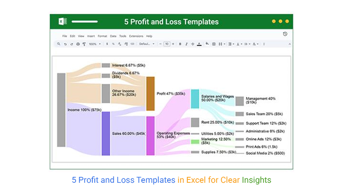
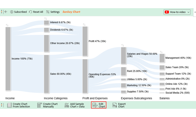
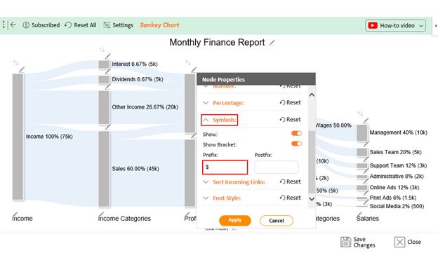
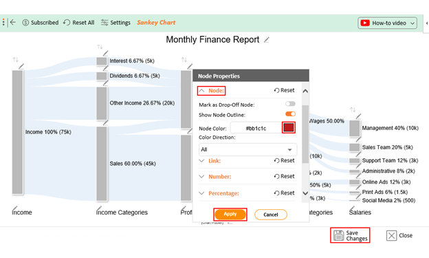
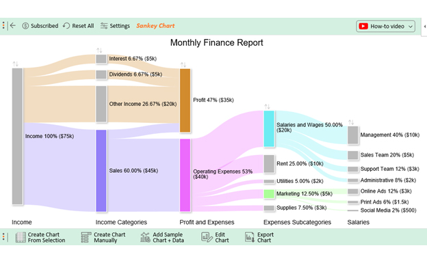
That’s where ChartExpo swoops in to rescue your profit and loss graph from the clutches of dullness. ChartExpo unveils the secrets of profit and loss analysis using a Sankey diagram in Excel that you couldn’t dream of!
Benefits of Using ChartExpo
How to Install ChartExpo in Excel?
ChartExpo charts are available both in Google Sheets and Microsoft Excel. Please use the following CTA’s to install the tool of your choice and create beautiful visualizations in a few clicks in your favorite tool.
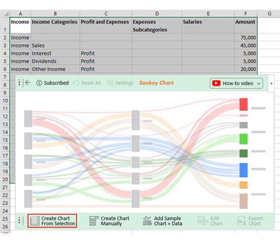
Assume you have the data below on income and expenses.
| Income | Income Categories | Profit and Expenses | Expenses Subcategories | Salaries | Amount |
| Income | 75,000 | ||||
| Income | Sales | 45,000 | |||
| Income | Interest | Profit | 5,000 | ||
| Income | Dividends | Profit | 5,000 | ||
| Income | Other Income | Profit | 20,000 | ||
| Sales | Profit | 5,000 | |||
| Sales | Operating Expenses | 40,000 | |||
| Operating Expenses | Salaries and Wages | 20,000 | |||
| Salaries and Wages | Management | 10,000 | |||
| Salaries and Wages | Sales Team | 5,000 | |||
| Salaries and Wages | Support Team | 3,000 | |||
| Salaries and Wages | Administrative | 2,000 | |||
| Operating Expenses | Rent | 10,000 | |||
| Operating Expenses | Utilities | 2,000 | |||
| Operating Expenses | Marketing | 5,000 | |||
| Marketing | Online Ads | 3,000 | |||
| Marketing | Print Ads | 1,500 | |||
| Marketing | Social Media | 500 | |||
| Operating Expenses | Supplies | 3,000 |
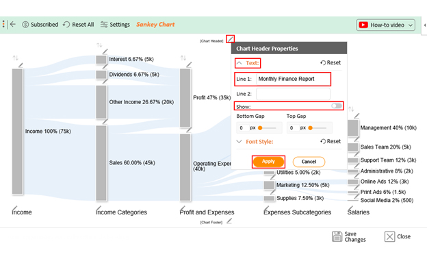
You want to present this data in a way that everyone can understand. Follow the steps below to learn how to create a Profit and Loss Chart in Excel with ChartExpo.


A profit and loss format in Excel simplifies calculations by using built-in formulas. This reduces manual work and minimizes the chances of errors, saving you valuable time each month.
The template organizes income, expenses, and profit into a structured format. This makes it easier to understand your company’s financial position at a glance.
Excel templates can be tailored to fit your business needs. You can adjust categories, time periods, or layouts to align with your specific financial reporting style.
By tracking trends in revenue and expenses, the template gives insights that support informed business decisions. This helps in planning future budgets and strategies more effectively.
Most Excel templates rely on manual input, which can be time-consuming and prone to mistakes. A small error in a formula or entry can affect the accuracy of the entire report.
Unlike accounting software, Excel cannot automatically fetch data from bank accounts or POS systems. This means you need to constantly update figures yourself, reducing efficiency.
For small businesses, Excel works fine. But as transactions grow, managing multiple sheets, formulas, and datasets can become complicated and overwhelming.
Excel templates only reflect the data you enter. They don’t update automatically with live financial activity, making it harder to get up-to-date insights for quick decisions.
The P&L template in Excel is like a Swiss Army knife for businesses. It offers a myriad of benefits that can significantly impact financial management and decision-making:
This template is a business visionary’s best friend. It helps create budgets by forecasting revenues and expenses based on historical data and current trends. This proactive approach allows for better resource allocation and financial goal setting.
Say goodbye to the era of manual calculations and error-prone spreadsheets. Excel’s formulas ensure your financial data is consistently accurate. This accuracy is vital for informed decision-making and financial analysis.
Time is money, and Excel saves plenty of it. The template streamlines financial data entry, calculations, and reporting. It automates repetitive tasks, freeing up valuable time for more strategic endeavors.
Numbers can be boring, but charts? They’re the rockstars of financial storytelling. Excel’s visual wizardry transforms your data into stunning charts, Waterfall chart, Sankey charts, Double bar charts, tree maps, and many more, making your financial story pop.
To know where you’re going, you need to know where you’ve been. Excel helps you travel back in time (figuratively) to compare past performance with the present. This historical perspective helps identify patterns, trends, and areas needing attention so you can steer your ship wisely.
Every penny counts. This template lets you track expenses across different categories meticulously and identify cost-cutting opportunities. It’s your financial watchdog, ensuring no dollar slips through the cracks.
Profitability isn’t just about making money; it’s about making smart money. The template, or a finance dashboard in Excel, dissects revenue sources and expense categories, enabling a granular profitability analysis. This way, you can identify which products, services, or departments contribute most to the bottom line.
In business, decisions are like forks on the road. The template equips you with timely and accurate financial information. Whether scaling operations, investing in marketing, or expanding, decisions become more informed and less risky.
Transparency is the name of the game when dealing with investors and stakeholders. A well-organized business profit and loss template in Excel instills confidence by presenting financial data clearly and comprehensively. Consequently, it fosters trust and collaboration.
Nobody wants to mess with the taxman. The template helps calculate taxable income and deductions, ensuring compliance with tax regulations and optimizing tax strategies.
When using Excel for your profit and loss statements, be mindful of these common mistakes:
You can find P&L templates directly in Excel under File > New > Search “Profit and Loss”, or download free ones from sites like Microsoft Office, Vertex42, Smartsheet, and other financial template providers.
Yes, Excel offers pre-designed profit and loss templates readily available within the software. You can access these templates to create financial statements, making tracking income, expenses, and profit or loss easier.
Monthly P&L templates in Excel are available in free and paid versions. Basic templates are often free and can be found online. On the other hand, more advanced or customizable templates may require a purchase or subscription.
A Stacked Column Chart is typically the best Excel chart to display profit and loss. It allows you to visualize revenue and expenses, showing the net profit or loss as the column’s height.
Excel’s profit and loss templates are the unsung financial management heroes. They empower you to track your business’s financial health, make informed decisions, and communicate effectively with stakeholders. With Excel’s robust capabilities, including built-in templates and formulas, it becomes a versatile ally in this financial journey.
Analyzing data for a basic profit and loss template in Excel opens a world of possibilities. These templates simplify complex financial tasks, from budgeting and planning to profitability analysis and tax compliance. Excel’s visualizations add a layer of clarity, turning numbers into meaningful insights.
But, as with any hero, there are limitations. Excel, while powerful, may fall short in the data visualization department. This is where ChartExpo shines, offering a dazzling array of visuals to complement your financial data.
Harnessing Excel and ChartExpo’s power to analyze numbers is a winning strategy in today’s dynamic business landscape. Go forth, analyze your data like a pro, and watch your financial fortunes soar.
How much did you enjoy this article?


Learn how to use sparklines in Excel to quickly visualize trends inside cells. Discover types, creation steps, customization, use cases, benefits, and best practices.

Learn what a confidence interval graph is, how to create it in Excel, and how to interpret results to make more reliable, data-driven decisions.

A correlation matrix in Excel helps identify relationships between variables. Learn how to create, read, and use it for effective data analysis.


