Categories
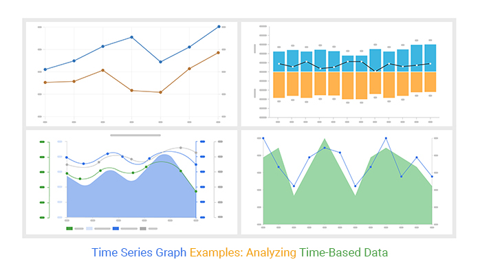
In the dynamic realm of data representation, “time series graph examples” stand as stalwarts, offering a fresh perspective into the evolution of variables over time.

As a data analyst of your company, your stakeholders have tasked you to keep track of specific data. Your stakeholders are interested in the forecast you provide.
In such a scenario, you will need a visualization that helps to identify data trends over time. The question is, what type of visualization will save your day?
You guessed right. You will need one of the time series graph examples.
Why? This is because time and dates are always continuous. A time series graph in Google Sheets can help you create a compelling forecast that will impress your stakeholders.
Buckle up as we get to know more about time series graph examples.
Do you want to improve your data visualization? If yes, walk with us as we uncover essential tips for time series visualization.
In this blog you will learn:
Time Series Graphs in Google Sheets are a type of chart used to analyze data collected at different time points.
A time series graph is one of the most common types of charts in investing and finance-related fields. Why? Investors track their investments and stock performance over time to make informed decisions.
Forex stock analysis is a real-life example of time series analysis.
If you are a Forex trader, this type of chart is likely very familiar—you’ve probably seen it many times while tracking currency prices across different periods
In the economic sector, economic experts use a time series data graph to track the Gross Domestic Product of a country across a period.
A graph for time series data offers meaningful insights if your data has these characteristics:
Let us assume you are analyzing the daily closing stock price for one year. It is essential to obtain all the customary closing stock prices and arrange them chronologically.
Such data would serve as a time series of the daily stock.
When using time series graph examples or a dot plot example, you plot your data on the y-axis against the time increment on the x-axis. This approach helps you visualize patterns and behaviors in your data more effectively.
Now that you know what a time series visualization is let us look at the examples of time series graphs.
Time series graphs are crucial for analyzing data trends over time. By plotting data points against time intervals, these graphs reveal patterns, fluctuations, and trends, aiding in decision-making and forecasting.
They help in understanding historical patterns, monitoring performance, and making predictions based on past behavior, making them invaluable across various fields like finance, economics, and meteorology.
They are particularly useful in scenarios where historical data needs to be examined to identify patterns, monitor changes, or make predictions about future outcomes.
Common applications include financial analysis, sales forecasting, inventory management, and monitoring trends in various industries such as healthcare, transportation, and climate science.
Let’s learn about some of the best examples of time series graphs in Google Sheets, which you can use in your data analysis. Some of the best charts for data analysis are as follows:
This visualization is one of the best time series charts in Excel. Why? Because it’s easy to read and analyze data. An Axis line Graph is essential if you want to compare the performance of two different variables in a specific period.
It doesn’t take much effort to show how two variables are related. Even with limited space in the visualization, it can reveal many insights and meaningful information.
With a Dual Axis Graph, you can quickly discover trends over time by analyzing many data visualizations.
That’s not all.
You can use a Dual Axis Graph to visualize two different variables with numerical units. The Dual Axis Chart is remarkable because it cannot be overwhelmed with such information. It can help give an incredible data story.
Below is an example of a Dual Axis Line Graph.

A Multi-Axis Line Graph functions like a Dual Axis Graph. It is one of the best time series graph examples. The only difference is that this graph has multiple axes. This feature makes it more flexible to use.
Most people are familiar with reading a simple line graph. A Multi-Axis Line Graph is different because it uses data with three or more different scales.
When reading a line graph with multiple lines, you must pay attention to each label and axis range. The data point positions in each line indicate a relationship within a specific range.
You can use three or more variables on a multi-axis line graph to show trend changes over time. While a multi-axis line graph can seem complicated, it is easy to read and provides meaningful insights. Below is an example of a multi-axis line graph.

This is one of the best time series graph examples. A Sentiment Trend Graph displays variable trends over time. It has positive and negative sentiments as well.
The visualization is essential, especially if your objective indicates growth and reduction of vital variables.
The line curve indicates a variable’s overall trend and pattern within a specific period.
Forex brokers use this visualization to forecast the future of share prices. Even in business, you can use this visualization to study your business performance based on past results.
A Sentiment Trend graph has a clear title, a time frame, a trend line, and a little clutter. All these elements help you avoid confusion during interpretation, much like how understanding what a data analyst does can clarify the analysis process. You can analyze the profits and losses of your business using this chart.
The visualization can appear complex in its structure. But it offers the benefit of easy clarity and interpretation.
Below is an example of a Sentiment Trend graph.

This is one of the best time series plot examples. An Area Line Graph is a time series graph connecting data points with a line. The area below the line is filled with a solid color.
The visualization seems to be unique from different time series graphs in Google Sheets. However, your audience can still gain meaningful insights from such a graph.
An Area Line graph has several uses, which include:
It is essential to focus on how the values in the vertical axis change. From these changes, you can gain vital insights into the evolution of a variable with time.
Below is an example of an area line graph.

You have three metrics in your business that you want to visualize. They include:
How do you visualize such data? Let us use the data in the table below.
| Months | Orders | Sales | Profits |
| Jan | 756 | 18766 | 19 |
| Feb | 485 | 18788 | 29 |
| Mar | 412 | 18743 | 28 |
| Apr | 607 | 18788 | 24 |
| May | 915 | 16406 | 26 |
| Jun | 413 | 17765 | 24 |
| Jul | 828 | 20532 | 27 |
| Aug | 611 | 20016 | 23 |
| Sep | 683 | 20122 | 21 |
| Oct | 886 | 20125 | 20 |
| Nov | 397 | 23783 | 16 |
| Dec | 408 | 22942 | 18 |
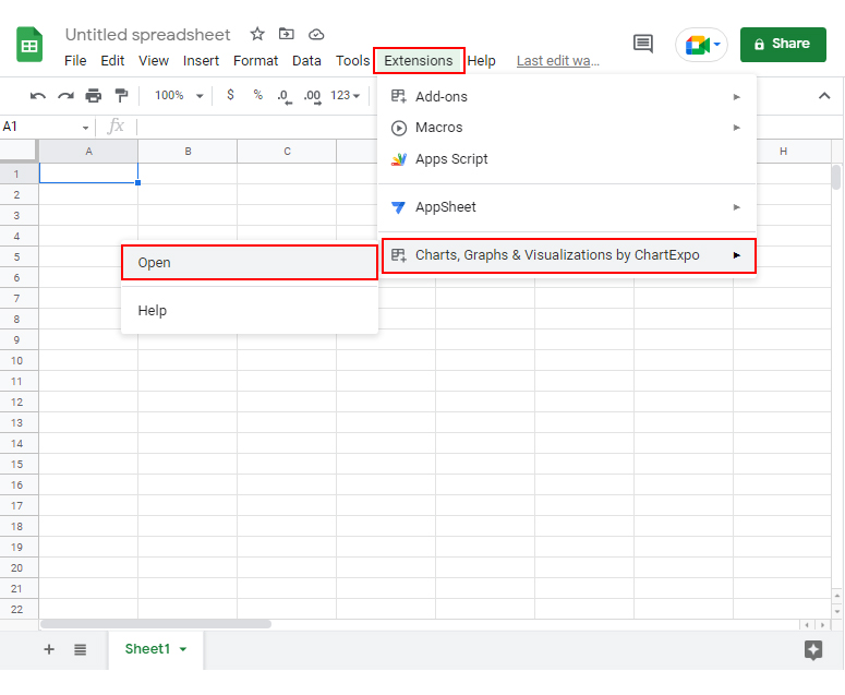
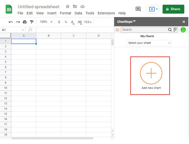
Let us take the necessary steps in using one of the time series graph examples in Google Sheets.


The best visualization for displaying time series data is the Multi-Axis Line Graph. This is because it can plot multiple variables against time.
From a Multi-Axis Line visualization, you can establish relationships among variables. This feature helps you to obtain many insights from such a chart.
Use a time series graph when you want to give a compelling data story to your audience. Your data story should reveal the insights your audience needs.
In addition, you should use a time series graph to highlight key takeaways for your audience.
Let us recap what we have covered so far.
We have defined what a time series graph is. We have learned that it is a visualization that visualizes variables against time.
If stakeholders in your company would require that you provide a forecast report, this is the graph to use.
We have covered the types of time series graphs in Google Sheets, which include:
The Graph types have given us a deeper understanding of how we can identify data trends over time.
We also used real-life time series analysis examples to broaden our practical skills. We used a Multi-Axis Line Graph in our example.
Our goal was to gain meaningful insights for our data store. With such time series graph examples, we can give a compelling forecast to our audience.
None of this would have been possible without the Google Sheets add-on called ChartExpo. It has saved much time with just a few clicks.
Now it’s time for you to try it. Start a 7-day free trial and access one of the time series graph examples.