Categories
By ChartExpo Content Team
Customer Satisfaction (CSAT) is like the heartbeat of your business. It’s the steady pulse that tells you how well you’re doing in the eyes of your customers.


Ever had a fantastic meal at a restaurant, only to have it ruined by poor service? How likely are you to return? Customer satisfaction (CSAT) works the same way. It’s the silent judge that can make or break your business.
Why does CSAT matter so much? Simple. Happy customers are loyal customers. And loyalty translates directly to your bottom line. But here’s the kicker – understanding CSAT isn’t just about asking, “Are you satisfied?” It’s about digging deeper, finding those golden nuggets of insight that tell you what’s working and what’s not.
In this blog, we’ll dive into the nitty-gritty of CSAT. We’ll explore the best practices, the pitfalls, and the downright ugly truths of customer satisfaction. But don’t worry, we’ll keep it light, engaging, and maybe even a little fun. After all, who said analytics has to be boring?
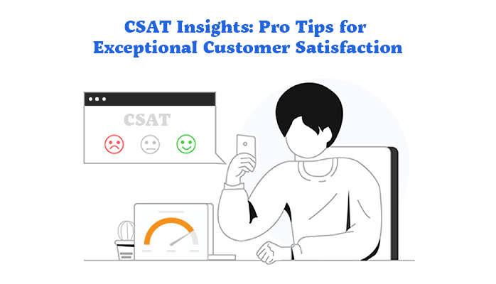
CSAT measures how happy customers are with your services or products. It’s a simple survey question: “How satisfied are you with our service?” Customers respond with ratings, usually on a scale from 1 to 5. High scores mean happy customers; low scores mean there’s work to do.
CSAT is vital for business success. High CSAT scores show you’re meeting customer needs. Happy customers stay loyal, buy more, and spread positive word-of-mouth. This boosts sales and reduces churn. Essentially, satisfied customers are your best marketers.
CSAT has come a long way. In the past, businesses guessed how customers felt. Now, with digital surveys and real-time feedback, it’s easy to gather and analyze data. This evolution means businesses can quickly adapt and improve based on customer feedback.
Measuring CSAT transforms businesses. It highlights areas needing improvement and shows what’s working well. With this data, companies can refine their strategies, enhance products, and provide better service. The result? Happier customers and a stronger bottom line.
High CSAT scores don’t just mean loyal customers; they also attract new ones. Happy customers are likely to recommend your business to others. This word-of-mouth marketing is invaluable. Plus, loyal customers are less price-sensitive, meaning they’re willing to pay more for your products or services.
A high Satisfaction Score strengthens your brand’s reputation. Customers trust businesses that consistently deliver great experiences. This trust builds a strong brand image, making you a preferred choice in the market. A good reputation attracts new customers and retains existing ones.
Before anything else, you need clear goals. Know what you want from your Customer Satisfaction (CSAT) program. Are you looking to improve product quality? Enhance customer service? Pinpoint your objectives.
CSAT stands for Customer Satisfaction Score. It measures how happy your customers are. This score is key to understanding their experience. Use it to track changes and drive improvements.
Start by knowing your current status. Use past data to see where you stand. This will help you measure progress and set realistic targets.
Good surveys need good questions. Keep them short and relevant. Ask things like, “How satisfied were you with our service?” or “What can we improve?” Make sure they are easy to understand.
CSAT often use a simple scale (e.g., 1-5). This makes it easy for customers to respond quickly. Use these scores to spot trends and identify areas for improvement.
Timing matters. Send surveys right after a customer interaction. Don’t overdo it – too many surveys can annoy customers. Find a balance that works for your business.
Get your surveys out through the right channels. Use email, SMS, or even in-app prompts. Choose what works best for your audience.
To get more responses, make it easy and quick. Offer a small incentive, like a discount or a chance to win something. Keep the survey short and respect their time.
Prevent survey fatigue by mixing things up. Don’t ask the same questions every time. Keep surveys fresh and relevant to keep customers engaged.
Collecting CSAT data can be tricky. You need the right tools to gather useful info without drowning in numbers. Online surveys, CRM systems, and customer feedback tools are your friends. Use them smartly to grab clean, accurate data.
Messy data? Big problem. Keep it clean by setting up strict data entry rules. Regular audits help spot errors. Use clear labels and consistent formats. Store data in a secure, easily accessible database. Neat data equals clear insights.
The CSAT score is simple but powerful. Ask customers to rate their satisfaction on a scale, say 1 to 5. Calculate the percentage of customers who gave you the highest ratings. That’s your Satisfaction Score. Easy, right?
Look at your Satisfaction Score over time. Are they going up or down? Check for peaks and dips. They tell a story. Maybe a new product launch spiked scores. Or a service glitch tanked them. Trends show you what’s working and what’s not.
Break down your data by age, location, or purchase history. Different groups have different needs. Maybe younger customers are happier with mobile support. Older folks might prefer phone help. Segmenting helps you tailor services to each group’s needs.
Want to see the future? Use predictive analytics. It’s about using past data to forecast future trends. If scores drop every winter, you can prepare. Predictive tools help you stay ahead of customer needs.
Regression analysis shows how different factors affect CSAT. Factor analysis digs deeper, finding hidden connections in your data. Both methods uncover the why behind your scores. Use them to fine-tune your services.
Machine learning makes your job easier. It automates data analysis, finding patterns you might miss. Algorithms can predict satisfaction trends, suggest improvements, and even handle customer queries. Let machines do the heavy lifting.
CSAT, Net Promoter Score (NPS), and Customer Effort Score (CES) are key metrics for understanding customer experience. CSAT measures immediate satisfaction, NPS gauges loyalty, and Customer Effort Score (CES) evaluates the ease of customer interactions. By integrating these, you get a broader view of customer sentiment. CSAT tells you if your customers are happy now. NPS shows if they’ll stay. CES points out friction areas. Combining these offers a richer insight, letting you address short-term and long-term customer needs effectively.
Net Promoter, NPS, NPS Prism and many other terms related to NPS are registered trademarks of Bain & Company Inc., Satmetrix Systems Inc., and Fred Reichheld.
To get the full picture, analyze feedback from CSAT, NPS, and CES together. Each metric highlights different aspects of the customer journey visualization. Use CSAT for quick wins, NPS for strategic planning, and CES for process improvements. Together, they provide a 360-degree view. This approach helps pinpoint specific issues and understand broader trends. It’s like having a map and compass, guiding your customer service strategy more accurately.
Happy customers spend more. They return, recommend, and contribute to a steady revenue stream. CSAT directly impacts your bottom line. Track the ROI of CSAT by linking satisfaction scores to repeat purchases, upselling, and customer referrals. This shows how investment in customer satisfaction pays off. A high Satisfaction Score often correlates with higher profitability. By measuring these connections, you can justify budget allocations to customer experience improvements.
CSAT isn’t just a number. It’s a predictor of future revenue. Develop a Customer Satisfaction Index (CSI) to quantify how CSAT influences long-term value. This index links the Satisfaction Score with customer lifetime value (CLV), showing the financial benefit of satisfied customers over time. A high Satisfaction Score often means longer customer relationships and higher lifetime value. Use this formula to forecast revenue based on satisfaction trends, helping in strategic planning and resource allocation.
Integrate CSAT data into your Customer Relationship Management (CRM) system for actionable insights. This centralizes customer feedback, making it accessible across teams. Use automation to tag and categorize responses, creating an easy-to-navigate feedback system. This integration helps real-time tracking of customer sentiment and quick resolution of issues. Best practices include setting up automated alerts for low scores and using dashboards to visualize trends.
CSAT insights shouldn’t stay siloed. Share them across departments to drive improvements. Marketing can refine campaigns based on customer feedback. Sales can identify and address pain points. Product development can prioritize features that enhance satisfaction. Cross-functional collaboration ensures that every team benefits from customer insights. Regular inter-departmental meetings to discuss CSAT trends can foster a culture of continuous improvement.
Healthcare is personal. Every interaction, from booking an appointment to post-visit follow-ups, affects patient satisfaction. Custom surveys help capture these nuances. Ask patients about wait times, the clarity of communication with healthcare providers, and the ease of navigating the facility. Use simple, direct questions. For example, “Was your wait time reasonable?” or “Did the doctor explain your treatment clearly?”
Consider the Mayo Clinic. They implemented real-time feedback kiosks in their clinics, utilizing self-service analytics to track patient responses and leading to a significant improvement in patient satisfaction scores.
Patients felt heard, and immediate action could be taken to address concerns. Another example is Cleveland Clinic, which used detailed post-visit surveys and self-service analytics to refine its patient care processes. They focused on specific feedback, like the clarity of discharge instructions, which led to better patient outcomes and higher satisfaction scores.
In finance, trust and efficiency are key. To enhance CSAT, focus on metrics like response time, resolution time, and customer understanding of financial products. Utilizing a Customer Journey Map can help identify touchpoints where improvements are needed.
Strategies include personalized communication and proactive service. For instance, a bank might send a customized email explaining a customer’s new credit card features shortly after they receive it, ensuring the customer feels supported throughout their journey.
Compliance is critical in finance. Use surveys to ensure customers understand regulatory requirements and feel secure. Ask questions like, “Did you understand the terms and conditions?” or “Do you feel your data is secure with us?” Regular training for customer service teams on regulatory updates can also boost customer confidence and satisfaction.
In tech, product feedback is gold. Companies like Apple and Microsoft use CSAT insights post-support interactions to refine their services. Questions might include, “Was your issue resolved promptly?” or “How would you rate the overall support experience?” This feedback helps in tweaking both product features and support processes.
Take Amazon. Their use of CSAT insights helped identify and fix pain points in their customer service. By focusing on metrics like issue resolution and ease of finding help, they streamlined their support system, leading to higher customer satisfaction. Similarly, Google’s use of brief, focused surveys after interactions has provided valuable insights, leading to more intuitive and user-friendly product updates.
Creating top-notch training modules isn’t rocket science. Focus on skills and strategies that directly impact customer satisfaction. Think about what your team needs to know. Is it product knowledge? Communication techniques? Problem-solving skills? Break it down into bite-sized lessons. Use real-world scenarios and role-playing to make it stick. Make training interactive. Boring lectures? Nope. Hands-on practice? Absolutely.
How do you know if your training is working? Simple. Check your CSAT scores. If they’re climbing, you’re on the right track. Use surveys and feedback forms to get insights. Compare scores before and after training. Look for patterns. Are certain modules making a bigger difference? Focus on those. It’s all about continuous improvement.
Performance reviews can be a drag. But not when you’ve got solid CSAT data. Use client feedback to highlight strengths and areas for growth. Show employees how their actions directly impact customer happiness. It’s motivating to see concrete examples. Plus, it takes the guesswork out of reviews. Everyone knows where they stand.
Who doesn’t love a good reward? Recognize your team’s hard work with thoughtful rewards. It could be anything from a shoutout in a meeting to a bonus. The key? Make it meaningful. Tie rewards to specific achievements. Did someone get rave reviews from a client? Celebrate it. Rewards boost morale and drive performance.
Never settle. Encourage your team to keep learning and growing. Provide resources for self-improvement. Set up regular check-ins to discuss progress. Celebrate small wins. Share success data stories. Create a culture where everyone’s excited to get better every day.
Get your team involved in CSAT initiatives. Ask for their ideas. How can you improve customer satisfaction? Hold brainstorming sessions. Implement their suggestions. When employees feel heard, they’re more engaged. And that’s good for everyone.
Real-time data gives you immediate insights into CSAT. Knowing how your customers feel right now helps you react promptly. Instead of waiting weeks or months, you get to know immediately if your service or product hits the mark.
Being quick to act on feedback shows customers you care. It’s not just about fixing problems but improving the overall experience. When you act fast, you turn unhappy customers into happy ones and keep the happy ones even happier. Fast action boosts loyalty and can turn negative experiences into positive stories.
A real-time dashboard is your feedback hub. To build one, you need a few key parts:
Connecting new feedback tools with your current systems keeps things smooth. Your CRM, helpdesk, and other software should work together. This way, your team has all the info in one place, saving time and reducing errors. Easy integration means less hassle and more focus on improving CSAT.
Constantly watch your data. Don’t wait for a quarterly review to make changes. Use the feedback as it comes in to tweak and refine your approach. Look for patterns and trends. If something’s off, fix it now, not later.
Be ready to change course based on what your data tells you. If customers don’t like a new feature, you can adjust or roll it back right away. Real-time feedback allows you to pivot quickly, keeping your strategy fresh and aligned with customer needs.
A great dashboard is clear, concise, and actionable. It includes these key components:
Personalize your dashboard to meet specific needs. Change colors, fonts, and layouts. Use filters to focus on what’s important. Keep it simple and clear. Less is more.
ChartExpo simplifies data visualization. It’s user-friendly and integrates with popular platforms. You don’t need to be a data scientist to create stunning charts.
ChartExpo helps you see trends and patterns. Use it to make data-driven decisions. Choose the right chart type for your data. CSAT Score Bar Chart and CSAT Score Survey Chart can tell different stories.
Set up email alerts to keep on top of changes. Get notified when key metrics hit certain thresholds. Stay proactive, not reactive.
Widgets offer a quick snapshot of your data. Place them on your dashboard for instant access to vital stats. They update in real-time, so you’re always in the loop.
The following video will help you to create a CSAT Score Survey Chart in Microsoft Excel.


The following video will help you to create a CSAT Score Survey Chart in Google Sheets.
Predictive analytics is the crystal ball for customer satisfaction. With tools like regression analysis and machine learning, businesses can forecast trends and understand customer behavior. By analyzing past data, companies can predict future satisfaction levels. This helps in crafting strategies that meet customer expectations. Predictive models also help identify key factors influencing satisfaction. Knowing these can guide businesses in making improvements before issues arise.
Anticipating customer issues before they become problems is a game-changer. Using predictive analytics, companies can spot patterns that indicate potential problems. By doing this, businesses can address issues proactively, enhancing customer satisfaction and supporting their customer loyalty rewards program. For instance, if data shows that customers often face delays with a particular service, steps can be taken to improve speed. This proactive approach not only boosts satisfaction but also strengthens customer loyalty through targeted rewards.
AI and machine learning are revolutionizing CSAT. These technologies make data interpretation faster and more accurate. AI tools can analyze vast amounts of data to uncover insights that humans might miss. Machine learning algorithms can identify patterns and trends in customer feedback. This helps businesses understand customer needs and preferences better. By leveraging AI, companies can make informed decisions that enhance customer satisfaction.
Evaluating customer feedback manually is time-consuming and prone to errors. Automation, powered by AI, changes this. Automated systems can quickly sift through feedback, categorize it, and highlight key issues. This speeds up the process and ensures no critical feedback is overlooked. Automation also allows for real-time analysis, enabling businesses to respond promptly to customer concerns. This efficiency leads to quicker resolutions and happier customers.
The future of CSAT measurement is bright with innovation. New techniques are emerging that go beyond traditional surveys. Real-time feedback tools, sentiment analysis, and social media monitoring are some of the latest methods. These tools provide a more comprehensive view of customer satisfaction. They capture feedback in real time, offering immediate insights. As technology advances, we can expect even more innovative methods to measure customer satisfaction effectively.
To stay ahead, businesses need to evolve their CSAT programs. Future CSAT programs will likely integrate more advanced technologies and innovative techniques. Embracing AI, predictive analytics, and real-time feedback tools will be crucial. Companies will also need to focus on personalization, ensuring that customer interactions are tailored to individual needs. By preparing for these changes, businesses can ensure they remain competitive and continue to meet customer expectations.
Boosting response rates can be tough. Many customers ignore surveys, making data hard to collect. To tackle this, simplify surveys. Shorter surveys with clear, concise questions get more responses. Offer incentives like discounts or entries into prize draws. Make it personal; address customers by their names and reference their specific interactions. This personal touch shows you value their opinion.
Bias skews data, making it less reliable. One way to reduce bias is to randomize question order. This prevents patterns that influence answers. Avoid leading questions; they should be neutral. Offering a “prefer not to answer” option can also help, giving respondents an out if they’re unsure.
Clean data is essential. Standardize your data entry process to avoid inconsistencies. Train your team thoroughly on how to handle data. Use automated tools to catch errors early. Regularly audit your data to spot and correct any mistakes.
Validation ensures your data is correct. Compare survey results with other data sources. If your survey says customers are unhappy, check if there’s a rise in complaints. Use control questions in your surveys to test if respondents are paying attention.
Feedback is meaningless without action, and a strong feedback loop ensures it drives meaningful change. After gathering feedback, analyze it promptly to identify recurring issues and address them effectively. Close the feedback loop by informing customers about the improvements made based on their suggestions. This approach demonstrates that you not only listen but also take action, reinforcing trust and customer loyalty.
Let customers see the impact of their feedback. Use emails, newsletters, or social media to communicate changes. Be specific about what feedback led to what change. This transparency builds trust and encourages more feedback in the future.
When it comes to winning, top companies have a few tricks up their sleeves. Apple keeps its customers loyal by creating sleek products and offering top-notch customer service. Amazon focuses on quick delivery and a vast selection. Toyota stays ahead with its efficient manufacturing process, saving time and money. These giants know their strengths and use them well.
Take a page from Apple’s playbook: Know what your customers want and keep giving it to them. With Amazon, it’s all about making things easy for the customer. And from Toyota, learned the value of doing things right the first time. Each of these companies has a clear strategy that brings big results. Study them, and you can find ways to make their lessons work for you.
Even the best make mistakes. Blockbuster ignored the digital shift, and Kodak stuck with film too long. These missteps offer clear lessons: Stay adaptable and keep an eye on trends. Don’t cling to old ways when new ones are taking over.
To bounce back from mistakes, learn to pivot. Netflix started with DVDs by mail but switched to streaming just in time. IBM went from selling hardware to offering services. These companies turned potential failures into huge successes by being flexible and forward-thinking.
Different industries require different strategies. In retail, Zara thrives by moving fashion from runway to store quickly. In tech, Google wins by constantly innovating and improving its algorithms. Healthcare giant Johnson & Johnson excels by focusing on product safety and customer trust. Each sector has its unique challenges and opportunities, and the winners are those who adapt their strategies to fit.
The key to success in any industry is knowing what works and making it your own. For example, fast fashion works for Zara because they respond quickly to trends. Google’s constant innovation keeps it at the top of search engines. Johnson & Johnson’s emphasis on safety builds trust in healthcare. Learn from these examples, and tailor your approach to fit your context.
When creating surveys, you need to have clear goals. Are you looking to improve product features, understand customer satisfaction, or gauge service quality? Each goal requires specific questions.
Not all customers are the same. Tailor your questions based on who’s answering. New users, loyal customers, and occasional visitors all have different perspectives.
Pick the right place to reach your customers. Your audience might prefer emails, in-app messages, or even SMS.
Timing is key. Send surveys when customers are most likely to respond. Too often, and they’ll get annoyed; too rare, and you’ll miss out.
Make your surveys feel personal. Use the customer’s name and refer to their recent interactions with your product or service. This shows that you value their specific experience.
People are more likely to respond if they see a benefit.
By focusing on these areas, you can create CSAT that not only gather valuable feedback but also keep your customers engaged and satisfied. Remember, the key to a good survey is relevance and respect for your customers’ time.


Happy customers are loyal customers. A high CSAT score means customers are satisfied, which can lead to repeat business and positive word-of-mouth. It also highlights areas where a company can improve.
CSAT is usually measured with a survey. After a customer interaction, a survey asks, “How would you rate your experience?” Customers choose from a scale, often from 1 to 5 or 1 to 10. The scores are then averaged to get the CSAT score.
A score above 80% is considered good. It means most customers are satisfied. Scores can vary by industry, so it’s best to compare within the same field.
A good CSAT score varies by industry, but generally, a score of 80% or higher is considered excellent. However, it’s more important to focus on improving your score over time rather than comparing it to industry benchmarks.
CSAT should be measured regularly to track customer satisfaction over time. Many businesses measure it after every significant customer interaction, while others might do so quarterly or biannually. The key is consistency in measurement to capture accurate trends and insights.
Negative feedback should be seen as an opportunity to improve. Respond promptly to address the issue, and investigate to understand the root cause. Use this information to make necessary changes and prevent similar issues in the future. Additionally, follow up with the customer to let them know their feedback has led to improvements.
Understanding and leveraging CSAT can transform your business from the ground up. By consistently gathering feedback, you tap directly into your customers’ minds, understanding their needs and expectations. It’s not just about numbers – it’s about stories and experiences that shape how your customers see your brand.
Think about the last time you received exceptional service. How did it make you feel? That’s the power of CSAT at work. By focusing on these moments, you create loyal advocates who don’t just return – they bring others with them. Implementing CSAT is like planting seeds for future growth. Each piece of feedback is a chance to water those seeds, nurturing stronger relationships and a healthier bottom line.
So, as you move forward, keep your finger on the pulse of your customer satisfaction. Use their insights to guide your actions, continually refining your approach to meet their needs better. Remember, happy customers are the cornerstone of a thriving business.
In the end, it’s simple: keep your customers happy, and they’ll keep your business thriving. Listen, learn, and act on their feedback, and watch as their satisfaction propels you to new heights.
How much did you enjoy this article?


Google Forms to Google Sheets keeps your data organized and current with every submission. Learn the steps, methods, and tips now!

Product survey questions reveal what customers truly think. Learn how to ask the right ones and act on the survey results. Read on!

Learn how the 5-Point Performance Rating Scale improves employee evaluations with clear, consistent, and fair performance reviews across teams.


