• Home
  • Tools dropdown img
    • Spreadsheet Charts

      • ChartExpo for Google Sheets
      • ChartExpo for Microsoft Excel
    • Power BI Charts

      • Power BI Custom Visuals by ChartExpo
    • Word Cloud

  • Charts dropdown img
    • Chart Category

      • Bar Charts
      • Circle Graphs
      • Column Charts
      • Combo Charts
      • Comparison Charts
      • Line Graphs
      • PPC Charts
      • Sentiment Analysis Charts
      • Survey Charts
    • Chart Type

      • Box and Whisker Plot
      • Clustered Bar Chart
      • Clustered Column Chart
      • Comparison Bar Chart
      • Control Chart
      • CSAT Survey Bar Chart
      • CSAT Survey Chart
      • Dot Plot Chart
      • Double Bar Graph
      • Funnel Chart
      • Gauge Chart
      • Likert Scale Chart
      • Matrix Chart
      • Multi Axis Line Chart
      • Overlapping Bar Chart
      • Pareto Chart
      • Radar Chart
      • Radial Bar Chart
      • Sankey Diagram
      • Scatter Plot Chart
      • Slope Chart
      • Sunburst Chart
      • Tornado Chart
      • Waterfall Chart
      • Word Cloud
    • Google Sheets
      Microsoft Excel
  • Services
  • Pricing
  • Contact us
  • Blog
  • Support dropdown img
      • Gallery
      • Videos
      • Contact us
      • FAQs
      • Resources
    • Please feel free to contact us

      atsupport@chartexpo.com

Categories
All Data Visualizations Data Analytics Surveys
Add-ons/
  • Google Sheets
  • Microsoft Excel
  • Power BI
All Data Visualizations Data Analytics Surveys
Add-ons
  • Google Sheets
  • Microsoft Excel
  • Power BI

We use cookies

This website uses cookies to provide better user experience and user's session management.
By continuing visiting this website you consent the use of these cookies.

Ok

ChartExpo Survey


Home > Blog > Data Analytics

Website Performance Metrics: From Data to Smart Visual

What are website performance metrics, and why should you care? If your site takes over 3 seconds to load, over 40% of users will leave. That’s a hard truth. Slow websites cost businesses billions, where a one-second delay in load time can reduce conversions by 7%. This means lost sales, lost engagement, and lost trust.

Website Performance Metrics

Website performance metrics are not optional. They are essential. These numbers tell you how fast your site loads, how it responds, and how users experience it. Without them, you’re flying blind.

Google uses site speed as a ranking factor. That’s not a theory—it’s confirmed. A faster site gets better placement, resulting in more clicks and more revenue.

You need to track website performance metrics the same way you track sales. Why? Businesses that analyze their performance weekly grow twice as fast. Metrics show you where to fix, where to improve, and where to win. This isn’t fluff—it’s survival.

Performance should be on your list if you’re trying to analyze competitor website traffic. A competitor with a faster site might win over your customers without saying a word. People trust speed and remember ease.

Numbers don’t lie. They guide, point, and sharpen decisions. Understanding your data gives you the edge in a digital space where milliseconds count.

Let me show you why performance isn’t a background issue—it’s front and center. Always.

First…

Table of Contents:

  1. What are Website Performance Metrics?
  2. Importance of Website Engagement Metrics
  3. What are the Top Metrics for a Website?
  4. How Do You Measure Website Performance Metrics?
  5. How Do You Analyze Website Performance in Google Sheets?
  6. What are the Best Practices for Website KPIs?
  7. FAQs
  8. Wrap Up

What are Website Performance Metrics?

Definition: Website performance metrics are data points that show how well a website runs. They measure speed, responsiveness, and user experience. These metrics include load time, bounce rate, and uptime. Businesses use them to spot and resolve issues quickly.

Clear data helps teams improve site quality. Website performance metrics support smarter decisions through visual tools like KPI graphs. When combined with store performance dashboards, they show how performance affects revenue. These metrics keep your site fast, efficient, and ready to compete.

Importance of Website Engagement Metrics

Numbers without meaning are noise. That’s why website engagement metrics matter. They help translate visitor behavior into business insight. Every click, scroll, or exit is feedback—and it’s measurable. Let’s break down why these metrics deserve your attention:

  • Understanding user behavior: You can’t fix something you don’t know is wrong. Engagement metrics show where users go, how long they stay, and when they leave—revealing their journey.
  • Better user experience (UX): They bounce when you are stuck or frustrated. These figures identify friction points you can straighten out from the experience and get people back engaged.
  • Tweaking marketing strategies: Engagement data offers insight into which content hits all the right notes and which one misses the mark. With insights for individual campaigns, you can concentrate on actions that lead to tangible results.
  • Boosting SEO rankings: Search engines track how users interact with your site. High engagement tells Google your content is valuable, which can push your rankings higher.
  • Driving business decisions: Gut feelings are risky. Metrics and KPIs provide solid evidence for what to tweak, what to invest in, and what to stop doing altogether.

What are the Top Metrics for a Website?

What makes a website truly perform? It’s not about flashy graphics or fancy plugins. It’s about speed, clarity, and action. The top website performance metrics show exactly how your site behaves—and how users respond. Whether you’re tracking traffic or refining your content, these numbers don’t lie:

  • Page Load Time: If the site loads slowly, people leave quickly. A 1-second delay can lower the conversion rate by 7%.
  • Bounce Rate: These are the people who come to your page and then go away. A high bounce rate indicates that your content or design might not be engaging visitors.
  • Average Session Duration: This metric shows how long users stay on your site. Longer sessions often signal stronger content and better engagement.
  • Pages Per Session: This is the number of pages a user looks at during a session. More pages per session generally mean your site is interesting and easy to navigate.
  • Conversion rate: This is the percentage of visitors who take a desired action, like buying, signing up, or clicking a link. It’s a core customer success metric that ties directly to ROI.
  • Core web vitals: These are Google’s essential performance metrics, measuring load speed, responsiveness, and visual stability. Strong Core Web Vitals improve both UX and SEO.

How Do You Measure Website Performance Metrics?

You can’t fix what you don’t measure. That’s the golden rule of performance. Tracking website performance metrics isn’t reserved for tech giants. Today, every brand can—and should—measure its site’s behavior in real-time. Data shows you what’s fast, what’s broken, and what drives results.

How?

  1. Use web analytics tools: Tools like Google Analytics or Hotjar give deep insight into traffic, behavior, and user paths. They also help analyze competitor website traffic, letting you benchmark your performance.
  2. Monitor page speed: Use tools like GTmetrix or Pingdom to track how fast your site loads. Speed affects both user experience and SEO rankings.
  3. Check core web vitals: Google’s metrics focus on loading (LCP), interactivity (FID), and stability (CLS). Keeping these scores high ensures a smoother, more reliable experience.
  4. Conduct real user monitoring (RUM): RUM tools track performance based on real visitor sessions. They reflect real-world speed and behavior, not lab simulations.
  5. Use A/B testing tools: Platforms like Optimizely or Google Optimize show which version of a page performs better. These tools tie into KPI graphs, turning experiments into decisions.

How Do You Analyze Website Performance in Google Sheets?

Let’s face it—website performance metrics aren’t thrilling dinner conversations. But they are what separates a high-performing site from one that’s bleeding traffic.

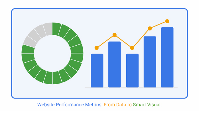
You’ve got the data? Great. Now what? Staring at endless rows in Google Sheets won’t get you far. Sure, it’s functional—but not insightful. So what? Turn to data visualization. Seeing your data tells a story that spreadsheets can’t.

And Google Sheets? It fumbles the plot. But don’t fret; we have ChartExpo. It turns boring tables into stunning, insightful visuals that make sense. Now your metrics speak—and people listen.

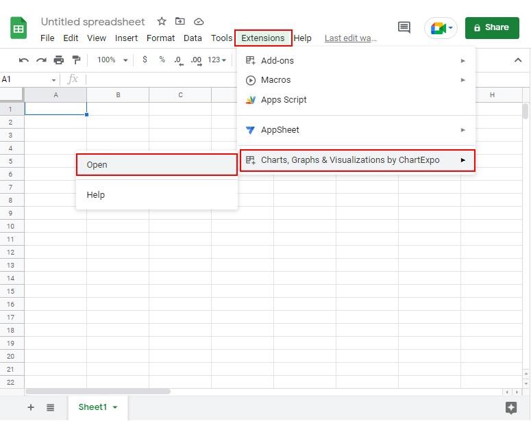
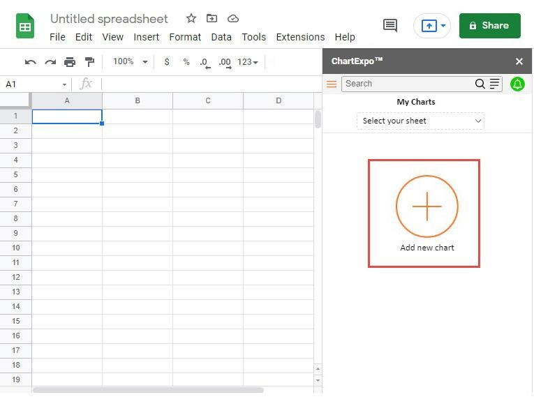
How to Install ChartExpo in Google Sheets?

  1. To start using ChartExpo, download it directly from the Google Sheets program. To do this, select Extensions from the top toolbar.
  2. A menu will appear. Click the Get add-ons option.
  3. Search for ChartExpo, and click on Charts, Graphs & Visualizations by ChartExpo when it appears in the results.
  4. Click the Install button. You will have to confirm your Google account and accept some permissions.

ChartExpo charts are available both in Google Sheets and Microsoft Excel. Please use the following CTAs to install the tool of your choice and create beautiful visualizations in a few clicks in your favorite tool.

Example

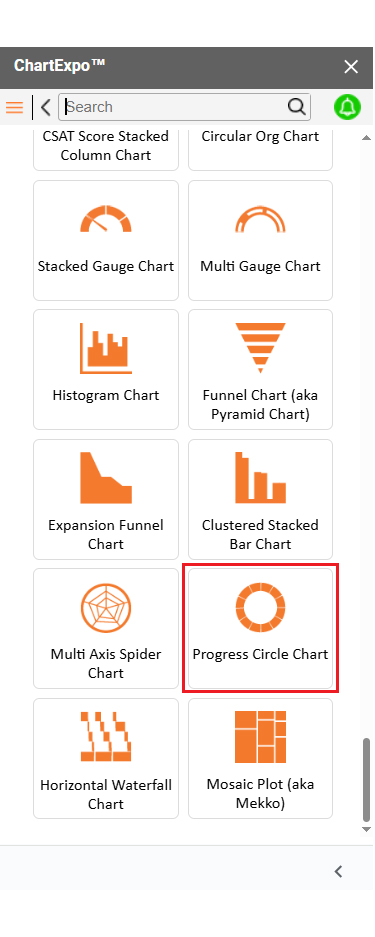
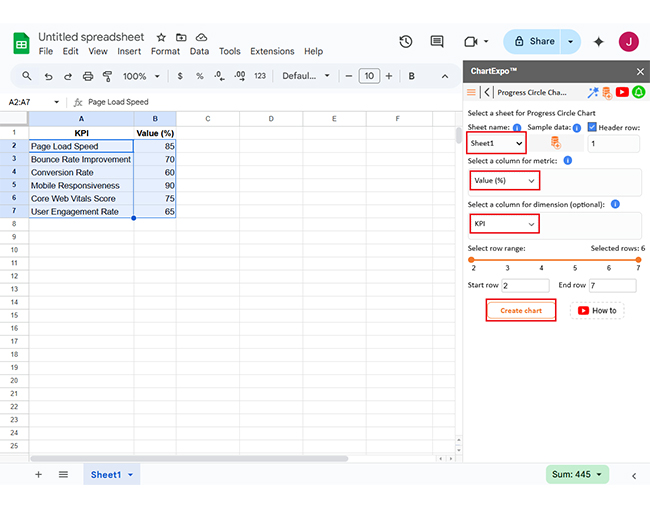
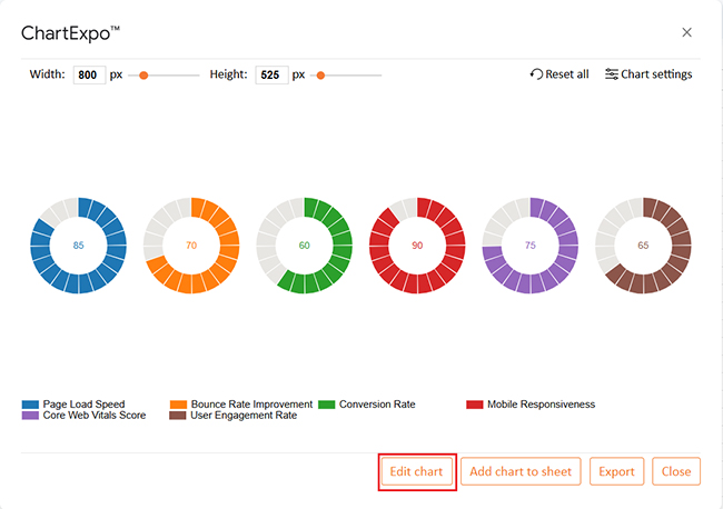
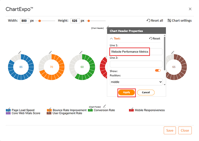
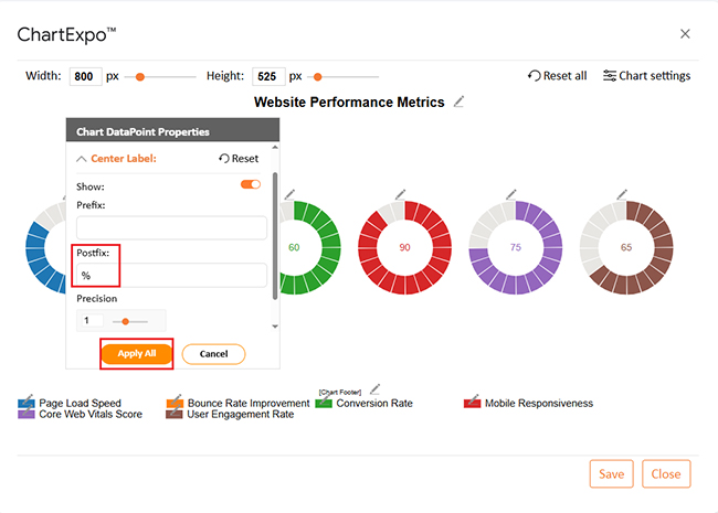
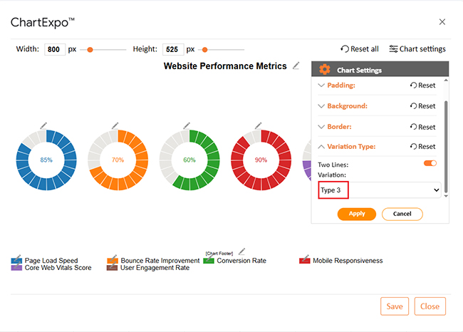
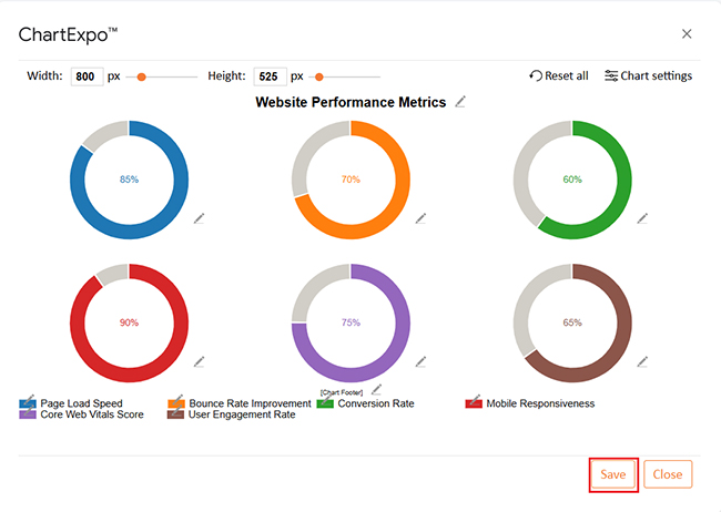
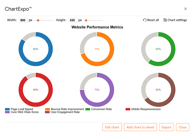
Let’s visualize this sample data in Google Sheets using ChartExpo and analyze it.

KPI Value (%)
Page Load Speed 85
Bounce Rate Improvement 70
Conversion Rate 60
Mobile Responsiveness 90
Core Web Vitals Score 75
User Engagement Rate 65
  • To get started with ChartExpo, install ChartExpo in Google Sheets.
  • Go to Extensions > Charts, Graphs & Visualizations by ChartExpo > Open.
Website Performance Metrics
  • To access the charts library, click the Add new chart button.
Website Performance Metrics
  • Once it loads, scroll through the charts list to locate and choose the “Progress Circle Chart”.
Website Performance Metrics
  • First, insert the data table into the sheet. Then, choose the Sheet name from the drop-down menu in the ChartExpo section.
  • Select the metric column; metric is the numeric column in your data sheet.
  • Select the dimensions column; the dimension is the categorical column in your datasheet that contains text information.
  • Click the Create chart button to complete the process.
Website Performance Metrics
  • If you want to add anything to the chart, click the Edit Chart button:
Website Performance Metrics
  • Click the pencil icon next to the Chart Header to change the title.
  • It will open the properties dialog. Under the Text section, you can add a heading in Line 1 and enable Show.
  • Give the appropriate title of your chart and click the Apply button.
Website Performance Metrics
  • You can add the percentage sign with all values as follows:
Website Performance Metrics
  • You can change the data representation by clicking on Settings as follows:
Website Performance Metrics
  • After making all the changes, click the “Save” button:
Website Performance Metrics
  • Your final chart will look like the one below.
Website Performance Metrics

Insights

  • Mobile responsiveness: Strong performance at 90%.
  • Page load speed: Solid score of 85%.
  • Conversion rate: 60% – needs improvement at 60%.
  • User engagement: Moderate performance at 65%.
  • Summary: While speed and mobile usability are high, improving conversion and engagement is key to boosting overall website performance.

What are the Best Practices for Website KPIs?

KPIs can guide your strategy—or completely mislead you. It all depends on how you set them. Great websites don’t chase numbers. They track the right ones at the right time for the right reasons. That’s what smart teams do with metrics and KPIs that drive results, not confusion.

Follow these best practices to get the most out of your website KPIs:

  • Align KPIs with business objectives: Your KPIs should reflect what your business is trying to achieve. If you aim for sales, clicks alone won’t tell the full story.
  • Focus on actionable metrics: Track numbers that lead to change. Vanity stats may look good, but they rarely improve outcomes.
  • Segment your data: Looking at averages hides real insights. Break data by device, location, or channel to find where performance shifts.
  • Monitor trends over time: A single spike means little. According to KPI graphs, consistent trends help you spot growth or decline early.
  • Set SMART goals: Vague goals fail. Use SMART KPIs—specific, measurable, achievable, relevant, and time-bound—to stay focused and accountable.
  • Use dashboards for visibility: Don’t hide data in spreadsheets. Store performance dashboards put KPIs front and center so your team always knows what matters.

FAQs

What are the top 3 website performance metrics to monitor?

Page load time shows how fast your site responds. The bounce rate reveals if users leave quickly. Conversion rate tracks actions taken. These three website performance metrics clearly show user experience and effectiveness.

What are key website metrics?

Key metrics include session duration, pages per session, and traffic sources. These show how users interact with your content. Add core web vitals for technical health. Together, they form the backbone of your store performance dashboards and decision-making.

Wrap Up

Website performance metrics help you understand how your site runs. They show what’s fast, what’s slow, and what turns people away. These metrics are your digital pulse check. Ignore them, and you’re flying blind.

Speed matters. Page load time affects bounce rates and SEO. A slow site costs you leads. But it’s not just speed. Engagement, time on site, and conversions count too. These numbers shape your strategy, guiding every decision.

Now, think broader. Ask yourself: What are sales KPIs? These metrics track revenue, lead conversion, and deal closure. They show if your marketing turns into money.

Need better goals? Use SMART KPI examples. These goals are Specific, Measurable, Achievable, Relevant, and Time-bound. They keep your team aligned and focused.

And never forget the customer success metric. It shows how happy and loyal your users are. Happy users return, and loyal users grow your brand. That’s the real win.

Finally, performance metrics turn traffic into truth. They help you fix problems, set goals, and build a stronger website that drives success. To visualize this data clearly and take smarter action, install ChartExpo.

How much did you enjoy this article?

PBIAd1
Start Free Trial!
155462

Related articles

next previous
Data Analytics7 min read

Leveraging Big Data Analytics to Reduce Healthcare Costs

This guide dives deep into how to leverage big data analytics to reduce healthcare costs. It shows you why you should use big data in the healthcare industry.

Data Analytics9 min read

Bank Dashboard: Enhancing Insights Through Data

Here is all you need to know about bank dashboards. You'll discover key features of an effective bank dashboard and how to analyze a banking dashboard.

Data Analytics8 min read

Metrics vs. Measures: Understanding the Key Differences

Metrics vs. measures track the right data and explain performance. This blog shows how to use both effectively with examples and visualization tips.

Data Analytics10 min read

DevOps Performance Metrics for Chart-Based Insights

DevOps performance metrics track efficiency in software delivery. This blog shows you how to use them to boost performance and streamline workflows.

Data Analytics8 min read

Social Media Dashboard to Improve Marketing Insights

This guide delves into what a social media dashboard is and how to create one. You'll also discover how to use a social media dashboard and more.

ChartExpo logo

Turn Data into Visual
Stories

CHARTEXPO

  • Home
  • Gallery
  • Videos
  • Services
  • Pricing
  • Contact us
  • FAQs
  • Privacy policy
  • Terms of Service
  • Sitemap

TOOLS

  • ChartExpo for Google Sheets
  • ChartExpo for Microsoft Excel
  • Power BI Custom Visuals by ChartExpo
  • Word Cloud

CATEGORIES

  • Bar Charts
  • Circle Graphs
  • Column Charts
  • Combo Charts
  • Comparison Charts
  • Line Graphs
  • PPC Charts
  • Sentiment Analysis Charts
  • Survey Charts

TOP CHARTS

  • Sankey Diagram
  • Likert Scale Chart
  • Comparison Bar Chart
  • Pareto Chart
  • Funnel Chart
  • Gauge Chart
  • Radar Chart
  • Radial Bar Chart
  • Sunburst Chart
  • see more
  • Scatter Plot Chart
  • CSAT Survey Bar Chart
  • CSAT Survey Chart
  • Dot Plot Chart
  • Double Bar Graph
  • Matrix Chart
  • Multi Axis Line Chart
  • Overlapping Bar Chart
  • Control Chart
  • Slope Chart
  • Clustered Bar Chart
  • Clustered Column Chart
  • Box and Whisker Plot
  • Tornado Chart
  • Waterfall Chart
  • Word Cloud
  • see less

RESOURCES

  • Blog
  • Resources
  • YouTube
SIGN UP FOR UPDATES

We wouldn't dream of spamming you or selling your info.

© 2025 ChartExpo, all rights reserved.