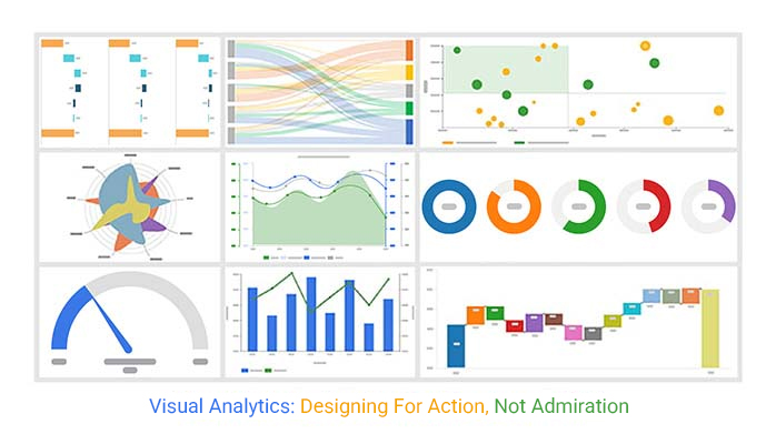
Categories
By ChartExpo Content Team
You built the dashboard. It runs clean. It loads fast. It checks all the boxes. But no one uses it.
This isn’t about color choices or chart types. The real issue is trust, timing, and alignment. When metrics look right but feel wrong, people stop listening. They smile, nod, then go back to gut decisions. Visual analytics wasn’t supposed to end like that.
Visual analytics can help spot trouble early—before the meeting derails, before churn spikes, before the plan collapses. It’s not about more data. It’s about the right data shown the right way, to the right people, at the right moment.
Visual analytics works when dashboards don’t. It signals what matters and when. It highlights shifts, mistrust, misalignment, and gaps. It turns metrics into motion.
Visual analytics won’t impress anyone with polish alone. But it can change what people notice, trust, and act on. It earns its keep when decisions get hard. Ready to make your visuals work harder? Read on.
Imagine working for months on a dashboard. You think it’s perfect, but no one uses it. Frustrating, right? This happens when dashboards don’t align with user expectations. Users need tools that solve their problems or answer their questions. If a dashboard fails to provide this, it gets ignored.
Dashboards should be more than data displays. They must offer insights and value. If users don’t find them helpful, they won’t bother with them. To ensure success, involve users in the design process. Understand their needs and create dashboards that address those needs directly.
Key Performance Indicators (KPIs) are vital for measuring success. But even if the numbers are right, people can feel something’s off. This feeling arises when KPIs don’t align with actual goals. Sometimes, KPIs look good on paper but fail to reflect real progress.
This mismatch creates confusion. People see the numbers but don’t believe them. It’s crucial to choose KPIs that genuinely reflect success. Engage with stakeholders to understand what matters most. Align KPIs with these priorities to ensure they resonate with everyone.
| 5 Pillars of Effective Visual Analytics | ||
| Pillar | Definition | Why It Matters |
| Data Trustworthiness | Ensures data sources are accurate, up-to-date, and clearly sourced. | Builds confidence in the visual output and supports informed decision-making. |
| Timing & Relevance | Presents data at the moment it’s most needed, tailored to user context. | Improves decision speed and ensures data isn’t overlooked or outdated. |
| Signal Clarity | Highlights meaningful trends, changes, or anomalies with minimal distraction. | Reduces noise, supports faster comprehension, and prevents decision fatigue. |
| Actionability | Designs visuals that suggest or support next steps. | Transforms insights into decisions and prevents visual paralysis. |
| Stakeholder Fit | Aligns visuals with the roles, goals, and cognitive style of the audience. | Ensures adoption and usability by making insights resonate across teams. |
Have you ever tried convincing someone who’s already decided? It’s tough. Dashboards often suffer the same fate. Decision-makers might ignore data if it contradicts their beliefs. They stick to their views, regardless of what the dashboard shows.
This bias can undermine the purpose of dashboards. They’re meant to guide decisions, not just confirm them. Encourage an open mindset among users. Promote a culture where data guides decisions, even if it challenges existing opinions. This approach helps dashboards fulfill their potential.
(Not Presenters in Keynote Mode)
Trust in data is like trust in a relationship—once it’s gone, it’s hard to get back. You might have a pristine-looking dashboard, but if the numbers don’t add up, confidence crumbles. To rebuild trust, ensure your data sources are reliable and updated regularly. Transparency about data origins and processing can also help reassure stakeholders.
It’s also essential to verify data accuracy continuously. Implement checks and balances, much like a quality control system in a factory. This vigilance ensures the data you’re presenting is not only attractive but also trustworthy. Address any discrepancies or errors head-on to maintain credibility.
| Visual Analytics Trust Checklist | ||
| Trust Factor | What to Verify | Why It Matters |
| Source Transparency | Clearly identify where data originates from | Builds confidence and allows auditing or replication. |
| Update Frequency | Ensure data is refreshed on a reliable schedule | Prevents decisions based on stale information. |
| Timestamp Visibility | Display last updated time on dashboards | Clarifies data freshness and reduces confusion. |
| Methodology Disclosure | Explain how metrics are calculated | Enables stakeholder understanding and alignment. |
| Anomaly Detection | Flag outliers and irregular values | Avoids misinterpretation due to data quality issues. |
| Error Logging | Track and display known data issues | Shows transparency and active data governance. |
| Data Consistency | Ensure uniform definitions across visuals | Avoids contradictions and misalignment between teams. |
| User Access Control | Restrict editing/viewing rights appropriately | Maintains data integrity and prevents unauthorized changes. |
| Change Logs | Maintain records of data or formula updates | Supports accountability and historical traceability. |
Think of cosmetic visuals as the shiny sports car that looks great but isn’t practical for a family road trip. They might dazzle, but they often lack substance. Combat-ready analytics, on the other hand, are the sturdy SUVs of the data world. They focus on function over form, offering insights that drive decision-making forward.
Your goal is to create visuals that serve a purpose. Choose designs that highlight key data points without distracting fluff. Use graphs and charts that communicate the message clearly and concisely. This way, your analytics are ready for any challenge, providing value beyond surface-level aesthetics.
A poorly designed dashboard can be the silent assassin in meetings. You know the type—cluttered, confusing, and about as helpful as a chocolate teapot. It distracts rather than informs, leaving attendees scratching their heads instead of nodding in agreement. To avoid this, streamline your dashboard to ensure it delivers the right data succinctly.
Keep your audience engaged by presenting data in digestible chunks. Use headlines and subheads to guide them through the information. A well-structured dashboard fosters discussion and collaboration, turning a potential meeting-killer into a productive tool.
| Common Visual Analytics Failures and Fixes | ||
| Failure | Description | Fix |
| Overloaded Dashboard | Too many metrics or charts crammed into one view, causing confusion. | Use progressive disclosure or drill-downs to simplify views. |
| Misleading Axis | Scales manipulated or inconsistent, leading to distorted interpretations. | Standardize axes and include annotations or baselines for context. |
| Stale KPIs | Metrics aren’t updated frequently, causing users to distrust the data. | Ensure automatic refresh schedules and timestamp transparency. |
| No Clear Action Path | Data is presented, but it’s unclear what to do with it. | Include callouts or cues for action based on threshold crossings or trends. |
| Cosmetic Overload | Visually appealing but data-poor charts that distract rather than inform. | Prioritize clarity over aesthetics; remove unnecessary elements. |
| Disconnected Visuals | Charts that don’t relate to each other or the overall objective. | Use layout and consistent scales to show relationships and narrative flow. |
| Irrelevant Metrics | Including KPIs that don’t reflect business goals or user needs. | Align metric selection with stakeholder intent and decision impact. |
Comparison Bar charts are versatile and handy. But even the most accurate chart can fail if it lacks context. Simply showing precise numbers isn’t enough. Your bar chart should tell a story, comparing data in a way that highlights relevant trends and patterns.
Accuracy without relevance is like a well-aimed arrow that misses the target. Ensure your bar charts are not just accurate but also meaningful. Use them to reveal insights that inform decisions and prompt action. This approach transforms a basic chart into a powerful communication tool.
| Chart Patterns by Analytical Intent | ||
| Analytical Intent | Recommended Chart Type | Use Case Example |
| Show Change Over Time | Slope Chart | Track shifts in KPI performance between two time points |
| Show Flow | Sankey Diagram | Visualize user drop-offs across a signup funnel |
| Show Comparison | Bar Chart | Compare regional sales across Q1 |
| Show Relationships | Scatter Plot | Explore correlation between engagement and churn |
| Show Composition | Tree Map | Break down total revenue by product category |
| Show Distribution | Histogram | Visualize frequency of order values |
| Show Ranking | Dot Plot | Rank customer satisfaction across departments |
| Show Progress | Bullet Chart | Measure actual performance against targets |
| Show Volatility | Line Chart | Reveal week-by-week stock price fluctuations |
| Show Sentiment Spread | Likert Scale Chart | Summarize survey responses across sentiment bands |
Dashboards are fantastic for showing what’s happening in your business. But they can become old news if they trail behind the actual work. Think about it: how useful is a weather report if it’s yesterday’s news? This lag creates a gap where opportunities are lost. Businesses need to close this gap to stay ahead. The problem isn’t the data, but how quickly you can interpret and act on it.
To escape this trap, businesses must align their analytics with real-time operations. It’s like having a live feed rather than a delayed broadcast. This requires systems that update quickly and accurately. The goal is to have dashboards that aren’t just reflective, but predictive. When analytics keep pace, they become tools for anticipation rather than retrospection. This proactive approach allows companies to react faster and with more precision.
| Visual Analytics Across the Decision Lifecycle | ||
| Decision Stage | Analytical Focus | Visual Analytics Role |
| Detect | Identify early signals, trends, or anomalies | Use slope charts, control charts, and real-time alerts to surface shifts |
| Diagnose | Investigate root causes and context | Apply filters, drill-downs, and scatter plots to explore relationships |
| Decide | Choose the best course of action | Summarize options using dashboards with KPI callouts and decision trees |
| Deliver | Implement and communicate the decision | Use storyboards and visual workflows to align teams |
| Debrief | Review outcomes and reflect on effectiveness | Compare projections vs. actuals using bar and bullet charts |
Many companies fall into the trap of endless meetings driven by analytics. Data should be a catalyst for action, not discussion. Imagine a soccer team that only talks about the game plan but never actually hits the field. The trick is to create analytics that prompt immediate steps. They should work like a coach’s whistle, signaling when and where to move.
To achieve this, analytics must be clear and direct. They should highlight what needs attention and suggest specific actions. Visual tools should simplify decision-making, reducing the need for lengthy discussions. This means crafting dashboards that cut through the noise and pinpoint priorities. When analytics drive action, they become a force for change, not just a topic for debate.
| Visual Analytics Heuristics Under Pressure | ||
| Need/Context | Recommended Visual | Rationale |
| Need speed | Bar Chart or Slope Chart | Quick to interpret and great for comparisons or trend shifts. |
| Need depth | Scatter Plot or Matrix | Reveals relationships and multivariable analysis in detail. |
| Need simplicity | KPI Tiles or Bullet Chart | Distills information into a glanceable format with context. |
| Need flow mapping | Sankey Diagram | Ideal for showing drop-offs or process stages visually. |
| Need to rank | Dot Plot or Sorted Bar Chart | Clearly orders values for fast ranking and prioritization. |
| Need to compare categories | Grouped Bar Chart | Allows side-by-side comparison across dimensions. |
| Need audience persuasion | Annotated Line Chart | Combines evidence with narrative to guide opinion. |
| Need to monitor thresholds | Gauge Chart | Shows performance relative to goal or benchmark instantly. |
| Need to visualize distribution | Histogram | Highlights data spread, central tendency, and outliers. |
In the world of metrics, subtle changes can signal big shifts. Think of it as noticing the first drops of rain before the storm hits. The ability to detect these early signs can set successful businesses apart. It’s about being a step ahead, recognizing the whispers of change before they turn into shouts. This skill allows companies to steer the course before problems escalate.
To develop this knack, businesses must focus on key indicators that hint at larger trends. It involves monitoring small fluctuations that might seem insignificant. These subtle shifts often precede more significant changes. By tuning into these early signals, companies can prepare and adapt, turning potential challenges into opportunities. It’s about staying nimble and responsive in a fast-paced environment.
Meet Jane, a SaaS product manager who faced rising churn rates. Instead of drowning in data, she focused on a single KPI: customer engagement. Jane noticed a dip in this metric and knew action was needed. By zeroing in on this indicator, she could address the real issues clients faced. Her proactive approach turned the tide, reducing churn and improving customer satisfaction.
Jane’s story shows the power of targeted analytics. By making the KPI “scream,” she highlighted the urgency of the situation. This focus allowed her team to prioritize actions that mattered. They launched new features and improved service, directly addressing customer pain points. Jane’s success underscores the importance of listening to data and letting it guide meaningful change.
Slope charts are like the early warning systems of analytics. They show trends over time, highlighting changes that might go unnoticed. Imagine watching two lines dance across a page, revealing shifts and patterns. These charts are perfect for spotting changes in direction before they become problems. They offer a visual snapshot of where things are headed.
By using slope charts, businesses can track progress and pinpoint areas needing attention. They provide a clear view of how metrics move over time, allowing teams to react swiftly. This early detection can prevent minor issues from becoming significant setbacks. In a world where timing is everything, having a tool that highlights directional change can be a game-changer.
The following video will help you perform visual analytics in Microsoft Excel.
You’ve spent hours on a dashboard. It looks perfect, right? But it’s still under scrutiny. Why? Even a sleek dashboard can face skepticism.
The issue often isn’t the design but the data it presents. Stakeholders want to be sure that data is accurate and relevant.
This becomes even more important when using a ranking chart maker, where small changes in data can significantly impact how items are positioned and interpreted.
Consider the user’s perspective. They need assurance that the data is current and reflects real-world scenarios.
Regular updates and clear sourcing can help. If users question the source, the whole tool loses credibility. So, ensuring data accuracy and transparency is crucial.
Creating visuals that withstand scrutiny is an art. People naturally doubt what they see, especially in data. Visuals should anticipate this doubt. Encourage questions by being transparent about data sources and methodologies.
Using interactive elements can help. Allow users to explore data themselves. This engages them and builds trust. When users can interact with data, they feel more confident in the conclusions. This active participation reduces skepticism and increases acceptance.
Even the best visual can fail if shown at the wrong time. Stakeholders have their own priorities and pressures. Timing is everything. A well-timed visual can resonate, while a poorly timed one falls flat.
Understand stakeholder needs and schedules. Align visuals with their current concerns. This makes the data more relevant and impactful. Anticipating their needs helps present data at the right moment, increasing the chances of acceptance.
| Stakeholder Needs vs. Visual Delivery | ||
| Stakeholder Role | Key Need | Recommended Visual Approach |
| C-Suite Executive | High-level trends, strategic alignment, goal tracking | KPI dashboards, executive summaries, annotated trend lines |
| Operations Manager | Daily performance, process bottlenecks, threshold breaches | Heatmaps, control charts, bullet graphs |
| Product Manager | User behavior, feature adoption, retention patterns | Sankey diagrams, funnel charts, cohort analysis visuals |
| Data Analyst | Detailed investigation, hypothesis testing, root cause analysis | Scatter plots, box plots, correlation matrices |
| Sales Leader | Pipeline status, target progress, regional performance | Bar charts, funnel visualizations, geo heat maps |
| Marketing Director | Campaign attribution, engagement segmentation, ROI visibility | Pie charts (with caution), treemaps, multi-touch attribution visuals |
| Customer Success Lead | Churn risk, satisfaction scores, escalation hotspots | Likert scale charts, NPS visuals, trend overlays |
| Finance Officer | Budget variance, cost breakdowns, revenue trends | Waterfall charts, treemaps, variance bar charts |
Gauge charts are like speedometers for your data. They show progress or performance at a glance. But they have limits. While they display confidence, they shouldn’t overstate certainty. A gauge chart should be used with care. It’s perfect for showing how close you are to a goal but doesn’t tell the whole story.
Use them to highlight key metrics. But always provide context. Pair them with detailed data to show the full picture. This balanced approach helps maintain viewer trust and avoids misleading conclusions.
Flat KPIs are like calm waters hiding a storm. On the surface, everything seems fine. But beneath, there might be underlying issues waiting to erupt. Stable metrics can lull decision-makers into a false sense of security. They miss the shifts and trends that happen quietly, out of sight.
It’s crucial to question the stability of metrics that appear too calm. They might mask subtle shifts that could have significant impacts. By using visual tools, businesses can dig deeper into these metrics, uncovering the hidden currents. This approach ensures they’re not caught off-guard by sudden changes.
Think of dashboards as visual antennas, constantly scanning the data horizon. They pull in information, highlighting anomalies that deserve attention. These dashboards act like an early warning system, flagging potential issues before they escalate.
Creating these dashboards involves selecting the right data points. It’s about setting thresholds that trigger alerts when something’s off. This way, businesses can respond swiftly, minimizing risks and capitalizing on opportunities. The right dashboard transforms data from a static report into a dynamic tool for decision-making.
In data analysis, what’s missing can be as telling as what’s present. It’s like solving a puzzle with a missing piece. That piece might hold the answer to a pressing question or reveal a hidden opportunity. Detecting these gaps requires keen observation and the right tools.
Visual analytics helps highlight what’s absent by comparing trends and patterns. It allows analysts to spot inconsistencies or unexpected voids in data. By identifying these gaps, businesses can address them, ensuring no stone is left unturned in their quest for insights.
Scatter plot charts are like treasure maps, revealing hidden gems. They show outliers that might otherwise go unnoticed. These outliers often hold critical insights, hinting at trends or issues that need attention. They’re the unusual suspects in a data lineup that deserve a second look.
By focusing on these outliers, businesses can uncover opportunities or risks that standard analysis might miss. This approach turns scatter plots into powerful tools, guiding decision-makers to look beyond the obvious. It’s about finding the unexpected and using it to your advantage.
Blaming the team is easy when things go south. But sometimes, it’s the tool that’s the real villain. Picture this: a carpenter trying to build a house with a plastic hammer. Frustration mounts, and progress stalls. The team might be top-notch, but without the right tools, they’re spinning wheels in the mud.
A mismatched tool can lead to chaos. It can turn simple tasks into Herculean efforts. If the team grumbles more about the tool than the task, it’s time to rethink the toolbox. Look for solutions that complement your team’s skills, not ones that fight against them. Remember, a good tool should empower, not impede.
Chasing the latest trend can lead you astray. Just because everyone’s talking about a tool doesn’t mean it’s the right one for you. Popularity doesn’t equal practicality. Think of it like fashion. What’s in vogue doesn’t always suit your style or needs.
Focus on tools that mesh with your workflow. A tool that’s a hit for large enterprises might be overkill for a small team. It’s like using a chainsaw to trim your hedges—effective, but not practical. Seek input from your team. They’re the ones who’ll be in the trenches, using it day in, day out.
A tool with bells and whistles can be tempting. But remember, features don’t guarantee success. Sometimes, less is more. A tool bursting with options can confuse rather than help. It’s like a Swiss army knife—handy, but often leaves you fumbling for the right blade.
Consider what your team truly needs. Do those extra features help or hinder? Often, a simpler tool fits like a well-worn glove. It’s better to have a few features that work well than a buffet of options that gather dust. Measure usefulness, not the feature list.
Picture this: a CFO dazzled by a shiny new tool, convinced it’s the answer to every prayer. The price tag? A cool $300K. Fast forward 90 days, and the tool gathers cobwebs. The team, frustrated and overwhelmed, abandons ship. It’s a costly lesson in mismatched priorities.
The problem? The tool didn’t fit the workflow. It was like forcing a square peg into a round hole. The team couldn’t adapt, and the tool was shelved. This tale is a stark reminder: match tools to your needs, not the other way around. Listen to your team; they know what works.
Mekko charts are like a snapshot of the battlefield. They provide a clear view of where each tool stands in relation to your needs. Think of them as a map, guiding you through the maze of choices. They help you see beyond the flashy sales pitch and focus on what truly matters.
These charts break down capabilities in context. They highlight strengths and weaknesses, giving you a balanced view. They’re your compass in the storm of information, pointing you towards the tools that fit your unique landscape. Use them to compare, contrast, and choose wisely.
Imagine a tug-of-war with each team pulling for their own metrics. One side pulls for sales figures, while the other tugs at customer satisfaction data. This can create confusion and friction, much like a crowded intersection without traffic lights. Dashboards serve as those traffic lights, guiding teams toward a common goal with clarity and precision.
Yet, sometimes dashboards can add to the chaos. If poorly designed, they can lead to misinterpretations. It’s like trying to assemble furniture without clear instructions. Teams may end up frustrated when they don’t understand how their metrics fit into the bigger picture. It’s vital to design dashboards that align metrics with overall business objectives, ensuring everyone moves in the same direction.
Think of visuals as the universal remote for your data. They’re meant to simplify, not complicate. Imagine trying to communicate with someone in a foreign language without a translator. A well-designed visual acts as that translator, bridging the gap between numbers and insights. It’s about crafting visuals that tell a story, making the data speak in a way that’s clear and concise.
Using colors, shapes, and patterns, visuals can highlight important insights. It’s like using a highlighter in a textbook for key points. By reducing interpretation gaps, teams can make informed decisions faster. This approach minimizes misunderstandings and aligns everyone toward common goals.
Visual translators are like the glue in an organization, holding different departments together. They transform complex data into simple visuals that everyone can grasp. Picture them as the conductors of an orchestra, ensuring every section plays in harmony. Their role is crucial in balancing the needs of product teams, operations, and executives.
These translators craft visuals that cater to diverse audiences without losing the essence of the data. Think of them as chefs who adjust recipes to suit various tastes while maintaining the original flavor. By doing so, they help departments see the bigger picture and work together toward shared objectives.
Imagine a company where three departments are at loggerheads over resource allocation. Enter a strategy lead, armed with a single dashboard to bring peace. It’s like a referee stepping onto the field, ready to mediate. This dashboard presented data in a way that highlighted each department’s contribution to the company’s goals.
By presenting a unified view, the departments saw how their efforts interlinked. It was a revelation, much like finding a missing puzzle piece. The departments began to collaborate, realizing that their success hinged on working together. The strategy lead’s dashboard became the starting point for a more cooperative and productive environment.
Think of a Likert scale chart as a thermometer for team morale. It measures opinions and satisfaction levels, helping to spot discontent before it boils over. It’s like having an early warning system, alerting you to potential issues. By capturing these insights, organizations can address concerns proactively.
This chart serves as a bridge between management and employees. It’s like a translator, turning feelings into actionable data. By understanding where misalignments occur, leaders can make informed decisions. This fosters a more positive work environment, preventing minor grievances from escalating into major conflicts.
(Not Where Reports Live)
Dashboards once reigned supreme. They summarized data in a neat package. But let’s face it, they often sit in the wrong spot. Moving them closer to the point of action changes everything. It’s like moving the thermostat to the room you actually use. You get accurate readings and can adjust accordingly.
When dashboards live where work happens, they become dynamic. They’re not static displays but interactive tools that respond to your needs. This shift helps teams see trends as they develop, allowing for timely interventions. The closer the dashboard is to the action, the more valuable it becomes.
Visual analytics embedded in products offers a fresh perspective. Instead of stale presentations, imagine analytics that updates as you go. This approach makes data a living, breathing part of your daily operations. Forget about endless slides; focus on real-time insights.
This integration transforms products into powerful tools for decision-making. It’s like having a calculator that updates with every button press. You’re not just viewing data; you’re interacting with it. This interaction enhances understanding, leading to better outcomes without the need for constant revisions.
Moment-of-use visuals change the game. They provide insights at the exact moment you need them. This approach prevents decisions from being just post-mortems. Picture a coach calling plays mid-game, not just reviewing tapes afterward. That’s the power of moment-of-use visuals.
These visuals allow for proactive decision-making. Teams can adjust strategies on the fly, avoiding pitfalls before they occur. It’s about catching the issue before it spirals out of control. This foresight leads to more efficient operations and better results.
Sankey diagrams are a visual treat. They map user flow, showing where drop-offs occur and how users recover. Imagine watching a river’s path, seeing where it splits and rejoins. That’s the magic of a Sankey diagram.
These diagrams help teams identify bottlenecks. They reveal where users struggle and where they succeed. This clarity allows for targeted interventions. By understanding flow, teams can enhance user experience and improve engagement.
Certainly! Below is the content for your guide on visual analytics, following all the provided instructions and guidelines.
Staring at endless graphs can feel like watching paint dry. It’s exhausting. That’s visual fatigue. You’ve got to cut through the noise. Make it pop and deliver a sigh of relief.
Design with a purpose. Stick to the essentials. Use color and contrast sparingly. Think of it as a highlight reel. You want clear, impactful visuals that draw the eye and tell a story.
A great visual doesn’t need a narrator. It speaks for itself. Send it to your team, and it should be as clear as if you were there explaining it.
Think of those moments when someone sends a snapshot of a chart. It’s thrilling to watch it spread and spark conversations. That’s the goal of a forwardable moment. It’s the ultimate compliment to your design.
Crafting visuals that seal the deal isn’t magic. It’s about clarity and relevance. Your dashboard should be the dealmaker in the boardroom.
Show numbers that matter. Think of it as the difference between a novel and a tweet. Brevity with impact. You want them to see it, get it, and act on it.
Tree maps are silent storytellers. They show financial priorities in a glance. Imagine seeing all your costs and profits laid out like a city map.
Each block tells a part of your financial story. It’s like walking through a neighborhood. You see the big buildings and the small shops. You know where the money is flowing.
Remember, the goal isn’t to impress with complexity. It’s to communicate with clarity. Make your visuals work for you, not against you.
If your dashboard isn’t sparking action, the problem isn’t the layout. It’s trust. Timing. Relevance.
Visual analytics only earns its place when it drives real decisions. That means no filler, no fluff, and no slides collecting dust. The chart has to speak when you’re not in the room. It has to guide action, not fuel debate.
What works? Simple: surface the signal, flag the shift, and strip out distractions. Show what’s missing. Show what’s changing. Show what matters.
Don’t waste time beautifying a dashboard that’s killing your meetings. Build one that cuts through the noise.
Because in the end, if your data can’t move someone, it’s not visual analytics—it’s decoration.
How much did you enjoy this article?


Calculate accounts receivable turnover ratio to measure credit collection speed, improve cash flow, and strengthen your financial strategy. Read on!

Change Management KPIs are the key to tracking adoption, performance, and ROI during transitions. Find out which metrics matter. Read on!

Data collection methods and techniques determine the quality of every insight you act on. Explore key approaches for gathering reliable data. Read on!


