Categories
By ChartExpo Content Team
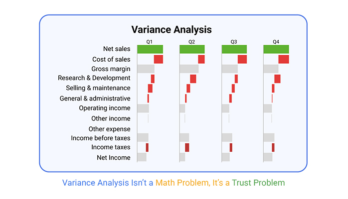
Why does variance analysis often end up ignored? Not because it’s useless—but because it’s misused.
Most finance teams run it like a report card. Numbers go up, numbers go down. Box checked. But executives don’t care about numbers without meaning. They care about signals. They want to know what went off, who owns it, and what’s next.
Variance analysis isn’t about pointing fingers. It’s about making decisions. Done right, it explains the story behind the miss. It shows if the forecast was off, if the model needs fixing, or if something went sideways in execution.
Variance analysis also tells you what matters. Not all gaps are worth your time. The right kind of analysis filters noise from signal. It focuses the team on the numbers that shape real decisions—before those numbers shape you.
Want your work to survive the exec table? Start using variance analysis as a decision tool, not a reporting task.
Variance analysis shines when used to guide decisions, not just tick off a compliance box. Imagine it as a helpful coach rather than a stern referee. It offers insights that allow you to tweak your game plan. Compliance might demand the analysis, but the real magic lies in using it to inform your choices.
Instead of seeing it as a chore, think of it as your secret weapon. It’s there to help you understand what’s working and what’s not. By focusing on the insights, not just the obligations, you turn data into actionable strategies. It’s like turning a flashlight on in a dark room—you suddenly see where you’re going.
So, your forecast missed the mark. Is it a fluke or a red flag? Variance analysis helps you figure that out. It’s like detective work, uncovering clues to reveal whether the miss is just a blip or a sign of something deeper. By examining variances closely, you can tell if market conditions shifted or if internal processes need a tweak.
Consider a forecast miss as an opportunity. Instead of panic, think of it as a chance to learn and adjust. Dig into the numbers, ask questions, and understand the story behind them. This way, you can decide whether to adjust your forecast or change your strategy. It’s all about turning potential setbacks into stepping stones.
Variance reports often fall into the “so what?” gap, where leadership sees the numbers but misses the implications. Why? Because numbers without context can feel meaningless. It’s like reading a book with no plot. Leaders need more than data—they need stories, insights, and actions.
To bridge this gap, make those reports come alive. Show how the numbers relate to business goals. Explain the impact and suggest actions. When you turn data into a narrative, you’re not just reporting; you’re storytelling. And that’s what grabs attention and drives action. Leaders want to see the path forward, not just the numbers that got them there.
Picture a three-lane highway. Timing errors are like traffic jams—they delay the journey. Driver errors are wrong turns, leading you astray. Model errors are faulty maps, giving incorrect directions. Each error type demands a unique approach.
To crack these cases, you need structure. Timing errors often relate to when transactions occur. Driver errors stem from incorrect assumptions or inputs. Model errors? They arise from flawed forecasts. By sorting errors into these lanes, you streamline your investigation.
Imagine a relay race, where each runner carries a baton. In business, each department holds part of the responsibility. When a variance pops up, who dropped the baton? Identifying the responsible party is key.
Ownership means accountability. Finance teams might own budget variances. Sales teams handle revenue gaps. By mapping variances to their rightful owners, you create a culture of accountability. It’s like having a team ready to tackle any challenge head-on.
Ever tried baking without all the ingredients? It’s tricky, but not impossible. Sometimes, data is incomplete. Yet, explanations must stand firm. How? By being transparent about assumptions and limitations.
Picture a courtroom, where evidence builds a case. Use what you have, even if it’s not perfect. Explain your reasoning clearly. Make sure your conclusions connect logically. This builds trust, even when data falls short.
| Types of Variance and Root Cause Framework | ||
| Type of Variance | Detection Method | Responsible Party |
| Timing | Period comparison, trend deviation, cutoff analysis | Accounting, Operations |
| Driver | Assumption vs actual review, variance decomposition | Product, Sales, Marketing |
| Model | Backtesting, scenario simulation, forecast error tracking | FP&A, Data Science |
| External | Market monitoring, sensitivity analysis | Executive Leadership, Strategy |
| Policy | Internal audit, change log reviews | HR, Legal, Compliance |
| Data Integrity | ETL checks, system audit trails, exception reports | IT, Finance |
| Process | Cross-functional workflow audits, SOP variance | Operations, Shared Services |
Visualize a river branching into streams. A Sankey diagram does just that with data. It shows where variances begin and how they split across departments. Each branch is a variance driver, revealing the flow of responsibility.
By using this tool, you see the full picture. It’s like watching a play unfold, act by act. Each department’s role becomes clear, and variances are easier to manage. With this clarity, organizations can make informed decisions to steer back on course.
Imagine having just three hours to close the books. Seems impossible, right? But it’s doable if you focus on what’s material and politically sensitive. Start by identifying the figures that could impact decision-making or spark boardroom debates. These numbers deserve your immediate attention.
Next, tap into your inner detective. Hunt for anomalies that could ring alarm bells for stakeholders. By focusing on these areas, you’ll not only meet deadlines but also bolster your credibility. Remember, it’s not about crunching every number; it’s about finding the ones that matter most and presenting them with confidence.
Imagine your analysis as a delicate house of cards. One wrong move, and it all comes tumbling down. Quick sanity checks help you avoid this disaster. Start by examining whether your assumptions hold water. Do they align with historical data? If not, it might be time to rethink them.
Spot-checking components can also save the day. Testing a few key figures can reveal where errors may lurk. These quick checks act like a security blanket, offering reassurance that your model holds up under scrutiny. Stressful situations often cloud judgment, so these checks help keep the analysis grounded and reliable.
Think of your commentary as a story. It should captivate your audience and withstand any grilling. Start with a strong opening that grabs attention. Then, back it up with facts and figures, leaving no room for doubt. It’s like building a fortress with words.
Avoid jargon. Use simple language that everyone can understand. This approach not only makes your points clearer but also leaves a lasting impression. Remember, your job is to inform, not to confuse. Clear and concise commentary can turn skeptics into believers, earning you a place at the executive table.
| Variance Commentary Template: Summary to Resolution | ||
| Section | Question Answered | Example Phrase |
| Summary | What happened? | Sales fell short of forecast by 7% in Q2. |
| Context | Why does it matter? | This shortfall impacted margin and delayed new investments. |
| Driver | What caused the variance? | Lower-than-expected renewal rates in EMEA market. |
| Timing | Was the variance due to timing? | Revenue was pushed to Q3 due to customer onboarding delays. |
| Ownership | Who is accountable? | Sales Operations and Regional Director for EMEA. |
| Resolution | What’s being done? | Pipeline adjusted; onboarding process being streamlined. |
| Forward Look | What’s next? | Expect recovery in Q3 with 90% of deals still in the pipeline. |
| Data Quality | Any limitations or assumptions? | Customer churn data is still being finalized. |
| Executive Ask | What action or decision is needed? | Approval to expedite onboarding automation tools. |
Time is of the essence, and presenting data clearly can mean the difference between clarity and chaos. Enter the Waterfall chart. It’s your trusty sidekick for illustrating budget-to-actual flows. This chart type is great for showing how each component contributes to the overall variance.
The beauty of a horizontal waterfall chart lies in its simplicity. It visually breaks down the data, making it easy to see where things went off track. By highlighting the biggest movers, you provide a clear picture of the financial landscape. It’s a straightforward way to communicate complex information without losing your audience in a sea of numbers.
The following video will help you to create a Horizontal Waterfall Chart in Microsoft Excel.
The following video will help you to create a Horizontal Waterfall Chart in Google Sheets.
(Choose Your Baseline Wisely)
Executives often have bigger fish to fry. They care about the bottom line and strategic goals. While forecast accuracy and budget discipline are important, they may not always be the top priority. For them, it’s about seeing the bigger picture. They want to know if the company is on track to meet its strategic objectives, not just whether forecasts and budgets match.
Accuracy in forecasting can save money and time. But if sticking to a budget means missing growth opportunities, execs might prefer to adapt. They weigh the risks and benefits, considering the long-term impact. In some cases, hitting the budget might be less important than seizing a new opportunity that wasn’t on anyone’s radar at the start of the year.
Bias can sneak into analysis if we’re not careful. When aligning analysis with leadership’s narrative, it’s easy to fall into the trap of seeing what you want to see. This happens when data is interpreted in a way that supports existing beliefs instead of challenging them. Baseline bias can lead to a skewed view of performance.
To avoid this, it’s crucial to remain objective. Use data to inform, not to justify. Challenge assumptions and consider alternative interpretations. This approach fosters a more honest discussion and can lead to better decision-making. The goal is to align with leadership’s vision without compromising on accuracy and truth.
| Baseline Selection Matrix: Budget vs Forecast vs Actual | ||
| Comparison Attribute | Budget vs Forecast | Actual |
| Purpose | Budget: Strategic discipline, Forecast: Operational agility | Actual: Real-world outcomes |
| Flexibility | Budget: Fixed, Forecast: Adaptive | Actual: Immutable, recorded events |
| Audience | Budget: Execs, Forecast: Managers | Actual: Auditors, Analysts |
| Use Case | Budget: Annual plans, Forecast: Course correction | Actual: Performance validation |
| Update Cycle | Budget: Yearly, Forecast: Monthly | Actual: Continuous |
| Owner | Budget: Finance, Forecast: FP&A | Actual: Finance/Accounting |
| Variance Use | Budget vs Forecast: Plan reliability | Forecast vs Actual: Model accuracy |
| Strategic Lens | Budget: Control, Forecast: Agility | Actual: Truth-checking |
Switching between different versions of a forecast can feel like juggling flaming torches. You need to keep your balance while making sure you don’t get burned. Maintaining credibility during these transitions is key. Each version of a forecast tells its own story, and the narrative can change as new data comes in.
To bridge the gaps effectively, transparency is essential. Clearly communicate why changes were made and what assumptions are involved. This builds trust and understanding, helping stakeholders see the rationale behind the numbers. Keeping an open dialogue ensures everyone stays on the same page, even when the forecast shifts.
Imagine a General Manager who hits the budget but misses the forecast. They might expect a pat on the back, but instead, they face tough questions. Why? Because hitting the budget means sticking to a plan, but missing the forecast suggests something went off track along the way. This raises concerns about future predictions and strategic planning.
This example highlights why understanding the difference between budget and forecast matters. It’s not enough to meet one target if another critical metric is off. The GM’s experience teaches a valuable lesson: always consider the broader context. Success isn’t just about hitting numbers; it’s about understanding why those numbers matter.
Visuals can speak louder than words, and a clustered stacked bar chart is no exception. It’s a tool that helps compare forecast, budget, and actual figures in a single glance. The challenge lies in maintaining the narrative without overwhelming the viewer with data. The goal is to tell a cohesive story while highlighting key differences.
This type of chart excels at showing variations and trends side by side. It allows you to see where expectations align or diverge. This clarity helps identify patterns and potential areas for improvement. By presenting all three metrics together, it ensures a comprehensive view of performance, making it easier to communicate insights and drive action.
Executive-grade commentary doesn’t need flowery language. It needs facts, accountability, and solutions. When writing for executives, focus on the essentials. They want to know the who, what, why, and how. Who is responsible? What happened? Why did it happen? How do we fix it?
Use active voice to assign accountability. Say, “The team missed the sales target by 10% due to lower demand in Q2.” Don’t say, “The sales target was missed by 10%.” The former assigns accountability and sets the stage for action. This approach not only informs but also empowers decision-makers to take corrective measures.
Imagine standing in a room with your CFO. Would your commentary pass the test of clarity? Your analysis should speak directly to the questions a CFO would ask. Be concise. Be precise. Numbers should be clear and explanations straightforward. Think of your commentary as a conversation with the CFO.
Use this test as a filter. If your response seems convoluted, simplify it. If it feels vague, add specifics. This helps to ensure your narrative is both clear and direct. Your goal is to make it so the CFO doesn’t need to ask follow-up questions. This builds trust in your analysis skills and strengthens your credibility.
Think of commentary layering as constructing a building. Start with a solid foundation. Begin with a summary. What’s the big picture? Lay down the basics first. Next, identify the main drivers. What factors contributed to the variance? This is where you dive deeper. Explain the causes clearly and concisely.
Finally, offer resolutions. How can the team address these variances? This is where you propose solutions. Offering actionable steps is crucial. Not only does it show your understanding, but it also demonstrates leadership. Layering your commentary this way ensures it’s comprehensive yet digestible.
Picture this. A finance director faced a CapEx project on the brink of failure. The budget was overshot, and stakeholders were anxious. The director needed to turn things around quickly. Rather than hide behind numbers, they took charge. They conducted a thorough review and pinpointed the problem areas.
With clear, no-nonsense commentary, the director presented their findings. They explained the variances in relatable terms, identified the root causes, and laid out a recovery plan. Stakeholders appreciated the transparency and swift action. By addressing the issues head-on, the project was back on track. This real-world example shows the power of clarity and accountability in variance analysis.
Double bar graphs can save the day when you need a clear visual comparison. They display budgeted and actual figures side by side. This makes it easy to spot variances at a glance. It’s like putting two pieces of a puzzle together. The differences become obvious.
When presenting to stakeholders, these graphs offer a straightforward way to communicate complex data. They show the story behind the numbers without words. This visual aid can be a powerful tool in variance analysis. It leaves little room for misinterpretation, making your commentary more impactful.
Not all variances are created equal. Some are mere noise, like static on a radio. They’re random and don’t offer much insight. But recurring variances? They’re the catchy tune you can’t ignore. These patterns suggest something more systematic. They might indicate a repeated error in a formula or consistent miscommunication between departments.
When a pattern emerges, it’s time to escalate. This isn’t about panic; it’s about being proactive. Escalation means bringing the issue to the right folks who can address it effectively. It’s about recognizing that while noise fades, recurring variances require action. Identifying these patterns early can prevent bigger issues down the line and keep operations running smoothly.
Think of variance memory systems as the organizational brain. They help remember past variances and their solutions. By maintaining a record, teams can quickly identify if a current variance has occurred before. This historical perspective aids in faster problem-solving and decision-making.
Building such a system involves documenting variances, their causes, and resolutions. It’s like creating a detailed diary. This diary helps in training new team members and in refining processes. With a good memory system, organizations avoid repeating past mistakes, leading to smoother operations and better outcomes.
Escalation logic is the decision-making matrix that helps prioritize issues. It’s the GPS for navigating variances. Consider frequency. How often does the variance appear? Then, materiality—how significant is the financial impact? Finally, exposure—what’s the risk if left unchecked?
Combining these factors creates a clear picture of which variances need immediate attention. It’s like triage in a hospital. Not every case is urgent. But those that tick multiple boxes in the matrix? They need swift action. Prioritizing in this way ensures resources are allocated effectively, tackling the most pressing issues first.
| Escalation Matrix for Variance Analysis | ||
| Scenario | Escalation Trigger | Recommended Action |
| High frequency, high materiality, high exposure | Recurring variance with significant financial and operational impact | Immediate cross-functional escalation and executive briefing |
| Medium frequency, high materiality | Infrequent but large impact events | Escalate to FP&A and department leads within the week |
| High frequency, low materiality | Persistent but low-risk issues | Log for continuous monitoring and quarterly review |
| Low frequency, high exposure | Rare events with reputational or compliance risks | Notify legal/compliance and monitor closely |
| Medium frequency, medium materiality | Moderate impact and recurrence | Add to variance tracker and assign owner |
| Low frequency, low materiality | One-off with minimal impact | Document, no immediate action |
| High exposure, uncertain root cause | Unknown but potentially damaging variance | Initiate root cause investigation and involve risk management |
In one company, a recurring R&D variance kept popping up. At first, it seemed minor, a blip on the radar. But the pattern persisted. Digging deeper, the team found a systemic flaw in their pipeline. Resources were consistently misallocated, leading to delays and budget overruns.
This discovery was a game-changer. It allowed the company to rethink its resource allocation and improve project timelines. Addressing the variance not only fixed the immediate problem but also strengthened the entire R&D process. It’s a reminder that sometimes small variances point to big opportunities for improvement.
Imagine a matrix chart as a detective’s board. Each cell represents a variance, categorized by time and type. This visual tool helps spot trends at a glance. It’s like connecting the dots in a complex case, revealing patterns that might otherwise be missed.
Using a matrix chart, teams can quickly identify which variances are most persistent and need attention. It’s an efficient way to allocate resources and focus on areas that matter most. By tracking variances over time, organizations gain insights that drive better decision-making and improved performance.
Causal bridges focus on factors that drive changes. They dig into the “why” behind data shifts. Use them when you need to explain reasons for a variance. They answer questions about causes, making them perfect for in-depth analysis.
Chronological bridges, on the other hand, focus on the “when.” They track changes over time, revealing patterns. Use them to show a timeline of events. They help connect the dots between different periods, making trends easier to spot.
| Causal vs Chronological Bridges: Use Cases and Benefits | ||
| Bridge Type | Best Use Case | Why It’s Useful |
| Causal | Explaining root causes of a performance gap | Links actions or inputs directly to outcomes for accountability |
| Causal | Variance due to business drivers (e.g., pricing, volume, mix) | Highlights controllable levers and facilitates targeted decisions |
| Causal | Strategic reviews and board presentations | Focuses on ‘why’ performance changed, preferred by leadership |
| Chronological | Monthly or quarterly variance walk-throughs | Helps visualize variance development over time |
| Chronological | Cash flow or project timeline analysis | Tracks how timing impacted results period by period |
| Chronological | Stakeholder updates across periods | Simplifies storytelling with a time-based sequence |
| Causal | Model validation or forecast performance analysis | Tests assumption accuracy and model reliability |
| Chronological | Budget to actual tracking in recurring cycles | Useful for consistent time-series reporting formats |
Delta refers to the differences in data points. Turning these differences into a story helps others understand. Presenting logic involves connecting these deltas in a coherent way. This approach makes your analysis more credible.
To withstand scrutiny, your narrative needs clarity and accuracy. Each point should have a logical connection to the next. This clarity helps defend your analysis against questions. It builds trust in your findings, ensuring your narrative holds up under examination.
Slides need to communicate effectively to different audiences. Start with a clear headline that outlines the core message. Use bullet points to highlight key details. This keeps the slides easy to read and understand.
Visuals play an important role in storytelling. Use graphs and charts to support your points. They make data more engaging and easier to digest. Make sure your visuals match the narrative, reinforcing the story you’re telling with numbers.
Imagine a CFO facing a potential deal collapse. Variance Bridge Analysis comes to the rescue. By breaking down the numbers, the CFO identifies key issues. This insight helps negotiate terms that both parties accept.
The CFO uses this analysis to show value to stakeholders. It provides a clear picture of potential gains and risks. This transparency builds confidence, ultimately saving the deal. Variance Bridge Analysis proves its worth as a decision-making tool.
Waterfall charts are visual tools that show changes step by step. They reveal how each component contributes to the total change. This makes it easier to see where variances occur.
These charts simplify complex data. They turn raw numbers into a visual journey. Each step in the chart tells a part of the story. Waterfall charts make it easier to understand how different factors impact the overall variance.
Picture a relay race where the baton represents responsibility. In a company, who holds the baton when things go awry? Shared metrics can turn into a blame game if roles aren’t clear. Finance may point to rising costs, while Product blames delays on a lack of resources. Operations might argue that unforeseen technical glitches are the true culprit.
In this complex relay, it’s vital to define who owns what. Shared metrics should guide teams, not divide them. When everyone knows their part in reaching the finish line, they focus less on passing blame and more on passing the baton effectively. Shared accountability fosters a culture where teams work together, not against each other.
Imagine a courtroom drama where every team is both the judge and the jury. Variance analysis can turn into a political tool, a stage for blame if not handled well. Teams may twist data to suit their narrative, defending their actions while pointing fingers at others. This is not healthy for any organization.
The key is to keep the analysis neutral and objective. Data should speak for itself, free from political agendas. Encourage teams to view the data as a collective truth rather than a weapon. This approach helps to build a culture of trust, where the focus is on learning and improving rather than assigning blame.
Think of a multilingual conference call where everyone speaks a different language. Communication breaks down, and misunderstandings arise. In companies, different teams often speak their own technical jargon. This can create barriers to effective collaboration. Finance talks in dollars and cents, Operations in efficiency, and Product in user experience.
Creating a shared language helps bridge these gaps. It’s like developing a universal translator that everyone can understand. When terms are defined and agreed upon, teams can align their efforts. This shared language fosters cooperation, helping different departments work together towards a common goal.
| Cross-Functional Metrics Ownership Map | ||
| Metric Type | Primary Owner | Common Variance Scenarios |
| Revenue | Sales | Missed targets due to pipeline slippage or lost deals |
| COGS | Operations | Fluctuations in material or shipping costs |
| Operating Expenses | Finance | Overruns in marketing or travel budgets |
| Customer Retention | Customer Success | Churn higher than forecasted |
| Product Delivery | Engineering | Delays in release schedule or feature drops |
| Marketing ROI | Marketing | Underperforming campaigns or lead quality gaps |
| Forecast Accuracy | FP&A | Model misses due to flawed assumptions |
| Compliance Spend | Legal/Compliance | Unexpected regulatory fines or legal costs |
| Inventory Turns | Supply Chain | Excess stock or stockouts |
| Headcount | HR | Overstaffing or slower-than-planned hiring |
| Cash Flow | Treasury | Delayed collections or early vendor payments |
Consider a ship navigating stormy seas, with each crew member steering in different directions. One VP faced this very storm, with his teams pulling apart due to conflicting data interpretations. He introduced a unified variance view, a single dashboard that presented data in an unbiased manner.
This tool served as the ship’s compass, guiding teams towards a common destination. By seeing the same numbers, the teams started speaking the same language. Trust was rebuilt, and collaboration improved. The unified view turned a chaotic voyage into a smoother sailing experience.
Visualize a map with multiple routes leading to the same destination. A multi-axis line chart does something similar for companies. It shows how different functions, like Finance, Operations, and Product, contribute to overall goals. Each line is a path, revealing how various drivers interact and sometimes conflict.
This chart is like a GPS for decision-makers, highlighting where paths converge or diverge. It helps leaders pinpoint areas of conflict and collaboration. By seeing the bigger picture, teams can adjust their strategies to align better, ensuring everyone heads in the same direction.
Commentary templates are lifesavers. They turn dry numbers into stories that people want to read. Numbers don’t speak for themselves. Context is key. Prebuilt templates guide you in providing that context. They help you organize your thoughts, ensuring you cover all the necessary angles. This makes your commentary insightful and engaging.
These templates are like a script for a play. They prompt you to address the who, what, when, and why. This approach keeps your audience engaged. It also ensures that no critical information slips through the cracks. When commentary is clear and organized, it captivates readers. They understand the implications of the data, making informed decisions easier.
Executives love the big picture. The bridge slide is your secret weapon. It distills complex data into an easy-to-digest format. This slide is stripped of fancy designs. It focuses on substance, showcasing key insights in a straightforward way.
Think of it as a bridge connecting data with decision-making. It provides a clear path from raw numbers to actionable insights. With a well-crafted slide, you don’t leave room for misinterpretation. You present information that guides strategic decisions. Executives appreciate the clarity and precision, making your insights valuable.
Navigating recurring issues is like trying to catch a slippery fish. That’s where the Sticky Variance Tracker steps in. It’s a record-keeper, ensuring past mistakes don’t repeat. This tool captures details of variances, which saves you from explaining the same miss twice.
Consider it your memory bank. It tracks patterns and trends over time. This helps in spotting recurring issues early. You can address root causes before they snowball into bigger problems. By keeping a detailed history, you save time and build a deeper understanding of your processes. This proactive approach boosts efficiency and prevents reoccurrence.
| Variance Analysis Toolkit: What to Standardize Across Teams | ||
| Tool/Asset | Purpose | Why Standardize It |
| Variance Commentary Template | Standardize how variances are explained | Improves clarity, accountability, and exec-readiness |
| Driver Attribution Framework | Classify causes into timing, driver, or model | Creates consistent root-cause narratives |
| Baseline Comparison Logic | Defines when to use Budget vs Forecast | Avoids confusion across reporting teams |
| Executive Bridge Slide | Summarizes key drivers and actions visually | Ensures uniform communication across leadership decks |
| Sticky Variance Tracker | Logs recurring variances across time | Prevents repeated issues and shortens resolution cycles |
| Escalation Matrix | Triage variances by impact and frequency | Enables faster, fairer prioritization |
| Visualization Standards | Specify use cases for Sankey, Waterfall, etc. | Improves comprehension and cross-team alignment |
| Monthly Close Commentary Template | Drives month-end storytelling consistency | Reduces rework and miscommunication |
| Root Cause Repository | Centralizes past root cause findings | Accelerates analysis and onboarding |
Standardizing variance analysis across multiple units is like herding cats. Yet, when done right, it brings harmony to chaos. Each unit has its quirks, but a standardized approach ensures everyone speaks the same language. This consistency is vital for a cohesive understanding across the board.
Imagine having 14 different musical instruments playing in perfect tune. That’s the magic of a standardized process. It aligns objectives and expectations. It enables seamless comparison across units, making it easier to identify areas for improvement. With everyone on the same page, collaboration becomes second nature. This unified approach allows for strategic alignment and efficiency.
The mosaic plot is your friend when you want to show the big picture and the details. It breaks down data into bite-sized pieces, revealing component-level contributions. This visual tool offers clarity without overwhelming your audience with detail.
Imagine a jigsaw puzzle, where each piece fits perfectly to complete the image. That’s what a mosaic plot does. It shows how each component contributes to the whole. This makes complex data easier to interpret. It highlights patterns and outliers, guiding you to focus on areas that need attention. This transparency fosters better decision-making and deeper insights.
There you have it! These insights bring variance analysis to life, making it less of a chore and more of an engaging story.
Variance analysis is the process of comparing actual results to budgeted or forecasted figures to understand why performance differed. It helps identify patterns, root causes, and areas needing attention. Instead of viewing it as a report card, teams use it to ask better questions, assign ownership, and support faster decisions. Whether the issue lies in timing, drivers, or assumptions, variance analysis turns gaps into insight.
A variance report is a summary that highlights the differences between planned and actual results. It shows where things went off track and helps teams explain the “why” behind the numbers. Good reports don’t just show gaps—they point to root causes, responsible teams, and possible actions. The goal is to make the data useful for decisions, not to flood executives with raw figures.
Variance analysis isn’t about checking a box. It’s about asking better questions.
It shows where plans broke down and helps teams fix what matters most. Whether it’s a missed forecast, a flawed model, or an execution gap, variance analysis connects numbers to real action. It lets leaders focus on what to change, not just what happened.
Use variance analysis to point forward—not backward.
The numbers won’t speak for you. Make them count.
How much did you enjoy this article?


Calculate accounts receivable turnover ratio to measure credit collection speed, improve cash flow, and strengthen your financial strategy. Read on!

Change Management KPIs are the key to tracking adoption, performance, and ROI during transitions. Find out which metrics matter. Read on!

Data collection methods and techniques determine the quality of every insight you act on. Explore key approaches for gathering reliable data. Read on!


