Categories
TOPN DAX Function is a tool in Power BI that helps users retrieve a specified number of rows from a table (or column) based on a given criterion.


In this guide, you’ll discover the various aspects of the TOPN DAX Function, the purpose and benefits of the Power BI TOPN function, and common mistakes to avoid when using the TOPN function in Power BI.
First…
The TOPN DAX Function in Power BI is used to rank data and retrieve a specific number of rows based on a certain condition. It’s useful for analyzing and visualizing data, and it allows users to focus on the most relevant information.
With the TOPN DAX Function, you can quickly identify top performers, anomalies, or values that meet a specific criterion within a dataset.
One of the key features of the TOPN DAX Function is its flexibility in defining the condition for ranking. Users can specify various criteria like sorting by a specific column, filtering by a certain value, or applying complex logical expressions. It allows users to customize the ranking based on their specific requirements and gain deeper insights into the data.
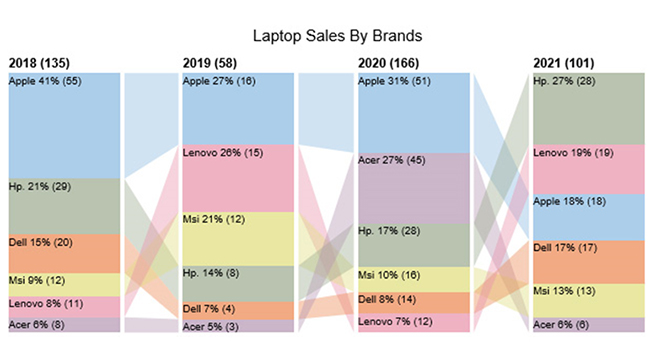
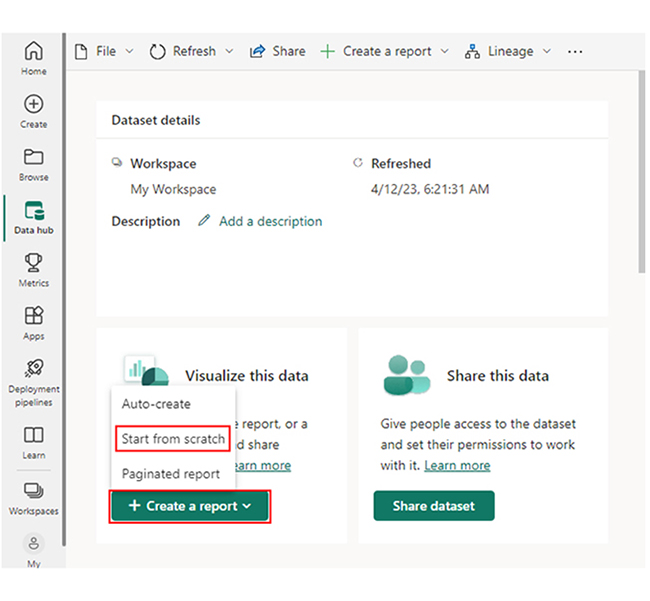
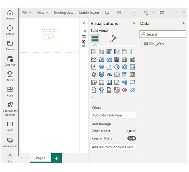
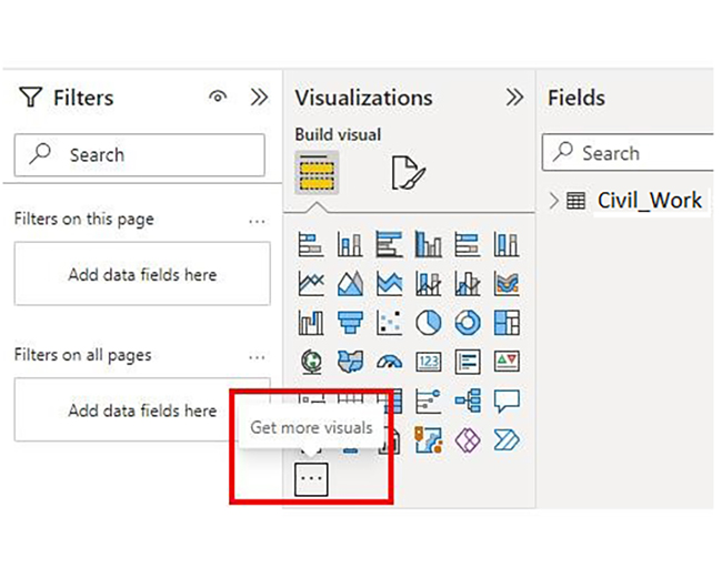
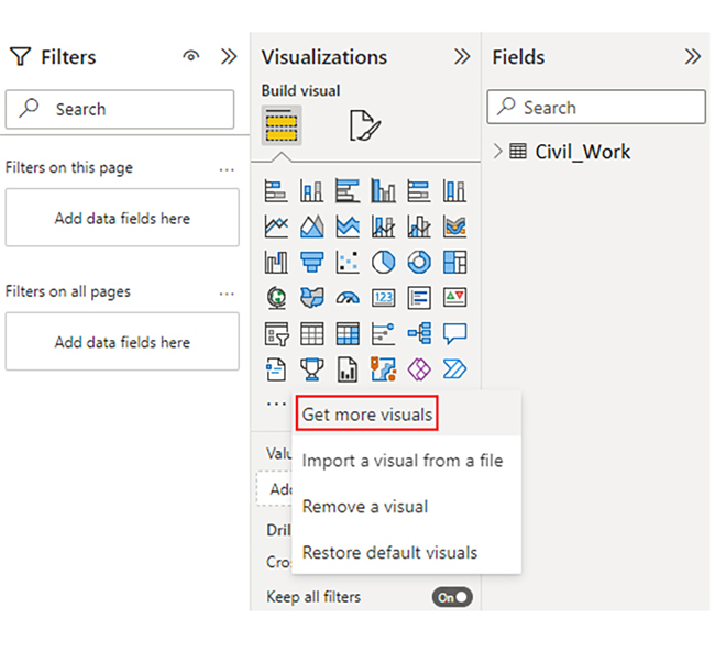
Here are examples of how to present your data with different visualizations:
The TOPN function in DAX helps users extract a specified number of rows, usually the top N, from a table (or table expression) based on a defined sorting order. This comes in handy in scenarios when analysts (or business users) have to focus on a subset of data that meets certain criteria or exhibits specific characteristics.
The first parameter will determine the number of rows that will be returned. A single scalar value will be returned where the expression will evaluate multiple rows.
This is the table from where you would like to evaluate the TOPN values.
This may consist of any DAX expression by which the result of the expression will sort and evaluate each row of the table.
(Optional) it will sort your expression in ascending (or descending) order.
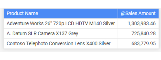
EVALUATE
TOPN (
3,
ADDCOLUMNS (
“@Sales Amount”, [Sales Amount]
),
[@Sales Amount],
DESC
)
ORDER BY [@Sales Amount] DESC
EVALUATE
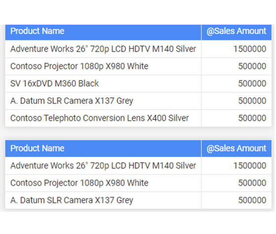
TOPN (
3,
ADDCOLUMNS (
VALUES ( ‘Product’[Product Name] ),
“@Sales Amount”, MROUND ( [Sales Amount], 500000 )
),
[@Sales Amount],
DESC
)
ORDER BY [@Sales Amount] DESC
EVALUATE
TOPN (
3,
ADDCOLUMNS (
VALUES ( ‘Product’[Product Name] ),
“@Sales Amount”, MROUND ( [Sales Amount], 500000 )
),
[@Sales Amount],
DESC,
[Product Name],
ASC
)
ORDER BY [@Sales Amount] DESC
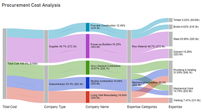
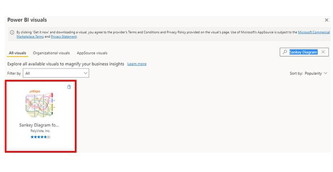
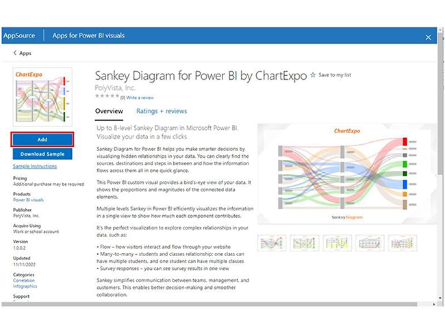
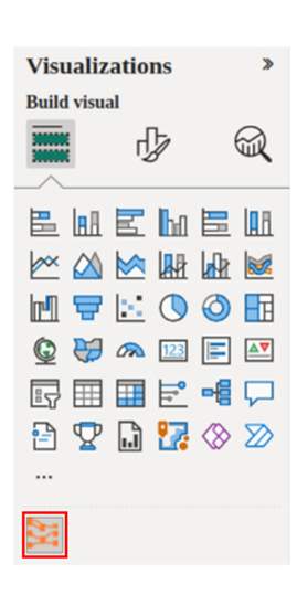
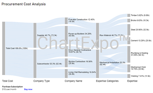
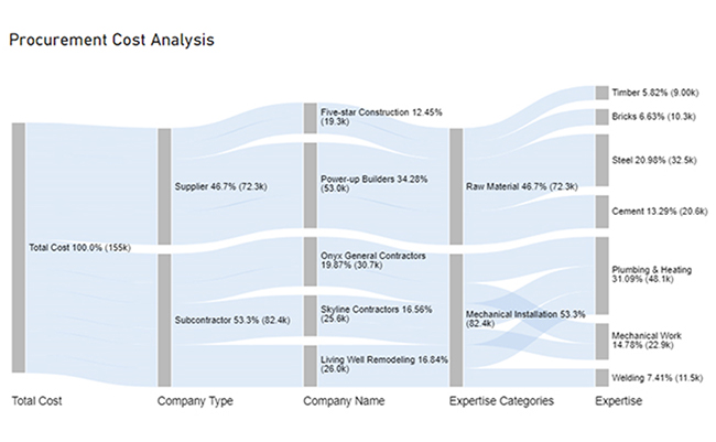
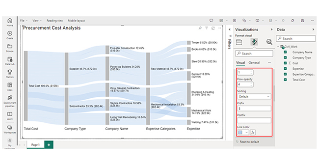
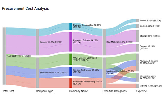
Use the TOPN DAX function in Power BI with a Sankey Diagram maker to highlight top-performing values and reveal meaningful data flows.
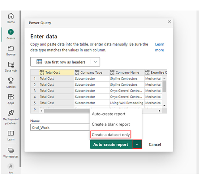
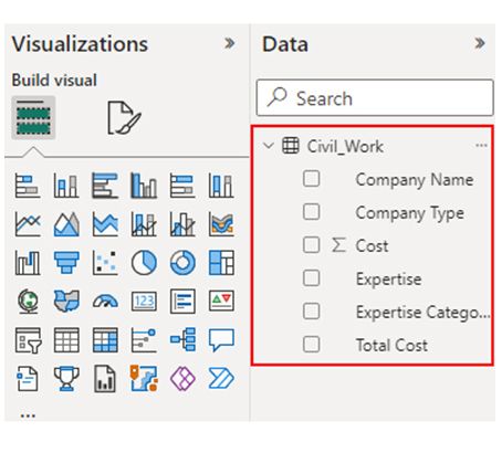
Here’s a breakdown of the five stages.


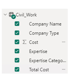
| Total Cost | Company Type | Company Name | Expertise Categories | Expertise | Cost |
| Total Cost | Subcontractor | Skyline Contractors | Mechanical Installation | Plumbing & Heating | 15456 |
| Total Cost | Subcontractor | Skyline Contractors | Mechanical Installation | Mechanical Work | 10159 |
| Total Cost | Subcontractor | Onyx General Contractors | Mechanical Installation | Plumbing & Heating | 18045 |
| Total Cost | Subcontractor | Onyx General Contractors | Mechanical Installation | Mechanical Work | 12695 |
| Total Cost | Subcontractor | Living Well Remodeling | Mechanical Installation | Plumbing & Heating | 14589 |
| Total Cost | Subcontractor | Living Well Remodeling | Mechanical Installation | Welding | 11456 |
| Total Cost | Supplier | Power-up Builders | Raw Material | Cement | 20561 |
| Total Cost | Supplier | Power-up Builders | Raw Material | Steel | 32456 |
| Total Cost | Supplier | Five-star Construction | Raw Material | Bricks | 10253 |
| Total Cost | Supplier | Five-star Construction | Raw Material | Timber | 9000 |
Insights
Unlock the potential of Power BI’s TOPN DAX function in this hands-on guide, where you’ll explore how to extract the top N values from your data. This feature lets you focus on the most important data points, creating dynamic visuals. By applying the TOPN function, you can visually filter and emphasize the highest-performing categories, making it easier to analyze and present your findings.
In DAX (Data Analysis Expressions), TOPN is a function used to retrieve the top N rows based on a specified expression, while RANKX calculates the rank of each row within a table based on a given expression.
TOPN in DAX retrieves the top N rows from a table (or expression) based on a specified sorting criterion, and that helps in analyzing and presenting data with the highest values or relevance.
DAX TOPN enables the extraction of the top N records using specified criteria. It’s used to identify trends, outliers, and it also helps users focus on the most relevant data points in a dataset.
When using the TOPN function in Power BI, you should avoid mistakes like overlooking aggregation, and inconsistent data types. Always be mindful of aggregations. Inappropriate aggregation may yield inaccurate results, and you also need to verify that the data types in the sorting column match. Having discrepancies will most likely lead to unexpected results.
You also need to ensure timely data refresh to reflect changes in underlying data. This prevents discrepancies between visualizations and actual datasets.
Visualization is arguably the best way to analyze data. By following the steps in this guide, you’ll become proficient in creating the Sankey Chart in Power BI.
How much did you enjoy this article?


Discover diverse and high-quality Power BI report examples for inspiration and insights. Elevate your reporting with strategic visualization techniques.

A Customer Relationship Management Dashboard centralizes data, tracks key metrics, and drives smarter business decisions. Discover now!

Explore Healthcare Dashboard Examples and learn how to turn complex healthcare data into clear, actionable insights for better decision-making.


