Categories
Project managers who ignore stakeholder dynamics usually regret it. A stakeholder analysis matrix maps every person or group with a stake in your work, then ranks them by two metrics: power and interest level.
This visual system lets you spot exactly where to invest energy. Some people need constant updates and careful handling. Others just want occasional check-ins. The matrix shows you the difference, preventing wasted effort and missed opportunities.
When you know who matters most, you can build smarter communication plans and make decisions that stick. Risk assessment matrix principles apply here, too—anticipate problems before they land on you.
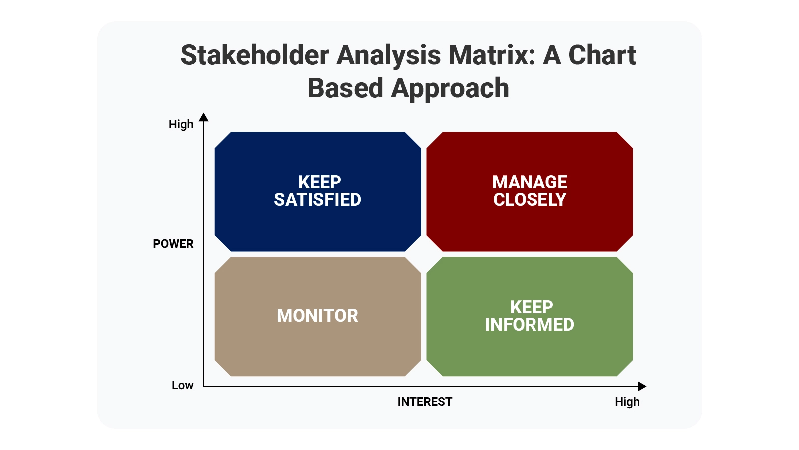
Definition: A stakeholder analysis matrix serves as a visual mapping tool that sorts people by two factors: their capacity to affect project outcomes and their level of concern about those outcomes. Think of it as a targeting system for engagement.
Project managers lean on this framework to structure conversations and resource allocation. When stakeholders appear on clearly marked axes, patterns emerge fast. High-power, high-interest individuals demand attention.
The matrix prevents guessing about who needs what level of involvement. Teams using this framework see clearer priorities and waste less time on ineffective outreach. Everyone gets the right amount of engagement—no more, no less.
Organizations using a stakeholder analysis matrix spend less time reacting to surprises. The tool forces early mapping of relationships and power structures.
Projects gain multiple advantages from systematic stakeholder tracking:
Like any prioritization matrix, this approach channels effort toward activities that deliver measurable value. Stop distributing energy evenly when influence is distributed unevenly.
Building a functional stakeholder matrix template demands precision. Structured inputs create actionable outputs.
Core elements that belong in every matrix:
Scoring influence and interest with consistency turns your matrix into something resembling a decision matrix—evidence-based rather than guesswork-driven.
Different projects demand different matrix configurations. Complexity, team size, and reporting requirements all shape which format works best.
Selection criteria worth considering:
Complex initiatives benefit from analyzing how stakeholder interest and influence correlate, much like examining patterns in a covariance matrix. Hidden dynamics surface early when you look for them.
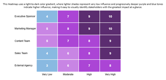
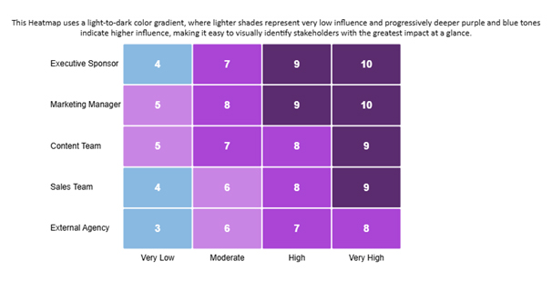
Marketing initiatives demonstrate how influence grows across organizational tiers. The Marketing Manager and Executive Sponsor carry the most weight.
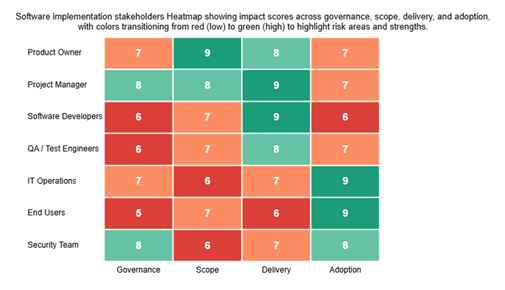
Software rollouts reveal stakeholder impact through multidimensional analysis. Red-to-green coloring highlights risk zones and strength areas instantly.
Construction scenarios map influence using blue-to-orange gradients. Authority levels become visually distinct, streamlining contractor management.
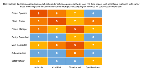
These visualizations also expose co-occurrence patterns between decision-making power and engagement requirements. Spotting such relationships early prevents collaboration breakdowns.
Building your matrix in Google Sheets offers flexibility without specialized software.
Follow this process to set up your matrix:
First-time visualizers should explore resources explaining how to create a chart in Google Sheets. Proper chart construction ensures influence and interest data displays without confusion.
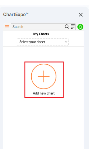
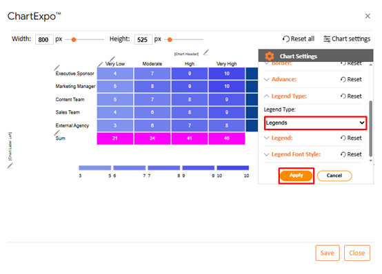
Turning stakeholder matrix template data into strategic insights requires more than static tables. ChartExpo converts raw information into dynamic visual intelligence.
The platform streamlines complex analysis through these steps:
ChartExpo shifts stakeholder analysis from passive spreadsheets toward active decision support.
Why use ChartExpo?
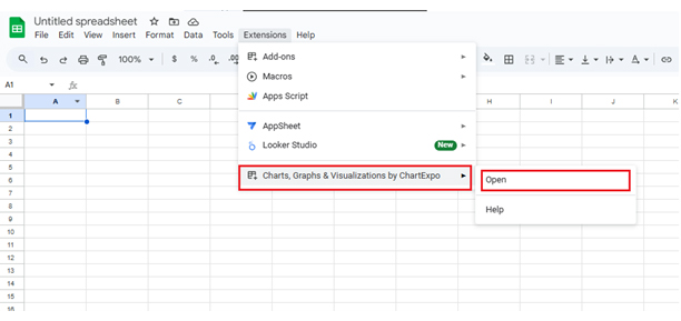
How to install ChartExpo in Excel?
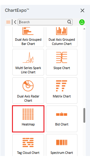
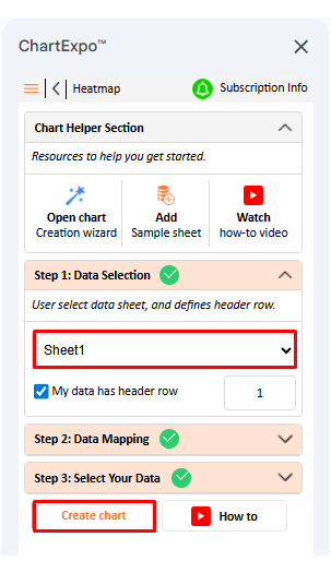
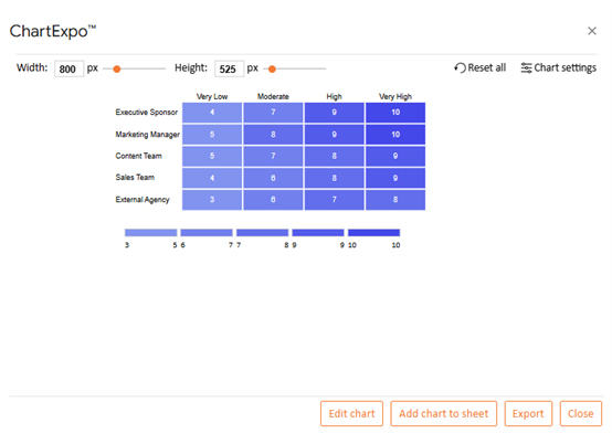
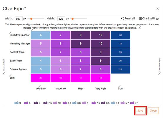
Consider we have the following data for a heatmap.
| Stakeholder Group | Influence Category | Influence Score |
| Executive Sponsor | Very Low | 4 |
| Executive Sponsor | Moderate | 7 |
| Executive Sponsor | High | 9 |
| Executive Sponsor | Very High | 10 |
| Marketing Manager | Very Low | 5 |
| Marketing Manager | Moderate | 8 |
| Marketing Manager | High | 9 |
| Marketing Manager | Very High | 10 |
| Content Team | Very Low | 5 |
| Content Team | Moderate | 7 |
| Content Team | High | 8 |
| Content Team | Very High | 9 |
| Sales Team | Very Low | 3.8 |
| Sales Team | Moderate | 6 |
| Sales Team | High | 7.6 |
| Sales Team | Very High | 8.5 |
| External Agency | Very Low | 3.4 |
| External Agency | Moderate | 5.7 |
| External Agency | High | 7.1 |
| External Agency | Very High | 8 |
The stakeholder analysis matrix delivers consistent value across every project phase. Structure and foresight replace reactive scrambling.
Specific advantages teams gain:
For finance-oriented stakeholders, pulling insights from Google Finance in Google Sheets helps synchronize engagement tactics with budget constraints and cash flow realities.
Strong matrices rest on accuracy, flexibility, and relentless refinement. Shortcuts produce unreliable outputs.
Best practices that strengthen your work:
Combining stakeholder records with trend analysis from forecasting in Google Sheets lets you anticipate shifts in power or interest before issues erupt.
Comparing baseline tools against advanced visualization platforms reveals where efficiency and insight quality diverge.
While native implementations depend mostly on basic Google Sheets apps, specialized solutions simplify both analysis and reporting workflows.
| Feature | Google Sheets | ChartExpo |
| Ease of use | Moderate | High |
| Visual customization | Limited | Advanced |
| Data import/export | Manual | Automated |
| Time to create | Longer | Faster |
| Collaboration features | Basic | Enhanced |
| Reporting and dashboards | Static | Interactive |
ChartExpo upgrades stakeholder analysis by fusing automation, visualization clarity, and speed. Spreadsheets handle data entry just fine, but ChartExpo transforms that information into understanding.
Manual effort drops, visual precision climbs, and decision velocity accelerates. For teams managing intricate stakeholder ecosystems, ChartExpo provides a more efficient and scalable path forward.
You should update it whenever stakeholder roles, influence levels, or project scope change to keep insights accurate.
Common issues include missing key stakeholders, relying on assumptions, and failing to revisit the matrix as projects evolve.
Identify stakeholders, assess influence and interest, define engagement strategies, and visualize them using a structured matrix.
Stakeholder matrices help project teams direct their relationship-building efforts where those efforts actually matter most and deliver value.
Risks shrink, and decision quality improves when you know exactly who holds power and cares about outcomes. Every project faces limited time and resources, making strategic engagement essential rather than optional.
Pairing Google Sheets with ChartExpo makes stakeholder data easier to visualize, interpret, and act on purposefully and effectively.
This combination ensures clarity, alignment, and smarter engagement choices throughout the entire project lifecycle.
Teams that map influence patterns consistently outperform those operating on assumptions alone. The investment delivers measurable returns through stronger relationships.
How much did you enjoy this article?


Calculate accounts receivable turnover ratio to measure credit collection speed, improve cash flow, and strengthen your financial strategy. Read on!

Change Management KPIs are the key to tracking adoption, performance, and ROI during transitions. Find out which metrics matter. Read on!

Data collection methods and techniques determine the quality of every insight you act on. Explore key approaches for gathering reliable data. Read on!


