• Home
  • Tools dropdown img
    • Spreadsheet Charts

      • ChartExpo for Google Sheets
      • ChartExpo for Microsoft Excel
    • Power BI Charts

      • Power BI Custom Visuals by ChartExpo
    • Word Cloud

  • Charts dropdown img
    • Chart Category

      • Bar Charts
      • Circle Graphs
      • Column Charts
      • Combo Charts
      • Comparison Charts
      • Line Graphs
      • PPC Charts
      • Sentiment Analysis Charts
      • Survey Charts
    • Chart Type

      • Box and Whisker Plot
      • Clustered Bar Chart
      • Clustered Column Chart
      • Comparison Bar Chart
      • Control Chart
      • CSAT Survey Bar Chart
      • CSAT Survey Chart
      • Dot Plot Chart
      • Double Bar Graph
      • Funnel Chart
      • Gauge Chart
      • Likert Scale Chart
      • Matrix Chart
      • Multi Axis Line Chart
      • Overlapping Bar Chart
      • Pareto Chart
      • Radar Chart
      • Radial Bar Chart
      • Sankey Diagram
      • Scatter Plot Chart
      • Slope Chart
      • Sunburst Chart
      • Tornado Chart
      • Waterfall Chart
      • Word Cloud
    • Google Sheets
      Microsoft Excel
  • Services
  • Pricing
  • Contact us
  • Blog
  • Support dropdown img
      • Gallery
      • Videos
      • Contact us
      • FAQs
      • Resources
    • Please feel free to contact us

      atsupport@chartexpo.com

Categories
All Data Visualizations Data Analytics Surveys
Add-ons/
  • Google Sheets
  • Microsoft Excel
  • Power BI
All Data Visualizations Data Analytics Surveys
Add-ons
  • Google Sheets
  • Microsoft Excel
  • Power BI

We use cookies

This website uses cookies to provide better user experience and user's session management.
By continuing visiting this website you consent the use of these cookies.

Ok

ChartExpo Survey


Home > Blog > Google Sheets

Forecasting in Google Sheets: A Complete Walkthrough

Forecasting in Google Sheets—who knew a spreadsheet could predict the future? This isn’t science fiction; it’s real data at work.

Forecasting in Google Sheets

Spreadsheets have changed. They’re no longer passive tools. You can project sales, track changes, and make more brilliant moves with Google Sheets functionality. Anyone with a Google account can build forecasts. You don’t need special software or advanced training. You only need past data and the will to plan.

So, why does this matter? Because dire forecasts hurt. Forecasting in Google Sheets helps reduce that risk. You input your data, and the system handles the math. Formulas, functions, and even charts help you see patterns fast.

Add visuals, and it gets even clearer. Try a line graph with multiple lines in Google Sheets to compare trends. The differences speak louder than rows of numbers ever could.

Forecasting in Google Sheets is practical, fast, and powerful. You can prepare for peaks, plan for slow seasons, or adjust your pricing strategy. It’s all possible without leaving your spreadsheet. You bring the data; Google Sheets helps tell the story.

This isn’t about guessing; it’s about preparing. Want to make better decisions next quarter? Start with your numbers today.

Let’s explore how Google Sheets makes it possible.

Table of Contents:

  1. What is Forecasting in Google Sheets?
  2. Why is Google Sheets Forecast Important?
  3. How to Use the Forecast Function in Google Sheets?
  4. How Many Methods of Sales Forecasting in Google Sheets?
  5. How to Perform a Sales Forecast in Google Sheets?
  6. How to Analyze a Google Sheets Forecasting Template?
  7. Advanced Techniques of Forecasting in Google Sheets
  8. FAQs
  9. Wrap Up

What is Forecasting in Google Sheets?

Definition: Forecasting in Google Sheets means using past data to predict future trends. It helps you plan based on real numbers. You can project sales, expenses, or growth with built-in formulas and Google Sheets functionality.

Use charts to visualize the forecast. It’s quick and effective. No special tools are needed. Anyone can use it to make informed business or personal decisions. Data becomes the direction, and forecasting becomes effortless.

Why is Google Sheets Forecast Important?

You don’t need a crystal ball to prepare for what’s next—you need a spreadsheet. A Google Sheets forecast gives you control, clarity, and confidence. Whether planning a product launch, managing team hours, or setting a yearly budget, forecasting helps you steer with purpose. Here’s why it matters more than ever:

  • Simplifies decision-making: Data-backed decisions are smarter decisions. Forecasting highlights patterns so you can act fast and avoid costly mistakes.
  • Enhances financial planning: Accurate forecasts help you build better budgets. You can align income, expenses, and cash flow to meet real goals.
  • Improves operational efficiency: Knowing future demand helps streamline resources. You avoid overstaffing, over-ordering, or running out at the worst time.
  • Provides easy accessibility and collaboration: Since Google Sheets is cloud-based, your team can work on forecasts together in real time. Everyone stays aligned, whether across desks or continents.
  • Supports continuous monitoring and adjustment: Things don’t always go as planned, but forecasts can adapt. With what-if analysis in Google Sheets, you can test new scenarios anytime and update your plan on the fly.

How to Use the Forecast Function in Google Sheets?

Planning shouldn’t feel overwhelming. Whether you’re estimating next month’s sales or projecting future expenses, the Google Sheets FORECAST function makes it simple. It’s quick, smart, and requires only a few inputs. Here’s how to put it to work, step by step:

  1. Organize your data: Start with two columns: historical x-values (like time) and known y-values (like revenue). Ensure the data is clean, consistent, and organized.
  2. Insert the FORECAST function: Click an empty cell and type: =FORECAST (future x, data y, data x). This tells Google Sheets to estimate the y-value for a future x based on past trends.
  3. Enter the prediction point: In place of future x, enter the point you want to predict, like next month or quarter. Google Sheets will calculate the expected value at that moment.
  4. Interpret the results: The result is a single number—a forecast. Combine this with how to add a trendline in Google Sheets to visualize predictions and spot where things are headed.

How Many Methods of Sales Forecasting in Google Sheets?

Have you ever wished you could predict your sales without complex software? Good news—you can, and all you need is Google Sheets. From simple trends to deeper analysis, Google Sheets has the tools to help you prepare for what’s coming next.

Let’s break down four methods you can start using right away:

  • Linear forecasting: This method uses historical data to find a straight-line pattern. By applying the FORECAST function, you estimate future sales based on past performance.
  • Trendline in charts: Create a chart and add a trendline to visualize your sales direction over time. Learn to add trendlines in Google Sheets will help you spot upward or downward trends quickly.
  • Moving average: An excellent option for smoothing out short-term fluctuations. It calculates the average sales over a set period to give a clearer picture of long-term trends.
  • Custom regression analysis: For those who want more profound insights, custom regression models allow you to analyze more complex relationships. You can combine multiple factors and use formulas to generate predictions.

How to Perform a Sales Forecast in Google Sheets?

Guesswork doesn’t grow a business, but good forecasting does. If you have past sales data, you have the first tool for building a solid forecast. You can turn raw numbers into sharp insights with Google Sheets’ time tracking and chart tools.

Here’s how to perform a sales forecast without leaving your spreadsheet:

  1. Organize your data: List dates and corresponding sales in two clean columns. Accurate, structured data is the foundation of a reliable forecast.
  2. Choose a forecasting method: Pick a method that fits your goal. Use a simple average, a trendline, or learn how to make an x-y graph in Google Sheets for more visual analysis.
  3. Insert a chart for visual forecasting: Create a visual using to create a chart in Google Sheets to understand your forecast better. Charts reveal trends that tables may hide.
  4. Analyze the forecast: Look for seasonal patterns, spikes, or slowdowns. Compare current performance with historical data to make wise decisions.
  5. Update regularly: Sales data changes, and so should your forecast. Refresh your sheet weekly or monthly to keep your predictions relevant.

How to Analyze a Google Sheets Forecasting Template?

Forecasting in Google Sheets sounds great until you hit a wall—data visualization. Sure, you can crunch numbers, but are you making sense of them visually? It’s not always as easy. Google Sheets has the basics, but it can leave you wanting more when it comes to stunning and insightful charts.

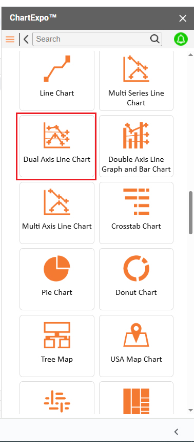
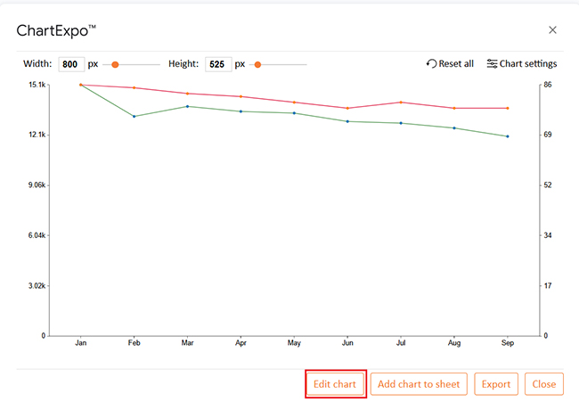
That’s where ChartExpo steps in. It turns your data into visuals that tell the story. Say goodbye to cluttered rows and hello to clear, actionable insights.

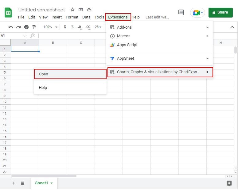
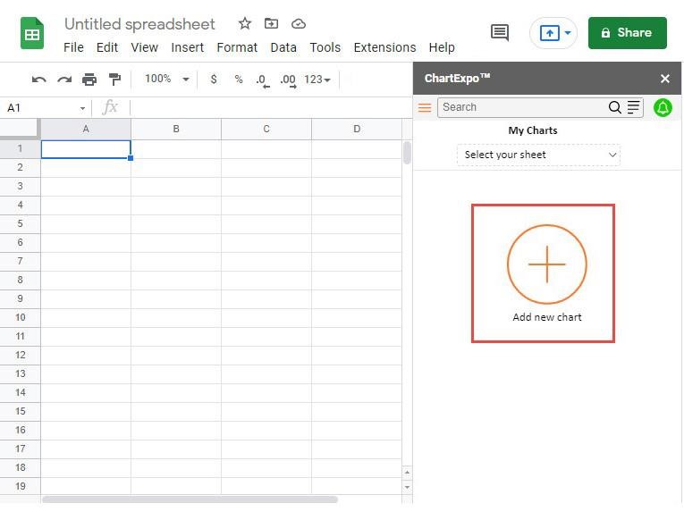
How to Install ChartExpo in Google Sheets?

  1. To start using ChartExpo, download it directly from the Google Sheets program. To do this, select Extensions from the top toolbar.
  2. A menu will appear. Click the Get add-ons option.
  3. Search for ChartExpo, and click on Charts, Graphs & Visualizations by ChartExpo when it appears in the results.
  4. Click the Install button. You will have to confirm your Google account and accept some permissions.

ChartExpo charts are available both in Google Sheets and Microsoft Excel. Please use the following CTAs to install the tool of your choice and create beautiful visualizations in a few clicks in your favorite tool.

Example

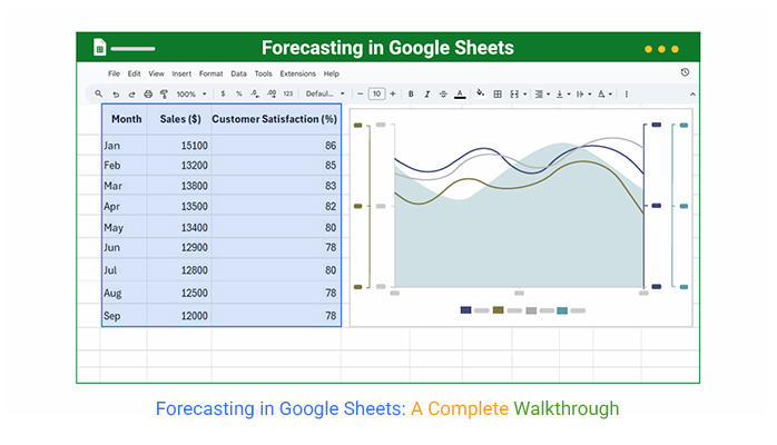
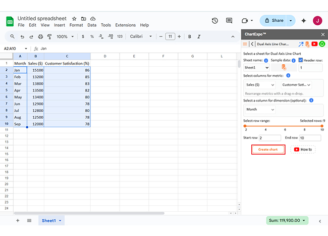
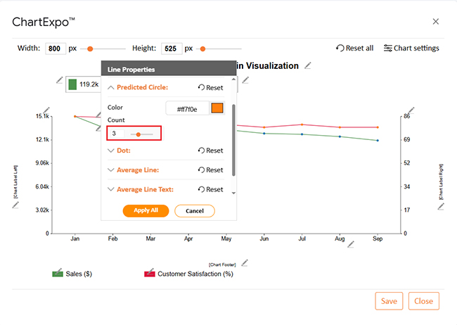
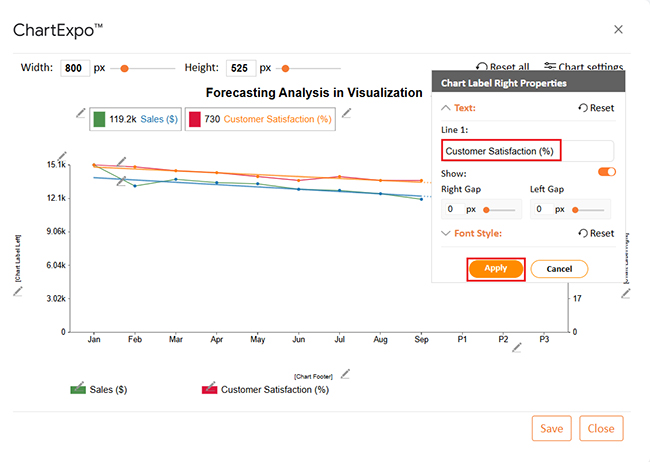
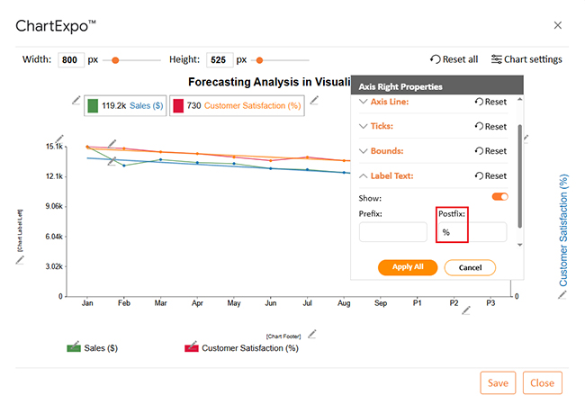
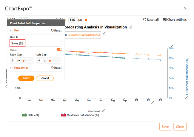
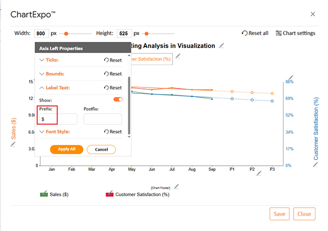
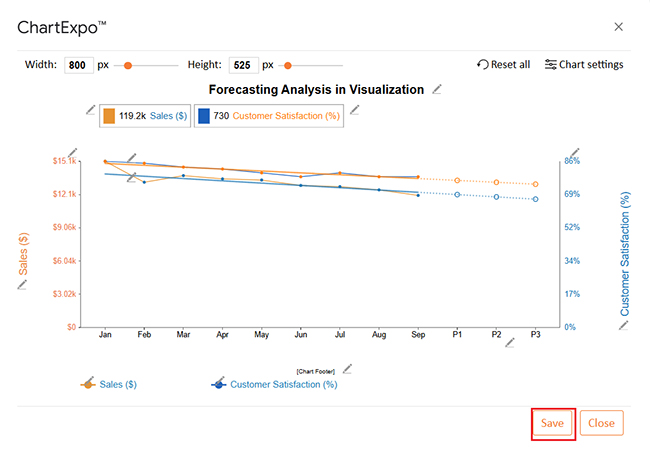
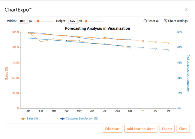
Let’s learn how to make a comparison chart in Google Sheets and analyze it using ChartExpo.

Month Sales ($) Customer Satisfaction (%)
Jan 15100 86
Feb 13200 85
Mar 13800 83
Apr 13500 82
May 13400 80
Jun 12900 78
Jul 12800 80
Aug 12500 78
Sep 12000 78
  • To get started with ChartExpo, install ChartExpo in Google Sheets.
  • Go to Extensions > Charts, Graphs & Visualizations by ChartExpo > Open.
Forecasting in Google Sheets
  • To access the charts library, click the Add new chart button.
Forecasting in Google Sheets
  • Once it loads, scroll through the charts list to locate and choose the “Dual Axis Line Chart”.
Forecasting in Google Sheets
  • Click the “Create Chart From Selection” button after selecting the data from the sheet, as shown.
Forecasting in Google Sheets
  • If you want to add anything to the chart, click the Edit Chart button:
Forecasting in Google Sheets
  • Click the pencil icon next to the Chart Header to change the title.
  • It will open the properties dialog. Under the Text section, you can add a heading in Line 1 and enable Show.
  • Give the appropriate title of your chart and click the Apply button.
Forecasting in Google Sheets
  • Enable the trend lines as follows:
Forecasting in Google Sheets
  • You can increase the number of predicted circles to 3 as follows:
Forecasting in Google Sheets
  • You can add the Label text on the right side as follows:
Forecasting in Google Sheets
  • You can add the percentage sign with values and also change the color as follows:
Forecasting in Google Sheets
  • You can add a Label text on the left side as follows:
Forecasting in Google Sheets
  • You can add the dollar sign with values and also change the color as follows:
Forecasting in Google Sheets
  • After making all the changes, click the “Save” button:
Forecasting in Google Sheets
  • Your final Dual Axis Line Chart will look like the one below.
Forecasting in Google Sheets

Insights

  • Sales decreased steadily from $15,100 in January to $12,000 in September
  • Customer satisfaction declined from 86% to 78% over the same period
  • The downward trend suggests possible issues with service quality or market demand

Advanced Techniques of Forecasting in Google Sheets

Basic forecasts are a good start, but what if you need more precision? As your data grows, so should your forecasting skills. That’s where advanced forecasting techniques in Google Sheets come into play. Here are five powerful methods you can try today:

  • Multiple linear regression: This method examines how several variables impact your results. You can predict sales based on price, ad spend, and season using formulas and Google Charts.
  • Exponential smoothing: Great for detecting short-term trends. This technique gives more weight to recent data, helping you respond faster to changes.
  • Moving averages forecast: You can flatten the noise by averaging past data over set periods. It helps highlight your trend and is perfect for spotting consistent growth or decline.
  • Scenario forecasting: Test different outcomes using What-If analysis in Google Sheets. You can create the same sheet’s best-case, worst-case, and most likely sales scenarios.
  • Time series decomposition: Break your data into trend, seasonal, and random components. Use this to isolate what’s driving your numbers and forecast with a sharper focus.

FAQs

Can you do Forecasting in Google Sheets?

Yes, you can; Use past data to predict future trends, apply the FORECAST function, and create charts for better insight. It’s fast, simple, and accurate. No special tools are needed – Google Sheets handles the math.

How does Google Forecast work?

  • Uses linear regression to predict future values
  • Requires historical data as input (x and y values)
  • Apply the FORECAST function: =FORECAST(target_x, known_y, known_x)
  • Estimates the future y-value based on trends

Wrap Up

Forecasting in Google Sheets helps you plan. It turns past data into future insights, and you don’t need complex tools. Google Sheets does the work.

You can use it for many tasks. Want to manage stock better? Combine forecasting with inventory tracking in Google Sheets. You’ll know what to restock and when.

Budgets benefit, too. With a budget on Google Sheets, forecasting helps you avoid overspending. You can track expenses, plan for income, and adjust as needed.

Visualization matters. Numbers are good, but charts are better. Use the ‘How to Make a Comparison Chart’ feature in Google Sheets to visualize trends. Compare months, products, or departments side by side.

Keep your data updated. A forecast is only valid if it reflects fundamental changes. Review it weekly or monthly.

Forecasting turns your spreadsheet into a smart guide. It’s about being prepared, not surprised. Google Sheets offers simplicity. But its power grows with the right tools and methods. So, install ChartExpo to take your data visualization to the next level.

How much did you enjoy this article?

GSAd2
Start Free Trial!
152217

Related articles

next previous
Google Sheets10 min read

Project Tracking in Google Sheets: A Visual Walkthrough

Project tracking in Google Sheets helps manage tasks and deadlines in one place. This guide shows how to build, use, and improve trackers with smart visuals.

Google Sheets8 min read

Google Sheets Add-Ons for Modern Spreadsheet Users

Google Sheets add-ons make your spreadsheets more powerful. This guide covers the top add-ons, the best for data analysis, and how to install and use them.

Google Sheets7 min read

How to Create a Clustered Bar Chart in Google Sheets?

Discover how to create and use Clustered Bar Charts in Google Sheets to visualize data clearly. Compare multiple series side by side and gain quick insights for decisions.

Google Sheets10 min read

Grouping Rows in Google Sheets: Get More Insights

Discover what Google Spreadsheet Group Rows is and how it streamlines data organization. Learn step-by-step grouping, analysis tips, and key benefits.

Google Sheets14 min read

How to Create a Dashboard in Google Sheets?

Learn how to Create a Dashboard in Google Sheets to simplify your data analysis and keep your performance insights organized.

ChartExpo logo

Turn Data into Visual
Stories

CHARTEXPO

  • Home
  • Gallery
  • Videos
  • Services
  • Pricing
  • Contact us
  • FAQs
  • Privacy policy
  • Terms of Service
  • Sitemap

TOOLS

  • ChartExpo for Google Sheets
  • ChartExpo for Microsoft Excel
  • Power BI Custom Visuals by ChartExpo
  • Word Cloud

CATEGORIES

  • Bar Charts
  • Circle Graphs
  • Column Charts
  • Combo Charts
  • Comparison Charts
  • Line Graphs
  • PPC Charts
  • Sentiment Analysis Charts
  • Survey Charts

TOP CHARTS

  • Sankey Diagram
  • Likert Scale Chart
  • Comparison Bar Chart
  • Pareto Chart
  • Funnel Chart
  • Gauge Chart
  • Radar Chart
  • Radial Bar Chart
  • Sunburst Chart
  • see more
  • Scatter Plot Chart
  • CSAT Survey Bar Chart
  • CSAT Survey Chart
  • Dot Plot Chart
  • Double Bar Graph
  • Matrix Chart
  • Multi Axis Line Chart
  • Overlapping Bar Chart
  • Control Chart
  • Slope Chart
  • Clustered Bar Chart
  • Clustered Column Chart
  • Box and Whisker Plot
  • Tornado Chart
  • Waterfall Chart
  • Word Cloud
  • see less

RESOURCES

  • Blog
  • Resources
  • YouTube
SIGN UP FOR UPDATES

We wouldn't dream of spamming you or selling your info.

© 2025 ChartExpo, all rights reserved.