Categories
Trendlines are lines drawn on a chart or graph to show a dataset’s trend or pattern. They visualize the variance across time or between two variables. They aid in identifying trends, patterns, and correlations in data.
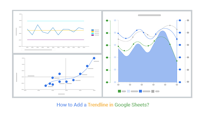


Only individuals with experience with charting software had access to trendlines in the past. Now, almost everyone can master how to add a trendline in Google Sheets in a few clicks.
To illustrate the importance of trendlines, let’s look at a case study.
A company was considering whether to expand into a new product line. They compiled data on sales and advertising expenditures and plotted it on a chart. Yet, it was hard to discern relationships and patterns between the two variables.
The patterns and relationships became clear when they added a trendline to the chart. The trendline showed that the more they spent on advertising, the higher their sales. This data was crucial in decision-making on investing in the new product line.
Let’s learn how to add a trendline in Google Sheets and discuss the importance of trendlines in data visualization.
A trendline is a line used to illustrate data points on a graph, chart, or diagram. It helps identify a trend’s direction or estimate future values. Trendlines are also known as lines of best fit. They indicate an average or expected outcome for a given data set.
Trendlines are common in forecasting, as they can provide insight into potential future trends. You can predict future sales, customer demand, and other essential metrics by analyzing trendlines.
You can use trendlines in other situations, such as:
Try your best to be precise when creating a line graph with multiple lines in Google Sheets. Specifically, ensure each line accurately fits the data points without deviating too far from them.
A trendline typically shows the direction of the trend in the data. It may show a positive, negative, or no trend at all. The slope of the trendline is the indicator: this is often visualized using a slope chart:
Trendlines also indicate how quickly the data changes over time. Whether the data is changing at a steady rate or if there are periods of rapid change.
A linear trendline is a best-fit straight line used with linear data sets. Simply, it shows data increasing or decreasing at a constant rate along a straight line.
An exponential trendline is a curved line. It represents data that increases or decreases at an increasingly higher or lower rate.

A polynomial trendline is a curved line used when data fluctuates. That is when data both increases and decreases.

A logarithmic trendline is a type of best-fit curved line. It is used when the data change rate increases or decreases rapidly and then levels out.

A power trendline is a curved line with data sets that increase or decrease steadily.

A moving average trendline smooths out fluctuations in data to show a pattern or trend more clearly.

A Control Chart is a statistical tool that analyzes process behavior over time. Consequently, detects significant changes. Unusual trends or patterns in the data will help identify whether the process is stable and in control. Or if it needs adjustments to improve quality.
The Control chart in Excel consists of data points plotted on a graph, often with a trendline. The trendline compares the actual observed performance to the expected performance of the process.
Control Charts are common in quality control for monitoring production processes. Thus, identify issues that could lead to poor product quality or process inefficiency.
Assume you own a shoe company where you have collected yearly data on customer claims.
| Months | No. of Claims |
| Jan | 120 |
| Feb | 80 |
| Mar | 150 |
| Apr | 100 |
| May | 90 |
| Jun | 130 |
| Jul | 80 |
| Aug | 120 |
| Sep | 120 |
| Oct | 100 |
| Nov | 130 |
| Dec | 120 |
Below is the Control Chart visualization of the data.

Scatter Plots Chart helps show the relationship between multiple variables.
A Scatter Plot is a graph with a sequence of data points. Each data point comprises two values, one from each variable. The points are dispersed around the graph, demonstrating the relationship between the two variables. The pattern of points can suggest a strong, weak, or no correlation.
It has a trendline that displays the direction of the relationship between the variables. It’s either straight or curved based on the nature of the relationship. If the data points form a straight line, then the relationship between the two variables is linear. If the data points form a curved line, then the relationship is non-linear.
Below is data on online store sales.
| Items | No. of Orders | Sales |
| Grocery | 300 | 200000 |
| Household & Pet Care | 250 | 400000 |
| Health & Beauty | 180 | 150000 |
| DIY & Furniture | 400 | 400000 |
| Office Supplies | 200 | 300000 |
| Sports & Leisure | 350 | 240000 |
| Consumer Electronics | 150 | 100000 |
| Entertainment | 500 | 800000 |
| Electronic | 250 | 200000 |
| Cosmetic | 450 | 600000 |
| Toys | 200 | 130000 |
Here is the Scatter Plot visualization of the data.

A Multi-Axis Line Chart uses multiple lines to represent different data points. Each line is plotted on its axis, making it easier to compare the data points. It is beneficial when you want to compare multiple datasets.
By adding trendlines to a Multi-Axis Line Chart, you can quickly identify any changes in the data. Trendlines make it much easier to spot changes in the data. Thus, incredibly useful for understanding how different factors are affecting the data.
Below is yearly data from an online store.
| Months | No. of Orders | Sales | Profit (%) |
| Jan | 300 | 200000 | 15 |
| Feb | 250 | 400000 | 14 |
| Mar | 180 | 150000 | 12 |
| Apr | 400 | 400000 | 18 |
| May | 200 | 300000 | 13 |
| Jun | 350 | 240000 | 16 |
| Jul | 150 | 100000 | 11 |
| Aug | 500 | 800000 | 20 |
| Sep | 250 | 200000 | 14 |
| Oct | 300 | 210000 | 15 |
| Nov | 450 | 600000 | 19 |
| Dec | 200 | 130000 | 13 |
The Multi-Axis Line Chart maps the data as shown below.

Learn how to add a trendline in Google Sheets to visualize the exact pattern of the data. Consequently, draw meaningful conclusions. It also provides a better understanding of the overall trend of the data.
Adding a trendline to a chart in Google Sheets is a breeze with ChartExpo. ChartExpo is an add-on that allows you to create insightful charts and graphs in Google Sheets. Adding a trendline to a chart in Google Sheets takes just a few clicks.
Let’s learn how to install ChartExpo in Google Sheets.
ChartExpo charts are available both in Google Sheets and Microsoft Excel. Please use the following CTA’s to install the tool of your choice and create data visualizations in a few clicks in your favorite tool.


Below is yearly data from an online store.
| Months | No. of Orders | Sales | Profit (%) |
| Jan | 300 | 200000 | 15 |
| Feb | 250 | 400000 | 14 |
| Mar | 180 | 150000 | 12 |
| Apr | 400 | 400000 | 18 |
| May | 200 | 300000 | 13 |
| Jun | 350 | 240000 | 16 |
| Jul | 150 | 100000 | 11 |
| Aug | 500 | 800000 | 20 |
| Sep | 250 | 200000 | 14 |
| Oct | 300 | 210000 | 15 |
| Nov | 450 | 600000 | 19 |
| Dec | 200 | 130000 | 13 |


Adding a trendline in Google Sheets can offer several benefits, particularly when working with data sets. Here are some advantages:
A trendline provides a visual representation of the overall trend in your data. This can make it easier to understand the general direction and pattern that the data points follow.
The trendline helps identify patterns and tendencies within your data set, making it easier to recognize correlations and trends that may not be immediately apparent when looking at raw data.
Once a trendline is established, it can be used to make predictions about future values based on the established pattern. This is particularly useful for forecasting and planning purposes.
Trendlines assist in the analysis of data by providing a summary of the data’s overall direction. This is especially helpful when dealing with large data sets where patterns may not be readily apparent.
In certain situations, a trendline can help validate a model or hypothesis. For example, if you expect your data to follow a linear or exponential pattern, adding a trendline can confirm whether your expectations align with the actual data.
Here are reasons why trendlines are important in data visualization:
A trendline is a line drawn on a chart or graph to show the direction of data points visually. It is a tool traders use to identify potential buying and selling opportunities. Consequently, assess the strength and direction of a trend.
A trendline connects data points to show the data’s general tendency or direction. It helps with identifying trends in data and making predictions about future values. You can use trendlines to forecast sales or other data points.
Using ChartExpo, getting a trendline on a spreadsheet is a simple process. Click the pencil icon near the Trendline property. This will open a dialogue where you can activate the Show option. The trendline will then appear on your spreadsheet.
A trendline is plotted on a chart or graph to show the direction a dataset is moving. It identifies if a data set is increasing or decreasing. Consequently, spot any patterns in the data and predict future values.
We have discussed the different types and importance of trendlines in data visualization. We have also learned how to add a trendline in Google Sheets.
You can use trendlines in a variety of ways, such as;
With just a few clicks using ChartExpo, you can easily add a trendline in Google Sheets. Then utilize it to your advantage in instances such as decision-making.
Try your best to be precise while drawing a trendline. Specifically, draw a line that best fits the data points. The line should not deviate too far from the data points.
That’s it.
You now possess the necessary skills to use ChartExpo to add a trendline in Google Sheets.
How much did you enjoy this article?


SUMPRODUCT in Google Sheets handles multi-condition calculations without extra columns. Master its syntax, uses, and errors. Read on!

An annual budget template in Google Sheets organizes your yearly finances, tracks every dollar, and reveals spending patterns. Read on!

Learn the best graph to show profit and loss with practical examples and use cases. Discover how to visualize your business data, track trends, and make smarter financial decisions.


