Categories
By ChartExpo Content Team
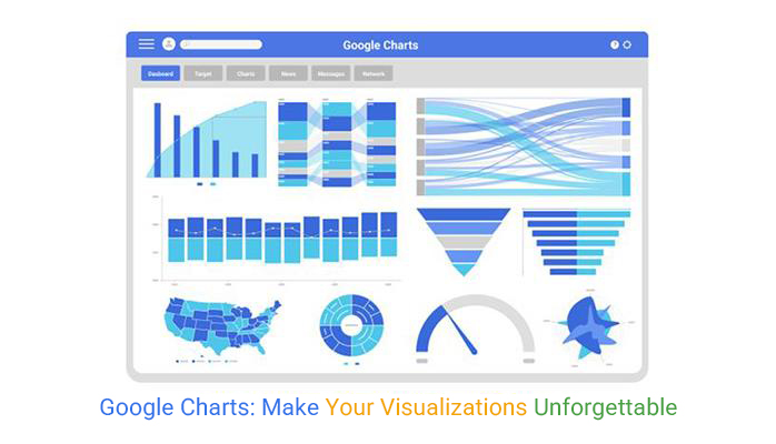
Google Charts makes your data come alive. You don’t need coding skills or expensive software. You only need your data and a few clicks. Whether it’s a line chart showing trends or a heat map highlighting key areas, Google Charts has you covered.


The best part? Google Charts is free. You can use it from anywhere. It connects with other Google services like Sheets, pulling in your data automatically. Your charts update as your data changes, keeping everything current.
If you want a clear way to present your data, Google Charts is the tool you’ve been looking for. Start turning your numbers into visuals that make sense.
Google Charts are tools that help you visualize data. They turn complex data sets into simple visuals. Think of them as a bridge between raw data and understanding. They offer various chart types, from line charts to geographical maps. Each type serves a different purpose, helping you highlight different aspects of your data.
These charts are interactive, meaning you can engage with them. Hover over a line or a bar, and it might reveal more details. This interaction turns passive viewers into active explorers. It’s like turning a static image into a lively conversation.
But that’s not all. Google Charts are customizable. You can tweak colors, labels, and sizes to fit your needs. This flexibility makes them suitable for any audience, from a classroom to a boardroom. You don’t need special software to use them. They’re web-based, making them accessible from any device with internet access. It’s like having a magical tool that works wherever you go.
Google Charts stands out in a crowd. What makes it shine? First, it’s free. You don’t need to spend a dime to access its robust features. Secondly, it’s versatile. Whether you’re working with financial data, social media metrics, or building a Pareto chart in Google Sheets, it offers the flexibility to support a wide range of analysis needs. This adaptability opens the door to endless possibilities.
Another strength is its integration with other Google services. You can pull data directly from Google Sheets, making the process smooth and efficient. It’s like having a data assistant that does the heavy lifting for you. Plus, it’s compatible with different browsers and devices, ensuring your charts look great everywhere.
Finally, Google Charts offers real-time data updates, which are especially useful when creating a Waterfall chart in Google Sheets. This feature is gold for live presentations or dynamic dashboards. Your charts refresh automatically as your data changes. It’s like having a live news feed for your numbers, ensuring your audience always sees the latest information. These features make Google Charts a solid choice for anyone who wants to make data speak.
Google Charts offers key features that make it a top choice for data visualization. Interactivity is at the forefront. Users can engage with charts, clicking and hovering to explore data. This interaction turns a static image into a dynamic experience. It’s like flipping through a photo album rather than looking at a single picture.
Customization is another pillar. Google Charts allows you to adjust almost every aspect of a chart. Change colors, fonts, and sizes to match your style or branding. This flexibility means your charts can fit seamlessly into any presentation or report. It’s like having a tailor for your data, ensuring a perfect fit every time.
As your data changes, so do your charts. This feature is essential for live dashboards or presentations where up-to-date information is crucial. It’s like having a live sports ticker for your data, keeping your audience informed and engaged. With these features, Google Charts doesn’t just present data; it brings it to life.
Interactivity makes charts fun and functional. If it’s not working, check your code first. Mistakes in the code can stop interactivity. Ensure you’ve included the correct libraries. Libraries are the tools that power your charts. Without them, your charts lose their magic.
Another common issue is data format. Google Charts needs data in a specific format. Verify your data’s structure matches Google’s requirements. This is essential for proper chart behavior.
Faulty event listeners can also cause problems. Event listeners respond to user actions. If they’re broken, your chart becomes static. Make sure you’ve properly set them up. This ensures users can click and interact with the chart.
Your charts should reflect your brand. If they don’t, customization might be the issue. Start by using the options object in your code. This object controls the chart’s appearance. Change colors, fonts, and sizes to match your brand.
Sometimes, Cascading Style Sheets (CSS) conflicts with chart styles. CSS affects how your page looks. Check for conflicts between CSS and chart settings. This helps maintain a consistent brand image.
Google Charts also allows custom tooltips. Tooltips are small info boxes that appear on hover. Customize these to add personal touches. They can include text, images, or even links.
Data is the fuel for your charts. Start with arrays for simple data. Arrays are easy to create and manipulate. For more complex data, JSON is your friend. JSON stands for JavaScript Object Notation. It stores data in a structured way.
APIs are like bridges to external data. They allow your charts to use live data. Use APIs to fetch real-time information. This keeps your charts accurate and up-to-date.
Dynamic feeds are another way to keep data fresh. They update your charts automatically. Use them to show live sales numbers or website traffic. Dynamic feeds make your charts relevant and timely.
Different browsers can display charts differently. This causes headaches for developers. Start by testing your charts on multiple browsers. Chrome, Firefox, and Safari are popular choices.
Use HTML5 and CSS3 for better compatibility. These technologies work well across browsers. Avoid browser-specific features that might break your charts.
Sometimes, older browsers don’t support new features. Use polyfills to fill in the gaps. Polyfills are scripts that add missing features. They help older browsers display charts correctly.
Imagine a big retailer needing to track sales. They used Google Charts to build a dashboard. This dashboard displayed real-time sales data. It helped managers make better decisions.
They started with a simple bar chart in Google Sheets. This showed daily sales numbers. Then, they added a line chart for monthly trends. Managers could see sales patterns over time.
Finally, they included a Scatter plot in Google Sheets. This revealed relationships between products and sales. The dashboard became a powerful tool for the retailer. It drove revenue by providing clear insights.
Ever tried linking Google Sheets with Google Charts and hit a wall? It’s frustrating when things don’t work. But don’t lose hope. Let’s tackle some common problems.
First, check your data format. Google Charts prefers clean, organized data. Ensure there are no empty columns or rows. If your data looks messy, clean it up. This small step can solve many issues.
Next, verify your permissions. Google Sheets might not allow access if settings are tight. Double-check sharing settings to avoid access problems. Make sure Google Charts has permission to read the data.
Finally, look at your internet connection. A weak connection can disrupt data updates. Ensure your network is stable and reliable. Smooth connection equals smooth chart updates.
Google Analytics holds a treasure trove of data. But how do you make sense of it all? Enter Google Charts. It turns numbers into visuals that speak volumes.
Visualizing traffic data can reveal patterns hidden in plain sight. Use line charts to track visitor trends over time. Are you seeing more visitors this month? A line chart can tell you.
Heat maps are another cool tool. They show where users click most on your site. You can see hotspots and cold zones. This insight helps you optimize page layouts.
Funnel charts are perfect for conversion tracking. See where users drop off in the buying journey. Identify and fix weak points to boost conversions.
Google Cloud offers a robust platform for data storage. But how do you connect it with Google Charts? Let’s find out.
First, store your data in Google Cloud Storage. It’s secure and scalable. Google Charts can access this data anytime. This setup allows for real-time visual updates.
Next, consider using BigQuery. It’s perfect for handling large datasets. Connect Google Charts to BigQuery for powerful data analysis. Your charts will reflect complex data with ease.
Finally, use Cloud Functions to automate processes. Automate data updates and chart refreshes. This way, your visuals always show current information. No manual updates required.
Imagine a financial firm. They need real-time data tracking for quick decisions. Google Sheets and Google Charts make this possible.
Their analysts input data into Google Sheets. This data updates automatically every minute. Google Charts fetches this data and refreshes visuals. The team sees market trends instantly.
Interactive dashboards show stock performance and market changes. The firm can respond to shifts within seconds. Decision-making becomes faster and more informed.
Alerts notify the team of significant changes. They receive updates on their devices wherever they are. This setup keeps them on top of market movements at all times.
Google Charts is a fantastic tool for anyone looking to whip up clean, interactive charts without a ton of hassle. Its biggest strengths? It’s free, cloud-based, and super easy to use. You get a variety of chart types, smooth animations, and seamless integration with other Google services like Google Sheets. Plus, the documentation is solid and beginner-friendly.
But it’s not all sunshine. Customization can be limited compared to heavyweights like D3.js. Performance can lag with massive datasets, and if you’re offline, forget about it—it’s a web-only tool. Also, while the learning curve is mild, more advanced visualizations can feel restricted. Great for quick, polished visuals, but not the most flexible for data wrangling pros.
| Google Charts Pros | Google Charts Cons |
| Free to Use | Limited Customization |
| Google Charts is completely free and accessible to all users, making it an attractive option for budget-conscious projects. | While it offers a variety of customization options, it is still limited compared to other libraries like D3.js or Chart.js. |
| Easy Integration with Google Services | Performance Issues with Large Data Sets |
| Works seamlessly with other Google services such as Google Sheets, making it ideal for dynamic data visualization. | Performance can degrade when handling large datasets or highly complex charts. |
| Cross-Browser Compatibility | Limited Offline Functionality |
| Google Charts supports most modern browsers without requiring additional plugins or frameworks. | Requires an internet connection since charts are rendered by Google’s servers, making it unsuitable for offline applications. |
| Extensive Documentation | Dependency on External Library |
| Google Charts offers detailed and thorough documentation, including examples and guides, which makes implementation straightforward. | Relies on Google’s API, which means changes to the API or deprecation can affect your implementation. |
| Responsive and Interactive Charts | Limited Chart Types |
| Charts are responsive by default and support interactive features like tooltips, zoom, and animation. | Although Google Charts supports many chart types, it lacks some advanced or highly customized visualizations available in other libraries like D3.js. |
| Simple to Implement | Limited Styling Options |
| Easy setup process with straightforward integration through JavaScript, making it beginner-friendly. | Custom styling can be cumbersome and limited, particularly when trying to apply custom CSS styles. |
| Good Performance for Small to Medium Data Sets | Security Concerns |
| Provides good performance for visualizing small to moderately-sized datasets. | Since data is rendered through Google servers, privacy and security could be a concern for sensitive or proprietary data. |
| Built-In Cross-Platform Support | No Server-Side Rendering Support |
| Works well across devices, including mobile and desktop, without extra effort. | Google Charts doesn’t support server-side rendering, which can be problematic for SEO or server-rendered applications. |
Businesses thrive on informed choices. Google Charts shines in this arena. Sales teams track trends with line charts, spotting opportunities. Marketers use bar charts to measure campaign performance.
Financial teams visualize expenditures and profits. These visual tools transform complex data into clear insights. Decision-makers act with confidence and clarity.
Spreadsheets can be overwhelming with endless rows and columns. Google Charts rescues with visual storytelling. Imagine a line chart replacing a data table. Trends suddenly leap off the page. A scatter plot shows relationships hidden in numbers.
These vivid visuals make data speak. Reports become engaging stories, not tedious tasks.
Embedded charts captivate and inform audiences. Websites use them to display user behavior. Visitors see trends in real-time. Financial institutions present investment data visually. Clients appreciate easy-to-understand information.
These charts draw users in, holding their attention. Data becomes more than numbers; it becomes an experience.
Financial data is rich but often complex. Google Charts offers untapped potential here. Interactive features allow users to explore data actively. A heat map can pinpoint investment risks. Pie charts highlight revenue distribution. These graphics simplify intricate data, making it accessible. Investors and analysts gain new perspectives and insights.
Branding is like a fingerprint. It’s unique and memorable. Colors, fonts, and styles should reflect your brand. Start with your color palette. Choose colors that match your brand’s personality. Use consistent fonts for a unified look. Styling should be simple but effective. Avoid a cluttered appearance. Make sure your charts are easy on the eyes. Consistency builds trust and recognition.
Legends and titles guide users through the data maze. But too much detail can confuse. Keep legends short and to the point. Use clear and simple language. Titles should tell the chart’s story in a few words. Avoid jargon and technical terms. If users struggle to understand, they’ll lose interest. Simplify to clarify.
Gridlines and animations can make or break user experience. Too many gridlines can be distracting. Use them sparingly to highlight key data points. Animations should be smooth and subtle. They’re not a fireworks show. Used right, they add depth and context. Remember, the focus should be on the data, not the effects.
Meet Bright Ideas Marketing. They faced a challenge: presenting complex data to clients. They turned to Google Charts. With customization, they made charts that matched their brand. They used colors that popped and fonts that spoke their language. Clear legends and titles ensured clients understood the data.
The result? Clients were impressed, and revenue soared. Google Charts became their secret weapon in the race for client satisfaction.
Ever wonder why your interactive features falter? It’s often the code. Bugs sneak in like ants at a picnic. Keep your code clean and organized. Commenting helps others understand your logic.
Another culprit is browser compatibility. Different browsers interpret code differently. Test on all major browsers. Don’t forget mobile devices. They’re vital in today’s digital age.
Lastly, watch out for data errors. Missing or incorrect data breaks functionality. Validate inputs to prevent issues. Consistency is key.
Drill-downs should invite exploration, not overwhelm users. Start with summary data. Show key metrics first. This approach directs users’ attention.
Add layers of detail gradually. Allow users to click for more information. Keep the interface simple to avoid confusion.
Consider using hierarchy. Group-related data. This method helps users find what they need quickly. It’s like a treasure map guiding them through buried data.
Tooltips can be your best friend. They offer context without clutter. Start by making them concise. Users don’t want a novel.
Include only necessary information. Avoid jargon unless explained. If it’s technical, offer a simple definition.
Position tooltips strategically. They should enhance, not obstruct. Use subtle animations for a polished look.
Animations can elevate your charts from dull to delightful. Start simple. Use transitions for smooth data updates. It’s more engaging than abrupt changes.
Limit animation to key elements. Too much can distract users. Focus on highlighting important data points.
Optimize performance. Heavy animations can slow pages. Test animations on different devices. Ensure they run smoothly for all users.
Meet Health Track, a health tech startup. They use animated charts to present data. Investors love the clarity.
They begin with an overview. Charts show overall health trends. Animations highlight significant changes over time.
Next, they dive into patient data. Drill-downs reveal detailed insights. This approach allows investors to explore without data overload.
Tooltips provide context. Simple explanations accompany complex metrics. This method engages without overwhelming.
Finally, Health Track optimizes performance. Charts load quickly, even on mobile. Investors access crucial data anytime, anywhere.
Ever feel your charts are dragging their feet? Big data files are often the culprit. Imagine trying to carry a mountain of data in one go. It slows things down. Rendering errors can also throw a wrench in the works. If your chart doesn’t appear as expected, check your code for mistakes. Poor integration with other systems can cause hiccups, too. Ensure all parts play nicely together.
Managing large datasets is like sorting a pile of leaves. Aggregation helps by grouping data, making it easier to handle. Sampling involves taking a smaller piece of data for faster processing. Think of it as tasting a spoonful of soup instead of the whole pot. Lazy loading delays loading data until needed, saving time and resources.
Asynchronous loading lets your page load different parts separately. It’s like multitasking, ensuring everything runs smoothly. Progressive rendering shows parts of your chart as they load. This approach keeps users engaged, as they see results faster. Both methods prevent your charts from getting stuck in a traffic jam.
Handling real-time data is like juggling balls. Too many, and things fall apart. Use efficient methods to update only what’s necessary. This approach keeps your performance intact. Buffering data and using web sockets can help manage the flow of information like an energy flow diagram. These tools ensure your data stream doesn’t turn into a flood.
Charts break for many reasons. Sometimes the data format is wrong. Other times, it’s a compatibility issue. Identify the root cause. This helps you choose the right fix.
Did you change the data structure? This can break charts. Check if your data matches the expected format. Fixing this is often a matter of rearranging columns or rows.
JavaScript errors can also cause problems. Inspect your browser’s console for error messages. These messages often point to what’s wrong. Correct any coding mistakes you find.
Data format issues are common. They break charts faster than you’d think. Ensure your data is clean and consistent. Use the correct types for each column.
Dates and numbers need special attention. Use the right format for numbers. Dates should be in a consistent style. This prevents many common errors.
Check for missing data. Gaps can confuse Google Charts. Fill them or adjust your code to handle them. Consistent data is key to smooth charting.
Not all browsers play nice with Google Charts. This can be frustrating. Test your charts on different browsers. Ensure they work on all major ones.
Older browsers may lack support. They might not render charts correctly. Avoid features that don’t work across browsers. This keeps your charts visible to all.
Consider using fallbacks. These provide alternatives for unsupported features.
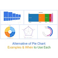
In some cases, simpler chart formats can also serve as an alternative of Pie chart, especially when you need consistent rendering and easier compatibility across all devices. Your users will appreciate it. This ensures everyone sees your data.
Integrating Google Charts with other platforms can be tricky. APIs might not connect smoothly. Check your API keys first. They must be correct and active.
Sometimes, the problem is in the code. Review your integration code carefully. Look for mismatched parameters or missing functions. Correct these to restore functionality.
Security settings can block integrations. Ensure your server permissions are set correctly. This allows data to flow freely. Proper settings prevent many headaches.
Meet DataCorp, a survey firm. They faced a data rendering problem. Their charts wouldn’t show results. Panic set in, but they didn’t quit.
They found the issue quickly. Their data format was wrong. Dates were formatted inconsistently. They fixed the format, and charts worked again.
Next, they checked browser compatibility. Some charts didn’t show on older browsers. They adjusted settings and added fallbacks. This made charts visible everywhere.
DataCorp’s project was back on track. They learned to check data and compatibility first. This saved them time and stress. Their lesson: small tweaks can solve big problems.
Blurry charts are like looking through foggy glasses. It’s all about resolution. Use higher DPI settings for clearer exports. Vector formats like SVG can save the day by scaling without losing sharpness.
PDFs are like the Swiss Army Knife of document sharing. Yet, they can mess with chart clarity. Use high-quality vector formats for export. Embed fonts to keep text sharp and readable.
Printing charts shouldn’t be a nightmare. Set a high DPI to keep details intact. Use print-friendly colors for better contrast. Preview before printing to catch any sneaky errors.
Choosing the right image format makes all the difference. PNG gives you clear images with transparency. JPEG is great for detailed color, but avoid it for text-heavy charts. SVG is the ace for scalability without fuzziness.
A consulting firm had to deliver crisp, clear reports. They switched to SVG for scalable charts. This change saved hours and improved client satisfaction. Clients loved the new, sharp visuals.
This adventure in Google Charts exporting is now full of useful tips. Remember, the key to success lies in the details and preparation.
Clutter is the enemy of clarity! Start by identifying essential metrics. What do you need to see at a glance? Use Google Charts to create clean, simple visuals. Less is more when displaying data.
Avoid unnecessary graphics and text. Stick to the essentials. Organize your dashboard logically. Group related information together for easy access. This makes finding insights a breeze.
Live data needs special handling. Connect your data source directly to Google Charts. This keeps your information fresh and up-to-date. Make sure your data connection is stable.
Interruptions can cause delays and inaccuracies. Optimize your dashboard for speed. Reduce the number of elements on each page. This helps maintain smooth performance.
Interactivity brings dashboards to life! Use clickable elements to dive deeper into data. But keep it simple. Too many interactions can confuse users. Choose wisely which elements to make interactive.
Use tooltips to provide extra information. They’re great for adding context without cluttering the screen. Ensure interactions don’t slow down performance. Test your dashboard’s speed regularly.
Google Charts shines by providing a smooth experience from start to finish. Its tight integration with Google Sheets supports real-time data visualization.
Chart.js offers simplicity but struggles with large datasets and dynamic updates. Plotly.js provides rich, interactive charts but requires more setup and coding. Google Charts balances user-friendliness and versatility, making it the smarter choice for quick and clean visualizations.
| Criteria | Google Charts | Chart.js | Plotly.js |
| Ease of Use | Very easy to use with simple API calls. | Beginner-friendly, straightforward API. | Moderate; requires learning the API but not as steep as D3.js. |
| Chart Types Available | Standard charts (line, bar, pie, scatter, etc.). | Standard charts with some advanced types. | Extensive: 3D charts, maps, statistical plots, contour plots, etc. |
| Customization | Moderate; limited compared to others. | Good; supports plugins for customization. | High; highly customizable layouts and styles. |
| Interactivity | Good; supports tooltips, zoom, pan, etc. | Good; supports hover effects and animations. | Excellent; supports detailed interactivity and callbacks. |
| Responsiveness | Built-in responsiveness. | Built-in responsiveness. | Built-in responsiveness with good performance. |
| Performance | Good for small to medium datasets. | Good for small to medium datasets. | Excellent; optimized for large datasets. |
| Documentation | Extensive and well-organized. | Well-documented with tutorials. | Comprehensive, with tutorials and community support. |
| Integration | Works well with Google services. | Works well with React, Vue, Angular. | Works well with JavaScript, Python, R, MATLAB. |
| Cross-Platform Support | Web-only (JavaScript). | Web-only (JavaScript). | Multi-language support (JavaScript, Python, R, MATLAB). |
| Data Binding | Works well with Google Sheets. | Static and dynamic data binding. | Excellent, especially for real-time updates with Dash. |
| Scalability | Limited; struggles with large datasets. | Limited; performance drops with large datasets. | Excellent; optimized for large datasets. |
| Security | Data privacy concerns (uses Google servers). | Local rendering; good security. | Local rendering is secure, especially with Dash. |
| Server-Side Rendering | Not supported. | Not supported. | Supported through Dash (Python). |
| Licensing | Free to use. | Free to use, MIT License. | Free for open-source use, paid for enterprise. |
| Community Support | Strong, but primarily supported by Google. | Strong, with active community contributions. | Strong, with active community and commercial support. |
| Use Cases | Dashboards, reports, business analytics. | Dashboards, basic data visualization, educational use. | Enterprise analytics, scientific research, and real-time dashboards. |
| Cost | Free. | Free. | Free for basic use, paid for enterprise use. |
| Learning Curve | Low. | Low. | Moderate; higher if using Python (Dash). |
Google Charts makes it easy to turn numbers into visuals. It’s free, simple, and works with other Google tools. You don’t need fancy software or special skills. Just code your charts and share them.
Whether you’re using bar charts, line charts, or maps, Google Charts handles it all. It’s perfect for tracking sales, mapping trends, or comparing data. Real-time updates keep your visuals fresh. You can even connect it with Google Sheets for live data feeds.
If something’s not working, it’s probably your code or data format. Check for errors. Make sure your data matches what Google Charts needs. Small mistakes can throw everything off.
The bottom line? Google Charts works. It turns data into something people can understand. Keep your charts clear, update your data, and let your visuals speak for themselves.
How much did you enjoy this article?


MySQL ODBC connector bridges MySQL databases and BI tools for secure, reliable data access across platforms. Set up yours today. Read on!
A ranking chart maker helps turn data into clear rankings for fast comparison. Learn Excel steps, examples, and tools to improve data visualization.
Vanity metrics can mislead teams into tracking numbers that never drive results. Discover what makes a metric truly actionable. Read on!