• Home
  • Tools dropdown img
    • Spreadsheet Charts

      • ChartExpo for Google Sheets
      • ChartExpo for Microsoft Excel
    • Power BI Charts

      • Power BI Custom Visuals by ChartExpo
    • Word Cloud

  • Charts dropdown img
    • Chart Category

      • Bar Charts
      • Circle Graphs
      • Column Charts
      • Combo Charts
      • Comparison Charts
      • Line Graphs
      • PPC Charts
      • Sentiment Analysis Charts
      • Survey Charts
    • Chart Type

      • Box and Whisker Plot
      • Clustered Bar Chart
      • Clustered Column Chart
      • Comparison Bar Chart
      • Control Chart
      • CSAT Survey Bar Chart
      • CSAT Survey Chart
      • Dot Plot Chart
      • Double Bar Graph
      • Funnel Chart
      • Gauge Chart
      • Likert Scale Chart
      • Matrix Chart
      • Multi Axis Line Chart
      • Overlapping Bar Chart
      • Pareto Chart
      • Radar Chart
      • Radial Bar Chart
      • Sankey Diagram
      • Scatter Plot Chart
      • Slope Chart
      • Sunburst Chart
      • Tornado Chart
      • Waterfall Chart
      • Word Cloud
    • Google Sheets
      Microsoft Excel
  • Services
  • Pricing
  • Contact us
  • Blog
  • Support dropdown img
      • Gallery
      • Videos
      • Contact us
      • FAQs
      • Resources
    • Please feel free to contact us

      atsupport@chartexpo.com

Categories
All Data Visualizations Data Analytics Surveys
Add-ons/
  • Google Sheets
  • Microsoft Excel
  • Power BI
All Data Visualizations Data Analytics Surveys
Add-ons
  • Google Sheets
  • Microsoft Excel
  • Power BI

We use cookies

This website uses cookies to provide better user experience and user's session management.
By continuing visiting this website you consent the use of these cookies.

Ok

ChartExpo Survey


Home > Blog > Microsoft Excel

How to Add a Secondary Axis in Excel?

Think of yourself as the marketing analyst for a clothing brand. You have data on consumers’ ages and purchase frequency for a year. The task at hand is investigating the connection between age and purchasing behavior, necessitating the creation of a secondary axis plot for a visual exploration of this relationship.

how to add a secondary axis in Excel

By employing the solution of how to add a secondary axis in Excel, you gain a powerful tool that acts like adding a second pair of eyes to your analysis.

This feature provides a whole new perspective, allowing you to identify distinct customer segments based on purchase behavior more effortlessly.

No longer will you have to squint and decipher confusing charts that compare data with different units.

Let me show you how to add a secondary axis in Excel and make your charts readable.

Table of Contents:

  1. What is the Secondary Axis in a Chart?
  2. Why Add a Second Axis in the Excel chart?
  3. How to Add a Secondary Axis in Excel?
  4. Adding a Second Y-axis to an Existing Chart
  5. How to Add a Secondary X-axis in Excel?
  6. Examples of Charts with Secondary Axis
  7. How to Add a Secondary Y-Axis in Excel With an Example?
  8. How to Delete Secondary Axis in Excel?
  9. Benefits of Incorporating a Secondary Axis in Your Charts
  10. How to Add a Secondary Axis in Excel FAQs
  11. Wrap Up

What is the Secondary Axis in a Chart?

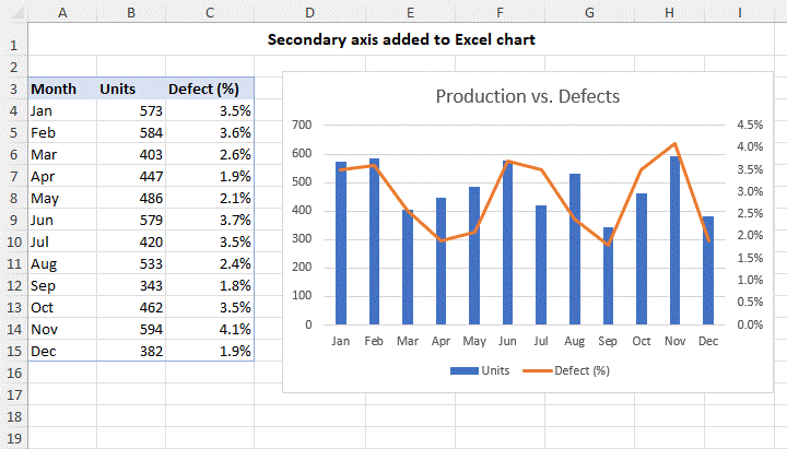
Definition: A secondary axis is a charting feature that allows you to display multiple data series on a single chart. It eliminates the need for additional charts when comparing data series measured in different units. Or have different scales of comparison, making it easier to visualize and compare the data.

While a secondary axis can be helpful in certain situations, you should use it sparingly and appropriately. Adding too many axes to a chart can make it cluttered and difficult to read. Consequently, detracts from the effectiveness of the chart.

Why Add a Second Axis in the Excel chart?

The second axis in a chart is crucial because it enables us to plot data with varying units or scales within the same chart. This feature proves particularly handy when comparing variables with vastly different ranges or magnitudes.

With a secondary axis in a Multi-Axis Chart Excel, we can ensure that each set of data is accurately represented without any distortion or misinterpretation. Moreover, it allows us to visualize relationships or trends between variables that might be challenging to discern on a single axis.

Ultimately, the secondary axis enhances the clarity and effectiveness of the chart, especially when depicting complex data presentations or correlations.

How to Add a Secondary Axis in Excel?

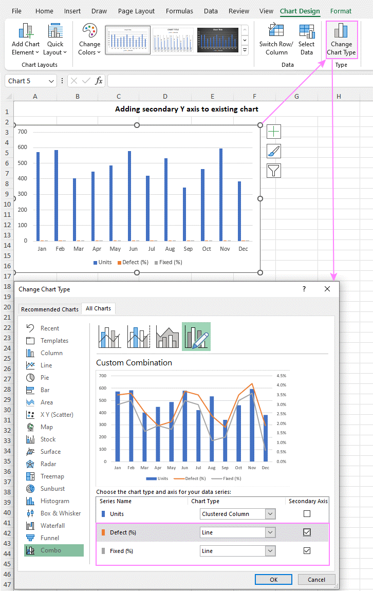
In earlier versions like Excel 2010, adding a second axis required multiple intricate steps. However, in newer versions like Excel 2013 through 365, the process is much simpler and quicker.

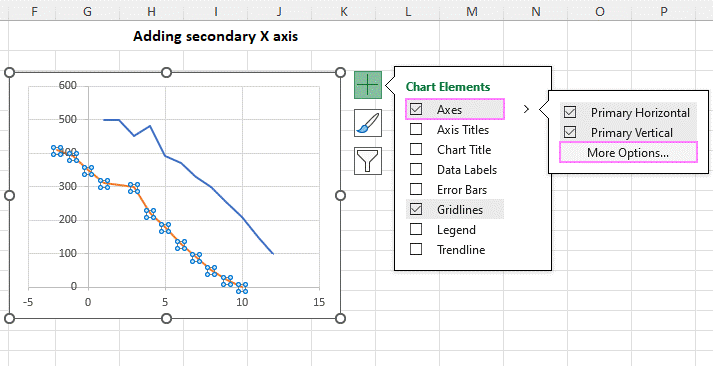
Here’s how to add a second axis to your Excel chart:

  • Select your data: including column headers.
  • Insert a chart: Go to the Insert tab, find the Charts group, and click on Recommended Charts.
Add a Secondary Axis in Excel
  • Use Recommended Charts: If you’re fortunate, you may find a chart with a second axis among the suggestions on the left side of the Insert Chart dialog box. If so, select it and click OK, you’re good to go. If not, no worries, just proceed to the next steps.
  • Combo Choice: If the recommended charts don’t include what you need, stay in the same window but switch to the All Charts tab. On the left, select Combo.
  • Combo Setup: Choose a Clustered Column for one data series and a Line for the other. Make sure to check the Secondary Axis box for the Line data series. Once everything is set, click OK.
Add a Secondary Axis in Excel 1
  • And there you have it! Your chart now features a second vertical y-axis.
Add a Secondary Axis in Excel 2

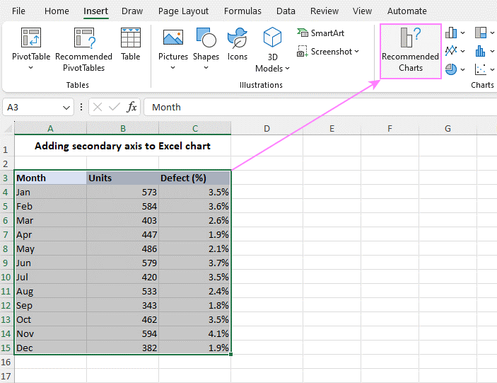
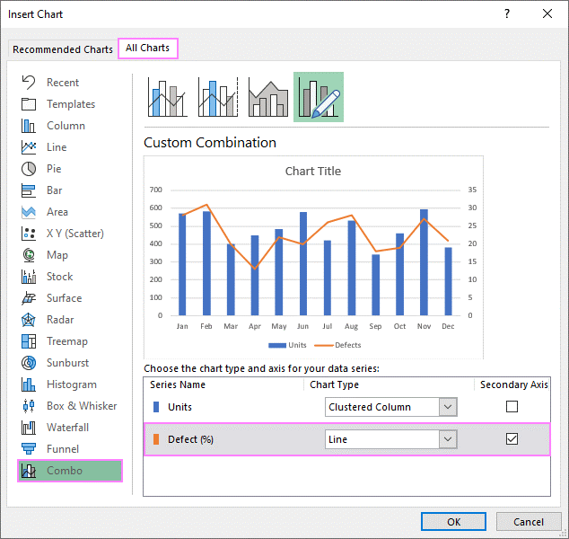
Tip: To enhance your combo chart with a second axis, consider customizing it further by changing the chart title, adding axis titles, and more. For detailed instructions, refer to ‘How to Edit Excel Graphs.

Adding a Second Y-axis to an Existing Chart

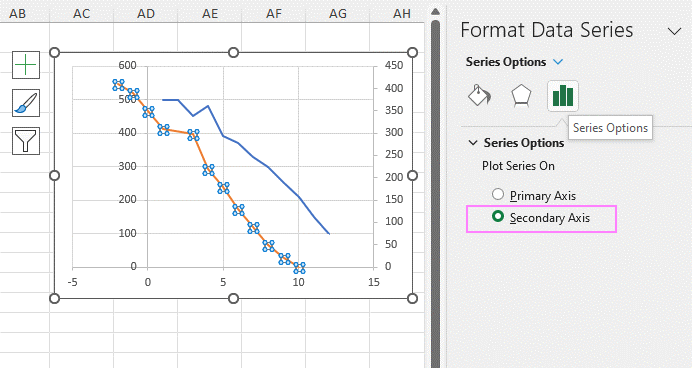
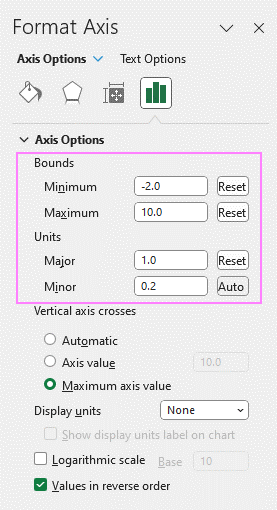
In some cases, it’s faster to add a second Y-axis to an existing chart rather than creating a new one from scratch. Here’s how to do it:

  1. Select Your Chart: Click on your chart to activate the Chart Tools tabs on the ribbon.
  2. Change Chart Type: Go to the Chart Design tab and click on the Change Chart Type button.
  3. Choose Combo Chart: In the dialog box that appears, select Combo from the left pane and choose the Cluster Column – Line on Secondary Axis chart type.
  4. Adjust Second Axis (if needed): If your chart includes multiple data series, you can choose which series to display on the secondary axis by checking the Secondary Axis box next to the desired series.
  5. Save Changes: Click OK to apply the changes and close the dialog box.

That’s it! Your chart now includes a second Y-axis, making it easier to visualize data with different scales or types.

Add a Secondary Axis in Excel 3

How to Add a Secondary X-axis in Excel?

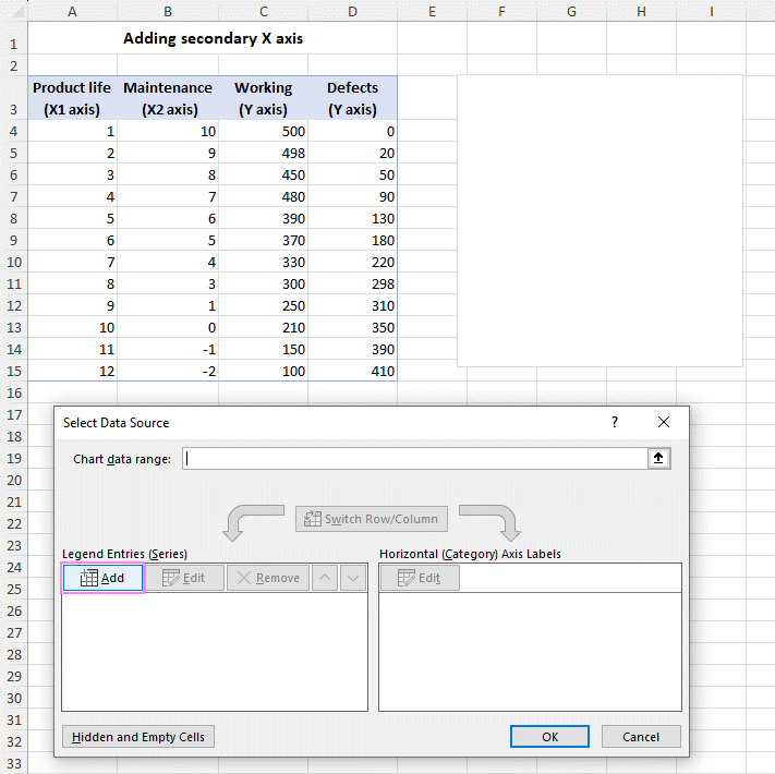
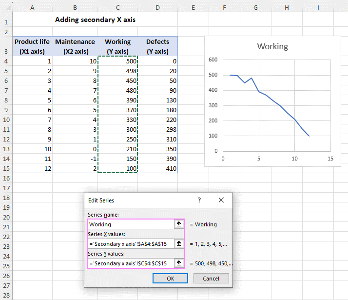
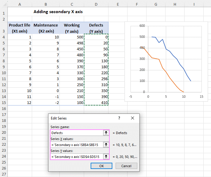
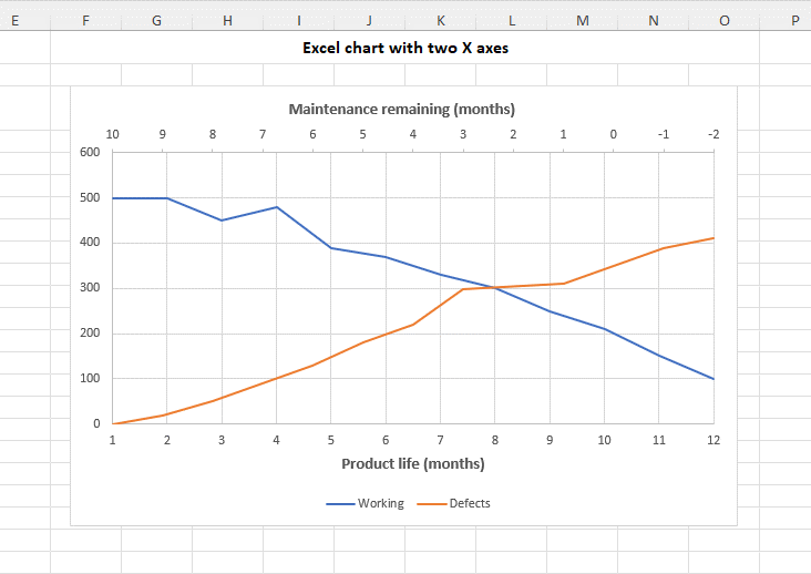
Adding a second horizontal X-axis in Excel can be useful for displaying two different sets of data across distinct time ranges. While Excel doesn’t provide an automatic option for a second X-axis, follow these steps to add one manually:

  • Start Fresh: Begin by creating a new chart without selecting any data. Go to the Insert tab, select the Charts group, and choose the Scatter with Straight Lines type.
Add secondary X axis in Excel
  • Select Data: Right-click the blank chart and choose ‘Select Data…’
Add secondary X axis in Excel 1
  • Add Data Source: In the dialog box that opens, click ‘Add’ to begin incorporating data into the chart.
Add secondary X axis in Excel 2
  • Define First Data Series: Name the first data series (e.g., “Working”), then select the X values (e.g., A4) and Y values (e.g., C4). Excel will display a preview of the chart. Click OK when you’re satisfied.
Add secondary X axis in Excel 3
  • Define Second Data Series: Similarly, add another data series (e.g., “Defects”). Select the X values (e.g., B4) and Y values (e.g., D4).
Add secondary X axis in Excel 4
  • Finalize and Exit: Click OK to close the Select Data Source window. The chart may not look correct yet, but adjustments will follow.
Add secondary X axis in Excel 5
  • Open Format Data Series Pane: Double-click the data series you want to place on the second X axis to open the Format Data Series pane. Alternatively, select the series, click the Chart Elements button (the plus sign), then click the arrow next to Axes and select ‘More Options…”
Add secondary X axis in Excel 6
  • Add Secondary Axis: In the Format Data Series pane, go to the Series Options tab and choose ‘Secondary Axis’.
Add secondary X axis in Excel 7
  • Adjust the Secondary Axis: Excel automatically adds a second Y axis by default. To change this to a second X-axis, click on the chart to activate the Chart Elements button. Click on this button, then the arrow next to Axes. Uncheck the ‘Secondary Vertical’ option and select ‘Secondary Horizontal’ instead.
Add secondary X axis in Excel 8
  • Reverse Order: If the second X axis is in reverse order, click on the vertical axis, open the Format Axis pane, find Axis Options, and check the ‘Values in reverse order’ box.
Add secondary X axis in Excel 9
  • Final Touches: Adjust the minimum and maximum bounds and major units for each axis to fine-tune your chart.
Add secondary X axis in Excel 10

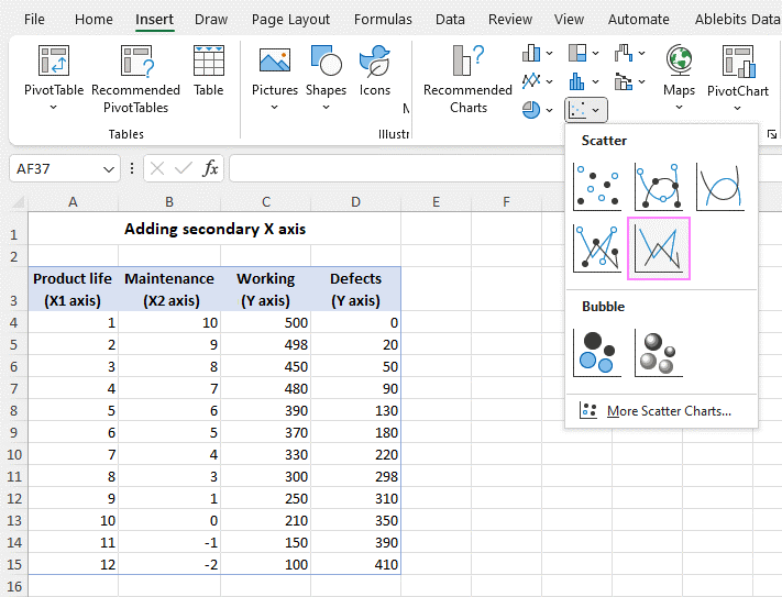
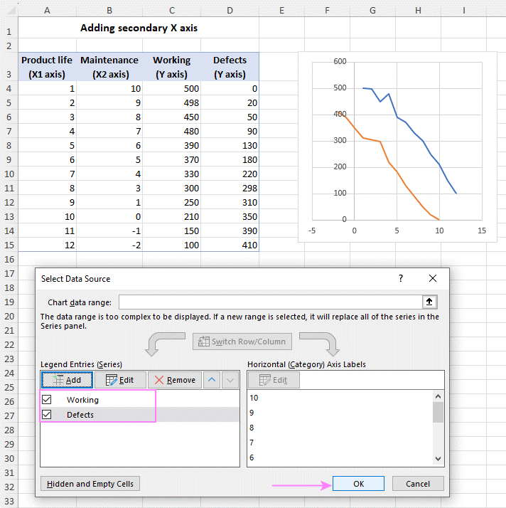
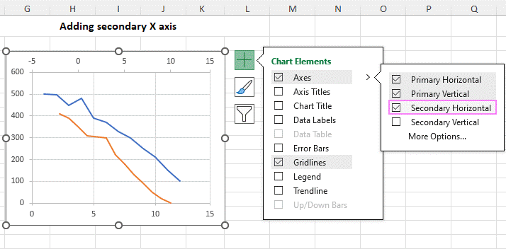
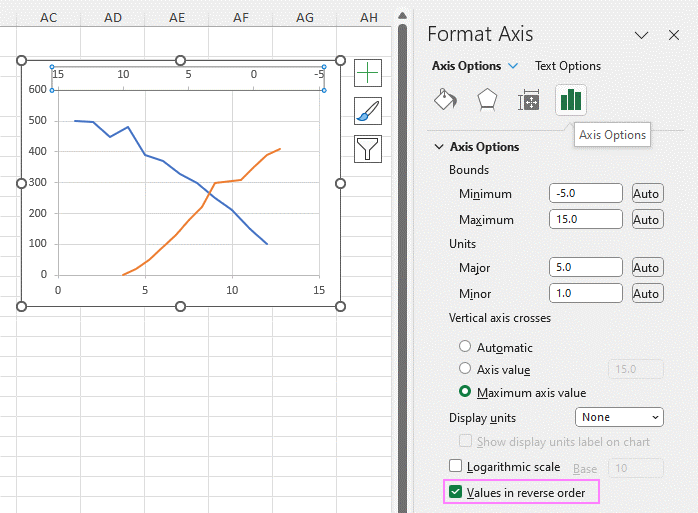
And there you have it! You’ve successfully added a second horizontal X-axis to your Excel chart, enhancing its ability to effectively present your data.

Add secondary X axis in Excel 11

Examples of Charts with Secondary Axis

Excel charts are a fantastic tool for visually representing complex data and communicating insights to your audience. Nonetheless, there are situations when you must display two separate data sets on the same chart. In such cases, using a Dual Axis Chart can be extremely helpful, as it allows you to compare these data sets more effectively without confusion.

That’s where a secondary axis comes in handy.

A secondary axis allows adding a second data set with a different scale than the principal axis. Consequently, it facilitates easy comparison.

How to add a secondary axis in Excel?

There’s a simple and intuitive solution: ChartExpo.

This Excel add-in makes it easy to create data visualizations in just a few clicks. Adding a secondary axis is no exception.

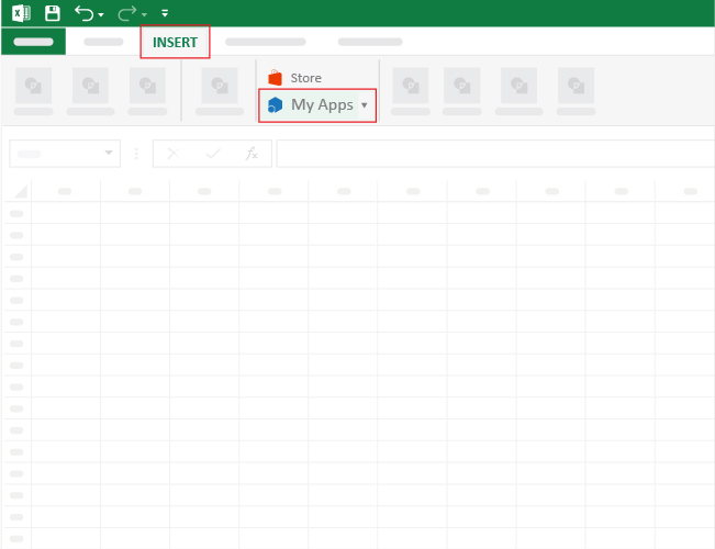
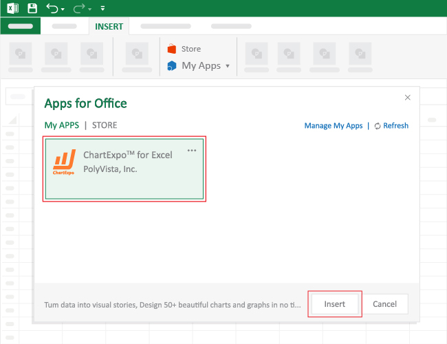
Let’s learn how to Install ChartExpo in Excel.

  1. Open your Excel application.
  2. Open the worksheet and click the “Insert” menu.
  3. You’ll see “My Apps”.
  4. In the office Add-ins window, click “Store” and search for ChartExpo on my Apps Store.
  5. Click the “Add” button to install ChartExpo in your Excel.

Example Data

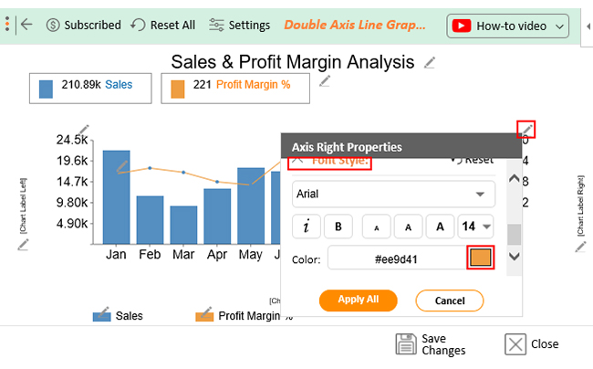
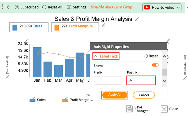
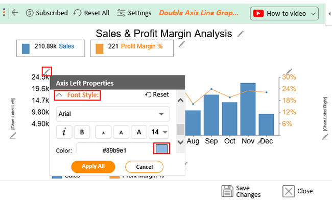
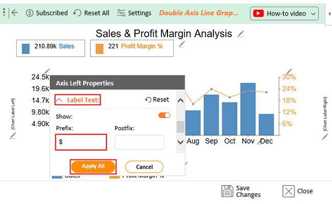
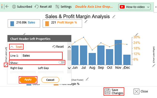
Let’s say you have the data below for your company. You want to analyze the company’s sales and profit margin.

Months Sales ($) Profit Margin %
Jan 16600 27
Feb 17964 14
Mar 16955 11
Apr 14726 16
May 13972 22
Jun 20216 21
Jul 24506 21
Aug 13216 13
Sep 19569 21
Oct 16064 17
Nov 18897 27
Dec 18205 11

To analyze this data, you need to use a chart that allows for adding a secondary axis. The suitable charts to use here are the Double-Axis Line Graph and Bar Chart.

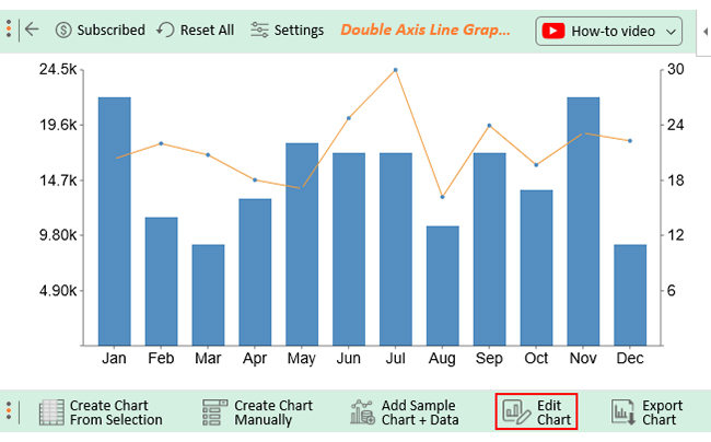
Follow through as I show you how to use ChartExpo to add a secondary axis in Excel.

  • To get started with ChartExpo, install ChartExpo in Excel.
  • Navigate to the INSERT menu and select My Apps.
insert chartexpo in excel
  • Choose ChartExpo from My Apps, then click Insert.
open chartexpo in excel
  • Once ChartExpo is loaded. Click on “Double Axis Line Graph and Bar Chart” from the list of charts.
search double axis line graph and bar chart in excel
  • Click the “Create Chart From Selection” button after selecting the data from the sheet, as shown.
create double axis line graph and bar chart in excel
  • The Double Axis Line Graph and Bar Chart will look like as below.
edit double axisit line graph and bar chart in excel
  • If you want to have the title of the chart, click on Edit Chart, as shown in the above image.
  • To change the title of the chart, click on the pencil icon that is available very next to Chart Header.
  • It will open the properties dialog. Under the Text section, you can add a heading in Line 1 and enable Show Give the appropriate title of your chart and click on Apply button.
set double axis line graph and bar chart in excel
  • Click the highlighted pencil icon to change the color of the right Y-Axis on the chart.
  • Expand the “Font Style” properties, then choose the desired color for the axis.
change double axis line graph and bar chart in excel
  • Let’s add a postfix (e.g. % Sign) to the numeric values in the chart.
  • Expand the “Label Text” property and add the postfix. Then click the “Apply All” button.
update double axis line graph and bar chart in excel
  • To change the color of the left Y-axis, click the highlighted pencil icon.
  • Expand the “Font Style” properties, then choose the desired color for the axis.
configure double axis line graph and bar chart in excel
  • Let’s add a prefix (e.g. $ Sign) to the numeric values in the chart.
  • Expand the “Label Text” property and add the prefix value. Then click the “Apply All” button.
settings double axis line graph and bar chart in excel
  • Let’s add label properties on the left axis.
  • Click the pencil icon located next to “Chart Label Left”.
  • This will open a properties dialog where you can add a heading under the “Text” section.
  • In the “Line 1” field, enter the appropriate label and enable the “Show” option. Click the “Apply” button to save the changes.
  • To ensure the changes remain, click the “Save Changes” button.
save double axis line graph and bar chart in excel
  • The final chart will look as below.
how to add a secondary axis

Insights

  • Sales figures were impressive in January, but the profit margin was not up to the mark.
  • From January till May, profits and sales recorded low figures.
  • From June to July, the profit margin showed an increasing trend and recorded its highest figure in July.
  • Sales and profit margin dropped in August, a cause for concern.
  • From September to December, the sales and profit margin remained steady.

How to Add a Secondary Y-Axis in Excel With an Example?

To install ChartExpo into your Excel, click this link.

Example: Dual Axis Line Chart

This section will use the Dual Axis Line Chart in Excel to visualize the table below. The aforementioned chart is one of the visualization designs with a secondary y-axis Excel.

Year Purchase Sales
2016 100000 150000
2017 60000 100000
2018 140000 200000
2019 120000 180000
2020 170000 200000
2021 130000 180000

To get started with ChartExpo, follow the easy steps below:

  • Open the worksheet and click the Insert button to access the My Apps option.
insert chartexpo in excel
  • Click the My Apps button and click the See All button to view ChartExpo, among other add-ins.
open chartexpo in excel
  • Select ChartExpo add-in and click the Insert button.
  • Once the add-in has been installed successfully, you will see a list of the charts available.
list of charts in excel
  • Once the interface below loads, click the Search box and type “Dual Axis Line Chart.”
search chart in excel
  • Select the sheet holding your data and click the Create Chart from the Selection button, as shown below.
create chart in excel
  • Check out the final chart below.
secondary y-axis

How to Delete Secondary Axis in Excel?

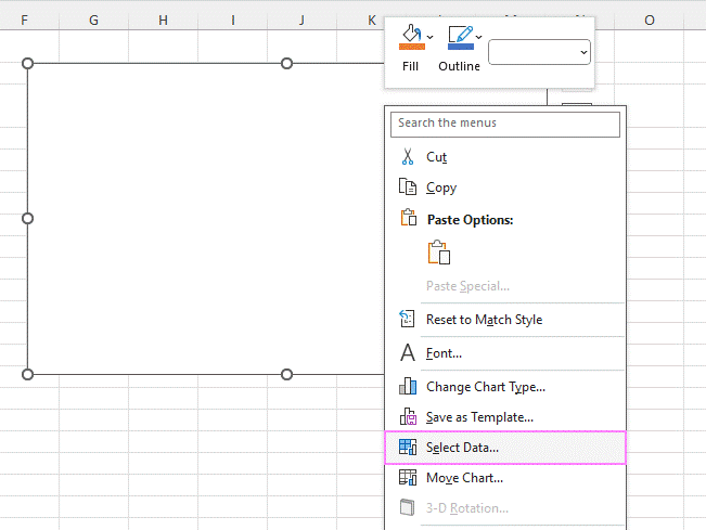
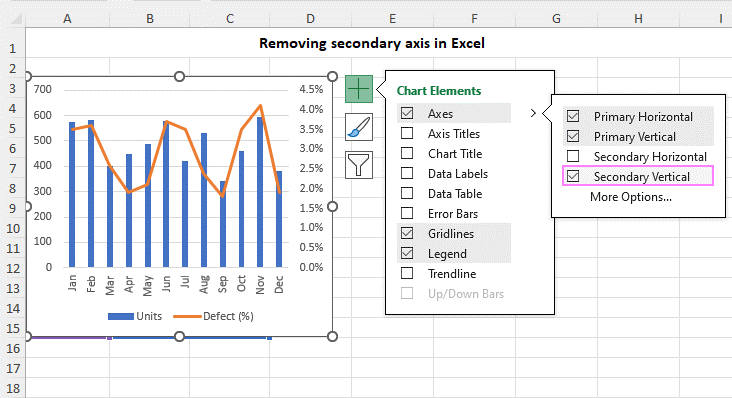
Removing a secondary axis in Excel is much easier than adding one. Here’s how:

  1. Delete Key: Click on the secondary axis to select it, then press the Delete key on your keyboard.
  2. Chart Elements Menu: Alternatively, click the Chart Elements button, click the arrow next to Axis, and uncheck the Secondary Axis box.

Both approaches will successfully eliminate the secondary axis, reverting your chart to a single-axis format.

Delete secondary X axis in Excel

Benefits of Incorporating a Secondary Axis in Your Charts

  • Data Comparison

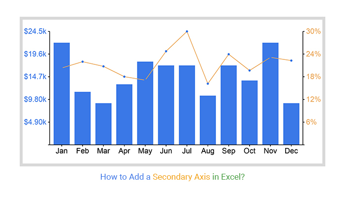
When creating charts, you cannot overlook the benefits of data comparison. Adding a secondary axis is useful when comparing two different data sets with different units of measurement. It allows you to plot the two data sets on separate axes with appropriate scales. Thus, making it easier to compare them accurately.

  • Improve Readability and Comprehension

Viewers can easily compare and contrast information displayed on separate axes from two data sources. This is very handy when working with data sets of varying scales. It allows you to accurately present both data sets without sacrificing clarity.

  • Highlight Trends and Patterns

It can be difficult to accurately compare data sets with vastly different scales or units of measurement. Adding a secondary axis to a chart appropriately plots the two data sets. This highlights the trends and patterns from the data making gleaning insights easier.

  • Avoid Misinterpretations

Adding a secondary axis to your chart can help avoid misinterpretations due to scaling issues. Plotting varying data sets on the same axis is inappropriate. It can make it difficult to see the trends in one data set. This can lead to incorrect conclusions or misinterpretations.

How to add a secondary axis in Excel enables you to plot the two data sets on separate axes with different scales. This makes it easier to see the trends in each set. Consequently, helps you make more accurate observations and conclusions from your data.

How to Add a Secondary Axis in Excel FAQs

Can you have more than 2 axes in Excel?

Yes, ChartExpo for Excel provides a solution to create dual/double-axis or Multi-axis charts. However, a maximum of two axes in a chart is recommended to avoid confusion.

Can you create a secondary axis in Excel?

Excel permits the addition of a secondary axis to charts for comparing data with different scales. Use ChartExpo for Excel to add a secondary axis. It provides several chart types with a secondary y-axis.

Are there any limitations to using a secondary axis in Excel?

Using a secondary axis in Excel has limits. Using too many axes in a chart might cause it to become cluttered and difficult to read. It is therefore recommended to use no more than two axes.

What is the purpose of adding a secondary axis in Excel?

The purpose of adding a secondary axis in Excel is to plot data of different scales. Especially when the data series have widely varying values or mixed data types. It allows for better visualization and comparison of different datasets.

Wrap Up

Business analytics relies heavily on data visualization. It allows decision-makers to understand the data better and make informed judgments. Data visualization also helps with stakeholder communication.

Charts present information in a format that is easier to understand and can be shared with others. A secondary axis is Excel’s most flexible and least intrusive charting feature. It helps you to compare data sets with different scales or measurement units. Thus, making it easier to make accurate observations and draw the right conclusions.

As we have discussed, secondary axes have several benefits. However, you should use secondary axes sparingly. Only add this feature when necessary since it can lead to more cluttered and confusing charts.

How do you add a secondary axis in Excel?

With ChartExpo, you can add a secondary axis to your chart.

The best part?

ChartExpo is easy to use, affordable, and flexible.

Why not give it a try?

How much did you enjoy this article?

ExcelAd2
Start Free Trial!
125815

Related articles

next previous
Microsoft Excel12 min read

Artificial Intelligence in Excel for Clear Insights

Discover how AI elevates Excel, from automation to advanced data analysis. This blog covers benefits, limitations, and examples to enhance your productivity.

Microsoft Excel8 min read

Excel Task Tracker Template for Smarter Task Insights

Task tracker template in Excel organizes tasks, tracks deadlines, and boosts efficiency. Learn its benefits, and explore expert tips to simplify task management.

Microsoft Excel10 min read

Invoice Tracker Template in Excel for Better Insights

An invoice tracker Excel template helps track invoices, due dates, and payments. Learn how to use this template for better financial management.

Microsoft Excel12 min read

Key Performance Indicators in Healthcare for Better Insights

Key Performance Indicators in healthcare track patient care and efficiency. Learn about these KPIs, top examples, and how to use them to improve outcomes.

Microsoft Excel10 min read

BMI Calculation Formula in Excel for Better Fitness Insights

The BMI calculation formula in Excel helps track and analyze body mass index. Explore step-by-step instructions and tips to simplify BMI tracking in Excel.

ChartExpo logo

Turn Data into Visual
Stories

CHARTEXPO

  • Home
  • Gallery
  • Videos
  • Services
  • Pricing
  • Contact us
  • FAQs
  • Privacy policy
  • Terms of Service
  • Sitemap

TOOLS

  • ChartExpo for Google Sheets
  • ChartExpo for Microsoft Excel
  • Power BI Custom Visuals by ChartExpo
  • Word Cloud

CATEGORIES

  • Bar Charts
  • Circle Graphs
  • Column Charts
  • Combo Charts
  • Comparison Charts
  • Line Graphs
  • PPC Charts
  • Sentiment Analysis Charts
  • Survey Charts

TOP CHARTS

  • Sankey Diagram
  • Likert Scale Chart
  • Comparison Bar Chart
  • Pareto Chart
  • Funnel Chart
  • Gauge Chart
  • Radar Chart
  • Radial Bar Chart
  • Sunburst Chart
  • see more
  • Scatter Plot Chart
  • CSAT Survey Bar Chart
  • CSAT Survey Chart
  • Dot Plot Chart
  • Double Bar Graph
  • Matrix Chart
  • Multi Axis Line Chart
  • Overlapping Bar Chart
  • Control Chart
  • Slope Chart
  • Clustered Bar Chart
  • Clustered Column Chart
  • Box and Whisker Plot
  • Tornado Chart
  • Waterfall Chart
  • Word Cloud
  • see less

RESOURCES

  • Blog
  • Resources
  • YouTube
SIGN UP FOR UPDATES

We wouldn't dream of spamming you or selling your info.

© 2025 ChartExpo, all rights reserved.